44 search results
(0.022 seconds)
- Yumna by WAP Type,
$20.00 wap_std makes cute fonts for kids. I only remember some of the font characters. I think this new font is cute & fun for your fun projects. yumna is made with all my heart, I love it, and I hope you like it too.
 - Strawberry Bubblegum - Personal use only

- KR Strawberry - Unknown license

- alien strawberry - Unknown license

- Strawberry Gossip by PizzaDude.dk,
$20.00 Here is something to talk about! Spread the word - spread the gossip! An elegant combination of thin and fragile lines, made with a fine pen. Fine lines, crunchy, sweet curls.
 - Strawberry Cheesecake by Supersemarletter,
$10.00 Strawberry Cheesecake is a handwritten style in Uppercase and Lowercase feel nice balanced. Provide ligatures with special character. Honestly it works perfectly for headlines, logos, posters, packaging, T-shirts and much more. Font Features : • Ligatures • Numerals & Punctuation • Accented Characters • Multiple Languages Supported Recommended to use in Adobe Illustrator or Adobe Photoshop with opentype feature. If you have questions, just send me a message and I'm glad to help.
 - Sweety Strawberry by NJ Studio,
$19.00 Hi...Thank for your visit :) Sweety Strawberry A Simple Fonts are font designs that are made for various vector designs, printing such as digital wedding invitations, blogs, online shops, social media, while printing can be used in the field of product clothing, accessories, bags, pins, logos, business cards, watermarks and many others ... so it can make your product look elegant and attractive, and also Multilingual support!!! Happy design ...
 - Strawberry Blossom by StereoType Fonts,
$29.00 Introducing Strawberry Blossom, a smooth script font, made for your best creative typographic designs! Try it for any of your DIY projects, cards, posters, packaging, web design, photos, scrapbooking, or anything hidden in your creative mind! With this soft and rounded style, it comes with plenty of alternates characters and ligatures so that you could create a unique and personal style to your text. And you'll also find a cool sans serif handwritten font to match perfectly!
 - Strawberry Monday by Supfonts,
$9.00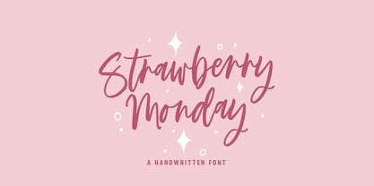 Strawberry Monday will be perfect for wedding lettering, beautiful frame for your home, book covers, greeting cards, logos, marketing, magazines or anything that requires cute handwritten lettering :) What's inside: Strawberry Monday Script Multilingual support Cricut support If you have any questions, please contact me directly or in instagram @superdizigner
 - Strawberry Swirl by Krafted,
$10.00 Imagine a world filled with swirls of strawberry, pops of pink, and pure joy to go around for everyone... Are you trying to make an elegant, sweet, and stylish statement with your invitations, social media, website, or printed materials? Then grab some cotton candy, crack a smile, and get ready for a swirly day of wonders! Introducing Strawberry Swirl - A Modern Script Font. This gorgeous & stylish font can be used for a host of different content needs and projects. Use it for your headings, logos, business cards, printed quotes, invitations (wedding, birthday, engagement, etc.), packaging, resumes, and even your website or social media branding. Enchant & delight your audience, clients, or guests with this versatile, stylish, and elegant font. What you’ll get: - Multilingual & Ligature Support - Full sets of Punctuation and Numerals Compatible with: - Adobe Suite - Microsoft Office - KeyNote - Pages Software Requirements: The fonts that you’ll receive in the pack are widely supported by most software. In order to get the full functionality of the selection of standard ligatures (custom created letters) in the script font, any software that can read OpenType fonts will work. We hope you enjoy this font and that it makes your branding sparkle! Feel free to reach out to us if you’d like more information or if you have any concerns.
 - Strawberry Junkies by Yumna Type,
$15.00 Choosing the right display font can make your designs look more attractive and stunning, so that your designs gain more popularity. This is the Strawberry Junkies for you. It is a rather circled display font of which prone circled letters express soft, fun nuances in order that the company becomes more easily recognized by customers and audience. This font’s main characters are the consistent geometry, proportion, and line thickness on every letter to make it legible for big text sizes. In addition, Strawberry Junkies provides an extra clipart as a special bonus. Furthermore, you can enjoy the available features here. Features: Multilingual Supports PUA Encoded Numerals and Punctuations Strawberry Junkies fits best for various design projects, such as brandings, posters, banners, headings, magazine covers, quotes, printed products, merchandise, social media, etc. Find out more ways to use this font by taking a look at the font preview. Thanks for purchasing our fonts. Hopefully, you have a great time using our font. Feel free to contact us anytime for further information or when you have trouble with the font. Thanks a lot and happy designing.
 - Strawberry Script by Mans Greback,
$59.00 Strawberry Script is a stylish and characteristic script typeface. It supports hundred of Latin languages, and has several ligatures to maximize the letters' flow. The font is designed and created by Noah Kinard and Måns Grebäck. Also check out its sister fonts: Raspberry Script and Blueberry Script.
 - Yume by Thinkdust,
$10.00Yume is a fun loving font with a cruel streak that can sometimes turn laughter into daggers. This wicked personality can lead to some aggressive turns of phrase, but when it’s not being mean, Yume can use its strength and sense of humour to do a lot of good. Either way, Yume is sure to have a big impact on your audience, shocking them into paying attention through crisp, sharp lines and chunky, bold characters. - KG Strawberry Limeade - Personal use only

- 101! Strawberry Delight - Unknown license

- Carrot and Strawberry by HIRO.std,
$17.00 Carrot and Strawberry is a Playful Serif Font. This font describes about fun, cute, easy going, and easy to use. FEATURES - Support Opentype Features - Support Ligatures - Numbering and Punctuations - PUA Encoded Characters - Multilingual Support - Works on PC or Mac USE Carrot and Strawberry works great in craft, any product packaging, book, logotype, magazine, editorial, quotes and any projects that need all about cute and fun taste. Enjoy using! Thanks. HIRO.std
 - KG Strawberry Limeade by Kimberly Geswein,
$5.00 Doodled, whimsical, curly "capitals" (some of which are lowercase styles) are paired with unicase lowercase letters in a playful mix of capital and lowercase styles.
 - Starberry Swirl Delight - Unknown license

- LT Shortcake Medium - 100% free

- Starberry Swirl Whipped Delight - Unknown license

- Raspberry Script by Mans Greback,
$59.00 Raspberry Script is a tall and characteristic script typeface. It supports hundred of Latin languages, and has several ligatures to maximize the letters' flow. The font is designed and created by Noah Kinard and Måns Grebäck. Also check out its sister fonts: Blueberry Script and Strawberry Script.
 - Blueberry Script by Mans Greback,
$59.00 Blueberry Script is a bold and characteristic script typeface. It supports hundred of Latin languages, and has several ligatures to maximize the letters' flow. The font is designed and created by Noah Kinard and Måns Grebäck. Also check out its sister fonts: Raspberry Script and Strawberry Script.
 - Bungler by Bogstav,
$17.00 This font is a strange mixture of sweet strawberry cake and horrifying terror! :) Meaning that the font can be used for something pretty scary (such as a horror poster) or something quite innocent (like products for children) It resembles fat brushstrokes, but clearly it was drawn with a pen.
 - Farmstand by Atlantic Fonts,
$26.00 Farmstand is a fresh and joyful font with the same kind-hearted feeling and naiveté of your local farmstand. Paired with Farmstand Goodies, 52 hand-drawn images of funky farmers' fare, you can celebrate and have some pickles, savor sweet strawberries, or get creative with Cosmos. Sometimes life can be simple.
 - The KR Strawberry font, designed by the talented Kat Rakos, exudes a delightful whimsy that captures the essence of childlike wonder and playfulness. At its core, it is a font that stands out for its...
- Magma II by Stone Type Foundry,
$49.00 Magma is a rare sans serif typeface family designed explicitly for use in both text and display applications. Starting with this design foundation, Sumner Stone refined the design and added a large suite of international characters to create Magma II, a type family with even more depth and versatility.
 - ITC Stone Sans II by ITC,
$45.99 The ITC Stone Sans II typeface family is new from the drawing board up. Sumner Stone, who designed the original faces in 1988, recently collaborated with Delve Withrington and Jim Wasco of Monotype Imaging to update the family of faces that bears his name. Sumner was the lead designer and project director for the full-blown reworking – and his own greatest critic. The collaborative design effort began as a relatively simple upgrade to the ITC Stone Sans family. As so often happens, however, the upgrade proved to be not so simple, and grew into a major design undertaking. “My initial intent,” recalls Sumner, “was to provide ITC Stone Sans with even greater versatility. I planned to add an additional weight, maybe two, and to give the family some condensed designs.” As Sumner began to look more closely at his twenty-year-old typeface, he decided that it would benefit from more extensive design improvements. “I found myself making numerous refinements to character shapes and proportions,” says Sumner. “The project scope expanded dramatically, and I’m pleased with the final result. The redesign has improved both the legibility and the overall appearance of the face.” The original ITC Stone Sans is part of the ITC Stone super family, along with ITC Stone Serif and ITC Stone Informal. In 2005 ITC Stone Humanist joined the family. All of these designs have always offered the same three weights: Medium, Semibold, and Bold – each with an italic counterpart. Over time, Stone Sans has emerged as the godfather of the family, a powerful design used for everything from fine books, annual reports and corporate identity programs, to restaurant menus, movie credits and advertising campaigns. ITC Stone Sans, however, lacked one attribute of many sans serif families: a large range of widths and weights. “These fonts had enjoyed great popularity for many years – during which graphic designers repeatedly asked for more weights and condensed designs in the family,” says Sumner. “Their comments were the impetus.” ITC Stone Sans II includes six weights ranging from an elegant Light to a commanding Extra Bold. An italic counterpart and suite of condensed designs complements every weight. In all, the new family encompasses 24 typefaces. The ITC Stone Sans II family is also available as a suite of OpenType Pro fonts, allowing graphic communicators to pair its versatile design with the capabilities of OpenType. These fonts offer automatic insertion of ligatures, small caps and use-sensitive figure designs; their extended character set also supports most Central European and many Eastern European languages. ITC Stone® Sans II font field guide including best practices, font pairings and alternatives.
 - Fruit And Veggie Doodles by Outside the Line,
$19.00 Fruit and Veggie Doodles is a 33-picture clipart font. Use them as dingbats or enlarge the small pictures and use them as clipart. Lots to choose from potatoes, tomatoes, avocado, eggplant, fig, watermelon, radish, peppers, broccoli, asparagus, corn on the cob, green onions, carrots, peas, lettuce, mushrooms, onion, olives, garlic, okra, beans, lemon, pear, pineapple, grapefruit or orange, pumpkin, apple, strawberry, grapes, cherry and banana. This is the companion font to Food Doodles Too. Also works nicely with Coffee & Tea Doodles. And if you need some fancy cakes check out Party Doodles. All in the same line drawing style to mix and match.
 - Power Breakfast by Hanoded,
$15.00 I am a firm believer in the fact that breakfast is the most important meal of the day. So, for the last 10 years (ever since I became a father), I have been serving my family a healthy breakfast. I live in The Netherlands, so the main portion of breakfast is bread, but I try to serve something ‘nice’ every day. Like strawberries, yoghurt with banana and brown sugar (not too much sugar!), oatmeal porridge or granola. I myself like Indonesian fried rice (nasi goreng) for breakfast, but I am afraid my kids won’t eat that in the morning… Power Breakfast is a handmade display font. Yes, it is wobbly, yes, it is uneven, but that’s what’s so darn good about it!
 - ITC Stone Sans by ITC,
$40.99 Sumner Stone worked together with Bob Ishi of Adobe to create the Stone family fonts, which appeared in 1987. Coincidentally, ishi is the Japanese word for stone, which precluded any squabbling about whose name the font would carry. The family consists of three types of fonts, a serif, a sans-serif and an informal style. The Stone fonts are very legible and make a modern, dynamic impression.
 - ITC Stone Informal by ITC,
$29.00 Sumner Stone worked together with Bob Ishi of Adobe to create the Stone family fonts, which appeared in 1987. Coincidentally, ishi is the Japanese word for stone, which precluded any squabbling about whose name the font would carry. The family consists of three types of fonts, a serif, a sans-serif and an informal style. The Stone fonts are very legible and make a modern, dynamic impression.
 - ITC Stone Serif by ITC,
$29.99 Sumner Stone worked together with Bob Ishi of Adobe to create the Stone family fonts, which appeared in 1987. Coincidentally, ishi is the Japanese word for stone, which precluded any squabbling about whose name the font would carry. The family consists of three types of fonts, a serif, a sans-serif and an informal style. The Stone fonts are very legible and make a modern, dynamic impression.
 - Rijk by Wilton Foundry,
$39.00 The font name comes from the Dutch word "Rijk" meaning "rich". I'd like you to consider Rijk as a good Pinot Noir: medium bodied, offering succulent juicy berry flavors, accentuated by delicate aromas of coffee and vanilla oak. Ruby red in color, it boasts of velvety tannins and a long fulfilling fruity aftertaste. Rijk has a structure that is delicate and fresh. The aromatics are very fruity like cherry, strawberry, and plum, often with notes of tea-leaf, damp earth, or worn leather… My intent was to create a script that is rich, while not overbearing. It will serve many noble and useful purposes because of its fresh and lively texture. It is also very legible because it has a slightly more upright angle. Use Rijk for headlines, packaging, identities, advertising and online. Available in OpenType, it includes a range of ligatures as well as a full range of class kerning.
 - Octava by ParaType,
$30.00 PT Octava™ was designed at ParaType in 2001 by Vladimir Yefimov. The first (Cyrillic only) version named Scriptura Russica (1996) consisting of three styles (book, italic, bold) was commissioned by the Russian Bible Society. Lately the Latin letters and bold italic were added. Inspired by Lectura, 1969, by Dick Dooijes and Stone Print, 1991, by Sumner Stone. In spite of large x-height the typeface is both space saving and quite legible at small sizes. Expert fonts including small caps (book) and old style figures are available.
 - Yumo by Thinkdust,
$10.00 Yumo is a new, textured remix of the original 2010 Yume typeface, and has plenty to offer of its own. Angular and blocky, this typeface creates impactful text with a hint of playfulness, expanded upon by its rough finish. There are no extraneous edges to this font because most of them have been subsumed into the characters themselves, so any sharpness it may have from the squared corners is removed by the lack of thin strokes or serifs. Perfect for headlines and large text that wants to stand out, Yumo’s big, bold text will help your message make an impact. Playing with colours on the textured surface only helps to strengthen this effect, so that Yumo will blow people away, whatever you want to say.
 - ITC Stone Humanist by ITC,
$40.99 Type designers have been integrating the design of sans serifs with serifed forms since the 1920s. Early examples are Edward Johnston's design for the London Underground, and Eric Gill's Gill Sans. These were followed by Jan van Krimpen's Romulus Sans, Frederic Goudy's ITC Goudy Sans, Hermann Zapf's Optima, Hans Meier's Syntax and Adrian Frutiger's Frutiger. Now, ITC Stone Humanist joins this tradition. It is a careful blend of traditional sans serif shapes and classical serifed letterforms. ITC Stone Humanist grew out an experiment with the medium weight of ITC Stone Sans, a design that already showed a relationship to these sans serif-serif hybrids. ITC Stone Sans has proportions based on those of ITC Stone Serif, and its thick-and-thin stroke contrast suggests the bloodline of humanistic sans serif typefaces. But other aspects of ITC Stone Sans are more closely aligned to the gothics and grotesques, a tradition that accounts for the largest portion of sans serif designs. Enter ITC Stone Humanist. During his experiments with the earlier design, Sumner Stone recalls, I was actually quite surprised at how seemingly subtle changes transformed the face," moving the design firmly into the humanist tradition. "The form of the 'g,' 'l,' 'M,' 'W,' and more subtly the 'a' and 'e' are part of the restructuring of the family," he explains. The top endings of vertical lower case strokes have been cropped on an angle, as have the ascender and descender stroke endings. ITC Stone Humanist is a full-fledged member of the ITC Stone family. It has been produced with the same complement of weights, and the x-heights, proportions, and underlying character shapes are completely compatible with the three original designs. The original ITC Stone Sans is a popular typeface, in part because of its notable versatility. ITC Stone Humanist shares this virtue, and can be used successfully at very small sizes, in long passages of text copy, and even as billboard-sized display type."
 - American Revolution by Celebrity Fontz,
$24.99American Revolution is a unique collection of signatures of 84 key personalities from both sides of the American Revolutionary War, one of the supreme dramas in history. A must-have for autograph collectors, desktop publishers, history buffs, or anyone who has ever dreamed of sending a letter, card, or e-mail “signed” as if by one of these famous Revolionary War figures. This font includes signatures from the following American Revolutionary War personalities, from both sides: Ethan Allen, Charles T. Armand, John Armstrong, Benedict Arnold, Pudhomme de Borre, John Cadwalader, George Rogers Clark, George Clinton, James Clinton, Thomas Conway, William Davidson, Philippe du Coudray, The Chevalier Louis Lebegue dePresle Duportail, Chistopher Gadsden, Horatio Gates, Moses Hazen, John Glover, Mordecai Gist, Nathaniel Greene, William Heath, Edward Hand, John E. Howard, Robert Howe, Isaac Huger, William Irvine, Henry Knox, Baron Johann de Kalb, Tadeusz Kosciuszko, Marquis de Lafayette, Charles Lee, Henry Lee, Andrew Lewis, William Maxwell, Benjamin Lincoln, Francis Marion, James Moore, Daniel Morgan, William Moultrie, Peter Muhlenberg, Alexander McDougall, Lewis Nicola, Lachlan McIntosh, John Nixon, Hugh Mercer, Samuel H. Parsons, Thomas Mifflin, John Paterson, Richard Montgomery, Andrew Pickens, Charles Cotesworth Pinckney, Enoch Poor, Count Casimir Pulaski, Israel Putnam, Joseph Reed, Elisha Sheldon, Arthur St. Clair, William Smallwood, Philip Schuyler, John Stark, Charles Scott, Adam Stephen, John Sullivan, Jethro Sumner, Thomas Sumter, James Varnum, Baron Friedrich Wilhelm August Heinrich Ferdinand von Steuben, Lord Stirling, Artemas Ward, Joseph Warren, George Washington, Anthony Wayne, James Wilkinson, Otho H. Williams, John Paul Jones, William Woodford, David Wooster, John Burgoyne, Sir Guy Carleton, Charles Cornwallis, Sir Henry Clinton, Sir Thomas Gage, Richard, Earl Howe, Sir William Howe, Sir Banastre Tarleton. This font behaves exactly like any other font. Each signature is mapped to a regular character on your keyboard. Open any Windows application, select the installed font, and type a letter, and the signature will appear at that point on the page. Painstaking craftsmanship and an incredible collection of hard-to-find signatures go into this one-of-a-kind font. Comes with a character map. - ITC Bodoni Seventytwo by ITC,
$29.99Giambattista Bodoni (1740-1813) was called the King of Printers; he was a prolific type designer, a masterful engraver of punches and the most widely admired printer of his time. His books and typefaces were created during the 45 years he was the director of the fine press and publishing house of the Duke of Parma in Italy. He produced the best of what are known as modern" style types, basing them on the finest writing of his time. Modern types represented the ultimate typographic development of the late eighteenth and early nineteenth centuries. They have characteristics quite different from the types that preceded them; such as extreme vertical stress, fine hairlines contrasted by bold main strokes, and very subtle, almost non-existent bracketing of sharply defined hairline serifs. Bodoni saw this style as beautiful and harmonious-the natural result of writing done with a well-cut pen, and the look was fashionable and admired. Other punchcutters, such as the Didot family (1689-1853) in France, and J. E. Walbaum (1768-1839) in Germany made their own versions of the modern faces. Even though some nineteenth century critics turned up their noses and called such types shattering and chilly, today the Bodoni moderns are seen in much the same light as they were in his own time. When used with care, the Bodoni types are both romantic and elegant, with a presence that adds tasteful sparkle to headlines and advertising. ITC Bodoni™ was designed by a team of four Americans, after studying Bodoni's steel punches at the Museo Bodoniana in Parma, Italy. They also referred to specimens from the "Manuale Tipografico," a monumental collection of Bodoni's work published by his widow in 1818. The designers sought to do a revival that reflected the subtleties of Bodoni's actual work. They produced three size-specific versions; ITC Bodoni Six for captions and footnotes, ITC Bodoni Twelve for text settings, and ITC Bodoni Seventytwo - a display design modeled on Bodoni's 72-point Papale design. ITC Bodoni includes regular, bold, italics, Old style Figures, small caps, and italic swash fonts. Sumner Stone created the ornaments based on those found in the "Manuale Tipografico." These lovely dingbats can be used as Bodoni did, to separate sections of text or simply accent a page layout or graphic design." - ITC Bodoni Twelve by ITC,
$29.99Giambattista Bodoni (1740-1813) was called the King of Printers; he was a prolific type designer, a masterful engraver of punches and the most widely admired printer of his time. His books and typefaces were created during the 45 years he was the director of the fine press and publishing house of the Duke of Parma in Italy. He produced the best of what are known as modern" style types, basing them on the finest writing of his time. Modern types represented the ultimate typographic development of the late eighteenth and early nineteenth centuries. They have characteristics quite different from the types that preceded them; such as extreme vertical stress, fine hairlines contrasted by bold main strokes, and very subtle, almost non-existent bracketing of sharply defined hairline serifs. Bodoni saw this style as beautiful and harmonious-the natural result of writing done with a well-cut pen, and the look was fashionable and admired. Other punchcutters, such as the Didot family (1689-1853) in France, and J. E. Walbaum (1768-1839) in Germany made their own versions of the modern faces. Even though some nineteenth century critics turned up their noses and called such types shattering and chilly, today the Bodoni moderns are seen in much the same light as they were in his own time. When used with care, the Bodoni types are both romantic and elegant, with a presence that adds tasteful sparkle to headlines and advertising. ITC Bodoni™ was designed by a team of four Americans, after studying Bodoni's steel punches at the Museo Bodoniana in Parma, Italy. They also referred to specimens from the "Manuale Tipografico," a monumental collection of Bodoni's work published by his widow in 1818. The designers sought to do a revival that reflected the subtleties of Bodoni's actual work. They produced three size-specific versions; ITC Bodoni Six for captions and footnotes, ITC Bodoni Twelve for text settings, and ITC Bodoni Seventytwo - a display design modeled on Bodoni's 72-point Papale design. ITC Bodoni includes regular, bold, italics, Old style Figures, small caps, and italic swash fonts. Sumner Stone created the ornaments based on those found in the "Manuale Tipografico." These lovely dingbats can be used as Bodoni did, to separate sections of text or simply accent a page layout or graphic design." - ITC Bodoni Ornaments by ITC,
$29.99Giambattista Bodoni (1740-1813) was called the King of Printers; he was a prolific type designer, a masterful engraver of punches and the most widely admired printer of his time. His books and typefaces were created during the 45 years he was the director of the fine press and publishing house of the Duke of Parma in Italy. He produced the best of what are known as modern" style types, basing them on the finest writing of his time. Modern types represented the ultimate typographic development of the late eighteenth and early nineteenth centuries. They have characteristics quite different from the types that preceded them; such as extreme vertical stress, fine hairlines contrasted by bold main strokes, and very subtle, almost non-existent bracketing of sharply defined hairline serifs. Bodoni saw this style as beautiful and harmonious-the natural result of writing done with a well-cut pen, and the look was fashionable and admired. Other punchcutters, such as the Didot family (1689-1853) in France, and J. E. Walbaum (1768-1839) in Germany made their own versions of the modern faces. Even though some nineteenth century critics turned up their noses and called such types shattering and chilly, today the Bodoni moderns are seen in much the same light as they were in his own time. When used with care, the Bodoni types are both romantic and elegant, with a presence that adds tasteful sparkle to headlines and advertising. ITC Bodoni™ was designed by a team of four Americans, after studying Bodoni's steel punches at the Museo Bodoniana in Parma, Italy. They also referred to specimens from the "Manuale Tipografico," a monumental collection of Bodoni's work published by his widow in 1818. The designers sought to do a revival that reflected the subtleties of Bodoni's actual work. They produced three size-specific versions; ITC Bodoni Six for captions and footnotes, ITC Bodoni Twelve for text settings, and ITC Bodoni Seventytwo - a display design modeled on Bodoni's 72-point Papale design. ITC Bodoni includes regular, bold, italics, Old style Figures, small caps, and italic swash fonts. Sumner Stone created the ornaments based on those found in the "Manuale Tipografico." These lovely dingbats can be used as Bodoni did, to separate sections of text or simply accent a page layout or graphic design."


Page 1 of 2Next page