5,554 search results
(0.083 seconds)
- Rue Display by Winnie Tan,
$29.00 Rue is an organic, casually ornamental, narrow-faced sans serif. It is a display type structured with random traces of calligraphic tendencies. It does not begin with any noble ideals, other than to mediate between the muse of imagination and the act of realization. The spirited and exploratory design is the materialization of a feeling about fonts as a family of organisms taking on a life of its own, in work and play. Rue is the epitome of vanity and indulgence which seems to purpose itself well in aesthetics, wellness and botanicals. Its whimsical quality also suggests applications in the form of gifts and ornamentation. In retrospect, Rue was conceived as a typeface, used as an image and discovered as an ornament. It comes in 5 weights of light, regular, medium, semibold and bold, and their matching italics. Rue Display was published in 2010 by TypeTogether. http://www.behance.net/gallery/Rue/373854
 - Flink Neue by Identity Letters,
$45.00 Geometric typefaces are a staple in every typographer’s toolbox since the 1920s. It was a time when iconic faces such as Futura, Erbar, and Kabel appeared on the scene and turned the world of type upside-down. Inspired by those early giants as well as later epigones with a legacy of their own (such as 1970’s Avant Garde Gothic), Flink Neue is the Identity Letters take on this genre, characterized by a clean and focused appearance. With neat shapes and the look of pure geometry, Flink Neue adapts to a vast range of applications and topics, from the fine print in contract to website body copy to logo design to billboard-size slogans. Its x-height is considerably larger than in classic geometric sans-serif fonts; its proportions are harmonized as opposed to strictly constructed. This makes for a more contemporary look, setting it apart from the classics. With three different widths, Flink is a true all-rounder. Geometric fonts are usually quite wide, which often leads to text-settings problems with headlines or small print. The Condensed and Compressed variants of Flink Neue solve this problem easily. This font family comes along in 18 weights from Thin to Black with matching Italics. There are almost 1400 characters per style, including nine stylistic sets that offer variations to the look and feel of Flink Neue, making it even more versatile. Besides the default mood of Flink Neue, there is also a Text and Bauhaus variant, where different letters have been changed to create a new mood. In theory, you just need one single font file to change between all three moods, but to make it easier for you, we also exported each mood within a separate file. Plenty of additional Open Type Features like ligatures, small caps, case sensitive forms, old-style figures, tabular figures and symbols make Flink Neue a valuable tool for the discerning typographer. Flink Neue is the reimagination of a classic genre, designed to suit the needs of our time.
 - Pine Nuts by Jonahfonts,
$42.00 Pine Nuts is very suitable for a variety of designs, packaging and quick statements. For a connected version please visit Pine Nuts United.
 - Neue Comic by Unio Creative Solutions,
$4.00 Meet "Neue Comic," a rounded typeface making a bold entrance into the design scene, aiming to redefine the delicate balance between playfulness and practicality in typography. Crafted with the recognition that rounded aesthetics enhance information retention and legibility, Neue Comic delivers a distinct, rhythmic design that breaks through traditional design boundaries. Reflecting on the divisive legacy of Comic Sans, we pondered: Is it really deserving of all the hate? Comic Sans entered the typography scene in 1994 with the noble goal of injecting fun into casual contexts. However, it fell victim to misuse and eventually succumbed to an undeserved sense of imposter syndrome. This prompted us to create a typeface that transcends these limitations. Inspired by the non-connecting script of comic book lettering, Neue Comic seeks to recapture the charm of the '90s while acknowledging the genuine intention behind Comic Sans—offering accessibility and friendliness. Avoiding the pitfalls of overuse, Neue Comic presents itself with seven weights and corresponding obliques, showcasing the flexibility of a variable version. Specifications: - Files included: Neue Comic, including obliques - Multi-language support (Central, Eastern, Western European languages) - OpenType Features (Superscript and Subscript Numerals, Fractions, Oldstyle figures) Thanks for viewing, Unio.
 - Oktah Neue by Groteskly Yours,
$25.00 Oktah Neue is an extended version of a more limited Oktah family. Since its release in 2019, Oktah Neue received two major updates, the most recent in June 2022. The latest version of Oktah Neue is comes in 22 styles as well as one variable font. Oktah Neue inherits the best traits of Oktah—great legibility, simple geometric letters shapes, low contrast across all styles—but also introduces what Oktah fell short of: extensive language support and enhanced OpenType features. While working on Oktah Neue, we strove to create a neutral typeface that would be a workhorse for designers, typographers and other font users alike. Building onto the familiar shapes of Oktah, we tried to make them more neutral, at the same time preserving the unique character of the typeface. Certain characters remained the same, others have undergone a complete transformation, which left them better tailored for the wide implementation range of Oktah Neue. Over the past years the size of the character set in Oktah Neue was significantly expanded (currently standing at 2500+ characters). In addition to Extended Latin, new language systems (Extended Cyrillic, Greek — both Basic and Polytonic — and Hebrew) were introduced. The already vast Cyrillic set also includes localised forms for such languages as Bulgarian, Serbian and many others. Oktah Neue is OpenType friendly: it knows how to do alternatives, contextual alternatives, switch various between stylistic sets and adjust the height of punctuation and symbols as you type. Small Caps include all listed languages as well as numerals and symbols. Oktah Neue comes equipped with various styles of numerals — from standard Proportional Lining figures to Oldstyle, Tabular Oldstyle. Sub- and Superscript, Fractions and two sets of circled numbers. Oktah Neue is well-kerned with more than 3000 kerning pairs and automatically hinted. Oktah Neue comes in 22 styles (11 uprights and 11 italics), two of which — Ultra Light and Black Italic — can be downloaded free of charge to get a firsthand experience of what Oktah Neue is ready to offer. The latest update of Oktah Neue introduced a fully variable option: now, both axes (Slant and Weight) can be accessed in the same file for utmost convenience.
 - Nauman Neue by The Northern Block,
$39.95 Nauman Neue is a modern humanist sans serif typeface made for the screen. Broad open letter forms are combined with precise geometry to create a functional and legible font that’s ideal for web and on-screen applications. In 2021 Nauman was expanded to sixty styles, including two helpful widths condensed and semi-condensed. Included in the font are 900 characters per style, ten weights and three widths with matching italics. Opentype features consist of seven numerals variations, including inferiors, superiors, fractions, tabular, lining, and old style. It also has alternate lowercase a, e, I, M, small caps, arrows and language support covering Western, South, Central Europe and Vietnamese.
 - Neue Northwest by Kaligra.co,
$19.00 Neue Northwest is a vintage sans serif family, Inspired by Vintage Wild west culture and combining with modern vintage touch. An All-Caps Sans Serif pairing with a Clean, Rounded & textured version of each. Choose between varying texture strength for your desired effect. This font is great for logo print, Restaurant Menus & Signage, Pubs, Bars, Tattoo Shops, Barber Shops, Butcher Shops, Handmade Brands, BBQ, Anything vintage styles related, etc
 - Due Credit by Wing's Art Studio,
$6.00 A versatile compressed font for film posters, credit blocks and trailers, Due Credit is a display font specifically designed for the film and television industry. A versatile typeface that’s suitable for bold headline titles and small credit blocks, with an additional horror genre inspired extra style. Watch Due Credit in action in this showreel: https://youtu.be/2XeoqG17wo8 Contents: Due Credit Version One and Two Uppercase Characters Lowercase Capitals Light, Regular, Bold and Extra Bold Weights Additional Cast and Crew Glyphs (simply drop in crew titles in one click) Additional "Horror" genre style with Alternatives
 - TF Nukes by Teenage Foundry,
$19.00 Introducing TF Nukes – the boldest display style font that will capture the attention of your audience and make your message stand out! This bold, strong font is perfect for headlines, titles, and any other text that needs to make a statement. A bold and striking font style will make your message impossible to ignore, while the bonus illustrations will add an extra layer of creativity to your design. Features: Uppercase, Lowercase, Numeral, Punctuation, Multilingual & Alternates. For any questions please contact me 🙂 Thanks!
 - vtks alcalina - 100% free

- Vtks Revolt - 100% free

- vtks distress - 100% free

- vtks squares - 100% free

- Vtks Sonho - 100% free

- Vtks espinhuda - 100% free

- VTKS SABONETE - 100% free

- VTKS clean - 100% free

- vtks 38 - 100% free

- ITC Eras by ITC,
$40.99 ITC Eras font is the work of French designers Albert Boton and Albert Hollenstein. It is a typical sans serif typeface distinguished by its unusual slight forward slant and subtle variations in stroke weight. ITC Eras is an open and airy typeface inspired by both Greek stone-cut lapidary letters as well as Roman capitals.
 - ITC Cerigo by ITC,
$29.99ITC Cerigo is the result of a challenge which designer Jean-Renaud Cuaz set for himself: to create a typeface with the grace of Renaissance calligraphy but different from the numerous Chancery scripts. He calls Cerigo a 'vertical italic' and based it on 15th century calligraphic forms. The weights are carefully designed to complement each other and are made more flexible by a number of italic swash capitals. The flexible ITC Cerigo is suitable for both text and display. - ITC Photoplay by ITC,
$29.99ITC Photoplay is another gem from Nick Curtis. Unearthed from the 1927 edition of Samuel Welo's Studio Handbook for Artists and Advertisers, the design's original suggested use was for title and caption cards for silent movies. A monoweight design that bridges the gap between turn-of-the-century decorative type and Art Deco, ITC Photoplay is both casual and stylish. And, yes, the cap S" is supposed to look that that. To expand this already handy typeface's versatility, a Black weight has been added to the original design. Curtis has also created an array of alternate characters, a couple of conjunctions, and a handful of "bishop's fingers" to help make your point. ITC Photoplay is eminently suitable for all those occasions when you need to say, "Unhand that fair damsel, you dastardly cad!", and really mean it." - LTC Kennerley by Lanston Type Co.,
$24.95 Kennerley Old Style was designed by Goudy for publisher Mitchell Kennerley in 1911. Goudy described it as a "book letter with strong serifs, firm hairlines, and makes a solid, compact page." One of Goudy's best text faces, Kennerley is considered an original American classic as it is not based on historical type designs.
 - ITC Gargoonies by ITC,
$29.99 - ITC Johnston by ITC,
$29.00ITC Johnston is the result of the combined talents of Dave Farey and Richard Dawson, based on the work of Edward Johnston. In developing ITC Johnston, says London type designer Dave Farey, he did “lots of research on not only the face but the man.” Edward Johnston was something of an eccentric, “famous for sitting in a deck chair and carrying toast in his pockets.” (The deck chair was his preferred furniture in his own living room; the toast was so that he’d always have sustenance near at hand.) Johnston was also almost single-handedly responsible, early in this century, for the revival in Britain of the Renaissance calligraphic tradition of the chancery italic. His book Writing & Illuminating, & Lettering (with its peculiar extraneous comma in the title) is a classic on its subject, and his influence on his contemporaries was tremendous. He is perhaps best remembered, however, for the alphabet that he designed in 1916 for the London Underground Railway (now London Transport), which was based on his original “block letter” model. Johnston’s letters were constructed very carefully, based on his study of historical writing techniques at the British Museum. His capital letters took their form from the best classical Roman inscriptions. “He had serious rules for his sans serif style,” says Farey, “particularly the height-to-weight ratio of 1:7 for the construction of line weight, and therefore horizontals and verticals were to be the same thickness. Johnston’s O’s and C’s and G’s and even his S’s were constructions of perfect circles. This was a bit of a problem as far as text sizes were concerned, or in reality sizes smaller than half an inch. It also precluded any other weight but medium ‘ any weight lighter or heavier than his 1:7 relationship.” Johnston was famously slow at any project he undertook, says Farey. “He did eventually, under protest, create a bolder weight, in capitals only ‘ which took twenty years to complete.” Farey and his colleague Richard Dawson have based ITC Johnston on Edward Johnston’s original block letters, expanding them into a three-weight type family. Johnston himself never called his Underground lettering a typeface, according to Farey. It was an alphabet meant for signage and other display purposes, designed to be legible at a glance rather than readable in passages of text. Farey and Dawson’s adaptation retains the sparkling starkness of Johnston’s letters while combining comfortably into text. Johnston’s block letter bears an obvious resemblance to Gill Sans, the highly successful type family developed by Monotype in the 1920s. The young Eric Gill had studied under Johnston at the London College of Printing, worked on the Underground project with him, and followed many of the same principles in developing his own sans serif typeface. The Johnston letters gave a characteristic look to London’s transport system after the First World War, but it was Gill Sans that became the emblematic letter form of British graphic design for decades. (Johnston’s sans serif continued in use in the Underground until the early ‘80s, when a revised and modernized version, with a tighter fit and a larger x-height, was designed by the London design firm Banks and Miles.) Farey and Dawson, working from their studio in London’s Clerkenwell, wanted to create a type family that was neither a museum piece nor a bastardization, and that would “provide an alternative of the same school” to the omnipresent Gill Sans. “These alphabets,” says Farey, referring to the Johnston letters, “have never been developed as contemporary styles.” He and Dawson not only devised three weights of ITC Johnston but gave it a full set of small capitals in each weight ‘ something that neither the original Johnston face nor the Gill faces have ‘ as well as old-style figures and several alternate characters. - VTF League by VarsityType,
$15.00 "VTF League" is a fully-kerned, hard working, 14-font athletic block display family. Its letterforms feature a synthesis of heavy verticals and lighter horizontals that create a steady visual rhythm, and chiseled terminals to help establish a competitive personality. Although developed for sports branding and similar projects, "VTF League" was inspired by the harmonized mix of sturdy, industrialized, no-nonsense typefaces and the brand uniqueness of local distilleries around Eastern Tennessee during a week-long moonshine tour in February 2018. As of July 2019, "VTF League" has been redeveloped to include a complete alphabet of uppercase, lowercase, and small cap alternates with 7 weights and oblique style variants for each. Enjoy!
 - ITC Atmosphere by ITC,
$29.00The Algerian designer Taouffik Semmad created the fonts in 1997. Taouffik Semmad grew up speaking Algerian-Arabic dialect and French, studied Russian, and is now living in Montreal. This could perhaps explain his current passion, to "find a universal writing", which he admits is a Utopian idea. Created with brush and Chinese ink, the characters of ITC Atmosphere came from Semmad's hand but only after they were fully formed in his mind's eye. - ITC Jamille by ITC,
$29.99Mark Jamra based the design for Jamille on the forms of the 18th century Modern Face fonts of Didot and Bodoni, but was also influenced by the work of artists like Adrian Frutiger, who reworked such fonts to adapt to the demands of modern technology. A very legible font, Jamille will give text a classic, elegant feel. - LTC Flash by Lanston Type Co.,
$24.95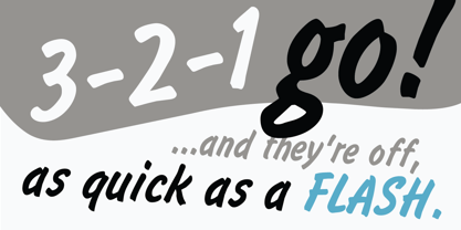
- ITC Clearface by ITC,
$45.99 The Clearface types were originally designed by Morris Fuller Benton in 1907. Their forms expressed the Zeitgeist of the turn of the 20th century; typical and distinguishing characteristics are the forms of the a" and the "k." The ATF version did not include an accompanying Italic. In 1978, ITC's Victor Caruso was licensed by ATF to develop a new serif typeface and matching italic based on the forms of Clearface. The result was ITC Clearface, a serif typeface with marked stroke contrast and italic weights. The teardrop-formed endings of the lowercase a, c and f (also found in Caslon) define the character of the face. The type's design is also distinguished by its small -- almost slab -- serifs, a large x-height, and little stroke contrast. ITC Clearface, with its historical touch, is good for both texts and headlines, but its slightly condensed nature performs at its best when it is allowed its space.
 - ITC Ballerino by ITC,
$29.99Vienna designer Viktor Solt has a love affair with handwriting. “Usually” he says “when I start with a specific calligraphic style I take some historic specimens and try to integrate their main features into my own handwriting.” Although there are hints of various 18th-century calligraphic styles in Ballerino it was not based on any historical model. The swash ascenders and descenders on the lowercase are all slightly different; this and the rough texture of the edges gives Ballerino a distinctly hand-written feel. The swash caps are meant to be used only in conjunction with the lowercase not to be combined with each other. - ITC Newtext by ITC,
$40.99ITC Newtext was designed by Ray Baker, who created a well designed and legible typeface and built into it every design refinement which could optimize its usefulness. The expanded shapes are generous and legible and the economical vertical set results in more lines to the page. - LTC Spire by Lanston Type Co.,
$24.95 LTC Spire with alternate caps was designed by Lanston’s type director Sol Hess in 1937. Spire Roman was designed without lowercase. But it includes alternate rounded caps which transform this extra condensed “fat face” into more of an art deco titling face. Spire Roman has been used within department store logos, luxury hotel signage, perfumes, etc, etc.
 - ITC Mixage by ITC,
$29.99Mixage font is the work of Italian designer Aldo Novarese, who cleverly combined the character shapes and proportions like those of Syntax and Antique Olive with the grace and warmth of a calligraphic typeface. Mixage font is a good alternative to more traditional sans serif designs. - ITC Garamond by ITC,
$34.99 Drawn by Tony Stan, ITC Garamond was first released in 1975 in Book and Ultra weights only. These were intended as display faces to complement existing text designs from other foundries. (In fact, many of ITC’s interpretations of traditional typefaces began as display counterparts for existing text designs.) These first weights of ITC Garamond became so popular, however, that ITC released the Light and Bold weights and a suite of condensed faces in 1977. Now, the complete ITC Garamond family features sixteen members: four weights of roman and italic in normal width and four weights of roman and italic in companion condensed versions. The family resemblance is there, but ITC Garamond’s unique provenance gives it an unmistakable, one-of-a-kind appeal.
 - ITC Isadora by ITC,
$29.99This calligraphic typeface, designed by Kris Holmes in 1989, manages to look both confident and relaxed, while showing great intricacy and beauty upon closer inspection; it is named after the dancer Isadora Duncan. - ITC Angryhog by ITC,
$29.00The name Angryhog came out of nowhere out of free association. "When you're working on a typeface on the Mac it demands a name from you which I find a bit confrontational" says Donaldson. ITC Angryhog brings together Roman and Gothic influences in a quirky and sophisticated display face. Characteristic of this typeface are its sharp, pointed forms, especially noticeable in the serifs, which give ITC Angryhog a restless, almost aggressive feel. It is as though the letters have a mind of their own and ignore all rules and regulations. ITC Angryhog is a perfect typeface for comics or satire, best suited to short to middle length texts and headlines. - ITC Kallos by ITC,
$29.99ITC Kallos is the work of British designer Phill Grimshaw, a text typeface family with traditional calligraphic flair. It is the result of Grimshaw's first experiments with text typeface design. The long ascenders and descenders of the lowercase alphabet lend them a look of sophisticated elegance. The capitals display the unmistakable influence of the pen and the proportions of classic inscriptional forms. - ITC Jambalaya by ITC,
$29.99The talented designer of the well-known Formata typeface, Bernd Möllenstädt was born on February 22, 1943 in Germany. He has lived in Westfalia, Berlin and Munich, Germany, and now permanently resides in Munich. From his earliest years he was interested in typography, first studying as a typesetter (1961-64) and then a student of graphic design (1964-1967). In 1967 Möllenstädt joined the Berthold typefoundry and his career as one of the leading type personalities began. One year after joining Berthold, he became the head of the type design department. For 22 years he worked as the head of that department, under the leadership of Günter Gerhard Lange. Upon Lange’s retirement in 1990, Möllenstädt ascended to the type directorship of Berthold where he was responsible for type design and font mastering. Möllenstädt designed two typeface for the Berthold Exklusiv Collection, Formata (1988) and Signata (1994). Under license from Berthold, Adobe marketed Formata as part of the Adobe Type Library. Formata is now one of the most successful sans serifs in the world, used both in American and European magazines, as well as newsletters in the Far East (Gulf New Kuwait). Formata also was chosen as the corporate typeface of Postbank, Allianz, VW Skoda, Infratest Burke, etc. In addition to his work for Berthold, Möllenstädt has lectured at local Munich schools on typography and graphic design, and designed corporate type identities and diverse logos for major corporations, including Allianz, Commerzbank, Mauser Officer and Hoepfner. Möllenstädt continues his association with Berthold as a designer. He most recently completed small caps and fractions for Formata. He also has substantially contributed to Berthold's Euro symbol program (e.g. adding the Euro symbol design-specific to the most popular families). Möllenstädt currently is working on a new Berthold Exklusiv design. - ITC Bottleneck by ITC,
$39.00Tony Wenman designed the display typeface Bottleneck in the early 1970s and its figures reflect the spirit of the times. Its distinguishing characteristic is the extreme heaviness of the serifs in the lower third of the characters, a trait which the viewer could associate with the plateau shoes of the 1970s. Bottleneck is a carefree, playful typeface which can be found even today on entertainment fliers and retro advertisements. When used sparingly in headlines and slogans, it is a real eye-catcher. Similar typefaces are Julia Script, by David Harris, and Candice, by Alan Meeks. - ITC Stenberg by ITC,
$29.99ITC Stenberg was designed by Tagir Safeyev based on the forms characteristic of the Constructivism in the early days of the USSR. The brothers Vladimir and Georgii Stenberg were two of the creative artists of this movement who were turning older forms to revolutionary use. ITC Stenberg has a caps and small caps alphabet and is available in a bold and an inline version.


