10,000 search results
(0.04 seconds)
- Ciutadella Slab by Emtype Foundry,
$69.00 The family keeps growing, Ciutadella Slab is the ‘serif’ counterpart of the popular Ciutadella font. The former alternate characters like 'a', 't' and '&' are now the default ones (and the former default characters are now the alternates), giving way for a typeface more suitable for texts. Thus, the new Ciutadella Slab is not only a great headline family, it will also work in texts of intermediate length and size. Especially appropriate for magazines, brochures or branding. This new addition provides even more versatility to the family started with Ciutadella and Ciutadella Rounded. It is available in Open Type format and includes Alternate Characters, Ligatures, Tabular Figures, Fractions, Numerators, Denominators, Superiors and Inferiors. It supports Central and Eastern European languages. As the sans version, the type family consists of 10 styles, 5 weights (Light, Regular, Medium, SemiBold and Bold) plus italics. For more details see the PDF.
 - Core Sans A by S-Core,
$19.00 Core Sans A Family from S-Core is a modern sans-serif typeface that is clean, simple and highly readable. It is a part of the Core Sans Series (Core Sans N SC, Core Sans N, Core Sans NR, Core Sans M and Core Sans G). Letters in this type family are designed with genuine neo-grotesque and neutral shapes without any decorative distractions. The spaces between individual letter forms are precisely adjusted to create the perfect typesetting. Core Sans A family consists of 8 weights (Thin, Extra Light, Light, Regular, Medium, Bold, Extra Bold, Heavy) with their corresponding italics. Core Sans A contains complete Basic Latin, Cyrillic, Central European, Turkish, Baltic character sets. Each font includes proportional figures, tabular figures, numerators, denominators, superscript, scientific inferiors, subscript, fractions and case features. We highly recommend it for use in books, web pages, screen displays, and so on.
 - Delicato Pro by MAC Rhino Fonts,
$59.00 In many aspects, built in a traditional way. Still, some modern details have been implemented which classic designs sometimes lack. The prime goal was to make a strong text font for books and longer texts in general. This fact does not exclude the possibilites for use elsewhere. Throughout history existing designs have often been the source of inspiration for newer ones. Delicato is no exception and looking closely, similarities can be found in the lowercase of Jeremy Tankard’s Enigma and the stems of Petr van Blokland’s Proforma. The goal is to respect these sources and turn the the typeface into something new with a unique and personal touch. Most text faces carry a basic set of weights like Regular, Italic, Bold and Small Caps. MRF wanted to expand that a little bit further and added a Medium, Alternates and a set of Ornaments to make the family complete and versatile.
 - Octagen Condensed by deFharo,
$11.00 Octagen is a family of 16 condensed Sans Serif fonts of geometric construction and neo-Gothic style with short descenders and a humanistic finish in the curves and auctions of the tiny letters to avoid the coldness of the grotesque typographies, providing expressiveness, energy, warmth and docility , resulting in a friendly typography with a lot of personality and readability, specially drawn for the composition of short and medium texts, signage or headlines where horizontal space saving is needed. The typography has 529 glyphs (Latin Extended-A) with advanced OpenType functions, several number games, a complete set of neutral-style alternative lower case letters and the Bitcoin symbol. For Octagen cursive styles I used a set of lowercase letters without terminal finishes, more neutral than the regular versions, this being compensated by the expressiveness of the italics inclination, thus achieving important morphological, coherent differences within the conceptual development of this typographic family.
 - Kurri Island by Mans Greback,
$29.00 Kurri Island is a positive sans-serif typeface. It was drawn and created by Måns Grebäck between 2017 and 2020. With its slightly irregular strokes and bends the font has a characteristic fun and comical and look. The sans is easy-going and relaxed while being serious enough to be used professionally. Kurri Island is an extensive multi-style font family, composed of 24 high quality fonts. The weights are Thin, Light, Regular, Medium, Bold and Black. Being favorably used as a block letter sans-serif, it has an additional Caps style to maximize the impression, and each font are provided as Italic. Its range of styles gives the typeface great flexibility, while also giving the ability to emphasize phrases or words. Kurri Island contains all characters you'll ever need, including all punctuation and numbers. It has an extensive lingual support, covering all European Latin-based scripts.
 - Finador Slab by Julien Fincker,
$24.00 Finador Slab is a soft slab-serif family. It has a strong character and can be used for a lot of cases, especially for editorial, branding, packaging and logos. The Slab version is based on the Finador Sans version. It matches perfectly and can be used easily together. The Finador Slab family includes 8 weights, from thin to heavy + their matching italics. With 900+ glyphs per style it supports over 200+ latin based languages, includes an extended currency symbol set and a lot of Open Type Features like small caps, ligatures, fractions, alternates and many more. The lightest and boldest weights are good for display usage, while the middle weights can be also used for body text. Finador Slab supports almost every of your needs. It meets all the requirements to become your next favorite workhorse family. So just give it a try. The Medium weight is for free.
 - Capraia by CAST,
$45.00 Capraia is a book typeface, with a heavily quirky look when shown at big sizes, and with an irregular but attractive rhythm at text sizes. Capraia Book and Regular are designed specifically for continuous texts: Book meets a current preference of Italian publishers for lighter faces, while the slightly heavier Regular is intended for the wider international market. True to its vocation for publishing, Capraia has a big x-height, medium contrast and wide bracketed serifs. Furthermore, its slightly flattened curves, some unconventional roman letterforms (a, G, Q) and the 'slanted roman' italics, along with design details such as ball terminals, give to the whole family a very contemporary appeal. Originally the design was intended as a tribute to Caslon's Great Primer but at a certain point the designer was enthralled by Baskerville. Capraia is the unpredicted and original result of that intense experience.
 - Garibaldi by Harbor Type,
$50.00 🏆 Selected for Tipos Latinos 6. 🏆 Selected for the 12th Biennial of Brazilian Graphic Design. 🏆 Typographica Favorite Typefaces of 2015. Garibaldi is a text typeface based on humanist calligraphy. It has an organic look and feel, while preserves the traditional construction of roman typography. It all started with a desire to learn more about the origin of the strokes on humanist typefaces. To accomplish that, Garibaldi features a 20° axis, medium contrast based on translation and expansion, asymmetric serifs, and terminals related to the broad nib stroke. Garibaldi Regular was nominated for Tipos Latinos 2014. Since then, the family was expanded with more weights and matching italics, making it a solid choice for setting books, magazines and documents. Among many OpenType features, each font contains small caps, ligatures and contextual alternates, totalling more than 750 glyphs and supporting at least 80 languages.
 - Core Sans C by S-Core,
$20.00 Core Sans C family is a part of the Core Sans Series, such as N, M, E, A, D, G, R and B. Core Sans C is inspired by classic geometric sans (Futura, Avenir, Avant Garde etc.). It is based on geometric shapes, like near-perfect circle and square. It has a much higher x-height (height of lowercase letters), an effect which promotes readability especially at small print sizes. The Core Sans C Family consists of 9 weights (Thin, Extra Light, Light, Regular, Medium, Bold, Extra Bold, Heavy, Black) and Italics for each format. Core Sans C supports complete Basic Latin, Cyrillic, Greek, Central European, Turkish, Baltic character sets. Each font includes proportional figures, tabular figures, oldstyle figures, numerators, denominators, superscript, scientific inferiors, subscript, fractions and case features. Core Sans C is an ideal font family for use in magazines, web pages, screens, displays, and so on.
 - Informative by Latinotype,
$39.00 Informative is a typeface consisting of a whole family of sans fonts and a collection of thematic pictograms. This combination of two different types of communication reflects the current need for using text and images as means of conveying information in a complementary way. The family comes with a text version of 7 weights (with matching italics)—Thin, Light, Regular, Medium, SemiBold, Bold and Black, and includes 7 thematic icons sets which allude to elements related to alimentation, city, energy, people, politics, sports and work. Each set contains 88 glyphs and includes both outline and black versions. The text font contains a set of 423 glyphs that support 207 different languages. Informative is a clean, simple and versatile typeface well-suited for a wide range of graphic design and visual communication projects. This font has especially been designed for infographics, maps and digital applications.
 - Widy by Pasternak,
$12.00 Wide font family is a geometric sans serif font, which features 9 styles. It’s based on the Futura developed by Paul Renner and neo sans-serif fonts. At the same time, it has significant stylistic differences. Massive lengthy letters are among the unique features of this font. They will help you come up with the perfect composition. The letters have optical compensation, while a circle is the main figure of the fonts. Due to wide fonts, your project will have modern and fresh design. The composition will keep its contrast regardless of a background you’ve chosen. The Widy family includes 9 styles: Thin, Extra Light, Light, Semi Light, Regular, Medium, Semi Bold, Bold and Extra Bold. Each of them also has Italic variation. The fonts are perfect for both graphic design projects (posters, brand identities, logotypes) and simple interface design, which needs the necessary style.
 - Feast of Flesh BB - Personal use only

- Extension by Red Rooster Collection,
$45.00Designed by Les Usherwood. Digitally engineered by Steve Jackaman. Many of the weights and the italics were created after Les’ death. - Chardonnay by BA Graphics,
$45.00A beautiful text font that works equally well as a headline font, great for books and magazines. Available with matching Italic. - Glob by Resistenza,
$35.00 Glob is a multilanguage bubble-letter font. ?Includes Italic, outline & a rough version, Check out also Modern Love Slanted - Turquoise - Nautica
 - The Gunship Italic font, created by Iconian Fonts, a noted type foundry known for its diverse and expansive portfolio of type designs, is a marvel in the realm of typographic artistry. Embodied with ...
- PF Square Sans Pro by Parachute,
$79.00 Designer Panos Vassiliou created Square Sans Pro in his quest for a true square-like text typeface which could balance simplicity with vitality and enhance with its subtle power the identity of any product or service, without compromising its characteristics as a text typeface. The family consists of 12 fonts—from extrablack to thin—including true italics. It supports 19 special OpenType features like small caps, fractions, ordinals, etc. and offers multilingual support for all European languages including Greek and Cyrillic. Finally, every font in this family has been completed with 270 copyright-free symbols, some of which have been proposed by several international organizations for packaging, public areas, environment, transportation, computers, fabric care and urban life.
 - Isotype - Unknown license

- Comment by cm5dzyne,
$12.00Comment is a unique yet still basic sans serif created to provide a consistent, attractive appearance in print, especially in small-to-medium sizes. - Aunque by Cloud9 Type Dept,
$45.00 Aunque Medium is a modern take on historical fraktur typefaces. Aunque is an OpenType font with OpenType features such as standard and discretionary ligatures.
 - ThreeDee by URW Type Foundry,
$99.99The idea for this completely new font design with overlapping characters came when Axel Stoltenberg, longtime IKARUS program developer at URW + +, visited a restaurant. As it can be seen quite often , the daily specials were offered handwritten with chalk on a blackboard applying a writing technique never been available before for digital fonts: each character is partly covered by its predecessor creating a three-dimensional effect. The implementation of this unusual notation for digital setting required a lot of programming and testing until all necessary character variants were produced and set properly always using the correct form. In order to achieve this, the OpenType Pro font ThreeDee contains about 12,400 characters and all the necessary OpenType features (GSUB ) for the automatic setting in OTF savvy application programs. The slightly playful basic design for ThreeDee was created by Anna Stoltenberg , the daughter of Axel, specially devised for the innovative representation and support of its special nature. The shadow generated with IKARUS even intensifies the 3D effect. As is well-known, making use of the embedded OTF features, i.e. the automatic access to all the 12,400 character variants , a corresponding text / layout program ( InDesign, Quark Xpress, current Open / LibreOffice or MS Word etc. ) is required. ThreeDee is a headline font that will unveil all its charisma and exceptional quality at appropriate, larger sizes. - Rasheda by Keristyper Studio,
$14.00 Rasheda is a beautiful italic font. Inspired by classic cursive calligraphy from the Renaissance era in the 8th Century. This font is good for logo design, Social media, Movie Titles, Books Titles, short text even long text letters, and good for your secondary text font with script, sans, or serif. **Featured:** * Standard Uppercase & Lowercase * Numeral & Punctuation * Multilingual : ä ö ü Ä Ö Ü ß ¿ ¡ * Alternate & Ligature * PUA encoded We recommend programs that support the OpenType feature and the Glyphs panel such as Adobe applications or Corel Draw. so you can use all the variations of the glyphs. Hope you enjoy our fonts!
 - Modesta by OhType!,
$25.00 Modesta Sans is a Neo Grotesque sans serif typefamily of seven weights plus matching italics. Inspired by Didone serif fonts and the first Sans serif types from the late 19th century and early 20th century, It reduces many of the eccentricities in order to make them more suitable to modern tastes. Every weight has more than 220 characters and includes uppercase, lowercase, numbers, special characters and a powerful opentype features. Perfectly suited for graphic design, headlines, advertisements, and any display use. It could easily work for editorial design, corporate, web, signage and many other uses in print and digital media.
 - Brokman by The Northern Block,
$32.00 Brokman is a contemporary sans serif designed to bring clarity and originality to brand related projects. The open apertures and large x-height help provide a fresh aesthetic with an easy, fluid texture across design layouts. While it's squarish proportions are balanced with subtle rounding achieving a carefully modulated and textured feel in longer text scenarios. Its weight-range allows great flexibility, making the typefaces suitable for a variety of media applications including apps, brand identities, broadcast, gaming and the web. Details include 430 characters, seven weights each with true italics, manually edited kerning and Opentype features.
 - Mistafelga by Keristyper Studio,
$14.00 Mistafelga is an elegant Silky italic font designed for editorial use and inspired by calligraphy in the middle century. This font is good for logo design, Social media, Movie Titles, Books Titles, short text even long text letters, and good for your secondary text font with sans or serif. Featured: Standard Uppercase & Lowercase Numeral & Punctuation Multilingual : ä ö ü Ä Ö Ü ß ¿ ¡ Alternate & Ligature PUA encoded We recommend programs that support the OpenType feature and the Glyphs panel such as Adobe applications or Corel Draw. so you can use all the variations of the glyphs. Hope you enjoy our fonts!
 - Good Day by Fontop,
$11.00 Welcome my new hand lettered, cute and decorative font Good Day. The font family includes two fonts – Regular and Italic – both with Latin multilingual uppercase letters, lowercase letters, numbers and basic punctuation. With so many stylistic alternates and swashes it’s easy to create cute designs and signs for wedding branding, quotes, ads, logos, prints, social media texts, blogs, and so much more. Swashes are controlled by adding 0/1/2 before or after any letter while alternates can be chosen from the glyphs panel in Adobe apps. Really very easy to use! Both OTF and TTF are included for each font.
 - Gamby by Nathatype,
$29.00 Gamby is an attractive, vintage, playful display font for your customers. Its main character is the round, thick letters in thin outlines. Gamby provides two versions, regular and italic to use for bigger-sized texts to be legible. Features: Ligatures Multilingual Supports PUA Encoded Numerals and Punctuations Gamby fits for any design projects, such as posters, logos, book covers, headings, printed products, merchandise, social media, etc. Find out more ways to use this font by taking a look at the font preview. Feel free to contact us for further product information or trouble complaints. Thank you and happy designing.
 - Nubian by G-Type,
$39.00 Nubian was one of the first typefaces ever designed by G-Type and is an elegantly proportioned, crisply modern sans serif family. Comprising five weights from Thin to Bold with true matching italics, each font also includes two sets of figures (lining and old-style numerals) and an extended European character set. Nubian has a noticeably open, semi extended appearance providing very even 'colour' and excellent legibility when set as text. The contemporary letterforms work well at all sizes in print and on screen making Nubian a great choice across all media. The family has been updated to OpenType with extended language coverage.
 - Harfesto by Keristyper Studio,
$14.00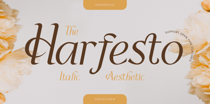 Harfesto is an elegant glamour and stylish italic serif with modern classy and feminine characteristic. This font is good for logo design, Social media, Movie Titles, Books Titles, short text even long text letters, and good for your secondary text font with the script, sans, or serif. Featured: Standard Uppercase & Lowercase Numeral & Punctuation Multilingual : ä ö ü Ä Ö Ü ß ¿ ¡ Alternate & Ligature PUA encoded We recommend programs that support the OpenType feature and the Glyphs panel such as Adobe applications or Corel Draw. so you can use all the variations of the glyphs. Hope you enjoy our fonts!
 - Ariom Sans by S6 Foundry,
$25.00 Ariom is a fresh, geometric, sans-serif font family inspired by iconic typefaces. Ariom has a big x-height value, geometrical letterforms, sharp edges, and strong stroke contrast as the neo-grotesque fonts from the 20th Century. The typeface is versatile and can be successfully used in magazines, posters, branding, websites, headlines, large-format prints, brand identities, social media, advertising, editorial design, posters. The family contains over 40 alternative glyphs and over 50 ligatures in each style. The family comes in 3 weights with their corespondent italics. The family Latin supports Western, Central, South Eastern, South American, Oceanian, Pan African, Vietnamese, and Sámi.
 - The Bellonte by Aminmario Studio,
$20.00 The Bellonte is a fashionable and relaxed handwritten font with a unique feel and a stunning impact. Comes with rough style regular and italic. This font is great for your creative projects such as watermark on photography, and perfect for logos & branding, photography, invitation, watermark, advertisements, product designs, stationery, wedding designs,label, product packaging, social media, movie titles, books titles, a short text even a long text letter and good for your secondary text font with sans or serif. And also for special events or anything that need handwritting taste. Thanks for checking out this font. I hope you enjoy it!
 - ATF Garamond by ATF Collection,
$59.00 The Garamond family tree has many branches. There are probably more different typefaces bearing the name Garamond than the name of any other type designer. Not only did the punchcutter Claude Garamond set a standard for elegance and excellence in type founding in 16th-century Paris, but a successor, Jean Jannon, some eighty years later, cut typefaces inspired by Garamond that later came to bear Garamond’s name. Revivals of both designs have been popular and various over the course of the last 100 years. When ATF Garamond was designed in 1917, it was one of the first revivals of a truly classic typeface. Based on Jannon’s types, which had been preserved in the French Imprimerie Nationale as the “caractères de l’Université,” ATF Garamond brought distinctive elegance and liveliness to text type for books and display type for advertising. It was both the inspiration and the model for many of the later “Garamond” revivals, notably Linotype’s very popular Garamond No. 3. ATF Garamond was released ca. 1918, first in Roman and Italic, drawn by Morris Fuller Benton, the head of the American Type Founders design department. In 1922, Thomas M. Cleland designed a set of swash italics and ornaments for the typeface. The Bold and Bold Italic were released in 1920 and 1923, respectively. The new digital ATF Garamond expands upon this legacy, while bringing back some of the robustness of metal type and letterpress printing that is sometimes lost in digital adaptations. The graceful, almost lacy form of some of the letters is complemented by a solid, sturdy outline that holds up in text even at small sizes. The 18 fonts comprise three optical sizes (Subhead, Text, Micro) and three weights, including a new Medium weight that did not exist in metal. ATF Garamond also includes unusual alternates and swash characters from the original metal typeface. The character of ATF Garamond is lively, reflecting the spirit of the French Renaissance as interpreted in the 1920s. Its Roman has more verve than later old-style faces like Caslon, and its Italic is outright sprightly, yet remarkably readable.
 - Antikor by Taner Ardali,
$35.00 Antikor is "mono geometric sans" family consist of 3 styles, 55 fonts with real italics... All fonts of family contains 800+ glyphs, and equipped with many typographic features. (Styles: Mono, Text and Display) Antikor Text is designed for those who prefer to use monospaced fonts not only in coding but in many different media of graphic design. The idea came from creating a typeface with monospaced aesthetic without disturbing aspects of monospaced typefaces . Antikor text has proportional spacing and precise kerning to avoid poor rhythm and track in reading text. It also provides wide range of useful features with extended glyph sets and opentype features. Antikor Mono is geometric sans monospaced typeface with all typographic features except spacing and kerning. As other styles it has many opentype features and extended character set including SmallCaps, Stylistic Alternatives, Scientific Numbers, Fractions, Oldstyle Numbers, Case Sensitive Forms, Arrows, Circled numbers and etc... It is designed to meet all the needs of the monospaced text medias... As Antikor is a versatile family, Antikor Display is a very alternative typeface with playful calligraphic curves. It is designed with the idea of creating a contrast and eye catching touch in display use of typography. It creates tasty contrast against the serious and solid monospace look. Each style has 11 weights ranging from Hairline to ExtraBold + real italics, consist of 22 fonts.
 - Bisco Condensed by Galapagos,
$39.00Bisco Condensed is a small capital design inspired by hand lettered memorial wall art from the Harlem section of New York City. As a memorial, this design is dedicated to a type design colleague who lost his long battle with cancer. This font is a tribute to his strength and his liveliness. The original idea for Bisco Condensed was to capture the energy of those unique "streetforms" in a text/display design and encapsulate them into a lively & fluid type design with a high level of readability at all point sizes. Bisco Condensed is an excellent type for expressive display layouts. It works well as an independent design or a long with contemporary sans serifs that complement Bisco's irregular contours, weighting and bounce. - Enter Cromix by Sipanji21,
$15.00 "Enter Cromix" is described as a futuristic display font that comes with multiple styles, including bold, italic, and outline. Fonts with a futuristic design often feature sleek and modern letterforms that convey a sense of innovation and cutting-edge aesthetics. The different styles—bold, italic, and outline—provide versatility in creating various typographic effects. The bold style emphasizes a strong and impactful appearance, the italic style adds a dynamic slant, and the outline style creates a distinct and open character structure. "Enter Cromix" is suitable for a range of design projects where a futuristic and dynamic typographic style is desired. Its variety of styles allows for creative exploration in conveying different visual elements within the text.
 - Sertona by Sarid Ezra,
$17.00 Introducing, Sertona, a trendy bold font with italic alternates! Sertona is a modern and trendy font based sans that have unique looks. This font contains uppercase and lowercase that have different form. You can use the lowercase and uppercase in the same word that will make your text more stand out! And the best of this font is the italic version as the alternates which mean you can combine it all without worrying about the kerning! You can use this font for the magazine, poster, and suitable for headline. This font also support multi language. What you will get: All Caps Font with different uppercase and lowercase Italic version as the alternates. Well Kerned.
 - Rieven by Delve Fonts,
$29.00 Designer Steven Skaggs wanted a versatile uncial typeface that was not simply decorative. Traditionally, a true uncial is a majuscule form, entirely lacking in ascenders and descenders. However, by designing Rieven Uncial, Skaggs found a way to use the true uncial as inspiration but retained a lowercase look and feel. Typically, uncials do not have italic forms but in order for Rieven to be a truly versatile face, it was imperative that it should be accompanied by an italic. The italic form owes much to the historical roots in the letra antigua cursiva of the 15th century humanist masters. Rieven Uncial was awarded a Certificate of Excellence in Type Design in the 2010 TDC2.
 - Gradia by Attract Studio,
$20.00 Gradia is a serif font in the form of a unique & elegant typographic design. very suitable for making your choice of design work from invitation cards to magazines, logos, branding, signage and many other creative projects. Gradia features OpenType 765+ glyphs, also has 270 character Alternates, 116 Ligatures that are perfect for various uses, and is also equipped with multiple language support. What is included: Gradia Regular Gradia Regular Italic Gradia Light Gradia Light Italic Gradia Bold Gradia Bold Italic To access these OpenType features, you will need Opentype-enabled software such as: Adobe Illustrator, Word, CorelDraw, Photoshop, Indesign and many more. Check out Bagoni Type which is a great pair for Gradia.
 - Avenir Next Variable by Linotype,
$328.99 The Avenir Next Variable Set font is a single font file that features three axes: Weight, Width and Italic. For your convenience, the Weight and Width axes have preset instances. The Weight axis has a range from Ultra Light to Heavy. The Width axis provides a range from condensed to regular width. The Italic axis is a switch between upright and italic. Variable fonts act as a complete family of fonts in a single file. The new Variation font feature is supported by a growing number of desktop design applications, and more importantly by all the major web browsers. Variable fonts provide a variety of benefits to web and print designers and developers including flexible, responsive typography.
 - Mersin by Hurufatfont,
$29.00 Mersin is a modern sans serif font family. The asymmetrical structure of the beginning and ending shapes of letters such as "Cc, Ss" is its most distinguishing feature. Mersin has a total of 20 fonts, includings 10 weights and their appropriate italics. With its 2-axis (Weight & Italic) Variable Version, Mersin offers the advantage of using a very rich weight between 100-900. It includes detailed ligatures such as "Th, Tl, Ti, Tä, Tä, Tü, Tö, iï, fä, fä, fö fü" for very wide and different accents. “Mersin Book” and “Mersin Book Italic” are specially designed for body texts and small fonts usages. Ideal for corporate identity, posters, brochures, guidance signages and all other kinds of graphic design works.

