636 search results (0.011 seconds)
  1. Florabet - Unknown license
  2. Deltoid - Unknown license
  3. Potomac by Context, $15.00
    A hearty utilitarian face inspired by stenciled type found on train cars and shipping crates. Ideal for posters, headlines, and titling.
  4. SubwayTicker by K-Type, $20.00
    Subway Ticker is based on a 5x7 grid, electronic display observed on a New York subway train in February 2005 en route to Coney Island.
  5. Seria Pro by Martin Majoor, $49.00
    The multi award-winning Seria (1996) is Martin Majoor’s second comprehensive typeface family and the successor to his popular text letter Scala. Seria explores the proportions of classical text typefaces. Its degree of sophistication is perfect to be used for poetry and other refined literature, its eye-catching details however makes Seria also suitable as a display typeface. The first sketches for Seria emerged in the summer of 1996 on the train from Berlin to Warsaw, to be precise, on July 25 – the date Majoor noted on the napkins of the train’s on-board restaurant, which he used for lack of suitable drawing paper. The italics are almost upright which contributes much to Seria’s delicately proportioned appearance. The Seria family consists of Seria Serif and Seria Sans. Combining the two creates countless possibilities of expression.
  6. Arts And Crafts-GS by Bannigan Artworks, $19.95
    The Arts And Crafts-GS font is loosely inspired by the lettering of Charles Rennie Mackintosh (1868 - 1928) of the Glasgow School, from which Jessie receive her training.
  7. Deviant Plain by TypeArt Foundry, $45.00
    Clean companion included with Deviant Strain.
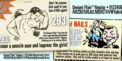
  8. Sassoon Patterns by Sassoon-Williams, $48.00
    Many children start school with their hands not ready and trained to produce the precise strokes required for forming letters and starting to write. Pattern is essential preparation. It is fun for children, building their confidence as well as training their muscles for the task. Each font has normal letters and pattern characters. Free to download resources: How to access Stylistic Sets of alternative letters in these fonts Purchasers of this font package may use their Order Number to receive a free Copybook PDF by Rosemary Sassoon recommended for effective teaching
  9. Trainbridge by Curvature Creations, $10.00
    My font Trainbridge is created by Power Point shapes, Block Arc and flowchart. It resembles a train and bridge, which gives it a unique look that will be eye catching and out standing.
  10. Station by Kimmy Design, $15.00
    Station is a bold headline typeface inspired by old Train Station type and graphics. It can be used in a modern and retro way, and its different patterns and styles give a unique look to any design.
  11. Film Title JNL by Jeff Levine, $29.00
    A World War II training film had its opening title card “First Aid” hand lettered in a casual, Art Deco sans serif design. This is now available digitally as Film Title JNL, in both regular and oblique versions.
  12. Pullman by Scriptorium, $18.00
    Pullman is based on turn-of-the-century lettering reminiscent of the signage on some luxury Pullman-style train cars of that period. It is a heavy script font with a lot of character and an authoritative, elegant look.
  13. Music To My Eyes by Comicraft, $19.00
    This singsong font is Chock Full o’Notes to help semibreviate your lettering with melodic minims, quarter notes and quavers! NOTE, however that we cannot take responsibility for any arrangement that my seem out of tune to the trained eye.
  14. WolfsRain - Unknown license
  15. Subway Ticker - Unknown license
  16. Public Transportation JNL by Jeff Levine, $29.00
    On the sides of freight cars, passenger trains, trolleys, buses and cable cars was once found identifying letters and numbers with a bold, yet quaint hand-painted look. Public Transportation JNL emulates the old-style look of those bygone years.
  17. Lara by Efe Avcı, $19.00
    Design-wise, it is an elegant, fine-grained font. There are 218 glyphs.
  18. Inverness by Red Rooster Collection, $45.00
    In the 1930s, it was popular to take day-trips by train to the seaside in the British Isles. Many posters were designed by the various regions to advertise these excursions; it is from one of these posters that Inverness was created.
  19. Federal Streamliner by Greater Albion Typefounders, $9.95
    Federal Streamliner was inspired by lettering seen on the side of a 1950s/60s era train. It speaks of the designs of the 'streamline' era and is ideal for retro projects invoking the 30s, 50s or 60s needing a simple distinctive display face.
  20. Segmenta by Librito.de, $15.00
    Segmenta, a sans serif typeface developed from the gridbased type of the Hamburg S-Bahn (metro). The type is originally used for diplaying informations about the trains. The typeface contains all accents and special letters for extended latin and the baltic languages.
  21. Word From Radio by Dharma Type, $14.99
    Based on retro vinyl records in the middle of 20th century. the mixture of funky, hippie and mid-century’s futuristics. There are three other fonts designed by in the same concept. -African Elephant Trunk -Moon Star Soul -Rebel Train Goes -Word From Radio
  22. Sutton Place JNL by Jeff Levine, $29.00
    Named for a Manhattan neighborhood, Sutton Place JNL is based on a 1930s-era poster advertising training in the “Household Arts” that was produced by the Federal Art Project in Ohio; a segment of the larger Depression Era WPA (Works Progress Administration).
  23. beaaaar - Unknown license
  24. Lizzie - Unknown license
  25. Seperated - Unknown license
  26. Competitor - Unknown license
  27. Digitalema - Unknown license
  28. Barricades - Unknown license
  29. Blockhead - Unknown license
  30. Shredder - Unknown license
  31. African Elephant Trunk by Dharma Type, $14.99
    Based on retro vinyl records in the early and middle of 20th century. This font includes small caps for advanced typography. There are three other fonts designed by in the same concept. -Moon Star Soul -Rebel Train Goes -Word From Radio -African Elephant Trunk
  32. Subway Ticker by K-Type, $20.00
    Subway Ticker is based on a 5×7 grid, electronic display observed on a New York subway train in February 2005. Also included is a ‘Grid’ variation of the font that is slightly more spaced out and based upon a more precise grid structure.
  33. Moon Star Soul by Dharma Type, $14.99
    Based on retro vinyl records in the early and middle of 20th century. the mixture of funky, hippie and mid-century’s futuristics. There are three other fonts designed by in the same concept. -Rebel Train Goes -Word From Radio -African Elephant Trunk -Moon Star Soul
  34. DT Enigmystic by Dragon Tongue Foundry, $9.00
    When reading text, the most informative parts of the written word for a human brain to identify, are the top and bottom edges of each word, and to a lesser degree, the leading and trailing edges. The overall shape has more useful info than the inner workings of each word. DT Enigmystic, is a display font family that gives you just that. The outer edge. At first glance, these letters don't look like standard letters, and yet, they are perfectly readable. And it is a 'somewhat' smart text, in that it will automatically complete the trailing edge of every word, whenever it sees a comma, period or space. Similarly, it will automatically complete the leading edge of every word following a space. When used as display test or as a heading, the first letter will need to be preceeded by a space, to achieve a full enclosed word outline. As with most of my fonts, do use Contextual Ligatures. This allows the letters to come alive. When generated here on this webpage, contextual ligatures are not turned on, and so the words do not appear completely closed at their beginnings and ends. But as can be seen in the poster images, these outlined words do automatically complete themselves when contextual ligatures are active.
  35. precision - Unknown license
  36. California Bound JNL by Jeff Levine, $29.00
    California Bound JNL is based on the hand lettering found on the side of the old California Zephyr passenger trains; the route now being a part of Amtrak. This somewhat unusual Art Deco design is more utilitarian than decorative, yet it still captures the "Streamline Era" perfectly.
  37. Lindas Lament - Unknown license
  38. Astigama Tizm - Unknown license
  39. Barbed Type - Unknown license
  40. Wide Glide - Unknown license
Looking for more fonts? Check out our New, Sans, Script, Handwriting fonts or Categories
abstract fontscontact usprivacy policyweb font generator
Processing