10,000 search results
(0.048 seconds)
- Time To Play by Vozzy,
$10.00 Introducing vintage label font named Time To Play. This font has a wide languages support with west european and cyrillic characters (check out all available characters on previews). The font family has four styles: Base, Grunge, Volume and Texture. All styles have the same metrics and kerning. This font will look good on any vintage styled designs like a poster, T-shirt, label, logo, etc.
 - MC Magic Time by Maulana Creative,
$14.00 Magic Time is a classic display serif font. With medium low contrast stroke, fun character with a bit of ligatures and alternates. To give you an extra creative work. Magic Time font support multilingual more than 100+ language. This font is good for logo design, Social media, Movie Titles, Books Titles, a short text even a long text letter and good for your secondary text font with script or serif. Make a stunning work with Magic Time font. Cheers, Maulana Creative
 - Times Kangaroo Down by Elemeno,
$25.00 - Third Time Lucky by Hanoded,
$15.00 We’re in the process of buying a house. Our first bid was rejected, our second bid as well. Our third (and final) bid was accepted (yay!), so, for us, the old ‘third time lucky’ quote rings true! Third Time Lucky is a set of three distinct handmade fonts, each with its own italic. Use this wonderful set for your books, your packaging or even your ‘house for sale’ signs.
 - Times New Roman by Monotype,
$67.99 In 1931, The Times of London commissioned a new text type design from Stanley Morison and the Monotype Corporation, after Morison had written an article criticizing The Times for being badly printed and typographically behind the times. The new design was supervised by Stanley Morison and drawn by Victor Lardent, an artist from the advertising department of The Times. Morison used an older typeface, Plantin, as the basis for his design, but made revisions for legibility and economy of space (always important concerns for newspapers). As the old type used by the newspaper had been called Times Old Roman," Morison's revision became "Times New Roman." The Times of London debuted the new typeface in October 1932, and after one year the design was released for commercial sale. The Linotype version, called simply "Times," was optimized for line-casting technology, though the differences in the basic design are subtle. The typeface was very successful for the Times of London, which used a higher grade of newsprint than most newspapers. The better, whiter paper enhanced the new typeface's high degree of contrast and sharp serifs, and created a sparkling, modern look. In 1972, Walter Tracy designed Times Europa for The Times of London. This was a sturdier version, and it was needed to hold up to the newest demands of newspaper printing: faster presses and cheaper paper. In the United States, the Times font family has enjoyed popularity as a magazine and book type since the 1940s. Times continues to be very popular around the world because of its versatility and readability. And because it is a standard font on most computers and digital printers, it has become universally familiar as the office workhorse. Times?, Times? Europa, and Times New Roman? are sure bets for proposals, annual reports, office correspondence, magazines, and newspapers. Linotype offers many versions of this font: Times? is the universal version of Times, used formerly as the matrices for the Linotype hot metal line-casting machines. The basic four weights of roman, italic, bold and bold italic are standard fonts on most printers. There are also small caps, Old style Figures, phonetic characters, and Central European characters. Times? Ten is the version specially designed for smaller text (12 point and below); its characters are wider and the hairlines are a little stronger. Times Ten has many weights for Latin typography, as well as several weights for Central European, Cyrillic, and Greek typesetting. Times? Eighteen is the headline version, ideal for point sizes of 18 and larger. The characters are subtly condensed and the hairlines are finer."
 - Time Count JNL by Jeff Levine,
$29.00 On the 1966 movie poster for “Seconds”, Saul Bass designed a hand lettered title utilizing a ‘futuristic’ stencil style. This inspired the digital typeface Time Count JNL, which is available in both regular and oblique versions.
 - The Funy Times by Gilar Studio,
$16.00 The Funy Time's Is a Joyful Display Font With 3 Style (Regular,Outline and Shadow) You Can Mix And Match for Your Awesome Project This fonts is ideal for crafting, branding and decorate your any project. This fonts are perfect for wedding invitation or your blog. Also with their help, you can create a logo or beautiful frame for your home. Or just use for your business, book covers, stationery, marketing, magazines and more. FEATURES : Uppercase & Lowercase Number & Punctuation More than 256 of glyphs Multilingual Language PUA Encode 24 Ligatures Alternate The alternative characters were divided into several Open Type features can be accessed by using Open Type savvy programs such as Adobe Illustrator, Adobe InDesign, Adobe Photoshop Corel Draw X version, And Microsoft Word. And this Font has given PUA unicode (specially coded fonts). so that all the alternate characters can easily be accessed in full by a craftsman or designer. Check Out my other fonts here : gilarstudio.com
 - Times Europa Office by Linotype,
$50.99The Times Europa Office family is designed after the model of the original serif family produced by Walter Tracy and the Linotype Design Studio in 1974. A redesign of the classic Times New Roman typeface, Times Europa was created as its replacement for The Times of London newspaper. In contrast to Times New Roman, Times Europa has sturdier characters and more open counter spaces, which help maintain readability in rougher printing conditions. Times Europa drastically improved on the legibility of the bold and italic styles of Times New Roman. Overall, text set in Times Europa is easier to read, and quicker to digest. Akira Kobayashi, Linotype’s Type Director, brought Times Europa up to speed for the new millennium in 2006. Now optimized for office communication instead of newspaper design, Times Europa Office offers a familiar yet refreshingly new appearance for serif text. Because of The Times of London’s specific printing conditions in the early 1970s, Times Europa originally had some intentional errors built into its letterform design. These inconsistencies created an even image in newspaper text in the long run. However, these design elements bear no role on modern office communication and its needs. Kobayashi redrew these problem forms, eliminating them completely. Now Times Europa’s font weights appear clearer and easier to read than ever before. - Changing Times JNL by Jeff Levine,
$29.00 Changing Times JNL was inspired by the hand lettering on the cover of the 1929 sheet music for "Wedding Bells (Are Breaking Up that Old Gang of Mine)". While the font’s name is an extremely vague reference to the subject of the song itself, it also represents the fact that the lettering style (still reflecting some Art Nouveau influence) welcomes the dawning of the Art Deco movement with the thick-and-thin line letter forms. The type design is available in both regular and oblique versions.
 - Waste Of Time by PizzaDude.dk,
$16.00Waste Of Time 1: The base version. Waste Of Time 2: The champagne bubble version! Waste Of Time 3: The alien version! Waste Of Time 4: The homeboy version! Waste Of Time 5: The shadow version! Waste Of Time 6: The zit version! Waste Of Time 7: The speedline version! - Old Times American by Baseline Fonts,
$29.00The Old Times American Family is derived from several letterpress books from the 1880s in the midwest. The fonts were painstakingly compiled from over 100 pages of text and optically balanced for optimum results. Old Times American is part of the Grit History Series A font set. The set encompasses serif and sans-serif fonts in varying weights to meet the needs of designers. The less-than-perfect letterforms evoke a sense of the non-digital. - Island Time JNL by Jeff Levine,
$29.00 Island Time JNL is based on the hand-lettered title from a piece of 1940s sheet music called "An Island Melody". This Art Deco typeface is perfect for projects where a clean, yet attractive headline font is needed. The font's name is based on the euphamism popular amongst Caribbean Islanders that when someone is excessively late for an appointment, date or event they are running on "island time".
 - Time In Hell by T-26,
$29.00 - Pep O Mint Normal - Unknown license

- Gothic Special Normal Italic by Wooden Type Fonts,
$15.00 A revival of one of the popular wooden type fonts of the 19th century, suitable for text or display, short descenders, tall ascenders, the narrow, italic version, completing the Gothic Special family of 5 fonts in total, sans serif.
 - Formal Notice JNL by Jeff Levine,
$29.00 Samuel Welo’s “Studio Handbook for Artists and Advertisers” was a popular book of inspiration for sign painters, graphic artists and designers from the 1920s through the 1960s. Many digital revivals of Welo’s hand lettered typography have been made available. Formal Notice JNL is one such revival, and is available in both regular and oblique versions.
 - Cross Stitch Formal by Gerald Gallo,
$20.00 Cross Stitch Formal is based on upper case characters 20 stitches tall and contains upper case characters A-Z. All characters are linked by at least one stitch.
 - Nouveau Formal JNL by Jeff Levine,
$29.00 Lettering found on the cover of 1915 textbook pamphlets from the Woman’s Institute of Domestic Arts and Sciences, Inc. [of Scranton, PA] inspired the creation of Nouveau Formal JNL. This attractive serif typeface is available in both regular and oblique versions.
 - Formal Dance JNL by Jeff Levine,
$29.00 A vintage Canadian-published music book circa the 1940s had the title "Strauss Waltzes" hand lettered in a bold Art Deco sans serif that featured block style letters with rounded corners. This was the working model for Formal Dance JNL, which is available in both regular and oblique versions.
 - Formal Invite JNL by Jeff Levine,
$29.00 The thin, condensed serif lettering found in a 1937 magazine ad for Chris Craft boats inspired Formal Invite JNL, which is available in both regular and oblique versions.
 - David Hadash Formal by Monotype,
$50.99Monotype Imaging is pleased to present David Hadash (New" David), the full family of typefaces by Ismar David, in its intended authentic form. The Estate of Ismar David has sought to revive this jewel of Twentieth-Century design by granting an exclusive license to Monotype Imaging to implement it in industry-standard format. Never before has the typeface in its full set of sub-styles been made available to the design community. David Hadash consists of three style families, Formal, Script, and Sans. Each of these appears in three weigths: regular, medium, and bold. Originally devised as a companion to the upright Formal style, the Script style has a beauty and grace all its own that allows it to be used for full-page settings also. While it is forward-leaning and dynamic, it does not match any of the existing cursive styles of Hebrew script. Ismar David created an eminently readable hybrid style which is like no other by inclining the forms of the upright while blending in some features of Rashi style softened with gentle curves. One can say that the Script style is the first truly italic, not just oblique, typeface for Hebrew script. Although the proportions of the Sans style are very similar to those of the Formal style, its visual impression is stunningly different. If the Formal style is believably written with a broad-point pen, the Sans is chiseled in stone. Rounded angles turn angular and stark. The end result is an informal style that evokes both ancient and contemporary impressions. David Hadash (Modern) supports the writing conventions of Modern Hebrew (including fully vocalized text) in addition to Yiddish and Ladino. David Hadash Biblical is a version of the Formal style that supports all the complexities of Biblical Hebrew, including vocalization and cantillation marks. " - Formal Event JNL by Jeff Levine,
$29.00 The hand lettered actors’ credits on a title card from the 1937 film “Shall We Dance” served as the model for Formal Event JNL – an Art Deco sans serif font available in both regular and oblique versions.
 - Emorical Typeface Western Display Font by Maulana Creative,
$17.00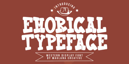 Emorical typeface western display font. Bold stroke, fun character with a bit of ligatures and alternates. To give you an extra creative work. Emorical typeface western display font support multilingual more than 100+ language. This font is good for logo design, Social media, Movie Titles, Books Titles, a short text even a long text letter and good for your secondary text font with script or serif. Make a stunning work with Emorical typeface western display font. Cheers, Maulana Creative
 - Blaster Eternal - 100% free

- Blaster Eternal - 100% free

- Eternal Flower by Bhubbiberry Studio,
$16.00 Eternal Flower is beautiful typeface that handwriting with a charming rhythm. Eternal Flower to create stunningly beautiful designs easily. Support multilingual languages, numbers, punctuation and alternative-ligatures. Warm Regards.
 - Stern Pro by Canada Type,
$49.95 Originally released in 2008, Stern is the only typeface to be produced and marketed simultaneously in digital and metal. In the twenty-first century, no less. It is also the last typeface Jim Rimmer ever completed. The process he used for its design and manufacture is the stuff of legend, and can be seen in the Richard Kegler documentary, Making Faces: Metal Type in the 21st Century. The design is a delicate upright italic named in memory of Chris Stern, the late artist and printer from Washington State. In 2013, Canada Type remastered and expanded the design's offerings to a glyphset of over 1200 characters, updated programming. Now Stern Pro includes the following features: - Small caps. - Caps-to-small-caps functionality, useful for setting mid-height caps alongside lowercase. - Tall caps. - Historical forms. - A wide variety of alternates for both uppercase and lowercase letters. - Plenty of ligatures. - Seven types of numerals, enclosers, cojoiners and currency symbols. - Automatic fractions. - A complete set of lowercase ordinals, from a to z. - Case-sensitive forms. - Language support for Greek and over 50 Latin languages. 20% of this font's revenues will be donated to the Canada Type Scholarship Fund, supporting higher typography education in Canada.
 - Eternal Life by PizzaDude.dk,
$20.00This font is named after a Jeff Buckley song. Use with care, best for love letters! - Eternal Worse by Hatftype,
$17.00 Eternal Worse - Blackletter Display Font is a display font that is inspired by gothic and horror style because its shape is very unique and is perfect for any project that you will use with this theme. Eternal Worse with opentype features such stylistic alternates, stylistic sets & ligatures good for logotype, poster, badge, book cover, tshirt design, packaging and any more. Features : 1.Uppercase & Lowercase 2.Multilingual support 3.Number 4.Symbol 5.Punctuation. 6.Extra Dingbat 7.Support in Mac and Windows OS -Support in design application (photoshop, illustrator, and more). There it is. I really hope you enjoy it. Comments & likes are always welcome and accepted.
 - Eternal Spring by Krismagraph,
$19.00 Eternal Spring is an elegant and modern San serif font family. It's sans serif in 8 weights from Thin to ExtraBold font. Comes with 76 unique ligatures and 27 alternates. Eternal Spring is a multipurpose font perfect for any project, with high contrast glyphs, giving it a feminine and masculine quality, modern, and easy to read. Excellent in layout design for quotes or body copy, best used as a display for headings, logos, branding, magazines, product packaging, invitations, and others. This font is easy to use and has OpenType features.
 - Eternal Patrol by LetterStock,
$23.00 **Eternal patrol Font** This pair was inspired by the Army poster design that i saw on some coffee shop, It was crafted by hand specially to add natural handmade feeling in its brand identity than i make it clean with pentool. **Opentype features** Eternal patrol font has 196 character set included Eternal patrol Font is very good looking in logo, labels, t-shirt prints, product packaging, invitations, advertising and others. This fonts works with folowing languages: Afrikaans, Albanian, Asu, Basque, Bemba, Bena, Chiga, Cornish, Danish, English, Estonian, Filipino, Finnish, French, Friulian, Galician, German, Gusii, Indonesian, Irish, Italian, Kabuverdianu, Kalenjin, Kinyarwanda, Low German, Luo, Luxembourgish, Luyia, Machame, Makhuwa-Meetto, Makonde, Malagasy, Malay, Manx, Morisyen, North Ndebele, Norwegian Bokmål, Norwegian Nynorsk, Nyankole, Oromo, Portuguese, Romansh, Rombo, Rundi, Rwa, Samburu, Sango, Sangu, Scottish Gaelic, Sena, Shambala, Shona, Soga, Somali, Spanish, Swahili, Swedish, Swiss German, Taita, Teso, Vunjo, Zulu Thank you for using this font. LS
 - Eternal Ego by Taznix Creative,
$16.00 Eternal Ego is a blackletter font with a unique and different style, with a touch of vintage design will create a unique design. Eternal Ego Perfect for for many creative products such as logos, tattoo design, t-shirt prints, street wear, headlines, tattoo lettering, calligraphy, clothing brands, music, sports, labels and much more. What's Included : Standard glyphs Ligature Works on PC & Mac Simple installations Accessible in the Adobe Illustrator, Adobe Photoshop, Adobe InDesign, even work on Microsoft Word. PUA Encoded Characters - Fully accessible without additional design software. Fonts include multilingual support for; ä ö ü Ä Ö Ü ß ¿ ¡ Image used : All photographs/pictures/vector used in the preview are not included, they are intended for illustration purpose only.
 - Beyond Eternity by Fromletterel,
$14.00 Welcoming to a new script font from letterel "Beyond Eternity" Beyond Eternity is a delicate script font with opentype featured such as ligature, swash and alternates. There are two styles for uppercase, a casual one and alternates one with beginning swash. For lowercase there are both beginning and ending swash to complete your design needs. All characters are coming with PUA encoded, so they are accessible. If you are not common with opentype featured you can use Beyond Eternity Alternates to access Uppercase Alternates and Beyond Eternity Swash to access lowercase swashes with ease. Happy Design
 - Arithysh Eternal by Sealoung,
$20.00 Arithysh Eternal Stylish Handwritten Font consisting of a fashionable sophisticated signature-style script with its own unique curves and an elegant inky flow. Arithysh Eternal Stylish Handwritten Font perfect for your favorite projects. It looks stunning on wedding invitations, thank you cards, quotes, greeting cards, logos, business cards and every other design which needs a handwritten touch. Fall in love with its incredibly distinct and timeless style and use it to create spectacular designs! Accessible in the Adobe Illustrator, Adobe Photoshop, Adobe InDesign, even work on Microsoft Word. PUA Encoded Characters - Fully accessible without additional design software. Fonts include multilingual support for; Afrikaans, Danish, Dutch, French, German, Indonesian, Irish, Italian, Norwegian, Portuguese, Scottish, Spanish, Swedish, Swiss. Hope you enjoy with our font!
 - XStella Stern by Ingrimayne Type,
$9.95 The XStellaStern group consists of five fonts of stars, star-like pictures, and derivatives of them.
 - Act Stern by Identikal Collection,
$23.00 - Vital Formations - Unknown license

- Normalise Din by Mecanorma Collection,
$45.00 - Mortal Coil by Hanoded,
$15.00 I was playing around with an old brush I found in our kitchen: it had fallen under the stove and it had probably been hiding there for quite some time! I dusted it off, got my Chinese ink and set to work. The result is a scary-ish font. Mortal Coil comes with discretionary ligatures for double lower case letter combinations.
 - Zornale Title by Eurotypo,
$20.00 Zornale TITLE is a family of four fonts that can be combined with the rest of Zornale family (text and caption). These fonts have been designed with precise kerning and full OpenType features: Old-style figures, swashes, stylistic alternates, ligatures and case-sensitive forms.


