2,479 search results
(0.015 seconds)
- Cerita Kids by Beewest Studio,
$10.00 Cerita Kids is Doodle Comic font style. This font is look relax and fun, suitable for comic and Children book. This font is rendered and done by manual hand drawing that digitalized as a font so this font is very natural. Thank you for download this font.
 - Totally Terrific by Set Sail Studios,
$12.00 I love Tea. Do you love Tea? Good. Because there's a whole load of T's in the Totally Terrific Typeface! Bursting with fun and bouncy brush-strokes, this typeface will undoubtedly add a dash of cheeky playfulness to your text - ideal for greeting cards, branding, merchandise, invitations & hand-made quotes. The awesome thing about this typeface is that it's so easy to mix up the various font styles and create totally unique, hand-made looking words each time. The lowercase characters can be connected (Totally Terrific Regular) or un-connected (Totally Terrific Two), and will work in any combination of these two versions. Not only does it also look great in all-caps, but the uppercase letters will fit in with the lowercase at any location - I'm serious! Just throw one in the middle of a word, I dare you ;). Your download will contain 2 font files: Totally Terrific Regular • Contains a full set of connected lowercase letters, uppercase letters, a large range of punctuation, numerals, and multilingual support. Totally Terrific Two • A second version of the Totally Terrific Typeface, with a completely new set of un-connected lowercase characters. These are designed to work in perfect harmony with the connected set from the other font file. Just keep switching between the two fonts to create unique word layouts!
 - Huxley Vertical by Tilde,
$39.75 - Jastin Septia by Letter Muray,
$17.00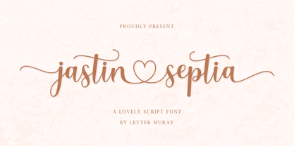 Jastin Septia feels equally charming and elegant. It looks lovely on wedding invitations, thank you cards, quotes, greeting cards, logos, business cards, and every other design which needs a handwritten touch. This font is PUA encoded which means you can access all of the glyphs and swashes with ease!
 - Hostile Portia by Letterhend,
$19.00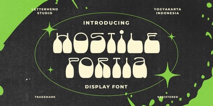 Hostile Portiais a reverse display font with fun and playful looks. This type of font perfectly made to be applied especially in storybook children or child theme which is need a standout font, and the other various formal forms such as invitations, labels, logos, magazines, books, greeting / wedding cards, packaging, fashion, make up, stationery, novels, labels or any type of advertising purpose. Features : regular & hand drawn numbers and punctuation multilingual PUA encoded We highly recommend using a program that supports OpenType features and Glyphs panels like many of Adobe apps and Corel Draw, so you can see and access all Glyph variations.
 - Metria Street by VP Creative Shop,
$20.00 Introducing Metria Street - Art Deco typeface Metria Street is bold, Art Deco typeface with 4 weights, ligature glyphs, alternates and multilingual support. It's a very versatile font that works great in large and small sizes. Metria Street is perfect for branding projects, home-ware designs, product packaging, magazine headers - or simply as a stylish text overlay to any background image. Uppercase, numeral, punctuation & Symbol Light Regular Bold Black Alternate glyphs Ligatures Multilingual support Feel free to contact me if you have any questions! Mock ups and backgrounds used are not included. Thank you! Enjoy!
 - African Textile by Scholtz Fonts,
$19.00The African Textile font had two major influences. The pattern is derived from the bogolan cloths from Africa, originally made using a traditional dyeing technique from Mali that uses bogo or clay as prime dye material. The character shapes are largely based on the Tabwa font. The font is best used as a heading or poster font, although the boldness of the design allows it to be useful at medium sizes, as subheadings as well. It is professionally letter-spaced and kerned and contains a complete character set. - Bertha Script by Romie Creative,
$14.00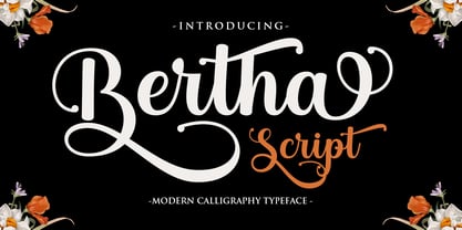 Bertha Script is a soft and sweet calligraphic typeface, with characters dancing along the baseline. It has a casual and elegant touch. Can be used for various purposes such as logos, wedding invitations, headings, t-shirts, letterheads, signage, labels, news, posters, badges etc.
 - Terminal Guise by Hanken Design Co.,
$30.00 Terminal Guise is a display typeface with detached or uncompleted forms to create a graceful and stylistic termination.
 - Teroxia Pro by limitype,
$24.00 Teroxia is a typeface that is inspired by the shape and characteristics of the curves and constructions that exist in robots or machines, this typeface is made with a modern touch and a more futuristic and strong form. This typeface is equipped with uppercase, lowercase, numbers, alternate, symbols and multilingual.
 - Bertha Lovely by Yoga Letter,
$18.00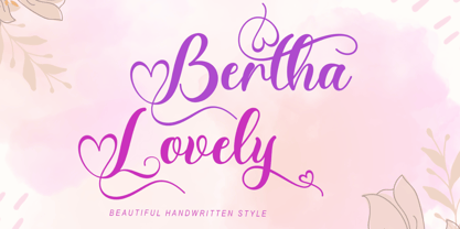 "Bertha Lovely" is a beautiful handwritten font with love decoration. This font is equipped with uppercase, lowercase, numerals, punctuation, ligatures, swash, titling, lowercase alternates, and multilingual support. It is very suitable for weddings, engagements, photography, Valentine's Day, Christmas, invitations, and others.
 - Vertical Sans by S6 Foundry,
$12.00 Vertical Sans is an extremely condensed sans set in 3 weights offering a balanced, stylish font perfect for branding and communications projects.
 - Huxley Vertical by URW Type Foundry,
$35.99 - Persia BT by Bitstream,
$50.99Masoud Nejabati has drawn upon his capable calligraphic skills to create this typeface. Persia represents his first latin-based design. This gentle and finely rendered script reveals Nejabati's extensive background in Islamic calligraphic art. The slight back slant further enhances the appearance of hand-scribed pen calligraphy. - Linotype Textra by Linotype,
$40.99Linotype Textra is a clever twist on the sans serif genre, designed by Jochen Schuss and Jörg Herz in 2002. Schuss says this about Linotype Textra: "Two in one! The same Linotype Textra, which is so neutral and practical for long text passages turns into an eye-catching headline type when used in larger point sizes. The trick? It's all in the details. The type's clear, robust forms give it a high degree of legibility when used in smaller point sizes for texts. When used in larger sizes, the angular, slightly irregular forms that give the type its strong character become apparent. Hence the name Linotype Textra: pure text with a little something extra!" With 15 weights, the Linotype Textra family provides graphic designers with a good basis for almost any type of work. The five regular weights have matching true italics and old style figures, and the five small cap weights include tabular figures. - Cerita Cinta by Aminmario Studio,
$20.00 Introducing Cerita Cinta Font Cerita Cinta is a casual handwriting font. Its charm makes it appear wonderfully, readable, and, ultimately, incredibly versatile. Comes in Regular and Italic styles. Equipped with beginning and ending tail. This font will look outstanding in any context, whether it’s being used on busy backgrounds or as a standalone headline! Thank you for the purchase. Happy creating design :)
 - Terry Script - Unknown license

- Terra X - Unknown license

- Terra Firma - Unknown license

- Ceria Style by Sensatype Studio,
$15.00 Ceria is a Modern Vintage Display Font A New Vintage font that we created special for Unique branding needs, with extra ligature in unique style that ready to add value of your brand. It's so nice to leverage designer or product owner that need solutions to make their design look more unique and vintage. Ceria Modern Vintage Display font ready with: Lowercase and Uppercase characters Numbers and Punctuations Preview as a inspirations that you can do with Ceria font Available for PC and Mac Wish you enjoy our font.
 - Autumn Ceria by AEN Creative Studio,
$16.00 Autumn Ceria is a simple and adaptable handlettered font. This font is PUA encoded which means you can access all glyphs and swashes with ease! Add it confidently to your favorite creations and let yourself be amazed by the outcome generated.
 - Lia Berta by Lia Baratz Fonts,
$40.00 Berta font is a typeface design that is inspired by vintage typographical styles. This font have a classic, timeless feel with distinctive details like, flourished lines, and varied stroke widths. They are commonly used in design projects that require a historical or nostalgic touch, such as wedding invitations, posters, book covers, and more. With a vintage font, designers can add a touch of sophistication and elegance to their work while also evoking a sense of bygone eras. Support both English and Hebrew letters
 - Certa Sans by Glen Jan,
$25.00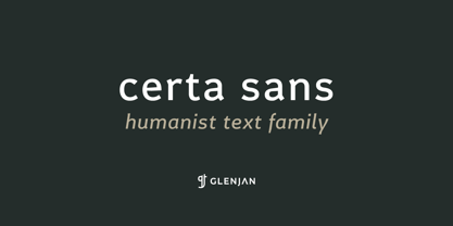
- MC Ertige by Maulana Creative,
$16.00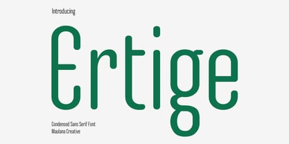 Ertige is a condensed sans serif Display font. Regular stroke, fun character with a bit of ligatures and alternates. To give you an extra creative work. Ertige font support multilingual more than 100+ language. This font is good for logo design, Social media, Movie Titles, Books Titles, a short text even a long text letter and good for your secondary text font with script or serif. Make a stunning work with Ertige font. Cheers, Maulana Creative
 - Epoque Seria by Rafaeiro Typeiro,
$24.00 Époque Seria is that kind of person who looks really cute when angry. This font was derived from the Époque family. She is the little sister to Époque - a little shorter with her smaller x-height and — how do you say it in the typographic circle — your eyes are also smaller (and you know you squint when things get serious, isn't it?). The genealogy of these font face is undeniable, but Époque Seria has a ‘personality’ very different from her older sister. The reduction of the x-height also shakes somewhat with the cap that had crossbar. To accompany the package of standardization, the letters that don't have their straight axes were changed, which brought to the set more Cs and Gs contemporaries. In addition, other measures were taken as a greater softness in the variation of the weights and the abandonment of the black weight, being considered too heavy for this version.
 - Terra Ignota by Three Islands Press,
$39.00 The idea for Terra Ignota came to me years ago as I was admiring a reproduction of "Amerique Septentrionale," a 1650 map by French cartographer Nicolas Sanson, given to me by my parents. The handlettering has a sort of rakish character, evocative of pirates or adventurers at a time of unbridled world exploration. I ended up putting the project aside, but the idea to create this font tugged gently at my mind until I simply couldn't ignore it any longer. The resulting typeface has an italic slant and a deliberate feel, in keeping with its historical roots. Useful for simulating old hand-lettered documents. Has a full character set (and then some).
 - Terry Junior by Monotype,
$40.99 Terrance Weinzierl's Terry Junior typeface is a perfectly imperfect design – one that retains the marks of the brush used to create it and harks back to the craft required to hand make letterforms. Originally drawn during a Monotype Font Marathon, Weinzierl later refined the typeface digitally – adding an Inline version and designing alternates that replicate the irregularity of real-life brush scripts. “It has a natural, cheery and bold appearance,” says designer Terrance Weinzierl. “It's young, but not wild. Painted, but not sloppy. A sign painter's apprentice, perhaps.” Terry Junior is an obvious choice for designers and brands communicating with younger audiences, but would also work well on book covers, packaging, and in digital environments that need a little bit of extra playfulness. The family includes five fonts, including an Inline version.
 - Certa Serif by Glen Jan,
$25.00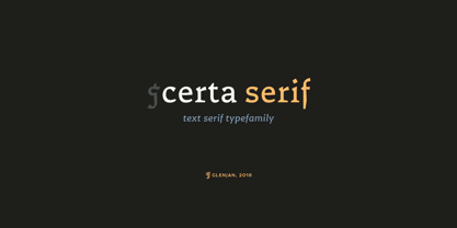
- Terital United by Letterbox,
$80.00 The long and frustrating search for a dynamic, monoline script drew our attention to the lack of such a typeface. This prompted us to create our very own, Terital, named after the 1960s Italian overcoat advertisement that was the original reference point for its 2003 creation. Fearing the odd all-caps script setting, we cheekily designed Terital as a lowercase set. This limitation was revised in the 2011 version. Beautiful swash capitals were also added.
 - Seria Pro by Martin Majoor,
$49.00 The multi award-winning Seria (1996) is Martin Majoor’s second comprehensive typeface family and the successor to his popular text letter Scala. Seria explores the proportions of classical text typefaces. Its degree of sophistication is perfect to be used for poetry and other refined literature, its eye-catching details however makes Seria also suitable as a display typeface. The first sketches for Seria emerged in the summer of 1996 on the train from Berlin to Warsaw, to be precise, on July 25 – the date Majoor noted on the napkins of the train’s on-board restaurant, which he used for lack of suitable drawing paper. The italics are almost upright which contributes much to Seria’s delicately proportioned appearance. The Seria family consists of Seria Serif and Seria Sans. Combining the two creates countless possibilities of expression.
 - KR Teatime Dings - Unknown license

- Video Terminal Screen - Unknown license

- Hella Bertta Script by Letterfreshstudio,
$15.00 Hella Bertta Script A new fresh an modern hand lettered font with decorative characters and a dancing baseline. So beautiful on invitation like handicraft, greeting cards, branding materials, business cards, quotes, posters, and more design concepts. Features : Ligatures Stylistic sets Basic Latin A-Z and a-z Numbers International Symbols included Punctuation Ligature
 - Rosenberg Textile MF by Masterfont,
$59.00 A practical font family with 4 weights for all your day by day design needs: headlines, body text, signage etc. High legibility at small sizes. An extended sans serif typeface that provides unique softness appearance without losing legibility.
 - Linotype Textile Pi by Linotype,
$40.99 - Vertical Roundpoint JNL by Jeff Levine,
$29.00 Vertical Roundpoint JNL is one of a number of classic hand-lettered typefaces found in a 1941 edition of the Speedball® Lettering Pen instruction book and re-drawn digitally by Jeff Levine.
 - EF Textile Pi by Elsner+Flake,
$35.00 - Align Vertical Mono by Mom,
$89.00 Align Vertical Mono has an innovator construction which gives to the designer the ability to align the letters creating beautiful patterns on the page. It was design by the Tyner (typography Designer) Pedro Mascarenhas to fill a gap in type design. With Align Mono Family type will be the leading role of the design. The final result of the art work depends of the choices designer makes for each glyph.
 - Textile Stencil JNL by Jeff Levine,
$29.00 An ad from the 1930s for a Spanish company called Intex Textiles featured some hand lettering in a bold and unique stencil design. This is now available as Textile Stencil JNL, in both regular and oblique versions.
 - FF Tartine Script by FontFont,
$51.99 French type designer Xavier Dupré created this script FontFont between 2002 and 2007. The family contains 3 weights: Regular, Bold, and Black and is ideally suited for advertising and packaging, logo, branding and creative industries as well as sports. FF Tartine Script provides advanced typographical support with features such as ligatures, alternate characters, case-sensitive forms, fractions, super- and subscript characters, and stylistic alternates. It comes with a complete range of figure set options – oldstyle and lining figures, each in tabular and proportional widths. As well as Latin-based languages, the typeface family also supports the Greek writing system.