10,000 search results
(0.012 seconds)
- ITC Tempus Sans by ITC,
$29.99ITC Tempus is the work of British designer Phill Grimshaw. He claims that every calligrapher's aspiration is to draw perfect roman capitals with a pen, but admits that this is extremely difficult. For this typeface, Grimshaw used a fountain pen on cheap, porous paper and, of course, the ink bled. The resulting forms are classic but their rugged edges deviate from the perfection of roman type. And Tempus Sans is just Tempus with the serif surgically removed, yet the proportions of the characters work nicely," says Grimshaw. Because of its rough quality, the typeface works best in larger point sizes, yet maintains its characters even in smaller sizes." - Tempting by RGB Studio,
$19.00 Tempting Script is one of the Elegant script fonts that comes with a very beautiful character change, a kind of classic copper decorative script with a modern touch, designed with high detail to present an elegant style. Files Include : Basic Latin A-Z and a-z Numbers Symbols PUA Encode Multilanguage Support Tempting Script is interesting because the typeface is pleasing to the eye, clean, feminine, sensual, glamorous, simple and very easy to read, because of the many luxurious letter connections. I also offer a number of decent stylistic alternatives for some of the letters. This font perfectly made to be applied especially in logo, and the other various formal forms such as invitations, labels, logos, magazines, books, greeting / wedding cards, packaging, fashion, make up, stationery, novels, labels or any type of advertising purpose. Tempting has 349+ , including multiple language support. With OpenType features with alternative styles and elegant. The OpenType features don't work automatically, but you can access them manually and for best results your creativity will be required in combining variations of these Glyphs. I highly recommend using a program that supports OpenType features and the Glyphs panel such as Adobe Illustrator, Adobe Photoshop CC, Adobe InDesign, or CorelDraw, so that you can view and access all variations of Glyphs. Thanks and have a wonderful day, If you have any questions, please get in touch with us Don't forget to check out our other products.
 - Tempo by Red Rooster Collection,
$45.00Based on the Medium weight of Ludlow Tempo. - Tempus Gothic by T-26,
$19.00 - ITC Tempus Serif by ITC,
$29.99ITC Tempus is the work of British designer Phill Grimshaw. He claims that every calligrapher's aspiration is to draw perfect roman capitals with a pen, but admits that this is extremely difficult. For this typeface, Grimshaw used a fountain pen on cheap, porous paper and, of course, the ink bled. The resulting forms are classic but their rugged edges deviate from the perfection of roman type. And Tempus Sans is just Tempus with the serif surgically removed, yet the proportions of the characters work nicely," says Grimshaw. Because of its rough quality, the typeface works best in larger point sizes, yet maintains its characters even in smaller sizes. - Manga Temple - Personal use only

- Manga Temple - Personal use only

- Manga Temple - Personal use only

- DF Temple - Unknown license

- Quattro Tempi by GRIN3 (Nowak),
$16.00Language support includes Western, Central and Eastern European character sets, as well as Baltic and Turkish languages. - Tempo LT by Linotype,
$29.99The Tempo font family was designed by R. Hunter Middleton and released between 1930 and 1931. The instant success of Futura in 1927 led to many similar designs, and Tempo is the version produced by the Ludlow foundry for large headlines in newpapers. Like Futura, Tempo font is basically geometric, but shows some humanistic influence. Tempo is popular for newspaper and commercial printing, and the heavy condensed font is excellent for headlines. - Slow Tempo by Dharma Type,
$19.99 Slow Tempo is a relaxed, loose-fit font that you can easily enjoy. Slow Tempo has basic, natural and neutral letterforms and skeletons for a wide range of usage. Though, there are some distinctive features. As you can see, Slow Tempo has low curvature of the intersections between stem & shoulder or bowl and also has large and open apertures. This makes this font relaxed. The letterform has low contrast and geometric shape to be neutral design, large x-height and humanistic terminal to be legible and distinguishable. Slow Tempo consists of 8 weights and their matching Italics for a wide range of usages. Further, Slow Tempo is supporting international Latin languages and basic Cyrillic languages including Basic Latin, Western Europe, Central and South-Eastern Europe. Also CSS covers Mac Roman, Windows1252, Adobe1 to 3. This wide range of international characters expands the capability of your works.
 - Java Temple by Sipanji21,
$13.00 Java Temple is a Display Font that is inspired by the uniqueness of Javanese culture, thus presenting a very dynamic font form that is very suitable for various design purposes, especially with traditional cultural themes with unique and authentic characteristics.
 - Samo Sans by CarnokyType,
$- Samo Sans is a modern sans-serif typeface with low contrast strokes and is balanced between technical shapes and dynamic feeling. The primary type family is consisted of complete set of Latin glyphs for lower and upper case. It also supports diacritics of all European languages including lining numerals, standard ligatures and other characters sufficient for regular typesetting. Characteristic features are lower spurs (a, b, d, u), and upper spurs (m, n, p, q, r) with distinctive wedge-shaped cuts. These parts are complemented by homogeneously designed diacritics, which is not disturbing and harmonizing with the whole unit. Another very strong feature of the type drawing are lower terminals of the round glyphs, which are finished by moderate narrowing. The type has got decreased caps height, also decreased numerals and optimal x-height, which makes it suitable for more extensive text typesetting. It can be effectively applied in corporate identities or in display typesetting. The narrowness of the basic set of Samo Sans typeface is supplemented by extended type family Samo Sans Pro .
 - Il Tempo Gigante - Unknown license

- Samo Sans Pro by CarnokyType,
$46.00 Samo Sans Pro is a contemporary sans-serif typeface with a slight contrast of strokes, balancing between technical design and dynamic feeling. The Pro Version is based on the Samo Sans basic typeface, and it is extended by more styles, more glyphs, and other features required for professional typesetting. Beside the complete set of Latin, Samo Sans Pro includes Cyrillic and Greek glyphs as well. Each font includes alternate glyphs, small capitals, standard and discretionary ligatures, oldstyle/lining and tabular numerals, fractions, superiors/inferiors figures, set of arrows, dingbats and a wide range of typographic options applied by the Opentype features. The complete typeface family consists of 16 styles in 8 weights and their Italics. The type has a reduced height of caps and numerals and it has an optimal x-height, which makes it suitable for the typesetting of more extensive texts. It can be effectively applied in corporate identities or in a display typesetting.
 - Sunny Sam by Mans Greback,
$39.00 Sunny Sam is a fun handwritten typeface. It was drawn and created by Måns Grebäck during 2019 and 2020. The movements of this happy script font represents optimism and vivacity. Sunny Sam comes in three high-quality styles: Thin, Medium and Bold. The three weights works great as complements to one another. It has an extensive lingual support, covering European Latin scripts. Sunny Sam contains all characters you'll ever need, including all punctuation and numbers.
 - Sam Suliman by K-Type,
$20.00 Sam Suliman is a condensed display face supplied in three weights – Regular, Medium and Bold – plus a set of handy italics (obliques). All six fonts are included in the value family pack. The fonts are inspired by lowercase lettering on a Sarah Vaughan album cover designed by Sam Suliman in 1962, a style which contrasts sharp tight outer corners with soft rounded counters. The letters were perhaps influenced by a Solotype font called Herald Square, but without that font’s aversion to diagonals, and adding distinctive perky ascenders/descenders on the lowercase r, a, u, g and n. The Sam Suliman fonts also add the nubs to d, m, p, and q. Suliman was born in Manchester, England in 1927. After working for McCann Erikson in London, he moved to New York where he took on freelance work designing album covers, particularly celebrated are his striking minimalist designs for jazz records. He moved back to England in the early 1960s, designing many book jackets, film titles and fabrics, also working in Spain and India before settling in Oxford in the 1980s.
 - Sam Pro by Throndsen,
$10.00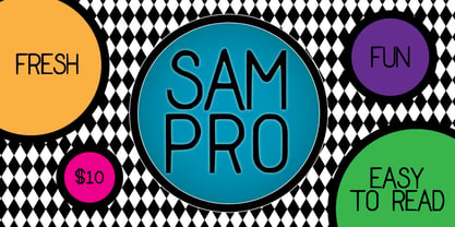
- Am Sans light - Unknown license

- Sans I Am - 100% free

- AM Sans One by URW Type Foundry,
$39.99 When designing AM Sans One, it was a great challenge for me to develop a modern sans serif, which despite the large number of existing fonts in this sector has its own unique character. Starting point for the design concept was the cap O, designed as a rectangle with rounded corners, and not as usual as a circle or oval. The O should form the basis for the whole alphabet. Another feature are the characters with oblique starting and end strokes such as "A, V, W". These have not exactly straight, diagonal lines, but have a slight curvature. Thus, these letters do not look too geometric. Also the cap K deviates slightly from the usual shape which makes AM Sans One different from other already existing fonts. I could well imagine applying this font for areas such as engineering or architecture.
 - Slamming - Unknown license

- Sham - Unknown license

- Sadness by Floodfonts,
$29.00 Sadness is based on some experiments during Felix Braden’s stay at the Trier College of Design: "I played around with Fontographer’s blendfonts-feature (a type design tool to interpolate fonts and to minimize effort and expenditure of large families) with some files from a close designer. Since the basic elements derived from extremely varied fonts without any similarities, the concluding shapes first turned out to be rather fragmentary. From those fragments I chose the most characteristic elements and drew a whole new font." For a detailed type specimen have a look at: http://on.be.net/1CdAZlC
 - Sax by URW Type Foundry,
$39.99
- Slm by Antiochus,
$30.00 We produce original printing press letter fonts, for example from the journal Southern Literary Messenger (circa 1830 - 1870). The only one in the world. What makes our fonts so attractive to the eye, are the myriad imperfections. It's not an approximation to the printing-press letters--- these are the actual letters, complete with all their manifold differences. If you look closely you will notice that the letter 'e' say, each time it is printed, is slightly different. These differences arise from the mechanical action of the inked-wooden press on the paper, and cannot be faked by artificial means. The eye subconsciously picks up this text as the actual printing press letters. Edgar Allan Poe published many of his great works in the Southern Literary Messenger, as did many other great nineteenth century writers, ie. Henry Wadsworth Longfellow, Nathaniel Hawthorne &c.
 - Samy by Soda,
$20.00 Samy is pure warm in a rational world. Yet its features cover uses of any kind. From very thin to chubby weights, this typeface offers a wide range of styles. This work is composed of two subfamilies: Samy, which gives a more conventional font looking, and the Alt version, conveying more fun and joy.
 - Lam by Produce,
$29.00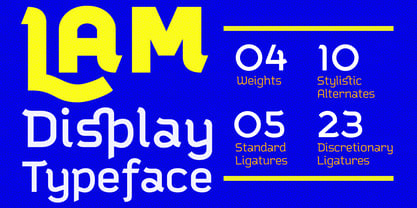
- Spam by words+pictures,
$20.00 - Rams by TipografiaRamis,
$30.00 RAMS is a Sans Serif type family of four weights with matching italics. The typeface’s design was influenced by the geometric style of Sans Serif faces of the 30s. The letter shapes – based on geometric forms – have been optically corrected for better legibility, thus enabling geometric concepts to be adapted by typographic tradition. While the typeface is intended for use in display sizes, it is also quite legible in text and is well suited for editorials. Rams is released in OpenType format with extended support for most Latin languages and includes some opentype features – proportional/tabular figures, slashed zero, ligatures, fractions...
 - Scam by Reserves,
$39.99 Scam is a discordantly eccentric geometric display face with exaggerated, alternating forms. Letters variate in extremes between bold and blacked-out and strictly linear, creating unpredictably unique letter pairings. Stylistically, Scam pushes the boundaries of type-as-image while retaining an acute legibility and refinement, greatly contrasting its aberrant nature. Features include: -Precision kerning -Expanded ligature set (89 unique ligatures, plus alternates) -Alternate characters (D, H, O, P, Q, R, 0, 6, 9, 8, _) -Alternate ligatures -Slashed zero -Full set of numerators/denominators -Automatic fraction feature (supports any fraction combination) -Extended language support (Latin-1 and Latin Extended-A) *Requires an application with OpenType and/or Unicode support.
 - ASM by Extratype,
$40.00 The initials ASM represent the acronym of the Santa Monica Arts cultural center located in Barcelona, Spain, where this typeface, with the same name, has served as the custom corporate typeface since 2008 till today (2013). ASM is an energetic monospaced with extreme legibility consisting of two original weights, with an underlined version – used on some of corporate applications – all with their corresponding italics.
 - Mohair Sam NF by Nick's Fonts,
$10.00A collision between some stylin' caps from legendary lettering artist Samuel Welo and a lowercase loosely based on ATF’s Romany Script yields this curious little wonder. Named after a 70s song which averred that all it took to be “the coolest guy what is what am” is to talk fast, walk slow and look good wearing that 'hair. Please note that, due to the exaggerated overhang of the many of the uppercase characters, this font has been optimized for upper- and lowercase uses. Both versions of this font contain the Unicode 1252 (Latin) and Unicode 1250 (Central European) character sets, with localization for Romanian and Moldovan. - Suave Sam NF by Nick's Fonts,
$10.00An extremely low midline marks this offering, based on an “elegant” alphabet found in Samuel Welo’s chapbook, Lettering: Modern and Foreign, published in 1930 by Frederick J. Drake and Company. Definitely different, and Deco at its most debonair. All versions of this font include the Unicode 1250 Central European character set in addition to the standard Unicode 1252 Latin set. - Same Same But Different - Personal use only

- Same Same But Different by Hanoded,
$15.00 Same Same, But Different is a loose, handwritten font with excellent legibility. It evokes post-it scripts, or notebook doodles and can be used virtually everywhere! Same Same But Different comes with extensive language support.
 - Sam is my Name - Unknown license

- Uncle Sam Slim NF by Nick's Fonts,
$10.00Based on Morris Fuller Benton's 1905 oeuvre American Extra Condensed, this titling face packs a lot of information into very little horizontal space. Its champfered corners give the font an industrial feel which remains fresh even after more than a century. Both versions include the complete Latin 1252, Central European 1250 and Turkish 1254 character sets, with localization for Lithuanian, Moldovan and Romanian. - Jacinto Sans - Unknown license


Page 1 of 250Next page