6,002 search results
(0.074 seconds)
- Fucked Olympia J - Unknown license

- Nostra 2003 J - Unknown license

- J Scott Campbell by Comicraft,
$29.00 Cliffhanger's top-selling DANGER GIRL creator and artist, Jeff Campbell, also topped our first MASTERS OF COMIC BOOK ART poll. Originally Jeff wanted his font to be wholly exclusive to the DANGER GIRL book, but we begged him, we pleaded with him and, eventually, we took photographs of him (in compromising positions with his "models") and he relented. Now, at long last we are making this slick and stylish font available as a part of our catalog, and you no longer need be a stranger to danger. See these families related to J Scott Campbell: J Scott Campbell Lower & J Scott Campbell Sketchbook .
 - Mr J Smith by Volcano Type,
$29.00When there is no picture of a "most wanted" or "Missing Persons", photofit pictures are used. Once drawn by hand, they are now more and more substituted by photomontage. The personality is created with different modules like head, eyes, nose and mouth. The vague memory of a witness leads to the image of a "concrete" person. Sometimes different combinations of possible looks are attributed to a same person. This new virtual image finds itself soon in thousands of archives and data bases. Anyone can easily have access to those images by internet. To increase security and help track criminals, unknown death (Mr. Smith) or lost and kidnapped people, government asks citizen to help search those people. "Mr. J. Smith" is a font family consisting of 4 portrait-fonts and one letter-fonts. The portrait font "Mr. J. Smith" is a portrait-construction-kit. By layering the fonts "Head", "Eye", "Nose", "Mouth" one over the other, you can design over 7 million different faces. The font "Wanted" gives you the possibility to join names and registration numbers to the unknown or most wanted persons. What is nice about this font is the "surprise moment". Just write a word , "security" e.g., and you will get a nice shot of 8 different characters! - Tanto by Lomax Design,
$17.00 Tanto is a boxy, futuristic sans-serif that is not directly inspired by any particular typestyle, but is more of an exploration of shapes. It has a very modern feel and although very geometric, still has a character that's not robotic.
 - Tatty by Scrowleyfonts,
$- Tatty is a sans serif, monoline font that is distinguished by the gentle, rounded, backward curves on the ascenders. I created it because I had a picture in my mind of a font that I wanted to use when designing images and logos for clients' websites but I could never find one that was just exactly right. Many years ago I worked for a sign-writing company. My job was to copy and enlarge letter sets from printed copy and then cut masks for airbrushing. One morning I arrived at my desk to find that the airbrush artist had written on a rough, rubbed out, scribbled on drawing of the letter ‘a’ - “make a letter happy, make it beautiful”. That was the brief I set myself in the design of Tatty - to make every letter happy and beautiful. The result is a flowing, elegant yet simple type which I believe works particularly well for poetry.
 - çarşı - Unknown license

- Curly - Unknown license

- Italian Cursive, 16th Century - Unknown license

- Cursive Signa Script Variable by Pedro Teixeira,
$670.00 Cursive Signa Script Variable, quite possibly the first true cursive and signature variable font. It has 90 styles that range between weight, slant and alternates. It can be use in a lot of projects, like logos, end of a statement, pairing with a beautiful sans serif like Aleante, in a title, invites and so on. Designed by Pedro Alexandre Teixeira
 - M J Ngai HK by Monotype HK,
$523.99 M J Ngai HK is a graphic style Traditional Chinese typeface. Graphic font designs have strong personalities and visual impact. Graphic style Traditional Chinese fonts feature decorative elements and pronounced graphics characteristics, suitable for catching attention in display applications.
 - J Scott Campbell Sketchbook by Comicraft,
$29.00 Created for J. SCOTT CAMPBELL'S DANGER GIRL SKETCHBOOK, this slick and stylish font is perfect for architectural drawings, marker comps or, um, sketchbooks! Artwork from Elephantmen: Man and Elephantman by J. Scott Campbell
 - J. Scott Campbell Lower by Comicraft,
$39.00 Lower-case lettering is so-called because the characters that we know as lower-case were once kept in the bottom, shallow drawers of a type compositor's typecase. Not a lot of people know that, and we suspect superstar artist and FAIRYTALE FANTASIES Calendar creator, J Scott Campbell doesn't either because even though we looked high and low, in every single one of his drawers, we still could not find a single example of Scott EVER writing in lower case, but we begged him, we pleaded with him and, eventually we HYPNOTIZED him, and here's the font you'll find in J. SCOTT TIME CAPSULE from Image Comics! You're welcome. See the families related to J Scott Campbell Lower: J Scott Campbell & J Scott Campbell Sketchbook.
 - M J Ngai PRC by Monotype HK,
$523.99 M J Ngai PRC is a graphic style Simplified Chinese typeface. Graphic font designs have strong personalities and visual impact. Graphic style Simplified Chinese fonts feature decorative elements and pronounced graphics characteristics, suitable for catching attention in display applications.
 - Kleukens Kursiv NF by Nick's Fonts,
$10.00This classic face is based on Kleukens Scriptura, designed by Friedrich Wilhelm Kleukens in 1926 for D Stempel AG. It served as an alternative to Lucien Bernhard's Cursive and an inspiration for Oswald Cooper's Pompeian Script. Both versions of the font contain the complete Unicode Latin 1252 and Central European 1250 character sets. - P22 Klauss Kursiv by IHOF,
$29.95 P22 Klauss Kursiv is the first ever digital revival and expansion of the last face Karl Klauß designed for the Genzsch & Heyse foundry in Stuttgart before he died in 1956. Karl Klauß’s classical training in the graphic arts gave him solid chops to use as a springboard for design ideas that remained relevant among the countless trends fleeting around the turmoil of two world wars. By the mid-1950s, a kind of ornamental deco aesthetic was well on its way into mainstream design in post-war Europe, and demand was high for unique, lively and non-minimal ad faces. Klauß, a reliable designer with a proven track record of calligraphic faces, pushed the envelope on his own calligraphy and designed something that packages elegance in a boldness seldom seen before in luxury scripts. Quite a bit of talent is on display in Klauss Kursiv. In spite of the restraint this kind of design imposes on itself almost by default, the interplay between thick and thin never seems forced or challenging. Clear, natural strokes build a compact alphabet that demonstrates the wrist control of a veteran calligrapher. Creative nib angling segues into very clever start-and-stop constructs to make attractive forms that work quite well together, yet stand well to individual scrutiny. P22 Klauss Kursiv comes with a load of built-in alternates and ligatures in a font of over 470 glyphs, providing extended support for Latin languages.
 - Cartoo Nature - Personal use only

- FT Tantor by Fenotype,
$9.95 FT Tantor is a heavy weight font from Fenotypes basement.
 - MC Vatteo by Maulana Creative,
$14.00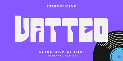 Vatteo is a retro decorative display font. Bold stroke, fun character with a bit of ligatures and alternates. To give you an extra creative work. Vatteo font support multilingual more than 100+ language. This font is good for logo design, Social media, Movie Titles, Books Titles, a short text even a long text letter and good for your secondary text font with script or serif. Make a stunning work with Vatteo font. Cheers, Maulana Creative
 - Matteo scary by Scratch Design,
$14.00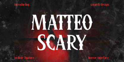 Please Welcome Matteo Scary. Matteo Scary is a horror and creepy font inspired by classic horror movie posters. It gives us the spirit of horror, spooky, frightening and suitable for poster movies, especially Halloween-themed, horror or thriller. This font is perfect also for branding, book cover, magazine header, and others which has horror or spooky vibes. What’s included? Uppercase & lowercase Number & Punctuation Ligatures Multilingual support Enjoy this font!
 - Batton Rettan by IM Studio,
$10.00 Batton Rettan stylized signature font is a font with ligature, stroke and finish stroke. It features signature characters that will take your project to the next level! This font is PUA coded which means you can easily access all the glyphs and swashes full of signatures! It also features many special features including glyphs and alternate ligatures. font designs made for various vector designs, printing such as digital wedding blogs, online shops, social media, while printing can be used in the field of clothing products, accessories, bags, pins, logos, business cards, watermarks and many others... so it can make your product look cute and attractive, and also Multilingual support!!! Happy designing...
 - Matroos Arabic by Eraqy TF,
$20.00 Matroos, translated as "Full" in English, is a new bold Arabic typeface created to be used for bold titles. It comes in two weights in a display way to make it legible for contemporary use in various creative projects including branding, headlines and posters. Features 25 bonus stickers in the glyph set.
 - Gerald Battom by Rotterlab Studio,
$12.00 Gerald Battom is a new modern script font with an irregular base line. Gerald Battom looks beautiful in wedding invitations, thank you cards, quotes, greeting cards, logos, business cards, and more. Perfect for use in ink or watercolors. It includes initial and terminal letters, alternatives and support for many languages. To activate the OpenType Stylistic alternative, you need a program that supports OpenType features such as Adobe Illustrator CS, Adobe Indesign & CorelDraw X6-X7, Microsoft Word 2010 or newer versions. There are additional ways to access alternatives / swashes, using Character Maps (Windows), Nexus Fonts (Windows), Font Books (Mac) or software programs such as PopChar (for Windows and Mac). How to access all alternative characters: https: //www.youtube.com/watch?v=Go9vacoYmBw https: //www.youtube.com/watch?v=XzwjMkbB-wQ Need help or have questions, let me know. I am happy to help :) Thank you & Congratulations on Design!
 - Battom Glory by Sealoung,
$10.00 Battom Glory is a bold and distinct blackletter font. Add this font to your creative ideas and notice how it will make them stand out!
 - Survival Horror - Unknown license

- Monotype Corsiva by Monotype,
$89.00 Monotype Corsiva is an italic typeface made in the style of the early Italian cursives as exemplified by the work of the writing master, Ludovico degli Arrighi, in the sixteenth century. The capitals of the Monotype Corsiva font are of swash design, with characteristic flourishes, designed primarily for use as initial letters. Monotype Corsiva can be used for short text passages in advertising but is best used to add sparkle to invitations, greetings cards and menus and to give a sense of occasion to certificates and awards.
 - Carnival VP by VP Creative Shop,
$21.00 Carnival VP is a long, clean font with Latin and Cyrillic support, tons of alternate glyphs, and multilingual support. It's a very versatile font that works great in large and small sizes. Carnival VP is perfect for branding projects, home-ware designs, product packaging, magazine headers - or simply as a stylish text overlay to any background image. Uppercase, numeral, punctuation and symbols Cyrillic support - Russian, Ukrainian, Bulgarian and more Alternate glyphs Multilingual support To access alternate glyphs in Adobe InDesign or Illustrator, choose Window Type & Tables Glyphs In Photoshop, choose Window Glyphs. In the panel that opens, click the Show menu and choose Alternates for Selection. Double-click an alternate's thumbnail to swap them out. Feel free to contact me if you have any questions! Thank you! Enjoy!
 - New Cuisine by Stephen Rapp,
$59.00 New Cuisine is a departure from formal, handwriting, and retro scripts. Influenced by the DIY lettering generation New Cuisine is a joyful looking script with all the right moves. Its bold graphic presence makes it ideal for packaging, online journals and blogs, signage, logos, and menus. Under the hood of New Cuisine lie precise connections, unique ligatures and alternates, and OpenType programming to orchestrate it all. Because of this, typesetting turns into a simple and playful experience. Also included are a simple fraction feature as well as Central European language support.
 - Horizone Survive by Multype Studio,
$23.00 Horizone Survive is a brush style font. With a very detailed brush style that looks more authentic. This font makes your designs look natural. This font would perfect for logos, branding, product designs, product packaging, photography, watermark, social media posts, advertisements, invitation, stationery, labels, logos, magazines, books, greeting / wedding cards, fashion, make up, and etc.
 - Monarch Cultivation by Hatftype,
$17.00 Monarch Cultivation - Blackletter Display Font is a display font that is inspired by gothic and horror style because its shape is very unique and is perfect for any project that you will use with this theme. Vamps Crime with opentype features such stylistic alternates, stylistic sets & ligatures good for logotype, poster, badge, book cover, tshirt design, packaging and any more. Features : 1.Uppercase & Lowercase 2.Multilingual support 3.Number 4.Symbol 5.Punctuation. 6.Extra Dingbat 7.Support in Mac and Windows OS -Support in design application (photoshop, illustrator, and more). There it is. I really hope you enjoy it. Comments & likes are always welcome and accepted.
 - Curse by words+pictures,
$20.00 - Curves by Just My Type,
$15.00Be it a blessing or a curse, when a type designer sees a shape that could be interpreted as a letter, his/her mind is off and running. My parents loved to travel; Dad drove to Florida seven different years, winding on (barely) two-lane “highways” clinging to the hills of Kentucky and Tennessee. My brothers and I saw many of these letters along the way. Watch those Curves . - Curve by Fontador,
$24.99 Curve is a modern neo-classical typeface family with some features of the Didone genre, but especially designed for contemporary typography. A large x-height not only creates space in the letters for extra-bold styles, but also lends Curve an open and generous character in the more narrow and semi-bold versions. It has 616 glyphs with small caps, numbers and ligatures in 10 weights. Curve is a contemporary serif typeface, special for logos, brands, magazines and editorial and for setting trends in fashion and design.
 - Myteri Tattoo PERSONAL USE ONLY - Personal use only

- VTC-Bad Tattoo Hand One - Personal use only

- FF Matto by FontFont,
$41.99 Italian type designer Alessio Leonardi created this display FontFont in 1996. The family has 12 weights, ranging from Regular to Bold (including italics) and is ideally suited for festive occasions and poster and billboards. FF Matto provides advanced typographical support with features such as ligatures and case-sensitive forms. It comes with proportional oldstyle figures.
 - Catto Puroo by Attype Studio,
$15.00 Introducing Catto Puroo, the perfect font for all animal-related products. With three different versions - regular, display, and extruded - Catto Puroo offers versatility and a range of design possibilities. The display version features a paw print on the font, which is perfect for creating fun and playful designs. Combine it with the extruded version for a 3D look that will make your designs stand out. Catto Puroo is the go-to font for animal lovers, pet enthusiasts, and anyone looking to create designs that are fun, quirky, and memorable. Features : - Catto Puroo Family Fonts - Ligatures - Multilingual, US Roman, Latin 1 Support --- Hope you enjoy with our font! Attype Studio
 - Gattos Breu by Pixesia Studio,
$23.00 Introducing Gattos Breau - Modern Retro Sans Serif Gattos Breau is a retro groovy display font that will make your designs pop with color and fun. It has a bold and playful style that is inspired by vintage groovy fonts and retro design. Gattos Breau is perfect for creating catchy headlines, funky stickers, cool badges, fun labels, and more. It also comes with alternates and ligatures to give your designs a unique and casual look. FEATURES - Stylistic Alternates - Ligatures - PUA Encoded - Uppercase and Lowercase letters - Numbering and Punctuations - Multilingual Support - Works on PC or Mac - Simple Installation - Support Adobe Illustrator, Adobe Photoshop, Adobe InDesign, also works on Microsoft Word Hope you Like it. Thanks.
 - Curly Coryphaeus - Unknown license

- Kristen Curly - Personal use only


