1,252 search results
(0.009 seconds)
- FHA Tuscan Roman by Fontry West,
$20.00 The first Tuscan lettering was penned in the mid-fourth century by the calligrapher Furius Dionysius Filocalus. The style was still in common usage as calligraphy when Vincent Figgins designed the first Antique Tuscan for print in 1817. Antique and Gothic Tuscan woodtype fonts appeared in the 1830’s. By the 1850’s, Tuscan fonts had become popular in America. These styles continued in print use into the twentieth century. Tuscan Antique and Gothic styles, borrowed from print and calligraphy, were perfect for signs, posters, handbills and other large format advertising. Sign painter, Frank Atkinson demonstrated several Tuscan forms in his book Sign Painting, A Complete Manual. Modified & Spurred Tuscan Romans were inspired by this and other works of the same period.
 - LHF Fat Cat by Letterhead Fonts,
$35.00 Inspired by Alf Becker's Rounded Block letterstyle. Nice 30's/40's era appeal.
 - FHA Broken Gothic by Fontry West,
$15.00 More than a century ago, Frank H. Atkinson presented this hand lettered style as Broken Poster. It was one of a hundred styles he demonstrated in his manual on sign painting. Even before his book was published (and certainly after), Broken Poster was a favorite with sign painters and letterers. It has graced show cards and movie posters, signs and windows displays, and advertisements of all varieties. We presented the our first digital revival of this classic in 2000. It is long overdue for an upgrade. Broken Gothic expands the basic Broken Poster to four weights, two specialty formats and some cool layed effects. The language base includes Greek, Cyrillic, Latin A, and some of Latin B and Latin Extended. There are also some nice alternates and ligatures. All weights are quite suited to posters, headlines, display copy, web headers, etc. At first glance, Broken Gothic may seem to have limited uses. Give it a chance and it will surprise you. Broken shouts out that there is a sale, a giant monster or the end of the world. Broken Gothic is comfortable in a wide range of themes and applications from zombie movie titles to salsa jar labels. While I can't recommend it for text, Broken is great for headers, banners, signs, titles, product presentation and other display applications. When you need a rough customer, Broken Gothic fills the bill.
 - Fat Font Grotesk by Intellecta Design,
$9.00a naive grotesque font - FHA Eccentric French by The Fontry,
$25.00 The curves are vintage and the serifs are big. They're so big that for years I never had the courage to tackle this intimidating font. But when fellow signmaker Frank Smith laid the groundwork for this intriguing typeface by Frank H. Atkinson, I couldn't pass on the opportunity to take it from paper to keyboard. After all, at over 100 years old, I felt this alphabet had never been given a proper, digital treatment. So how did this face survive the last century? Well, for those who don't know the history, it survived in Atkinson's ubiquitous book, Sign Painting, published first in 1908, the generational standard for anyone interested in sign-related type design. The layouts and lettering treatments in this book have influenced countless designers for more than a hundred years, but most haunting to me was this strange face with the big serifs. Well, I'm haunted no more. The work is done, the kerning is complete, and nothing but a mouse-click separates a very old idea from the modern world. It's wide, it's big, and with those crazy serifs, it is definitely eccentric-!!!
 - Old Fat Boy by Gleb Guralnyk,
$14.00 Hello! Introducing a creative all caps font named Old Fat Boy. It's a vintage shape smooth typeface with authentique 90's style look. This font includes lots of multilingual characters (check out a screenshot with available letters and signs).
 - FT Ornamental - Unknown license

- FT Rosecube - Unknown license

- FT Blockbusta - Unknown license

- FT Funghi by Fenotype,
$29.95 With Funghi Dingbats you can easily create abstract patterns or use the images as such.
 - TA Bankslab by Tural Alisoy,
$33.00 The building of the Northern Bank of St. Petersburg's Baku branch was built in 1903-1905. It was the first Art Nouveau-style building in Baku, Azerbaijan. Later the bank was transformed into the Russian-Asian Bank. After the oil boom in Baku in the 19th century, branches of many banks and new banks were opened in the city. The branch of the Northern Bank of St. Petersburg was among the first banks that was opened in Baku. N.Bayev was the architect of the building for the branch of the Northern Bank of St. Petersburg located at Gorchakovskaya 3 in 1903-1905. The building currently houses the Central Branch of the International Bank of Azerbaijan. My purpose in writing this is not to copy and paste the information from Wikipedia. What attracted me to the building was the word "Банкъ" (Bank) written in Cyrillic letters, which was also used in Azerbaijan during the Soviet era. The exact date of the writing is not known. Every time I pass by this building, I always thought of creating a font of this writing someday. I had taken a photo of the building and saved it on my phone. I did a lot of research on the font and asked a lot of people. However, some did not provide information at all and some said they did not have any information. I was interested in the history of this font but I do not know if this font really existed or it was created by the architect out of nowhere. If there was such a history of this font, I wanted to recreate this font and make it available. If not, I had to create it from scratch in the same way, using only existing letters on the building. Finally, I made up my mind and decided to develop the font with all letters I have got. It was difficult to create a font based on the word, Банкъ. Because in the appearance of the letters, the midline of the letters on A, H, K was very distinct, both in the form of inclination and in more precise degrees. The serif part of the letters, the height of the upper and lower sides, differed from each other. I don't know whether it was done this way when the building was constructed or it happened over time. I prepared and kept the initial version of the font. I took a break for a while. I started digging on the story of the font again. Meanwhile, I was researching and got inspired by similar fonts. Unfortunately, my research on the font's history did not yield any results. I decided to continue finishing up the font. After developing the demo, I created the font by keeping certain parts of these differences in the letters. In addition, I had to consider the development of letters in the Cyrillic, as well as the Latin alphabet, over the past period. Thus, I began to look at the appearance of slab-serif or serif fonts of that time. In general, as I gain more experience in developing fonts, I try to focus on the precision of the design for each font. In recent years, I specifically paid attention to this matter. YouTube channel and articles by Alexandra K.'s of ParaType, as well as, information and samples from TypeType and Fontfabric studios on the Cyrillic alphabet were quite useful. I gathered data regarding the Latin alphabet from various credible sources. I do not know if I could accomplish what I aimed at but I know one thing that I could develop the font. Maybe someday I'll have to revise this font. For now, I share it with you. I created the font in 10 styles. 7 weight from Thin to Extra Black, an Outline, Shadow, and Art Nouveau. The Art Nouveau style was inspired by the texture in the background used for the text on the building. The texture I applied to capital letters adds beauty to the font. If you like the font feel free to use it or simply let me know if your current alphabet doesn't support this font.
 - Berlewi FA by Fontarte,
$39.00 FA Berlewi is inspired by stencil lettering of a vanguard creator, Henryk Berlewi, who was a precursor of contemporary typography, a painter and a creator of the mechano-facture (Mechano-Faktura) theory. In 1924 he designed a poster for his mechano-facture one-man show in Warsaw Austro-Daimler car salon. An attention-grabbing composition with stencil lettering was doubtless a real innovation and according to Berlewi - the first typographic poster to be made in Poland.
 - FT Tantor by Fenotype,
$9.95 FT Tantor is a heavy weight font from Fenotypes basement.
 - FT Mammoth by Fenotype,
$19.95 FT Mammoth is a heavy and tough all-caps font. Mammoth is an ideal font for big words!
 - Liberta TA by Elsner+Flake,
$40.00 Between 1958 and 1961, Herbert Thannhaeuser developed the typeface Liberta for Typoart as a broadly conceived newspaper type which established itself quickly. Its positive adaptation by publishing houses and printing companies was based, next to its agreeable and reader-friendly general impression, also on a relatively robust typeface character which does not sacrifice its power of impression and elegance even when confronted with poor paper and printing qualities. In the 1970s, a bullish and robust design style took over the area of consumer goods which then required a corresponding advertising face. Harald Brödel re-worked the Liberta Ultra for phototypesetting, and, with great sensitivity, designed a matching cursive variation. Both types work especially well as an attention getter for advertising and for emphasis purposes.
 - TA KotodamaF by Skill Information"S",
$99.00 TA-kotodama is designed by Masahiko Yamada who is a famous and popular graphic designer. It is a 4 weight family. 「TAことだま」は、グラフィックデザイナーである山田正彦がデザインしたデザイナーズフォントでファミリーとして4書体ある日本で人気のフォントである。
 - Ft Thyson by Fateh.Lab,
$30.00 FT Thyson is a powerful and elegant display typeface. can be used to present your ideas in sports/fitness or editorials, Its weight is superior in posters, social media, headlines, titles, large format print - and wherever you want to be noticed.
 - FT Stamper by Fenotype,
$19.95 FT Stamper is made with ink and rubber stamp. It has an oriental calligraphic vibe.
 - Komunikat FA by Fontarte,
$39.00 FA Komunikat is an experimental and geometrical typeface based on simple elements: a circle, it's parts and straight lines. The typeface communicate the spirit of future, dynamism and modernity. FA Komunikat design was based on the sketch of unique lettering from 1932 made by Władysław Strzemiński, Polish vanguard abstract painter, an artist and a typographer. Strzemiński claimed that modern economic letter forms should be standardized and based on lines and arches. He wrote that readability is a matter of habit and after a practice the new letter forms would be very well readable for everyone. In 2004 Artur Frankowski revived original design creating set of characters, widen up with numerals, punctuation marks and diactrics.
 - Mobie FA by Fontarte,
$39.00 FA Mobie is a contemporary decorative fat face. For use on posters, leaflets, ads.
 - FT Massachusettz by Foxys Forest Foundry,
$9.00 FT Massachusetts is a dense, hand-drawn sans-serif typeface with uneven edges and a dancing baseline. It creates a vivid impression, feels friendly, playful, and communicative. The font is full of alternate letters, symbols, and graphics. It easily adapts, confidently engages with the customer, and transforms slightly depending on the space and purpose. Change letters to alternates for the uniqueness of spellings. For convenience, alternative characters are used when typing in lowercase, and normal letters are used when typing in uppercase. Additionally, you can always switch letters to additional alternative ones and insert symbols. Furthermore, to add visual interest, the font is equipped with auto-replacements for prepositions and word endings.
 - TA Fabricans by Tural Alisoy,
$25.00 TA Fabricans graphic presentation at Behance TA Fabricans font is based on Film Fiction Semi Expanded font. The font also supports the Hebrew alphabet. The Display version comes only in the Latin alphabet. I tried to prepare the font carefully. I specifically searched for the Hebrew alphabet. I benefited from my Israeli colleagues. I believe that my font will be successful. Please check and if you have any additional requests or complaints, please write to me. t@taft.work TA Fabricans works great for branding, magazines, headers, logos, TV, UI, web, badge, packaging, headlines, posters, t-shirt/apparel etc. TA Fabricans offers you options to explore a whole host of applications and gives a real modern feel to any project. Family overview: 36 fonts, 9 weights (from Thin to ExtraBlack) + Condensed, Expanded, Display Latin, Hebrew Display font without Hebrew Multilingual 4 free font Localized Forms with NLD, PLK OpenType Features: Localized Forms Contextual Alternates Tabular Figures Subscript Scientific inferiors Superscript (Superiors) Numerators Case Sensitive Forms Standard and Discretionary Ligatures Stylistic Alternates Kern Ordinals
 - FT Supervisor by Fenotype,
$29.95 Supervisor is a compact and tough retro font. The font has small caps and plenty of automatic ligatures. Supervisor will rock your record covers and posters.
 - FT Aessthetique by Foxys Forest Foundry,
$24.00 FT Aessthetique is a modern classic serif font that effortlessly combines delicate lines with bold strokes. Its aesthetic captures a beautifully romantic style, blending vintage elements with nostalgia. FT Aessthetique goes beyond being a font; it's a crucial brand element that seamlessly complements other fonts, imparting a sophisticated appearance to any project. Its professional characteristics make it appealing for expressing individuality across various endeavors. The font is perfect for large headlines and titles. FT Aessthetique features 65 ligatures and 35 alternative letters, expanding its versatility and providing creative possibilities. It supports most Latin-based languages and includes an extended set of symbols, punctuation, and diacritical marks.
 - FT Roundabout by Fenotype,
$29.95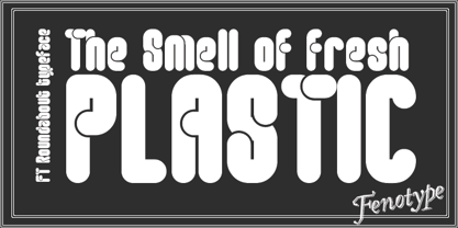
- FT Drobbs by Foxys Forest Foundry,
$9.00 FT Drobbs is inspired by the Didot font group, known for its neoclassical style reminiscent of the Age of Enlightenment. The font includes a combination of very narrow and very wide lines. FT Drobbs features increased contrast between wide and narrow lines and includes rich teardrop endings. I love to watch how the lines bend, how they move, expanding or going into the thickness of the hair. I love their graceful beauty. FT Drobbs is not alphabetic, but it contains numbers, a set of basic currency symbols, and a few typographic characters. It is suitable for use as accents in labels, posters and infographics.
 - TA Kirigirisu by Skill Information"S",
$99.00 TA-kirigirisu is the most popular designed font in Japanized font. TA-kirigirisu is one of the representative works designed by Yasushi Saikusa who is famous as a typographer in Japan. TA-kirigisu is used in book covers, flyers, POP advertising, TV commercials, and Web designs everywhere in Japan. It looks superficially imbalanced, but then it also projects an image of attachment. TAキリギリスは、日本語のデザイナーズフォントの中で一番人気の有るフォントです。 フォントのデザインは、有名な七種泰史がデザインした代表作品のフォントです。 日本国内では、本の表紙、フライヤー、POP、TVのCM、Webデザインなど至る所で使われています。 一見アンバランスに見えるデザインが愛着のある可愛らしさを伝えます。
 - Modernista FA by Fontarte,
$39.00 An inspiration for two fonts of FA Modernista was the second page of Polish vanguard magazine "Praesens" Nr 1 from 1926 designed (as the first page) by Henryk Stażewski. The type applied - Baccarat was a sans serif from Polish foundry Jan Idźkowski i S-ka. Fonts FA Modernista imitate the effect of letterpress with spilled printing ink. Letters of two cuts vary in distortion as in the old days of letterpress technology.
 - Saturator FA by Fontarte,
$39.00 Inspired by hand lettering and vernacular typography. Its informal and friendly character allows for different creative ways of usage. It is recommended for publishing, advertising and branding to get fresh handmade feeling. First version of Saturator FA Regular was designed by Magdalena Frankowska in 2007 and used successfully by many graphic designers all over the world. New version of Saturator FA is broadened with more diacritic characters for most of Latin languages. In 2016 new styles: Italic, Serif and Serif Italic were designed to enrich the Saturator FA family.
 - FT Helsingfurt by Fenotype,
$29.95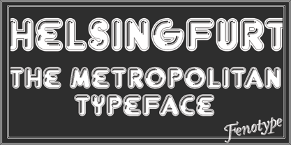
- Ft Zeux by Fateh.Lab,
$18.00 Ft Zeux is a strong and elegant display typeface. Inspired by the style of design that is currently popular, and this is the answer to all the needs of every idea that you will pour in this modern era, with a thick and solid style in each letter as if this font has a soul in it. Its weight is superior in posters, social media, headlines, titles, large format print - and wherever you want to be noticed.
 - FT Giorgio by Fenotype,
$19.95 FT Giorgio is based on a hand lettering in a movie poster La Dolce Vita by Giorgio Olivetti. FT Giorgio has class-based kerning and around 200 automatic interlock ligature pairs which gives your design a custom look. To use the ligatures you only need to write in CAPS and use an OpenType-aware application.
 - FT Forest by Fenotype,
$29.95 With Forest Dingbats you can easily create fast nature patterns or use the images as such.
 - FT Activica by Foxys Forest Foundry,
$9.00 On one hand, this font serves as a calm sans-serif, while on the other, it stands alone as a graphic system. Enriched with various shapes and symbols, it goes beyond the mere conveyance of information through text. It's an emotional neo-grotesque and a versatile tool in the hands of a designer, capable of adapting to a project and guiding the flow of information in the desired direction, adding either rigor or emotion in the appropriate places.
 - FT Graphitum by Foxys Forest Foundry,
$9.00 This is a powerful graphic rough sans-serif typeface with four different styles. Two linear, one with an aged texture and one basic, for your experiments. It makes a bold impression, feels like a strong simple typeface. Looks great in short inscriptions, headlines, posters.
 - FT Brush by Fenotype,
$14.95 FT Brush is a calligraphy style font family of three members - light, regular & bold. Combine different cuts for vivid outcome.
 - TA Kenisans by Tural Alisoy,
$35.00 TA Kenisans is a combination of two fonts. You can create very good works with Geometric and Grotesque style. This typeface also equipped with useful OpenType features such as Ordinal, Superior, Stylistic Alternates, Proportional Figure, Fraction, Tabular Figure, Numerator & Denominator. Each font file covers Western & Eastern Europe Latin language, as well as other Latin based languages – over 200 languages supported! This is a new real multi-purpose typeface that will be perfect for logo, packaging, greeting cards, presentations, headlines, lettering, posters, branding, quotes, titles, magazines, headings, web layouts, mobile applications, art quote, typography, advertising, invitations, packaging design, books, book title, & nearly any other type of creative design you’re working on.
 - TA Typefire by Tural Alisoy,
$- Typefire font will be known as TA Typefire from now on. Additionally, Cyrillic, Caucasian Albanian scripts and some glyphs were added. I made some slight modifications to letters. I hope you like it. Much love! TA Typefire is perfectly suited for editorial design, branding, magazines, logos, headings and more. TA Typefire OT Features: aalt, calt, case, dlig, dnom, frac, kern, liga, locl, numr, ordn, salt, sinf, ss01, ss02, ss03, subs, sups Supported Languages: Western Europe, Central/Eastern Europe, Baltic, Turkish, Romanian, Cyrillic, Caucasian Albanian Amount of glyphs included 456 Latin Plus languages supported 94% Latin Plus diacritics included 88% source: underware TA Typefire graphic presentation at Behance
 - TA KokoroF by Skill Information"S",
$99.00 TA-kokoro is very popular in Japanized font. TA-kokoro is designed by Yasushi Saikusa who is famous as typographer and based with Maru-gothic. TA-kokoro expresses yet cuteness. TAこころは、日本語のデザイナーズフォントの中で大変人気の有るフォントです。 タイポグラファで有名な七種泰史がデザインしたフォントで、丸ゴシックのデザインをベースにして更に可愛らしさを表現したフォントです。
 - TA Charged by Tural Alisoy,
$20.00 Consisting of 5 fonts in 5 weights, it features an extended charset of over 520 glyphs, covering multilingual support, including Western European, Central European, and Southeastern European. Complete with advanced open type features like stylistic alternates, discretionary ligatures, ordinals, small caps, fractions, and case-sensitive forms. The elegant and refined details seen in this font provide a new aesthetic input, satisfy contemporary style, and give a range of choices for luxury typographic projects. This font is perfectly suited for high-impact headlines. Advance open-type features are stunning on logos, branding, magazines, website, etc. Supports languages: Afrikaans, Albanian, Asu, Azerbaijani, Basque, Bemba, Bena, Bosnian, Catalan, Cebuano, Chiga, Colognian, Cornish, Corsican, Croatian, Czech, Danish, Dutch, English, Estonian, Faroese, Filipino, Finnish, French, Friulian, Galician, Ganda, German, Gusii, Hungarian, Icelandic, Ido, Inari Sami, Indonesian, Interlingua, Irish, Italian, Javanese, Jju, Jola-Fonyi, Kabuverdianu, Kalaallisut, Kalenjin, Kinyarwanda, Kurdish, Latvian, Lithuanian, Lojban, Low German, Lower Sorbian, Luo, Luxembourgish, Luyia, Machame, Makhuwa-Meetto, Makonde, Malagasy, Malay, Maltese, Manx, Maori, Morisyen, North Ndebele, Northern Sami, Northern Sotho, Norwegian Bokmål, Norwegian Nynorsk, Nyanja, Nyankole, Occitan, Oromo, Polish, Portuguese, Romanian, Romansh, Rombo, Rundi, Rwa, Samburu, Sango, Sangu, Sardinian, Scottish Gaelic, Sena, Shambala, Shona, Slovak, Slovenian, Soga, Somali, South Ndebele, Southern Sotho, Spanish, Swahili, Swati, Swedish, Swiss German, Taita, Taroko, Teso, Tsonga, Tswana, Turkish, Turkmen, Upper Sorbian, Vunjo, Walloon, Welsh, Western Frisian, Wolof, Xhosa, Zulu


