2,454 search results
(0.02 seconds)
- Anisette Std by Typofonderie,
$59.00 A geometric Art Déco multi-widths type family Anisette has sprouted as a way to test some ideas of designs. It has started with a simple line construction (not outlines as usual) that can be easily expanded and condensed in its width in Illustrator. Subsequently, this principle of multiple widths and extreme weights permitted to Jean François Porchez to have a better understanding with the limitations associated with the use of MultipleMaster to create intermediate font weights. Anisette is built around the idea of two widths capitals can be described as a geometric sanserif typeface influenced by the 30s and the Art Deco movement. Its design relies on multiple sources, from Banjo through Cassandre posters, but especially lettering of Paul Iribe. In France, at that time, the Art Déco spirit is mainly capitals. Gérard Blanchard has pointed to Jean François that Art Nouveau typefaces designed by Bellery-Desfontaines was featured before the Banjo with this principle of two widths capitals. A simple sentence will be as diverse in its representations, as the number of Anisette variables available to the user. With Anisette, typography becomes a game, as to design any title page as flamboyant as if it has been specially drawn for it. Two typefaces, many possibilities The complementarity between the two typefaces are these wide capitals mixed with narrow capitals for the Anisette while the Anisette Petite – in its latest version proposes capitals on a square proportions, intermediate between the two others sets. Anisette Petite proposes capitals in a square proportion, intermediate between the two other sets, all of which are interchangeable. In addition, Anisette Petite also includes a set of lowercase letters. Its style references shop signs present in our cities throughout the twentieth century. Anisette, an Art Déco typeface Anisette: Reveal your typographic expertise Club des directeurs artistiques, 46e palmarès Bukva:raz 2001 Slanted: Contemporary Typefaces #24
 - Mislab Std by Typofonderie,
$59.00 A brighter slab n’ sans in 18 styles Referred to as Egyptian’s in the early years of the nineteenth century, today slab serifs are primarily used in display sizes but seldom used in body text. With Mislab, Xavier Dupré has designed a brighter and more legible slab serif than most. Mislab aptly combines the strength of a slab serif with the lightness of a sans serif. Bold and thick serifs make for strong impact in display uses while performing extremely well under the most stressful body text conditions. A slight cursive feel adds spice to the text while its delicate rounded rectangular structure is naturally adapted to screen displays. The capitals have fully assumed serifs while the lowercases have more discreet versions. Notable features include sanserif endings on the lowercase a, c, e & s, inducing fluidity and enhanced readability. This highly versatile typeface brings clarity to headlines. Mislab will provide foolproof stability to your layouts. Mislab, a new design by Xavier Dupré Type Directors Club 2014 Tokyo TDC 2014 Communication Arts Typography Awards 2014 Club des directeurs artistiques, 45e palmarès Slanted: Contemporary Typefaces #25
 - Chevin Std by G-Type,
$60.00 Chevin is a contemporary rounded type family in 6 weights which was designed with functionality and legibility in mind. With its open counters and slightly condensed style Chevin can be used for text and is particularly suited to signage. Erik Spiekermann is a fan, noting that Chevin “is charming without being cute, and very legible even in small sizes because of its restrained shapes and simple construction.” Chevin is named after a hill on the outskirts of Otley in West Yorkshire. Since 2007 the type family has been highly prominent in the UK as Royal Mail’s corporate font and the typeface that adorns every Post Office in the country. The Chevin Pro set includes additional Greek and Cyrillic layouts.
 - Ambroise Std by Typofonderie,
$59.00 An exquisite Didot font in 18 series Ambroise is a contemporary interpretation of various typefaces belonging to Didot’s late style, conceived circa 1830, including the original forms of g, y, &; and to a lesser extent, k. These unique glyphs are found in Gras Vibert, cut by Michel Vibert. Vibert was the appointed punchcutter of the Didot family during this period. It is the Heavy, whom sources were surest that Jean François Porchez has been used as the basis for the design of the typeface family. In the second half of the 19th century, it was usual to find fat Didots in several widths in the catalogs of French type foundries. These same typefaces continued to be offered until the demise of the big French foundries in the 1960s. Ambroise attempts to reproduce more of what we see printed on paper in the 19th century; a more accurate representation of Didot punches. So, the unbracketed serifs are not truly square straight-line forms but use tiny transitional curves instead. The result on the page appears softer and less straight, particularly in larger sizes. The illustrious Didot family of type founders and printers Every variation of the typeface carries a name in homage to a member of the illustrious Didot family of type founders and printers. The condensed variant is called Ambroise Firmin. The extra-condensed is called Ambroise François. Ambroise Pro brought back to life: fifteen years in the making! Club des directeurs artistiques, 48e palmarès Bukva:raz 2001
 - Makika Sun by Andinistas,
$39.00 Makika Sun enhances the handwritten expressive possibilities of an architect mom and a graphic designer dad in Bogotá, Colombia. In other words, it is a versatile handwritten font family designed for writing short messages in children's contexts. Makika Sun shines for its conceptualization and logic, combining ideas from the American calligrapher Austin Norman Palmer and the Italian calligrapher Ludovico degli Arrighi. Makika Sun, a creative font family specializing in titles and paragraphs for children's books, emerged in 2009 and has developed over the years. Its essence lies in the simplicity of handwriting. In 2023, Makika Sun was applied in the book "Secret Files Tardigrades 1" for children ages 5-6 on Amazon from MyMicroSchool. The main goal of Makika Sun is to emulate handwriting that is legible and accessible to everyone. Makika Sun stands out for its readability and uncomplicated, artisanal style. It offers four typographic styles that simulate different calibers of markers: thick tip (Makika Sun Black), medium tip (Makika Sun Bold), normal tip (Makika Sun Regular) and Makika Sun Dingbats, a set of arrows and figures perfect to enrich your writing. . In short, Makika Sun's versatility and stylistic uniformity make it easy to create writing in various typographic settings. Its typographic heart communicates harmony in messages meticulously designed for spontaneous contexts that require high readability. Makika Sun offers a dynamic range of styles in 4 fonts notable for their outstanding performance in the field of children's book design and the creation of playful brand identities.
 - Peachy Sun by Carpiola Studio,
$12.00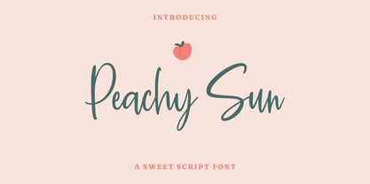 Peachy Sun is a lovely and timeless handwritten font. It is the best choice for creating eye catching logos, branding and quotes. Every letter has a unique and beautiful touch, which will make your design come alive!
 - Airco Std by Typofonderie,
$59.00 Designed between italic and script styles Airco is a typeface designed between italic and script styles. The letterform finish is rounded. Designed ultra slanted (27°), the shapes evoke a fast and assertive movement. The result is a human typeface, dynamic, that will visually work well in technology and sport, without ever being dry, rigid or dehumanized. The structure of the letters is influenced by Renaissance italics, at the difference that in the case of Airco, the lowercases and capitals are visually homogeneous thanks to the giants lowercases. In fact, the default numerals can be used in capital as well lowercases settings.
 - FUD Grotesk by Ilya Bazhanov,
$50.00 A narrow sans serif, FUD Grotesk was inspired by brutalist architecture and modernist typography. There is a subtle stroke contrast, many inktraps, and even some microserifs (look for them in the main strokes!). Note the closed bowl apertures, exaggerated in the alternate forms, which result in a dense, ornate typeset. Five weights (from Light to Bold), and a large set of discretionary ligatures.
 - Sub Comp by Ech000,
$10.00 SubComp is a carefully constructed font made with over 160+ individual glyphs for English and some Latin based languages. This font is inspired by old fashioned computer and programming fonts with a unique twist to the lettering. Features characters or glyphs for Basic Latin, Some Extended Latin Characters, Some Greek, Some Coptic. Created for web, poster, graphic design, social media and branding.
 - Diversa Std by DSType,
$10.00 DSType proudly presents Diversa Std, the same system as Diversa, but with separate styles: Serif, Serif Stencil, Inline, Soft Serif, Sans, Sans Stencil, Slab, Slab Stencil and Baroque. Diversa Std: Because uniformity still sucks!
 - Audace Std by Typofonderie,
$59.00 Between geometry & shapes inspired by nature, in 4 fonts Audace was born as a response to a simple brief: how to visually express human interaction and technology with abstract forms? The starting point is a humanistic sanserif, to which are added external references: design pieces, furniture, buildings. Architects shape our world with the intention to reconnect nature, human and address a perfect functionality. Not so far to typeface design which combines a personal vision and ensures good legibility in a certain context. Audace — like the works of those artists, designers, architects — is clearly influenced by the tension of the line, the play with negative space, the dynamics, the surprise, the nature that will influence the shapes of the letters. So if a v is asymmetrical, and the y based on similar asymmetry but in reverse, these two shapes help to distinguish from one to the other. This is a consequence of the influence of forms from design and art in the design of the Audace. And this small example illustrates the confrontations of the designer’s influences: the search for the most unique shapes, but without compromising on function: to be read, to be legible, even at very small size in the worst conditions. Audace, between geometry and shapes inspired by nature
 - Sad Angel by Senekaligrafika,
$12.00 “Sad Angel” has hard strokes and signature style that speak to instant unique sensation. Take your creative projects to the highest level with this font. “Sad Angel” will help you to create special and touching typographical design for your projects, for every day or the happiest day in life, greeting card, headings, flyer, product packaging, book cover, printed quotes, logos, and many more. It is really universal and modern font. The owner of endless possibilities!
 - Nexgen SLD by Alphabet Agency,
$20.00 Nexgen SLD font family is a modern sans serif font. The family includes 6 fonts, 3 weights each with 2 styles; regular and italic. The fonts are designed to be clean and easy to look for readability. The straight lines and diagonal cut at the corners of each character give the fonts their solid modern tech look. The family works great in all kinds of themes especially in tech, science and sports themes.
 - Black Sun by Inumocca,
$19.00 BlackSun – A futuristic, eyecatching font with simple, strong characters. Inspired by modern technology, synthwave, Sci-fi movie posters, science and generally space. A really great font for many projects, like lettering, website interface, magazines, branding, posters, wedding invitations, quotes lettering, logos, and more. - Unique glyphs - Multilingual support - UPPERCASE - Lowercase - Numeric - Symbol - Punctuation - PUA encoded - Stylistic alternates
 - Sun Pride by Attype Studio,
$13.00 Sun Pride is script font with beginning and ending swash of sun flower and is suitable for any summer event. Sun Pride is perfect for branding, logo, invitation, stationery, social media post, product packaging, merchandise, blog design, game titles, cute style design, Book/Cover Title and more. Includes Multilingual Support for Afrikaans, Albanian, Catalan, Danish, Dutch, English, Estonian, Finnish, French, German, Icelandic, Italian, Norwegian, Portuguese, Spanish, Swedish, Zulu. Hope you enjoy with our font! Attype Studio
 - Ardoise Std by Typofonderie,
$59.00 A straightforward sanserif in 20 fonts, 4 widths Ardoise met the needs of publications. By extension, it met the needs of a newpapers typeface featuring a low contrast, straightforward forms, as Franklin Gothic. The verticals metrics and proportions of Ardoise are calibrated to match perfectly others Typofonderie families. Four widths to answer all situations Ardoise, inspired by the needs of today’s fine newspapers offers simple and tense shapes designed to renew and revitalize. Ardoise could be considered as an homage to Antique Olive, but quite indirectly and as an organic result of the designer’s longstanding admiration of the work of Roger Excoffon. Ardoise shares a purity and dynamics with Excoffon’s designs giving it a unique elegance and excellent readability. Its sturdiness means it is virtually immune it to distortion. In addition, a few alternates glyphs (a, c, g) can be used to alter the overall tone of a text setting.
 - Teimer Std by Suitcase Type Foundry,
$75.00Typographer and graphic designer Pavel Teimer (1935-1970) designed a modern serif roman with italics in 1967. For the drawing of Teimer he found inspiration in the types of Walbaum and Didot, rather than Bodoni. He re-evaluated these archetypes in an individual way, adjusting both height and width proportions and modifying details in the strokes, thus effectively breaking away from the historical models he used as a starting point. Teimer's antiqua has less contrast; the overall construction of the characters is softer and more lively. The proportions of the italics are rather wide, making them stand out by their calm and measured rhythm. This was defined by the purpose of the typeface, as it was to be utilised for two-character matrices. The long serifs are a typical feature noticeable throughout the complete family of fonts. In 1967, a full set of basic glyphs, numerals and diacritics of Teimer's antiqua was submitted to the Czechoslovak Grafotechna type foundry. However, the face was never cast. At the beginning of 2005 we decided to rehabilitate this hidden gem of Czech typography. We used the booklet "Teimer's antiqua - a design of modern type roman and italics", written by Jan Solpera and Kl‡ra Kv’zov‡ in 1992, as a template for digitisation. The specimen contains an elementary set of roman and italics, including numerals and ampersands. After studying the specimen, we decided to make certain adjustments to the construction of the character shapes. We slightly corrected the proportions of the typeface, cut and broadened the serifs, and slightly strengthened the hair strokes. In the upper case we made some significant changes in the end serifs of round strokes in C, G and S, and the J was redrawn from the scratch. The top diagonal arm of the K was made to connect with the vertical stem, while the tail of Q has received a more expressive tail. The stronger hairlines are yet more apparent in the lower case, which is why we needed to further intervene in the construction of the actual character shapes. The drawing of the f is new, with more tension at the top of the character, and the overall shape of the g is better balanced. We also added an ear to the j, and curves in the r have become more fluent. To emphasise the compact character of the family, the lining numerals were thoroughly redrawn, with the finials being replaced by vertical serifs. The original character of the numerals was preserved in the new set of old-style figures. To make the uppercase italics as compact as possible, they were based on the roman cut rather than on the original design. The slope of lowercase italics needed to be harmonised. The actual letter forms are still broader than the characters in the original design, and the changes in construction are more noticeable. The lower case b gained a bottom serif, the f has a more traditional shape as it is no longer constricted by the demands of two-matrice casting, the g was redrawn and is a single storey design now. The serifs on one side of the descenders of the p and q were removed, the r is broader and more open. The construction of s, v, w, x, y, and z is now more compact and better balanced. Because Teimer was designed to make optimal use of the OpenType format, it was deemed necessary to add a significant amount of new glyphs. The present character set of one font comprisess over 780 glyphs, including accented characters for typesetting of common Latin script languages, small caps and a set of ligatures, tabular, proportional, old style and lining, superscript and fraction numerals. It also contains a number of special characters, such as arrows, circles, squares, boxed numerals, and ornaments. Because of its fine and light construction, the original digitised design remained the lightest of the family. Several heavier weights were added, with the family now comprising Light, Light Italic, Medium, Medium Italic, Semibold, Semibold Italic, Bold, and Bold Italic. - Oprah Suede by Forberas Club,
$16.00 Introducing Oprah Suede by Forberas Club Oprah Suede is a Handwritten Script font that will make your designs look classic, Farmhouse, Boho, and Feminine. It is a great font for events, Wedding projects, fashion, apparel projects, signatures, album covers, logos, branding, magazines, social media posts, and advertisements, but it also works great for other projects. Add it to your fonts’ library, and it will enhance your creativity! Oprah Suede is best for: - logos, branding, & Signatures. - Flyers, Album cover, Magazine, & Advertisements. - Website design, design blogs, & fashion. - Quote graphics for social media. - and also it works great for other projects. What's included : - Character Set - Numerals and Punctuation - Accents (Multilingual characters) If you have any questions, before or after purchase, please feel free to get in touch.
 - Fiery Sun by Epiclinez,
$19.00 Fiery Sun is a fun and bold display font. Carefully handcrafted to fit most of your projects, this font is going to become your favorite in no time! Its organic-style is suitable for creating any branding, product packaging, quote, t-shirt, label, poster, logo that you wish to develop. Fiery Sun contains 194 glyphs. Supporting more than 66 languages, from English to Zulu. I hope you enjoy it. Thanks
 - Mixink Std by MIX.Jpg,
$14.00 Mixink Std is a serif font features amazing swashes. It has a vintage feel and look that makes it perfect for any retro and nostalgic project.
 - Sui Generis by Typodermic,
$11.95 Looking for a typeface that’s as unique as your personality? Look no further than Sui Generis, the rounded square sans-serif that’s unlike any other. With its technical letterforms and boxy curves, Sui Generis has an industrial character that’s all its own. It’s the kind of typeface that demands attention, without ever feeling pushy or obnoxious. In fact, its understated charm is part of what makes it so special. But don’t let its quirky personality fool you—Sui Generis is as practical as it is unique. With four weights, two widths, italics, and an outline style, it’s incredibly versatile and perfect for any project that requires a touch of character. So if you’re tired of bland, run-of-the-mill typefaces that all look the same, give Sui Generis a try. Its square letterforms and distinctive voice will make your design stand out from the crowd, and leave a lasting impression on anyone who sees it. Most Latin-based European writing systems are supported, including the following languages. Afaan Oromo, Afar, Afrikaans, Albanian, Alsatian, Aromanian, Aymara, Bashkir (Latin), Basque, Belarusian (Latin), Bemba, Bikol, Bosnian, Breton, Cape Verdean, Creole, Catalan, Cebuano, Chamorro, Chavacano, Chichewa, Crimean Tatar (Latin), Croatian, Czech, Danish, Dawan, Dholuo, Dutch, English, Estonian, Faroese, Fijian, Filipino, Finnish, French, Frisian, Friulian, Gagauz (Latin), Galician, Ganda, Genoese, German, Greenlandic, Guadeloupean Creole, Haitian Creole, Hawaiian, Hiligaynon, Hungarian, Icelandic, Ilocano, Indonesian, Irish, Italian, Jamaican, Kaqchikel, Karakalpak (Latin), Kashubian, Kikongo, Kinyarwanda, Kirundi, Kurdish (Latin), Latvian, Lithuanian, Lombard, Low Saxon, Luxembourgish, Maasai, Makhuwa, Malay, Maltese, Māori, Moldovan, Montenegrin, Ndebele, Neapolitan, Norwegian, Novial, Occitan, Ossetian (Latin), Papiamento, Piedmontese, Polish, Portuguese, Quechua, Rarotongan, Romanian, Romansh, Sami, Sango, Saramaccan, Sardinian, Scottish Gaelic, Serbian (Latin), Shona, Sicilian, Silesian, Slovak, Slovenian, Somali, Sorbian, Sotho, Spanish, Swahili, Swazi, Swedish, Tagalog, Tahitian, Tetum, Tongan, Tshiluba, Tsonga, Tswana, Tumbuka, Turkish, Turkmen (Latin), Tuvaluan, Uzbek (Latin), Venetian, Vepsian, Võro, Walloon, Waray-Waray, Wayuu, Welsh, Wolof, Xhosa, Yapese, Zapotec Zulu and Zuni.
 - Serial Sue by JOEBOB graphics,
$33.00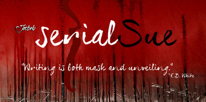
- Midnight Sun by Hanoded,
$15.00 Midnight Sun, despite its rough look, was carefully painted. I used a very cheap brush with stuck-together bristles to get that ‘eroded’ look. Midnight Sun comes with double letter ligatures and some really cool stylistic alternates as well.
 - Red Sun by Inumocca,
$20.00 Red Sun – A futuristic font with simple and strong characters. Inspired by the visuals and colour scheme of neon signs and synthwaves. A really great font for many projects, like game design, websites, magazines, branding, posters, logos, and more. - Unique glyphs - Multilingual support - UPPERCASE - Lowercase - Numeric - Symbol - Punctuation - PUA encoded - Stylistic alternates
 - Kropotkin Std by sugargliderz,
$30.00 This typeface design was influenced by the British Rail corporate type introduced in an old lettering instruction book published in Japan. Of course, the only clue to this typeface is the lettering instruction book at hand. Therefore, this typeface is based on the British Rail corporate type introduced in an old lettering instruction book published in Japan, and I have expanded the design variations. I started with the Bold design first. Then I designed Light, Regular, and Black in that order. Light and Regular are intended to be used as the text type, while Bold and Black are intended to be used as the base for logotypes, headlines, and other eye-catchers.
 - Black Mud by Stripes Studio,
$20.00 Black Mud a new font that is brushed is very attractive with a natural, detailed and perfect texture, also has an additional Black Mud Underlines. Perfect for brand projects, logos, product packaging, posters, invitations, greeting cards, news, blogs, everything including personal charm etc.
 - Autobahn Std by AVP,
$18.00 Autobahn is a robust masculine sans of near monoline thickness and angular characteristics. Autobahn Std has a full Latin 1 character set but no CE, Cyrillic or Opentype features. For the extended character set and Opentype features, see Autobahn Pro.
 - Zosimo Std by Delicious Type,
$39.00 Zosimo is a neo-grotesque typeface created by designer Ron Gilad (Delicious Type) in cooperation with renowned typographer Oded Ezer based on his ubiquitous Alchemist typeface. Carefully drawn curves, robust shapes and a range of OpenType features make Zosimo a great choice for designing logotypes, signage, titling, texts and more. Zosimo now comes in three families: Standard (full Latin support), Cyrillic (basic Latin and Cyrillic) and Pro (all included). Totalling in 9 weights, roman and italic, Zosimo can accommodate all your type-related design needs in one big happy family.
 - Sun Summer by Sakha Design,
$12.00 Sun Summer is a cute and casual display font. It will add an incredibly joyful touch to your designs. Add this beautiful font to each of your creative ideas and notice how it makes them stand out!
 - Spud AF by Andrew Foster,
$12.00 100% authentic! - all characters were cut from real potatoes, creating the charming imperfections and unexpected results of the real thing. Perfect for posters, children’s projects and ‘green’ themed graphics. Spud AF brings a quirky, personal touch to any job. Please note: Spud AF Tatty has replaced the original Spud AF font.
 - Bulldog Std by Club Type,
$37.00
- Phoenica Std by preussTYPE,
$29.00 PHOENICA is a contemporary humanistic typeface family suitable for traditional high-resolution print purposes, office application and multi-media use. Of the creation formed the basis an idea which was developed for the first time by Lucian Bernhard approx in 1930 with the Berhard Gotic and was taken up in the last time by different written creators repeatedly: the repeated elimination anyway (in comparison to a Antiqua, e.g. Garamond) already very much diminished form Grotesque (as for example Helvetica) by systematic leaving out of the serifs. The horizontal direction of the writing is thereby stressed remarkably by which so-called »Rail effect« originates. The eyes can grasp the line to be read very well what is ordinarily left to a Serif-stressed font. By this desired effect is suited PHOENICA also for big text amounts. In numerous test runs Stems and tracking was compared to experienced fonts and was adapted. The experienced was taken over without renouncing, nevertheless, the modern and independent character PHOENICA. PHOENICA offers to you as a welcome alternative to the contemporary humanistic Sansserif. It is a very adaptable family for text and Corporate design uses. Several companies have discovered PHOENICA meanwhile as a Corporate font for themselves and use them very successfully. She provides a respectable typeface combined with refinement and elegance. Every PHOENICA family has at least six weights in each case in regular and italic. In addition more than three fine Haarline weights (Hairline 15, 25, 35). These are a total of 27 possibilities. Phoenica as well as Phoenica Condensed are excellently readable fonts, because they were optimised especially for amount sentence. Both basic styles (Regular and Condensed) are tuned on each other and follow the same form principle. The family is neither exclusively geometrical nor is constructed humanistically, the forms were sketched on quick and light Recognition effect of every single letter. The PHOENICA family design and logo is suited for all only conceivable uses like newspapers and magazines, for the book typography and Corporate Design.
 - Basco Std by Typofonderie,
$59.00 A mix of Renaissance & tropical atmosphere Basco is an exploration of the Renaissance style, a period in which letterforms were informed primarily by hand writing. It is clearly a contemporary interpretation of calligraphic shapes forms. The serifs are subtly asymmetrical. Slightly curved arches on the n, m and u are noticeable, creating an interesting tension in the text. Bruno Mello’s distinctive style is most obvious in his mastery of super fluid curves. It is a result of his extensive exploration of calligraphic forms, their tensions and dynamics, mixing angularities with curves. The roman weights include alternate swashes, as well as initial and terminal glyphs. The italics, based on chancellery script, feature simple stroke endings, most visible on the s and c. ➼ Basco minisite
 - Oksana Std by AndrijType,
$25.00 Oksana Std has only the Western Latin characters from multilingual Oksana. It has six weights with real italics, and Alt faces with Old Style figures, alternative characters -a-g-k-y- and ampersand. German großes Eszett is also included.
 - Rufina STD by TipoType,
$13.00 Rufina was as tall and thin as a reed. Elegant but with that distance that well-defined forms seem to impose. Her voice, however, was sweeter, closer, and when she spoke her name, like a slow whisper, one felt like what she had come to say could be read in her image. Rufina's story can only be told through a detour because her origin does not coincide with her birth. Rufina was born on a Sunday afternoon while her father was drawing black letters on a white background, and her mother was trying to join those same letters to form words that could tell a story. But her origin goes much further back, and that is why she is pierced by a story that precedes her, even though it is not her own. Maybe her origin can be traced back to that autumn night in which that tall man with that distant demeanor ran into that woman with that sweet smile and elegant aspect. He looked at her in such a way that he was trapped by that gaze, even though they found no words to say to each other, and they stayed in silence. Somehow, some words leaked into that gaze because since that moment they were never apart again. Later, after they started talking, projects started coming up and then coexistence and arguments, routines and mismatches. But in that chaos of crossed words in their life together, something was stable through the silence of the gazes. In those gazes, the silent words sustained that indescribable love that they didn't even try to understand. And in one of those silences, Rufina appeared, when that man told that woman that he needed a text to try out his new font, and she saw him look at her with that same fascination of the first time, and she started to write something with those forms that he was giving her as a gift. Rufina was as tall and thin as a reed, wrote her mother when Rufina was born.
 - Big Sur by Mysterylab,
$11.00 Big Sur is a six-width slab serif font family with a unique look. At first glance, it is clearly in the tradition of old west style alphabets, with its chunky top and bottom strokes and serifs. But it also features a whimsical vibe in the curvy and pointed flourishes, the wavy baseline, and the swash terminals on many of the glyphs. It's a true standout with unique identifiers, and is bound to grab the eye as something new and different; yet it's traditional enough to establish a solid Western or vintage Americana style. Great for rodeo, county or state fairs, saloons, pubs & taverns, cowboy gear, and even vintage psychedelic posters.
 - Ysans Std by Typofonderie,
$59.00 Fashion style meets typography in 9 styles The Ysans designed by Jean François Porchez is a sanserif influenced by Cassandre lettering pieces and the geometric sanserif style from the inter-war period. Since Chanel logo, the geometric sanserif style is the favorite typographic thing in fashion. Ysans asserts this reference. Not only Haute-Couture houses use these categories of typefaces for their visual identity, but fashion magazines usually strength their layout with these geometric sanserif when a Didot isn’t used. Details of Ysans drawings Nevertheless, Ysans takes its sources in certain details imagined by the graphic designer Adolphe Mouron Cassandre for the monogram then logotype Yves Saint Laurent (1961 …). One thing keeps coming in again and again in Cassandre’s post-war graphic work: the pointed finish and endings, the references to the Roman capitals engraved and unique features such as the open R or other details influenced by Antiqua and calligraphic forms or ductus (you should have in mind that an earlier typeface by Cassandre is the Peignot, a modern uncial based on researches of the palaeographer Jean Mallon.) Certain letters from the Ysans are directly an homage to the Yves Saint Laurent logo, the R, the narrow U, the apex of the N, and all the details of such pointed endings on the f and t lowercases. The Ysans, a typeface between diversity and synthesis There are several ways to approach the design of a new geometric sanserif. The first approach is to follow the Bauhaus philosophy by designing in the most rational way, typographic forms based on simple geometric elements: square, round, triangle. Another approach is to start a revival based on an historical geometric typeface and optimize the original ideas, in order to adapt certain details to the contemporary needs. For Ysans, the approach is somewhat different because this project started in 2011 at ZeCraft as a typeface designed specifically for Yves Saint Laurent Beauty, still in use by the brand under its original name Singulier. The Singulier-Ysans has been conceptualized by ZeCraft, both drawing its sources from Cassandre and various historical geometric typefaces. Some will spot specific traits as in Futura, others in Metro or Kabel. By closely observing the Ysans, the result can also recall the way Eric Gill draw the curves and endings of his typefaces, of which Jean François Porchez is a fervent admirer. In the end, Ysans is like fashion as envisioned by Yves Saint Laurent who constantly revealed multiple references in his new collections, without being recognisable any other than with his unique style. “Fashions pass, style is eternal. Fashion is futile, not style.” Cherry on the cake: Ysans Mondrian Ysans Mondrian, named in reference to the Mondrian dress created by Yves Saint Laurent, is the multi-layer version of the family. Ysans, fashion style meets typography Club des directeurs artistiques, 49e palmarès
 - Geneo Std by Typofonderie,
$59.00 A robust oldstyle, an elegant slab, 8 styles Geneo, created by Stéphane Elbaz, is a synthesis of historic and present-day visions of typography, a slab serif constructed on an oblique axis. Its subtle contrast evokes both Renaissance elegance and the robustness of the Egyptian typefaces that were in vogue during the 19th century. Geneo falls halfway between the classic styles of Garamond and Transitionnals, with aspects of contemporary slab serifs like Rockwell, Boton, as well a bit informal. From this blend of styles and genres, it emerges with a singular identity perfectly suited for modern illustrations of quality, savoir-faire, and culture. Geneo’s limited contrast has been carefully crafted to make the font adaptable for use as both text and headlines, as well as for small-print elements like footnotes, appendices, and captions. The variety and precision of certain weights, like Regular, allow minute adjustments of the font color in text compositions. This flexibility is especially useful for displaying on devices with high pixel densities such as the latest iPhone or iPad, on which text may appear too thin. Flexibility and sturdiness The sturdiness of Geneo makes it a perfect choice for posters, logos, print and any project that requires finesse and sophistication. It provides alternate versions of some letters such as g and a to give you the flexibility you need for your typographic projects. Geneo pairs perfectly with contemporary typeface genre. Geneo, a new typeface designed by Stéphane Elbaz Tokyo TDC 2014 Type Directors Club 2009
 - Wasty Pudding by PizzaDude.dk,
$15.00 Wasty Pudding was made by drawing a lot of letters, over and over again - and not caring so much about the looks, but focusing more on the speed of drawing, because I wanted a font that represented the way I write, when I am taking notes for myself. It’s not pretty, but it’s legible and scribbeliciously beautiful! :) Anyway, I think the purpose of this font is massive amounts of text. Song lyrics, novels, stories, diaries, manuscripts, books, etc. I bet you can fool someone with them thinking that this is not a font, because I have added 6 different versions of each lowercase letter!!!
 - Costa Std by Typofonderie,
$59.00 A mediterranean style sanserif in 4 styles The original idea of Costa was to create a contemporary mediterranean typeface style. Costa is a synthesis of the purity, as found on Greek capitals, and softness, found in Renaissance scripts. First thing was the design concept that take its roots on the Chancery script. Such writing style appeared during Italian Renaissance. Later few typefaces have been developed from such cursive models. Today most serifed typeface italic take their roots on such triangular structure we can find on gylphs like the n, p, or d. The Costa capitals remains close to pure sanserif models when the lowercases features an ending serif on many letters like the a, n, d, etc. This ending serif being more like a minimal brush effect, creating a visual contrast and referencing the exoticness of the typeface. Knowing that the Costa typeface family began life in the 90s as a bespoke typeface for Costa Crociere, an Italian cruise company — it suddenly makes sense and explains well why Jean François Porchez focused so much on Italian Chancery mixed to a certain exotism. The curvy-pointed terminals of the Costa n can obviously get find on other glyphs, such as the ending of the e, c and some capitals. So, the sanserif looks more soft and appealing, without to be to pudgy or spineless. The general effect, when set for text, remains a sanserif, even not like Rotis Semiserif. Costa is definitly not a classical typeface, or serif typeface which convey past, tradition, historicism as Garamond does beautifully. Because of the Costa crocieres original needs, Costa typeface was designed to be appropriate for any uses. Anytime you’re looking for good mood, qualitative effects, informal tone, cool atmosphere without to be unconvential or blowzy, Costa will convey to your design the required chic and nice atmosphere, from large headlines sizes, brands, to small text sizes. It’s a legible typeface, never boring. A style without neutrality which doesn’t fit comfortably into any typeface classification! Does it proves the novelty of its design and guarantees as well as its originality? Its up to you to be convinced. Barcelona trip Originally not planned, this need appeared because of a trip to Barcelona at the time of the project, where Jean François was giving a lecture. He wanted to pay an homage to that invitation to create something special. So, he designed during his flight some variations of the Spanish Ch, following ideas developed by the Argentinian type designer Rubén Fontana for his typeface called Fontana ND (published by the Barcelona foundry Bauer). Then, he presented during his lecture variations and asked to the audience which design fit the best to their language. They selected the design you can find in the fonts today. Read more about pairing Costa Type Directors Club 2000 Typographica: Our Favourite Typefaces 2004