2,348 search results
(0.014 seconds)
- Stat Display Pro by Jure Kožuh,
$45.00 www.Stat-Type.com Complementary Type Family Stat Text Pro Stat Display Pro is an information design sans serif type family legible in circumstances of low visibility. Its large character set with multiple weights is defined by optimal size ratio, distinctive letter shapes, wide aperture and balanced counters. Stat Display Pro remains legible in unfavorable circumstances of distance, size, movement and similar. It contains nearly 700 glyphs, including diacritics, ligatures, small caps, old–style figures, arrows and more. This enables it to achieve wide language support. It consists of four main (Light, Regular, Medium, Bold) and four secondary, negative weights (Light Negative, Regular Negative, Medium Negative, Bold Negative) which are accompanied by their corresponding obliques. Stat Display Pro type family has higher than average x height (72% of cap height) which is accompanied by matching ascender and descender size ratios. With its distinctive letter shape detail it minimizes the possibility of letter shape confusion, while optimizing legibility with wide aperture and balanced counters. Its main intended use is information design, where it, with its characteristics, meets the requirements of wayfinding, infographics, table setting and much, much more. The development of the type family was based on research in legibility to achieve highly legible letter shapes, while not diminishing their visual character. A detailed description of Stat Pro type family is available at Stat-Type.com where a DEMO font can be downloaded.
 - Stat Text Pro by Jure Kožuh,
$45.00 www.Stat-Type.com Complementary Type Family Stat Display Pro Stat Text Pro is an information design sans serif type family which was developed as a complementary to Stat Display Pro. Stat Text Pro retains many characteristics of its display counterpart, while giving readability a greater importance. It has simpler letter shape details which enable it to accomplish a constant rhythm whiles being read. Its main intended use is to accompany Stat Display Pro in places where longer passages of text are needed. In this way the visual character of the composition is retained and at the same time readability of text is given attention. As its display counterpart it has a large character set with multiple weights, which are defined by optimal size ratio, wide aperture and balanced counters. It contains nearly 700 glyphs, including diacritics, ligatures, small caps, old–style figures, arrows and more. This enables it to achieve wide language support. It consists of four weights (Light, Regular, Medium, Bold) which are accompanied by their corresponding obliques. Stat Text Pro type family has higher than average x height (72% of cap height) which is accompanied by matching ascender and descender size ratios. The development of the type family was based on research in legibility to achieve highly legible letter shapes, while not diminishing their visual character. A detailed description of Stat Pro type family is available at Stat-Type.com where a DEMO font can be downloaded.
 - State of Love and Toast LL by Leftover Lasagne,
$25.00 State Of Love and Toast is a retro typeface reminiscent of the early 90’s. It’s certainly the Seattle of fonts. The font features auto ligatures for duplicate letters, quite a few graphical elements & shapes which can be accessed by shortcuts (lowercase letter + number form 0-9) and smallcaps (alternate versions of the lowercase letters).
 - Hebrew Latino by Wiescher Design,
$39.50 Hebrew Latino was started out of frustration. I could not find a font that looked like Hebrew - actually I found one, but it had only capitals. So I decided to make my own. Strangely enough it looks a little bit Jugendstylish! Here it is. Shalom! Gert Wiescher
 - Lady Cleo by Solotype,
$19.95This started out to be a font with an Egyptian hieroglyphic look, but took a detour just beyond the first pyramid. A young lady we know said many of the letters reminded her of the hooks on a bra strap. Whatever. - AT Move Artu by André Toet Design,
$39.95 Artù ! Strano ma vero, strange but true. A beautiful, intelligent and lively Italian dog and a great friend, unfortunately no longer among us ... but his memory lingers. A typeface designed in Rosennano (Tuscany), its Italian, but executed in Amsterdam. This monospace typeface might prove to be extremely useful for household products like washing powder or any anything like that. Just use it in your designs, let it live! Concept/Art Direction/Design: André Toet © 2017
 - Caesar - Unknown license

- Loophole by ArtyType,
$23.00 Loophole is a visually striking display typeface in 3 weights (Light, Regular & Bold), its DNA firmly rooted in the Cyclic Sans family which makes the perfect foil to this somewhat decorative font styling. The Loophole name is quite simply based on the ubiquitous hole motif, which is strategically deployed on each character across the 3 font styles. Each font contains an extended Latin character set covering Western & Central Europe, the Baltic States & Turkey.
 - Wesna by Type Salon,
$41.90 Typeface Wesna was created as a reflection of the current state of design whose starting point is rooted in the letterings from the Slovenian posters from the interwar period. Bold strokes, condensed letterforms, sharp stroke joints and unique features are combined in the typeface. Wesna preserves the Slovenian typography heritage and establishes the connection between the past and the present through new digital formation. Available in 3 weights, italics in Latin & Cyrillic.
 - Statos is a worn, blurred sans-serif typeface , built on the conviction that imperfection is not a flaw—it's the message. Statos questions typographic perfection. It moves away from absolute clea...
- Deviant Plain by TypeArt Foundry,
$45.00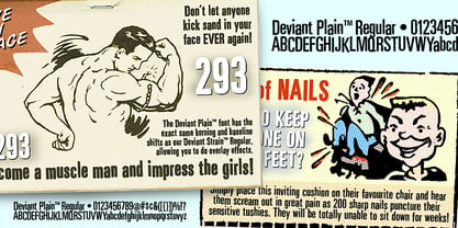 Clean companion included with Deviant Strain.
 - Storyline by Comicraft,
$19.00 It starts slowly, gently drawing you in... you're introduced to a number of strangely interesting and compelling characters. The plot seems at first to be satisfyingly predictable, then -- suddenly -- the narrative takes a completely unexpected turn! The protagonist is thrown into a series of devastating and alarming twists and turns! The antagonist triumphs -- evil trounces good, mass hysteria seizes the city streets! Our Hero is separated from his One True Love, and it seems that she has fallen for The Villain of the Piece! Will Good Prevail? Will Evil Perish? Will Love Conquer All?!? I don't know yet -- that's as far as I've got. Don't worry, it has a Great Ending.
 - ITC Roswell by ITC,
$40.99Roswell was designed by Jim Parkinson, who acknowledges the 'spacey' ancestry of its name. Yes, Roswell, New Mexico. There was a big anniversary of 'the incident' in the news while I was designing in Roswell. "The incident" is of course the alleged UFO crash in Roswell. "I thought the name was acceptable as a serious font name, while, on another level, having a strangely humorous edge," says Parkinson. Roswell looks great in large sizes on a poster or in a magazine layout. It started out as "a variation on American gothic forms like Railroad Gothic", says the designer, but Roswell is an original design with eccentricities of its own." - Nightmare by BA Graphics,
$45.00A strange design; just let your imagination run wild. - Eisley by Rocket Type,
$20.00 Eisley started as an experiment with creating brushes in illustrator. I began by drawing each letter and tweaking until each one balanced next to one another. I painted over 50 paint brush strokes to give a variety of different looks to the final characters. Strategically crafted to look as real and as spontaneous as a sign painter might paint up (although possibly running a bit dry on paint giving the end result a vintage and grungy effect). Eisley is perfect for use in any design branding that requires vintage or distressed display lettering. Eisley is perfect for use in any design branding that requires vintage or distressed display text. Great fun to use AND personalize with your own flair.
 - Blubber by Jesse Tilley,
$18.64 This strange mysterious "blubber" is told to hold the secrets of the universe, many legends and myths have been told about its strange and amazing powers. Great fortunes await to those who can harness its power. NOT TO BE USED FOR EVIL. Get it before it gets you...
 - Ravenwood by BA Graphics,
$45.00A strange design very mysterious and bizarre but sets extremely well even in text. - Black Cow by Scriptorium,
$12.00Black Cow is a scary, somewhat surrealistic looking font which came from somewhere strange and unpleasant. - Newspeak by Barnbrook Fonts,
$30.00 Newspeak is a display typeface based upon Soviet architectural forms from the Stalinist period (spanning the 1930s—'50s). Stalinist architecture is now considered unsightly and without aesthetic merit, yet it has a strange beauty, hinting at an unrealised utopia (while its function was to buttress a brutal dictatorship). Inspiration was also drawn from the Cyrillic alphabet which, to kids growing up in Western Europe in the '70s and '80s, was a cipher for an alternative way of living – Cyrillic letterforms represented the exotic, familiarity-twice-removed universe of Eastern Bloc states. When you visited a communist country you were confronted with unfamiliar typography that reinforced your sense of alienation and unease that there existed a real, if imperfect, working alternative to consumerism.
 - Deco Cafe - Unknown license

- Fatty Pantz by Ingrimayne Type,
$5.00 FattyPans is a strange, bizarre font with spiky serifs that bulges where letters are not supposed to bulge.
 - Seven Monkey Fury BB - Personal use only

- Ovaltown by Ingrimayne Type,
$9.00 Ovaltown is a geometric font family with three weights in which the letters are derived from ovals or ellipses. It does to have true lower-case letters but many of the characters in the lower-case slots differ from the corresponding characters in the upper-case slots. Ovaltown is strange, unusual, and bizarre and can be useful when one wants strange, unusual, and bizarre lettering.
 - Crazer by Atom,
$13.00 Crazer is a strange and irregular display typeface. Bringing tense, scary, powerful, and chaotic artwork. Create your creativity with Other Dangers!
 - Ultras Liberi - Unknown license

- Toleis by Twinletter,
$12.00 Toleis is a san serif font that we designed for you. Much attention is paid to the correct position of the accent. All overhead has its own height, which creates an additional level of readability. As well as numbers and punctuation, which are an integral part of any text. This pack includes alternative options for many glyphs — old-style figures, straps, style sets, and more. So you can customize the font to your liking and keep your look consistent.” of course, your various design projects will be perfect and extraordinary if you use this font because this font is equipped with a font family, both for titles and subtitles and sentence text, start using our fonts for your extraordinary projects.
 - Soft2911 by Ivan Kostynyk,
$15.00 This font was a product of self-initiated project I started a while back. It started and finished as a project that I was working on while procrastinating at school, for fun; however, I spent enough time to not give it out for free.
 - Zulia Pro by Sudtipos,
$59.00 Zulia is located in the west of Venezuela and it is the state in where Joluvian grew up. It is a region of sunshine, high temperatures, oil and cheerful people, although we choose the name to honor his mother who is from there (zuliana) and who is proud of her land and everything that it represents the area. Zulia is also his first typographic project. It is based on two of his favourite calligraphic styles: italic and brush pen. He started with simple and contrasted strokes on paper with brush and marker. After that he developed the full alphabet and its various options for each letter, starting from a set of handmade forms that could be connected in different ways according to the user needs. What motivates him to involve this style was to create a differentiation with his daily work by generating a heavier type, contrasted and low rise. Zulia finally got life of its own with the participation of Alejandro Paul and a feedback of techniques and skills that were generated with the duo work. Zulia is not just a typeface, Zulia is his love of letters.
 - Leisurely by Bogstav,
$17.00 Think green and help save the planet - start using this font!
 - Shapiro Base by OGJ Type Design,
$29.00 The bold cut is a good starting point for a branding.
 - CA Spotnik by Cape Arcona Type Foundry,
$40.00 The initial inspiration for CA Spotnik was the opening title of an early Andrei Tarkovsky movie. There was this very unconventional hand drawn “s” which drew my attention. Despite its strange shape, it felt totally natural in that context. So we made a few screenshots and started to sketch some more letters in order to catch the spirit that attracted us so much. The result is a grotesque typeface with a slight contrast, the proportions are rather wide with a large x-height. The bolder the weight, the wider it gets. In case you find the swirly “s” uncomfortable, there is a standard s included as well. The general atmosphere of the typeface, which could be described as “nerdy but friendly” doesn’t depend on this detail. It’s rather the sum of details derived from the original inspiration.
 - Thorben by Studio Buchanan,
$18.00 The old Norse legend of Thorben Odinson is a cautionary tale. And this typeface, like the nebulous kingdom he ruled, is something of a cloudy concoction. Thorben the typeface is something of an inspiration-hybrid, pulling aspects from multiple sources and combining them into a typeface that strangely seems to work (or not – depending on your point of view). What started as a redrawing of some old carvings (on a castle wall in deepest, darkest Suffolk), is now something entirely different. Part Nouveau curves and Celtic script, topped with a few sprinkles of modernism, darkness and some quirky ideas – Thorben absorbs it all, creating a display face that feels antiquated and current at the same time. Each style also comes pre-loaded with a handful of pictograms and icons perfect for adorning your designs with extra Thorben-ness.
 - Busted by Canada Type,
$24.95 Busted is the very strange and out-of-character outburst of Bill Troop, a guy who was classically trained in everything, from classical piano and literature to classical photography and type design. As far as we could tell, Bill Troop is the kind of guy whose appearance and voice instantly trigger thoughts of black and white photos, fedoras, and pre-industrial age Europe. A few years ago, he even moved from the United States to England, where it took him less than a week to feel at home and start sounding like a Norwich native. Then something happened and the poor dude just snapped. Busted is the controversial result of the blood rushing to his head. If you know what exactly happened to him, please let us know. Concern, consideration and human interest story aside, Busted is a fascinating thing. It is a set of four interchangeable thick outline fonts where the same letter forms turn from wild to wilder to broken to somewhat clean. Mix them up in a setting and you have words that snarl with a sneer. Life's too short. Take it all with a grain of salt. Scream whenever you feel like it. Busted Pro is a single font combining all four character sets, and rigged with an OpenType pseudo-randomizer in the contextual alternates feature, which you can disable or enable anywhere in your setting for maximum visual shock just the way you like it. Works just as well in PAL or SECAM. Don't be fooled by imitations, and don't get caught with your drawers down.
 - Lifeform by Supremat,
$12.00 Lifeform is a modern display font created as a result of my experiments on the forms of letters. While working on the font, I had ambivalent feelings, on the one hand I liked the individual curved lines, on the other hand they seemed very strange, alien and illogical. It was like looking into a microscope and seeing something strange. I wanted to develop and study these forms as something new, because I had never seen anything similar before. The result is a contrasting font that has both curves and sharp, and smooth lines that resemble some kind of organic matter. The font is well suited for large headlines, posters and covers. Its strange design catches the eye and will not leave the viewer indifferent.
 - Ammonia by Chank,
$49.00Ammonia is a simple sans serif made fumey and gloopy. Strange little dendrites poke out from some of the characters, causing some linkage between letters. - SirClive - Unknown license

- URAL by Fenotype,
$19.00 On a clear day you can see all the way to URAL from a high place in Helsinki. There your eyes will meet strange permafrost letters.
 - Ultras Liberi - Unknown license

- Abesif by Twinletter,
$12.00 Introducing Abesif sans serif font. This font is stretched from the normal theme, it is boring, while different, it seems strange. from there we design the appearance of this font that is not normal so that it is not boring and we display it differently but not look strange. so if you use this font it will look different from the others but it doesn't look strange because it has a normal design. so that it creates an impression that is easy for each of your audience to remember when they first see your project. This font is very suitable as text with displays for various kinds of branding, advertisements, posters, banners, packaging, news headlines, magazines, websites, logo design, banners, social media design and of course you can use a lot more.
 - Satellite PT by Puckertype,
$19.00Satellite PT started out as an experiment. Wanting to explore the geometry of using angles instead of curves, I started sketching out the face using grid paper. I had seen similar fonts that tended to be completely symmetrical. My exploration tended to include what I humorously call 'faux humanist' elements, such as asymmetrical bowls, tapers and 'flare-serifs' (for lack of a better word) for select terminals. The result was a quirky and interesting face at display sizes. However, at small sizes, as ink bleed starts to take over, the angles disappear in favor of the overall forms (rounded bowls, etc.) and the 'faux-humanist' effects start to mimic modulation found in more traditional, modulated text faces. While it is hardly a true text face, the result is surprising legibility at text sizes.


