10,000 search results
(0.012 seconds)
- Roc Grotesk by Kostic,
$40.00 Roc is a sans serif grotesk inspired by American wood types from the end of the 19th century. With nine weights in five widths, this family contains 45 fonts in total. The character set supports Western and Central European languages, as well as Turkish. Roc Grotesk comes in a range of five widths: Compressed, Condensed, Normal, Wide and ExtraWide, in order to cover a wide scope of applications. Although the styles at both ends of each range are made in their most pronounced form in terms of width and weight, they are not taken to such extremes as to become absurd, and are quite usable in display settings. The Normal width keeps all its nine styles in proportionally similar widths. The Compressed width, however, is deliberately made to be disproportionate, so that every style takes the least possible horizontal space. That is why the contrast between Compressed Thin and Compressed Heavy style is substantial. As the weights progress from Thin to Heavy, the stroke contrast becomes more prominent. It is intentionally exaggerated in heavier weights, which is particularly apparent in the uppercase E and R of the Black and Heavy style. Roc has a large x-height and relatively short descenders and ascenders. No uppercase letter descends below the baseline, so the lines of an all-caps text can be packed tightly on a poster or a headline. The Regular style is somewhat generously spaced, as it is most likely to be used for setting longer passages of text. Its Bold counterpart is spaced in such a way that the width of the text column will be similar to the text set in Regular. Tabular figures in these two styles have exact matching widths, so for example, you could emphasize one row of numbers in a data column without visually disrupting the vertical order of the table. The lowercase g and r have alternatives to accommodate what most designers expect from a typical Grotesk typeface. The single-story g and the cut-off r are accessible via the OpenType feature.
 - Candy Store BV - Unknown license

- Store Clerk JNL by Jeff Levine,
$29.00 The cover of the 1929 sheet music from the First National/Vitaphone picture “The Girl from Woolworth’s” had its title (“Someone”) hand lettered. This single word title was the model for Store Clerk JNL, which is available in both regular and oblique versions as well as solid and solid oblique versions (without an inline). A bold, casual sans serif with rounded ends and an inline, Store Clerk JNL is perfectly suited for projects where a strong, yet playful title is necessary to grab the reader’s attention. For those old enough to remember, Woolworth’s was a leading “Five and Dime” store chain, especially in the days when a nickel or a dime actually could purchase something.
 - Record Store Stencil by Ian Farnam,
$10.00 Record Store Stencil is based on classic stencil lettering from the first half of the 20th century. The font features Upper and lowercase, small caps, in upright, italic, and backslant. The font's multipart letterforms are ideal for color application. Available are two color variations, Black with Red accents and Blue with Red accents, with cycling activated through contextual alternates.
 - Stove Plate JNL by Jeff Levine,
$29.00 An old printer's advertising cut for Red Star Oil Stoves yielded a typeface that was both vintage and somewhat techno at the same time. Originally drawn as a slanted logo, the individual letters had an array of chamfered, angled and flat sides combined with a bold outline. This font is available in both vertical and oblique versions.
 - Corner Store JF by Jukebox Collection,
$32.99
- Department Store JNL by Jeff Levine,
$29.00 Amongst a number of items for sale in an online auction was a font of metal type featuring a thin, condensed serif font with decidedly Art Deco styling. This was the inspiration for Department Store JNL, which is available in both regular and oblique versions.
 - Variety Store JNL by Jeff Levine,
$29.00 Ben Harris' illustrated cover for the sheet music of "I Found A Million Dollar Baby (in a Five and Ten Cent Store)" from 1931's "Billy Rose's Crazy Quilt" lists the show's stars and other credits in a pen lettered monoline design with rounded terminals. This early Art Deco type style has now become the digital font Variety Store JNL (a reference to the Five and Ten Cent stores alluded to in the song title from the sheet music).
 - Stony Island NF by Nick's Fonts,
$10.00Among many of Alf Becker’s contributions to Signs of the Times magazine was 1 1935 offering named Chicago Modern Thick and Thin, which provided the inspiration for this face. It’s a perfect choice for friendly headlines with an Art Deco vibe. Both versions include the complete Unicode Latin 1252, Central European 1250 and Turkish 1254 character sets, as well as localization for Lithuanian, Moldovan and Romanian. - DT Stoner Toon by Dragon Tongue Foundry,
$10.00 Inspired by early cool cartoon fonts, early rock and hippie posters, I created this casually organic 'DT Stoner Toon' font. Please use with contextual ligatures turned on when possible. These letters like to adapt to their neighbours. 60's 60s artdeco artnouveau cartoon cartoonesque Cartoon Font cartoonish cartoony casual contextual cool cool font cool typeface dots fun fun font gigposter hippie hippy joined party poster poster font poster typeface rock poster spots spotted Stoned Stoner stones theater poster toon wet with dots written
 - Paint Store JNL by Jeff Levine,
$29.00Paint Store JNL is the third in Jeff Levine's series of display fonts modeled from actual water-applied decals that were manufactured by the Duro Decal Company of Chicago (now Duro Art Industries). Duro Decals were sold in paint, hardware, variety and art supply stores, and even [in some cases] print shops. - Store Tags JNL by Jeff Levine,
$29.00 Store Tags JNL is a collection of vintage-style store price tags that are great for a multitude of purposes. Print them with a color fill and overlay them on product photos in ad fliers. Enlarge them and print them out on card stock to create pre-printed tags, or print them out poster-size and use them for point-of-sale displays.
 - Loading Dock NF by Nick's Fonts,
$10.00This typeface is patterned after the lettering produced by the Marsh Stencil Making Machine, which was an indispensable part of industrial shipping departments in the mid-twentieth century. The font is unicase, but includes a “this side up” pointing hand at the section mark position, and a recycle symbol at the German double-s position. Both versions of the font include 1252 Latin, 1250 CE (with localization for Romanian and Moldovan). - Sports Jock JNL by Jeff Levine,
$29.00 Sports Jock JNL brings you a serif-style sports font built on the classic design of an early-1900s block font with chamfered angles.
 - Boss Jock JNL by Jeff Levine,
$29.00 The title and credits from the 1965 film “Strange Bedfellows” were hand lettered in a style typical of the early-to-mid 1960s – casual and playful. This brought to mind similar type designs used by many radio stations when advertising their disc jockeys as cool, hip and fashionable in the slang term of the day “boss” jocks. Boss Jock JNL is available in both regular and oblique versions.
 - M Rocky PRC by Monotype HK,
$523.99 M Rocky PRC is a graphic style Simplified Chinese typeface. Graphic font designs have strong personalities and visual impact. Graphic style Simplified Chinese fonts feature decorative elements and pronounced graphics characteristics, suitable for catching attention in display applications.
 - Smart Frocks NF by Nick's Fonts,
$10.00 A sign in a London storefront, ca. 1930, pitching—surprise!—Smart Frocks provided the visual cues for designing this typeface. Singularly stylish, hip and haughty and decidedly Deco, this is the smart font to use! This font contains the complete Latin language character set (Unicode 1252) plus support for Central European (Unicode 1250) languages as well.
 - M Rocky HK by Monotype HK,
$523.99 M Rocky HK is a graphic style Traditional Chinese typeface. Graphic font designs have strong personalities and visual impact. Graphic style Traditional Chinese fonts feature decorative elements and pronounced graphics characteristics, suitable for catching attention in display applications.
 - Sock Hop JNL by Jeff Levine,
$29.00Back in the 1950s and 1960s a popular event was the sock hop - when kids would meet in the school gymnasium, kick off their shoes and dance to the popular records of the day. Sock Hop JNL recalls those simpler times. - URW Dock Condensed by URW Type Foundry,
$35.99URW Dock Condensed is the matching complement for the URW Dock. Including 20 additional condensed styles the URW Dock Condensed is the space-saving alternative in the URW Dock family. URW Dock is a contemporary geometric type family rooted in the square sans genre. Inspired by the square sans typefaces of the 60s, it is a reinterpretation and enhancement particularly designed for today’s requirements of a multipurpose font: to work excellent in print and screen environments. Including a wide range of styles, an extended character set and a careful composition, it has the ability to give brands, artworks, and interfaces a modern, professional and unique touch. Its high legibility and clear informative and technological appearance are perfectly suitable for infographics, signage and way-finding systems. And especially when embedded in app, gaming and infotainment software it will display its strength. While the upright styles communicate a clear, instructional and informative message, the italics express an industrial, dynamic and forward-thinking spirit. An extensive language support, several figure sets and a wide range of OpenType Features will make the URW Dock font family a perfectly suitable partner for a wide range of print, web and app projects. - KR Sword In The Stone - Unknown license

- Rocky Mountain Spotted Fever - Unknown license

- Spinner Rack Pro BB by Blambot,
$10.00 Spinner Rack Pro BB is a new and improved version of the classic Blambot typeface, Spinner Rack BB! New spacing, kerning, manga characters, barred-I correction, additional accented characters, autoligatures, contextual alternates, and a plain bold weight for the first time!
 - Bornholm Allinge by Trine Rask,
$25.00 Bornholm Allinge is named after a village "Allinge" on the only rocky island in Denmark "Bornholm" It is the third face in a series of rough stone cut typefaces, that shares proportions, but differs in any other aspect like different pieces of rock. It is a powerful face, but still very friendly. Good for very big sizes, but can be used for small texts, movie titles, cartoons …
 - Bornholm Sandvig by Trine Rask,
$25.00 Bornholm Sandvig is named after the village, "Sandvig", on the only rocky island in Denmark, Bornholm. It is the second face in a series of rough stone cut typefaces, that shares proportions, but differs in any other aspect like different pieces of rock. It is a powerful face, but still very friendly. Good for very big sizes, but can be used for small texts, movie titles, cartoons, etc.
 - Bornholm Tejn by Trine Rask,
$25.00 Bornholm Tejn is named after the Tejn village on the only rocky island in Denmark, Bornholm. It is the first face in a series of rough stone cut typefaces, that shares proportions, but differs in any other aspect like different pieces of rock. It is powerful face, but still very friendly. Good for very big sizes, but can be used for small texts, movie titles, cartoons and more.
 - Megalithic by IC Fonts,
$20.00 3D Chiseled Rock type font based on the ideas of Ancient Megalithic Structure and Stone Masonry. This Font comes in a Solid Bolder type or Outlined Type for that Chiseled Ice Block Look. Based on Hulkbusters by Dan Zadorozny.
 - TrajanusBricks - Unknown license

- Doggybag by Kustomtype,
$25.00 Doggybag is a font based on a text I found on a long-standing rock and roll record in a thrift store. Using several characters, I completed the font, vectorized and digitized it into a thoroughly modern font. The font is ideal to use as a display font, for rock bands, posters, T-shirts, postcards, etc. In short, Doggybag is an indispensable font for all your graphic works or projects. Lastly, it is a font for an eye-catching design. Enjoy Doggybag!
 - Bornholm Tejn Low by Trine Rask,
$25.00 Bornholm Tejn is named after a village »Tejn« on the only rocky island in Denmark »Bornholm« Bornholm Tejn Low is the lowercase variant of Bornholm Tejn, released in 2012, the first face in a series of rough stone cut typefaces, that shares proportions, but differs in any other aspect like different pieces of rock. It is a powerful face, but still very friendly. Good for very big sizes, but can be used for small texts, movie titles, cartoons … Bornholm Tejn Low has a large x-height which supports the heavy and black look of the typeface. It contains tabular and proportional old style and lining figures.
 - JFRockOutcrop - Unknown license

- Squealer - 100% free

- Halla by Wilton Foundry,
$19.00 Creating Halla was a bit unusual for me since I started out creating the italic version first and that inspired the name Halla, meaning to tilt in Icelandic. It is also a fairly common female name in Iceland. “Halla” is derived from old Norse word “hallr” = 'flat stone, rock' or 'sloping, leaning to one side' Halla is a true italic inspired by handwriting and mechanical type. The combination of Light and Italic makes Halla ideal for advertising, branding, signage, packaging and editorial design.
 - Peanut Gallery NF by Nick's Fonts,
$10.00Every type library needs a generic, comicbook-style “POW!” font, and this one is ours. Breezy, bouncy and bold, it’s the perfect choice for rock-em, sock-em headlines. Both versions of the font include 1252 Latin, 1250 CE (with localization for Romanian and Moldovan). - Brothers of Metal - Unknown license

- Rocher by Harbor Type,
$29.00 🏆 Selected for Tipos Latinos 8. 🏆 Hiii Typography 2018 Merit Award. Rocher was designed while looking for an answer to a simple question: what would a typeface look like if it was made of stone? It certainly would look solid, but did we have to add cracks and rubble so it would resemble rocks? We didn’t think so. We decided to tackle the problem a different way. We added corners where there usually aren’t any and threw some unusual letterforms into the mix. The result is a typeface that feels like stone, but if you look closely there is nothing inherently stony about it. Unexpected corners provide just the right amount of roughness, while unusual letterforms give the text an informal aesthetic, traces of something naive and handmade. A family was born when the sturdy letterforms were turned into a series of playful layers. With 9 fonts in total, Rocher can be mixed and matched to create unique layered compositions that add depth to the layout. We designed Rocher to be used in logotypes, packaging, mobile apps and headlines. We are confident you will find another handful of scenarios where it can shine.
 - Back Beat by Comicraft,
$19.00 You'll have to admit this is a rocking font, man. It's Fab AND Gear. Not only that, it's called BackBeat and it's GOT a backbeat -- you can't lose it (not if you back up all your data on a hard drive stored at a separate facility), any old way you choose it (Opentype, PostScript or TrueType). Yes, it's just gotta be Comic Book Fonts, if you want to dance with the folks who got all shook up about these kind of things. Yeah.
 - Jimi by Canada Type,
$24.95Jimi is a tribute to classic rock posters of the sixties and seventies. It was inspired by and modeled after a 1969 sheet of dry transfer letters. Named after the famous American rock and blues guitarist Jimi Hendrix. Ideal for any design that intends to invoke or parody the era of classic rock, free love and mysticism. - Jaguarundi by Dharma Type,
$9.99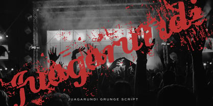 This extremely scratched and decadent font is suitable for posters of rock or grunge.
 - Ongunkan Old Turkic Yenisei by Runic World Tamgacı,
$50.00 The Yenisei Inscriptions consist of a total of 158 Turkish inscriptions, kurgans (graves) and rock stones that have been found along the Yenisei River, which passes through the Khakasya, Tuva and Altai Autonomous Republics in Russia. The inscriptions were written with Turkish Stamps, which we know as the Orkhon Alphabet. In addition, there are dozens of versions of the Turkish Runic script, apart from the Yenisei inscriptions and the Orkhon inscriptions. I will present the other versions here as soon as possible.


