905 search results (0.016 seconds)
  1. Vintage Stages by Ditatype, $29.00
    Vintage Stage is a gracefully designed script font that captures the essence of classic calligraphy with a modern twist. Crafted with a weight that is delicately balanced—not too thick nor too thin—this font offers a subtle elegance and a versatile appearance. The consistent sizing ensures that the font maintains a rhythmic flow, resembling traditional handwriting, but with the clarity and readability required in contemporary design. The relatively low contrast of the strokes further enhances the font’s legibility while maintaining a soft and approachable feel. One of the most captivating characteristics of Vintage Stage is the inclusion of swinging ends on select letters. In addition, enjoy the features here. Features: Ligatures Stylistic Sets Multilingual Supports PUA Encoded Numerals and Punctuations Vintage Stage fits in headlines, logos, posters, flyers, branding materials, greeting cards, print media, editorial layouts, and many more designs. Find out more ways to use this font by taking a look at the font preview. Thanks for purchasing our fonts. Hopefully, you have a great time using our font. Feel free to contact us anytime for further information or when you have trouble with the font. Thanks a lot and happy designing.
  2. Mono Tamene by Differentialtype, $10.00
    Mono Tamene is a cute and fun display font. You can use it for crafts, digital designs, presentations, or anything else, this font has a unique and friendly feel
  3. Dark Shade by Letterhend, $16.00
    Meet Dark Shade, the font that dares you to venture into the shadows where creepy and fascination intertwine. This font an aura of spine-tingling dread, perfect for instilling suspense but playful too in your designs. Whether you're channeling classic horror or crafting a display masterpiece, Nights Side versatility is your creative companion. Features : Uppercase & lowercase Numbers and punctuation Alternates & Ligatures Multilingual PUA encoded
  4. Balboa Shaded by Parkinson, $20.00
    Originally released as a Type 1 font, Balboa Shaded was refreshed (version2) and re-released as simple Open Type in 2013. Balboa is a contemporary display design. It draws elements and details from 19th-century British san serifs.
  5. Roman Shaded by URW Type Foundry, $35.00
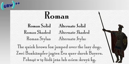
  6. Black Stage by RagamKata, $16.00
    Black Stage - Retro Serif Font Black Stage is a charming and eye-catching retro serif font. With a combination of an elegant serif style and a classic vintage touch, this font conveys a feel reminiscent of a bygone era but retains a timeless elegance. Features : - Ligatures & Alternates - Letters, numbers, symbols, and punctuation - No special software is required to use this typeface even work in Canva - Multilingual Support
  7. Sweden Funkis Outlined - Unknown license
  8. Sweden Funkis Straight - Unknown license
  9. Sweden Funkis Regular - Unknown license
  10. EF StarsN Spirals by Elsner+Flake, $35.00
  11. Student Council JNL by Jeff Levine, $29.00
    While Student Council JNL was not influenced by any school activities, the design is based on a lithographed cardboard sign (circa 1930s) for Spizz Sparkling Water, a bottled seltzer from the Dr. Pepper Bottling Company of Lexington, Kentucky. A squared letterform with angled semi-serifs, this Art Deco typeface grabs attention. Student Council JNL is available in both regular and oblique versions.
  12. Traffic Type Sweden by URW Type Foundry, $35.00
  13. Shaken, Not Stirred by Hanoded, $15.00
    Shaken, Not Stirred. A famous line from just about every James Bond movie (yes, we're talking Martini-time). The font is also quite shaken (and not stirred). It looks like someone scrawled something onto paper, or etched the letters in metal. Shaken, Not Stirred comes with a set of diacritics befitting a Secret Agent.
  14. Art Student JNL by Jeff Levine, $29.00
    Art Student JNL is a limited character set font inspired by hand lettering found on the box for a learn-to-draw set from the 1950s.
  15. Ongunkan Sweden Futhark by Runic World Tamgacı, $40.00
    Prior to 500 AD the 24-rune Elder Futhark was used in Sweden. From 500 AD until 800 AD there were many Futharks which were transitions from the 24-rune Futhark to one of the 16-rune Futharks. By the end of this period the 24-rune Futhark was completely out of use , and only 16-runes Futharks were in use. By 900 AD two different types of Shorttwigs-Futharks had been born. One was popularized in Norway and the other was used in the west (the British islands). By 1000 AD the adjustment of the runes to the Latin alphabet had begun, and several versions are found up until the Dalrunes, about 1700-1800 AD.
  16. Stan Bugs by Dingbatcave, $15.00
  17. Shade of Adelyne - Personal use only
  18. Avondale SC Shaded - Unknown license
  19. Action Man Shaded - Personal use only
  20. SF Chaerilidae Shaded - Unknown license
  21. SF DecoTechno Shaded - Unknown license
  22. SF RetroSplice Shaded - Unknown license
  23. Action Man Shaded - Unknown license
  24. SF Speakeasy Shaded - Unknown license
  25. SF DecoTechno Shaded - Unknown license
  26. SF Speedwaystar Shaded - Unknown license
  27. SF Speakeasy Shaded - Unknown license
  28. Avondale SC Shaded - Unknown license
  29. Sans Serif Shaded - Unknown license
  30. SF Speedwaystar Shaded - Unknown license
  31. SF Chaerilidae Shaded - Unknown license
  32. Should've Known Shaded - Unknown license
  33. Futura Shaded SH by Scangraphic Digital Type Collection, $26.00
    Since the release of these fonts most typefaces in the Scangraphic Type Collection appear in two versions. One is designed specifically for headline typesetting (SH: Scangraphic Headline Types) and one specifically for text typesetting (SB Scangraphic Bodytypes). The most obvious differentiation can be found in the spacing. That of the Bodytypes is adjusted for readability. That of the Headline Types is decidedly more narrow in order to do justice to the requirements of headline typesetting. The kerning tables, as well, have been individualized for each of these type varieties. In addition to the adjustment of spacing, there are also adjustments in the design. For the Bodytypes, fine spaces were created which prevented the smear effect on acute angles in small typesizes. For a number of Bodytypes, hairlines and serifs were thickened or the whole typeface was adjusted to meet the optical requirements for setting type in small sizes. For the German lower-case diacritical marks, all Headline Types complements contain alternative integrated accents which allow the compact setting of lower-case headlines.
  34. Stage Play JNL by Jeff Levine, $29.00
    Vintage sheet music for Earl Carroll's dramatic mystery-comedy production "Murder at the Vanities" has its title hand-lettered in the Art Deco style which served as the basis for Stage Play JNL.
  35. Friendly Shaded Sans by Greater Albion Typefounders, $16.00
    ‘FRIENDLY SHADED SANS’ is just what the name says. It’s a chubby and cheerful Sans Serif typeface that is ideal for poster work, headings and informal design generally.
  36. Stage Production JNL by Jeff Levine, $29.00
    A 1935 piece of sheet music entitled “(There’s A) Little Picture Playhouse in My Heart” had its movie-themed title hand lettered in a condensed Art Deco style with a few interesting character variations. The resulting digital type design is Stage Production JNL, which is available in both regular and oblique versions.
  37. Futura Shaded SB by Scangraphic Digital Type Collection, $26.00
    Since the release of these fonts most typefaces in the Scangraphic Type Collection appear in two versions. One is designed specifically for headline typesetting (SH: Scangraphic Headline Types) and one specifically for text typesetting (SB Scangraphic Bodytypes). The most obvious differentiation can be found in the spacing. That of the Bodytypes is adjusted for readability. That of the Headline Types is decidedly more narrow in order to do justice to the requirements of headline typesetting. The kerning tables, as well, have been individualized for each of these type varieties. In addition to the adjustment of spacing, there are also adjustments in the design. For the Bodytypes, fine spaces were created which prevented the smear effect on acute angles in small typesizes. For a number of Bodytypes, hairlines and serifs were thickened or the whole typeface was adjusted to meet the optical requirements for setting type in small sizes. For the German lower-case diacritical marks, all Headline Types complements contain alternative integrated accents which allow the compact setting of lower-case headlines.
Looking for more fonts? Check out our New, Sans, Script, Handwriting fonts or Categories
abstract fontscontact usprivacy policyweb font generator
Processing