1,352 search results
(0.007 seconds)
- Octin Sports Free - 100% free

- KR Winter Sports - Unknown license

- KR Sports Dings - Unknown license

- Candy Store BV - Unknown license

- Store Clerk JNL by Jeff Levine,
$29.00
- Sports Play JNL by Jeff Levine,
$29.00
- Record Store Stencil by Ian Farnam,
$10.00
- Sport OT Regular by T-26,
$19.00
- Corner Store JF by Jukebox Collection,
$32.99
- Good Sport JNL by Jeff Levine,
$29.00
- Moho Sport Pro by John Moore Type Foundry,
$36.00
- Ship to Shore by Design23,
$34.00
- Sports Jock JNL by Jeff Levine,
$29.00
- Sporting Life JNL by Jeff Levine,
$29.00 - Fty OLD SPORT by The Fontry,
$15.00
- Philly Sport Script by URW Type Foundry,
$35.00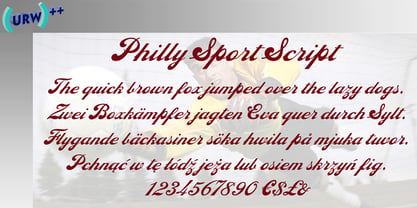
- Gans Sport Club by Intellecta Design,
$19.90 - Musical Score JNL by Jeff Levine,
$29.00
- Max Sport Futuristic by Sipanji21,
$15.00
- Department Store JNL by Jeff Levine,
$29.00
- Variety Store JNL by Jeff Levine,
$29.00
- Elite Sport Distressed by Alphabet Agency,
$10.00
- Sporting Event JNL by Jeff Levine,
$29.00
- Sport Shaded JNL by Jeff Levine,
$29.00 - Paint Store JNL by Jeff Levine,
$29.00 - Old Sport JNL by Jeff Levine,
$29.00
- Store Tags JNL by Jeff Levine,
$29.00
- Sporting Chance JNL by Jeff Levine,
$29.00
- KR Women In Sports - Unknown license

- Beverly Shores Script SG by Spiece Graphics,
$39.00
- Square Line Icons Sports by Howcolour,
$17.00
- MLB Red Sox - Unknown license

- NBA Bucks - Unknown license

- AS-VELASCA - Personal use only

- Allstar - Unknown license

- NFL Saints - Unknown license

- SF Collegiate Solid - Unknown license

- SF Collegiate Solid - Unknown license

- AlphaSports - Unknown license

- Varsity Regular - Unknown license


