7,302 search results
(0.016 seconds)
- Cover Up by Hanoded,
$15.00 Cover Up is a roughish font with a lot of character. Its edges are slightly jagged, there is no real baseline and it looks like the whole thing has been sand blasted. When you get to know Cover Up, you’ll find that it comes with a hidden agenda, because underneath the rough exterior lives an oh-so sweet heart. Use it for your product packaging, book covers and posters - it won’t disappoint you. Comes with an illegal amount of diacritics.
 - Breul Grotesk by Typesketchbook,
$55.00 Taking inspiration from an attempt to marry art with industry of Bauhaus (1919), Brueul Grotesk is classic and straightforward, cutting back superfluous elements. A Sans Serif type, it’s like a design from the Machine Age. It comes in A and B sets to offer end variations—choose the bulbous terminals set if you need a less stern impression. It is then suitable for diverse demands. Brueul Grotesk has A and B sets with 16 weights each, giving you an all-purpose usage typeface.
 - Cardigan Christmas by Aldedesign,
$25.00 Cardigan Christmas // Modern Calligraphy is a stylish script font that features a varying baseline, smooth line, modern, and depth of love. For those of you who need a touch of love and modernity for your designs or branding, it can be used for various purposes such as headings, weddings, invitations, signatures, logos, branding, t-shirt, letterhead, signage, labels, news, posters, badges, etc. Each Font Has: Stylish modern handwritten script Beautiful Swash (Ending tail) Beautiful Titling (Beginning tail) Special Ligatures Multilingual Support
 - Belastoria Script by Seniors Studio,
$19.00 Belastoria Script is a connecting script with a dancing baseline, which is designed to convey elegance and style. It is clean, feminine and friendly. This font works perfectly for logos, magazines, menus, books for children, invitations, wedding / greeting cards, packaging, labels, t-shirt etc. All designs will have a wonderful homemade touch with Belastoria Script. It offers a variety of features such as ligatures, swashes, endings, and many early forms alternately. To unleash your creativity, this font also supports multiple languages.
 - Montheim by Arterfak Project,
$24.00 Introducing Montheim, a vintage script font with medium weight. Inspired by modern retro movement and brush calligraphy, Montheim has many variations of alternates characters that you can mix and match, also with custom swashes (ligature) in the middle text and end swashes. Montheim complete with stylistic set gives more options to the layout. Montheim looks good in layout, vertical or horizontal and is the perfect choice for posters, logos, logotypes, insignia, storefronts, t-shirt designs, labels, flags, magazines, and other vintage design needs.
 - Brojeria by Maulana Creative,
$14.00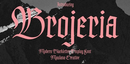 Bojeria is a Classic modern Blackletter font. With medium high contrast stroke and smooth edges, fun character with a bit of ligatures and alternates. To give you an extra creative work. Bojeria font support multilingual more than 100+ language. This font is good for logo design, Social media, Movie Titles, Books Titles, a short text even a long text letter and good for your secondary text font with sans or serif. Make a stunning work with Bojeria font. Cheers, Maulana Creative
 - Begonia by Grontype,
$14.00 Description: Begonia is an unique bold with curve and pointy edge style font, inspired from begonia flower that traditionally symbolic of uniqueness, harmony, gratitude, or caution, which is make this font has its own characteristic. Begonia is all-caps font equipped with extra ligatures and alternates. Begonia is perfect for branding, text header, t-shirt design, logotype and other stunning graphic design. Begonia Features: Uppercase glyphs Lowercase glyphs Numeral and Punctuations Currencies Standard Ligatures Stylistic Alternates Thankyou for choosing this font Regard, Grontype
 - Ratieka by Yukita Creative,
$12.00 Ratieka is a stylish, modern font that is perfect for use in fashion-related design projects. Its elegant letterforms make it ideal for branding and logo design, while its high level of legibility makes it perfect for use in websites, advertising, and other types of communication. Features. Supports all languages in the world (37) Versatile Single Font. One font for all needs. OTF File Ratieka is perfect for modern fashion brands or any projects that require a high-end feel.
 - The Brownies by DLetters Studio,
$14.00 The Brownies, is a Romantic lovely font with irregular stroke style. trendy and feminine style. It looks lovely for weddings, invitations, thank you cards, quotes, business cards, and more your creative idea. What's Included : Full Upper + Lowercase Glyphs Number + Punctuation Ligatures Alternates Glyphs, Beginning, Ending, and Swash PUA Encoding How to access alternate glyphs? you can see it on this link ( http://goo.gl/1vy2fv ) Thanks for your support, please kindly send us a message with any question about our product.
 - Deco Donut by Just My Type,
$20.00 On the very northern edge of South Tucson lies an Old Pueblo institution, Le Caves Bakery, Home of the Vegetable Donut. That’s what they were called when Le Caves opened; now you’d say Vegan Donut, or No Animal Products Used. Radical concept in the Brave New World of 1935. I started with the letters from their sign and extrapolated the rest of the font from those. Deco Donut Fat is extrapolated from Deco Donut. If you want a donut, type a 0 (zero).
 - Cafgone by Wildan Type,
$14.00 Cafgone is a modern display sans serif with modern and elegant style. This fonts is designed to pair harmoniously, and lend themselves to high end branding, logo designs, product packaging & invitation designs. With two fonts style (Regular and Oblique), Cafgone clean lines and subtle contrast give any project a touch of luxury and class. There are also decorative alternates and ligature available for uppercase letters and lowercase, so you can mix and match to add extra character and interest to logos and wordmarks.
 - Crate Pro by Kustomtype,
$25.00 Crate Pro is a brand-new stencil font with rounded edges and thick main strokes, all glyphs have been contemplated very carefully so that all characters match in a well-balanced and streaming way. In both shaped weights, the font suits extraordinary well for headings, slogans etc. The cleanly cut and powerful Crate Pro font can easily be used for logotype, games, prints, magazines, web, apps, packaging, posters, T-shirts, signage & design projects. The font is original and custom made by Kustomtype.
 - Keymer Radius by Talbot Type,
$19.50Talbot Type Keymer Radius is related to Talbot Type Keymer ; where Keymer is square-edged, Keymer Radius is subtly rounded for a softer look. Keymer Radius mixes geometric and humanist traits to achieve a modern, clean, elegant appearance. It is a legible and versatile text and display face available in six weights. Keymer Radius features an extended character set to include old style numerals, accented characters for Central European languages and bespoke characters in the italic for a more flowing look. - Brittania by Atharuah Studios,
$18.00 Introducing the Brittania! Classic script font that shows beauty and balance in every letter that is displayed. The font files include uppercase, lowercase, numbers, punctuation, and multilingual support. Brittania also adds a beginning and ending swash to beautify each of your projects. You can access it in every lowercase alternative. That's it! I hope you enjoy it. Feel free to comment if there are issues or queries. You can also say hello to me on Instagram: https://www.instagram.com/atharuah_ Thank You!
 - Linotype Bariton Paneuropean by Linotype,
$92.99Linotype Bariton is part of the Take Type Library, chosen from contestants of Linotype's International Digital Type Design Contests of 1994 and 1997. Designer Alexei Chekulayev designed his font in one weight to mirror the Zeitgeist of the early 1930s. The characters of this extremely bold font are based on the form of a rectangle though its rounded edges soften its look a bit. Linotype Bariton should be used only in larger point sizes in headlines which should really catch the eye. - Accord Alternate by Soneri Type,
$48.00 The main difference between Accord Alt and Accord is in the way curved strokes join with vertical stems in letters such as “bpn”. The Italics are designed at an italic angle of 10 degrees. All the letter forms have been kept similar while designing italic instead changing the form e.g. 'a' remains same double story in italic also instead changing it to single story. The intention is to keep it simple and neutral which helps communicate the corporate sense of professionalism.
 - Valentia by Eurotypo,
$59.00 Valentia is an elegant font, casual and readable, this new script typeface is based on Copperplate style. Valentia has been drawn with spontaneous strokes and slightly contrasting thicknesses.The capital letters are full of expressiveness, with very dynamic "ductus" and linked ends, which allow to decorating with subtle and finishing touch. Contains small caps and titling. Decoration variables with its own terminal forms and initial forms. You can use Standard and discretionary ligatures, swashes, stylistic and contextual alternate, old style figures, CE languages andornaments.
 - Popsmart by Bogstav,
$14.00 Popsmart means "smart or skilled in a superficial, self-righteous or annoying way" - but when I was young in the 1980ies, it was a positive thing to be popsmart. At least in Denmark! :) Anyway, I find this font to be smart in a positive way: It has a bouncy appearance ( with help from the Contextual Alternates, the font cycles the 6 different versions of each letter!) and a "go-ahead-and-type-anything-and-it-will-end-up-looking-good" kinda vibe.
 - Happy Easter by Trim Studio,
$15.00 **Happy Easter **A cute script font that's perfect for Easter-themed moments is whimsical and playful. It has flowing, organic lines that resemble the curves of an Easter egg or the curling petals of a spring flower. The letters are so airy, with a gentle bounce that gives them a sense of movement and liveliness. --- File Include: - Readme.pdf Thank you for let us be your design partner, If you have any questions please don't hesitate to drop me a message
 - Sopi by Tipo,
$40.00 Sopi is a typography of ornaments, borders and combined frames. It was inspired by the design of limestone tile floors, located in different places in Buenos Aires. All characters have the same measure, which enables the possibility of any desired combination. In the case of edges or combined frames, the typography was programmed in a way that is possible to generate textures with 2 or more colors, attempting to rescue the colorful designs that were original thought in the limetone tile floor.
 - Byronic by Alan Meeks,
$30.00 Byronic is soft modern sans-serif but with an antique style lower-case. The rounded end soft look gives Byronic a friendly soft look whilst still retaining a classical typographic appearance. A very clean style and slightly condensed it is excellent for text setting and headline with an unusual loser case that compliments the caps perfectly. Available in a range of 5 weights and 5 italics and a Latin Pro character set of 430 characters including ranging numerals and small caps.
 - Nantua by Characters Font Foundry,
$- Nantua is inspired by the Russian Constructivism from the early 1920s. Artists like Aleksandr Rodchenko used typography as forms. Nantua can be used with that very same principal. It's a very geometrical display font with hard edges. Used in big sizes it is very 'in your face'. Used in small sizes it tends to work like a compact background pattern. With very small inner forms, Nantua needs to be used in big sizes to be legible. It's preferably seen on posters or flyers.
 - Polias by Esintype,
$23.00 Polias is an all-caps uniwidth typeface inspired by an ancient inscription carved on a monoblock stone in hybrid characters — between no-contrast linear sans to low-contrast flared serif. The inspiring inscription is the dedication by Alexander the Great, discovered in the Temple of Athena Polias in the ancient Ionian city of Priene. Stanley Morison mentioned this inscription in one of his lectures: “The distinctive feature of this inscription consists of a consistent thickening towards the ends of perpendiculars and horizontals.” … “We have not the right to say that the serif was invented for Alexander the Great's inscription, only that this is its first datable appearance.” The letter proportions are almost identical to the original, but the stroke features have been reinterpreted and characterized. Serif-like nodes at the end of the strokes are subtle extensions that serve to accentuate rather than break its monoline elegance. With an analogy, they are not flowers, but like blooming buds. Polias is a flared sans typeface which is closer to sans-serif forms on the spectrum between sans and serif. It’s especially light looking by design to convey rather thin and white typographic color of its original monumental look. It comes in eight weights and a variable font, scaled from Thin to Bold. It is multiplexed, so the weights do not affect text lengths. Light weights are closely based on the actual carving of the inscription. Thicker weights can be used on smaller typesettings to compensate for the weight difference of larger letters’ strokes, and to keeping the monoline appearance of the entire text block intact. This method can be used for any purpose, such as setting a hierarchy between the lines or to justify their lengths. Some of the original letterforms have been preserved and stylistic alternatives such as Ionic four-bar Sigma, dotted Theta, palm Y are provided as open type feature. Some of the other ancient forms, such as the three-bar Sigma (S), the pointed U, were also added for both the Greek and Latin scripts. Polias is preferable for big type settings such as logos and headlines as a modern representation of perennial classical forms. Its a fine fit for product branding, movie posters, book covers, packaging materials, and more, which require an epic look to attracting attention with a distinctive elegance. Polias can be considered for distinctiveness wherever Roman Capitals work. As a noun, Polias is one of the epithets of Athena / Minerva, and in this case referring to her role as the protector of the city of Priene. Polias is one of the seven typeface designs in Esintype's ancient scripts of Anatolia project, Tituli Anatolian series.
 - Polias Varia by Esintype,
$140.00 Polias Varia is an all-caps uniwidth variable weight typeface inspired by an ancient inscription carved on a monoblock stone in hybrid characters — between no-contrast linear sans to low-contrast flared serif. The inspiring inscription is the dedication by Alexander the Great, discovered in the Temple of Athena Polias in the ancient Ionian city of Priene. Stanley Morison mentioned this inscription in one of his lectures: “The distinctive feature of this inscription consists of a consistent thickening towards the ends of perpendiculars and horizontals.” … “We have not the right to say that the serif was invented for Alexander the Great’s inscription, only that this is its first datable appearance.” In Polias Varia, the letter proportions are almost identical to the original, but the stroke features have been reinterpreted and characterized. Serif-like nodes at the end of the strokes are subtle extensions that serve to accentuate rather than break its monoline elegance. With an analogy, they are not flowers, but like blooming buds. Polias Varia is a flared sans typeface which is closer to sans-serif forms on the spectrum between sans and serif. It’s especially light looking by design to convey rather thin and white typographic color of its original monumental look. It comes in eight weights and a variable font, scaled from Thin to Bold. It is multiplexed, so the weights do not affect text lengths. Light weights are closely based on the actual carving of the inscription. Thicker weights can be used on smaller typesettings to compensate for the weight difference of larger letters’ strokes, and to keeping the monoline appearance of the entire text block intact. This method can be used for any purpose, such as setting a hierarchy between the lines or to justify their lengths. Some of the original letterforms have been preserved and stylistic alternatives such as Ionic four-bar Sigma, dotted Theta, palm Y are provided as open type feature. Some of the other ancient forms, such as the three-bar Sigma (S), the pointed U, were also added for both the Greek and Latin scripts. Polias Varia is preferable for big type settings such as logos and headlines as a modern representation of perennial classical forms. Its a fine fit for product branding, movie posters, book covers, packaging materials, and more, which require an epic look to attracting attention with a distinctive elegance. Polias Varia can be considered for distinctiveness wherever Roman Capitals work. As a noun, Polias is one of the epithets of Athena / Minerva, and in this case referring to her role as the protector of the city of Priene. Polias (family) is one of the seven typeface designs in Esintype’s ancient scripts of Anatolia project, Tituli Anatolian series.
 - MGN Debris by Morgana Studio,
$17.50 This design is characterized by its futuristic and modern aesthetic. The clean lines and minimalist approach create a sleek and sophisticated look, while the unique touches and use of the MGN Debris font give it a bold and edgy vibe. It is a perfect example of how a modern design can also be unique and innovative, with elements that set it apart from traditional designs. This style is perfect for businesses and organizations that want to convey a sense of innovation and cutting-edge technology. The MGN Debris font used in this design adds to its modern and futuristic feel. The font is bold and sharp, with a unique style that makes it stand out. It complements the overall design perfectly and adds to the edgy and unique vibe. This font is perfect for businesses and organizations that want to convey a sense of innovation and forward-thinking, and it pairs well with modern designs. Overall, this design is a great example of how a modern and futuristic style can be unique and captivating, with the use of the MGN Debris font adding an extra element of boldness and edge.
 - Down Home JNL by Jeff Levine,
$29.00 In the October 31, 1920 edition of Wid's Daily (the predecessor to The Film Daily), a block of ad copy from a 1920 film called "Down Home" had the text printed in such a fluent pen-lettered style that a bit of a shortcut was used at the beginning of the design process for this typeface. Normally, font inspirations are redrawn [and not by simply using auto-trace] except under specialized circumstances like this one where that feature is a help, rather than a replacement for the creative process. The entire block of text copy was auto-traced, then the necessary letters were selected from the available wording and cleaned up to remove any sharp points and irregular curves in an effort to make the end results as close to the original and unusual hand-drawn text. From there the missing characters needed to produce a finished type font were created utilizing the standard methods of drawing and font construction. The end results turned out very well. Using the film's title as its namesake, this design is now available digitally as Down Home JNL in both regular and oblique versions.
 - Beast Energy by Ditatype,
$29.00 Beast Energy is a brush-copying-script font in letter designs having uneven edges as its artistic and organic characteristics. This brush script font can express dramatic, fun impressions through its capital letters making the brush wipe details clearer. The edges will look wider and thicker on certain parts of the letters. The color applications in this brush script font will also give amazing, artistic effects. For example, brighter colors will live up the letters, while darker ones will have dramatic and mysterious effects. Above all, you need to make sure the letters remain legible even in bigger text sizes. Furthermore, you can enjoy the available features here. Features: Multilingual Supports PUA Encoded Numerals and Punctuations Beast Energy fits best for various design projects, such as brandings, quotes, printed products, merchandise, social media, etc. Find out more ways to use this font by taking a look at the font preview. Thanks for purchasing our fonts. Hopefully, you have a great time using our font. Feel free to contact us anytime for further information or when you have trouble with the font. Thanks a lot and happy designing.
 - Boxy by Hackberry Font Foundry,
$24.95 In my on-going quest for display fonts to be used with my books and on my book covers, I decided I need a squared sans serif. I started the build off of Fiscal, a font I designed back in 2006. I never liked the font, plus my tastes have changed. So, I opened it, made it narrower, increased the x-height, and various stuff like that. I made it much heavier—an ended up with Boxy. Then my brain slapped me and said, "Why don't you make a sorta modern version?" So, I did and decided to call that style Chic. But then I wanted a thin version also. Fiscal was always too heavy and ponderous for me. So, I made the Thin style. Finally, I felt I needed an italic of Chic. OpenType features didn't seem to work well with the family, so all I added was oldstyle figures. So, I ended up with another of my unique families—with two unmodulated fonts: Thin and Medium, and two modulated fonts: Chic and Chic Italic. But, I'm pleased with it. My hope is that you will like it also.
 - Sophia Honey by Bungletter,
$12.00 Sophia Honey is one of the modern calligraphy fonts that comes with a beautiful style that connects in the middle of the heart, designed with high details to present a luxurious style. Sophia Honey includes a complete set of beautiful upper and lower case letters, numbers, punctuation, ligatures and multilingual. All lowercase letters including the beginning and end of the swash, give it a luxurious handwriting style. Classic style is very suitable to be applied in various formal forms such as invitations, labels, restaurant menus, logos, fashion, make up, stationery, novels, magazines, books, greeting / wedding cards, packaging, labels or all kinds of your needs. . . Attention! -Has 6 styles of connecting hearts in the middle. -Has 8 start and end swash styles. To use beautiful applications, you need a program that supports OpenType features such as Adobe Illustrator CS, Adobe Photoshop CC, Adobe Indesign, and Corel Draw. How to access all alternative characters using Adobe Illustrator: https://www.youtube.com/watch?v=XzwjMkbB-wQ How to access all alternative characters, using the Windows Character Map with Photoshop: https://www.youtube.com/watch?v=Go9vacoYmBw If you need help or have any questions, let me know. I'm happy to help. Thanks & Happy Designing!
 - Type Tiles JNL by Jeff Levine,
$29.00 Type Tiles JNL is based on a ‘completed’ version of ‘Alpha-Blox’ by American Type Founders, circa 1944. The capitals, lower case and numerals shown in the sample sheet put out by ATF depicted type made with five-high blocks comprised of modular units spaced two points apart. These units could be combined in varying ways to create custom type of varying heights and widths and was available for purchase in both linear (multi-line) and reverse (white on black) formats. Using the 'reverse' model shown on the sample sheet, all of the characters were re-created digitally, and missing punctuation, foreign characters and other glyphs found in a basic computer font were drawn and added. The 'J' and 'T' in the type sample had truncations, so a more complete character was created for each of those letters. For those wanting an unbroken string of words or blank end caps, there is a double column space on the vertical bar key. A single column space is located on the broken bar key for shorter end caps. Type Tiles JNL is available in both regular and oblique versions
 - Aprilis by Eurotypo,
$34.00 Are you looking for a new casual and organic script font? Please, take a look to the Aprilis! In times of early Roman calendar, "Aprilis" followed and preceded "Martius" "Maius" when spring came, was green nature and flowers burst into colours to greet the sun. And Aprilis font was conceived in April... The Aprilis font is the perfect blend of elegant and casual. (It is best used in OpenType-aware software). With the total number of 625 glyphs, is equipped with plenty of OpenType features. Uppercase letters can alternate between at least two different forms and lowercase letters have leastways four choices more to avoid repetition. These effects include start and end forms of lowercase letters, which are automatically substituted in at beginnings or ends of words. To activate the optional glyphs you may click on Swash, Contextual, Standard Ligatures, Stylistic or Discretionary Ligatures buttons in any OpenType savvy program or manually choose the characters from Glyph Palette. Also, there’s a set of 50 ornaments designed to support the font (access the ornaments through the Glyph Palette). The Aprilis font might be the choice to use on creating headlines, logos & posters for branding and packaging purposes. Hope you enjoy.
 - Praxis by Linotype,
$29.99 Praxis™ was designed in 1976 by Gerard Unger for the German technology corporation Dr.-Ing Rudolf Hell. Praxis is the sans serif counterpart to Demos, another early digital type designed by Unger, who is an accomplished Dutch typographer and teacher. Praxis and Demos share important characteristics, such as open counters, a tall x-height, and blunt stroke terminations. Both faces have very little thick/thin variation, which facilitates smooth linear enlargement and reduction. And like Demos, Praxis is a flexible and legible typeface that works well in small point sizes and on low-quality paper (office documents, newsletters, newspapers, etc.). The word "Praxis" comes from Greek, and means "a practical application." In the late 1990s, Demos and Praxis, along with Univers 57, were selected as the official typefaces of the German Government. More info. In 1990, Linotype AG merged with Dr.-Ing Rudolf Hell GmbH, forming the Linotype-Hell AG (today Linotype GmbH). Since then, Linotype has been the official source of all fonts that were originally designed for the Hell Corporation. Linotype has also improved the typefaces using new technologies, including OpenType."
 - Sweet Blues by Zamjump,
$17.00 Sweet Blues Monoline Script is a signature font that you can use to make a design for Photography logo, logo branding, poster headline, magazines, advertisements, product designs, wedding invitation, signature or handwritten quote, business cards, fashion, . Sweet Blues Monoline Script font including alternates, 15 ligatures and includes textured swashes. Enable the OpenType Stylistic alternates, you need a program that supports OpenType features such as Adobe Illustrator, Adobe Indesign, Adobe Photoshop, CorelDraw & Microsoft Office. a font that made the hand by having the character up and down like a dancer. Freestyle has a very unique style of signature, it is very suitable for use in the work of modern design. Alternative ending character you can use character + underscore ( a_ ) = ending a with swash to open ligature just tap double character [ l l = ll (ligature)] Features: Basic Latin A -Z and a – z Number International Symbol International glyphs Alternate Ligature Languages supported: Breton, Catalan, Czech, Danish, Estonian,French, German, Hungarian, Icelandic, Italian, Romanian, Scottish Gaelic, Slovak, Latvian, Lithuanian, Norwegian, English, Finnish, Polish, Portuguese, Slovenian, Spanish, Swedish, Turkish, Welsh. Basically, all european languages that are based on latin alphabet.
 - Verali by Gilar Studio,
$16.00 This font is a feminine modern handwritten font is made in a modern style with a very beautiful beginning and ending, elegantly, very casual and suitable for your various design needs. carefully handcrafted to become a true favorite. Its casual charm makes it appear wonderfully down-to-earth, readable and, ultimately, incredibly versatile. Verali will look outstanding in any context, whether it’s being used on busy backgrounds or as a standalone headline! I'ts Perfect for logo, branding, tittle, social media posts, advertisements, product packaging, product designs, label, photography, watermark, special event, magazine, web design, etc. Features : Uppercase & Lowercase Numerals & Punctuations (OpenType Standard) Accents/Multilingual characters beginning and ending swash (ss01-ss03) beautiful ligature PUA Encoded To access all OpenType Stylistic alternates, you need a program that supports OpenType features such as Adobe Illustrator, Adobe Photoshop, CorelDraw and Microsoft word. The font has PUA Unicode (Private Use Areas - font specific code), so that all the alternative characters (with flourishes and swirly lines) can be easily accessed in full through Windows and Mac and you can load them into applications such as Cricut Design Space and Silhouette Studio. Check my other Font here : https://gilarstudio.com/ Gilar Studio
 - Kira by Eurotypo,
$35.00 Kira is a modern hand-painted script with an irregular baseline. Rough edges and imperfect lines give to this brush font a unique and trendy look. All glyphs have been carefully painted giving your words a wonderful flow. Fat and thin stroke in this font impresses the harmony. Want to give your projects an organic, hand-painted look? Kira font contains 717 glyphs, with inky lines, and “perfect or imperfect” painted edges, including a few extra character alternates, stylistics and contextual alternates, swashes, stylistics sets, ligatures for a genuine hand-lettered effect. This font includes OpenType features that may only be accessible via OpenType-aware applications, a Central European language support. To activate the optional glyphs you may click on Swash, Contextual, Standard Ligatures and Discretionary, Titling, or Stylistic sets buttons in any OpenType savvy program or manually choose the characters from Glyph Palette. Bonus: 40 useful ornaments and a lot of catchwords that you use for the most demanding design project! Kira looks lovely on wedding invitations, greeting cards, logos, business cards and is perfect for using in ink or watercolour based designs, fashion, magazines, food packaging and menus, book covers and more!
 - Tiverton by Adam Fathony,
$15.00 The idea behind this typefaces was to combine something retro and vintage with a style of this century. A reference from Vintage Typography, Art Deco, Neo Deco. With an improvised and create something in between those styling. Tiverton created in Serif, Sans-Serif and Script. Within 3 Style, it more helping and easier for create something without "thinking" the font compartment. Features of Sans Serif and Serif are comes with stylistic alternates and you can activated with Contextual Swash button on Adobe Illustrator or Adobe Photoshop, And Catchword such as the preview above, activated with underscore in the beginning and end of the letters, for example : _ the _ (underscore)the(underscore). Features of Tiverton Script are Ligatures, Contextual alternates, Contextual Swashes. no alternates. but Tiverton Script available with 2 Weight, Light and Regular. For a bonus, I create an Ornament Fonts. Special shout for the ornament fonts are for the borders. on the Number Character 0-9 are created for connected borders. for Beginning and end the lines you can press Shift on the Number Character. For example : type !2222@ on the text preview below and see on the Tiverton Ornament.
 - Sucesion Slab - Personal use only

- Sabática - Personal use only

- Kontext Dot by Elster Fonts,
$20.00 Imagine a font that is easier to read the smaller it is – or the further away the text is. There are already many rasterised fonts, I wanted to take it to the extreme and use as few dots as possible. The result is a typeface that lives up to its name. Each individual circle makes no sense on its own; individual letters are only recognisable in the context of all associated circles, individual letters are most likely to be recognised in the context of whole words. Attached to a building wall, text would be readable from a great distance and become increasingly difficult to decipher the closer you get to the building. Placed on the ground or on a large flat roof, text would only be readable from a higher building, an aeroplane or - depending on the size - in Google Earth. Kontext has old style figures, superscript numerals, case-sensitive questiondown and exclamdown and an alternative ampersand, 390 glyphs at all. Use the same value for font size and line spacing to keep the lines in the grid, or change the line spacing in 10% steps. Change the spacing in 100-unit increments to keep the grid. The numbers in the family- and style-names refer to the (ca.) grey value of the respective background and the font itself. Kontext Dot 00-33 has e.g. a white background (0%) and 33% grey value. Kontext Dot 66-33 has a 66% background and 33% grey value. »Positive« styles (first number smaller than the second number) have kerning, »negative« styles (first number bigger than the second number) can have none.
 - Knight Souls by Ditatype,
$29.00 Knight Souls is a captivating display font inspired by epic medieval adventures. Designed in uppercase, this typeface captures the spirit of heroic quests with its bold and commanding style. The consistent letter proportions of Knight Souls create a sense of balance and harmony throughout the font. This design choice guarantees that every character fits seamlessly together, resulting in a typographic composition that exudes strength and resilience. With sharp endings, Knight Souls adds an element of dynamism and edge to the font. Each letter is defined by precise angles and sharp corners, evoking a sense of power and determination. This feature lends a bold and assertive quality to the font, reflecting the courage and bravery of knights on epic quests. High letter contrast in Knight Souls emphasizes readability and visibility. The distinct difference between thick and thin strokes enhances the visual impact of each character, making them easily distinguishable and captivating to the eye. The high contrast design adds depth and intensity to the font, making it stand out in any game-themed design. You can also enjoy the available features here. Features: Multilingual Supports PUA Encoded Numerals and Punctuations Knight Souls fits in headlines, logos, posters, titles, branding materials, print media, editorial layouts, website headers, and any projects that aim to transport players to a world of valor and fantasy. Find out more ways to use this font by taking a look at the font preview. Thanks for purchasing our fonts. Hopefully, you have a great time using our font. Feel free to contact us anytime for further information or when you have trouble with the font. Thanks a lot and happy designing.

