839 search results
(0.014 seconds)
- Rose Marie by Scratch Design,
$10.00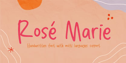 Rose Marie is a beautiful handwritten font, support with multi-languages. This font has a cute modern style that is perfect for your branding design, and will also be very beautiful in your wedding invitations, diary quotes, youtube text, movie titles, Instagram, and business cards. Rose Marie should make your designs instantly look beautiful, original, and amazingly! So enjoy this font and make some cool stuff!
 - Thursday Afternoon by Bogstav,
$15.00 Nothing is as it really should be with Thursday Afternoon. The x-height is jumpy, letters are not in their right places, lines are crunchy, serifs are uneven...the list goes on...but in the end, Thursday Afternoon turns out as a legible and functional font. It has most of the moves from classic serif fonts, but then again it has a mind of its own!
 - Bendigo by ITC,
$29.00The lively calligraphy font Bendigo was created by Phill Grimshaw in 1993 and looks as though it were written by an energetic hand. Generous capitals fit harmoniously with more reserved lower case letters and the right slant of both emphasizes the dynamic feeling of the font. Bendigo should be used in point sizes of 14 or larger and its strong character makes it particularly good for headlines. - Chwast Buffalo by Linotype,
$29.99Seymour Chwast designed the fun font Chwast Buffalo in 1981 and gave it his name. Its extremely robust figures are rendered in regular, even strokes, significantly reducing the inner white spaces. The typeface should therefore only be used in large and very large point sizes. A distinguishing characteristic of Chwast Buffalo is its half-circle serifs, which give the forms a technical, constructed appearance. - Tapir by HVD Fonts,
$26.00 Searching for the Exceptional Designing Tapir was driven by the search for a display typeface which is doing something different than the rounded and bouncy fun faces – the letterforms should stand out with a slight touch of weirdness, creating attention and recognizabilty. A big character set, optimized spacing & kerning and lots of features make Tapir a good choice for professional usage between games, toys and skateboards.
 - After Nightfall by Hanoded,
$10.00 After Nightfall is a handmade fairytale font. It was called Bunting Nook first (after a spooky story of a black dog that haunts a town in Britain), but I figured it was a bit of a weird name, so I settled for After Nightfall. This font comes with some lovely swashes, which should be used sparingly. But that, of course, is entirely up to you.
 - Ps Willy by Fontopia,
$13.99 Willy is a typeface with a wink. This display font is based on existing piquant form from the immediate vicinity. It is sexy, if you have an eye for. But it also should not be taken too seriously, especially because it has a humorous slant. The font has its origins in an art project. It is now made available for design around festifals, parties, invitations, etc.
 - Restoe Bumi by HansCo,
$15.00 Restoe Bumi is a Luxury Handwriten that is luxurious in a casual and distinctive style that is perfect for your branding design, and will also be very beautiful in your wedding invitations and business cards and especially for your brand name logotype. This one should make your designs instantly professional and amazingly! Be a perfect professional in a minute and start creating with this font today! Enjoy
 - Halima Sofira by HansCo,
$15.00 Halima Sofira is a Luxury Handwriten that is luxurious in a casual and distinctive style that is perfect for your branding design, and will also be very beautiful in your wedding invitations and business cards and especially for your brand name logotype. This one should make your designs instantly professional and amazingly! Be a perfect professional in a minute and start creating with this font today! Enjoy
 - Laura by ITC,
$29.00Laura is the work of British designer Tony Watson, a brush style typeface with an effective three-dimensional look. The forms are a little more formal than those of many other brush style typefaces but this only adds to its flexibility. Capital and lowercase letters should be set closely. Laura is well-suited to a variety of uses, wherever a strong, eye-catching typeface is needed. - Dead Rite PB by Pink Broccoli,
$14.00 A beefy unicase flare serif typeface inspired by a Frank Kane pulp paperback of the same name. Dead Rite is filled with awkward comic personality, mixing Capital and lowercase forms into a pseudo-unicase format that is a joy to play. A dangerous temptress, with large scale easily legible letterforms, this typographic conundrum is waiting for you to solve how it should be used for your designs!
 - Augustea Open by ITC,
$29.00Augustea was designed by Alessandro Butti and Aldo Novarese and is one of the most popular classical, monumental letterforms featureing a stone cut effect. This font is based on the classic proportions of Capitalis, which dates back to the first century AD during the reign of Augustus. It should be set with a widely spaced bias. Augustea is distinguished by its balanced, classic and majestic image. - Linotype Ergo by Linotype,
$40.99Ergo is a relatively new font oriented on the form philosophy of Univers and Frutiger, namely, that a font which the eye should see as correct cannot be constructed. The eye tends to enlarge horizontals and to perceive verticals as weaker, and the stroke differences of Ergo are therefore designed to accommodate this tendency. Ergo makes a dynamic and modern impression and is extremely legible. - Cabarga Cursiva by ITC,
$29.00Cabarga Cursiva is the work of the father and son team of Demetrio E. Cabarga and Leslie Cabarga, both New York designers. The details of the sharp strokes almost give the impression of a knife blade, whether straight or curved like a scimitar. The capitals should be used only as initials and are complemented by a robust lower case alphabet as well as alternate forms and ligatures. - Foreman by Anthony Prudente,
$15.00 This typeface is inspired from the old display fonts that used to decorate the world around us, but just because we don't see such beautiful signage these days, doesn't mean we should lose the great typefaces used. Foreman is a condensed serif display typeface, with hard geometric lines inspired from fonts used in the 1930s and 1940s, and very much used by the American Art Deco movement.
 - Hoyer Script by RMU,
$30.00 Hoyer Script™ is a fresh redesign of Hans Hoyer’s Schoenschrift, a slender vintage italic with a calligraphic touch. This font should be used like my blackletter fonts. It means that the s-key is occupied by the long s, and the round s lies on the #-key. By typing N, o, and period plus activating Ordinals feature you will get an old-style number sign.
 - Astopher by HansCo,
$15.00 Astopher was inspired by urban script fonts. With its modern script style, this font will be suitable for various projects, for example: quotes, blog titles, branding, logos, fashion, invitations, greeting cards, posters, business cards, clothing, letters, stationery, and more. This one should make your designs instantly professional and amazingly! Be a perfect professional in a minute and start creating with this font today! Enjoy!
 - Capsule by Eclectotype,
$40.00 Capsule is a reverse-stress, high-contrast, rounded sans-serif font with two distinct personalities. An all-caps face, there are however variations of some letters in the lowercase slots. The lowercase variants are more playful, with more bulbous elements that riff on phototype faces like Amelia and Data 70, but all can work together and be mixed and matched to your heart's content. Capsule boasts a bunch of esoteric discretionary ligatures to play around with, and stylistic alternates for 4, 7 and £. The language support is extensive enough to set essays in most Latin-based languages, even though that's the last thing you should be doing with this font! Capsule should be set large. The fit is tight and the kerning is aggressive. It's not what you'd call a workhorse, but Capsule is an All-Caps you'll (see what I did there?!) want to use for impactful headlines, cutting edge logos and post-modern layouts.
 - Hypnotique by Comicraft,
$19.00 Do we have a volunteer from the audience! Yes, you young lady, step into the ring, there's no need to be afraid! What's your name? Hypnotique? How appropriate! Now, don't turn away, look into my eyes, look into my eyes, the eyes, the eyes, not around the eyes, don't look around my eyes, look into my eyes, aaaannnndd you're under. And on the menu of mesmerism tonight is a waking dream of letterforms that will keep you on the threshold of consciousness and yet illuminate your every hypnagogic hallucination! Now that we have your focused attention and reduced your peripheral awareness you have an enhanced capacity for response to the suggestion that you should not only purchase this font, but our entire library of fonts. On the count of three you will wake up and you will think of nothing else but acquiring all the tools all good graphic designers should have in their font library. And all we had to do was snap our fingers.
 - Deco Sans by Alan Ronn,
$30.00This font was created while looking at the various shapes my handwriting consistently took, especially in the ways that letters would have breaks in them. Over the course of a few months I continually tweaked the letter forms and shapes, and lo and behold, I developed Deco Sans. This family currently only includes a thin weight, as I'm only one person, and very busy with college. I'm continuing work on a regular, bold, and possibly a future italic weight, but these may not be released for many months to come. As this is a very thin font, it should be used at sizes no smaller than around 16 or 18pt as it tends to get lost in whitespace, and looks best at large sizes. As such, this weight should be considered more of a display font than a text font, however, I predict a regular weight to be very readable and much more useable for the everyday. - Fortunate by PizzaDude.dk,
$20.00 I wanted to make something suitable as a bookcover for a something romantic or adventurous - or perhaps even both. As the proces continued, I found that the font was suitable for even more than that. You can easily use Fortunate for your postcards, invitations, menus, posters and many other things. You shouldn’t even be afraid to do your projects in foreign languages, because Fortunate is loaded with international characters. Besides that, every letter has got 5 different versions that automatically cycles as you type. Now that’s something enchanted!
 - Cobalt 27 by Lee Iley,
$29.00 A typeface based on early Constructivism Design and Early 20th Century Type form the Modernist Movement. Cap Height for the font has been extended to represent early 20th century typography more closely, while rounded shoulders add a contemporary, modern feel, allowing the design to bridge both centuries. Cobalt Bold works best for headers and titles, while Cobalt Medium and Regular lend themselves to body text. Cobalt Text has smaller Cap Heights, Ascenders, and Descenders, and has been designed where smaller leadings in a body of copy is needed.
 - Korb by JCFonts,
$30.00 Korb is a rounded sans serif family of four styles. It features a narrow geometric construction inspired by DIN letter shapes along with more unusual details like open counters and smooth connections between shoulders and stems. This makes the family suitable for a variety of applications, from corporate design to signalization. The fonts, provided in OpenType format, include diacritics for most European languages, a set of arrows and a variety of OpenType features like stylistic alternates, case-sensitive forms, tabular figures, etc. Check the pdf specimen in the gallery tab for more info.
 - Cake Frosting - Unknown license

- DF Etalage Script by Dutchfonts,
$33.00 Etalage Script was drawn for the first time in the year 2000, based on a early 20th century lettering stencil with what farmer Boelema at Lalleweer stenciled his grainsacks. Eventually the script letter was developed as a typeface with a wink to the ‘lost’ display types for the ‘display window’ of graphic designer Ariënne Boelens, who in exchange made the website www.lalleweer.nl. What originated the Ariënne should be evident now.
 - F2F HogRoach by Linotype,
$29.99The Techno sound of the 1990s, a personal computer, a font creation software and some inspiration had been the sources to the F2F (Face2Face) font series. Thomas Nagel and his friends had the demand to create new unusual faces that should be used in the leading german techno magazine Frontpage". Even typeset in 6 point to nearly unreadability it was a pleasure for the kids to read and decrypt the messages." - Munchkin Land NF by Nick's Fonts,
$10.00This typeface bears a superficial resemblance to Belwe Extrabold, but is based on a work called Thor, issued by Frederic Wesselhoeft Ltd of London in the 1930s. The characters in this font are loosely spaced for use in attention-getting subheads, but you can tighten the tracking to get spectacular headlines, should you wish. Both versions of the font include 1252 Latin, 1250 CE (with localization for Romanian and Moldovan). - Volut by jpFonts,
$19.95 Volut is a very charming display font designed by Christoph Ulherr. The family comes with four design variations as Base, Blocks, Outline and Outline Blocks. It’s touching and kissing characters create an outstanding sex appeal. Volut invites you to play and have fun, just try it. It should only be used in large point sizes beyond 24pt. All fonts include stylistic alternates and special ligatures to guarantee the best typographic quality.
 - Rotenfold by HansCo,
$15.00 Rotenfold is a Elegant yet Luxury Handwriten that is luxurious in a casual and distinctive style that is perfect for your branding design, and will also be very beautiful in your wedding invitations and business cards and especially for your brand name logotype. This one should make your designs instantly professional and amazingly! Be a perfect professional in a minute and start creating with this font today! Enjoy
 - Ramadan Elegant by Marmara,
$23.00 If you are a graphic designer, magazine editor, fashion stylist, industrial designer, publisher, printer or have a creative business, this font is for you, I believe it is a font that should be in your font folder for all your work.. Make awesome logotypes; When you write any word, it almost gives a logotype effect, I enjoyed working on it very much, I'm sure you will like it too...
 - F2F Screen Scream by Linotype,
$29.99Heavy techno music, a personal computer, a font creation program and some inspiration had been the sources to the Face 2 Face font series. Thomas Nagel and his friends had the demand to create new unusual faces that should be used in the leading german techno magazine Frontpage". Even typeset in 6 point to nearly unreadability it was a pleasure for the kids to read and decrypt the messages." - Handy Snack by PizzaDude.dk,
$15.00 It's always handy with a good font that helps your design stand out. And if you have a delicious snack while designing, then everything should be in its place. This font is quite handy, and its litterally a designing snack! And it contains zero calories! :) Well, its a comic book kind of font, and comes in Regular, Black and Layer. Mix those 3 versions for great designing results!
 - Ps Willy Small But Fine by Fontopia,
$13.99 Willy small but fine is a typeface with a wink. This display font is based on existing piquant form from the immediate vicinity. It is sexy, if you have an eye for. But it also should not be taken too seriously, especially because it has a humorous slant. The font has its origins in an art project. It is now made available for design around festifals, parties, invitations, etc.
 - Madame by Linotype,
$40.99 The font, Madame, first appeared in a sample with similar fonts, presented by the Fonderie Typographique Française in the 19th century. The font consists of three cuts, letters, accents and numericals. The flamboyant Madame is meant for titles and headlines, emphasis in text or as initials. It combines well with both serif and sans serif fonts, but should be used sparsely to maximize the advantages of its ornate forms.
 - DF Ariënne by Dutchfonts,
$33.00 The Etalage-script has been drawn for the first time in the year 2000, based on a early 20th century lettering stencil with what farmer Boelema at Lalleweer stenciled his grainsacks. Eventually the script letter was developed as a typeface with a wink to the ‘lost’ displaytypes for the ‘display window’ of graphic designer Ariënne Boelens, who in exchange made the website www.lalleweer.nl. What originated the Ariënne should be evident now.
 - F2F ZakkGlobe by Linotype,
$29.99The Techno sound of the 1990s, a personal computer, a font creation software and some inspiration had been the sources to the F2F (Face2Face) font series. Thomas Nagel and his friends had the demand to create new unusual faces that should be used in the leading german techno magazine Frontpage". Even typeset in 6 point to nearly unreadability it was a pleasure for the kids to read and decrypt the messages." - Linotype Rory by Linotype,
$29.99Linotype Rory oblique is part of the Take Type Library, selected from contestants of Linotype’s International Digital Type Design Contests of 1994 and 1997. The font was designed by Canadian Tad Biernot with strictly constructed forms. The similarly formed figures seem mechanically created and their light slant gives the impression of strenght and dynamism. Linotype Rory oblique should only be used in the shorter texts of headlines in larger point sizes. - Macbeth by Linotype,
$29.99 Macbeth is a heavy, condensed Art Deco-style typeface from Linotype. Macbeth includes some particularly noteworthy diagonal elements -- these enliven the design and give typeface its overall character. Macbeth should be used for music-oriented applications, or anything that is both reminiscent of the early 20th Century and a bit spooky. The letters in Macbeth are quite similar to display style found on Frankenstein posters, and those of other early films.
 - Conference by ITC,
$29.99Conference is a bold, playful sans serif, which was designed in 1978 by Martin Wait. Conference's letters are very curvaceous; many of them bulge lovingly outward from their centers. This typeface offers a different feeling than is available from most contemporary sans serif display faces; Conference is lively, without sacrificing readability. The type should be set in large, display sizes, where the eye can better appreciate its loving forms. - Belshaw by ITC,
$29.99Nick Belshaw designed Belshaw in 1980 as a nostalgic tribute to Jugendstil mixed with a 1980s feel. Belshaw is a headline font and should not be used with a smaller point size than 12. It is a good font for initials in magazines or on posters as well as for very short texts. It combines well with sans serif fonts. Belshaw gives a strong and lively feel to any text.
