1,631 search results
(0.024 seconds)
- Green Apple Splatters - Unknown license

- TypographerGotisch Schatten S - Unknown license

- Pin Spotter JNL by Jeff Levine,
$29.00 It’s Art Deco “thick and thin”… It’s wide… It’s quirky… It’s a hand lettered sign over the lanes of the Bryant-Lake Bowl – a landmark bowling alley in Minneapolis, Minnesota… and it was spotted in an amazing YouTube video from a “drone tour” of the facility! The sign inspired the font Pin Spotter JNL which is available in both regular and oblique versions.
 - Sassoon Handwriting Starter by Sassoon-Williams,
$45.99 Sassoon fonts package for handwriting starters The three upright "infant" fonts developed to meet the demand for letters to produce pupil material for handwriting as well as for reading. Letters have extended ascenders and descenders ideal on screen and print. They facilitate word recognition. The exit strokes link words together visually, also crucially, they space the letters for improved legibility. The "joined" font puts the skills gained into practice producing joined-up handwriting. Together these typefaces provide a valuable resource for Teachers to create consistent material across the curriculum. Sassoon Infant Tracker B font: This font with its direction arrows helps pupils to start in the correct place. Motor movements can be refined by keeping inside the line. When starting and direction is no problem, the arrow font can be dropped and the Dotted font used. Sassoon Infant Dotted B font: Writing over the dots of this font refines motor skills. The aim here is to give confidence by reinforcing starting points, exits and to now encourage fluidity. Sassoon Infant font: With some words in this font and a baseline beneath to copy onto, pupils can use their learned starting points and exit strokes to write freely along the baseline - still unjoined. Once learned, this leads to spontaneous joins along the baseline leading logically to a joined-up hand. Sassoon Joined font: Having learned to write letters with correct starts and exits, this is when the joined font for teaching handwriting can be used. With some words in this font and a baseline beneath to copy onto, pupils can use their learned starting points and simply extend their exit strokes to make joined-up writing. The default joins the font provides are recommended, however there are alternative letterforms that are so important for some Teachers which can be accessed. Create ‘pen lifts’ anytime too! NOTE: Fonts display unjoined by default on this website and are delivered that way - joining is controlled by your text editing application such as Word or TextEdit, read more for instructions… Free to download PDF resources: Stylistic Sets and how to access the alternative letters feature in these OpenType fonts. Using the separate letter fonts Using the joined font Teachers copybooks using these fonts: How to teach pre-cursive Copybook How to teach cursive handwriting Copybook
 - B-Movie Splatter by Die Typonauten,
$19.00
- LD Red Hatters Hand by Illustration Ink,
$3.00This whimsical font is thicker than normal and slightly toggled. It is playful and fun. - Snappy Patter NF by Nick's Fonts,
$10.00The pattern for this delightful gem was found in Dan X. Solo's "Rustic and Rough-Hewn Alphabets" book under the name "Antique No 14." For this font, the rough-hewn lines have been cleaned up, but the underlying fun remains. - MC Sattel Hintar by Maulana Creative,
$14.00 Sattel Hintar Brush Script Font Sattel Hintar is a brush script font. With rough brush stroke, fun character with a bit of ligatures and has a two files lowercase alternates. To give you an extra creative work. Sattel Hintar font support multilingual more than 100+ language. This font is good for logo design, Social media, Movie Titles, Books Titles, a short text even a long text letter and good for your secondary text font with sans or serif. Make a stunning work with Sattel Hintar font. Cheers, MaulanaCreative
 - Ala Carte - Unknown license

- Ela Sans by Wiescher Design,
$39.50 Ela Sans is the sister of the typeface I originally designed for the business of my second wife and mother of my two sons, her name is - of course - Michaela. Ela - the typeface - is suitable for magazines, newspapers, posters, advertiments, books, text, documentation/business reports, business correspondence, multimedia, and corporate design. Because lately this typeface became very popular I decided to extend the Ela Sans family to eight weights and I added italic and smallcaps versions to it. So now Ela Sans and Demiserif together is a full fledged typeface family.
 - Gal MF by Masterfont,
$59.00 Even stroke widths with geometrical symmetric structure will make it into a great signage and logo.
 - Mardi Gras by BA Graphics,
$45.00A Festive look creates that happy feeling! - Ala Kazam by Scholtz Fonts,
$22.00 Ala Kazam is a new take on Calligraphic fonts. It has all the drama and pen-like quality of the calligraphy genre, but presents as a casual, quirky, magical font. Ala Kazam evokes many moods - it's fun, it's sophisticated, it's fashionable, it's contemporary romance. It's perfect for a host of uses - branding, packaging, kids stuff, fashion, wedding stationery, greeting cards. Vigorous and readable, Ala Kazam has all the features usually included in a fully professional font. Language support includes all European character sets, Greek symbols and all punctuation. Ala Kazam makes use of OpenType features to avoid the mechanical look caused by two identical characters side by side.
 - Ela Demiserif by Wiescher Design,
$39.50Ela Demiserif is the typeface I originally designed for the business of my second wife and mother of my two sons; her name is, of course, Michaela. Ela - the typeface - is suitable for magazines, newspapers, posters, advertiments, books, text, documentation/business reports, business correspondence, multimedia, and corporate design. Because lately this typeface became very popular I decided to extend it to eight weights and I added italic and smallcaps versions to it. So now Ela is a full fledged typeface. - Gras Vibert by Intellecta Design,
$24.95a family with decorative variations of Gras Vibert, a bodonian typeface - Tabac Glam by Suitcase Type Foundry,
$75.00 A special category of typefaces, combining together principles of both serif and sans-serif, is sometimes described as Linear-Antiqua by German typographers. This concept catches the eye wherever it appears and this is also the case of Tabac Glam — a highly contrasting display typeface, expanding the wide expressive spectrum of our Tabac super-family through a new characteristic hue. Tabac Glam is naturally a great complement to the serif Tabac. It’s however only in conjunction with other styles of the superfamily — Sans, Slab and Mono, that you’ll be able to unleash the enormous potential of the wide range of combinations, and the family’s 112 styles will certainly satisfy all needs of both elegant and technical typesetting. Tabac Glam will best stand out in huge grades, on the covers of thick magazines under glossy layers of UV coating, or on snow-white surfaces of displays.
 - Gola Chanis by Runsell Type,
$16.00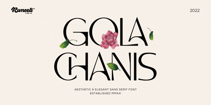 Gola Chanis font is perfect for many of your projects like logos & branding, photography, invitations, watermarks, advertisements, product designs, stationery, wedding designs, labels, product packaging, special events and much more.
 - Glam Rock by Sylvestre Studios,
$25.00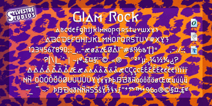 Glam Rock isn't for just anyone.
 - Ela Swashes by Wiescher Design,
$39.50 Ela Swashes are not meant to and cannot be used as a standalone typeface. Swashes are a set of many different embellished letters to be used together with Ela Demiserif fonts of corresponding weights.
 - Orange Glos by Gatype,
$10.00 aIntroducing Orange Glos - a bold classic serif with more hand-illustrated alternatives, and preserved textures, for a unique, yet modern vintage feel. Each letterform has a slightly grainy exterior that works beautifully to enhance the conventional and soft details of the Orange Glos. This versatile display typeface has enough character for logos and branding, as well as headlines, apparel, bridal and more. Keep it classic, or decorate it with ornate alternatives to uppercase and lowercase glyphs! To access the alternatives, you must have access to an older version of Photoshop to copy/paste the glyphs from the included PSD, OR the Glyphs Panel, which can be found in Photoshop CC or any Version of Adobe Illustrator. Enjoy!
 - Coltan Gea by deFharo,
$11.00 Coltan Gea is a Slab Serif typographic family with 6 Weights plus the italic versions all include small capital letters and cryptocurrency symbols. It is a geometric, minimalist typeface, with neo-grotesque modulations and slightly rounded corners. The typeface has alternative letters and numbers, small caps and advanced OpenType functions. The proportions, metrics and kerning I have configured meticulously for a perfect reading in any size. The complete package includes the roman version in VariableFont format.
 - Buffalo Gal by Monotype,
$29.99 - Oo-la-la by Emboss,
$26.95 Inspired by old French poster art. This typeface was cut from an old rubylith.
 - Espesor Olas Lines - Personal use only

- KR Mardi Gras - Unknown license

- Pea Glo-Girl - Unknown license

- 1786 GLC Fournier by GLC,
$38.00This family was inspired by numerous documents and books printed in Paris during the end of the 1700s. Mainly, documents printed by P.G. Simon & N.H. Nyon, “Printers of the parliament” were used for the Normal and italic styles and “Caps”. “Titling” characters were coming from a collection of hymns printed by Nicolas Chapart. In France these Fournier characters, as Baskerville in Great Britain, were the most often in use in the late 1700s, just before the Didot designs. This font supports strong enlargements, specially the capitals of “Caps” file and “Titling”, remaining very smart, elegant and fine. - Glam Rock MF by Masterfont,
$59.00 Either Futuristic or Space ship logo - it will sure fit to a mysterious poster.
 - Clean and Glam by Pixel Colours,
$22.00 Clean and Glam is a sweet handwritten font duo that has a sassy modern style to create the most beautiful design projects. ❤️ Includes a light monoline script font that is so chic and clean, and it combines perfectly with the uppercase sans to create amazing text combinations. Works great for Logos & branding, product packaging, product design, labelling, wedding design, social media posts, advertisement, editorial design, etc. Includes: Clean and Glam: A light modern script font. Includes numerals, uppercase and lowercase characters, punctuation and some cute hearts. Clean and Glam Sans: A modern uppercase sans font that is the perfect match of the script, great for descriptions, taglines, ingredients, etc. Includes numerals, uppercase and lowercase characters, punctuation and more cute hearts. Language support
 - Ragtime Gal JNL by Jeff Levine,
$29.00 Amongst a batch of antique sheet musical instruction booklets offered for sale online was a piece with Art Nouveau hand lettering on the cover entitled “Seven Musical Travelogues for Piano”. This design served as the inspiration and model for Ragtime Gal JNL, which is available in both regular and oblique versions. The font’s name comes from the line ‘Hello my baby, hello my honey, hello my ragtime gal…’ from the 1899 song “Hello Ma Baby”; a tune that found a new burst of popularity in an odd way within a 1955 Warner Brother’s cartoon [“One Froggy Evening”].
 - 1864 GLC Monogram by GLC,
$20.00 This family of two character monograms and initial letters was inspired from a French portfolio containing about two hundred examples of "Chiffres - deux lettres", destinated to engravers and jewelers, published in Paris in 1864, drawn by French engraver, C. Demengeot. Unfortunately, a large part of the pages were lost, so we have had to redraw about two thirds of the complete monogram family. Each package contains numerals and two complete sets of two-letter monograms, for example the A-B set, containing AA AB AC... corresponding to caps keys alphabet and BA, BB, BC... corresponding to lower case keys alphabet. We have added an Initial set, with two choices of single characters. Warning: I and J have strictly identical monograms.
 - Tabac Big Glam by Suitcase Type Foundry,
$39.00 Tabac Big Glam probably stretches the Tabac super-family’s boundaries the furthest. While it’s based on the serif version, it achieves an especially surgical cleanliness and extremely sharp typesetting by completely letting the serifs go. Despite this, the text isn’t boring for a moment — the angled cut of the stems on b, d, h, k, l, the open loop on g or the rounded variant of the italic y, which can be called by turning on the stylistic set, reliably banishes any suspicions of the letters’ monotony.
 - Ola Script 4F by 4th february,
$22.00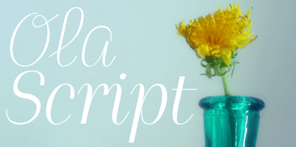
- 1592 GLC Garamond by GLC,
$38.00 This family was inspired by the pure Garamond pattern set of fonts used by Egenolff and Berner, German printers in Frankfurt, at the end of the sixteenth century. All the experts said it was the best and most complete set of the time. The italic style used with it was Granjon’s, as in 1543 Humane Jenson. A few fleurons from the same printers have been added. It can be used variously for web-site titles, posters and flyers design, publishing texts looking like ancient ones, or greeting cards, various sorts of presentations, as a very elegant and legible font... This font supports very large sizes as easily as small sizes, remaining very smart, elegant and fine. Its original cap height is about five millimeters. Decorated letters like 1512 Initials, 1550 Arabesques, 1565 Venetian, 1584 Rinceau from GLC Foundry, can be used with this family without anachronism.
 - 1968 GLC Graffiti by GLC,
$38.00 This font was inspired by the paint brushed letters in use in the 60 - 70s for protest slogans tagged on the cities walls. In those days, we didn't commonly use aerosols like today, so we used paint brushes, with paint or tar cans, drew the letters, and ran away quickly ! Capitals and lower case have the same size, and a lot of alternates characters or ligatures allows the user to vary each letter (until tree alternates for single letters) in each word of a text . Likewise, the words may be easily underscored or intersected by a few stains looking like paint spots, substituted to the following standards characters: [greater], [less], [dagger], [backslash], [bullet], and [underscore].
 - 1751 GLC Copperplate by GLC,
$38.00 This family was inspired by an engraved plate from Diderot & Dalembert's Encyclopedia (publication beginning in 1751), illustrating the chapter devoted to letter engraving techniques. The plate bears two engravers names : "Aubin" (may be one of the four St Aubin brothers ?)and "Benard" ( which name is present below all plates of the Encyclopedia printed in Geneva ). It seems to be a transitional type, but different from Fournier or Grandjean. Small caps are included in fonts for TTF and OTF version, separate files are included in the family sets of the Mac TT version.
 - GLC Ornaments One by GLC,
$20.00 This font is a collection made with the largest part of the ornaments contained in the GLC foundry medieval and renaissance period fonts. It was made for the use of customers who wish to embellish their works without buying our complete catalog! It is used to embellish and animate as variously as web-site titles, posters and fliers design or greeting cards, all various sorts of presentations, menus, certificates, letters. It was specially drawn to accompany our medieval and renaissance fonts, like 1462 Bamberg, 1509 Leyden, 1538 Schwabacher, 1543 Humane Jenson, 1557 Italique, 1589 Humane Bordeaux, 1592 GLC Garamond and others, giving them an historical additional genuine touch...
 - 1785 GLC Baskerville by GLC,
$42.00 This family was created/inspired from the well-known Baskerville Roman and Italic typefaces created by John Baskerville, the English font designer. We were inspired by the original family sent by Baskerville’s wife after his death. The full Baskerville collection was bought by the French editor and author Pierre-Augustin Caron de Beaumarchais who used it to print - in Switzerland - for the first time the complete works of Voltaire (known as the “Kehl edition” from the "Imprimerie de la société littéraire typographique"). We have used this edition, with copies from 1785, to reconstruct these two genuine historical styles. The font faces, kerning, and spacing are scrupulously identical to the original. This Pro font includes characters for Western, Eastern and Central European languages (including Celtic) and Turkish, with a complete set of small caps, standard and “long s” ligatures in each of the two styles.
 - Mardi Gras Improved by Solotype,
$19.95George Bruce's New York foundry had a remarkable number of decorative types, most of which were lost or destroyed when the firm was taken over by the American Type Founders Co. and closed down in 1906. Bruce catalogs are prized among collectors. - 2009 GLC Plantin by GLC,
$38.00 We created this family in an attempt to submit a Plantin's font pattern overview. So it is not a real historical font, but a "looking like". We have added the special East European diacritics (Czech, Hungarian, Romanian, Croatian, Slovak, Slovenian, Sorbian ) and some other features. Our Italic style is resulting from a choice through the numerous possibilities.


