2,145 search results
(0.009 seconds)
- Rude Condensed by DSType,
$50.00 Rude was designed as a dichotomy between the Grotesque and Humanistic typographic shapes: a no-nonsense Sans and a very muscular Slab Serif companion. Showing the historically demanded consistency for such kind of typefaces, this is one of DSType's most wide-ranging and flexible type systems, introducing seven weights across seven widths, from Thin to Black and ExtraCondensed to ExtraWide, along with a wonderful set of Icons.
 - Sweet June by Typefactory,
$14.00 Sweet June is a lovely script font. It has a natural writing style with a great readability. It’s perfect for adding a natural touch to your luxurious designs.
 - Junge Rules by Scriptorium,
$12.00 - Rude Slab by DSType,
$50.00 Rude was designed as a dichotomy between the Grotesque and Humanistic typographic shapes: a no-nonsense Sans and a very muscular Slab Serif companion. Showing the historically demanded consistency for such kind of typefaces, this is one of DSType's most wide-ranging and flexible type systems, introducing seven weights across seven widths, from Thin to Black and ExtraCondensed to ExtraWide, along with a wonderful set of Icons.
 - Runde Wien by Wannatype,
$36.00 Runde Wien Pro, the rounded sans serif by Ekke Wolf. Typeface lovers looking for a modern, well-developed sans serif font with a touch of retro and warm, individual lettering will get excited about a new addition to the font market. The more than complete Runde Wien Pro front comes in three styles and four different weights. In addition to the upright Runde Wien Pro there is the Runde Wien Pro Oblique with a moderate 6° slant and the Runde Wien Pro Superoblique with an 18° slant. Available weights are light, regular, medium, bold and black. These fonts are equipped with extended Latin alphabet for Central and Eastern Europe and also Cyrillic and Greek alphabet. The set of characters includes nine different sets of numbers, plus its own set for the small caps, as well as alternative characters and groovy ligatures. In addition, all Runde Wien Pro styles are also available as unicase with upper case and lower case x-height alignment. The style, metrics and proportions of Runde Wien Pro combine perfectly with the Liebelei Pro and the script fonts of the Calafati Pro.
 - Rude Wide by DSType,
$50.00 Rude was designed as a dichotomy between the Grotesque and Humanistic typographic shapes: a no-nonsense Sans and a very muscular Slab Serif companion. Showing the historically demanded consistency for such kind of typefaces, this is one of DSType's most wide-ranging and flexible type systems, introducing seven weights across seven widths, from Thin to Black and ExtraCondensed to ExtraWide, along with a wonderful set of Icons.
 - Chip Tunes by Pisto Casero,
$14.00 Chip Tunes font family is a geometric 3d pixel display typeface. It was inspired by–and designed while–listening to the chip tunes and 8bit styles of music. Designed in the UCLM, Cuenca in 2011.
 - Prosper Rules by Nathatype,
$29.00 Prosper Rules is a distinguished serif font that exudes sophistication and refinement. With its timeless serifs and carefully crafted extended lines, this typeface brings an air of elegance to your designs. The defining feature of Prosper Rules lies in its extended lines, gracefully integrated into select letters. These extended lines add a touch of distinction and visual interest, elevating the font's overall composition. Each letter is meticulously designed to strike the perfect balance between tradition and modernity. Inspired by classic typographic elements, Prosper Rules captures the essence of timeless beauty. The serifs, with their subtle flares, provide a sense of stability and sophistication. The extended lines offer a contemporary twist, infusing the font with a touch of creativity and uniqueness. The uppercase letterforms of Prosper Rules are meticulously crafted, showcasing clean lines and well-balanced proportions. The extended lines, thoughtfully placed in specific letters, create a sense of flow and purpose. Features: Ligatures Stylistic Sets Multilingual Supports PUA Encoded Numerals and Punctuations Prosper Rules fits for headings, titles, logos, and any design project that seeks to make a refined and memorable statement. Whether you're working on editorial layouts, branding materials, invitations, or any project that demands a touch of sophistication, this font will lend a sense of timeless beauty. It is particularly well-suited for applications related to luxury, fashion, fine arts, and high-end products. Find out more ways to use this font by taking a look at the font preview. Thanks for purchasing our fonts. Hopefully, you have a great time using our font. Feel free to contact us anytime for further information or when you have trouble with the font. Thanks a lot and happy designing.
 - Paradise June by Putracetol,
$28.00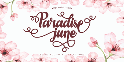 Paradise June is a beautiful swirl script font. This font is feminime, elegant, messy and modern. This font has a very beautiful swirl, perfect for use in wedding and invitation projects. Also very suitable for crafting or lettering. Paradise June perfect for wedding event, anniversary, birthday,greeting cards, logotype, branding, wedding invite and card, elegant logo, poster, packaging, stationery, website, and any other projects. Come with open type feature with a lot of alternates, its help you to make great lettering. This font is also support multi language.
 - Ruling Script by Linotype,
$29.99Prof. G. Pott’s Ruling Script first appeared in 1992 with Linotype-Hell. The font is a part of the package Calligraphie for Print, which also contains Sho and Wiesbaden Swing. Calligraphie for Print 2 completes the set. These packages offer modern calligraphy fonts particularly well-suited to use in posters, magazines and advertisements. Ruling Script looks like the zestful handwriting of a calligrapher but its legibility even in longer sentences set it apart from others of its type. - June Pro by Schriftlabor,
$33.99 June was first published in 2019 but it got a redesign and upgrade in the character set. It now supports Latin Extended and Vietnamese. It also has OpenType features such as stylistic alternates, case sensitive punctuation, small figures, arrows, superscript, subscript, fractions, and many more. June Pro was inspired by the work of Adrian Frutiger and his exploration into font design and legibility. June Pro is a modern sans-serif family in 10 weights ranging from Thin to Heavy with true italics. It was designed with legibility in mind. It is a versatile and distinctive font that makes it useful for various applications like editorial, web design, or branding.
 - Kids Rule by PizzaDude.dk,
$13.00 Sometimes you need a lot of text, and that text needs a little bit extra something. Something sweet for the eye, but still legible and not too funky. Maybe that's where Kids Rule comes in. It's a bouncy, but super-legible handmade comic font. It has a lot of attitude, and I have added 5 different versions of each letter!
 - Neue June by Matt Chansky,
$21.00 Four years of development imbue Neue June with its uniquely crafted high x-height, enabling designers to literally and figuratively elevate layout designs. In today’s highly competitive brand marketplace, readability across communication platforms and memorability go hand in hand towards target audience retention. Neue June comes in six weights, from elegant thin to full-bodied emphatic bold, plus italics. You’ll find a robust selection of highly refined multilingual glyphs. In addition to a suite of ligatures, there are a number of extra characters, such as the estimated symbol, the number sign, and directional arrows. When the creative direction calls for sophisticated and memorable tactics—leverage the versatile 385 glyph count for big messages and easily consumable body copy.
 - Lady Rene by Sudtipos,
$59.00 Looking back on my production to date, neither so little nor so large, it does not come as a surprise to find myself now introducing Lady René. A brief review of my career would read as follows: graphic designer graduated from Buenos Aires University, a 10-year professorship in Typography in the same institution, an illustrator in the making. For almost 15 years now my work has focused on the design of editorial pieces, predominantly books and CD sleeves. Typography proper has always been central to my research projects. All my obsessions eventually embodied as much the search for a perfect, spotless text as for a daring and provoking one. In my view, "how-to-say-something" ranks highest amongst a graphic designer’s responsibilities. It was in this vein that I called in the written word to illustrate, to draw, to narrate. Why not reverse the saying and proclaim that “a word is worth a thousand images”? If so, one single word could trigger endless meanings, associations, ideas, and memories in every reader’s mind. Language, we know, has a strong power and is a living expression of a culture. In my illustrations, letters and drawings reunite in one synergy said and unsaid, the finiteness of the message and the freedom of the free reading. And this is how and when, Lady René, my first born type font sees the light of day conceived out of a love of illustration and a reverence for the written word, recalling the whimsicality of the handmade drawing and reflecting its sensitive, warmth and spontaneity. Enabled by the characteristics of Open Type and the hard, outstanding work of designer Ale Paul, Lady René succeeds in composing texts in a simple, organic way by means of its contextual and stylistic alternates, swash characters, ligatures and connecting words. A bundle of decorative miscellanea completes the set of signs, enabling the user considerable freedom to create new typographic landscapes. Lady René is then prepared, very much like a character in a short story, to come to life in the reader’s mind. I expect you will enjoy her as much as I did creating her. Laura Varsky
 - Page Rules by Scriptorium,
$12.00 - Classy Brune by Typetemp Studio,
$18.00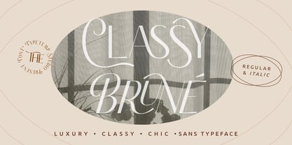 Classy Brune a display sans serif with luxury, clean, chic, and visual elegance with two styles Regular and Italic and alternatives, ligatures, multilingual suport. Perfect for editorial projects, Logo design, Clothing Branding, product packaging, magazine headers, or simply as a stylish text overlay to any background image. Features : Uppercase and Lowercase Stylistic Alternates & Ligatures Numerals & Punctuation Multilanguange PUA Encoded Web Font Included Contact me with an inbox message If you have any question. Thank you! Happy Creating
 - Rude ExtraCondensed by DSType,
$50.00 Rude was designed as a dichotomy between the Grotesque and Humanistic typographic shapes: a no-nonsense Sans and a very muscular Slab Serif companion. Showing the historically demanded consistency for such kind of typefaces, this is one of DSType's most wide-ranging and flexible type systems, introducing seven weights across seven widths, from Thin to Black and ExtraCondensed to ExtraWide, along with a wonderful set of Icons.
 - Stay Tuned by Sarid Ezra,
$14.00 Introducing, Stay Tuned! Stay Tuned is a traditional brush font. Including different lowercase and uppercase that you can use randomly. You can combine the uppercase and lowercase in a word that will make your design looks more natural and handmade. Use the underline for dramatic looks. Number, symbol, and another punctuation also included in this fonts. Support multilingual!
 - Rude Icons by DSType,
$50.00 Rude was designed as a dichotomy between the Grotesque and Humanistic typographic shapes: a no-nonsense Sans and a very muscular Slab Serif companion. Showing the historically demanded consistency for such kind of typefaces, this is one of DSType's most wide-ranging and flexible type systems, introducing seven weights across seven widths, from Thin to Black and ExtraCondensed to ExtraWide, along with a wonderful set of Icons.
 - Rude SemiCondensed by DSType,
$50.00 Rude was designed as a dichotomy between the Grotesque and Humanistic typographic shapes: a no-nonsense Sans and a very muscular Slab Serif companion. Showing the historically demanded consistency for such kind of typefaces, this is one of DSType's most wide-ranging and flexible type systems, introducing seven weights across seven widths, from Thin to Black and ExtraCondensed to ExtraWide, along with a wonderful set of Icons.
 - Rude SemiWide by DSType,
$50.00 Rude was designed as a dichotomy between the Grotesque and Humanistic typographic shapes: a no-nonsense Sans and a very muscular Slab Serif companion. Showing the historically demanded consistency for such kind of typefaces, this is one of DSType's most wide-ranging and flexible type systems, introducing seven weights across seven widths, from Thin to Black and ExtraCondensed to ExtraWide, along with a wonderful set of Icons.
 - Ruge Boogie by TypeSETit,
$24.95 This two-font set is a fun, bouncy style with a latin flair. Great for scrapbooking, tubes, and other fun stuff.
 - Runa Serif by Monotype,
$29.99Swedish designer Lennart Hansson began designing letterforms at the age of 20, and since then his exceptional calligraphic artwork has been on exhibit throughout the world. Hansson won the Nordic Typeface Competition in Copenhagen for his typeface Runa Serif, inspired by the forms of ancient Viking runes. - Altemus Rules by Altemus Creative,
$11.00 Rules is a collection of 174 geometric and shape rule designs including all flips and flops. Rules Two is a collection of 174 underlined geometric and shape rule designs including all flips and flops. Rules Three is a collection of 174 loop rule designs including all flips and flops. Rules Four is a collection of 174 classic and scotch rule designs including all flips and flops.
 - René Menue by URW Type Foundry,
$39.99 Some time ago, I started to think about the idea of combining my passionate hobby cooking with my profession as a graphic designer. While browsing through cooking books, cooking magazines and graphic publications I noticed that there were no symbols and drawings easily recognizable for interested cooks (hobby or professional). So I decided to create symbols for all the classical cooking paraphernalia still found in grand mother’s kitchen cabinet. René Menue Symbol contains 99 kitchen symbols of classical design and quality. To complement the symbols typographically, there is René Menue, a fitting linear Sans Serif typeface with plenty of extra characters such as ligatures, figures etc. René Menue is a modern, slightly condensed and economic design with round shapes, very modern but classical at the same time. These features make it perfectly usable in many different publications, not necessarily restricted to cooking… A successful cooking and enjoy your meal!
 - No Rules by Gleb Guralnyk,
$13.00 Introducing a creative font named No rules. It's a very unique typeface with modern experimental shapes. It includes five different styles for letters and numbers. No rules font can help you to create an unexpected texture and graphical rythm. Each next letter will be automatically switched to another variation using OpenType contextual alternates feature. Using capital or lower first letters will make a different looking words. Also letters set can be changed using stylistic alternates feature. Please note: Only english alphabet and numbers have five glyphs variations. Multilingual characters have only two of them for capital and lower case letters.
 - Ongunkan Wardruna Arabic Runes by Runic World Tamgacı,
$50.00 Wardruna Arabic is a method of writing Arabic with a Runic-like alphabet devised by Devin Lester. He imagined that if some vikings had settled in the Middle East, they might have started speaking Arabic and writing it with a version of the Runic alphabet. This particular alphabet is based on Tolkien's Cirth Runes. A band of vikings went to Baghdad after raiding in Europe. The markets in Constantinople were closed as the Turks had just sacked the city. These men had heard of the great market in Baghdad and went there to sell their wares, seeing that this land was warm and fertile they decided to stay. They ended up settling the land and taking Arab wives and having children, because of thier Northern European accent their Arabic evolved into a part-Arabic dialect of Iraqi arabic. This is why today you see a few Arabs with green eyes and dark blonde or red hair. The Arabic alphabet was too fluid for them and vikings disdained the use of paper as a persons writings could be burned, so the evolved their runes to fit Arabic.
 - Ongunkan Anglo Saxon Futhark Predator by Runic World Tamgacı,
$49.99 Anglo Saxon Futhark Runic adapted form of that beautiful impressive alien script from the Fantastic Predator movie. It looks great with the impressive red color.
 - Running shoe - Unknown license

- Running Smobble - Unknown license

- Home Run by Doyald Young,
$50.00Home Run Script has the formality of 18th-century English roundhands, narrow, tightly fitted and drawn in a very bold weight and inspired by my ITC Eclat font. The x-height is large, and the caps are simply drawn with minimal swashes. Its companion font Home Run Sanscript, sold separately also, has sans serif caps that enable the user to combine script and sanserif caps with the same slope. It has the same lowercase as Home Run Script with a few alternate characters and sans serif lining and Oldstyle figures. Both Young Finesse and Home Run include Richard Isbell’s “interrabang,” appropriately used for statements that are both interrogative and exclamatory. - Galaxy Run by Monotype,
$29.99 - Running Back by Trequartista Studio,
$25.00 Presenting Running Back , a condensed sport inspired upper and lowercase typeface. Running Back has five Style with sans serif and matching italics. This typeface has a clean and athletic look, glyphs and extensive Latin support. Running Back is bold, vibrant with sharp sans serifs and competitive appearance, therefore excellent to use for headers, logos, captions and posters, especially for the sports branding industry, but just as good for any other projects.
 - Run Child by Figuree Studio,
$18.00 Say hello to Run Child font. Made with love and joy. Comic look, so it will make your design more beautiful, cute, fun and colorful. Features: Character Set Numerals and Punctuation (OpenType Standard) Accents (Multilingual characters) PUA Encode
 - Running Stars by Funnyarti,
$20.00 Running Stars is a chic and festive decorative font. This original look will appeal to a wide range of crafty ideas, from letterheads and titles, to stationery.
 - Rue Display by Winnie Tan,
$29.00 Rue is an organic, casually ornamental, narrow-faced sans serif. It is a display type structured with random traces of calligraphic tendencies. It does not begin with any noble ideals, other than to mediate between the muse of imagination and the act of realization. The spirited and exploratory design is the materialization of a feeling about fonts as a family of organisms taking on a life of its own, in work and play. Rue is the epitome of vanity and indulgence which seems to purpose itself well in aesthetics, wellness and botanicals. Its whimsical quality also suggests applications in the form of gifts and ornamentation. In retrospect, Rue was conceived as a typeface, used as an image and discovered as an ornament. It comes in 5 weights of light, regular, medium, semibold and bold, and their matching italics. Rue Display was published in 2010 by TypeTogether. http://www.behance.net/gallery/Rue/373854
 - TT Runs by TypeType,
$39.00 TT Runs useful links: Specimen PDF | Graphic presentation | Customization options TT Runs Version 2.0—an Unusual Wide-Proportioned Sans Serif! An update that expands the font's capabilities. TT Runs is a font designed for the sports industry. Before starting the development, we researched the identities of various Olympic venues and analyzed current sports brands. We put in maximum effort to design a unique yet elegant modern font well-suited for the sports sector. TT Runs has wide and unusual proportions that are different from traditional ones. It is because of the reversed contrast, which refers to the distinction between the upper and lower parts of letters. The uppercase letters have distinctive inverted proportions, particularly noticeable in characters like K, C, S, and R. This design choice gives the font an original personality and makes the letters look stylish and suitable for both athletic and casual sportswear. While updating the font, we kept its distinctive characteristics and preserved the graphical look of the majority of the characters. However, we thoroughly redesigned the outlines and italic font styles and updated the font's technical aspects entirely. As a result, TT Runs has become more convenient to use, and its range of applications has significantly broadened. - More projects and countries! The set of each font style has expanded from 791 to 917 characters. We added new languages and characters of the expanded Latin and Cyrillic writing systems. - Perfect italics! The new italic font styles are flawless from both graphical and technical points of view. The updated variable font. We have united the roman and italic font styles. You can now change the font on the axes of slope and weight, choosing the suitable values. - The new set of OpenType features! We added the updated numerators with currency symbols, numbers in filled circles, and localization features for the Dutch, Catalan, Turkish, Serbian, Bashkir, Chuvash, Bulgarian, and Romanian languages. TT Runs is an expressive font. It looks aesthetically pleasing on both athletic and casual clothing and is well-suited for printing on any material. Due to its proportions, the font is an ideal choice for headings, offering excellent readability and an elegant appearance in bigger blocks of text. Created with the sports industry in mind, this font brings a touch of style to any modern project. FOLLOW US: Instagram | Facebook | Website TT Runs OpenType features: aalt, ccmp, locl, subs, sinf, sups, numr, dnom, frac, ordn, tnum, onum, lnum, pnum, case, dlig, liga, salt, ss01, ss02, ss03, ss04, ss05, ss06, ss07, ss08, ss09, ss10, ss11, ss12, calt. TT Runs language support: English, Albanian, Basque, Catalan, Croatian, Czech, Danish, Dutch, Estonian, Finnish, French, German, Hungarian, Icelandic, Irish, Italian, Latvian, Lithuanian, Luxembourgish, Maltese, Moldavian (lat), Montenegrin (lat), Norwegian, Polish, Portuguese, Romanian, Serbian (lat), Slovak, Slovenian, Spanish, Swedish, Swiss German, Valencian, Azerbaijani, Kazakh (lat), Turkish, Uzbek (lat), Acehnese, Banjar, Betawi, Bislama, Boholano, Cebuano, Chamorro, Fijian, Filipino, Hiri Motu, Ilocano, Indonesian, Javanese, Khasi, Malay, Marshallese, Minangkabau, Nauruan, Nias, Palauan, Rohingya, Salar, Samoan, Sasak, Sundanese, Tagalog, Tahitian, Tetum, Tok Pisin, Tongan, Uyghur, Afar, Asu, Aymara, Bemba, Bena, Chichewa, Chiga, Embu, Gikuyu, Gusii, Jola-Fonyi, Kabuverdianu, Kalenjin, Kamba, Kikuyu, Kinyarwanda, Kirundi, Kongo, Luba-Kasai, Luganda, Luo, Luyia, Machame, Makhuwa-Meetto, Makonde, Malagasy, Mauritian Creole, Meru, Morisyen, Ndebele, Nyankole, Oromo, Rombo, Rundi, Rwa, Samburu, Sango, Sangu, Sena, Seychellois Creole, Shambala, Shona, Soga, Somali, Sotho, Swahili, Swazi, Taita, Teso, Tsonga, Tswana, Vunjo, Wolof, Xhosa, Zulu, Ganda, Maori, Alsatian, Aragonese, Arumanian, Asturian, Belarusian (lat), Bosnian (lat), Breton, Bulgarian (lat), Colognian, Cornish, Corsican, Esperanto, Faroese, Frisian, Friulian, Gaelic, Gagauz (lat), Galician, Interlingua, Judaeo-Spanish, Karaim (lat), Kashubian, Ladin, Leonese, Manx, Occitan, Rheto-Romance, Romansh, Scots, Silesian, Sorbian, Vastese, Volapük, Võro, Walloon, Walser, Welsh, Karakalpak (lat), Kurdish (lat), Talysh (lat), Tsakhur (Azerbaijan), Turkmen (lat), Zaza, Aleut (lat), Cree, Haitian Creole, Hawaiian, Innu-aimun, Lakota, Karachay-Balkar (lat), Karelian, Livvi-Karelian, Ludic, Tatar, Vepsian, Guarani, Nahuatl, Quechua, Russian, Belarusian (cyr), Bosnian (cyr), Bulgarian (cyr), Macedonian, Serbian (cyr), Ukrainian, Gagauz (cyr), Moldavian (cyr), Kazakh (cyr), Kirghiz, Tadzhik, Turkmen (cyr), Uzbek (cyr), Azerbaijan, Lezgian, Abazin, Agul, Archi, Avar, Dargwa, Ingush, Kabardian, Kabardino-Cherkess, Karachay-Balkar (cyr), Khvarshi, Kumyk, Lak, Nogai, Rutul, Tabasaran, Tsakhur, Buryat, Komi-Permyak, Komi-Yazva, Komi-Zyrian, Shor, Siberian Tatar, Tofalar, Touva, Bashkir, Chechen (cyr), Chuvash, Erzya, Kryashen Tatar, Mordvin-moksha, Tatar Volgaic, Uighur, Rusyn, Karaim (cyr), Montenegrin (cyr), Romani (cyr), Dungan, Karakalpak (cyr), Shughni, Mongolian, Adyghe, Kalmyk, Talysh (cyr) .
 - Running Hipster by Hanoded,
$15.00 Running Hipster is a tall, thin and all caps font with a funny name. The upper and lower case letters differ and can be mixed. You don’t necessarily have to use it to market your free range sheep woolen jumpers or organic button squash and soy based sour cream soup, feel free to use it for just about anything. Comes with a vintage amount of diacritics.
 - Fifth Avenue Salon NF by Nick's Fonts,
$10.00A quirky semiscript, derived from lettering in an 1930 ad for the beauty salon of Kathleen Mary Quinlan on New York's Fifth Avenue. The Opentype version of this font supports Unicode 1250 (Central European) languages, as well as Unicode 1252 (Latin) languages. - Channel Tuning JL - Unknown license


