10,000 search results
(0.012 seconds)
- Sales Event JNL by Jeff Levine,
$29.00 Sales Event JNL is an inline sans that was modeled from examples of old wood type. Its casual, cheerful style well suits point-of-sale signage or banners, fun headlines and relaxed themes. The font is available in both the regular inline version and the black (solid) version.
 - KR Down By The Sea - Unknown license

- Marquis De Sade Ornaments - 100% free

- punk rock rummage sale - Unknown license

- Stays In The Cave! - Unknown license

- Have a Nice Day by Cultivated Mind,
$20.00 Have A Nice Day is a handwritten font created by Cindy Kinash. This font features three font styles (Basic/Tall/Wide) and comes in three weights (Light/Regular/Bold). All three font styles can be used together as one unique and fun font! This font also includes a set of fun hand drawn ornaments like smiley faces, flowers, leaves, insects, frames, captions, desserts, food, clouds, and catchwords that will surely brighten your day! Enjoy!
 - Electro Wave Vol.2 by Jamalodin,
$16.00 Electro Wave Vol.2 Comes with updated neaterglyphs, more stable kering size, new punctuation & numbes. Electro Wave Vol.2 is a brave decorative display font that is suitable for branding, wedding invitations, greeting cards, posters, name card, quotes, blog header, logo, fashion, apparel, letter, stationery and other projects. The alternative characters were divided into several Open Type features such as Swash, Stylistic Sets, Stylistic Alternates, Contextual Alternates. The Open Type features can be accessed by using Open Type programs such as Adobe Illustrator, Adobe InDesign, Adobe Photoshop Corel Draw X version, And Microsoft Word. And this Font has given PUA unicode (specially coded fonts). so that all the alternate characters can easily be accessed in full by a craftsman or designer. Electro Wave Vol.2 : Uppercase & Lowercase International Language & Symbols Support Punctuation & Number PUA Unicode. If you don't have a program that supports OpenType features such as Adobe Illustrator and CorelDraw X Versions, you can access all the alternate glyphs using Font Book (Mac) or Character Map (Windows). If you have any question, don't hesitate to contact me. Thanks for your visit.
 - Same Old English JNL by Jeff Levine,
$29.00 Same Old English JNL is your basic, everyday Old English text font with one small difference—it more resembles a hand-lettered typeface complete with tiny inconsistencies than it does the "perfect" versions found in printer's type.
 - Have A Great Day by Roland Hüse Design,
$10.00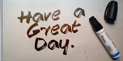
- Parking Lot Sale JNL by Jeff Levine,
$29.00 Here’s a novelty font emulating the plastic pennant streamers that were popular in the 1950s and 1960s used to decorate a store parking lot or used car lot for a sales event. The typeface inside the individual pennants is Manufacturer JNL, which can be used for body copy associated with titles made by this font. Parking Lot Sale JNL is available in regular (black letters on white pennants) and black (with white letters). A blank pennant for word spacing or end caps is available on the backslash key.
 - Janda Safe And Sound by Kimberly Geswein,
$5.00 Imperfectly hand-sketched sans serif.
 - Point Of Sale JNL by Jeff Levine,
$29.00 Point of Sale JNL is a specialty font for producing retro-style price cards, tags, stickers, labels and similar items. Within this design are a large set of numerals and two smaller sets of numerals. Both of the smaller sets are centered against the larger ones with one set also having underscores. In addition, there are a number of price card designs provided for those who want a truly nostalgic feel to their price marks. The layout of Point of Sale JNL breaks down as follows: A through J = 1 through zero in large numbers K = a decimal point L = dollar sign M = cents sign N through Z = various price cards a through j = small centered numbers k through t = small numbers with underscores
 - KG By The Grace Of God by Kimberly Geswein,
$5.00 Inspired by the decayed lettering on the signs at Siesta Key beach painted on weather-worn old wood in Florida, these letters are made to look like peeling paint.
 - KG God Gave Me You - Personal use only

- KG God Gave Me You by Kimberly Geswein,
$5.00 This font is reminiscent of teen girl handwriting, with very round letters and a mixed-print-cursive style.
 - Saiyan Sans - Unknown license

- Crash Waves Lead To Skinny Font - 100% free

- Adverse Stencil JNL by Jeff Levine,
$29.00If you're old enough to remember having a lettering stencil in school, then you might have tried to save all of the waste paper punched out of the letters and numbers; hoping to do something with them later on. Jeff Levine took his Tramp Steamer JNL stencil font and gave it the look of those waste paper pieces - lined up to form erratic characters with a personality all their own. - Adonis by ParaType,
$30.00PT Adonis™ was designed by Natalia Vasilyeva and licensed by ParaType in 2002. An original typeface, its characters have slightly oblong proportions, with rounded serifs and generally soft letterforms. The face is both space-saving and quite legible in small sizes. For use in text and display typography. - Thunderbold by Gartype Studio,
$15.00 Thunderbold is inspired by "Fast & Bold character" so,this is a powerful font suitable for poster, banner, flyer, race number, logo, logotype and more.This font have an extrude style to save your time to make extruded fonts just switch to extrude style!.Not just that, Thunderbold have a lot of Alternate too. Be bold like Thunder !
 - Ornata G by Wiescher Design,
$39.50 Ornata G is the seventh of a series of old ornaments that I am trying to save from oblivion. I am completely redesigning the ornaments from scratch. These ornaments have been designed around 1890, I think by someone at the Enschede foundry in Holland. These have a lot of nice swings. Your digitizing type-designing savior, Gert Wiescher
 - Ornata B by Wiescher Design,
$39.50 Ornata B is the second of a series of old ornaments that I am trying to save from oblivion. I am not just scanning these, I am completely redesigning the ornaments from scratch, thereby eliminating imperfections. These ornaments have been first designed by the Elzevier printer family from the Netherlands. The designs date back til the 17th century and I think they just had to be saved. Your digitizing type-designing savior, Gert Wiescher
 - Tale by Suomi,
$25.00 Tale is an experiment to convert the script-style calligraphy into bitmap format. The two variants have the same dimensions, but (as the naming suggests), Forty has double amount of pixels in it when compared to Twenty. Both variants have hand made bitmaps to compliment these correlating point sizes, and you can always get the appropriate bitmaps by multiplying by two.
 - Glass Light by Wiescher Design,
$49.50 Glass Light was designed in 1912 by Franz Paul Glass for the Genzsch & Heyse foundry. The font is stylewise related to the "Lo types" of the same period. Glass designed a lot of decorative elements to go along with the font. I added Swashes, endletters and smallcaps to the set to make it complete. Since this type of font will probably not be used by many professionals, I did not put all the letters into one big OTF-version since most people don't have OTF-savy software. These fonts can and should be mixed for optimal results. Your decorative designer Gert Wiescher
 - Deluta by Dharma Type,
$14.99 You can not find such a lovely, unique and funny blackletter. Enjoy and have fun with this font. There are two other fonts designed by in the same concept. -Xesy -Ekistra -Deluta Black
 - Darwin Office by Los Andes,
$16.00 We have adapted the version of our Darwin font for use in Microsoft Office. It only has 4 variants: regular, italic, bold and bold italic. Font weights have been named in a way that can be clearly shown up in the font list in Office programs for the sake of a good hierarchy (the bold variant is quite bold and does not look the same as the original font).
 - Ornata F by Wiescher Design,
$39.50 Ornata F is the sixth of a series of old ornaments that I am trying to save from oblivion. I am completely redesigning the ornaments from scratch. These ornaments have been designed around 1910, I could not find out by whom. This set is perfect to design flowery frames. Your digitizing typedesigning savior, Gert Wiescher
 - Bell Gothic by ParaType,
$30.00 The Bitstream version of Bell Gothic designed by Chauncey H. Griffith in 1938 for telephone directories of the Bell Telephone Company. It is a good sans serif choice for listings, catalogues and directories as its design is very space saving. The weight of the line is moderate and uniform. Being a clear and easy-to-read font, Bell Gothic is popular now for display and magazine advertising. Cyrillic version by Isabella Chaeva was released by ParaType in 1999. Italic styles added in 2009 by the same designer.
 - Gothicus by Aerotype,
$29.00 From original samples of Rudolf Koch's Maximilian, Gothicus and Gothicus Alternate have Fraktur style captials, Gothicus Roman has Roman capitals. All three have the same lower case which includes three swash characters for g, s and t, available as discretionary ligatures in OpenType versions, and manually otherwise. All include two authentic ornaments, also penned by Koch. Gothicus Roman has three additional floret ornaments.
 - Ornata C by Wiescher Design,
$39.50 Ornata C is the third of a series of old ornaments that I am trying to save from oblivion. I am not just scanning these, I am completely redesigning the ornaments from scratch, thereby eliminating imperfections. These ornaments have been first designed by a designer named Ben Sussan. The designs date back to about 1910. Your digitizing type-designing savior, Gert Wiescher
 - FG Typical by YOFF,
$14.95FG Typical is inspired by typewriting. But the letters got skewed in processing making it look a bit corny, but it looks great at small sizes as well as large. the characters all have the same height except for the i, å, ä etc. - Bodoniez by Huy!Fonts,
$19.00 Nice typographic experiment consisting of the progressive "bodonization" I have summarized in two steps, by a letter drawn with the same concentration and intensity with which Paris Hilton reading a book, to get something like the sketches that Mr. Gianbattista used to Wrap the sandwich.
 - Ornata D by Wiescher Design,
$39.50 Ornata D is the fourth of a series of old ornaments that I am trying to save from oblivion. I am completely redesigning the ornaments from scratch, trying in this one to keep the rough "letterpress" character. These ornaments have been first designed by Auriol around 1910. This set is perfect to design a great number of frames. Your digitizing type-designing savior, Gert Wiescher
 - Drop_it by Just in Type,
$18.00Drop_it is a redesign of fonts originally created to be recognized by computers using OCR (optical character recognition) softwares. Strangely, human beings fell in love for the stylistic inconsistencies of these fonts made for machines. In small sizes, Drop_it emulates the appearance of fonts in antique operational systems monitors. In large sizes, its structure is composed of capsules and pills allude the universe of medicines, drugs and rave culture. Drop_it Dingbats follow the the same grid of its alphabetic version, and can be used side by side in sign projects. Besides the traditional symbols, it present specific images from the rave culture like DJ (Disc-Jockey) and VJ (Visual-Jockey). Drop_it italic set adds velocity to text compositions using six angle variations. All the fun starts with a very unusual Break version. Fall version is a kind of "anti-italic". Slow version put your text in another rhythm. Swing have a little italic emphasis. Italic is, you know, italic. And Speed version run away. - Arquitecta Office by Latinotype,
$16.00 We have adapted the version of our Arquitecta font for use in Microsoft Office™. It only has 4 variants: regular, italic, bold and bold italic. Font weights have been named in a way that can be clearly shown up in the font list in Office™ programs for the sake of a good hierarchy (the bold variant is quite bold and does not look the same as the original font). Arquitecta Office update: Improvements of proportions and drawing. The set was extended to the current one of Latinotype.
 - Prism by Stereotypes,
$- Prism was mainly inspired by two things, the sketches of Rudolf Koch for Prisma and the proportions of Avant Garde by Herb Lubalin. Even when the proportions and widths stay the same from ExtraLight to Black, you get the opportunity to change the weight and get a complete new look for that typeface by changing the grayscale or color. It is a modern combination for headlines, that want to have a different look.
 - Gibbons Gazette by Comicraft,
$39.00HOLD THE FRONT PAGE! STOP THE PRESSES! We have a new Headline for our Cover Story! DAVE GIBBONS is all over the tabloids, the trades AND the quality papers today. Yes, it's the opening of the WATCHMEN movie, but we have a much BIGGER story; the REAL scoop -- and we're announcing it in 72 point type... yes, there's a new addition to the Dave Gibbons family, and our editorial staff have the baby's name and our paparazzi have the pictures! Dave's new little sprog is called... GAZETTE. Man, that kid is gonna get teased at school, Dave. - Taurus by Fenotype,
$30.00 Save time and effort – choose your type wisely. Use Taurus and you’ll achieve impact without having to resort to cheap tricks. We have done the work for you: just type out words using Taurus and you’ll have a logo for a Wall Street law firm – or for that precious vintage Barolo. Refinement. Sophistication. Seriousness. Sex appeal. Taurus has it all.
 - Protrakt Variable by Arkitype,
$10.00 Protrakt is inspired by city life and sport. It has been designed as a variable font and is best to use as a variable font to get the full enjoyment of using this typeface. However, if you do not have access to variable technology through your software, there are nine widths in the font family so this will give you just as much access to the creativity this font can provide. By using the variable sliders in your design software you have a range of weight and width options. Play around with individual letters to give your type a unique look. Included in this family are alternate characters to add even more styling options. *Unfortunately there is no option to test out the variable capabilities on MyFonts as yet. Please have a look at the poster images to get a great idea of how I have used this font. By using the variable version you only need to install one font file instead of the entire family, this saves space and time to manually select individual styles.
 - Copperplate Gothic Hand by Wiescher Design,
$39.50 The classic font as designed by F. W. Goudy for ATF in 1901, now in a hand-drawn version for a little bit of variation. Everybody else just offers another version of the same old Copperplate, but I now have a new rough one. Oh, just for the record, I have a couple of other versions of this font in my collection of the Copperplate Classic fonts. Your rough designer Gert Wiescher


