10,000 search results
(0.015 seconds)
- Hold Hand by Putracetol,
$16.00 Hold Hand - A Modern Display Font with Distinctive Charm Hold Hand is an exceptional modern display font that captivates with its unique and original design. This font sets the stage for contemporary creativity, making your projects stand out with its distinct flair. This font comes in two versatile versions, allowing you to choose between the regular and display styles. Additionally, both versions include a rough variant to add character and depth to your typography. Hold Hand is the ideal choice for logo designs, branding, invitations, packaging, posters, titles, businesses, greeting cards, magazines, headlines, and various modern display-themed designs. Whether you're looking to make a bold statement or add a touch of modern elegance to your projects, this font has you covered. Elevate your designs with the unique charm of Hold Hand, and watch your creative visions come to life.
 - Gold Spur by FontMesa,
$20.67 Gold Spur is a spurred version of the FontMesa Gold Rush set of fonts. Each version includes many extended characters for Western, Central and Eastern European countries. The Gold Spur Trail OpenType version has alternate double letter pairs included in the font and will automatically be substituted when used in Adobe CS products or other software that takes advantage of OpenType features. The $20.67 price of each font reflects the price of an ounce of gold in 1865 which was the year that the original Gold Rush font was created.
 - Rock Show Whiplash - Unknown license

- Chinese Rocks Free - Unknown license

- Retro Rock Poster - Unknown license

- Rock ‘n Roller - Unknown license

- KG ROCK CONCERT - Unknown license

- Rock-A-Billy - Unknown license

- Glam Rock MF by Masterfont,
$59.00 Either Futuristic or Space ship logo - it will sure fit to a mysterious poster.
 - Rock Concert JNL by Jeff Levine,
$29.00 Rock Concert JNL is a playful free form type design inspired by the opening title and credits for the 1964 motion picture comedy “Send Me No Flowers” starring Rock Hudson, Doris Day, and Tony Randall. Strongly resembling hippie movement poster lettering of the mid-1960s, this fonts fits well with any retro project emulating the “Peace and Love” movement or (as its name implies) re-creating period piece rock concert posters.
 - MC Scar Rock by Maulana Creative,
$16.00 Scar Rock Scary Display Font. Scar Rock scary display font. Heavy stroke, fun character with a bit of ligatures. To give you an extra creative work. Scar Rock scary display font support multilingual more than 100+ language. This font is good for logo design, Social media, Movie Titles, Books Titles, a short text even a long text letter and good for your secondary text font with script or serif. Make a stunning work with Scar Rock scary display font. Cheers, Maulana Creative
 - Rock And Cola by Corradine Fonts,
$49.95 Rock and Cola's design is clearly inspired by the sinuous shapes of the world's most famous drink's logo. It however does not pretend to copy it faithfully or to serve as a platform to generate the logo itself. Rock and Cola is a very elegant Script font with great weight and contrast. Its OpenType features include ligatures, swashes, alternative characters, ornaments and accents in order to support many foreign languages. It has huge possibilities for application in logos, titles and short texts by generating in them great impact and recalling. Use Rock and Cola in your projects and enjoy it!
 - MC Rock Ice by Maulana Creative,
$17.00 Rock Ice Funny Display Typeface Rock Ice funny display typeface. Heavy stroke, fun character with a bit of ligatures. To give you an extra creative work. Rock Ice funny display typeface support multilingual more than 100+ language. This font is good for logo design, Social media, Movie Titles, Books Titles, a short text even a long text letter and good for your secondary text font with script or serif. Make a stunning work with Rock Ice funny display typeface. Cheers, Maulana Creative
 - Round Rock NF by Nick's Fonts,
$10.00Woodtype wizard Rob Roy Kelly identified the inspiration for this typeface in his 100 Wood Type Alphabets simply as "No. 154". Funky, chunky, round and robust, it’s clearly a barrel of fun. Named after a small town in Central Texas, which just happens to be the home of Dell Computer. Both versions of the font include 1252 Latin, 1250 CE (with localization for Romanian and Moldovan). - Jaded Rock Stars by Throndsen,
$10.00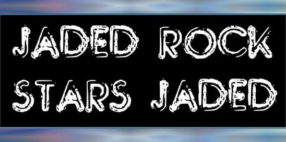
- CA Cape Rock by Cape Arcona Type Foundry,
$39.00 CA Cape Rock, first released in 2007 and now reissued and expanded, is an impressive display typeface. Designed with a fat Clarendon and wood type in mind, the typeface’s bold and distinctive forms add spice and personality to any design that requires a strong display aesthetic. CA Cape Rock is particularly enjoyable for use in headlines and ideal for highlighted text. With already two dozen existing ligatures and many OpenType swashes, the new edition also received letters for use in the Central European and South Eastern European area. Cleaned and harmonized paths, a completely new kerning as well as a newly added Italic (Slanted) style are also among the new features.
 - LD Rock Hero by Illustration Ink,
$3.00 - Andreas Sans Cnd - Unknown license

- Basic Sans Cnd by Latinotype,
$29.00 Basic Sans Cnd: A new sans. Designed by Daniel Hernández Basic Sans Cnd is a narrower version of Basic Sans. It is a family of Grotesque features with a functional, neutral and seeming clean style that looks to keep a neutral (or basic) appearance on paper, but including lots of details that give it a unique personality. Basic Sans Cnd is a sans-serif typeface well-suited for publishing projects, medium-sized text, branding, posters, headlines and more! This font family comes in 7 weights—ranging from Thin to Black—plus matching italics and it has a set of 416 characters that support 206 different languages.
 - Contane Text Cnd by Hoftype,
$49.00 Contane Text Condensed is the text optimized version of Contane Condensed. More solid, more robust, it embodies the power addition to the more delicate members of the Contane Condensed family. Stronger hairlines and stronger serifs also make it appropriate for smaller text size applications. Contane Text Condensed supports up to 80 languages and it’s OpenType format allows a wide range of typographic applications. 20 styles offer fine graduation of the weights. All weights contain small caps, ligatures, superior characters, proportional lining figures, tabular lining figures, proportional old style figures, lining old style figures, matching currency symbols, fraction- and scientific numerals, matching arrows and alternate characters.
 - Le Monde Courrier Std by Typofonderie,
$59.00 A rounded slab in 4 styles In our age, since the arrival of microcomputing, the majority of professional letters have been composed in quality typefaces. Typewriters & the typestyles they used have become antiques. A letter set in Times or Helvetica & printed with a laser printer at 600 dpi or more are of such quality that one can no longer distinguish it with a document produced by offset printing. But letters composed in this way appear overly institutional when a bit of informality is needed. Le Monde Courrier, designed by Jean François Porchez, attempts to re-establish a style halfway between writing and printing. Informal neo-tech style This rounded slab serif returns the informal character of “typewritten” fonts to letters and suit well all bad conditions, from inkjet printed memos to webfonts use. With a unique typographic colour, it integrate itself with the rest of the Le Monde family with effective contrast. The verticals metrics and proportions of Le Monde Courrier are calibrated to match perfectly others Typofonderie families. Bukva:raz 2001 Type Directors Club .44 1998 European Design Awards 1998
 - Le Monde Journal Std by Typofonderie,
$59.00 A highly legible typeface in 4 series Le Monde Journal by definition is intended for newspaper use & at small sizes. It’s an economical and workshorse typeface adapted to any extrem condition of uses. Even though it has the same colour as Times, it appears more open. The reading flow has been made more fluent & less abrupt. The glyphs counters are bigger, as if they were “alluminating the interior.” The form, characterized by its serifs, remains embedded in our visual memory. Intermediate weights like Book can be considered as a grade supplement of the Regular. Italics accompany Le Monde Journal. With a more delicate design & a distinctive rhythm, they remain noticeable when used with the romans. Its companion, Le Monde Sans can extend your typographic palette. For beautiful page layout, use it in conjunction with Le Monde Livre for titling sizes. The verticals metrics and proportions of Le Monde Journal are calibrated to match perfectly others Typofonderie families. This family was designed in 1994 as bespoke typeface family for the French newspaper Le Monde. The family is not used any more by this newspaper from November 2005. Bukva:raz 2001 Type Directors Club .44 1998 European Design Awards 1998
 - MFC Haute Monde Monogram by Monogram Fonts Co.,
$19.95 The source of inspiration for Haute Monde Monogram is the 1934 "Book of American Types" by American Type Founders. Found in that specimen book was a wonderfully elegant traditional smallcap-Capital-smallcap monogram alphabet known as “Elite Monogram Initials”. This elegant typeface is now digitally remastered and updated for modern use with functionality beyond its original intentions. Download and view the MFC Haute Monde Guidebook if you would like to learn a little more. MFC Haute Monde Monogram comes complete with Pro format fonts. You will require with programs that can take advantage of OpenType features contained within the Pro fonts.
 - Le Monde Livre Std by Typofonderie,
$59.00 A text face in 4 styles Before the arrival of Phototypesetting, each font size had a specific design. Le Monde Livre, designed by Jean François Porchez, along with Le Monde Journal re-establishes this practice. When Le Monde Journal was developed specifically for use at small point sizes (below 10 points.) Le Monde Livre works beautifully for book typography, magazine settings. In comparison to the italics in Le Monde Journal, Le Monde Livre’s italics are of a totally different design, closer to the models of the Renaissance. The families match well together on the same page, Le Monde Journal for small sizes settings, Le Monde Livre for large settings. The verticals metrics and proportions of Le Monde Livre are calibrated to match perfectly others Typofonderie families.
 - Le Monde Sans Std by Typofonderie,
$59.00 Humanist sans in 8 styles Designed by Jean François Porchez, Le Monde Sans is a sanserif based on Le Monde Journal — a practice that become commonplace from early nineties. Designed originally in 1994 for the Le Monde newspapers, it was expended over the years to the large family we know today. Le Monde Sans features a “traditional g” in addition to the usual 1994’s g. Le Monde Sans is offered in numerous weights — in roman, italic to meet all kinds of situations. It will help designers to select the best weights depending their needs, from glossy paper printing to high resolution screen. Superfamily The design of Le Monde Sans continues the basic common structure found in the members of the Le Monde family: its proportions, a relatively narrow width, a fairly oblique axis, etc. The typographer can, at all times, switch between Sans & Journal or Courrier without any disruption in the composition. The verticals metrics and proportions of Le Monde Sans are calibrated to match perfectly others Typofonderie families. This family was designed in 1994 as bespoke typeface family for the French newspaper Le Monde. The family is not used any more by this newspaper from November 2005. Type Directors Club .44 1998 European Design Awards 1998
 - Wolf's Bane Bold Shadow - Unknown license

- Prescript Cn Bold Italic - Unknown license

- Wolf's Bane Bold Pro - Unknown license

- Earth's Mightiest Bold Expanded - Unknown license

- Bionic Type Expanded Bold - Unknown license

- Spylord Bold Expanded Italic - Unknown license

- Year 3000 Bold Italic - Unknown license

- D3 Euronism Bold italic - Unknown license

- WC ADDENDUM Bta Bold - Unknown license

- AuX DotBitC Xtra Bold - Unknown license

- Futurex Metal-gear Bold - Unknown license

- D3 LiteBitMapism Bold-Selif - Unknown license

- Wolf's Bane Bold Outline - Unknown license

- D3 Skullism Alphabet Bold - Unknown license

- D3 Skullism Katakana Bold - Unknown license


