112 search results
(0.005 seconds)
- RM Squarial by Ray Meadows,
$19.00 Based loosely on a square, this hair line design works best at 24pt and above. Due to the modular nature of this design there may be a slight lack of smoothness to the curves at very large point sizes (around 100 pt and above).
 - RM Sans by Ray Meadows,
$19.00 RM Sans has been designed to offer an useful but inexpensive family of 5 regular weights; 3 condensed weights; 5 outline weights and an 'eco' alternative. Due to the modular nature of this design there may be a slight lack of smoothness to the curves at very large point sizes (around 100 pt and above).
 - RM Random by Ray Meadows,
$19.00 A fun design, useful for many informal applications. Based on hand-drawn letters. Due to the nature of this design there may be a very slight lack of smoothness to the curves at extremely large point sizes (around 200 pt and above).
 - RM New Albion by Ray Meadows,
$19.00 A classic blackletter Which looks best at 16pt and above. Due to the modular nature of this design there may be a slight lack of smoothness to the curves at very large point sizes (around 100 pt and above).
 - RM Squarial Ribbon by Ray Meadows,
$19.00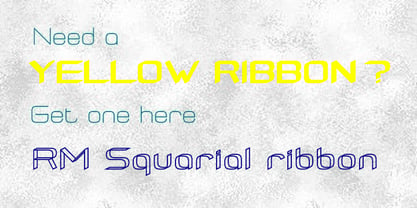
- RM True To Type by Ray Meadows,
$19.00 Throw away the carbon paper, ribbons and Tippex ... now you can get that typewritten look with RM True to Type. Legible at all sizes, it is available in regular and bold. That faithful old typewriter has given many years of valiant service, but now the keys are worn and blocked with ink. The Old styles replicate the wear and tear of years of use. Includes: Western European, Central European, Baltic & Turkish sets Due to the modular nature of this design there may be a slight lack of smoothness to the curves at very large point sizes (around 100 pt and above).
 - Chew On This by Kitchen Table Type Foundry,
$16.00 Back in 2013 I released an all caps font called Rum Doodle. Rum Doodle is a really nice, really weird font with angular glyphs and a unique look. I decided that it would be nice to tweak this font a bit and design a lower case for it. The result is Chew On This. I chose that name for no apparent reason - so don’t make a fuss about it…
 - Pacific Atoll JNL by Jeff Levine,
$29.00 Pacific Atoll JNL is a stylized slab serif type design based on the movie title lettering for the 1942 wartime film “Pacific Rendezvous”, and is available in both regular and oblique versions. According to Wikipedia, “…an atoll (sometimes known as a coral atoll), is a ring-shaped coral reef, including a coral rim that encircles a lagoon partially or completely. There may be coral islands or cays on the rim.”
 - No Liming by chicken,
$17.00 A chunky, laid-back typeface inspired by a hand-painted notice on the doors of a mechanic's workshop in Plymouth, Tobago. Two different mostly-uppercase alphabets in one font help to keep things loose. 'Liming'? hanging out, drinking rum, shooting the breeze...
 - Screenplay JNL by Jeff Levine,
$29.00Screenplay JNL was modeled from the signage seen in an old photo of the RKO movie studios building circa the 1930s. This multi-line lettering is so classic of the Art Deco period. For best effect and readability, use wider spacing between letters. For single words or initials, regular spacing should do fine. - C64 by Volcano Type,
$19.00 The Commodore 64 (C64) is a home computer with 64 kilobytes of RAM that was popular in the 1980s. Released by Commodore Business Machines (CBM) to the public in August 1982 at a price of US$595, it offered sound and graphics performance that was good compared to the standard at that time.
 - American Oak by Ian Barnard,
$15.00 I've always been drawn to the beautiful typography of whiskey, gin, rum & bourbon bottle labels, as they enhanced the history that is behind this aged old spirits. A combination of elegant scripts and rugged serifs, these labels give sensibility to the slow process which these spirits go through in the distilling process.
 - Malagua by Scriptorium,
$18.00Malagua is a rough, hand-drawn font in the style of 18th century handwriting. It's designed to evoke an era of pirates, highwaymen and desperate conspiratorial notes written with a crude pen in a hand shaking from too much rum. The full version of the font includes a selection of interesting alternate character forms. - Pass the Port by Comicraft,
$39.00There are Rum doings in the harbor tonight, me hearties! Black-hearted buccaneers are gatherin' in the tavern and there's talk of gunpowder, treason and plot. Even if there are ladies in the room, we advise that you Pass the Port, put away your pieces of eight and weigh anchor until the Pirates have Caribbean and gone. - Quick Titling JNL by Jeff Levine,
$29.00 An ad spotted in a 1960 issue of Billboard magazine promoting a 45 rpm release by Randy Lee doing the old song "Did You Ever See A Dream Walking?" featured the song title in a casual, brush lettered style. While the ad made a perfect model for a digital font design, the record itself tanked. Quick Titling JNL is available in both regular and oblique versions.
 - Dance Partner JNL by Jeff Levine,
$29.00 The unusual mix of Art Deco lettering with a smattering of Art Nouveau characters found within Dance Partner JNL comes from a movie poster for the 1935 RKO picture "Roberta" starring Fred Astaire and Ginger Rogers. The musical was based on the hit 1933 stage play that introduced the song "Smoke Gets in Your Eyes". The play itself was based on the Alice Duer Miller novel "Gowns by Roberta".
 - Almahira by Rometheme,
$16.00 Almahira is a modern calligraphy typeface, beautiful and luxurious. This elegant and beautiful font is stylish and versatile so you can use in a plethora of designs in both digital and print applications. Almahira font is the best choice for your professional design projects, including : signature, watermark on photography, quotes, album cover, book cover, business card, logo, branding, magazines, social media, advertisements, product designs, and many other design project. Enjoy designing, Rom
 - screenfox9 - Unknown license

- Bovid by Type Fleet,
$12.00 Bovid ready to clash Following the ancient Adriatic history and natural shapes of the ram horns, Bovid typeface connects sports and tradition in a fearless and reckless way. It empowers players as soon as they put on their jerseys, making them ready to clash for the highest score. Bovid typeface has low contrast and high legibility with priority on numerals. It has capital letters in two sizes and is suitable for sport jerseys, posters, brochures, flags and tickets.
 - Miss Rhythm JNL by Jeff Levine,
$29.00 An early 1960s hand-lettered trade publication ad for an upcoming single 45 rpm release inspired the type design of Miss Rhythm JNL. The nickname of "Miss Rhythm" was given to Ruth Brown because of her popular "jump tunes"; that is rhythm and blues with an uptempo beat. Because the trade ad for her record was the inspiration for the font, it was only fitting to use that nickname as the font's name in honor of her.
 - Promotional Copy JNL by Jeff Levine,
$29.00 The typeface which inspired Promotional Copy JNL can be found on hundreds of 45 rpm records from the 50s through the 80s, as well as in headlines from articles found in one of the music industry’s leading publications throughout their older issues – it was a favorite and a workhorse. Now’s your chance to create a facsimile of the record label you always wanted to have with your garage band… or at the very least, utilize this font for some clean and crisp text or headline projects.
 - Irish Penny by K-Type,
$20.00 Irish Penny is based on the lettering from Percy Metcalfe's beautiful and influential pre-decimal coinage of Ireland, the Barnyard Collection. The font is more monoline than is conventional for Irish insular styles, almost giving the feel of a modern soft sans, and perfect for small and large scale display purposes. Irish Penny contains a full complement of Latin Extended-A accented characters, Irish lenited consonants with the dot accent, and the tironian et which is commonly used in Ireland instead of an ampersand. Lowercase characters are provided small caps style, slightly reduced in size and subtly thickened in weight. The licensed font comes with a faux italic, and although obliques are not common among insular typefaces, Irish Penny Italic is a useful smart and sporty extra. Although the insular G/g is usually understood, Irish Penny also includes a more latinised option as an alternate G/g. The supplemental 'Irish Penny Alternate G' font places the latinised G and g characters at the normal G/g keystrokes, and makes the original insular glyphs the alternates. An alternate E/e with an angled crossbar is also included. The font contains a selection of discretionary ligatures, these include the ligatures that were used for pre-decimal coins: AC/ac, AE/ae, AL/al, AO/ao, AU/au, AT/at (halfpenny, half crown), AX/ax, AY/ay CA/ca, CC/cc, CE/ce, CO/co (half crown), CU/cu, CY/cy EA/ea (halfpenny, half crown), EC/ec, EE/ee, ET/et, EU/eu (sixpence), EY/ey FE/fe (farthing), FF/ff, FL/fl (florin) GI/gi (penny), GU/gu KA/ka, KE/ke, KI/ki, KO/ko, KT/kt, KU/ku LA/la, LE/le (halfpenny, half crown), LL/ll (shilling), LO/lo, LT/lt, LU/lu, LY/ly RA/ra, RC/rc, RE/re (three/sixpence), RH/rh, RI/ri (florin), RK/rk, RN/rn, RM/rm, RO/ro (half crown), RR/rr, RT/rt, RU/ru, RY/ry TA/ta, TE/te, TO/to, TU/tu NOTE - Irish Penny contains some characters that are not accessible directly from your keyboard, but which may be copied from a font viewer such as Character Map, Font Book or FontExplorer, and pasted into documents. They can also be accessed from the Glyphs browsers within OpenType-aware applications like Adobe InDesign and Illustrator, and Affinity Photo and Publisher.
 - CANNABIS Company by Fat Hamster,
$20.00 CANNABIS company is a vintage display typeface, it has an old American feel. CANNABIS company typeface includes 5 font styles: serif, sans serif, rough, outline, round. CANNABIS company font with bonus cannabis leaf, hemp, CBD, pre-roll, joint illustrations are great for CBD company logo design; label for cannabis products and CBD packaging design; badges, clothing and t-shirts; posters and headings; distillery and brewery branding design; spirits label design (such as rum, gin, whiskey, bourbon, vodka, tequila, mezcal, beer); coffee and tea; supplements and cosmetics design and much much more.
 - Recording Artist JNL by Jeff Levine,
$29.00 When 45 RPM records were the norm for a teenager’s music collection in the 1950s and 1960s, many discs had their labels printed by letterpress. Some record companies utilized a bold, condensed typeface set in all caps for the song’s title and other pertinent information. The digital version of this font is called Recording Artist JNL, and is available in both regular and oblique versions. A companion font loosely based on this type design [but with more original characters and a slightly lighter weight] is Promotional Copy JNL.
 - Maus - Personal use only

- 1456 Gutenberg by GLC,
$38.00 Font designed from that used by Gutenberg in Mayence to print the 42-line bible in 1456. The original font has too many characters for a true type font. Many of them have - in 2008 - no more utility. This font include "long s", naturally, as typicaly medieval, but also a lot of ligatures and abbreviations as "...us", "...rum" "...s" "...r...". A render sheet, added, help to identify them on keyboard. Uses include web-site titles, posters and flier designs, editing ancient texts or greeting cards as a very decorative font... This font support easily as enlargement as small size, remaining clear and easy to read.
 - MidnightKernboy - Unknown license

- Martin Crantz by Proportional Lime,
$9.99 Martin Crantz (or sometimes Krantz) of the three, including Ulrich Gering and Michael Friburger, that set up a press at the Sorbonne in 1470 was likely the fellow who had the technical know how how to cast the type itself, hence the name of this new face that is based on his work. This font has been expanded to meet the demands of modern day use but it also contains a number of specialized glyphs that allow for the recreation of text in the manner of his day with such characters as the -rum abbreviation and other handy Renaissance oddities. Since this face was designed prior to 1501 there is no italic variant in keeping with the spirit of historical accuracy.
 - Sun Type by VP Creative Shop,
$29.00 Introducing Sun Type, a delightful and versatile serif logo font that exudes creativity and charm. With over 150 ligature glyphs and alternate characters, this font offers a wide range of design possibilities, allowing you to craft unique and visually stunning logos and brand identities. Sun Type goes above and beyond with its extensive collection of 52 swashes, offering you the opportunity to add elegant and decorative elements to your text. These swashes effortlessly elevate your designs, giving them a touch of sophistication and individuality. Not only does Sun Type excel in its aesthetic appeal, but it also showcases its practicality by supporting a staggering 87 languages. No matter where your audience is located or what language they speak, you can confidently communicate your message with this font. Language Support : Afrikaans, Albanian, Asu, Basque, Bemba, Bena, Breton, Chiga, Colognian, Cornish, Czech, Danish, Dutch, Embu, English, Estonian, Faroese, Filipino, Finnish, French, Friulian, Galician, Ganda, German, Gusi,i Hungarian, Indonesian, Irish, Italian, Jola-Fonyi, Kabuverdianu, Kalenjin, Kamba, Kikuyu, Kinyarwanda, Latvian, Lithuanian, Lower Sorbian, Luo, Luxembourgish, Luyia, Machame, Makhuwa-Meetto, Makonde, Malagasy, Maltese, Manx, Meru, Morisyen, North Ndebele, Norwegian, Bokmål, Norwegian, Nynorsk, Nyankole, Oromo, Polish, Portuguese, Quechua, Romanian, Romansh, Rombo, Rundi, Rwa, Samburu, Sango, Sangu, Scottish, Gaelic, Sena, Shambala, Shona, Slovak, Soga, Somali, Spanish, Swahili, Swedish, Swiss, German, Taita, Teso, Turkish, Upper, Sorbian, Uzbek (Latin), Volapük, Vunjo, Walser, Welsh, Western Frisian, Zulu LigaturesAB,AC,AD,AF,AG,AI,AK,AL,AM,AN,AP,AR,AT,AU,AV,AW,AY,BA,BE,BI,BL,BO,BU,CA,CC,CE,CH,CI,CK,CL,CO, CR,CT,CU,DA,DD,DE,DI,DO,DS,DY,EA,EC,ED,EE,EF,EG,EI,EL,EM,EN,EP,ER,ES,ET,EV,EW,EX,EY,FA,FE,FF,FI, FO,FR,GA,GE,GH,GO,GS,HA,HE,HI,HO,HT,IK,IL,IM,IN,IT,IH,KE,KI,KN,KO,LA,LE,LF,LI,LK,LL,LO,LT,LY,MA,ME, MM,MO,MP,MS,MU,NC,ND,NE,NG,NK,NL,NN,NO,NS,NT,OA,OB,OC,OD,OF,OG,OI,OK,OL,OM,ON,OO,OP, OR,OS,OT,OU,OV,OW,PE,RA,RE,RF,RK,RM,RN,RO,RR,RS,SA,SC,SE,SH,SK,SS,ST,TC,TE,TH,TI,TL,TO,ST,TT,TU, TW,TY,UC,UE,UL,UM,UN,UR,US,UT,VA,VE,VO,WA,WE,WH,WN,WO,YE,YO,YS,MEN,FRO,RON,ROM,THE, AND,ING,HER,HAT,HIS,THA,ERE,FOR,ENT,TER,WAS,YOU,ITH,VER,ALL,THI,OUL,GHT,AVE,HAV,HIN,ATI, EVE,HING,WERE,FROM,THAT,THER,HAVE,THIS,MENT How to access alternate glyphs? To access alternate glyphs in Adobe InDesign or Illustrator, choose Window Type & Tables Glyphs In Photoshop, choose Window Glyphs. In the panel that opens, click the Show menu and choose Alternates for Selection. Double-click an alternate's thumbnail to swap them out. Mock ups and backgrounds used are not included. Thank you! Enjoy!
 - Ongunkan Varna Vinca by Runic World Tamgacı,
$50.00 The Vinča script is a cache of symbols found belonging to the Vinča culture of the central Balkans over 7000 years ago. The symbols have been a topic of debate amongst historians. The Tărtăria tablets are three tablets discovered in 1961 in the village of Tărtăria(Hungarian: Alsótatárlaka). This is about 30 km (19 mi) from Alba Iulia in Romania.The tablets, dated to around 5300 BC, have symbols inclay: the Vinča symbols. Some claim they are a yet undeciphered language. If this is so, they would be the earliest known form of writing. In 1908 similar symbols were found during excavations, by Miloje Vasić (1869–1956) in Vinča. This is a suburb of Belgrade (Serbia), some 300 km from Turdaș. Later, more were found in another part of Belgrade. Since 1875 over one hundred and fifty Vinča sites have been found in Serbia alone. Many, including Vinča itself, have not been fully excavated. The culture of the whole area is called the Vinča culture. Although some of these symbols look exactly the same as some letters in Etruscan, Greek, and Aramaic, they are generally regarded as a an original, independent development.
 - Turntable Stencil JNL by Jeff Levine,
$29.00 A disc jockey-only promotional sleeve for a 1964 [45 rpm] release of “Close to Me” and “Let Them Talk” by Dan Penn featured the song titles printed in a stencil typeface on the record sleeve. Closely resembling a stencil version of Franklin Gothic but with its own unique characteristics, this design has been reinterpreted as Turntable Stencil JNL and is available in both regular and oblique versions. For trivia buffs, Dan Penn is a singer-songwriter-record producer, often collaborating with Dewey Lindon “Spooner” Oldham; both closely associated with the late Rick Hall’s Fame recording studios in Muscle Shoals, Alabama. In 1964, Hall started the Fame record label, and for a time it was distributed by Vee-Jay Records of Chicago, the first major Black-owned record label in the United States. Penn’s release was only the second for the new label; Fame 6402.
 - Long Underwear by Comicraft,
$29.00 Boy, they're everywhere. One of your neighbors is probably one of them, Freaking super-heroes (TM, ©, ®, SM blah blah blah) are more ubiquitous in cities these days than Simon Cowell is on talent shows. Notice how that guy on the subway -- the one with the boy scout haircut? -- see how he keeps his shirt buttoned all the way up? He's not sweating either... that's 'cause he's probably from some dead planet that exploded twenty years ago. His REAL parents wrapped him in blankets and, when he turned 18, his Ma on Earth turned those same blankets into Long Underwear for her foster son. He's probably wearing his long underwear right now. That's why he's smiling at you through his horn rimmed glasses. He thinks you don't know. Thinks he's special. Thinks he's a super-hero (TM, ©, ®, SM blah blah blah). Ain't that Super?
 - Gravitational Pull by Hanoded,
$15.00 My 9-year old son Sam asks a lot (a LOT!) of questions. Like: ‘what killed the dinosaurs?’ (probably an asteroid), ‘what is the distance to Pluto’ (about 7.5 billion km), ‘how big is space’ (93 billion lightyears - give or take). I am pretty sure he asked me about gravity as well. Gravitational Pull is a messy pencil script font. It comes with a whole bunch of double-letter ligatures and some really wonky glyphs. And no, in its virtual form, this font is not subject to the Earth’s gravitational pull.
 - Corporate S by URW Type Foundry,
$180.99 The Corporate ASE typeface trilogy was designed by Prof. Kurt Weidemann, a well-known German designer and typographer, from 1985 until 1990. This superb trilogy consisting of the Corporate A (Antiqua), Corporate S (Sans Serif), and Corporate E (Egyptian) is a design program of classical quality, perfectly in tune with each other. Weidemann says: “My ASE trilogy, quite like triplets, is in perfect harmony and covers all needs of modern typography!” Initially exclusively designed for DaimlerChrysler as a corporate font, the ASE trilogy may be now licensed and used without restriction. URW++ digitized the ASE for DaimlerChrysler and Prof. Weidemann and is the exclusive licensing agent for this outstanding and extremely popular typeface program. Meanwhile, URW++ enhanced the Corporate ASE family in regular, bold, italic, and bold italic by Greek, Cyrillic, and all additional Latin characters to cover Eastern Europe including the Baltic Rim, Romania and Turkey. Corporate ASE in regular, bold, italic, and bold italic is now available in the WGL 4 character complement.
 - Corporate S WGL by URW Type Foundry,
$210.99 The Corporate ASE typeface trilogy was designed by Prof. Kurt Weidemann, a well-known German designer and typographer, from 1985 until 1990. This superb trilogy consisting of the Corporate A (Antiqua), Corporate S (Sans Serif), and Corporate E (Egyptian) is a design program of classical quality, perfectly in tune with each other. Weidemann says: “My ASE trilogy, quite like triplets, is in perfect harmony and covers all needs of modern typography!” Initially exclusively designed for DaimlerChrysler as a corporate font, the ASE trilogy may be now licensed and used without restriction. URW++ digitized the ASE for DaimlerChrysler and Prof. Weidemann and is the exclusive licensing agent for this outstanding and extremely popular typeface program. Meanwhile, URW++ enhanced the Corporate ASE family in regular, bold, italic, and bold italic by Greek, Cyrillic, and all additional Latin characters to cover Eastern Europe including the Baltic Rim, Romania and Turkey. Corporate ASE in regular, bold, italic, and bold italic is now available in the WGL 4 character complement.
 - Corporate A WGL by URW Type Foundry,
$210.99 The Corporate ASE typeface trilogy was designed by Prof. Kurt Weidemann, a well-known German designer and typographer, from 1985 until 1990. This superb trilogy consisting of the Corporate A (Antiqua), Corporte S (Sans Serif), and Corporate E (Egyptian) is a design program of classical quality, perfectly in tune with each other. Weidemann says: "My ASE trilogy, quite like triplets, is in perfect harmony and covers all needs of modern typography!" Initially exclusively designed for DaimlerChrysler as a corporate font, the ASE trilogy may be now licensed and used without restriction. URW++ digitized the ASE for DaimlerChrysler and Prof. Weidemann and is the exclusive licencing agent for this outstanding and extremely popular typeface program. Meanwhile, URW++ enhanced the Corporate ASE family in regular, bold, italic, and bold italic by Greek, Cyrillic, and all additional Latin characters to cover Eastern Europe including the Baltic Rim, Romania and Turkey. Corporate ASE in regular, bold, italic, and bold italic is now available in the WGL 4 character complement.
 - Promenades - Personal use only

- Oracul Decorative by Struvictory.art,
$16.00 Oracul is a modern display font with Bohemian motives. The font is created in a psychedelic retro style and decorated with the stars. Oracul includes stylistic alternates and ligatures. The font is suitable for the design on the theme of astrology, mysticism, spirituality, witchcraft, magic, esotericism, fortune-telling, tarot. Oracul has extensive language support, it includes English, French, German, Italian, Spanish, Portuguese, Danish, Norwegian, Swedish, Finnish, Estonian, Turkish. Oracul font includes stylistic alternates for symbols: E, H, I, J, L, O, Q, T, U, Y. There are also ligatures: MA, RA, KA, XA, AA, AM, RM, OO.
 - Tarte Tatin by Hanoded,
$15.00 A Tarte Tatin is a French upside down apple pie. The story goes that one of the Tatin sisters (who ran Hôtel Tatin in Lamotte-Beuvron 169 km south of Paris), was baking a regular apple pie, but put the apples first and, realising her mistake, tried to rescue the dish by adding the pastry and sticking it in the oven. Tarte Tatin is a really nice all caps font. It was made with a Japanese brush pen on rough paper. Tarte Tatin comes with extensive language support and a set of alternates for the lower case letters.
 - Gorod.Volgograd by FontCity,
$15.00The general idea: Can You imagine to yourself, what the hydroelectric power station is? The building of this electricity production foundry is half hidden under the water, but the visible above-water part astonishes your sense. It is a construction almost 1,5 km length dammed out the powerful river stream. Besides thousand of electricity conduction lines supports it bears also the highway and the railroad. From a faraway distance the train seems like a caterpillar that has climbed up the stout tree. There are also the navigable sluices, the flood channels and other erections. The idea of this typeface outlines arrived to the authors exactly on the viewing platform, under the impression of the waterfalls, which are escaping from the dam womb, falling from almost 50 meters altitude and becoming white-haired during this flight. Release: in the form of "gorod.Volgograd" font with the one style. We work with other styles now and sometime we will be very glad to introduce the Bold and Italic styles to You. We should explain the font name meaning. "Gorod" is "city of" in Russian and Volgograd is the old, big and famous Russian city. The Volga hydroelectric power station of a name of XXII congress of the CPSU caused the Volgograd sea formation. It expands of 14 km width and more than 600 km along the Volga river-bed. But HEPS isn't the sole Volgograd sight. There are many interesting places here. The most known tourist sight, the visit card of Volgograd is the Mamaev Hill. Being here You can see almost all 100 kilometers of city length. Due to its geographical position, Mamaev Hill has got a great importance during the Great Patriotic War (1941-1945). It became and still is the Main Height of Russia. Soviet people have built the huge stately memorial ensemble here. There are many other witnesses of the heroic past of Volgograd: the Alley of Heroes, the Perished Fighters Square, the Soldiers Field and others. The line of tank turrets is stretched out along all town not far from Volga bank. It marks the line, where fascist troops was stopped in 1943. It is very amazingly when You dive under the ground on a usual tram. Volgograders have built a few underground station for the high-speed tramway. The river tram need a quarter of an hour to get an island in the Volga. And You need the same time to walk across the river station. The Volga-Don navigable channel starts from Volgograd. There are planetarium, circus, some theatres, many museums in Volgograd. One of football matches of Euro-2004 qualifying round took a place in the "Rotor" stadium in Volgograd. Volgograd holds the longest - above 50 km - park in the world. Its avenues, squares, embankments are beautiful, Volgograd central districts are built in unique architecture style called the Stalin Empire. You can enjoy fountains, parks, attractions, water-pools and other Volgograd sights. If You visit Volgograd once You'll never forget it. You can read about the ancient history of Volgograd city on the Tsaritsyn font page. Also we plan to create the Stalingrad font and give You a short story about another period in Tsaritsyn-Stalingrad-Volgograd history.


