10,000 search results
(0.02 seconds)
- Sever - Unknown license

- Every by TypeThis!Studio,
$54.00 EVERY is designed to be the most valuable typography equipment in your repertoire! Rich in visions, a wide range of features have been created to master all your typographic challenges par excellence: Italics, small caps, old-style figures, ligatures & arrows are just some of the many possibilities that EVERY offers. 28 Styles in three optical sizes gives you the opportunity to create fascinating design with the scent of iconic elegance. Be exceptional – EVERY day. www.typethis.studio
 - Severe by Gerald Gallo,
$20.00 Severe is a clean, contemporary, condensed, geometric font family. There are 2 fonts in the Severe family, Severe Lower Case and Severe Small Caps. The small caps versions has small caps in place of the lower case alphabet. The lower case and small caps versions have the same uppercase alphabet, numbers, punctuation, symbols and miscellaneous characters. In addition to the cap height numbers there are small cap height numbers in each. The Severe fonts are ideal for headlines, titles, branding, small blocks of text or wherever a fresh, contemporary, condensed font is desirable. Severe Lower Case and Severe Small Caps are sold only as a set priced at $20.
 - Revel by Emily Lime,
$21.00 Revel is a stylish blend of high fashion meets country western. Use all Caps for an ultra-modern, sophisticated look. Or type in all lowercase for a more youthful, rocker effect. This cool font also comes with alternates, decorative elements, ligatures and even a few swashes thrown in the mix.
 - Never by Graphicxell,
$19.00 inspired by the famous minimalist logo perfect for the purposes of designing templates, brochures, videos, advertising branding, logos, invitation, layout design, elegant crafting, beauty design and other What's Included : + Standard glyphs + International Accent + Works on PC & Mac + Simple installations Accessible in the Adobe Illustrator, Adobe Photoshop, Corel Draw. PUA Encoded Characters - Fully accessible without additional design software. Fonts include multilingual support Image used : All photographs/pictures/vector used in the preview are not included, they are intended for illustration purpose only. Thank You
 - Dever by insigne,
$24.00 Dever’s brute, industrial lines are rounded up in this new typeface from Jeremy Dooley. Dever combines plenty of inspirations. It’s the flair of the Wild West melded with a shout out to the sign painters and package lettering artists of the 1800s. Dever’s big, bold, and handy frame moves through all three of the family’s strapping members. First is the sans. No doubts on what this brother’s like. Dever Sans is as straight-forward as you’ll find in this family with its four separate weights and numerous distressed options. The second of the kin’s a bit of half-breed, you might say. Pointed serifs bring a sharpness to this outfit. Rounding out the family is Dever Wedge, a bit of wild rodeo all its own. This poke’s a quick draw with any of its 107 font, and with it’s auto-replacing alternates, no two repeating characters are alike. You’re guaranteed a great show anytime Dever leaves the chute. The route to Dever was long, with many a switchback. The Wedge variant was designed first, shelved, then developed into Plathorn. But I wanted to return to those brutish forms and decided to round out the family with a sans, serif and plenty of other options. Any of the Dever family have an extended character set including Central and Eastern European languages. The strong faces have specially adapted sub-families, too, so they’re bound and determined to have an outstanding impact at whatever size you use ‘em. It’s a hard ride ahead corralling all those words. Be sure and add these able-bodied boys to your posse today!
 - Revisal by Type Dynamic,
$35.00 Revisal is a humanist sans family. Open forms are very useful for signage. The Revisal family includes 7 weights, from Hairline to Black, with their corresponding italics. Each font includes OpenType Features such as Stylistic Alternates, Proportional Figure, Tabular Figures, Numerator, Superscript, Denominators, Scientific Inferiors, Subscript, Ordinals and Fractions. Revisal family supports Latin and Cyrillic, all these languages are covered: Latin language support: Afar, Afrikaans, Albanian, Asturian, Azeri, Basque, Bosnian, Breton, Bulgarian, Catalan, Cornish, Corsican, Croatian, Czech, Danish, Dutch, English, Esperanto, Estonian, Faroese, Filipino, Finnish, Flemish, French, Frisian, Friulian, Gaelic, Galician, German, Greenlandic, Hungarian, Icelandic, Indonesian, Irish, Italian, Kurdish, Latin, Latvian, Lithuanian, Luxembourgish, Malagasy, Malay, Maltese, Maori, Moldavian, Norwegian, Occitan, Polish, Portuguese, Provençal, Romanian, Romansch, Saami, Samoan, Scots, Scottish, Serbian, Slovak, Slovenian, Spanish, Swahili, Swedish, Tagalog, Turkish, Walloon, Welsh, Wolof Cyrillic language support: Adyghe, Avar, Belarusian, Bulgarian, Buryat, Chechen, Erzya, Ingush, Kabardian, Kalmyk, Karachay-Balkar, Karakalpak, Kazakh, Komi, Kyrgyz, Lak, Macedonian, Moldovan, Mongol, Permyak, Russian, Rusyn, Serbian, Tatar, Tofa, Tuvan, Ukrainian, Uzbek
 - Planes-S-Modern - Unknown license

- Mod Quad S - Unknown license

- genotype S BRK - Unknown license

- Jenna s Kitties - Unknown license

- Collective S (BRK) - Unknown license

- Dipple KK S - Unknown license

- Collective S BRK - Unknown license

- TypographerGotisch Schatten S - Unknown license

- Mod Circle S - Unknown license

- S Water Jump by Supfonts,
$10.00 Water Jump will be perfect for wedding lettering, beautiful frame for your home, book covers, greeting cards, logos, marketing, magazines or anything that requires cute handwritten lettering :) What's inside: Multilingual support Cricut support If you have any questions, please contact me directly or in instagram @superdizigner
 - Neuzeit S LT by Linotype,
$30.99 Designed by Wilhelm C. Pischner, Neuzeit-Grotesk first appeared in 1928 with the font foundry D. Stempel AG. In 1966, Neuzeit S was introduced by Linotype-Hell AG, intended for large bodies of text and predecessor of Siemens corporate design. Neuzeit S is timeless, combining strength of form and objectivity and legible even on inferior papers.
 - H-AND-S by AND,
$89.00 A common creation: (to pass from one hand to the other): For the first time, various hand-signs from diverse sources are unified into one single visual style. This compendium is the result of 15 years of incubation and 7 years of creation. In his travels throughout the world, graphic designer Jean-Benoit Levy, principal of the visual studio AND, has collected pictures of multiple hand signage. Uncertain what to do with those signs, he kept them year after year until the idea came to unify almost 200 handsigns into one single family. In accordance with this entire collection, the name of the typeface is a mix: "h-and-s". A global collection: (To put in good hands): We all have one thing in common: Hand-signs are an international language, they are meant to be understood by all of us. Each of us regularly comes in contact with modern hieroglyphs such as the hand-sign-codes that are so prevalent in our daily life. This way of communication belongs to no one in particular and to all of us in general. Even if the sense of certain signs varies from one culture to the other, there is a common hand-sign language. We are surrounded by this language of handsigns each time we step in a store, we eat, open a container of milk, we clean up, use package of wash-powder, by shaving, when we work, use tools, at home, by tearing the envelope of a condom, by traveling, etc. When we encounter these signs, we all understand them easily. A visual connection: (To go hand in hand): This typeface is a global visual statement. Collecting, ordering, redrawing, unifying. Reconstructed and assembled into one original alphabet, H-AND-S is a unique and complex signs program. Our choice is based on daily gestures and global hand-codes. Logically this typeface starts with the "American Sign Language" and expands on two type-variations, each on two levels of keyboard. The international team of H-AND-S would like to send his special thanks to all of the anonymous graphic designers throughout the world who designed different hand-signage and who influenced and inspired to create such a sign collection into one unified family. We, the global nomad team of AND, hope that you will enjoy our H-AND-S. Additional Credits Production: Studio AND. www.and.ch. Concept, Idea & Creative Direction: Jean-Benoît Lévy, Switzerland / USA. Research & Sketches: Eva Schubert, Germany. Illustration, Graphic Design & Visual Fusion: Diana Stoen, USA. Transfer, Adaptation & Refining: Moonkyung Choi, Korea. Finalization & Checking: Sylvestre Lucia, Switzerland. Coaching & Technical Advice: Mike Kohnke, USA. Creative Energy & Implementation: Joachim Müller-Lancé, Germany / USA.
 - Grotesk S SB by Scangraphic Digital Type Collection,
$26.00Since the release of these fonts most typefaces in the Scangraphic Type Collection appear in two versions. One is designed specifically for headline typesetting (SH: Scangraphic Headline Types) and one specifically for text typesetting (SB Scangraphic Bodytypes). The most obvious differentiation can be found in the spacing. That of the Bodytypes is adjusted for readability. That of the Headline Types is decidedly more narrow in order to do justice to the requirements of headline typesetting. The kerning tables, as well, have been individualized for each of these type varieties. In addition to the adjustment of spacing, there are also adjustments in the design. For the Bodytypes, fine spaces were created which prevented the smear effect on acute angles in small typesizes. For a number of Bodytypes, hairlines and serifs were thickened or the whole typeface was adjusted to meet the optical requirements for setting type in small sizes. For the German lower-case diacritical marks, all Headline Types complements contain alternative integrated accents which allow the compact setting of lower-case headlines. - Grotesk S SH by Scangraphic Digital Type Collection,
$26.00Since the release of these fonts most typefaces in the Scangraphic Type Collection appear in two versions. One is designed specifically for headline typesetting (SH: Scangraphic Headline Types) and one specifically for text typesetting (SB Scangraphic Bodytypes). The most obvious differentiation can be found in the spacing. That of the Bodytypes is adjusted for readability. That of the Headline Types is decidedly more narrow in order to do justice to the requirements of headline typesetting. The kerning tables, as well, have been individualized for each of these type varieties. In addition to the adjustment of spacing, there are also adjustments in the design. For the Bodytypes, fine spaces were created which prevented the smear effect on acute angles in small typesizes. For a number of Bodytypes, hairlines and serifs were thickened or the whole typeface was adjusted to meet the optical requirements for setting type in small sizes. For the German lower-case diacritical marks, all Headline Types complements contain alternative integrated accents which allow the compact setting of lower-case headlines. - Corporate S WGL by URW Type Foundry,
$210.99 The Corporate ASE typeface trilogy was designed by Prof. Kurt Weidemann, a well-known German designer and typographer, from 1985 until 1990. This superb trilogy consisting of the Corporate A (Antiqua), Corporate S (Sans Serif), and Corporate E (Egyptian) is a design program of classical quality, perfectly in tune with each other. Weidemann says: “My ASE trilogy, quite like triplets, is in perfect harmony and covers all needs of modern typography!” Initially exclusively designed for DaimlerChrysler as a corporate font, the ASE trilogy may be now licensed and used without restriction. URW++ digitized the ASE for DaimlerChrysler and Prof. Weidemann and is the exclusive licensing agent for this outstanding and extremely popular typeface program. Meanwhile, URW++ enhanced the Corporate ASE family in regular, bold, italic, and bold italic by Greek, Cyrillic, and all additional Latin characters to cover Eastern Europe including the Baltic Rim, Romania and Turkey. Corporate ASE in regular, bold, italic, and bold italic is now available in the WGL 4 character complement.
 - Dry Billow S by Tadiar,
$13.00 DryBillows Font is unusual decorative font carefully designed and well looking with Latin Extended character set. It is good for Text and Headers with lowercase and uppercase letters both! DryBillows ideally works in luxury, fashion, cosmetics, wine and food areas. Please see the large preview images to see how it works.
 - S&L Gothic by BA Graphics,
$45.00A new gothic; great for books and magazines. - KG June Bug Reverse - Personal use only

- Reverse Calendar Blocks JNL by Jeff Levine,
$29.00 Reverse Calendar Blocks JNL is the third typeface from Jeff Levine that allows the user to create a vintage-style calendar. Other versions available are Calendar Blocks JNL and Monthly Calendar JNL. The layout for the font is as follows: Numerals for displaying a year are on the 0-9 keys The 1-31 dates are located on the A-Z and a-e keys The combination dates of 23/30 and 24/31 are located on the f and g keys Days of the week (Sunday through Saturday) are on the keys h though n Months are found on the o through z keys A blank box (for balancing out layouts) is on the period key
 - Wood Fancy Reverse JNL by Jeff Levine,
$29.00 Amongst some pages scanned and posted online of old wood type alphabets comes this lovely, ornamental design in a reversed style of white lettering on black rectangular boxes. This classic set of wood type is now available digitally as Wood Fancy Reverse JNL. There is a narrow blank box on the “less than” key for use as an end cap, and a wider blank box on the “greater than” key to use between words as a blank space if so desired.
 - MPI Norwich Aldine Reversed by mpressInteractive,
$5.00 Norwich Aldine Reverse is a font of “streamer type” (type reversed out of a solid) originally designed around 1872. Norwich Aldine is slightly lighter and more open than Aldine. It features medium stroke contrast, heavy serifs, and large rounded bracketing where the stems meet the serifs. Our version is based on wood type of unknown origin. We created dozens of special ligatures to reduce problematic kerning encountered with a monospaced reversed type.
 - Gain And Reverb by takoliko,
$9.00 Gain and reverb is a awesome raw typeface. Basicly its a serif hand drawn typeface. Inspired by the gain and reverb sound of a guitar and a rock band. It has a little bit rebellion vibe and a handmade touch on the characters. You can add a different weight to create a variation and uniqueness on the letters, make even more look like its a raw hand made design. So enjoy and have a great project with our typeface!
 - tYpEwRiTeR's ReVeNgE! - Unknown license

- Recess Brush by Gassstype,
$25.00 Hello Everyone, Introduce our new collection, Recess Brush is Rough Display Brush Font and Ligature Brush Font. Recess Brush Font is a Strong Style and classy style, inspired by famous logos of Technology and brands that have very strong characteristics, this font is great for your creative projects such as watermark on photography, and perfect for logos & branding, invitation,advertisements,product designs, stationery, wedding designs,label ,product packaging, special events or anything that need handwritting taste. That is why Recess Brush has charming, authentic and relaxed characteristic ,strong ,cool more natural look to your text with a more natural look to your text. You can activate Ligature OpenType panel.
 - Void Reaver by Zamjump,
$17.00 Introducing Void Reaver, a chilling masterpiece perfectly blending the themes of crash and horror. This unique typeface is meticulously crafted to evoke an unsettling and edgy atmosphere, making it an ideal choice for various applications. This font is your go-to choice for infusing a dark and mysterious atmosphere into a variety of creative projects, from social media graphics to website design. Elevate your designs with a font that leaves a lasting impression and invites exploration into the realms of crash and horror.
 - No Remorse by Vozzy,
$10.00 Introducing vintage label font named No Remorse. This font has a multilungual and cyrillic characters support (check out all available characters on previews). The font family has six styles: Regular, Inline, Shadow, Inline FX, Shadow FX and Aged. This font will look good on any vintage styled designs like a poster, T-shirt, label, logo, etc.
 - Reservation Wide by TypeTrust,
$30.00Reservation Wide is intended for headlines with its relatively snug letterspacing and extended forms. Its simplicity will accommodate smaller sizes and lower resolution displays. OpenType Stylistic Alternates for characters 'a', 'g' and 't' lend an even simpler finish. The hand-drawn curves and angled stroke endings temper the otherwise rigid proportions of the family. This painterly tendency becomes more apparent in the heavier weights keeping them from looking too imposing. The design first took shape as a custom font named Majestos for the cable channel The Food Network . It can be found in their growing online and printed presence in addition to their broadcast identity for which it was developed. - Vintage Rovery by Din Studio,
$29.00 Hi, Everyone! If you’re looking for a cute but elegant font to captivate your audiences or customers then we’ve got the font for you! Introducing Vintage Rovery - A Serif Font This typeface with elegant style looks very interesting for loads of different projects and promotions. It is perfect to be used on your website, for your social media branding, Pinterest banners, printed products, and more! Includes: Vintage Rovery (OTF) Features: Standart Ligatures Alternates Stylistic Set Swashes Multilingual Support PUA Encoded Numerals and Punctuation Thank you for downloading premium fonts from Din Studio
 - DIVERSITY Font by TypoGraphicDesign,
$9.00 The typeface DIVERSiTY Font is designed from 2022 for the font foundry Typo Graphic Design by Manuel Viergutz as a political statement #diversity #♥︎ 1 font-styles (Mix) with 245 glyphs incl. decorative extras like icons, arrows, dingbats, emojis, symbols, geometric shapes (type the word #LOVE for ♥︎ or #SMILE for ☺ as OpenType-Feature dlig) and stylistic alternates (3 stylistic sets). For use in logos, magazines, posters, advertisement plus as webfont for decorative headlines. The font works best for display size. Have fun with this font & use the DEMO-FONT (with reduced glyph-set) FOR FREE! Font Specifications ■ Font Name: DIVERSiTY Font ■ Font Styles: 1 (Mix) + DEMO (with reduced glyph-set) ■ Font Category: Display for headline size ■ Glyph Set: 245 glyphs incl. extras like icons (decorative extras like dingbats, emojis, symbols) ■ Design Date: 2022 ■ Type Designer: Manuel Viergutz
 - Diversal Brush by ijemrockart,
$10.00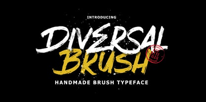 Introducing Give your designs an authentic brush handcrafted feel. “Diversal Brush Font” is perfectly suited to stationery, logos and much more. Thank you,
 - Evers by Graphicxell,
$19.00 inspired by the famous minimalist logo perfect for the purposes of designing templates, brochures, videos, advertising branding, logos, invitation, layout design, elegant crafting, beauty design and other What's Included : + Standard glyphs + International Accent + Works on PC & Mac + Simple installations Accessible in the Adobe Illustrator, Adobe Photoshop, Corel Draw. PUA Encoded Characters - Fully accessible without additional design software. Fonts include multilingual support Image used : All photographs/pictures/vector used in the preview are not included, they are intended for illustration purpose only. Thank You
 - 50's Headline DSG - Unknown license

- Quill Experimental S BRK - Unknown license


