9,425 search results
(0.011 seconds)
- Frostine Snow by Attype Studio,
$12.00 Introducing Frostine Snow - Inspired by winter snow, Frostine Snow is christmas font. perfect for making merry christmas images for card & super easy to use for 3D effect using Frostine Snow font, make combination of this font to create amazing design! Two style Font: Handwritten & Display Frostine Snow is perfect for children product, branding, logo, invitation, stationery, product packaging, merchandise, monogram, blog design, game titles, cute style design, Book/Cover Title and more. Features : - Frostine Snow.otf - Frostine Snow Display.otf - Multilingual Support --- Hope you enjoy with our font! Attype Studio
 - Guardian Snowing by Allouse Studio,
$16.00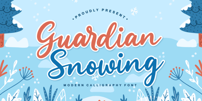 Proudly Presenting, Guardian Snowing a Modern Calligraphy Font Guardian Snowing is perfect for any titles, logo, product packaging, branding project, megazine, social media, wedding, or just used to express words above the background. Guardian Snowing also come with Multi-Lingual Support. Enjoy the font, feel free to comment or feedback, send me PM or email. Thank You!
 - Celtic Knots by Clanbadge,
$20.00 While it is obvious that this is an ornamental style font, it is more than that: it is a Celtic Knotwork design tool! Irish, Scottish, Welsh, even Norse and Viking cultures have used knotwork designs for millenia. These ancient traditional interwoven designs are experiencing a revival as Celtic culture gains exposure in the modern world. Intricate Celtic knots are featured everywhere from jewelry to tattoos. While many enjoy them simply for their beauty and fascinating twists, they can also be used to add an air of myth, magic and mystery to any project. The interlaced lines make them perfect for wedding invitations, borders, dividers and rules, web graphics, and logos. I began using Celtic knotwork designs in my own work as part of my knifemaking and jewelry making hobbies. I read all of the books I could find about Celtic knots and at first I drew them by hand with pencil and paper. Then as I realized how nice it would be to have "undos" I switched over to using Corel Draw. Draw proved to be a natural for this type of artwork with tools like contour and the trim function. But even with these great tools, it was still tedious to create these designs. I noticed that I was able to reuse a lot of parts in repetitive sections. I developed a small library of reusable bits and chunks of Celtic designs. I found them so useful and fun to work with that I began thinking about ways to market my Celtic design kit. I thought about CDR and EPS formats, but then I thought of creating this toolset as a True Type Font. That way anyone with ANY program that uses fonts could easily create Celtic knotwork designs. Word processors, embroidery programs, engraving programs, jewelry design programs, CAD/CAM programs...almost every program can use fonts. I was also interested in CNC work and thought that this font would work well for applications such as laser etching, vinyl signs, and machining. With that in mind, I designed each character of the font with extremes of accuracy. If one character from the font is used at one inch tall, every control point will be placed to an accuracy of better than 0.0001 inch. I wanted every piece to meet exactly with the next, with no possibility for misalignment. The different styles are all very carefully created to fit accurately with each other. So the Filled Style fits exactly into the Outline Style, and the Inverse Style fits precisely around the Outline Style so as to make up the background behind the knotwork. Combining the styles allows you to have complete creative control. By assembling the nearly 200 pieces it is quite easy to produce very complex designs. It is actually a bit like playing with a puzzle and many people really enjoy putting the pieces together to make designs. In fact, I have had many customers tell me of how they love playing with this font and making knots into the wee hours of morning. If you like puzzles then you will absolutely love this font! And creating the patterns is just the beginning of the fun! If you apply your favorite Photoshop tricks on them you can make anything from dazzling chrome knotwork to carved stone. Photoshop plug-ins like SuperBladePro are great for converting knotwork text into corroded bronze or rusted iron. Use your knotwork to add texture to a virtual landscape, or add them as surface embelishments on architecture and furniture. You can also make round knotwork by using this font with "WordArt" (WordArt is included with every copy of Microsoft Word. See http://clanbadge.com/round_knots.htm for a tutorial on how to make round knotwork). For Crafters there are limitless uses for this font. It has been used for embroidery, jewelry, leatherwork, stencils, stained glass, quilting, painting, pyrography, woodcarving and lots more. We have even sold copies to monks for use in decorating handmade books!
 - Snow Blue by Girinesia,
$17.00 Hello guys... We proudly presenting our new font. It's name SNOW BLUE. SNOW BLUE is modern display font. SNOW BLUE is a bold decorative font perfect for your celebration party like Halloween, Chrismast or New Year. SNOW BLUE would perfect for Titles for kid`s book, scrapbook, logo, icon, phrases or quotes for winter greeting cards ( Halloween, Christmas or New Year holidays), photo overlay, short phrases, children’s book, gift shops tag, presentation in social media Pinterest, Instagram, Facebook or others.
 - Sunday Snow by Sronstudio,
$15.00 Sunday Snow is a fun Handwritten Font, this font Is perfect for product packaging, product designs, label, photography, watermark, special events, or anything. Sunday Snow comes with uppercase and lowercase letters, multilingual symbols, numerals, punctuation. If you have any questions please don't hesitate to drop me a message :) Thank You, Sronstudio
 - Medieval Knots by Kaer,
$21.00 Medieval Knots font family has Regular and Colored styles. It inspired by Celtic knots initials and lines. It's all you need to precisely imitate medieval style text. Use this font as a decorative element at the beginning of a paragraph or section, other part of the paragraph should be in regular black letter font. You’ll get Drop Caps & Numbers set. --- *You can use color fonts in PS CC 2017+, AI CC 2018+, ID CC 2019+, macOS 10.14 Mojave+ * *Please note that the Canva & Corel doesn't support color fonts!* *Please download this test file with only A letter ( https://www.dropbox.com/s/w6n0zmga231xng1/MedievalKnots-Test.otf?dl=0 ) to check your app & system.* --- Please feel free to request any help you need: kaer.pro@gmail.com Best, Roman. Thank you!
 - Anke Print - Unknown license

- KG Be Still & Know - Personal use only

- I know a ghost by Dismantle Destroy,
$19.00 This font was inspired by music from the band The Devil Wears Prada.
 - KG Be Still & Know by Kimberly Geswein,
$5.00 Inspired by typewriter-style lettering, this font is legible and still has a bit of flair.
 - Courier Now - Unknown license

- Chibaraki Now - Unknown license

- Brown Now by Studio Fat Cat,
$15.00 Brown Now is a handwritten font family that is designed directly on paper so that it provides a unique experience when you type using it, this font also has alternative characters that also have a different feel when using it.
 - Etrusco Now by Italiantype,
$39.00 Etrusco Now is the revival of a lead typeface originally cast in lead by Italian foundry Nebiolo in the early 1920s. Heavily inspired by the design of the Medium weight of Schelter & Giesecke's Grotesk, Etrusco was, like Cairoli, an early precursor of the modernist grotesque superfamilies: a solid, multi-purpose "work-horse" typeface family that could solve a wide range of design problems with its range of widths and weights. When designing the new incarnation of Nebiolo's Etrusco, the Italiantype team directed by Cosimo Lorenzo Pancini and Mario de Libero decided to extend the original weight and width range to keep this "superfamily" approach. Etrusco Now has twenty-one styles widths in three widths of seven weights each, with matching italics; the original weights for the typeface have been collected in the Etrusco Classic subfamily. Etrusco Now new widths allowed the team to include in the design many nods and homages to other vintage classics of Nebiolo. The lighter weights of the normal width have been heavily influenced by the modernist look of Recta, while the heavy condensed and compressed widths refer to the black vertical texture of Aldo Novarese's Metropol. This infuses the typeface with a slightly vintage mood, making Etrusco at the same time warmly familiar and unexpected to eyes accustomed to the formal and cold look of late modernist grotesques like Helvetica. Contemporary but rich in slight historical quirks, Etrusco Now is perfect for any editorial and branding project that aims to be different in a subtle way. Etrusco Now's deviations from the norm are small enough to give it personality without affecting readability, while its wide range of open type features (alternates, stylistic sets, positional numbers) and language coverage make it a problem solver for any situation. Like its cousin Cairoli, Etrusco is born out of love for lost letterforms and stands like its lead ancestor from a century ago, at the crossroads between artsy craftsmanship and industrial needs.
 - Anytime Now by Device,
$29.00
- Heading Now by Zetafonts,
$39.00 Heading Now is the new incarnation of Heading Pro, developing the original typeface family designed by Francesco Canovaro for Zetafonts into a superfamily with 160 variant combinations. Built around 10 different widths, ranging from ultra-compressed to ultra-wide, and eight weights from thin to heavy, Heading Now provides a full spectrum of sans serif type solutions to your design problems. Born as a space-optimizing typeface for headers and titles, Heading Now can be used in its compressed widths to manage space on the printed page and on the screen. In these widths Heading Now excels in titles and subheadings, timetables, infographics and in situations of exuberant and excessive copywriting. On the other side of the width spectrum, you can find extended width variants, ready to be used for titling where style and energy matter more than pixel or paper economy. Heading family is not only made of extreme widths: you can use the medium width range to design body text. Matching italics provide versatility in text use, as well as a dynamic display alternate to the bolder weights. Heading Now keeps the original design of Heading, but extends the width and weight range while keeping its (post) modernist attention to readability and details. Each Heading Now font includes over 1100 characters with coverage for 200+ languages using Latin, Cyrillic and Greek alphabets. A full array of open-type features is included in each weight featuring also stylistic alternates, small caps, old-style and tabular numerals and positional figures. • Suggested uses: born as a space-optimizing typeface for headers and titles, Heading Now can be used in its compressed widths to manage space on the printed page and on the screen. Perfect for contemporary branding, web design, packaging and countless other projects; • 162 styles: 8 weights + 8 italics x 10 different widths + 2 variable fonts; • 1100 glyphs in each weight; • Useful OpenType features: Access All Alternates, Small Capitals From Capitals, Case-Sensitive Forms, Glyph Composition / Decomposition, Denominators, Fractions, Kerning, Standard Ligatures, Lining Figures, Localized Forms, Mark Positioning, Mark to Mark Positioning, Numerators, Oldstyle Figures, Ordinals, Proportional Figures, Stylistic Alternates, Scientific Inferiors, Small Capitals, Stylistic Set 1, Stylistic Set 2, Stylistic Set 3, Stylistic Set 4, Subscript, Superscript, Tabular Figures, Slashed Zero; • 220 languages supported (extended Latin, Cyrillic, Greek alphabets): English, Spanish, Portuguese, French, Russian, German, Javanese (Latin), Vietnamese, Turkish, Italian, Polish, Afaan Oromo, Azeri, Tagalog, Sundanese (Latin), Filipino, Moldovan, Romanian, Indonesian, Dutch, Cebuano, Igbo, Malay, Uzbek (Latin), Kurdish (Latin), Swahili, Greek, Hungarian, Czech, Haitian Creole, Hiligaynon, Afrikaans, Somali, Zulu, Serbian, Swedish, Bulgarian, Shona, Quechua, Albanian, Catalan, Chichewa, Ilocano, Kikongo, Kinyarwanda, Neapolitan, Xhosa, Tshiluba, Slovak, Danish, Gikuyu, Finnish, Norwegian, Sicilian, Sotho (Southern), Kirundi, Tswana, Sotho (Northern), Belarusian (Latin), Turkmen (Latin), Bemba, Lombard, Lithuanian, Tsonga, Wolof, Jamaican, Dholuo, Galician, Ganda, Low Saxon, Waray-Waray, Makhuwa, Bikol, Kapampangan (Latin), Aymara, Zarma, Ndebele, Slovenian, Tumbuka, Venetian, Genoese, Piedmontese, Swazi, Zazaki, Latvian, Nahuatl, Silesian, Bashkir (Latin), Sardinian, Estonian, Afar, Cape Verdean Creole, Maasai, Occitan, Tetum, Oshiwambo, Basque, Welsh, Chavacano, Dawan, Montenegrin, Walloon, Asturian, Kaqchikel, Ossetian (Latin), Zapotec, Frisian, Guadeloupean Creole, Q’eqchi’, Karakalpak (Latin), Crimean Tatar (Latin), Sango, Luxembourgish, Samoan, Irish, Maltese, Tzotzil, Fijian, Friulian, Icelandic, Sranan, Wayuu, Papiamento, Aromanian, Corsican, Breton, Amis, Gagauz (Latin), Māori, Tok Pisin, Tongan, Alsatian, Atayal, Kiribati, Seychellois Creole, Võro, Tahitian, Scottish Gaelic, Chamorro, Greenlandic (Kalaallisut), Kashubian, Faroese, Rarotongan, Sorbian (Upper Sorbian), Karelian (Latin), Romansh, Chickasaw, Arvanitic (Latin), Nagamese Creole, Saramaccan, Ladin, Kaingang, Palauan, Sami (Northern Sami), Sorbian (Lower Sorbian), Drehu, Wallisian, Aragonese, Mirandese, Tuvaluan, Xavante, Zuni, Montagnais, Hawaiian, Marquesan, Niuean, Yapese, Vepsian, Bislama, Hopi, Megleno-Romanian, Creek, Aranese, Rotokas, Tokelauan, Mohawk, Onĕipŏt, Warlpiri, Cimbrian, Sami (Lule Sami), Jèrriais, Arrernte, Murrinh-Patha, Kala Lagaw Ya, Cofán, Gwich’in, Seri, Sami (Southern Sami), Istro-Romanian, Wik-Mungkan, Anuta, Cornish, Sami (Inari Sami), Yindjibarndi, Noongar, Hotcąk (Latin), Meriam Mir, Manx, Shawnee, Gooniyandi, Ido, Wiradjuri, Hän, Ngiyambaa, Delaware, Potawatomi, Abenaki, Esperanto, Folkspraak, Interglossa, Interlingua, Latin, Latino sine Flexione, Lojban, Novial, Occidental, Old Icelandic, Old Norse, Slovio (Latin), Volapük;
 - Linked Now by Jehoo Creative,
$16.00 Linked Now is so named because this Typeface has Multiple Discreationary Ligatures that unite two different letters to make a striking shape. Is a powerful grotesque typeface designed to be versatile in a wide range of contexts. Having more than 50 stylish Dsicreationary Ligatures on Uppercase letters and unique Alternate on certain letters makes it seem like they have various shapes, so they are great to use as display fonts. To complete it, Linked Now typeface is equipped with 8 weights from Extralight to black and each includes italic. More than 485 glyphs on each and support most European languages .
 - Cairoli Now by Italiantype,
$39.00 Cairoli was originally cast by Italian foundry Nebiolo in 1928, as a license of a design by Wagner & Schmidt, known as Neue moderne Grotesk. Its solid grotesque design (later developed as Aurora by Weber and Akzidenz-Grotesk by Haas) was extremely successful: it anticipated the versatility of sans serif superfamilies thanks to its range of weights and widths, while still retaining some eccentricities from end-of the century lead and wood type. In 2020 the Italiantype team directed by Cosimo Lorenzo Pancini and Mario De Libero decided to produce a revival of Cairoli, extending the original weight and width range and developing both a faithful Classic version and a Now variant. The Cairoli Classic family keeps the original low x-height range, very display-oriented, and normalizes the design while emphasizing the original peculiarities like the hook cuts in curved letters, the high-waisted uppercase R and the squared ovals of the letterforms. Cairoli Now is developed with an higher x-height, more suited for text and digital use, and adds to the original design deeper ink-traps and round punctuation, while slightly correcting the curves for a more contemporary look. Born as an exercise in subtlety and love for lost letterforms, Cairoli stands, like its lead ancestor from a century ago, at the crossroads between artsy craftsmanship and industrial needs. Its deviations from the norm are small enough to give it personality without affecting readability, and the expanded weight and width range make it into a workhorse superfamily with open type features (alternates, stylistic sets, positional numbers) and coverage of over two hundred languages using the latin extended alphabet.
 - PGF Now by PeGGO Fonts,
$24.00 Geometric Sans with Humanistic proportions Typeface (Roman a.k.a. ‘Capitalis Monumentalis’), Inspired on vintage minimalism, with a subtle Art Déco air, where the configuration of the basic and open shape (long ascenders/descenders and a moderate ‘x’ height) star a crisp and luminous look, manufactured under an analytical and handmade process as used to be in ancient times. Among its graphic virtues are a special focus on relaxed and fluid reading rhythm while looking clear and sophisticated, an upright version representing a formal voice paired with an Italic with a more expressive vocal tone, easily distinguished as a second quoted content in Editorial and Branding communicational contexts. Equipped with generous stylistic options controlled by OpenType features as: 17 glyphs variations stored as stylistic sets Standard and Discretionary Ligatures Lining and Old Style Numeral forms Tabular forms Superior and Inferior Scientific Numeric Notation Numerators and Denominators for fractional compositions Pre-Composed Fractions, ordinals Dotted Zero for alphanumeric contexts Circled numbers An Art Déco style Border Set Bullets set for multiple levels ordered list Arrow set Monetary Symbols Mathematical Operators Publishing and Social Media Markers Wide range of Diacritics allowing you to set contents in more than 200 Latin base languages. The access to all these options is also possible via character set panel. With no hesitation, PGF Now is a highly valuable publishing and Branding tool that deserves to flaunt in the more elegant contexts but also daily situations that need a clear and modern voice.
 - Write Now by Scholtz Fonts,
$15.00 Write Now: Write Now is an elegant, informal, handwritten script font, developed from the designer's handwriting, and carefully crafted to create a flowing, legible image. The large, opulent capitals, with their loose loops and curves create a perfect foil for the more subdued lower case characters, presenting a strong but gentle message . Write Now is perfect for: -- invitations -- advertising material where an informal and personal mood is required -- greeting cards -- menus -- book covers Write Now comes in two styles, Write Now Regular and the delicate Write Now Thin. The font has been carefully letterspaced and kerned. A full character set (all upper and lower case characters, punctuation, numerals and accented characters) is present.
 - Captura Now by TypeThis!Studio,
$54.00 Carefully refined shapes and sensitively balanced spacing and kerning create the gentle rythm that grants Captura Now its warm-hearted face, perfect in form and shape. Expanded with an enormous character set, Captura Now offers the freedom to transform your design into the Cyrillic-language world, as well as into any Latin based language — including Vietnamese. *Variable fonts work well in software that supports variable font technology.
 - Logopedia Now by Bülent Yüksel,
$19.00 What makes "Logopedia Now" unique is that it has a strong body, upper and lower case letters are the same size and work in perfect harmony. All letters in the character have "alternatives" in various numbers. This feature provides you variety in your designs. It is possible to take your designs to the next level by using "Logopedia Now". "Logopedia Now" is ideal for especially logo design, advertising and packaging, branding and creative industries, banners and billboards and signage as well as web and screen design. "Logopedia Now" provides advanced typographical support for Latin-based languages. An extended character set, supporting Central, Western and Eastern European languages, rounds up the family. The designation “Logopedia Now 500 Regular” forms the central point. "Logopedia Now" comes 3 weights and italics total 6 types. The family contains a set of 543 glyphs. Classes and Features, Stilistic Style, Fractions and Old Style Numerator just one touch easy In all graphic programs. "Logopedia Now" is the perfect font for web use. Be sure to check out the other siblings of "Logopedia". - Logopedia Now - Logopedia Now Soft - Logopedia Next - Logopedia Next Soft You can enjoy using it.
 - Helvetica Now by Monotype,
$42.99 Every single glyph of Helvetica has been redrawn and redesigned for this expansive new edition – which preserves the typeface's Swiss mantra of clarity, simplicity and neutrality, while updating it for the demands of contemporary design and branding. Helvetica Now comprises 96 fonts, consisting of three distinct optical sizes: Micro, Text and Display, all in two widths. Each one has been carefully tailored to the demands of its size. The larger Display versions are drawn to show off the subtlety of Helvetica and spaced with headlines in mind, while the Text sizes focus on legibility, using robust strokes and comfortably loose spaces. The Micro sizes address an issue Helvetica has long faced – that of being 'micro type challenged'. In the past, the typeface struggled to be legible at tiny sizes because of its compactness and closed apertures. Helvetica Now's Micro designs are simplified and exaggerated to maintain the impression of Helvetica in tiny type, and their spacing is loose, providing remarkable legibility at microscopic sizes and in low-res environments. There's also an extensive set of alternates, which allow designers the opportunity to experiment with and adapt Helvetica's tone of voice. This includes a hooked version of the lowercase l (addressing a common complaint that the capital I and lowercase l are indistinguishable) as well as a rounded G, and a straight-legged R, a single storey a and a lowercase u without a trailing serif. In the past, designers had to nudge, trim and contort the design to create stylish display-type lockups with Helvetica. Helvetica Now Display was designed and spaced with those modifications in mind—saving effort and providing more consistent (and more stylish) results. “Helvetica is the gold standard,' says Monotype Type Director Charles Nix. “To use it is to claim that you are the ultimate expression of whatever your brand aspires to be. Its blankness is its power.” Helvetica Now User Guide PDF. Featured in: Best Fonts for Resumes, Best Fonts for Websites, Best Fonts for PowerPoints
 - Futura Now by Monotype,
$53.99 For nearly 90 years, Paul Renner’s Futura has been as popular as it is versatile—from children’s books to fashion magazines to the plaque on the Moon. Futura is a typographic icon. Futura Now offers designers a chance to see Futura with fresh eyes. It’s more truly Futura-like than any digital version you’ve ever worked with. “It brings some much-needed humanity back to the world of geometric sans serifs,” says Steve Matteson, Monotype’s Creative Type Director who led the design team. “Despite its reputation as the ultimate modern typeface, Futura Now is surprisingly warm,” he explains. “It’s just as at home set next to a leafy tree as it is next to a stainless-steel table, because it skillfully navigates the border between super-clean geometry and humanist warmth.” Futura Now—the definitive Futura—contains 102 styles, including: new Headline and Text weights; new Script and Display weights and styles; and new decorative variants (outlines, inlines, shadows, and fill). Its contemporary alignment of names and weights makes the family easier to understand and use, and its comfortable Text and judicious Headline subfamilies provide instantly refined spacing. With a large Latin, Greek, and Cyrillic character-set, Futura Now serves a wider international creative community. Futura Now is available both as individual OpenType fonts and as a set of Variable fonts, delivering limitless styles in a tidy digital footprint.
 - Offshore Banking Business - Unknown license

- Ink Tank (BRK) - Unknown license

- F25 Bank Printer - 100% free

- Ink Tank BRK - Unknown license

- Cranked Pipe 2D by 2D Typo,
$24.00 Font has Industrial motifs and simple geometric shapes. Best suited for large lettering. Font contains characters for all occasions, many ligatures, alternatives and exotic.
 - Bank Stencil EF by Elsner+Flake,
$35.00 - Bank Script SB by Scangraphic Digital Type Collection,
$26.00Since the release of these fonts most typefaces in the Scangraphic Type Collection appear in two versions. One is designed specifically for headline typesetting (SH: Scangraphic Headline Types) and one specifically for text typesetting (SB Scangraphic Bodytypes). The most obvious differentiation can be found in the spacing. That of the Bodytypes is adjusted for readability. That of the Headline Types is decidedly more narrow in order to do justice to the requirements of headline typesetting. The kerning tables, as well, have been individualized for each of these type varieties. In addition to the adjustment of spacing, there are also adjustments in the design. For the Bodytypes, fine spaces were created which prevented the smear effect on acute angles in small typesizes. For a number of Bodytypes, hairlines and serifs were thickened or the whole typeface was adjusted to meet the optical requirements for setting type in small sizes. For the German lower-case diacritical marks, all Headline Types complements contain alternative integrated accents which allow the compact setting of lower-case headlines. - Bank Of England by K-Type,
$20.00 Bank of England is loosely based on the blackletter lettering from Series F English twenty pound banknotes introduced in 2007. The font takes inspiration from German Kanzlei (Chancery) typefaces and the English calligraphers John Ayres and George Bickham. For designers using OpenType-aware applications, Bank of England includes Swash versions of all uppercase letters and ampersand, Alternates for nine lowercase letters and capital Z, and sixteen ornamental flourishes. Western European accented characters are included, and also a simplified St. Edward’s Crown (Elizabeth II’s coronation crown) at the Section (§) and PlusMinus (±) keystrokes (Windows Alt-0167 and Alt-0177).
 - Hebrew Frank Tanach by Samtype,
$189.00 This is The Classic font of XX century. Based in a typeface created by
 - Bank Statement AOE by Astigmatic,
$19.95A typeface made from vintage typewriter samples and meticulously compiled into a complete character set. - Bank Sans EF by Elsner+Flake,
$35.00 With its extended complement, this comprehensive redesign of Bank Gothic by Elsner+Flake offers a wide spectrum for usage. After 80 years, the typeface Bank Gothic, designed by Morris Fuller Benton in 1930, is still as desirable for all areas of graphic design as it has ever been. Its usage spans the design of headlines to exterior design. Game manufacturers adopt this spry typeface, so reminiscent of the Bauhaus and its geometric forms, as often as do architects and web designers. The creative path of the Bank Gothic from hot metal type via phototypesetting to digital variations created by desktop designers has by now taken on great breadth. The number of cuts has increased. The original Roman weight has been augmented by Oblique and Italic variants. The original versions came with just a complement of Small Caps. Now, they are, however, enlarged by often quite individualized lower case letters. In order to do justice to the form changes and in order to differentiate between the various versions, the Bank Gothic, since 2007 a US trademark of the Grosse Pointe Group (Trademark FontHaus, USA), is nowadays available under a variety of different names. Some of these variations remain close to the original concept, others strive for greater individualism in their designs. The typeface family which was cut by the American typefoundry ATF (American Type Founders) in the early 1930’s consisted of a normal and a narrow type family, each one in the weights Light, Medium and Bold. In addition to its basic ornamental structure which has its origin in square or rectangular geometric forms, there is another unique feature of the Bank Gothic: the normally round upper case letters such as B, C, G, O, P, Q, R and U are also rectangular. The one exception is the upper case letter D, which remains round, most likely for legibility reasons (there is the danger of mistaking it for the letter O.) Because of the huge success of this type design, which follows the design principles of the more square and the more contemporary adaption of the already existing Copperplate, it was soon adopted by all of the major type and typesetting manufacturers. Thus, the Bank Gothic appeared at Linotype; as Commerce Gothic it was brought out by Ludlow; and as Deluxe Gothic on Intertype typesetters. Among others, it was also available from Monotype and sold under the name Stationer’s Gothic. In 1936, Linotype introduced 6pt and 12pt weights of the condensed version as Card Gothic. Lateron, Linotype came out with Bank Gothic Medium Condensed in larger sizes and a more narrow set width and named it Poster Gothic. With the advent of photoypesetters and CRT technologies, the Bank Gothic experienced an even wider acceptance. The first digital versions, designed according to present computing technologies, was created by Bitstream whose PostScript fonts in Regular and Medium weights have been available through FontShop since 1991. These were followed by digital redesigns by FontHaus, USA, and, in 1996, by Elsner+Flake who were also the first company to add cursive cuts. In 2009, they extended the family to 16 weights in both Roman and Oblique designs. In addition, they created the long-awaited Cyrillic complement. In 2010, Elsner+Flake completed the set with lowercase letters and small caps. Since its redesign the type family has been available from Elsner+Flake under the name Bank Sans®. The character set of the Bank Sans® Caps and the Bank Sans® covers almost all latin-based languages (Europe Plus) as well as the Cyrillic character set MAC OS Cyrillic and MS Windows 1251. Both families are available in Normal, Condensed and Compressed weights in 4 stroke widths each (Light, Regular, Medium and Bold). The basic stroke widths of the different weights have been kept even which allows the mixing of, for instance, normal upper case letters and the more narrow small caps. This gives the family an even wider and more interactive range of use. There are, furthermore, extensive sets of numerals which can be accessed via OpenType-Features. The Bank Sans® type family, as opposed to the Bank Sans® Caps family, contains, instead of the optically reduced upper case letters, newly designed lower case letters and the matching small caps. Bank Sans® fonts are available in the formats OpenType and TrueType.
 - Dinky Rink NF by Nick's Fonts,
$10.00Handlettering on a 1934 WPA poster promoting skating in Central Park provided the pattern for the uppercase letters of this typeface, while the lowercase letters take their inspiration from Paul Renner’s Steile Futura. The result is a warm, friendly face that is both quaint and modern. Available in Roman and Italic versions. Both versions of the font include 1252 Latin, 1250 CE (with localization for Romanian and Moldovan). - Banks and Miles by K-Type,
$20.00 K-Type’s ‘Banks & Miles’ fonts are inspired by the geometric monoline lettering created for the British Post Office in 1970 by London design company Banks & Miles, a project initiated and supervised by partner John Miles, and which included ‘Double Line’ and ‘Single Line’ alphabets. The new digital typeface is a reworking and extension of both alphabets. Banks & Miles Double Line is provided in three weights – Light, Regular and Dark – variations achieved by adjusting the width of the inline. Banks & Miles Single Line develops the less used companion sans into a three weight family – Regular, Medium and Bold – each with an optically corrected oblique. Although the ‘Banks & Miles Double Line’ and ‘Banks & Miles Single Line’ fonts are based on the original Post Office letterforms, glyphs have been drawn from scratch and include numerous adjustments and impertinent alterations, such as narrowing the overly wide Z and shortening the leg of the K. Several disparities exist between the Post Office Double and Single Line styles, and K-Type has attempted to secure greater consistency between the two. For instance, a wide apex on the Double Line’s lowercase w is made pointed to match the uppercase W and the Single Line’s W/w. Also, the gently sloping hook of Single Line’s lowercase j is adopted for both families. The original Single Line’s R and k, which were incongruously simplified, are drawn in their more remarkable Double Line forms, and whilst the new Single Line fonts are modestly condensed where appropriate, rounded letters retain the essentially circular form of the Double Line. Many characters that were not part of the original project, such as @, ß, #, and currency symbols, have been designed afresh, and a full set of Latin Extended-A characters is included. The new fonts are a celebration of distinctive features like the delightful teardrop-shaped bowl of a,b,d,g,p and q, and a general level of elegance not always achieved by inline typefaces. The Post Office Double Line alphabet was used from the early 1970s, in different colours to denote the various parts of the Post Office business which included telecommunications, counter services and the Royal Mail. Even after the Post Office was split into separate businesses in the 1980s, Post Office Counters and Royal Mail continued use of the lettering, and a version can still be seen within the Royal Mail cruciform logo.
 - Hebrew Frank Std by Samtype,
$59.00 This is The Classic font of the XX century.
 - Frank Ruhl1924 MF by Masterfont,
$59.00 The most common Hebrew typeface, based on Sefaradic tradition, used in most newspapers and publications. The main Hebrew typeface of the 20th century, designed in 1908 and was published by Berthold in 1924. OpenType Pro Excellent support for Niqqud (Vowels). All marks are programmed to fit each glyph's shape and width. OpenType Pro includes new advanced features like Dagesh Hazak, ShevaNa, Qamatz Katan, Holam Haser and wide letters. Best used with Adobe InDesign CC that support complex Hebrew text. Please check these advanced features in this link: https://tinyurl.com/ybgdsxme Font files were re-generated to get better online screen display, as well as refined OpenType features as kerning glyph substitution.
 - LD Franks Friends by Illustration Ink,
$3.00Do the Monster Mash with DB Frank's Friends! Makes great Halloween party invitations, spooky adornments or fun additions to any scrapbook project. LD Frank's Friends Distressed is just in time for Halloween! This spookified font and it's distressed style makes it perfect for your Halloween party invitations, journaling, or adding a nice touch to your scrapbook pages.


