5,667 search results
(0.066 seconds)
- Puma by Canada Type,
$24.95Based on Herbert Thannhaeuser's 1954 Kurier design, Puma is the digital version of what is possibly the friendliest yet least used heavy brush design. Aside from its utilitarian functionality as a poster and sign font, Puma includes some original and artistic shapes, such as the very gorgeous single-stroke take on the letter P, the humorous knot-and-dash Q, the happy fish-eye e, the casual single-looped f, and the welcoming g. Perfect for shop signs, posters, menu heads, children book covers, fun flyers, and loud but friendly messages altogether. The complete character set is complemented with a second font containing various letter alternates and ligatures. - Pace by Ratzlaff Type,
$9.00 Pace is a geometric minimalist typeface with a large range of weight options to suit multiple scenarios, from videogames to sports magazines. To inspire movement and speed, try the Slanted styles.
 - Pecos by BA Graphics,
$45.00Extreme look. - My Puma - Unknown license

- Black Puma by Gergely Soós,
$20.00 The Black Puma typeface was inspired by the rock beats and the honest spirit of today's indie music scene. Just as evolving garage bands', Black Puma’s strength lies in its fresh and brave approach: to playfully experiment and proudly take its imperfections as long as they are needed to stay real and honest. Black Puma's aim is to entertain, while expressing a strong human touch through its handmade and creatively assembled characters. Black Puma's varying rounded and edgy shapes create a vibrating yet coherent visual, which carries a positive, playful atmosphere. Its irregularities and extra bold characters empower Black Puma to have great and touching visual impact, which make it stand out of the mass flow of information delivered in the information society we live today. Black Puma font - with its 370 glyphs - includes all the accented characters of the Latin alphabet, and also comes with a couple of alternate characters (stylistic and contextual) to play around with. And, above all - as mentioned before - it includes its essence: the young spirit. So come, play around and have fun with Black Puma. Use it to create expressive, passionate posters, flyers and art work full of spirit for the awaiting young-minded public. You can find more artwork using Black Puma under the "Gallery" tab above.
 - Kuma by L'île Foundry,
$35.00 In Ancient Greek, Kuma means wave. This wavy, dynamic and poetic all-caps display typeface is useful for headlines or short texts. Kuma is the result of a graphic and perceptual game that, using experimentation as a working method, explores the possibilities of writing as an image. This grid-based typeface creates different shapes and directions, never predictable. There are different types of waves created by the wind. That's why there are three different versions of Kuma: Kuma, Kuma Rounded and Kuma Square. Each version is available in seven weights which can be combined together. In their black and white rhythm, they guarantee global readability and balance. Kuma was designed by Jérémy Ruiz. Supported languages: Afrikaans, Albanian, Basque, Bosnian, Breton, Catalan, Croatian, Czech, Danish, Dutch, English, Esperanto, Estonian, Faroese, Fijian, Finnish, Flemish, French, Frisian, German, Greenlandic, Hawaiian, Hungarian, Icelandic, Indonesian, Irish, Italian, Latin, Latvian, Lithuanian, Malay, Maltese, Maori, Moldavian, Norwegian, Polish, Portuguese, Provençal, Romanian, Romany, Sámi (Inari), Sámi (Luli), Sámi (Northern), Sámi (Southern), Samoan, Scottish Gaelic, Slovak, Slovenian, Sorbian, Spanish, Swahili, Swedish, Tagalog, Turkish, Welsh.
 - Pump by ITC,
$40.99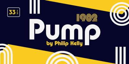
- Pema by Designpiraten,
$65.00 Pema – a contemporary Tibetan sans serif encoded in the Unicode standard. This is the first Tibetan typeface influenced by western sans serif fonts. It was designed especially to match multilingual purposes. The rather calligraphic Tibetan scripts did not match with the design aesthetics of western and Indian fonts and so I came up with the idea to design a “modern” Tibetan sans serif. Pema comes in two weights, Regular and Bold, each equipped with almost 1.300 glyphs.
 - Yuma by Otto Maurer,
$19.00 This Font is made for a Capture Function on an Web template. For Security.
 - Peking Duck by Hanoded,
$15.00 I used to be a tour guide and I traveled to China numerous times. Usually, the itinerary mentioned going to a restaurant in Beijing and eating ‘Beijing Roast Duck’ (北京烤鸭), a famous dish that has been prepared since the Imperial era. Typically, the whole duck is sliced at your table. The skin is crisp, glazed and thin and you should eat it with thin pancakes and thinly sliced spring onion. Of course, if I had to guide several ‘China tours’ in a row, I would often eat something else (there is only so much Beijing Duck you can eat). Peking Duck is a nice, handmade, Chinese Ink font. Use it for your restaurant menu, your book covers or your posters, advertising oriental food!
 - FF Pepe by FontFont,
$41.99 Spanish type designer Pepe Gimeno created this script FontFont in 2002. The font is ideally suited for advertising and packaging, festive occasions, editorial and publishing as well as poster and billboards. FF Pepe provides advanced typographical support with features such as swashes, ligatures, alternate characters, and case-sensitive forms. It comes with tabular lining and proportional oldstyle figures.
 - Pecking Order by Hanoded,
$15.00 I keep chickens for eggs and meat, but the ones that have names cannot be eaten. ;-) As I was busy working on this font, the chickens were sitting in the window, looking at me and hoping they'd get a treat! Pecking Order is a cartoon and kids font. It comes with a wholesome, homemade goodness and extensive language support, including Sami, Greek and Vietnamese.
 - FS Pele by Fontsmith,
$50.00 Iconic Conjuring memories of chunky typefaces from the late-60s and early-70s, and named after the world’s greatest footballer of that and probably any other era, FS Pele is one of a set of Fontsmith fonts designed specifically for headlines and other prominent applications. “We wanted to create fonts that could be integral to the design of posters, album covers and magazines,” says Jason Smith. Welcome to FS Pele, iconic, like its namesake (though, perhaps, a little less nimble). Big Pele, little Pele There was only one Pele. But there are two sizes of FS Pele. FS Pele One, with the finer counters and details, adds considerable weight and style at large sizes, especially in big block headlines on posters. FS Pele Two’s thicker “slots” make it a better choice for smaller-sized text. A load of blocks FS Pele began as an exercise by Phil Garnham in turning squares into legible letters, via the least means necessary. The idea extended his ideas about logo-making, and the search for a stamp-like brand mark that lends authority, stability and instant identification. “The thought that the type was a 2D/3D jigsaw of slotted, architectural pieces was almost an after-thought. I wanted to create a strong, stacking, block aesthetic for the most contemporary poster design. “At the time there were a lot of designers creating their own versions of the same thing but I wanted to take the blocker forms to the next step, and infer a more legible text without sacrificing the idea.”
 - Peck Initials by Scriptorium,
$12.00 - Uma by Sudtipos,
$39.00 Uma is a typeface family consisting of two weights: light and bold. The typography is fresh, informal and friendly at first glance, but the constructive architecture makes it elegant and modern. It works equally as well in large or small sizes, and the combination between the two weights is very interesting to work with. It is a contemporary typeface, ideal for use in magazines, brochures, flyers and advertising among other applications. Uma may seem simple at a first glance, but it is very functional and professional, with aesthetic enchanting details. Uma has a wide range of functionality and has a great personality. Designed by Ariel Di Lisio and digitized by Ale Paul, Uma includes alternates, fractions, ligatures and a wide range of latin languages.
 - My Puma Outlined - Unknown license

- My Puma Oblique - Unknown license

- Pete-Boy <> Hand of Pete-Boy - Unknown license

- Kremlin Duma - Unknown license

- kuma Font - Unknown license

- Kuma Square by L'île Foundry,
$35.00 In Ancient Greek, Kuma means wave. This wavy, dynamic and poetic all-caps display typeface is useful for headlines or short texts. Kuma is the result of a graphic and perceptual game that, using experimentation as a working method, explores the possibilities of writing as an image. This grid-based typeface creates different shapes and directions, never predictable. There are different types of waves created by the wind. That's why there are three different versions of Kuma: Kuma, Kuma Rounded and Kuma Square. Each version is available in seven weights which can be combined together. In their black and white rhythm, they guarantee global readability and balance. Kuma Square was designed by Jérémy Ruiz. Supported languages: Afrikaans, Albanian, Basque, Bosnian, Breton, Catalan, Croatian, Czech, Danish, Dutch, English, Esperanto, Estonian, Faroese, Fijian, Finnish, Flemish, French, Frisian, German, Greenlandic, Hawaiian, Hungarian, Icelandic, Indonesian, Irish, Italian, Latin, Latvian, Lithuanian, Malay, Maltese, Maori, Moldavian, Norwegian, Polish, Portuguese, Provençal, Romanian, Romany, Sámi (Inari), Sámi (Luli), Sámi (Northern), Sámi (Southern), Samoan, Scottish Gaelic, Slovak, Slovenian, Sorbian, Spanish, Swahili, Swedish, Tagalog, Turkish, Welsh.
 - Kuma Rounded by L'île Foundry,
$35.00 In Ancient Greek, Kuma means wave. This wavy, dynamic and poetic all-caps display typeface is useful for headlines or short texts. Kuma is the result of a graphic and perceptual game that, using experimentation as a working method, explores the possibilities of writing as an image. This grid-based typeface creates different shapes and directions, never predictable. There are different types of waves created by the wind. That's why there are three different versions of Kuma: Kuma, Kuma Rounded and Kuma Square. Each version is available in seven weights which can be combined together. In their black and white rhythm, they guarantee global readability and balance. Kuma Rounded was designed by Jérémy Ruiz. Supported languages: Afrikaans, Albanian, Basque, Bosnian, Breton, Catalan, Croatian, Czech, Danish, Dutch, English, Esperanto, Estonian, Faroese, Fijian, Finnish, Flemish, French, Frisian, German, Greenlandic, Hawaiian, Hungarian, Icelandic, Indonesian, Irish, Italian, Latin, Latvian, Lithuanian, Malay, Maltese, Maori, Moldavian, Norwegian, Polish, Portuguese, Provençal, Romanian, Romany, Sámi (Inari), Sámi (Luli), Sámi (Northern), Sámi (Southern), Samoan, Scottish Gaelic, Slovak, Slovenian, Sorbian, Spanish, Swahili, Swedish, Tagalog, Turkish, Welsh.
 - Bushel And Peck by Make Media Co,
$12.00 Introducing Bushel and Peck - A flirty, bouncy, SMOOTH Script with over 50 alternates, a handy Sans Serif, and an adorable Dingbat style with loads of farmhouse charm. Use this sweet trio to make logos, greeting cards, signage, apparels, totes, mugs and more!
 - FS Pele Variable by Fontsmith,
$199.99Iconic Conjuring memories of chunky typefaces from the late-60s and early-70s, and named after the world’s greatest footballer of that and probably any other era, FS Pele is one of a set of Fontsmith fonts designed specifically for headlines and other prominent applications. “We wanted to create fonts that could be integral to the design of posters, album covers and magazines,” says Jason Smith. Welcome to FS Pele, iconic, like its namesake (though, perhaps, a little less nimble). Big Pele, little Pele There was only one Pele. But there are two sizes of FS Pele. FS Pele One, with the finer counters and details, adds considerable weight and style at large sizes, especially in big block headlines on posters. FS Pele Two’s thicker “slots” make it a better choice for smaller-sized text. A load of blocks FS Pele began as an exercise by Phil Garnham in turning squares into legible letters, via the least means necessary. The idea extended his ideas about logo-making, and the search for a stamp-like brand mark that lends authority, stability and instant identification. “The thought that the type was a 2D/3D jigsaw of slotted, architectural pieces was almost an after-thought. I wanted to create a strong, stacking, block aesthetic for the most contemporary poster design. “At the time there were a lot of designers creating their own versions of the same thing but I wanted to take the blocker forms to the next step, and infer a more legible text without sacrificing the idea.” - Frantic Pace JNL by Jeff Levine,
$29.00 Frantic Pace JNL is based on hand lettering found on the lid of a late 1950s or early 1960s edition of the Print Craft alphabet printing set once manufactured by the Superior Marking Equipment Company of Chicago. The free-form spurred serif lettering is fun and casual; giving the impression of movement or action.
 - My Puma Oblique Outlined - Unknown license

- pee pants script - Personal use only

- Polytype Numa Frames by Prime Graphics,
$45.00 - Polytype Dumas I Frames by Prime Graphics,
$45.00 - Polytype Dumas II Frames by Prime Graphics,
$45.00 - Racer - 100% free

- Ringbearer - Unknown license

- Aniron - Unknown license

- Dom by Bitstream,
$29.99 The most familiar of brush scripts designed by Pete Dombrezian for ATF in 1951.
 - Advent by Jonahfonts,
$25.00 A Semi-Slab face with a distinct emphasis on power and legibility. Very paced for packaging, posters, logos and various other applications.
 - Tamarac JNL by Jeff Levine,
$29.00Tamarac JNL offers the look of wood type with added serifs. Use Tamarac JNL when you need a change of pace from the "regular" serif fonts. - Linotype Gianotten by Linotype,
$29.99 It took the Italian designer Antonio Pace more than five years to create Linotype Gianotten™, a successful new interpretation of the classic Bodoni types. To re-draw the 200-year-old characters for the world of modern digital technology, Pace studied Giambattista Bodoni's original punches at the Bodoni Museum in Parma. He felt that previous Bodoni interpretations were not well suited for body texts, so he focused his study of Bodoni's "Manuale Typografico" on the types made specifically for text sizes. Consequently, his Bodoni has strong hairlines, rounded transitions and shorter, fluted serifs - elements that help to achieve readability by providing an overall tranquil effect. This contemporary, highly readable family is an excellent choice for text settings in books, newspapers, and magazines. Incidentally, the name Gianotten has nothing to do with Bodoni, but was chosen by Pace and Linotype to honor Dutch typographer, Henk W. J. Gianotten."
 - Unusually Deco JNL by Jeff Levine,
$29.00 The hand lettered words “Pere Noel” under a vintage French magazine’s photo of Santa with two bikini-clad beauties inspired the digital version of this quirky, condensed type style. Unusually Deco JNL is available in both regular and oblique versions From Wikipedia: “Père Noël “Papi Christmas”, sometimes called ‘Papa Noël’ (“Daddy Christmas”), is a legendary gift-bringer at Christmas in France and other French-speaking areas, identified with the Father Christmas and/or Santa Claus of English-speaking territories. Though they were traditionally different, all of them are now the same character, with different names, and the shared characteristics of a red outfit, workshop at the North Pole/Lapland, and a team of reindeer.”
 - Single Fighter by Subectype,
$15.00 Single Fighter is a supercharged, street-wise brush font bursting with energy. With extra attention to quick strokes and sharp details, Single Fighter is guaranteed to deliver an unapologetically loud & fast-paced message; ideal for logos, apparel, quotes, product packaging, or anything which needs a typographic turbo-boost.
 - Bishops Stinger by Folding Type,
$9.00 Ouch! Bishops Stinger is a unique isometric display typeface, perfect for bold headlines and logotypes. The blunt serifs and terminals that appear on select letters help ground the faced-paced look. When used for a block of text at smaller sizes the style resembles old script writing but with a retro futuristic twist.


Page 1 of 142Next page