2,191 search results
(0.014 seconds)
- Paper Cut - Personal use only

- P22 Pooper Black Pro by IHOF,
$39.95 Pooper Black Pro is based on a brush ethic and has an extreme axis that lends a certain amount of speed to the font while the lack of connectors slows it down. The pro version expands on the original and popular Pooper Black with the addition of full Central and Eastern European character sets and plenty of alternate characters for those who have applications that support Opentype features. Almost all of the lower case characters now include an in stroke and out stroke version for greater design flexibility. A wonderful face for packaging, titling, and short bursts of text.
 - Prêt-à-porter by Latinotype,
$39.00 Prêt-à-porter is a project developed as part of a series of type experiments appearing on the blog ‘Letritas’. Prêt-à-porter is a very expressive friendly font with a handwritten look, smooth curves and strong identity. Its counterforms make it a carefree, wild, cheerful, light and highly readable typeface. This type system consists of two Script families—Contrast and Linear—and a Slab family. The Contrast set works as a complement, providing more elegance and formal refinement. Both Linear and Contrast come in 5 weights plus Ornaments, which can be used as initial and terminal forms since they have been designed for connecting with each letter. Linear and Contrast families include ligatures and the whole font family supports 208 different languages.
 - Cooper Black SH by Scangraphic Digital Type Collection,
$26.00Since the release of these fonts most typefaces in the Scangraphic Type Collection appear in two versions. One is designed specifically for headline typesetting (SH: Scangraphic Headline Types) and one specifically for text typesetting (SB Scangraphic Bodytypes). The most obvious differentiation can be found in the spacing. That of the Bodytypes is adjusted for readability. That of the Headline Types is decidedly more narrow in order to do justice to the requirements of headline typesetting. The kerning tables, as well, have been individualized for each of these type varieties. In addition to the adjustment of spacing, there are also adjustments in the design. For the Bodytypes, fine spaces were created which prevented the smear effect on acute angles in small typesizes. For a number of Bodytypes, hairlines and serifs were thickened or the whole typeface was adjusted to meet the optical requirements for setting type in small sizes. For the German lower-case diacritical marks, all Headline Types complements contain alternative integrated accents which allow the compact setting of lower-case headlines. - FF Prater Block by FontFont,
$62.99 German type designers Henning Wagenbreth and Steffen Sauerteig created this display FontFont in 2000. The family contains 3 weights and is ideally suited for advertising and packaging, festive occasions, film and tv, editorial and publishing as well as poster and billboards. FF Prater Block provides advanced typographical support with features such as ligatures, alternate characters, and case-sensitive forms. It comes with tabular lining and proportional lining figures. This FontFont is a member of the FF Prater super family, which also includes FF Prater Sans, FF Prater Script, and FF Prater Serif.
 - FF Prater Script by FontFont,
$62.99 German type designers Henning Wagenbreth and Steffen Sauerteig created this display and script FontFont in 2000. The font is ideally suited for advertising and packaging, festive occasions, film and tv, editorial and publishing as well as poster and billboards. FF Prater Script provides advanced typographical support with features such as ligatures, alternate characters, and case-sensitive forms. It comes with proportional lining and tabular lining figures. This FontFont is a member of the FF Prater super family, which also includes FF Prater Block, FF Prater Sans, and FF Prater Serif.
 - XXII Grober Pinsel by Doubletwo Studios,
$29.99 XXII Grober Pinsel - Rough brush capitals The Grober Pinsel is simply what it’s called - a rough brush ("Grober Pinsel“ in german). Handwritten Capitals from A - Z and 0 - 9 in three character sets, upper-, lowercase and an alternates set. In addition comes a set of 10 line strokes and a couple of ligatures and alternates. On the whole this font gives you the possibility to make your design look very unique and handmade. The Pinsel is awesome on shirts, posters and stickers, your stylish fashion blog or cookbook, and everything that needs a bold lettered message. It loves big headlines and gives its best in dynamic logos and also he speaks a well central european. Also see: Behance-Project.
 - Preferred Shares JNL by Jeff Levine,
$29.00 A bold, condensed slab serif face A July 9, 1935 trade paper ad for Paramount Pictures’ 1st quarter film releases sported hand lettering with chamfered slab serifs. This condensed type design is now available as Preferred Shares JNL in both regular and oblique versions.
 - FF Prater Serif by FontFont,
$62.99 German type designers Henning Wagenbreth and Steffen Sauerteig created this display and serif FontFont in 2000. The family contains 2 weights: Regular and Bold and is ideally suited for advertising and packaging, festive occasions, film and tv, editorial and publishing as well as poster and billboards. FF Prater Serif provides advanced typographical support with features such as ligatures, alternate characters, and case-sensitive forms. It comes with tabular lining and proportional lining figures. This FontFont is a member of the FF Prater super family, which also includes FF Prater Block, FF Prater Sans, and FF Prater Script.
 - Oceanfront Property JNL by Jeff Levine,
$29.00 Oceanfront Property JNL was modeled from the hand lettered title on the cover of the 1932 sheet music for "There's Oceans of Love by the Beautiful Sea". A simple sans, it still reflects the beginnings of the Art Deco Era with its approach to letter forms and varying widths. This type design is available in both regular and oblique versions.
 - Cooper Black SB by Scangraphic Digital Type Collection,
$26.00Since the release of these fonts most typefaces in the Scangraphic Type Collection appear in two versions. One is designed specifically for headline typesetting (SH: Scangraphic Headline Types) and one specifically for text typesetting (SB Scangraphic Bodytypes). The most obvious differentiation can be found in the spacing. That of the Bodytypes is adjusted for readability. That of the Headline Types is decidedly more narrow in order to do justice to the requirements of headline typesetting. The kerning tables, as well, have been individualized for each of these type varieties. In addition to the adjustment of spacing, there are also adjustments in the design. For the Bodytypes, fine spaces were created which prevented the smear effect on acute angles in small typesizes. For a number of Bodytypes, hairlines and serifs were thickened or the whole typeface was adjusted to meet the optical requirements for setting type in small sizes. For the German lower-case diacritical marks, all Headline Types complements contain alternative integrated accents which allow the compact setting of lower-case headlines. - The Flame Proofer by UICreative,
$23.00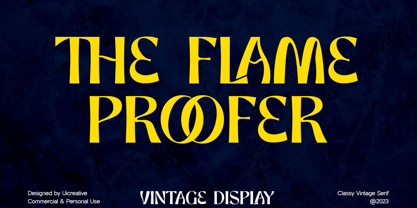 Introducing our new product the name The Flame Proofer Display Serif Font. Modern Serif font that beautiful classy, elegant, and modern. This font is perfectly suited for a wide variety of projects, such as signature, stationery, logo, wedding, typography quotes, magazine or book covers, website headers, clothing, branding, packaging design, and more. Also for fashion-related branding or editorial design and displays both masculine and feminine qualities.
 - Cooper Black Pro by SoftMaker,
$15.99 SoftMaker’s Cooper Black Pro is a friendly, chubby typefaces with rounded serifs and tilted back ovals. It is perfect whenever an informal, friendly character is desired in your designs. Oswald Cooper designed Cooper Black in 1919 for Barnhart Brothers & Spindler; later it was popularized by ATF. This release adds variations not present in the original design: In addition to a true italic and a condensed version, you can also experiment with a “poster” variant (tighter spacing, integral umlauts and accents) and a “stencil” variant. SoftMaker’s Cooper Black Pro typeface family contains OpenType layout tables for sophisticated typography. It also comes with a huge character set that covers not only Western European languages, but also includes Central European, Baltic, Croatian, Slovene, Romanian, and Turkish characters. Case-sensitive punctuation signs for all-caps titles are included as well as many fractions, an extensive set of ligatures, and separate sets of tabular and proportional digits.
 - XXII Grober Bleistift by Doubletwo Studios,
$21.99 Handwritten Pencil Capitals You need a simple pencil written look? There you go. Maybe the Bleistift fulfills your needs. It’s perfect to use on notes or handwritten lookalike products. The font uses the calt-OpenType-feature to replace every second lowercase with an alternate. This makes the look way more handwritten. Extended detail on behance.net.
 - Cooper Black EF by Elsner+Flake,
$35.00 - FF Prater Sans by FontFont,
$62.99 German type designers Henning Wagenbreth and Steffen Sauerteig created this display and sans FontFont in 2000. The family contains 2 weights: Regular and Bold and is ideally suited for advertising and packaging, festive occasions, film and tv, editorial and publishing as well as poster and billboards. FF Prater Sans provides advanced typographical support with features such as ligatures, alternate characters, and case-sensitive forms. It comes with tabular lining and proportional lining figures. This FontFont is a member of the FF Prater super family, which also includes FF Prater Block, FF Prater Script, and FF Prater Serif.
 - Cooper Old Style by URW Type Foundry,
$35.99
- Trooper Roman Black by Wooden Type Fonts,
$15.00 Serif wide thin lines
 - Too Much Paper! - Unknown license

- KR Flower Power - Unknown license

- KR Paper Hearts - Unknown license

- DT Paper Type by Dragon Tongue Foundry,
$9.00 DT PaperType has evolved and morphed over time from quite distant origins. I previously created DT Paperside. It was neither Papyrus nor SSI Countryside, but was inspired in some ways by the Papyrus form, although untextured and smoother, and had the more open dimensions and proportions, similar to that of Countryside SSi, with its larger easily readable lowercase body, and more consistent, shorter stems. DT Paperside had an open scripted feel which was pleasing to the eye and easy to read. DT PaperType has since been crafted from of the original Paperside font. The Organic flow and comfortable form of Paperside has been retained, but it has been shifted very much from the feel of a script font, into a quality, extremely readable, organic and friendly, serif font, retaining its clarity, while adding a great deal of pose and class. This font is primarily suited to body text, and as such is extremely readable. It does however also make an excellent Display font, and comes with a full set of over sized Caps that drop below the line to stand out on a headline when required. Paperside can also automatically enhance the first letter of most sentences, and changes other letters to suit their position within words, and the letters they appear beside. Now comes with an italic that curves and softens various letters. For best results, use this ‘smart font’ with Contextual Ligatures turned on. Mulitiple Stylistic Alternatives are included. Inspiration for this fonts predecessor (Paperside) came from two other fonts. Papyrus: designed by Chris Costello and created in 1982, it is a hand-drawn textured typeface, emulating texts written in biblical times. One of the most used (and misused) fonts of all times. Owned by Letraset, and currently published by the Internation Typeface Corporating (ITC). Countryside SSi: The serif font of an unknown designer, currently licensed by Southern Software Inc. Feel free to preview some other Dragon Tongue fonts that are yet to be released, at https://www.dragon-tongue.com/fonts
 - Powers Of Marduk by Deniart Systems,
$15.00Based on the seals of the Fifty Names to summon the Elders. - Term Paper JNL by Jeff Levine,
$29.00Jeff Levine's collection of stencil fonts based on original source material has grown by one with the addition of Term Paper JNL, a bold sans serif based on a stencil lettering guide from the 1950's. - Funny Papers JNL by Jeff Levine,
$29.00 Sheet music for the 1910 composition "Good-By Betty Brown" has its title hand lettered in a thick and thin, condensed sans serif design reminiscent of lettering found in later comic strips and books of the 1930s and 1940s. Transcending both the Art Nouveau and Art Deco styles, Funny Papers JNL gets its name from the slang reference Americans of the early 20th Century gave the Sunday comics pages in their local newspapers, and is available in both regular and oblique versions.
 - Power of Dragon by Alit Design,
$21.00 Introducing "Power of Dragon" Typeface - Unleash Your Inner Hero! Unleash the extraordinary with our "Power of Dragon" Typeface, a bold and dynamic serif display font designed for those who aspire to be legendary. Embrace the spirit of a super hero anime with this powerful typeface that combines strength, elegance, and a touch of fantasy. 🐉 Dragons and Wings Illustrations: Feel the might of dragons and soar high with the included intricate illustrations of majestic wings. Each character is crafted to convey the essence of mythical power, bringing an extra layer of magic to your designs. ⚔️ Swords and Pirates: Channel the bravery of a swashbuckling hero with sword illustrations that add a dash of adventure to your projects. The pirate theme brings a sense of daring and excitement, making "Power of Dragon" Typeface perfect for projects that require a touch of maritime courage. 🌟 Super Hero Anime Theme: The "Power of Dragon" Typeface is inspired by the dynamic world of super hero anime, ensuring that your designs exude strength and heroism. Whether you're working on comic books, posters, or branding projects, this typeface brings an electrifying energy to your creations. 🔠 1084 Characters: With a robust set of 1084 characters, "Power of Dragon" Typeface gives you the flexibility to express your creativity without limitations. From uppercase and lowercase letters to numerals and punctuation, every character is meticulously crafted for maximum impact. 🌐 PUA Unicode and Multilingual Support: Seamlessly incorporate "Power of Dragon" into your designs with PUA Unicode support. Additionally, enjoy the versatility of multilingual support, making it easy to communicate your message across various languages and cultures. Let "Power of Dragon" Typeface be your ally in design, helping you create captivating and unforgettable visuals. Elevate your projects to new heights with this font that embodies the spirit of heroic tales and epic adventures. Unleash the power within, and let your creativity take flight!
 - The Vikings Power by Estudio Sunrise,
$10.00 Embark on an epic journey with "Mythical Vikings Power," a font infused with the might of Norse warriors, runes, and Viking ships. Channel their fearless spirit and unleash your creative potential in every design. Follow the link for more info: https://www.behance.net/gallery/137062963/Mythical-Vikings-Power-font
 - DB Flower Power by Illustration Ink,
$3.00DB Flower Power is a collection of cute flowers in bloom with a spring themed feel. - Evening Paper JNL by Jeff Levine,
$29.00 Evening Paper JNL, one could say, was "culled from the headlines". It was. The front page headlines from some 1938 newspapers archived online were the basic model for this font. The typeface design goes back to a font first issued by Ludlow in the 1920s.
 - Crepe Paper JNL by Jeff Levine,
$29.00 Crepe Paper JNL is an alphabet-only novelty font that creates a wavy ribbon headline with a vintage wood type alphabet that somewhat resembles an unfurled stretch of crepe paper. The upper case A-Z keys will produce a white ribbon banner with black letters, while the lower case a-z keys are white letters on a black background. The end caps for the white banner are on the left and right parenthesis keys, while the end caps for the black banner are on the bracket keys. A blank space is located on the period key for the white banner and on the comma key for the black banner. This will allow for a continuous text banner without an open break due to using the space key.
 - Paper Sting Stencil by PizzaDude.dk,
$17.00 I made Paper Sting using an inky pen. There is a great variation in the stroke width, which gives a very lively handmade feeling. Paper Sting comes in two versions: Regular and Stencil - mix them for cool realistic results. Of course there is multi-lingual support as well as contextual alternates, which means 5 different versions of each letter.
 - Morning Paper JNL by Jeff Levine,
$29.00 Morning Paper JNL is part of a small series of fonts re-drawn from screen captures of original vintage newspaper headlines. The typefaces are classic wood and metal faces that were popular in all forms of print of the time. This sans is a companion to Final Edition JNL and Evening Paper JNL.
 - Paper Stencil JNL by Jeff Levine,
$29.00Paper Stencil JNL is another addition to Jeff Levine's ever-growing collection of stencil fonts based on vintage source material. - Paper Caper NF by Nick's Fonts,
$10.00This typeface is an amalgam of two cut-paper typefaces, as presented by Margaret Shepherd in her book, Calligraphic Alphabets Made Easy. Also included are a glue bottle at the bar position, and round-edge scissors at the dagger and double-dagger positions. Both versions of the font include 1252 Latin, 1250 CE (with localization for Romanian and Moldovan). - Trade Paper JNL by Jeff Levine,
$29.00 In the March 16, 1936 edition of “The Film Daily” (a trade publication for the film industry) the magazine ran an ad for its Year Book. The ad was set in a slab serif typeface similar to popular designs such as Karnak, Stymie, Beton and the like. Redrawn digitally as Trade Paper JNL, it is available in both regular and oblique versions.
 - Paper Cutout Pro by Kimmy Design,
$10.00 Paper Cutout Pro is a playful typeface inspired by paper letterforms cutout by scissors. It's imperfect letters create the feel of an authentic hand-cut school project. It comes in regular and round versions.
 - SBB Power Grid by Sketchbook B,
$9.00 Powerful and angular. Power Grid comes in four versions: Regular, Stencil, Inline and Rounded. Inspired by 1920s constructivist posters, it's perfect for industrial and bold applications. Power Grid is all caps and includes a handful of alternate glyphs. 8 fonts 4 styles: Regular, Stencil, Inline and Rounded Alternate characters
 - Deco Power JNL by Jeff Levine,
$29.00 A June 18, 1929 issue of the Hollywood trade paper “The Film Daily” ran an ad for a film called “The Power House”. The film’s title was hand lettered in an extra bold sans serif design with strong Art Deco influences. This is now available digitally as Deco Power JNL in both regular and oblique versions.
 - Vulgar Display Of Power - Unknown license

- Cut Paper Stencil JNL by Jeff Levine,
$29.00Playing around with a previous design, Jeff Levine came up with Cut Paper Stencil JNL, a typeface with both an Art Deco flair and the look of letters made from cut paper.


