10,000 search results
(0.024 seconds)
- Rustic Printed by Edignwn Type,
$12.00 The font is called "Rustic Printed", it is sans serif display with vintage themes. The font comes with 2 style typefaces (regular and stamp). This font include different width of alternates glyphs. The Rustic Printed matches applies in some designs such as the logotype, poster, label, badge, packaging, branding, and more custom design. Rustic Printed includes : 2 style typefaces (regular and stamp) Uppercase, lowercase, numeral, symbol and punctuation Alternates Multilingual PUA Encoded Thank you for your support and choosing us.
 - On The Town JNL by Jeff Levine,
$29.00 On the Town JNL is a reworking of Parks Department JNL, giving it a classic "solid black Art Deco treatment". The wide monoline font of the original design was inspired by hand lettering on a WPA (Works Progress Administration) poster. Art Deco typography and the streamlined style it embraced often conjures up images of New York City in the 1930s and 1940s, thus On the Town JNL is named for the classic MGM musical starry Gene Kelly, Frank Sinatra and Jules Munchen that was filmed on location in "the city that never sleeps".
 - Old Towne No 536 by Linotype,
$29.99Old Town No. 536 is a homage to the old woodtypes. These became especially popular through their use on wanted posters in Wild West films. Adrian Frutiger also designed his typeface Westside in this style. Due to its robust figures, Old Town No. 536 is particularly effective when used in headlines. It belongs stylistically to the Italienne typefaces, whose serifs are thicker than the strokes. - Old Towne No. 536 by URW Type Foundry,
$35.00
- Go To Town JNL by Jeff Levine,
$29.00 Vintage sheet music for a song from the 1941 animated feature "Mr. Bug Goes to Town" featured a casual, hand-lettered inline type style on its cover page. Recreated as the digital font Go to Town JNL, this design is presented in all the imperfect glory of pen and ink lettering. Go to Town JNL is available in the regular inline version as well as a solid version. A bit about the cartoon: The project was created by the legendary Fleischer Studios in Miami, Florida (they had relocated from New York City), after they could not obtain the rights to adapt Maurice Maeterlinck's "The Life of the Bee". Beset by the expenses of relocating to Florida, growing production costs on the full-length feature cartoon and other problems; mid-way through the making of "Mr. Bug Goes to Town" the Fleischer brothers were forced to sell their studio to their distributor (Paramount Pictures) in order to continue in operation. It was released on Dec. 5, 1941 - just two days before the Japanese attack on Pearl Harbor. The release [and subsequent re-release by Paramount as "Hoppity Goes to Town"] was a disappointing failure, earning [as late as 1946] only $241,000 of the initial cost of $713,511 it took to make the film.
 - Town And Country JNL by Jeff Levine,
$29.00 Town and Country JNL features a mix of block-style characters along with rounded ones found so often in the Art Deco fonts of the 1940s. Modeled from the hand-lettered title on a piece of sheet music from that era, this unusual coupling of two distinct design styles works despite it breaking all of the obvious rules of typography.
 - LED - Unknown license

- LEFt - Unknown license

- Leo by Canada Type,
$29.95 Leo is an economic magazine and book face meant for use in sizes suitable for immersive reading, with different cuts optimized for different body copy size ranges, like footnotes and legal text. Designed with the explicit intent of relaying information without calling attention to itself, this typeface places itself squarely on the "function" side of the eternal debate about form versus content. The roman Leo fonts were built with as little ornamentation as possible, with wedge serifs, a high x-height and a skeleton somehwat rooted in the designers' reflections on the modern, post-war Dutch archetype. Rather than follow traditional models with entirely different forms, contracted widths and steep slants, the Leo italics deliver naturally subtle emphasis in reading by closely relating to the forms, stance and rhythm of their roman counterparts. The 12 Leo fonts contain over 700 glyphs each, and include support for the vast majority of Latin languages. Included OpenType features are built-in small caps, lining and oldstyle figures in both proportional and tabular sets, superiors, numerators, denominators inferiors, ordinals, automatic fractions, ligatures, and optional long descenders for optimal counterspace management in book and magazine text layout. For more information on Leo's character set, features and some print tests, please consult the PDF in the gallery section of this page.
 - Led by Graviton,
$8.00 Led font family has been designed for Graviton Font Foundry by Pablo Balcells in 2012. It is dotted display typeface. Led consists of 2 styles.
 - Jet by Brownfox,
$39.99 Jet is an assertive italic sans that anticipates the return of the simpler, optimistic times when progress was considered positive and forward seemed to be the only way to go. It may have felt right at home in the mid-1970s, the time of Sc-Fi, synthetics and disco, yet it unmistakably belongs to the present. Its dynamic sturdy forms and angular tapering of some horizontal forms convey movement and edgy impatience for change, with a few re-imagined details, like the reversed slant on top of the lowercase t and the atypical round counter of the lowercase a, showing a new hope for the bygone optimism. Available in five weights in Latin and Cyrillic, supporting many languages, with stylistic alternates and two sets of figures. Designed by Gayaneh Bagdasaryan and Vyacheslav Kirilenko, 2020
 - Own Friday by DYSA Studio,
$18.00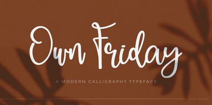 Own Friday is handwritten calligraphy font. This another collection of script is perfect for your next personal branding project, excellent for your business. Own Friday have a smooth edges, so this font gives an authentic handcrafted feel style. Own Friday is perfect choice for people looking for clean, modern, minimalist, elegant, beauty design styles. Suitable for almost any graphic designs such as logo, branding materials, business cards, gift cards, t-shirt, cover, thumbnail, print, poster, photography, quotes .etc
 - One Ton by Luke Thompson,
$10.00 One Ton is a really chunky stencil face that sticks to some strict rules, giving it a distinctively industrial, angular look. It's designed so that the spaces between characters all align in a strong grid. It can bring a ton of personality to signage, branding, editorial and packaging projects where you can afford to be a bit experimental.
 - Zwoelf Ton by Volcano Type,
$19.00 - Let Me Ride - Personal use only

- 3D LET (BRK) - Unknown license

- Never Let Go - Personal use only

- 3D LET BRK - 100% free

- Let Me Ride by Mans Greback,
$59.00
- Never Let Go by Kimberly Geswein,
$5.00 Natural, authentic cursive handwriting. Legible, yet imperfect.
 - Old English (Let) by ITC,
$29.99 Old English is a digital font that was produced by Monotype's design staff, circa 1990. But its roots go much further back: the face's design is based on that of Caslon Black, a Blackletter type cast by the venerable William Caslon foundry in England, circa 1760. This design has been popular throughout England for centuries. Its style of lettering, conveniently also called Old English, can be found all over the UK. Old English-style typefaces belong to the Blackletter category. They nicely combine the design attributes of both the medieval and Victorian eras. This is mostly because their Textura forms, which were born during the Middle Ages, became quite fashionable again in the late 1800s! This Old English font is very legible for a Blackletter face. Perhaps that is why it is more familiar to readers in the UK and North American than German Blackletter varieties, like Fraktur. A favorite once again today, Old English is ideal for certificates, diplomas, or any application which calls for the look of stateliness and authority. It's a sturdy and sure bet for newspaper banners, holiday greeting cards, and wedding announcements.
 - Prince And Princess Charming by Harald Geisler,
$68.34 Prince and Princess Charming are very extravagant and extroverted about their feelings. Prince Charming puts a heart on everything. If you're convinced that you love you've got to go with Prince Charming. Compared to the Prince, Princess Charming puts more hearts on every letter. Convince that you have to be loved: follow Princess Charming. As you would expect from Aristocrats the family members are fluent in many languages and have a surprising extensive character set that even covers Cyrillic. Prince and Princess Charming are a part of the Light Hearted Font Collection that is inspired by a recording of Jean Baudrillard with the title, "Die Macht der Verführung" (The Power of Seduction) from 2006. Further inspiration came from the article, "The shape of the heart: I'm all yours". The heart represents sacred and secular love: a bloodless sacrifice. by British writer Louisa Young printed in EYE magazine (#43) London, 2002.
 - Down the Drain - Unknown license

- So Run Down - Unknown license

- So Run Down - Unknown license

- Labtop Down Under - Unknown license

- VTC Lo-Down - Unknown license

- DS Down Cyr - Unknown license

- Urban Scrawl Down - Unknown license

- Z Dabble Down - Unknown license

- Down Home JNL by Jeff Levine,
$29.00 In the October 31, 1920 edition of Wid's Daily (the predecessor to The Film Daily), a block of ad copy from a 1920 film called "Down Home" had the text printed in such a fluent pen-lettered style that a bit of a shortcut was used at the beginning of the design process for this typeface. Normally, font inspirations are redrawn [and not by simply using auto-trace] except under specialized circumstances like this one where that feature is a help, rather than a replacement for the creative process. The entire block of text copy was auto-traced, then the necessary letters were selected from the available wording and cleaned up to remove any sharp points and irregular curves in an effort to make the end results as close to the original and unusual hand-drawn text. From there the missing characters needed to produce a finished type font were created utilizing the standard methods of drawing and font construction. The end results turned out very well. Using the film's title as its namesake, this design is now available digitally as Down Home JNL in both regular and oblique versions.
 - Juicy Toon Font by Josie Makes Stuff,
$10.00 Juicy toon is the perfect font to add a sense of fun and happiness to your project! Round, bouncy characters are with varying line weight are designed to find the perfect balance between hand-drawn charm and a polished, professional finish.
 - Up and Down by HIRO.std,
$22.00 Up and Down is a Display Font. This font describes about fun, dynamic, rough, headline, pleasure, humanist, easy going, and easy to use. FEATURES - Uppercase and Lowercase letters - Support Ligatures - Numbering and Punctuations - PUA Encoded Characters - Multilingual Support - Works on PC or Mac USE Up and Down works great in any branding materials, logotype, poster, print etc.
 - Evening Gown JNL by Jeff Levine,
$29.00 Evening Gown JNL comes from the lettering displayed on a printed ad for the fictional "Gowns by Roberta" in a scene in the 1935 film of the same name. "Roberta" starred Fred Astaire and Ginger Rogers and was based on the successful 1933 stage play.
 - Toon In JNL by Jeff Levine,
$29.00Lettering in the credits of classic animated cartoons was the inspiration for Toon In JNL, a fun and lighthearted typeface. Use this font anywhere a relaxed, informal or playful message is displayed. - Times Kangaroo Down by Elemeno,
$25.00 - Snoodle Toons NF by Nick's Fonts,
$10.00Lettering on a menu from a Pennsylvania hotel, circa 1930, provided the inspiration for this happy-go-lucky take on the alphabet. Lowercase letters are variants of the uppercase and kerning has been applied to every possible letter combination, so feel free to double-clutch the shift key to create a truly handlettered feel with this font. Both versions of this font include the complete Latin 1252 and CE 1250 character sets, with localization for Romanian and Moldovan. - DT Stoner Toon by Dragon Tongue Foundry,
$10.00 Inspired by early cool cartoon fonts, early rock and hippie posters, I created this casually organic 'DT Stoner Toon' font. Please use with contextual ligatures turned on when possible. These letters like to adapt to their neighbours. 60's 60s artdeco artnouveau cartoon cartoonesque Cartoon Font cartoonish cartoony casual contextual cool cool font cool typeface dots fun fun font gigposter hippie hippy joined party poster poster font poster typeface rock poster spots spotted Stoned Stoner stones theater poster toon wet with dots written
 - Tooned Out JNL by Jeff Levine,
$29.00Tooned Out JNL gives a serif treatment to the cartoon-inspired lettering of Toon-In JNL. Both fonts are great for any casual or fun messages or themes. - Down The Wall by Hanoded,
$15.00 I have no great love for walls, especially when they are built to keep people out. When I started working on this font, I realized it looked a bit like protest graffiti, found on… yes, walls. Down The Wall is a great little font: it is handwritten, messy and in your face. It has no real baseline and glyphs jump all over the place. Use it for book covers, posters, album covers - anything really. It certainly would look good on a wall too! Comes with a whole bunch of diacritics, so whatever you have to say, the world will understand.


