1,780 search results
(0.015 seconds)
- Janda Romantic - Personal use only

- Janda Christmas Doodles - Personal use only

- Mister Slasher Halloween by Sipanji21,
$15.00
- Night Franklin by Sipanji21,
$18.00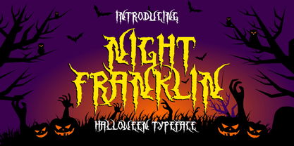
- Massimo by Borutta Group,
$29.00
- Vacaciones - Personal use only

- Our Happy Holiday by Seemly Fonts,
$12.00
- PIXymbols Gridmaker by Page Studio Graphics,
$20.00 - Handy Cut by Los Andes,
$34.00
- Ony by Cuda Wianki,
$20.00
- Campland by Magpie Paper Works,
$20.00
- P22 1722 by IHOF,
$39.95
- Skarpa by Aga Silva,
$23.99
- HT Pavla Prospekt by Hype Type,
$34.00
- Magical Brush by Hanoded,
$15.00
- Dog Eared by Andy Babb,
$19.20
- Anja Eliane - Unknown license

- Janda Rosalie - Personal use only

- Coming Home - Personal use only

- Just Realize - Personal use only

- Textan - Piple - Unknown license

- Lillius by Aga Silva,
$22.50
- Chortler by FansyType,
$15.00
- Dragonblood by Hanoded,
$20.00
- Horier Time by Letterhend,
$17.00
- Annabella by Autographis,
$39.50
- Ghostly Whispers by Seemly Fonts,
$12.00
- Softly Darkish by Seemly Fonts,
$12.00
- Lonely Cowpoke by 10four,
$20.00
- Aaarp by Drawwwn,
$15.00
- Deco Days JNL by Jeff Levine,
$29.00
- Sibylle by Hanoded,
$15.00
- Zawlbuk by Richard Khuptong,
$20.00
- Bauer Bodoni by Bitstream,
$34.99 - More Or Less by Hanoded,
$15.00
- Skizzors by Fonthead Design,
$19.00 - Face Your Fears by Hanoded,
$15.00
- Economica PRO by Underground,
$29.90
- Pinstripe Limo - Personal use only

- Janda Siesta Sunrise - Personal use only


