2,333 search results
(0.007 seconds)
- Park Avenue by Bitstream,
$29.99The first of the popular American informal scripts designed by R.E. Smith for ATF in 1933. - MSung PRC by Monotype HK,
$523.99 Song style typefaces originated in the age of woodblock printing in Song Dynasty. Being an essential Chinese type style for printing and publishing all since Ming Dynasty. Based on the Kaishu calligraphic script, its structure has evolved, regularised and standardised with thick stems (豎), thin horizontal strokes (橫) and triangular finials. Dots (點), hooks (勾) and downstrokes retained some features of calligraphy, hence an appropriate choice for continuous reading. The typeface is equipped with a variety of stroke weights, all highly legible .
 - Arc Neuvo by Funk King,
$5.00 Arc Neuvo has a retro, art deco feel and provides a few quirky glyphs to add to the fun.
 - Par Avion by Greater Albion Typefounders,
$15.00 Par Avion's design draws something of its inspiration from the wings of the old BSA Motorcycles logo and was developed in parallel with our Vinea typeface family. “Par Avion” means ‘By Air’ - remember those little blue stickers in the Post Office - for sending Air Mail? We think this typeface design has a lovely streamlined feel of the early jet-era about it.
 - Liquidism part 2 - Unknown license

- W.J. Pearce hollow - Unknown license

- W.J. Pearce 213 - Unknown license

- Parks Department JNL by Jeff Levine,
$29.00 A WPA (Works Progress Administration) sponsored Water Carnival taking place in Central Park in the 1930s had "Department of Parks, City of New York" in the thin Art Deco hand lettering which is now available as Parks Department JNL.
 - Hello Paris Condensed by Sans And Sons,
$19.00 Hello Paris Serif Condensed is a Modern Serif with Elegant Style is perfect for branding, logos, invitation, master heads, and more. Hello Paris Features : - Multilanguage - Alternates - PUA Encoded - Ligatures
 - Park Avenue Script by Linotype,
$29.99Park Avenue is a lighthearted contemporary script designed by Robert E. Smith in 1933 for American Type Founders. This unique design has small x-height lowercase letters with very long ribbon-like ascenders. Park Avenue is a good design for occasional pieces such as invitations and menus. - Fenway Park JF by Jukebox Collection,
$32.99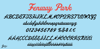
- Old Paris Nouveau by Baseline Fonts,
$24.00Old Paris Nouveau is based on letterpress stylings of modern roman alphabets from the 1920s. Adapting the nouveau sensibility to the digital age required several conventions, including several alternate glyphs for specific individual letterforms as well as creating consistent stem weights and x-heights for more effective body copy. The inherent charm of Old Paris lies in its variation in form and style -- and yet the uniformity. Organic simplicity and elegance underscore the strength and utility inherent in the family of fonts. - 1514 Paris Verand by GLC,
$20.00 This set of initial decorated letters was inspired by a font in use in the beginning of 1500s in Paris. Exactly, we have used the set that Barthélémy Verand employed for the printing of Triumphus translatez de langage Tuscan en François, (from “Triumph” of Petrarque) in the year 1514. Some letters, lacked, have been reconstructed to propose a complete alphabet. It appears that the printer used some letters to replace others, as V, turned over to make a A, or D to make a Q. The original font’s letters were drawn in white on a black background only, but it was tempting to propose a negative version in black on white. It is used as variously as web-site titles, posters and flyers design, publishing texts looking like ancient ones, or greeting cards, all various sorts of presentations, as a very decorative, elegant and luxurious additional font. This font supports strong enlargements remaining very smart and fine. It’s original medieval hight is about one inch equivalent to about four lines of characters. This font may be used with all blackletter fonts, but works particularly well with 1543 Humane Jenson, 1557 Italic and 1742 Civilite, without any anachronism.
 - Paris Stencil JNL by Jeff Levine,
$29.00 Vintage French tin stencils with various phrases were the model for Paris Stencil JNL. The type design is available in both regular and oblique versions.
 - Cafe De Paris by Studio K,
$45.00 Café de Paris is, clearly, inspired by all things French, especially the quirky typefaces that adorn French shopfronts from cafes to charcuteries and bistros to boulangeries. My intention was a fresh, crisp, modern take on a classic theme, with just a soupcon of Art Nouveau, which is characteristic of so much of French typography (See also Studio K’s Paris Metro font) C'est chic - n'est-ce pas?
 - Echinos Park Script by Mans Greback,
$59.00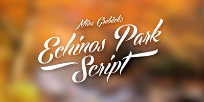
- Ornaments of Paris by Outside the Line,
$19.00 The Ornaments of Paris were inspired by a recent trip to Paris. Each tiny Paris icon is distilled from a church, a fence, a doorway, a railing, the Louvre, graphics in a store window, a feeling, a rainy day, a glass of wine... For more of the similar see Fleurons of Paris.
 - Borough Park JNL by Jeff Levine,
$29.00 Borough Park JNL is named for a neighborhood in the southwestern part of the borough of Brooklyn, NY and was modeled from hand lettering found on vintage sheet music.
 - Printers Parts JNL by Jeff Levine,
$29.00 The thirty images contained in Printers Parts JNL are another assortment of wonderful dingbats from various vintage sources. Brackets, ornaments, end caps, arrows, pointing hands and advertising phrases are part of the wide and various choices and styles found within this font.
 - Hello Paris Sans by Sans And Sons,
$19.00 Hello Paris Sans, a Modern Sans with Elegant Style. Hello Paris Sans is a high contrast typeface so delicate, legible and lend themselves to high end branding, logo designs, product packaging, invitation & masterhead designs. Language Support: All fonts support English, French, Italian, Spanish, Portuguese, German, Swedish, Norwegian, Danish, Dutch, Finnish, Indonesian, Malay, Hungarian, Polish, Turkish, Slovenian.
 - Milan In Paris by Mevstory Studio,
$25.00 Milan in Paris is a powerful and elegant display typeface, constructed to maximize use of horizontal space. Built from hand sketches drawn over several years, Milan in Paris eight weights span an elegant Thin to a vibrant Heavy, with accompanying obliques.Milan in Paris makes a strong impression in print, headlines, video, and social media – whether paired with a contrasting typeface or on its own.
 - Central Park JNL by Jeff Levine,
$29.00 The beautiful Art Deco monoline pen lettering on the cover of a 1940s piece of sheet music inspired Central Park JNL. The 1940s was an era when couples took romantic walks along the pathways of Manhattan's Central Park or rode around it in hansom cabs. Big bands played at the major clubs and ballrooms and "uptown" meant the well-to-do. Men dressed in their tuxedos and top hats and the ladies were in their jewels and evening gowns.
 - National Parks JNL by Jeff Levine,
$29.00 National Parks JNL was based on a 1930s WPA (Works Progress Administration) poster where the word "National Parks" was hand lettered in an unusual and eclectic Art Deco style. Bold and non-conformist, the typeface is available in both regular and oblique versions.
 - Bit Part JNL by Jeff Levine,
$29.00 Bit Part JNL is an extra condensed monoline sans serif typeface that's well suited for movie credits, disclaimers and other forms of tight-fit word copy. Inspired by just the numbers "65" on the cover of a 1965 high school yearbook, this retro font will fit a lot of copy into a small area. The typeface is available in regular and oblique versions.
 - Fleurons of Paris by Outside the Line,
$19.00 The Fleurons of Paris were inspired by an iron gate, an iron railing, a Metro tile, a Metro stop, the Eiffel Tower, Notre Dame, a rainy afternoon, a glass of wine, an outdoor cafe and the list goes on and on. Absorbing all things visual was immensely satisfying second only to coming home and reliving the trip tiny graphic by tiny graphic. Also look at the Ornaments of Paris.
 - Jackson Park NF by Nick's Fonts,
$10.00Handlettering in an ad from the 1920s for a Chicago engraving company provided the inspiration for this fine, fat, flowing face, full of fun and antique charm. Both versions of this font include the complete Unicode 1252 Latin and Unicode 1250 Central European character sets. - Cinema Paris MF by Masterfont,
$59.00
- No Parking JNL by Jeff Levine,
$29.00 No Parking JNL was inspired by a hand-cut stencil of those words painted in an area of a department store's parking lot.
 - Park Slope JNL by Jeff Levine,
$29.00 The free-form geometric shapes of the lettering on a vintage piece of sheet music entitled "Four Pictures" is the basis for Park Slope JNL, named for a neighborhood in Brooklyn, New York.
 - Notes from Paris by PeachCreme,
$18.00 "Notes from Paris" will make your letters look très chic while still maintaining its functionality with easy-to-read letterforms. Furthermore, the comforting vibe of this font brings a touch of relaxation to your typography. The words flow with ease and grace, like a gentle breeze on a summer day in the city of love. So, whether you're crafting a logo design or wedding invite, "Notes from Paris" is a font that you must have for a chic and legible typographic journey. With 59 Opentype ligatures, this font blurs the line between script and handwriting, allowing for a seamless transition between letters and creating a truly genuine sensation.
 - Waite Park JNL by Jeff Levine,
$29.00Waite Park JNL is based on the smallest of the die-cut letters and numbers contained in the Webway Sign Cabinet - once manufactured by the Holes-Webway Company of Minneapolis, Minnesota. The largest of the set's sizes (2 inch) was the model for Sign Kit JNL, the medium size (1-1/8 inch) was used to make Sign Production JNL and this font is a version from the 3/4 inch size. Each size of alphabet and numerals have their own unique characteristics, although they all follow the same basic font style, which is reminiscent of classic Art Deco-era sanserif typefaces. The name Waite Park JNL was derived from a division of Holes-Webway that (for some reason lost to time) distributed their sign kits under the name Waite Park Sign Company, located in the Minnesota city of the same name. - Holiday In Paris by Ake,
$12.00 Experience modern elegance with 'Holiday in Paris' Fonts. A casually cool handwritten typeface that adds contemporary flair to any project. Perfect for travel journals, social media, and invitations, it balances artistic strokes with readability, infusing your design with Parisian charm.
 - Park West JNL by Jeff Levine,
$29.00 The thin, stylish Art Deco slab serif lettering featured on the cover of the 1934 sheet music for “Then I’ll be Tired of You” inspired the digital type face Park West JNL, which is available in both regular and oblique versions. Central Park West has always been the upscale area for affluent New Yorkers, but in the Great Depression years of the 1930s the mystique of the well-to-do held an even stronger significance.
 - Prospect Park JNL by Jeff Levine,
$29.00 Prospect Park JNL was inspired by inline lettering found on some vintage sheet music from the Art Deco era entitled "By My Side". The font's namesake is located in the Crown Heights section of Brooklyn, NY. Prospect Park is famous for its zoo as well as its tree lined paths, historic carousel and the expansive park area.
 - Paris Van Java by Fikryal,
$25.00 Introducing this very simple sans serif font that is Paris Van Java, the font Family. I created this font with the inspiration of simplicity and it is very friendly to look at, with four versions, namely regular, italic, bold, bold italic. Very suitable to be applied in various aspects of design, Also it’s perfect for logo, branding, title, social media posts, advertisements, product packaging, product designs, label, photography, watermark, special event, magazine, web designs, etc. Features : Symbols multilingual support If you have any questions please don’t hesitate to contact me follow my Instagram: @fkryall Thank you
 - Trailer Park Numerals by Coniglio Type,
$9.95Trailerpark numbers 0-9 were rather old fashioned 1950's cut aluminum numbers, you've seen digitized nowhere else but here! Part of Market LTD, a collection of limited faces, mostly alpha-numeric and some just plain numeric, used primarily in retail and display situations and titling. - Buena Park JF by Jukebox Collection,
$32.99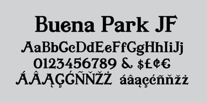
- Asbury Park JNL by Jeff Levine,
$29.00 In the 1930s the WPA (Works Progress Administration) sponsored a Federal art project. Many posters were produced that featured government-sponsored cultural events, health and safety tips and various other topics. One such poster from Pennsylvania has the words “Work with Care” in a hand-lettered inline sans design. This became the basis for Asbury Park JNL.
 - M Kai PRC by Monotype HK,
$523.99 M Kai is a design inspired by the popular Kaiti developed in contemporary China. MKai adopts many features of Kaishu, one of the many Chinese writing scripts and calligraphic style. Yet writing style and constructions have been well-unified to meet quality as typeface. Its strokes has relatively heavier stroke beginning and finishing, as well as thinner middle part. It is catered for fine print with little conglutination. Its medium weight makes it more visible at distance and pretty versatile in use. Zhonggong are tightly built with ample character spacing for good individual character recognition. It is best suited for formal body text, set upright (non-slanted), non-condensed.
 - MSung Gold PRC by Monotype HK,
$523.99 M Sung Gold PRC is a modulated style Simplified Chinese typeface. Modulated font designs have apparent thick-thin contrast at the strokes, and often include special design characteristics at entry, finial and transitional points of the strokes. Modulated Simplified Chinese font design category includes traditional Song, Ming or Fang Song style typefaces which are popular for continuous reading.


