10,000 search results
(0.014 seconds)
- Monotype Old Style by Monotype,
$29.99 Monotype Old Style is a nineteenth century update of Caslon Old Face with characteristics of the moderns built in. Monotype Old Style was recut by Monotype in 1901 from a Stephenson Blake & Company version. The design originated at the Miller and Richard foundry in 1860. In some respects it can be seen as transitional between old style and modern, but the spirit of the old styles predominates. By the turn of the century it had become a successful rival to the moderns. The Monotype Old Style font family is an attractive design which gives a light, airy feel to text.
 - Old English (Let) by ITC,
$29.99 Old English is a digital font that was produced by Monotype's design staff, circa 1990. But its roots go much further back: the face's design is based on that of Caslon Black, a Blackletter type cast by the venerable William Caslon foundry in England, circa 1760. This design has been popular throughout England for centuries. Its style of lettering, conveniently also called Old English, can be found all over the UK. Old English-style typefaces belong to the Blackletter category. They nicely combine the design attributes of both the medieval and Victorian eras. This is mostly because their Textura forms, which were born during the Middle Ages, became quite fashionable again in the late 1800s! This Old English font is very legible for a Blackletter face. Perhaps that is why it is more familiar to readers in the UK and North American than German Blackletter varieties, like Fraktur. A favorite once again today, Old English is ideal for certificates, diplomas, or any application which calls for the look of stateliness and authority. It's a sturdy and sure bet for newspaper banners, holiday greeting cards, and wedding announcements.
 - OL Machina Black by Dennis Ortiz-Lopez,
$30.00 - OL Brierwood Grecian by Dennis Ortiz-Lopez,
$30.00 - OL Hebrew David by Dennis Ortiz-Lopez,
$30.00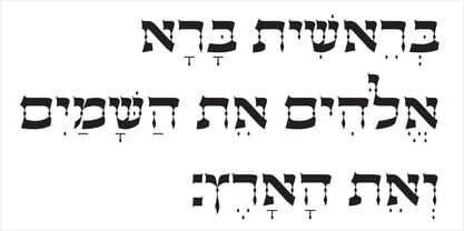
- Cul De Sac - Personal use only

- Edgar da cool - Unknown license

- LBC Cool 2 - Unknown license

- king cooL KC - Personal use only

- Coca Cola ii - Unknown license

- KR Cow Juice - Unknown license

- Markus the Cow - Unknown license

- cool three pixels - Unknown license

- Cló Gaelach (Twomey) - Unknown license

- Cowling Sans AOE by Astigmatic,
$24.95 Cowling Sans AOE is a charming Art Deco architectural style typeface. It is the cleaned-up, refined revival and elaboration of a lettering design from “Lettering for Commercial Purposes” by Wm. Hugh Gordon published in 1918. What began as a basic character set of Capitals, lowercase, and two styles of ampersand has been expanded to a full character set including unlimited fractionals, superiors & inferiors, ordinals, tabular, proportional, and oldstyle figures, and an expanded language glyph set, all with a smallcaps and Caps to Smallcap set to match. This lettering style exudes the charm of its era with every word set in it by way of the small details that set it apart from other sans typestyles.
 - Cal Roman Capitals by Posterizer KG,
$16.00 Calligrapher Roman Capitals Font, is one of the calligraphic group of fonts called “21 alphabets for Calligraphers“. All graphemes are taken from calligraphic pages written on traditional Imperial (Roman) calligraphic stile. This font is ideal for calligraphic sketches or for imitation of ancient manuscripts. Font contains Small Caps and all the Latin glyphs.
 - Cal Roman Black by Posterizer KG,
$19.00 Cal Roman Black is one more font from the PKG “Cal” (Calligraphic) group. This time for calligraphic sketches we used a wide brush instead of the iron pen. Instead of minuscule letters, there are Small Caps (which are almost the same weight as capitals). There was an intention to keep the spacing as small as possible, because of that, there is no obvious difference in the stroke thickness of the capitals and the lowercase capital letters. The difference in height is only one-third of the brush-width. Cal Roman Black font is rhythmic, informal, dark and hefty... romantic and strong at the same time (just like Ferdinand). As such, this font is widely used in the typographic creation of shorter and closely packed text forms such as magazine headlines, brochures and book covers, t-shirt designs, logos, posters, movie spots, banners...
 - Cal Neuland Shadow by Posterizer KG,
$16.00 Cal Neuland Shadow is the shadow version of Cal Neuland Bold. The font is ideal for comic headlines and other funny things. It contains all of the Latin, Cyrillic and Greek glyphs.
 - Hype vol 2 by Positype,
$20.00 Hype lives up to its name. An energetic attempt to blow past previous sans’ descriptive words of massive, large, extensive, super and others. Hype transcends the everyday marketing terms and rests solely atop them all with a jaw-dropping current offering of 432 fonts that spans 18 widths and 12 weights. Insert a long pause and mic drop here, because nothing compares. Hype Volume 2 includes 6 of the 18 subfamilies that comprise the full Hype Collection. Each of these subfamilies represent 1 of the 18 available widths and each width contains 12 weights and matching italics. Volume 2 contains 144 fonts. Families included in Volume 2: Hype 0200, Hype 0500, Hype 0800, Hype 1100, Hype 1400, and Hype 1700. If you would like to complete your collection be sure to view and purchase Hype vol 1 and Hype vol 3. Hype’s bombastic approach meant supplying everything it could within each typeface: including small caps, yes small caps, a full numeral set that includes inferiors and superiors, super- and subscripts, full fraction support, case-sensitive forms, stylistic alternate letterforms, and more while touting a full Western, Central and South Eastern European character support. Embracing a Univers-esque bravado and a willingness to push the envelope, Hype leaves even more room to grow. No corners were cut, no shortcuts taken with a focus on sensible, efficient letter construction and functional reliability that ignores any one classification and instead looks to form an amalgam of classic sans styles influenced by wood type, movie showcards, and urban industrial letterforms.
 - Cal Carolingian Minuscule by Posterizer KG,
$16.00 Calligrapher Carolingian Minuscule Font is one of the calligraphic group of fonts called “21 alphabets for Calligraphers“. All graphemes are taken from calligraphic pages written in traditional Carolingian Minuscule calligraphic style. This font is ideal for calligraphic sketches or for imitation of ancient manuscripts. It contains all the Latin glyphs.
 - Hype vol 3 by Positype,
$20.00 Hype lives up to its name. An energetic attempt to blow past previous sans’ descriptive words of massive, large, extensive, super and others. Hype transcends the everyday marketing terms and rests solely atop them all with a jaw-dropping current offering of 432 fonts that spans 18 widths and 12 weights. Insert a long pause and mic drop here, because nothing compares. Hype Volume 3 includes 6 of the 18 subfamilies that comprise the full Hype Collection. Each of these subfamilies represent 1 of the 18 available widths and each width contains 12 weights and matching italics. Volume 3 contains 144 fonts. Families included in Volume 3: Hype 0300, Hype 0600, Hype 0900, Hype 1200, Hype 1500, and Hype 1800. If you would like to complete your collection be sure to view and purchase Hype vol 1 and Hype vol 2. Hype’s bombastic approach meant supplying everything it could within each typeface: including small caps, yes small caps, a full numeral set that includes inferiors and superiors, super- and subscripts, full fraction support, case-sensitive forms, stylistic alternate letterforms, and more while touting a full Western, Central and South Eastern European character support. Embracing a Univers-esque bravado and a willingness to push the envelope, Hype leaves even more room to grow. No corners were cut, no shortcuts taken with a focus on sensible, efficient letter construction and functional reliability that ignores any one classification and instead looks to form an amalgam of classic sans styles influenced by wood type, movie showcards, and urban industrial letterforms.
 - CAL Bodoni Ferrara by California Type Foundry,
$47.00 Bodoni Ferrara™ Fashionable, Luxury Heritage: The Original Bodoni Ferrara Sculpted from hi-res photos and scans of Bodoni's original Ferrara Font—his 1818 Manuale Tipografico and 1768 specimens. It has never before been available. This cut of Bodoni specially selected by Dave Lawrence from rare book specimens. Part of the California Type Foundry Origin Series. 3 Display Fonts in One!! And 6+ style mixes. Bodoni's 1st Draft - Transitional Serif Bodoni was often inspired by French type designs. His first draft of Ferrara was inspired by Pierre Simon Fournier. But Bodoni added his own Italian sensibilities. Bododni’s first, transitional style can pair with humanist sans, and transitional fonts. Bodoni's Rework - Modern Serif Later, Bodoni reworked Ferrara to match the later neo-classic style or modern serif of Firmin Didot¹. Bodoni’s modern style can pair with geometric sans, grotesque sans, neo-grotesque sans, gothic sans, copperplate script, . Informal On™ - Informal Mode by CAL Type Foundry This can pair with “infant” fonts. Geometric sans, and other sans or serifs with one-storied a’s. + Bodoni’s Tivoli a for another option! Works great with Fournier¹ fonts and grotesques, since the terminals will match. Font Pairing Guide This font includes a 78 page Ferrara Pairing Guide. This book shows you 131 pairings with text fonts. 47 pairings with subheader fonts! We want to help you get more out of your font collection. Design Features • Subtle forward angle (0.5-1.5°) makes Ferrara more lively and engaging than most Bodoni or Didot fonts. • Round curves make this font feel letter-pressed. • Bodoni's original tall x-height and slightly condensed proportions: great for headlines, where space is at a premium. • Better uppercase. Uppercase punctuation for design apps. • Proportional oldstyle and lining figures, both modern style and transitional numbers. Every pair of numbers is kerned for display sizes: no unsightly gaps! • Multiple special symbols for whenever you need a design to pop, including 3 of Bodoni’s amazing ampersands. Language Features Latin standard for western European and other languages. +Advanced support for: German, French, Spanish, Portuguese, Italian, and French. Special, uppercase umlauts for titles! Compare to metal Bauer¹ Bodoni! Special context kerning for French, Spanish, Portuguese, Italian, and French, to allow better better words like L'Angelique & “¿Nosotros?”. This kerning gets rid of unsightly gaps between “¿ and other combinations. Can’t Find the Pairing Guide? Can't find the pairing guide? Google “California Type Foundry” and grab the pairing guide. Get another free pro font while you’re there! Ferrara: many sizes, styles, moods and situations. It's a classic, fashionable font for display, headlines, and titles. Grab Ferrara today! ----------- ¹Trademarks of their respective owners. Ferrara™ is a trademark of the California Type Foundry.
 - LDJ Cool Cat by Illustration Ink,
$3.00This stylin' font is one cool cat! It's great for that groovy layout. - Cal Gothic Textura by Posterizer KG,
$16.00 Calligrapher Gothic Textura Font is one of the calligraphic group of fonts called “21 alphabets for Calligraphers“. All graphemes are taken from calligraphic pages written on traditional Gothic Textura calligraphic style. This font is ideal for calligraphic sketches or for imitation of ancient manuscripts. It contains all the Latin glyphs.
 - Cal Fraktur Brush by Posterizer KG,
$19.00 Cal Fraktur Brush is one more font from the PKG “Cal” (Calligraphic) group. This time, we used a wide brush instead of the calligraphic pen for the sketches. This font is widely used in the typographic creation of shorter text forms such as headlines, tattoo and graffiti quotes, book covers, t-shirt designs, logos, posters, movie spots, banners, labels... Enjoy!
 - Kappa Vol. 2 by W Type Foundry,
$25.00 Kappa Vol.2 is the serif version of our popular Kappa. Just as Kappa sans, this font has a slight narrowed structure and a prominent ascender height, therefore this font is suitable for a large range of platforms. Moreover, due to its serif Kappa Vol.2’s level of legibility is more accurate, so when you use it alongside Kappa sans the results will be extremely effective. Designed with powerful OpenType features in mind. Each weight includes alternate characters, ligatures, fractions, special numbers, arrows, extended language support, small caps and many more… Perfectly suited for graphic design and any display / text use. The 36 fonts are part of the larger Kappa super family. Learn about upcoming releases, work in progress and get to know us better! On Instagram W Foundry On facebook W Foundry wtypefoundry.com
 - Cal Insular Majuscule by Posterizer KG,
$16.00 Calligrapher Insular Majuscule Font, is one of the calligraphic group of fonts called “21 alphabets for Calligraphers“. All graphemes are taken from calligraphic pages written in traditional Insular Majuscule calligraphic style. This font is ideal for calligraphic sketches or for imitation of ancient manuscripts. Font contains all the Latin glyphs.
 - CAL iWasLike Pro by California Type Foundry,
$47.00 CAL iWasLike™ Pro is totally for sure the amazing friendly font you need for, like, everything! Its conversational tone makes reading fun and enjoyable! Designed for friendly, paragraph reading ease on screen or medium res print, with the full set of OpenType features. It's design gives it the most even text shade for digital fonts, and has less holes in the text for easier reading. iWasLike™ is a large x-height, informal text and caption font designed to render well for Apple Quartz and Microsoft devices, low res to high res printing, with full Western Central European, and Turkish support, small caps, superiors, inferiors, fractions, as well as some special additions like music symbols, pricing feature, arrows, and two sets of circled numbers.
 - Cal Humanist Minuscule by Posterizer KG,
$16.00 Calligrapher Humanist Minuscule Font, is one of the calligraphic group of fonts called “21 Alphabets for Calligraphers“. All graphemes are taken from calligraphic pages written in traditional Humanist Minuscule calligraphic style. This font is ideal for calligraphic sketches or for imitation of ancient manuscripts. Font contains all the Latin glyphs.
 - CAL Bodoni Palazzo by California Type Foundry,
$47.00 The Greatest Caps Of The Greatest Font Designer Bodoni's Most Beautiful Display Caps, Finally Available in Digital This font is the largest display caps that Bodoni ever made, painstakingly handcarved and now digitized to wow in any situation. It is one of the most beautiful fonts for whenever you need a stunning all caps display. The obvious and easy choice over tired standards like Trajan, Palazzo will be a highlight in your font collection. Bodoni Palazzo was updated in 2021 to include Small Caps and other new features. Previously only included the "old style" figures (top); Now with lining figures to better match all caps, and small caps numbers to match the small caps. CAL Bodoni Palazzo is a member of our Origin Series. Origin Fonts are designed to be true to the original designer's intentions and fonts. Our Bodoni origin fonts ARE Bodoni fonts, not imitations or interpretations. They were drawn by Bodoni, our team just expanded it for modern use.
 - Rock And Cola by Corradine Fonts,
$49.95 Rock and Cola's design is clearly inspired by the sinuous shapes of the world's most famous drink's logo. It however does not pretend to copy it faithfully or to serve as a platform to generate the logo itself. Rock and Cola is a very elegant Script font with great weight and contrast. Its OpenType features include ligatures, swashes, alternative characters, ornaments and accents in order to support many foreign languages. It has huge possibilities for application in logos, titles and short texts by generating in them great impact and recalling. Use Rock and Cola in your projects and enjoy it!
 - Cow Palace JNL by Jeff Levine,
$29.00 During the 1960s Hippie movement, a large amount of the rock and roll poster art was strongly influenced by the Art Nouveau period of the early 1900s. A poster for an appearance by The Doors at San Francisco’s Cow Palace Exposition Center (presented by Fillmore East and West owner Bill Graham) featured some wonderfully eclectic Nouveau-styled serif hand lettering. Now recreated as a digital type face called Cow Palace JNL (and named for the performance venue), the font is available in both regular and oblique versions.
 - CAL Bodoni Terracina by California Type Foundry,
$47.00 Bodoni Terracina is a legible, fun-formal script face, with lots of curls. Sometimes script faces are hard to read. Sometimes being formal means that there’s no personality and there’s no fun. Enter Terracina: one of the masterpieces of font design. Some of the most personable italics ever carved. Includes powerful new features for: • Dates • Pricings • Addresses Not is only Terracina formal but fun, it’s also fun to use! In a program like Adobe Indesign or Illustrator, just highlight a word and see lots of fun options. Bodoni himself etched these symbols, and his fun-loving personality shines through. As a semi-script, it can go together with many script fonts, but it is more readable. When you need something equal parts elegant and whimsical, Terracina strikes a perfect balance to let the fun shine through, such as for holiday designs or fairytales. Terracina is a subheads font, but Bodoni also used it for paragraphs. So Terracina works well doing subhead paragraphs, especially when contrasting with the mood of the first font. And because of the swash variety, it works well for setting German and other European languages. CAL Bodoni Terracina is a member of our Origins Series. Origin Fonts are designed to be true to the original designer's intentions and fonts. Our Bodoni origin fonts ARE Bodoni fonts, not imitations or interpretations. They were drawn by Bodoni, our team just expanded it for modern use. For Terracina, Bodoni's original weight is the "Quasi-Lite" option, all other weights have been meticulously matched by the CAL Origins Team.
 - Cal Uncial Rough by Posterizer KG,
$19.00 Cal Uncial Rough is a calligraphic font based on sketches written with cane calligraphy pen and ink on coarse-textured paper. Because of the fact that the Uncial don't have lowercase letters, there are small capitals instead of the lowercase. As the Latin version of the Uncial was created from the Greek Uncial script (translating the Bible from Greek into Latin), in addition to the standard Latin graphemes, the font contains the Greek alphabet (and also the Cyrillic letters (Ustav), derived from the Greek Uncial too). Regardless of the stylistic connection, there is a difference between the morphology of related Greek, Latin and Cyrillic letters. Most of the graphemes are based on traditional roman and insular uncial calligraphy. Cal Uncial Rough is suitable for the preparation of calligraphic sketches as well as an application in typography that should bring us closer to historical topics (European literature, quotes, history, film ...).
 - Cal Rustic Capitals by Posterizer KG,
$16.00 Calligrapher Rustic Capitals Font, is one of the calligraphic group of fonts called “21 alphabets for Calligraphers“. All graphemes are taken from calligraphic pages written on traditional Rustic Capitals calligraphic stile. This font is ideal for calligraphic sketches or for imitation of ancient manuscripts. It contains all the Latin glyphs.
 - Cal Cursive Modern by Posterizer KG,
$16.00 Calligrapher Cursive Modern, is one of the calligraphic group of fonts called “21 alphabets for Calligraphers“. All graphemes are taken from calligraphic pages written on Cursive Modern calligraphic style. This font is ideal for calligraphic sketches or for imitation of ancient manuscripts. Cal Cursive Modern contains all the Latin and Cyrillic glyphs.
 - Cal Fraktur Modern by Posterizer KG,
$16.00 Calligrapher Fraktur Modern is one of the calligraphic group of fonts called “21 alphabets for Calligraphers“. All graphemes are taken from calligraphic pages written on modern Gothic Fraktur calligraphic style. This font is ideal for calligraphic sketches or for imitation of ancient manuscripts. This font contains all the Latin glyphs.
 - Cul De Sac by Hanoded,
$25.00 Cul De Sac is a beautiful cartoon-like font. It was hand drawn, using an old fashioned pen and India ink. Use it for your ads, posters and websites.
 - Cal Gothic Bastard by Posterizer KG,
$16.00 Calligrapher Gothic Bastard Font, is one of the calligraphic group of fonts called “21 alphabets for Calligraphers“. All graphemes are taken from calligraphic pages written in traditional Gothic Bastard calligraphic style. This font is ideal for calligraphic sketches or for imitation of ancient manuscripts. Contains all the Latin glyphs.
 - Cal Square Capitals by Posterizer KG,
$16.00 Calligrapher Square Capitals Font, is one of the calligraphic group of fonts called “21 alphabets for Calligraphers“. All graphemes are taken from calligraphic pages written on traditional Square Capitals calligraphic stile. This font is ideal for calligraphic sketches or for imitation of ancient manuscripts. It contains all the Latin glyphs.


