613 search results
(0.014 seconds)
- AZ Rough Fart by Artist of Design,
$20.00 AZ Rough Fart font was created out of a need for a typeface that would compliment a rough outlined Tee-Shirt design. For use as a headline or subhead in your design.
 - AZ Plug Italic by Artist of Design,
$20.00AZ Plug Italic font is inspired from a combination of original early 1900’s Edward Penfield and Franz Hazenplug poster art. This font is designed for use as a worn and antiqued headlines or subheadlines. - AZ Cut Script by Artist of Design,
$25.00 AZ Cut Script utilizes a simple hand-drawn “old look” to the line work which is designed to have a “worn feel” to it. Ideal for use as headline or sub-head text in your design.
 - AZ Vintage Tattoo by Artist of Design,
$20.00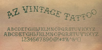
- AZ Sailor Tattoo by Artist of Design,
$20.00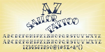
- AZ Harpers July by Artist of Design,
$25.00 AZ Harper's July font is inspired from original early 1900's Edward Penfield's poster art. This font is designed for use as a worn and antiqued headline.
 - AZ Hello Brushed by Artist of Design,
$25.00 AZ Hello Brushed font was inspired from old auto repair signs. This font utilizes an "old look" to the line work which is designed to have a "worn feel" to it. It is designed to compliment it's sister font; AZ Hello. Ideal for use as headline or sub-head text in you design.
 - Neospace Circuit Exp - Personal use only

- Coranto 2 by TypeTogether,
$49.00 Now available as Opentype font with extended character set, Coranto 2. It is originally based on Unger’s typeface Paradox, and arose from a desire to transfer the elegance and refinement of that type to newsprint. Coranto 2 has a larger x-height and in many places has been made more robust. Over the past 25 years newspaper production has seen spectacular improvements in paper and print quality, the introduction of colour printing, and vastly better register. Newspaper production still demands a lot of letter forms, but advanced printing brings out details better and makes typography more appealing to readers. For text type the newspaper is no longer an environment in which survival is the chief assignment. Today, newspapers are not merely a matter of cheap grey paper, thin ink and super-fast rotary printing, and type design no longer has to focus on surviving the mechanical technology and providing elementary legibility. Now there is also room to create an ambience, to give a paper a clearer identity of its own; there is scope for precision and refinement. One consequence of this is that newspaper designers can now look beyond the traditional group of newsfaces. Conversely, a newsface can be used outside the newspaper — not an uncommon occurrence. The update to this beautiful font family, Coranto 2, includes the addition of over 250 glyphs featuring full Latin A language support, new ligatures, 4 sets of numerals, arbitrary fractions and superiors/inferiors. Furthermore, kerning was added and fine tuned for better performance.
 - Tempo LT by Linotype,
$29.99The Tempo font family was designed by R. Hunter Middleton and released between 1930 and 1931. The instant success of Futura in 1927 led to many similar designs, and Tempo is the version produced by the Ludlow foundry for large headlines in newpapers. Like Futura, Tempo font is basically geometric, but shows some humanistic influence. Tempo is popular for newspaper and commercial printing, and the heavy condensed font is excellent for headlines. - Hayabusha by Typehand Studio,
$20.00 A display font with 700++ ligature, Hayabusha packs a full set of capitals, number and punctuation. Be it gigs, sport events, logo design or etc. Hayabusha was made to bring impact. Hayabusha features: AA AZ Ligature ZA ZZ Ligature ATA ETE and More ligature ATTA UTTU and More Ligature
 - Nimrod Paneuropean by Monotype,
$92.99Nimrod was released by Monotype in 1980. Designed for current newspaper technology, the Nimrod font family evolved as a result of extensive examination of newspaper industry needs. Nimrod retains many of the features of the traditional newspaper Ionics, but some of the fussier detailing has been replaced by the more sober forms of the old styles, such as Plantin. A highly legible font family, especially in smaller sizes, its clear unambiguous character shapes make easily readable blocks of text. Nimrod also withstands the degradation encountered in newspaper production and printing. First used for body text in the Leicester Mercury newspaper, the Nimrod font family has subsequently become a popular choice in newspapers for text and headlines. - Tapeworm by TypeArt Foundry,
$45.00 Newspaper headline simulating inking deficiency.
 - Courant by Hanoded,
$20.00 Courant means "newspaper". Courant font was modeled on 17th century Dutch newspapers and most of the glyphs are authentic. The 'modern' glyphs, like @, $, €, * and several others have been designed by me, as they were not in use in the 1600's.
 - Acta Poster by DSType,
$40.00 First designed for Chilean newspaper La Tercera in 2010, Acta family is a clean and fresh type system, while conservative enough for newspaper setting. The complete Acta Type System contains Acta and Acta Display, both with six weights with matching italics, Acta Symbols with an amazing collection of symbols specially designed for newspapers and magazines, and Acta Poster, a heavyweight version, elegant and eye-catching in three styles with plenty of ligatures and alternates.
 - Acta Symbols by DSType,
$40.00 First designed for chilean newspaper La Tercera in 2010, Acta family is a clean and fresh type system, while enough conservative for newspaper setting. The complete Acta Type System contains Acta and Acta Display both with six weights with matching italics; Acta Symbols with an amazing collection of symbols specially designed for newspapers and magazines and Acta Poster, a heavyweight version, elegant and eye catching in three styles with plenty of ligatures and alternates.
 - Acta Display by DSType,
$40.00 First designed for chilean newspaper La Tercera in 2010, Acta family is a clean and fresh type system, while conservative enough for newspaper setting. The complete Acta Type System contains Acta and Acta Display both with six weights with matching italics; Acta Symbols with an amazing collection of symbols specially designed for newspapers and magazines and Acta Poster, a heavyweight version, elegant and eye catching in three styles with plenty of ligatures and alternates.
 - Acta by DSType,
$40.00 First designed for chilean newspaper La Tercera in 2010, Acta family is a clean and fresh type system, while enough conservative for newspaper setting. The complete Acta Type System contains Acta and Acta Display both with six weights with matching italics; Acta Symbols with an amazing collection of symbols specially designed for newspapers and magazines and Acta Poster, a heavyweight version, elegant and eye catching in three styles with plenty of ligatures and alternates.
 - The Ronita by Letter Muray,
$15.00 The Ronita is a unique Font. like dance letters, smooth, clean and simple. The Ronita is a perfect Font for weddings, events, invitations, companion cards, menu headers, displays, logos, blog sliders, packaging, greeting cards, etc. The Ronita includes alternate glyphs and beautiful swirls in fonts including style sets, Ligatures etc. The Open Type feature can be accessed using intelligent Open Type programs such as Adobe Illustrator CS, Adobe Indesign & CorelDraw X6-X7 and Microsoft Word. And this Font has provided PUA unicode (custom coded font). so that all alternative characters can be easily accessed in full by a craftsman or designer. Features: Basic Latin AZ and az Numbers & Punctuation Style Sets & Fasteners PUA Encode (Custom Encoded Fonts) If you don't have a program that supports OpenType features such as Adobe Illustrator and CorelDraw X Version, you can access all the alternative glyphs using Font Book (Mac) or Character Map (Windows). Using Windows Character Map with Adobe Photoshop ( PS)
 - Script Betiya by Petterco,
$13.00 Betiya is a unique Font. like dance letters, smooth, clean and simple. Betiya is a perfect Font for weddings, events, invitations, companion cards, menu headers, displays, logos, blog sliders, packaging, greeting cards, etc. Betiya includes alternate glyphs and beautiful swirls in fonts including style sets, Ligatures etc. The Open Type feature can be accessed using intelligent Open Type programs such as Adobe Illustrator CS, Adobe Indesign & CorelDraw X6-X7 and Microsoft Word. And this Font has provided PUA unicode (custom coded font). so that all alternative characters can be easily accessed in full by a craftsman or designer. Features: Basic Latin AZ and az Numbers & Punctuation Style Sets & Fasteners PUA Encode (Custom Encoded Fonts) If you don't have a program that supports OpenType features such as Adobe Illustrator and CorelDraw X Version, you can access all the alternative glyphs using Font Book (Mac) or Character Map (Windows). Using Windows Character Map with Adobe Photoshop ( PS)
 - QuaText by LucasFonts,
$39.00 This special newstext version of TheAntiqua was developed in close collaboration with the Berlin newspaper Die Tageszeitung (taz). Its sturdy forms were optimized for newspaper stock. This font family is currently being reworked and will be further developed with variable weights that can be adjusted to clients’ specifications.
 - TE Sara by Tharwat Emara,
$35.00 It is the most common font and is used in most Arab countries because it has the potential to be written in a narrow space when compared to other Arabic fonts. It is suitable for titles of books, magazines, daily newspapers, commercials, banners, advertising, holiday cards, newspaper headlines, Introduction to students.
 - Clarion by Monotype,
$29.99Designed for the newspaper technology of the 1980s, Clarion uses many of the findings made in the preparation of Monotype Nimrod, from which it is derived. The Clarion font family differs from Nimrod in its detailing, which is more akin to that of the Ionics, a style which influenced most designers of contemporary newspaper faces. The large x-height and sturdy construction of the characters make Clarion well suited for use on laser printers as well as being an excellent choice for setting newspapers, journals, newsletters and circulars. - Sole Serif by CAST,
$45.00 Sole Serif is a newspaper face with features relating to book typography. Inspiration from Francesco Griffo’s romans was adapted to resist the rough usage typical of newspaper printing without any loss of quality. Sole Serif is available in an extensive range of cuts including extra bold and ultra thin. With its big x-height, short ascenders and a roundish and wide italic for text and titles, it has all the attributes of a newspaper face. Nonetheless, details like the inclined axis, calligraphic terminations, Renaissance proportions and a refined but slightly mannered design, all evoke the book rather than the daily paper.
 - Monotype Ionic by Monotype,
$29.99 The earliest form of Ionic was brought out by Vincent Figgins in 1821 and was intended for display work. In 1863 a more refined version appeared which had more contrast between thick and thin strokes and the serifs were bracketed. Further developments were made, however the robustness of the Egyptian style was retained making the face suitable for newspaper text setting. With a large x-height and strong hairlines and serifs, the Ionic font family became widely used by the newspaper industry as a body type and provided a model for many twentieth century newspaper typefaces.
 - TE Ruqaa by Tharwat Emara,
$35.00 Ruqaa font is one of the original Arabic fonts. It is the most common font and is written in most Arab countries because it has the potential to be written in a narrow space when compared to other Arabic fonts. It is used in the titles of books, magazines, daily newspapers, commercials, banners, advertising, holiday cards, newspaper headlines, Introduction to students.
 - Colonia Portuguesa by Intellecta Design,
$21.90 Authentic and historical Brazilian lettering typeface from early Portuguese community newspapers on Brazil; first years of the 20th Century.
 - Astrology by Monotype,
$40.99Astrology signs that had been designed for newspaper and printers purposed in the hotmetal aera from the Monotype caster. - Chilespice by Just My Type,
$25.00 Chilespice was originally designed to head a newspaper article on chiles. Use it when you need something verdant and organic.
 - Sole Sans by CAST,
$45.00 Sole Sans, companion to Sole Serif , is a newspaper sanserif available in a wide range of weights and styles. It’s a workhorse, suitable for headlines, diagrams, graphics and tabular work. Contrast at the junctions between arches and stems is a feature of early 19th-century sanserifs which inspired Sole Sans. It was originally designed for the leading Italian financial newspaper Il Sole 24 ore.
 - Press Run JNL by Jeff Levine,
$29.00 Press Run JNL is a reinterpretation of the classic typeface Cheltenham Condensed taken from actual screen captures of vintage newspaper headlines.
 - Newsworthy JNL by Jeff Levine,
$29.00 Newsworthy JNL and its oblique counterpart are variations on the ever-popular condensed type styles used for newspaper and tabloid publications.
 - Tabloid Press JNL by Jeff Levine,
$29.00 Tabloid Press JNL is one of a number of classic typefaces re-drawn from screen captures of actual vintage newspaper headlines.
 - Latin Extra Condensed by Bitstream,
$29.99The American nineteenth century display form as handed down through ATF and the composing machine companies, largely for use in newspaper headlines. - Universal by Monotype,
$29.00A collection of Pi fonts containing Greek characters, mathematical signs and symbols, the Universal fonts are useful in newspapers and commercial typesetting. - Temporal by E-phemera,
$20.00Temporal is one in a series of fonts designed for use in creating replica vintage newspapers. It is inspired by the nameplates of major metropolitan newspapers from the 1920s. Its rough character is apparent at headline sizes, and it remains nicely legible at small sizes. In addition to a complete international character set, it contains east and west coast variations for some letters, along with extra ligatures traditional for blackletter typesetting. - PF Press by Parachute,
$45.00 Press combines aesthetic and functional attributes which make written text highly readable. It was originally designed for a newspaper with medium contrast to withstand harsh printing conditions. Its structure is quite narrow which makes this typeface ideal for body text and headlines where space is at premium. Supports Latin and Greek. This is a modern serif typeface which may be the right choice for newspapers, magazines and corporate communications.
 - Daily Tabloid JNL by Jeff Levine,
$29.00 Daily Tabloid JNL was redrawn from a set of wood type that was popularly used for newspaper headlines, posters, broadsides and the like.
 - Final Edition JNL by Jeff Levine,
$29.00 A classic sans grotesk wood type design, Final Edition JNL was modeled from actual headlines found in online examples of an old daily newspaper.
 - Early Edition JNL by Jeff Levine,
$29.00 A bold, classic wood type newspaper headline was the inspiration for Early Edition JNL. The source of the type design was actually a dummy newspaper with the headline “Thursby and Archer Murders Linked” [which was used in the 1941 film noir classic “The Maltese Falcon” featuring an all-star cast headed by Humphrey Bogart, Mary Astor, Peter Lorre and Sidney Greenstreet]. Early Edition JNL is available in both regular and oblique versions.
