1,943 search results
(0.082 seconds)
- Palm Sunday by Putracetol,
$22.00 Palm Sunday - Quirky Easter Day Theme Font is a unique typeface designed to capture the playful spirit of Easter and Palm Sunday. This font is characterized by its quirky, chaotic, and variable thick-thin letterforms, which add an element of fun and intrigue to your designs. It can be used effectively either on its own or in combination with its ten charming variations. With ten distinctive variations inspired by Easter day, including eggs, bunnies, carrots, bunny ears, and flowers, Palm Sunday is the ideal choice for projects related to Easter, Pascha, and the joyous celebrations associated with the holiday. It perfectly suits children's themes, crafting projects, and any design that seeks to evoke a sense of fun, playfulness, and a vibrant, colorful aesthetic.
 - Palms & Chill by Ardian Nuvianto,
$19.00 Palms & Chill is a laid-back and stylish script font that effortlessly captures the essence of tropical vibes and relaxation. With its fluid strokes and casual letterforms, this font transports your designs to a sun-soaked paradise, making it the perfect choice for projects that exude a carefree and easygoing aesthetic. Inspired by the leisurely swaying of palm trees and the warmth of a tropical breeze, Palm & Chill is an invitation to infuse your designs with a touch of coastal charm. Its versatility makes it suitable for a range of applications, from beach party invitations to vacation-themed branding and social media graphics. The breezy, handwritten quality of Palm & Chill adds a personal touch to your designs, making them feel approachable and inviting. Whether you're creating logos for beachside cafes or designing laid-back apparel, this font brings a sense of relaxed sophistication to your projects. Embrace the chill vibes of Palm & Chill script font and let your creativity flow as you craft designs that transport your audience to a world where every day feels like a beach day."
 - Trali-Vali by Green Type,
$46.00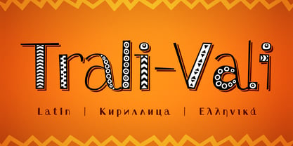
- Play Toon by Twinletter,
$14.00 Playtoon is a playful display typeface that may be used for a variety of projects. Each letter in this typeface has been specifically created to emphasize a fun, distinctive, and distinct personality. also in a unique pattern on each letter, greatly enhancing the uniqueness and enjoyment of your project. Of course, this typeface is appropriate for a wide range of creative applications, including game covers, titles, book covers, outdoor events, posters, banners, promotional material, movie titles, YouTube covers and thumbnails, children’s games, cartoon projects, and other unique projects.
 - Pagi Senja by Stringlabs Creative Studio,
$29.00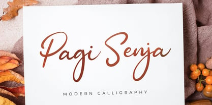 Pagi Senja is a flowing handwritten font, described by an elegant touch, perfect for your favorite projects. Fall in love with its incredibly distinct and timeless style and use it to create spectacular designs!
 - Pai MF by Masterfont,
$56.00 - HS Ali by Hiba Studio,
$59.00 HS Ali was designed in memoriam of my brother - Ali Abu Afash who was martyred during the last aggression on Gaza in summer 2014. HS Ali introduced a modern OpenType Arabic typeface, which had the characterstic, features of Kufi style with noticeable both curvy and sharp segments; beside the refinements of its letters that made it more readable. HS Ali is a display font that has been designed to be used in titles in modern graphic and publication projects. It supports Arabic, Persian, Urdu and Kurdish languages and contains four weights: Light, regular, medium and bold which can be condsiderd as and elaboration to the library of Arabic fonts contemporary models that meet the variant purposes of designs for all tastes.
 - Ali SRF by Stella Roberts Fonts,
$25.00 Ali SRF is named for Stella's son, and was designed for Stella Roberts by Ray Larabie of Typodermic Fonts. The net profits from my font sales help defer medical expenses for my siblings, who both suffer with Cystic Fibrosis and diabetes. Thank you.
 - Ali Ana by IbeyDesign,
$18.00 Ali Ana- Heart Font feels equally charming and elegant. It looks stunning on wedding invitations, thank you cards, quotes, greeting cards, logos, business cards, and every other design which needs a handwritten touch.
 - SF Pale Bottom - Unknown license

- Pale Ale Purveyor - Unknown license

- SF Pale Bottom - Unknown license

- FF Child's Play by FontFont,
$62.99 British type designer John Critchley created this script FontFont in 1993. The family has 7 weights, and is ideally suited for advertising and packaging, editorial and publishing as well as poster and billboards. FF Child's Play provides advanced typographical support with features such as ligatures and alternate characters. It comes with a complete range of figure set options – oldstyle and lining figures, each in tabular and proportional widths.
 - Hello Paris Condensed by Sans And Sons,
$19.00 Hello Paris Serif Condensed is a Modern Serif with Elegant Style is perfect for branding, logos, invitation, master heads, and more. Hello Paris Features : - Multilanguage - Alternates - PUA Encoded - Ligatures
 - Sports Play JNL by Jeff Levine,
$29.00 Re-drawn and modified from a set of early 1900s die-cut sign letters, Sports Play JNL is a chamfered typeface with an inline that reflects sports-themed topics.
 - Palo Pinto NF by Nick's Fonts,
$10.00Here’s a typeface with a stance as big as Texas. It’s based on Vincent Pacella’s 1960s oeuvre for Photo-Lettering, Inc. called Pacella Vega Extended 10, and named for a county in Central Texas, home of Possum Kingdom Lake. Both versions of this font include the complete Unicode Latin 1252 and Central European 1250 character sets. - Fair Play JNL by Jeff Levine,
$29.00 Inspired by hand lettering on a 1939 World’s Fair Poster, Fair Play JNL is a bold, condensed design with spurred serifs and some flared characters… and is available in both regular and oblique versions.
 - Old Paris Nouveau by Baseline Fonts,
$24.00Old Paris Nouveau is based on letterpress stylings of modern roman alphabets from the 1920s. Adapting the nouveau sensibility to the digital age required several conventions, including several alternate glyphs for specific individual letterforms as well as creating consistent stem weights and x-heights for more effective body copy. The inherent charm of Old Paris lies in its variation in form and style -- and yet the uniformity. Organic simplicity and elegance underscore the strength and utility inherent in the family of fonts. - YT Play Latin by Yangtype,
$9.00 The concept of this letter is health. Eat well, sleep well, exercise comfortably, have strong muscles and endurance. It makes people feel quite positive. It will give great strength to sentences that have meaning that people can understand, rather than inflammatory messages.
 - Stage Play JNL by Jeff Levine,
$29.00 Vintage sheet music for Earl Carroll's dramatic mystery-comedy production "Murder at the Vanities" has its title hand-lettered in the Art Deco style which served as the basis for Stage Play JNL.
 - 1514 Paris Verand by GLC,
$20.00 This set of initial decorated letters was inspired by a font in use in the beginning of 1500s in Paris. Exactly, we have used the set that Barthélémy Verand employed for the printing of Triumphus translatez de langage Tuscan en François, (from “Triumph” of Petrarque) in the year 1514. Some letters, lacked, have been reconstructed to propose a complete alphabet. It appears that the printer used some letters to replace others, as V, turned over to make a A, or D to make a Q. The original font’s letters were drawn in white on a black background only, but it was tempting to propose a negative version in black on white. It is used as variously as web-site titles, posters and flyers design, publishing texts looking like ancient ones, or greeting cards, all various sorts of presentations, as a very decorative, elegant and luxurious additional font. This font supports strong enlargements remaining very smart and fine. It’s original medieval hight is about one inch equivalent to about four lines of characters. This font may be used with all blackletter fonts, but works particularly well with 1543 Humane Jenson, 1557 Italic and 1742 Civilite, without any anachronism.
 - Paris Stencil JNL by Jeff Levine,
$29.00 Vintage French tin stencils with various phrases were the model for Paris Stencil JNL. The type design is available in both regular and oblique versions.
 - Cafe De Paris by Studio K,
$45.00 Café de Paris is, clearly, inspired by all things French, especially the quirky typefaces that adorn French shopfronts from cafes to charcuteries and bistros to boulangeries. My intention was a fresh, crisp, modern take on a classic theme, with just a soupcon of Art Nouveau, which is characteristic of so much of French typography (See also Studio K’s Paris Metro font) C'est chic - n'est-ce pas?
 - Ornaments of Paris by Outside the Line,
$19.00 The Ornaments of Paris were inspired by a recent trip to Paris. Each tiny Paris icon is distilled from a church, a fence, a doorway, a railing, the Louvre, graphics in a store window, a feeling, a rainy day, a glass of wine... For more of the similar see Fleurons of Paris.
 - Time To Play by Vozzy,
$10.00 Introducing vintage label font named Time To Play. This font has a wide languages support with west european and cyrillic characters (check out all available characters on previews). The font family has four styles: Base, Grunge, Volume and Texture. All styles have the same metrics and kerning. This font will look good on any vintage styled designs like a poster, T-shirt, label, logo, etc.
 - Hello Paris Sans by Sans And Sons,
$19.00 Hello Paris Sans, a Modern Sans with Elegant Style. Hello Paris Sans is a high contrast typeface so delicate, legible and lend themselves to high end branding, logo designs, product packaging, invitation & masterhead designs. Language Support: All fonts support English, French, Italian, Spanish, Portuguese, German, Swedish, Norwegian, Danish, Dutch, Finnish, Indonesian, Malay, Hungarian, Polish, Turkish, Slovenian.
 - Milan In Paris by Mevstory Studio,
$25.00 Milan in Paris is a powerful and elegant display typeface, constructed to maximize use of horizontal space. Built from hand sketches drawn over several years, Milan in Paris eight weights span an elegant Thin to a vibrant Heavy, with accompanying obliques.Milan in Paris makes a strong impression in print, headlines, video, and social media – whether paired with a contrasting typeface or on its own.
 - Fleurons of Paris by Outside the Line,
$19.00 The Fleurons of Paris were inspired by an iron gate, an iron railing, a Metro tile, a Metro stop, the Eiffel Tower, Notre Dame, a rainy afternoon, a glass of wine, an outdoor cafe and the list goes on and on. Absorbing all things visual was immensely satisfying second only to coming home and reliving the trip tiny graphic by tiny graphic. Also look at the Ornaments of Paris.
 - Kids At Play by Celebrity Fontz,
$19.99 Kids at Play is a playful and curious font with children silhouettes in the form of letters. The letters/children are engaged in a variety of poses and activites. If you want to develop a text, story, or publication for or about children, this is a must-have font. Includes full set of accented characters.
 - Cinema Paris MF by Masterfont,
$59.00
- Sweet blink play by Sulthan Studio,
$10.00 Sweet Blink is a cute and friendly handwritten font duo that is perfect for creating charming and playful designs. Its delicate and whimsical letters feature playful curves and loops, giving it a warm and inviting personality. This font is perfect for invitations, greeting cards, and other projects that require a personal and charming touch. The font’s cute and friendly personality is sure to make viewers smile.
 - Play It Cool by PizzaDude.dk,
$17.00 Play it cool with your designs - especially if you do something handcrafted! This font has 4 different versions of each letter - enough to make it look random and handcrafted!
 - Fun Play Arabic by FunFont,
$17.00 Fun Play Arabic is sibling of Fun Play comes with Arabic version ; Arabic, Urdu, Persian, Kurdish and Jawi. Fun Play is a Fun and Playful display typeface family with 5 wights variant; from Light to Bold. Comes with many features; Multilingual Support, Ligatures, Stylistic Alternate and more. Each character represents a child's joy. ‘Fun Play’ can be used for branding, packaging, headline and all styles of children-related design.
 - Notes from Paris by PeachCreme,
$18.00 "Notes from Paris" will make your letters look très chic while still maintaining its functionality with easy-to-read letterforms. Furthermore, the comforting vibe of this font brings a touch of relaxation to your typography. The words flow with ease and grace, like a gentle breeze on a summer day in the city of love. So, whether you're crafting a logo design or wedding invite, "Notes from Paris" is a font that you must have for a chic and legible typographic journey. With 59 Opentype ligatures, this font blurs the line between script and handwriting, allowing for a seamless transition between letters and creating a truly genuine sensation.
 - Holiday In Paris by Ake,
$12.00 Experience modern elegance with 'Holiday in Paris' Fonts. A casually cool handwritten typeface that adds contemporary flair to any project. Perfect for travel journals, social media, and invitations, it balances artistic strokes with readability, infusing your design with Parisian charm.
 - LDJ Cool Play by Illustration Ink,
$3.00 - Paris Van Java by Fikryal,
$25.00 Introducing this very simple sans serif font that is Paris Van Java, the font Family. I created this font with the inspiration of simplicity and it is very friendly to look at, with four versions, namely regular, italic, bold, bold italic. Very suitable to be applied in various aspects of design, Also it’s perfect for logo, branding, title, social media posts, advertisements, product packaging, product designs, label, photography, watermark, special event, magazine, web designs, etc. Features : Symbols multilingual support If you have any questions please don’t hesitate to contact me follow my Instagram: @fkryall Thank you
 - Palm Canyon Drive by RetroSupply Co.,
$19.00 Mid-century California was a magical place. Post-war optimism fueled the popularity of everything from Hollywood to roadside diners. Palm Canyon Drive is a monoline script inspired by retro matchbook covers, travel postcards, Tiki bars and Hollywood. With a classy yet unpretentious tone Palm Canyon Drive is as comfortable on a Tiki bar matchbook cover as it is on a Hollywood movie poster.
 - Play Day - Personal Use - Personal use only

- Child's Play Trial Version - Unknown license


