2,604 search results
(0.007 seconds)
- MS Mincho by Microsoft,
$39.00MS Mincho™ Japanese font features serifs at the end of its strokes, and can be used for a variety of uses from screen display to publications. This font file is 5.3 MB in size. MS Mincho Japanese font is a trademark of Microsoft Corporation. MS Mincho font Character Set: Latin-1, Japanese (code page 932). MS Mincho is available in both TrueType and OpenType font formats. - Trebuchet MS by Microsoft Corporation,
$49.00Trebuchet™ Family, designed by Vincent Connare in 1996, is a humanist sans serif designed for easy screen readability. Trebuchet Family takes its inspiration from the sans serifs of the 1930s which had large x heights and round features intended to promote readability on signs. The typeface name is credited to a puzzle heard at Microsoft, where the question was asked, 'could you build a Trebuchet (a form of medieval catapult) to launch a person from the main campus to the consumer campus, and how™' The Trebuchet fonts are intended to be the vehicle that fires your messages across the Internet. 'Launch your message with a Trebuchet page'. Character Set: Latin-1, WGL Pan-European (Eastern Europe, Cyrillic, Greek and Turkish). - Ms. Jollie by FadeLine Studio,
$15.00 Ms. Jollie is a new signature font. This font is designed with a monoline and slant style. In this font you will find a style of simple, luxury, and modern. With a style like this, this font will be suitable in use for logos, branding projects, homeware designs, product packaging, mugs, quotes, posters, shopping bags, t-shirts, book covers, name cards, invitation cards, greeting cards, and all your other lovely projects.
 - MS Gothic by Microsoft Corporation,
$39.00MS Gothic™ Japanese font features plain strokes similar to sans serif designs, and works well for on-screen display such as user interfaces. This file is 4.4 MB in size. MS Gothic is a trademark of Microsoft Corporation. MS Gothic font Character Set: Latin-1, Japanese (Code Page 932) - Calibri (MS) by Microsoft Corporation,
$49.00 - MS-PMincho by Microsoft Corporation,
$39.00 - Cafeterio MS by Redcollegiya,
$10.00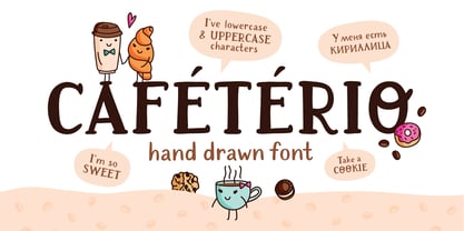 Cafeterio is a hand drawn cute font which makes it great for any children's design, be it a book cover, a t-shirt or a poster. Font includes latin and cyrillic characters, diacritics, numbers and punctuation.
 - Maybug MS by Redcollegiya,
$12.00 Maybug is a Scandinavian font family which makes it great for any children's design: greeting cards, invitations, posters, textile prints or book covers. You can mix letters of all styles to get really funny and unusual compositions.
 - Ms Claudy by Calamar,
$20.00 Ms. Claudy is an elegant modern calligraphy font that will look awesome on wedding and event stationery, logos and branding materials, cards and so on. Ms Claudy includes includes full set of Uppercase and Lowercase Basic Characters, Numerals and Punctuation. Also it contains ligatures and a lot of stylistic alternates to perfectly re-create natural calligraphy (check the previews in order to see them all). You can check your language typing characters in text box above.
 - MS-Mincho by Microsoft Corporation,
$39.00 - Quartz MS by Microsoft Corporation,
$39.00Quartz MS captures the display of text on an LCD (Liquid Crystal Display) and LED (Light Emitting Diode) screen. Quartz MS was designed by Terrance Weinzierl of Ascender Corporation for Microsoft. The Quartz MS has a technical, industrial quality. It can be used to good effect when a futuristic, scientific or technical impression is desired. - Ms Augustine by Calamar,
$18.00 Ms. Augustine is a light, lovely and modern calligraphy font with sophisticated flows. This beautiful script particularly well suited for wedding invitations, save the date cards and feminine branding. Ms. Augustine includes full set of Uppercase and Lowercase Basic Characters, Numbers and Punctuation. Also it contains a lot of stylistic alternates to perfectly re-create natural calligraphy.
 - Mrs Eaves by Emigre,
$125.00 This typeface is named after Sarah Eaves, the woman who became John Baskerville’s wife. As Baskerville was setting up his printing and type business, Mrs. Eaves moved in with him as a live-in housekeeper, eventually becoming his wife after the death of her first husband, Mr. Eaves. Like the widows of Caslon, Bodoni, and the daughters of Fournier, Sarah similarly completed the printing of the unfinished volumes that John Baskerville left upon his death.
 - MS Reference Specialty by Microsoft Corporation,
$29.00MS Reference Specialty is a unique font that was originally developed for inclusion in a Microsoft product. The MS Reference Specialty font is available in TrueType with a custom character set. - MS Reference 1 by Microsoft Corporation,
$29.00MS Reference 1 is a unique font that was originally developed for inclusion in a Microsoft product. MS Reference 1 font is available in TrueType with a custom character set. - Third Floor MS by Redcollegiya,
$10.00 Third Floor is a handwritten narrow uppercase font for grungy or funny children's design. Great for bullet journal headlines, for book and planner covers. This typeface includes latin and cyrillic characters, numbers, punctuation and diacritical marks - 258 glyphs in total.
 - MS Gothic UI by Microsoft Corporation,
$39.00MS UI Gothic™ features plain strokes similar to sans serif designs with proportional width Latin characters. It was modified for the display requirement of User Interfaces. This font file is 4.4 MB in size. MS Gothic is a trademark of Microsoft Corporation. MS UIGothic font Character Set: Latin-1, Japanese (Code Page 932) - MS Reference 2 by Microsoft Corporation,
$29.00MS Reference 2 is a unique font that was originally developed for inclusion in a Microsoft product. MS Reference 2 font is available in TrueType with a custom character set. - Fancy Kingdom MS by Redcollegiya,
$9.00 Fancy Kingdom is elegant serif font family wich great for wedding invitation, greeting cards, book covers or any fairy design. This kit includes 3 typefaces: - Regular - without curls; - Decorative - uppercase and lowercase with curls; - Combined - uppercase with curls.
 - Ginger Mate MS by Redcollegiya,
$8.00 Ginger Mate is a handwritten funny font duo which makes it great for Christmas cards or advertising, as well as for any children's design. Each of these fonts include latin and cyrillic characters, diacritics, numbers and punctuation.
 - Ms Kitty NB by No Bodoni,
$35.00Some scribbles on a bar napkin, a note from a cute girl passed in history class, what is there to say but why not a typeface? Actually it's that late night, �let's get this typeface done� madness that causes these flights of fancy. Anything to relieve the boredom of doing all those kerning pairs. Or maybe it's sunspots? Ms Kitty is all uppercase letterforms so there are two versions of each letter, one in the cap position, another in the lowercase position. Besides the regular weight and bold, there�s a bolder and much bolder in the works. And perhaps there will be a "too bold to be believed" version. Depends on the sunspots. - Eau - 100% free

- Eva - 100% free

- leaves - Unknown license

- Weaving by Ingrimayne Type,
$9.00 Weaving is a family in which the letters fit together so that wavy lines separate them both horizontally and vertically. It creates this effect by alternating letters on upper-case keys with those on lower-case letters and this alternating is done automatically in applications that support the OpenType feature of contextual alternatives (calt). (The upper-case can be used alone but it unlikely that the lower-case characters could be used by themselves.) The family is a thinner and condensed version of the typeface Woven, but in condensing it, the tessellation properties that a were in Woven are lost. It is a decorative display face but because there are few typefaces similar to it, it is hard to predict what uses it may have. Be creative!
 - Ealing by T-26,
$19.00 - Mr Eaves Modern by Emigre,
$59.00 Mr Eaves is the often requested and finally finished sans-serif companion to Mrs Eaves, one of Emigre’s classic typeface designs. Created by Zuzana Licko, this 2009 addition to the Emigre Type Library expands the versatility of the original Mrs Eaves with two complimentary families: Mr Eaves Sans and Mr Eaves Modern. Mr Eaves was based on the proportions of Mrs Eaves, but Licko took some liberty with its design. One of the main concerns was to avoid creating a typeface that looked like it simply had its serifs cut off. And while it matches Mrs Eaves in weight, color, and armature, Mr Eaves stands as its own typeface with many unique characteristics. The Sans version relates most directly to the original serif version, noticeably in the roman lower case letters a, e, and g, as well as in subtle details such as the angled lead in strokes, the counter forms of the b, d, p, and q, and the flared leg of the capital R, the tail of the Q. The distinctly loose-fitting letter spacing of Mrs Eaves was applied also to the Sans version. This, together with generous built-in line spacing due to a small x-height and extended ascenders and descenders, renders the same kind of lightness and airiness when setting text that is so characteristic of Mrs Eaves. Deviations from the original Mrs Eaves are evident in the overall decrease of contrast, as well as in details such as the flag and tail of the f and j, and the finial of the t, which were shortened to maintain a cleaner, sans serif look. And the lower case c had to be balanced out differently after it lost its top ball terminal. And with the loss of serifs, Mr Eaves set width is slightly narrower. Mr Eaves Italic also carries over many forms from its Mrs Eaves model, most notably the v, w, and z, which are unusually flamboyant for a sans italic design. It also utilizes lead in and terminal tails that are reminiscent of the serif italic. The biggest departure here is the width of the characters. The extra narrow gauge and delicate features seemed more appropriate for the Serif than the Sans. To allow for a comfortable fit, Mr Eaves Italic has a more robust design and wider character width. Meanwhile, the Modern family provides an overall less humanistic look, with simpler and more geometric-looking shapes, most noticeably in the squared-off terminals and symmetric lower case counters. This family has moved furthest from its roots, yet still contains some of Mrs Eaves’ DNA. The Modern Italic is free of tails, and overall the Modern exhibits more repetition of forms, projecting a cleaner look. This provides stronger differentiation from the serif version whenever a more contrasting look is desired. Each version (Sans and Modern) contains its own set of alternates providing unique options for applications such as headlines, word logos, letterheads, pull quotes, and other short text settings. Both the Sans and Modern come in six weights. The simpler forms of a sans-serif provide the opportunity of more weights than do serif letter forms, which are more complex in structure, making it difficult to accommodate additional weight without distortions. Regular and Bold match the original Mrs Eaves weights, while the Heavy provides an additional weight for extra emphasis.
 - Mr Eaves Sans by Emigre,
$59.00 Mr Eaves is the sans-serif companion to Mrs Eaves, one of Emigre’s classic typeface designs. Created by Zuzana Licko, this 2009 addition to the Emigre Type Library expands the versatility of the original Mrs Eaves with two complementary families: Mr Eaves Sans and Mr Eaves Modern. Mr Eaves was based on the proportions of Mrs Eaves, but Licko took some liberty with its design. One of the main concerns was to avoid creating a typeface that looked like it simply had its serifs cut off. And while it matches Mrs Eaves in weight, color, and armature, Mr Eaves stands as its own typeface with many unique characteristics. The Sans version relates most directly to the original serif version, noticeably in the roman lower case letters a, e, and g, as well as in subtle details such as the angled lead in strokes, the counter forms of the b, d, p, and q, and the flared leg of the capital R, the tail of the Q. The distinctly loose-fitting letter spacing of Mrs Eaves was applied also to the Sans version. This, together with generous built-in line spacing due to a small x-height and extended ascenders and descenders, renders the same kind of lightness and airiness when setting text that is so characteristic of Mrs Eaves. Deviations from the original Mrs Eaves are evident in the overall decrease of contrast, as well as in details such as the flag and tail of the f and j, and the finial of the t, which were shortened to maintain a cleaner, sans serif look. And the lower case c had to be balanced out differently after it lost its top ball terminal. And with the loss of serifs, Mr Eaves set width is slightly narrower. Mr Eaves Italic also carries over many forms from its Mrs Eaves model, most notably the v, w, and z, which are unusually flamboyant for a sans italic design. It also utilizes lead in and terminal tails that are reminiscent of the serif italic. The biggest departure here is the width of the characters. The extra narrow gauge and delicate features seemed more appropriate for the Serif than the Sans. To allow for a comfortable fit, Mr Eaves Italic has a more robust design and wider character width. Meanwhile, the Modern family provides an overall less humanistic look, with simpler and more geometric-looking shapes, most noticeably in the squared-off terminals and symmetric lower case counters. This family has moved furthest from its roots, yet still contains some of Mrs Eaves' DNA. The Modern Italic is free of tails, and overall the Modern exhibits more repetition of forms, projecting a cleaner look. This provides stronger differentiation from the serif version whenever a more contrasting look is desired. Each version (Sans and Modern) contains its own set of alternates providing unique options for applications such as headlines, word logos, letterheads, pull quotes, and other short text settings. Both the Sans and Modern come in three weights. The simpler forms of a sans-serif provide the opportunity of more weights than do serif letter forms, which are more complex in structure, making it difficult to accommodate additional weight without distortions. Regular and Bold match the original Mrs Eaves weights, while the Heavy provides an additional weight for extra emphasis.
 - MS Reference Sans Serif by Microsoft Corporation,
$39.00MS Reference Sans Serif font is a special font containing the WGL character set and a range of symbols and icons. The WGL Pan-European character set provides support for Western, Central and Eastern European languages including Greek, Cyrillic, Baltic and Turkish. MS Reference Sans Serif is based on the Verdana fonts created by Matthew Carter and hinted by Thomas Rickner. The MS Reference Sans Serif font is distributed under license from Microsoft Corporation. - Mrs Eaves XL Serif by Emigre,
$59.00 Originally designed in 1996, Mrs Eaves was Zuzana Licko’s first attempt at the design of a traditional typeface. It was styled after Baskerville, the famous transitional serif typeface designed in 1757 by John Baskerville in Birmingham, England. Mrs Eaves was named after Baskerville’s live in housekeeper, Sarah Eaves, whom he later married. One of Baskerville’s intents was to develop typefaces that pushed the contrast between thick and thin strokes, partially to show off the new printing and paper making techniques of his time. As a result his types were often criticized for being too perfect, stark, and difficult to read. Licko noticed that subsequent interpretations and revivals of Baskerville had continued along the same path of perfection, using as a model the qualities of the lead type itself, not the printed specimens. Upon studying books printed by Baskerville at the Bancroft Library in Berkeley, Licko decided to base her design on the printed samples which were heavier and had more character due to the imprint of lead type into paper and the resulting ink spread. She reduced the contrast while retaining the overall openness and lightness of Baskerville by giving the lower case characters a wider proportion. She then reduced the x-height relative to the cap height to avoid increasing the set width. There is something unique about Mrs Eaves and it’s difficult to define. Its individual characters are at times awkward looking—the W being narrow, the L uncommonly wide, the flare of the strokes leading into the serifs unusually pronounced. Taken individually, at first sight some of the characters don’t seem to fit together. The spacing is generally too loose for large bodies of text, it sort of rambles along. Yet when used in the right circumstance it imparts a very particular feel that sets it clearly apart from many likeminded types. It has an undefined quality that resonates with people. This paradox (imperfect yet pleasing) is perhaps best illustrated by design critic and historian Robin Kinross who has pointed out the limitation of the “loose” spacing that Licko employed, among other things, yet simultaneously designated the Mrs Eaves type specimen with an honorable mention in the 1999 American Center for Design competition. Proof, perhaps, that type is best judged in the context of its usage. Even with all its shortcomings, Mrs Eaves has outsold all Emigre fonts by twofold. On MyFonts, one of the largest on-line type sellers, Mrs Eaves has been among the 20 best selling types for years, listed among such classics as Helvetica, Univers, Bodoni and Franklin Gothic. Due to its commercial and popular success it has come to define the Emigre type foundry. While Licko initially set out to design a traditional text face, we never specified how Mrs Eaves could be best used. Typefaces will find their own way. But if there’s one particular common usage that stands out, it must be literary—Mrs Eaves loves to adorn book covers and relishes short blurbs on the flaps and backs of dust covers. Trips to bookstores are always a treat for us as we find our Mrs Eaves staring out at us from dozens of book covers in the most elegant compositions, each time surprising us with her many talents. And Mrs Eaves feels just as comfortable in a wide variety of other locales such as CD covers (Radiohead’s Hail to the Thief being our favorite), restaurant menus, logos, and poetry books, where it gives elegant presence to short texts. One area where Mrs Eaves seems less comfortable is in the setting of long texts, particularly in environments such as the interiors of books, magazines, and newspapers. It seems to handle long texts well only if there is ample space. A good example is the book /CD/DVD release The Band: A Musical History published by Capitol Records. Here, Mrs Eaves was given appropriate set width and generous line spacing. In such cases its wide proportions provide a luxurious feel which invites reading. Economy of space was not one of the goals behind the original Mrs Eaves design. With the introduction of Mrs Eaves XL, Licko addresses this issue. Since Mrs Eaves is one of our most popular typefaces, it’s not surprising that over the years we've received many suggestions for additions to the family. The predominant top three wishes are: greater space economy; the addition of a bold italic style; and the desire to pair it with a sans design. The XL series answers these requests with a comprehensive set of new fonts including a narrow, and a companion series of Mrs Eaves Sans styles to be released soon. The main distinguishing features of Mrs Eaves XL are its larger x-height with shorter ascenders and descenders and overall tighter spacing. These additional fonts expand the Mrs Eaves family for a larger variety of uses, specifically those requiring space economy. The larger x-height also allows a smaller point size to be used while maintaining readability. Mrs Eaves XL also has a narrow counterpart to the regular, with a set width of about 92 percent which fulfills even more compact uses. At first, this may not seem particularly narrow, but the goal was to provide an alternative to the regular that would work well as a compact text face while maintaining the full characteristics of the regular, rather than an extreme narrow which would be more suitable for headline use. Four years in the making, we're excited to finally let Mrs Eaves XL find its way into the world and see where and how it will pop up next.
 - Mr Eaves XL Sans by Emigre,
$59.00
- Mr Eaves XL Modern by Emigre,
$59.00
- LT Eat - Personal use only

- Let's Eat - Unknown license

- BM leaves - Unknown license

- Leaves & Straw by Stone Type Foundry,
$49.00 These ornaments are made from plants which grow on Alphabet Farm, the place where Stone Type Foundry is located.
 - Sav Display by T-26,
$29.00 - Play Leaves by Yumna Type,
$25.00 Play Leaves is a plant leaves-inspiring display font. Its simple, round letters have natural, organic leaf ornaments along with the unique characteristics of elegant, modern displays in natural looks. For that reason, it is suitable to apply for simple, yet elegant designs with which you can emphasize the delivery of messages in your graphic designs. Such font is perfectly applicable for any related natural, environmental, organic product designs and expresses fresh, cool, natural nuances to apply for health and natural element products such as cosmetics and food. Moreover, Play Leaves provides a clipart in accordance with the font theme as a bonus and features you can enjoy. Features: Multilingual Supports PUA Encoded Numerals and Punctuations Play Leaves fits best for various design projects, such as brandings, headings, magazine covers, quotes, printed products, merchandise, social media, etc. Find out more ways to use this font by taking a look at the font preview. Thanks for purchasing our fonts. Hopefully, you have a great time using our font. Feel free to contact us anytime for further information or when you have trouble with the font. Thanks a lot and happy designing.
 - Withered Leaves by Rvandtype,
$12.00 Withered Leaves is Handwritten font. It has a elegant, and modern look which can be used for logos, branding, invitations, stationary, wedding designs, social media posts, and every other design.
 - Tropical Leaves by Sakha Design,
$10.00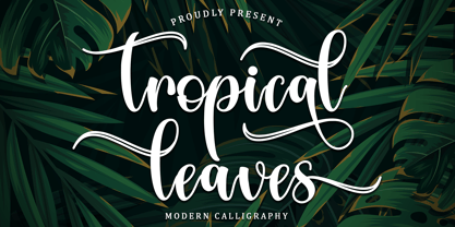 Tropical Leaves is a modern calligraphy font. It will add a luxury spark to any design project that you wish to create! This font is PUA encoded which means you can access all of the amazing glyphs and ligatures with ease!


Page 1 of 66Next page