3,975 search results
(0.01 seconds)
- Coranto 2 by TypeTogether,
$49.00 Now available as Opentype font with extended character set, Coranto 2. It is originally based on Unger’s typeface Paradox, and arose from a desire to transfer the elegance and refinement of that type to newsprint. Coranto 2 has a larger x-height and in many places has been made more robust. Over the past 25 years newspaper production has seen spectacular improvements in paper and print quality, the introduction of colour printing, and vastly better register. Newspaper production still demands a lot of letter forms, but advanced printing brings out details better and makes typography more appealing to readers. For text type the newspaper is no longer an environment in which survival is the chief assignment. Today, newspapers are not merely a matter of cheap grey paper, thin ink and super-fast rotary printing, and type design no longer has to focus on surviving the mechanical technology and providing elementary legibility. Now there is also room to create an ambience, to give a paper a clearer identity of its own; there is scope for precision and refinement. One consequence of this is that newspaper designers can now look beyond the traditional group of newsfaces. Conversely, a newsface can be used outside the newspaper — not an uncommon occurrence. The update to this beautiful font family, Coranto 2, includes the addition of over 250 glyphs featuring full Latin A language support, new ligatures, 4 sets of numerals, arbitrary fractions and superiors/inferiors. Furthermore, kerning was added and fine tuned for better performance.
 - Metroblack #2 by Linotype,
$29.00American graphic designer William Addison Dwiggins' (W.A.D. for short) first typefaces were the Metro family, designed from 1927 onward. The project grew out of Dwiggins' dissatisfaction with the new European sans serif typefaces of the day, such as Futura, Erbar, and Kabel, a feeling he expressed in his seminal book Layout in Advertising. Urged by Mergenthaler Linotype to create a solution for the problem, Dwiggins began a professional relationship that would span over the next few decades. The first Metro family typeface to be released was Metroblack, brought to market by Linotype in 1929 (Metroblack #2™ the only one of the two versions that Mergenthaler Linotype eventually put into production which is available in digital form). With more of a humanist quality than the geometric styles popular in Europe at the time, Dwiggins drew what he believed to be the ideal sans serif for headlines and advertising copy. Metroblack has a warmer character than the Modernists' achievements, and the type is full of mannered curves and angled terminals (Metroblack also has an astoundingly beautiful Q). The weights of the Metro family, Metromedium #2™ and Metrolite #2™, were each designed by Mergenthaler Linotype's design office under Dwiggins' supervision. In 2012 Toshi Omagari reworked the Metro family as "Metro Nova" with many weights into a modern type family that even contains the alternate characters from the origin Metro family from Dwiggins. Despite having been created more than three-quarters of a century ago, the Metro family types have aged well, and remain a popular sans serif family. Although spec'd less often than other bestsellers, like Futura, Metro continues to find many diverse uses. The typeface has appeared throughout Europe and the North America for decades in newspapers and magazines, and can even help create a great brand image when used in logos and corporate identity. Dwiggins ranks among the most influential graphic designers and typeface designers of the 20th Century. He has several other quality fonts in the Linotype portfolio, including the serif text faces Electra™ and New Caledonia™, as well as Caravan™, a font of typographic ornaments. - Andron 2 by SIAS,
$44.90 The sister fonts Andron 2 English and Andron 2 Deutsch provide a groundbreaking new possibility to render literature text bodies in a sophisticated traditional and yet modern way of type. In German typographic history there has once been a long-lasting struggle called the Frakturstreit (the blackletter quarrel). It was about wether German text ought to be composed in blackletter or rather in Roman type, a question upon which even Goethe, Schiller and other period celebrities got grey over time. However, blackletter type remained alive and has just recently seen an astonishing renaissance. This is not about a blackletter revisionism or some ‘mixture’ concept arguably bridging the gap between either worlds. Andron 2 English and Andron 2 Deutsch offer a new approach to circumvent that old antagonism. As for the lowercase letters I applied certain features of blackletter type onto the glyphs – but entirely abandoned the principle of the broken stroke as such. The result is a lowercase alphabet in the classical Andron style which may be considered an attractive alternative for text in English, German or even other languages. So it’s no longer entirely about choosing between ‘modern’ Roman or ‘ancient’ blackletter only. Andron 2 English Regular and Andron 2 Deutsch Regular feature the same lowercase glyphs but differ in the majuscules (Andron 2 English has normal Latin capitals). ++++ 2012 + NEW! +++ In response to its growing popularity we now present five new fonts as part of the Andron 2 series. Andron 2 English is completed by an Italic and a Bold font. Andron 2 Deutsch now contains three interesting alternative fonts: Italic, Scriptive and Laendlich. Last but not least – A new set of wonderful classical typographic ornaments is part of the Italic and Scriptive fonts. – You can also purchase these ornaments separately as “Andron Ornamente”.
 - Capitolium 2 by TypeTogether,
$58.00 Capitolium was designed in 1998 at the request of the Agenzia romana per la preparatione del Giubileo for the Jubilee of the Roman Catholic Church in 2000. This type design was the central part of the project for a wayfinding and information system to guide pilgrims and tourists through Rome. Capitolium also continues Rome’s almost uninterrupted two-thousand-year-old tradition of public lettering . It is a modern typeface for the twenty-first century and strongly related to the traditions of Rome. Soon after the completion of this project Unger began contemplating the possibility of bringing the atmosphere of this design to newspapers. Though Capitolium works well in most modern production processes and also on screens, it is too fragile for newsprint. For newspapers sturdier shapes were required as well as more characters to a line of text, and Capitolium News has a bigger x-height than Capitolium. Capitolium News is a thoroughly modern newsface, with classic letterforms linked to a strong tradition. Capitolium News for running text comes in the variations regular, italic, semibold, semibold italic, bold and bold italic. As is possible with most of Unger’s type designs, Capitolium News can be condensed and expanded without any harm to the letterforms. The update to this beautiful font family, Capitolium News, includes the addition of over 250 glyphs featuring full Latin A language support, new ligatures, 4 sets of numerals, arbitrary fractions and superiors/inferiors. Furthermore, kerning was added and fine tuned for better performance.
 - Meloneads 2 by PizzaDude.dk,
$20.00Although being made of geometric shapes, Meloneads 2 is a playful and funny set of drawings. - Latin #2 by Monotype,
$29.99Typefaces designated as Latins were popular during the last half of the nineteenth century. One of the styles that continued to be popular into the twentieth century is the bold condensed typeface Latin. Readily identifiable by its triangular serifs and sharp terminals on the strokes of some of the lowercase letters, Latin Condensed makes an interesting display type and its condensed proportions easily solve copyfitting problems. - Metrolite #2 by Linotype,
$29.00In 1929 Chauncey Griffith at Mergenthaler commissioned W.A. Dwiggins to design a warmer and less mechanical Geometric Sanserif to compete with Futura. Dwiggins’ best efforts proved that human warmth had little to do with cool geometry; for twelve years, until the introduction of Spartan, Mergenthaler lost ground to Intertype’s licensed version of Futura. - joeHand 2 by JOEBOB graphics,
$19.00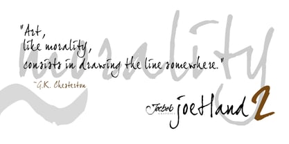
- Wonderbar 2 by Sharkshock,
$125.00 Wonderbar 2 is wacky, retro, and not to be taken too seriously. The wavy nature throughout the characters ensure that you're in for a wild ride. Alternating between upper and lowercase letters is like shifting gears. Uppercase characters take on a more undulating flow with stems that reach out to tickle you. Because of this slight overlap should be expected. In addition to Latin this childlike display font is equipped with Extended Latin for many European languages as well as Cyrillic. Try it in a children’s book, poster, or birthday invitations.
 - Cindie 2 by Lewis McGuffie Type,
$49.00 Cindie 2 is an update of the optical type Cindie Mono. It retains the monospace-stacking system of the original, but some letters have been redrawn. It also now includes a lowercase and Cindie 2 has a script accompaniment (which isn’t mono and should be used with Contextual Alternates turned on!). Good for posters, branding and headlines, Cindie 2 has 26 monospaced widths which will fit any job. Cindie 2 also comes as a Variable Font.
 - dearJoe 2 by JOEBOB graphics,
$19.00 DearJoe 2 is the second of four handwritten scripts by JOEBOB graphics. A complete character set with numbers and most (but not all) special signs.
 - Xtreem 2 by Mans Greback,
$59.00 An updated version of the popular Xtreem typeface.
 - Quadrille 2 by Solotype,
$19.95This is a simplified Tuscan, free from excessive ruffles and flourishes. Types of this general design began to appear in profusion in the 1830, and continued as a popular form until the end of the nineteenth century. We added the lowercase to this one for increased usefulness. - Tomoli 2 by PizzaDude.dk,
$20.00Part 2 in the series of "things of more or less importance" which include different drawings. - Engravers #2 by Linotype,
$29.99 - Pax 2 by Linotype,
$29.99Pax is clearly a didone, using Vox classification. The contrast between the thin lines and the thicker ones is noticeable, as you would expect from a didone. The basic form is relatively narrow, therefore I designed another Pax, slightly wider and darker, and called it Pax #2. Otherwise they are more or less identical. Pax is Latin for peace, on everyone's want list in 1995 - as well as every single year before and after that. Pax was released in 1995. - 2 Quadro by Apostrof,
$50.00 This big family summarizes and develops the tradition of boldface squared-off 45° shear sanserifs. Known from the middle of 19th century and actively used in different times (1920s, 1970s) is still usable now, thanks to its brutal expression, monumentality and possibility to fully maximize the flatness without loss of readability. This font is especially good for filling letters with photos or to create geometrical “constructivist” compositions.
 - Metromedium #2 by Linotype,
$29.00American graphic designer William Addison Dwiggins' (W.A.D. for short) first typefaces were the Metro family, designed from 1927 onward. The project grew out of Dwiggins' dissatisfaction with the new European sans serif typefaces of the day, such as Futura, Erbar, and Kabel, a feeling he expressed in his seminal book Layout in Advertising. Urged by Mergenthaler Linotype to create a solution for the problem, Dwiggins began a professional relationship that would span over the next few decades. The first Metro family typeface to be released was Metroblack, brought to market by Linotype in 1929 (Metroblack #2™ the only one of the two versions that Mergenthaler Linotype eventually put into production which is available in digital form). With more of a humanist quality than the geometric styles popular in Europe at the time, Dwiggins drew what he believed to be the ideal sans serif for headlines and advertising copy. Metroblack has a warmer character than the Modernists' achievements, and the type is full of mannered curves and angled terminals (Metroblack also has an astoundingly beautiful Q). The other weights of the Metro family, Metromedium #2™ and Metrolite #2™, were designed by Mergenthaler Linotype's design office under Dwiggins' supervision. Despite having been created more than three-quarters of a century ago, the Metro family types have aged well, and remain a popular sans serif family. Although spec'd less often than other bestsellers, like Futura, Metro continues to find many diverse uses. The typeface has appeared throughout Europe and the North America for decades in newspapers and magazines, and can even help create a great brand image when used in logos and corporate identity. Dwiggins ranks among the most influential graphic designers and typeface designers of the 20th Century. He has several other quality fonts in the Linotype Originals, including the serif text faces Electra™ and New Caledonia™, as well as Caravan™, a font of typographic ornaments." - Ninja 2 by Andinistas,
$29.95 - Galerie 2 by ArtyType,
$29.00 Galerie 2 has a narrower styling and less contrast than its sister family but incorporates the same unique characteristics as Galerie within its elegant proportions. The close genetic proximity to Galerie enables dual deployment in text and artwork, each family complimenting the other in combinations of headings and copy. Galerie 2, like the full width Galerie volume, comes in 4 weights from Thin to Bold.
 - FD Messed up - Unknown license

- Mess Hall JNL by Jeff Levine,
$29.00Modeled from a set of individual painting stencils, Mess Hall JNL is named for the armed services cafeteria where thousands of enlisted men endured bland, boring meals day in and day out for years. - Pep O Mint Normal - Unknown license

- Unexplored Galaxies O BRK - Unknown license

- Typesource Extol O BRK - Unknown license

- Your Complex O BRK - Unknown license

- Quill Experimental O BRK - Unknown license

- Web-o-Mints GD by Galapagos,
$19.00George Ryan’s font of typographic ornaments and borders, available as a free download from Galápagos. - Gal Sans O Type by O Type Foundry,
$29.00 O Type Foundry published the unique 'Geometric Mechanic Sans Serif' in 2023, a typeface that Galang Persada had been perfecting since 2013. Attention all graphic designers! Are you tired of using the same old fonts and design elements in your projects? Look no further than Gal Sans, the newest geometric mechanic sans serif font on the market. With its clean lines and modern aesthetic, Gal Sans is the perfect addition to any designer’s toolkit. Its versatility makes it suitable for a wide range of design projects, from logos to website text. Plus, its minimalist design adds an elegant touch to any composition. Don’t settle for ordinary – elevate your designs with Gal Sans. Try it out today!
 - F. O. T. R. by JAF 34,
$9.90 F. O. T. R. is experimental sans serif display font. Space travelling is near so I decided to bring you a brand new typeface based on insight into the future. Clean shapes, a lot of atypical alternates and the futuristic appearance. F. O. T. R. typeface is conceptually connected with a chronophotography project FUTURE OF THE RHYTHM.
 - Monod Brun by Resident,
$40.00 Created in 2009 by V.H. Fleisher, Monod Brun is a geometric sans-serif typeface. The font has OpenType features that can be accessed in programs like the Adobe Creative Suite. These features include tabular lining figures, titling caps which are heavier & more loosely spaced than the regular caps, alternative punctuation marks, and arbitrary nut fractions (for single digit numerators & denominators). By clicking on the “Gallery” tab above, you can see an illustration of the OpenType features. The “ff” tab on the “Sample Text” bar below allows you to test the OpenType features with your own text. Supported languages include: Albanian, Czech, Danish, Dutch, English, Faroese, Finnish, French, German, Icelandic, Italian, Norwegian, Portuguese, Spanish & Swedish.
 - Ariergard Rondo by ParaType,
$25.00 AriergardRondo is supplemental to Ariergard by the same author. It differs with sharp geometrical letterforms and with circular shapes of round letters. The face includes antique Cyrillic letter shapes: N has diagonal stroke, uppercase Y and Ч are equilateral. Both lc г and т have ascenders. For use in advertising and display typography.
 - Mundo Sans by Monotype,
$50.99 Mundo Sans, by Carl Crossgrove for the Monotype Studio, is distinctive, approachable – and ready to tackle jobs both big and small. Its open counters and large x-height, which give the design a straight-forward no-nonsense mien, are softened by inviting calligraphic undertones. With 10 weights and a complementary suite of cursive italics, there is little outside the range of the Mundo Sans family. The light weights are elegant in packaging and brochure design, the medium are easy readers in digital blogs and print periodicals and the bold command attention in banners and headlines. Mundo Sans is at home in a wide range of sizes, and comfortable in everything from wayfinding to mobile apps. Mundo Sans takes on complicated branding projects with efficient grace. The family enables companies and products to express their brand seamlessly in websites, advertising, corporate messaging, packaging – virtually everywhere visible engagement is possible. A large international character set, that includes support for most Central European and many Eastern European languages, ensures ease of localization. Mundo Sans was originally released with seven weights. The family was updated with three new roman weights and their italics in 2019 that extend and diversify its range of use: a fine hairline weight, a book weight, slightly lighter than regular, and a demi that is subtly lighter than the medium. The design is also is a good mixer. It easily pairs with everything from refined Didones to stalwart slab serif designs. And if you need a more harmonious palette, look no further than Mundo Sans’ relative, Mundo Serif. The two designs harmonize with each other perfectly in weight, typographic color and proportion. Mundo Sans’ italics are true cursive designs, with fluid strokes and obvious calligraphic overtones. The flick of the down-stroke in the ‘a,’ the descending stroke of the ‘f’ and baseline curve of the ‘z’ add grace to the design and distinguish it from more mechanistic styles. Mundo Sans is a design with deep roots. It was originally drawn to pair with classic Renaissance book typefaces like Bembo® and ITC Galliard®. With a hint of diagonal stroke contrast and gentle flaring of strokes, Mundo Sans complements these designs with warmth and grace. Crossgrove says that Mundo isn’t meant to be showy or distinctive. It is intended to follow the tradition of sans serif designs that have a wide range of uses, enabling comfortable reading and clear expression. Crossgrove has designed a variety of typefaces ranging from the futuristic and organic Biome™ to the text designs of Monotype’s elegant Walbaum™ revival. His work for Monotype also often takes Crossgrove into the realm of custom fronts for branding and non-Latin scripts.
 - Mundo DemiBold by Type-Ø-Tones,
$40.00 Mundo DemiBold is the perfect counterpart of the Hannover Modern, the other Javier Mariscal typeface in our catalogue. This nice font belongs to a series of drawings used in the Señor Mundo comic strip of the nineties.
 - Monto Screen by Lucas Tillian,
$28.00 Introducing Monto Screen – the latest addition to the Monto superfamily, distinguished by its rational and meticulously constructed aesthetic. This new sub-family complements the success of Grotesk and Grotesk Display while offering a fresh take on Monto's design principles. Monto Screen is purposefully crafted for the digital era, ensuring unparalleled legibility and visual clarity on screens of all sizes. Its stroke endings align precisely at 90 and 0-degree angles, and its rounded shapes feature carefully designed verticals, creating a clean and harmonious structure. Through its rational construction, Monto Screen exudes a very trustworthy feel and established aesthetic, embodying a sense of reliability and timeless elegance. Its cap height aligned to the ascenders presents a unique choice that sets it apart, making it a compelling and distinct addition to the Monto superfamily. Embrace the future of typography with Monto Screen – a modern and rationally designed typeface that sets new standards for clarity and readability on digital platforms.
 - Hondo Grunge by Fontasmic,
$16.99 The Hondo Grunge fonts are a collection of ultrabold eroded slab serif typefaces with a dynamic look and extended functionality. Accented with decorative and functional inktraps and complete with Slant and Backslant styles, this heavyweight has a high performance hardcore edge to it. Ideal for titling, poster work, logos, and small bits of copy. For the Opentype savvy, the Opentype version contains a complete alternate set of base characters, which by enabling contextual alternates option will force the typeface to continually alternate between the original & alternate character sets for a more spontaneous look.
 - HS Sondos by Hiba Studio,
$40.00 HS Sondos is an Arabic display typeface designed specifically for titles and graphic projects. Drawing inspiration from Modern Kufi calligraphy, the font features a harmonious fusion of sharp and curved lines, resulting in a visually captivating and innovative take on square shapes and geometric structures. The distinctive sharp endings at the bottom of each character add an extra touch of aesthetic appeal. With three available weights -regular, bold, and black- HS Sondos offers versatility and variety. The black weight introduces a novel concept by maintaining the same horizontal dimensions as the regular weight but expanding the vertical dimensions, creating a uniquely bold appearance. Supporting Arabic, Persian, and English languages, HS Sondos opens up a world of possibilities for designers looking to enhance their Arabic typography. Its visually striking and flexible nature makes it an excellent choice for projects that demand attention and creativity. Overall, HS Sondos stands as a testament to the beauty and adaptability of Arabic typography, empowering designers to bring their visions to life with a captivating and versatile typeface.
 - Monto Grotesk by Lucas Tillian,
$28.00 Monto is a superfamily — this is the Grotesk + Grotesk Display part of it. Monto Grotesk is a modern sans serif typeface that combines the strengths of the neo-grotesque and geometric genres. While maintaining an established and trusted look, the design is influenced by a contemporary geometric aesthetic, making it a modern yet timeless companion. The Grotesk is split into two sub-families (Monto Grotesk and Monto Grotesk Display). While Grotesk is intended to be used in long paragraphs and copy text, Grotesk Display is perfect for striking headlines. To achieve maximum legibility, Grotesk emphasizes its characters vertical strokes, focusing on a coherent rhythm and having more open counters in contrast to Display which features a reduced tracking and more geometric and round forms. Furthermore, individual characters change their entire shape to best suit their areas of operation.
 - Mundo Serif by Monotype,
$50.99 With designs drawn specifically for comfortable reading in everything from on-screen digital content to print in periodicals and books, Mundo Serif is ready to take on just about any project. Carl Crossgrove drew the suite of typefaces to complement his Mundo Sans family’s classic humanistic design traits – and added a subtle modern influence. Restrained stroke modulation, generous counters, commanding x-height and tall ascenders ensure that content set in Mundo Serif is both legible and easy on the eyes. While primarily designed for text copy in print and on screen, Mundo Serif becomes a powerful display type tool in the lightest and boldest weights. Headlines, navigational links and banners are naturals for this versatile collection of typefaces. Mundo Serif is a large family. Nine weights, each with an italic companion, enable precise typographic tuning. Captions, subheads, pull quotes and long-form copy can be melded to create a welcoming page of modulated text. For best results in digital environments, skipping a weight – or even two – ensures hierarchical clarity. Crossgrove did extensive testing of Mundo Serif to ensure the best possible on-screen readability. To further guarantee optimal digital imaging of the family, he gave the design generous inter-character spacing and slightly expanded intricate characters like the lowercase a and g. If the goal is diversified or multi-platform branding, look no further than Mundo Sans. The two designs harmonize with each other perfectly in weight, typographic color and proportion. Both designs benefit from large international character set that includes support for most Central European and many Eastern European languages. For a stronger contrast, pair Mundo Serif with virtually any sans serif grotesque design. Crossgrove has designed a variety of typefaces ranging from the futuristic and organic Biome™ to the warm, clean lines of the Mundo Sans. His work for Monotype also often takes Crossgrove into the realm of custom fronts for branding and non-Latin scripts.
 - KG Life Is Messy by Kimberly Geswein,
$5.00 A messy, markered, painted font in pure whimsical and messy style.


