320 search results
(0.014 seconds)
- Maltiner Display by Arterfak Project,
$28.00 Introducing Maltiner Display: A versatile, elegant, and sophisticated condensed serif font inspired by classic typography and newspaper headlines. Designed to excel in display settings, Maltiner Display prioritizes typographic excellence, offering a bold yet refined aesthetic. With unique letterforms and sharp edges, Maltiner Display provides ligatures and special characters, the perfect choice for luxury projects.
 - Matinee Idol by Comicraft,
$19.00 Now showing at your local picture house is the latest romantic comedy coupling featuring Matinee Idol and Matinee Idol Bold; famous faces you've come to know and love in features like Warners' "Hush" and Columbia's "The Evil That Men Do." Stop by our lobby and check these fonts out. Oh, and please remember to refrain from smoking and talking during the show!
 - Martin Bold by Wooden Type Fonts,
$15.00 Unusual sans serif with some rounded portions.
 - Martin Gothic by URW Type Foundry,
$35.99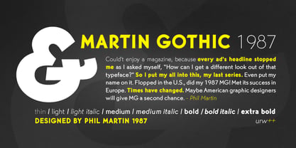
- Praying Mantis by Tomass Gavars,
$8.00 Praying Mantis is a typeface designed by Tomass Gavars. The design was inspired by the praying mantis insect. The shapes of the mantis head, forelegs and body are represented in each glyph. Each font consists of 226 characters - including numbers and punctuation. Praying Mantis has Latin character set support.
 - Mantika Sans Paneuropean by Linotype,
$67.99With its well-defined characters that are readily legible even in the small font sizes, Mantika Sans by Jürgen Weltin is ideal for typesetting. The elaborately designed and highly individual set of italics enhances the attractiveness of the font.Jürgen Weltin developed the Mantika™ Sans sans serif font using older designs for an serif font as his inspiration. Nothing more than the merest suggestion of the original serifs has survived. Bevelled line endings and the slight variation in thickness of verticals, in particular, provide Mantika Sans with a very dynamic character that evokes manuscript. Short ascenders and descenders give the font a compact appearance that is also underscored by its condensed proportions. Weltin has achieved his aim of producing a typeface with excellent legibility even in small sizes not just by means of the x-height, which is tall in comparison with the capital letters, but also by using clearly defined and well differentiated designs for critical letters, such as i", "I" and "l". Lower case "i", for example, has a serif while the "l" has a curved base.In addition to uppercase numerals, Mantika Sans also has lowercase or old style numerals that have been designed so that they can be used in both tabular and proportional settings. The uppercase numerals are slightly shorter than the uppercase letters, ensuring that the latter can be sympathetically incorporated within continuous text.The Mantika Sans italics are very unusual. They are inclined at only 4.5° (the usual angle for italics is 10 - 12°) and so appear to be almost upright. In addition, they also have quite distinctive forms. The overall effect calls attention to their curvilinear, manuscript character, enhances contrasts and further emphasizes the terminals. Weltin explains: "Within the variety of forms of the italics there are many contrasting terminal elements that create dynamism. The result is a diversity of interaction between the rounded and angular forms". Mantika Sans Italic thus has all the features of a display typeface, but can also be happily used on its own to set longer text passages. Mantika Sans is available in two weights; Regular and Bold, both of which have corresponding italics sets. Mantika Sans has been designed so that the widths of the four related cuts are identical, meaning that a change of font within a single layout will have no effect on justification. In addition, the members of the Mantika Informal font family, designed by Jürgen Weltin in 2010, also have the same thickness. Other font families having weights with equal thickness can be found in the "Linotype Office Alliance series".The Mantika Sans character sets are paneuropean. There are characters for setting texts in Eastern European languages, Greek and Cyrillic. There is also a range of special symbols, including right-angled brackets, subscript and superscript lower case letters, together with numerals, arrows and many different bullet points.As a vibrant and highly legible text font, Mantika Sans has a broad spectrum of potential applications. Its unusual italics are not just perfect for use in display text. The fact that it has only four cuts means that Mantika Sans is particularly suitable for office use or for the setting of business reports. Its excellent legibility even in the small font sizes also makes it ideal as a text for electronic reading devices; this also applies to Mantika Informal.At the 3rd International Eastern Type Design Competition Granshan 2010, Mantika Sans was awarded in the category Greek text typefaces." - Mantika Informal Paneuropean by Linotype,
$67.99Jürgen Weltin's Mantika Informal is pretty difficult to categorize, but very easy to like. This particularly reader-friendly typeface in regular and bold weights, brings to the table the informal fluidity of a script, the consistency of an inclined italic, and the open and airy forms and contrast of a humanist sans. The result is a warm, approachable, and very legible typeface that is never static and staid, but rather invites an attentive, reading eye. The original idea behind Mantika Informal lay in the challenge to create a typeface for setting children's books. German designer Jürgen Weltin aimed to create a reading typeface for those just starting to learn how to read. On the one hand, it should help create clear word-images; on the other, its letterforms should remain uncomplicated but resist mechanical and industrial sterility. Mantika?s subtle cursive lines stress the printed word's connection with handwriting, in addition to making the transition from school writing exercises to printed texts seamless and effortless. The resulting slightly organic and cursive forms that developed during the design process are so captivating that Mantika Informal may be used for a multitude of unintended applications - anywhere a friendly and informal yet sophisticated character could lend a helping hand, Mantika is there, giving a fresh accent to anything from packaging design to food products. With a broad character set encompassing support for Cyrillic and Green, Mantika Informal's two fonts make for a versatile and dynamic typeface that surely will find its place in a broad range of applications. - Mantika Book Paneuropean by Linotype,
$67.99Mantika Book expands the Mantika super family: a contemporary serif font with a soft, yet robust character and a classic lookMantika Book, an Antiqua, is the third member of the Mantika super family, which consists of the Mantika Sans and Mantika Informal. Designer Jürgen Weltin has gone back to the roots of his font, which he had originally derived from a Renaissance Antiqua. These origins are recognizable in the first member of the Mantika family, Mantika Sans, in the form of carefully suggested line use and a contrast in the weights that recalls the Antiqua. This solid sans serif, optimized for use in text, also has a particularly energetic and dynamically designed italic. Mantika Informal also brings to mind a cursive font at first glance; ultimately, however, it is not easily categorized. Its light, organic shapes combine the informally flowing style of cursive handwriting with the open and airy form and contrast of a humanist sans serif. The shapes in the serif Mantika Book are also based on the Renaissance Antiqua, just like the other members of the Mantika super family. However, the contrast in the weights is somewhat stronger than is conventional for this genre, and the serifs are characteristically asymmetrical, with slanted ends. Lightly grooved stems with an implied curvature in the lower-case letters as well as dots whose shape flirts with a fountain pen lend the Mantika Book a dynamic and particularly friendly character. Details like the open "g" or the contoured foot of the "k" emphasize this dynamism. The letters of Mantika Book have the same large x-height as the other members of the super family, but are equipped with somewhat longer ascenders and descenders. - Jack Martine Duo by Zamjump,
$17.00 Jack Martine font duo is a textured, hand-drawn slab font in a regular style with upper and lowercase letters and bounching italic script style solid proportions that works great for a variety of display uses. Carefully drawn for quality and legibility, but still rough enough to show handcrafted details. Jack Martine is great for display, branding, packaging, advertising, food, sports, craft, titles and more. Jack Martine Features: Regular and Script Style Different uppercase and lowercase characters Simply switch between upper and lower case for alternatives Hand-drawn details and textures Extensive multilingual character support This font has broad Latin support for Western, Central, and Southeastern Europe. Includes: Uppercase Numbers Punctuation Symbols Multilingual support Begin and ending alternate
 - Matinee Stencil JNL by Jeff Levine,
$29.00 The poster for a 1947 film entitled “The Unfaithful” was hand lettered in an extra-bold spurred serif design emulating a stencil typeface. This served as the working model for Matinee Stencil JNL, which is available in both regular and oblique versions.
 - Annabelle Matinee NF by Nick's Fonts,
$10.00A charming headline font, bold yet feminine, based on Lilith, designed by Lucien Bernhard for Bauersche Gießerei in 1930. Some of the fussier elements of the original have been removed in order to create an elegant exercise in typographic chiaroscuro. Both versions of this font contain the Unicode 1252 (Latin) and Unicode 1250 (Central European) character sets, with localization for Romanian and Moldovan. - Movie Matinee JNL by Jeff Levine,
$29.00 A 1926 trade ad for the silent comedy “The Nut-Cracker” starring Edward Everett Horton has the film’s title hand lettered in a decorative bold sans serif design complete with highlight lines and accent dots. This festive type face is now available digitally as Movie Matinee JNL in both regular and oblique versions.
 - K&T Martine by K and T,
$70.00 This is an angular typeface inspired by axonometric construction diagrams (for flat-pack furniture), particularly the way their lines impart a sense of 3-D space. The horizontal, vertical, and diagonal constraints of stroke direction produce interesting results in characters such as the 'R', 'S', and 'V' and contribute the mechanical appearance of this typeface. There is a high degree of repetition amongst different characters (upper and lower case) for instance the ’M’ and ‘W’ are similar and so are the ’m’ and ‘w’.
 - Martin Medium Regular by Wooden Type Fonts,
$15.00 Medium weight, sans serif.
 - FF Matinee Gothic by FontFont,
$41.99 American type designer Jim Parkinson created this display FontFont in 1996. The font is ideally suited for advertising and packaging, festive occasions, film and tv as well as poster and billboards. FF Matinee Gothic provides advanced typographical support with features such as ligatures and stylistic alternates. It comes with proportional lining figures.
 - Matinee Idol NF by Nick's Fonts,
$10.00This typeface is patterned after lettering on a 1931 poster for a German Spa by Fritz Loehr. Informal and idiosyncratic, it will lend its own peculiar charm to any project it graces. Both versions of this font contain the Unicode 1252 (Latin) and Unicode 1250 (Central European) character sets, with localization for Romanian and Moldovan. - Cafe du Matin - Unknown license

- Spy Stencil JNL by Jeff Levine,
$29.00 Dean Martin starred in four movies as Matt Helm, the titular character in a series of spy novels by Donald Hamilton. Martin’s version of the government counter-agent followed his TV persona – a fun-loving ladies man who (in this case) just happened to be a spy. The movie poster for 1966’s “The Silencers” has its title hand lettered in an extra bold sans serif stencil style. This is now available as Spy Stencil JNL in both regular and oblique versions.
 - TNA Bound for Glory - Unknown license

- 24hourbauer - Unknown license

- Little Britain - Unknown license

- Teen Light - Unknown license

- Doctor Who 2006 - Unknown license

- Teen - Unknown license

- Teen - Unknown license

- Teen Light - Unknown license

- Teen - Unknown license

- Doodlebears - Unknown license

- Souvenir Gothic Antique by URW Type Foundry,
$35.99Original design by Phil Martin - Teen - Unknown license

- Charlie's Angles - Unknown license

- Palette by Berthold,
$57.99 Palette was designed by Martin Wilke for Berthold in 1950.
 - Pixelette - Unknown license

- Marfhaus - Unknown license

- Drunk Punk - Unknown license

- Luckmeister PB by Pink Broccoli,
$14.00 From the vintage record cover, "Music from MR. LUCKY", composed and conducted by Henry Mancini, comes this offbeat and full of life condensed serif typeface. A uniform stroke structure and a light baseline bounce give this typeface a festive yet serious duality of a personality.
 - Felvetica - Unknown license

- Komputter - Unknown license

- Cry Uncial - Unknown license

- MuskelBengt - Unknown license


