80 search results
(0.006 seconds)
- Ice Cream Soda by Fenotype,
$29.95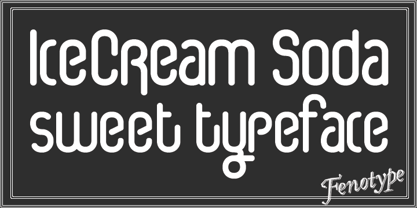
- La Moda NF by Nick's Fonts,
$10.00An unusual blend of block and script letterforms, based on poster lettering for an Italian fashion house of the same name, designed by Wilman Schiroli in 1935, and notable for its very jolly lowercase c. Both versions of the font include 1252 Latin, 1250 CE (with localization for Romanian and Moldovan). - Soda Fountain JNL by Jeff Levine,
$29.00 In most cities during the 1950s and 1960s the corner pharmacy or soda shop was a mainstay of teenage life. It was a place to hang out with friends, hear the latest hits on the jukebox and indulge in everything sugary from malted milkshakes to banana splits. During this time, a popular form of window advertising was supplied by the Coca-Cola Company to promote its product being served by these locations. Specialty window decals designed to emulate drawn (raised) Venetian blinds "bookmarked" by the soda's logo were adhered to the shop's windows, with a space provided to add in customized lettering. The store's name or its specialties were applied to each window pane, and this formed a consistent border at the top of all of the shop's windows. Although few visual images exist of this specific bit of advertising nostalgia, an old record album by a late-1950s singer named Chip Fisher called "Chipper at the Sugar Bowl" provided a somewhat usable sample for what is now Soda Fountain JNL.
 - TXT Soda Shoppe by Illustration Ink,
$3.00Go beyond the basics with this cool font. Create one-of-a-kind scrapbook lettering and titles. Download it for groovy or retro flyers, announcements, and invitations. - Beverage Stencil JNL by Jeff Levine,
$29.00 The brand marking on a vintage wooden shipping case for bottles of Mission Naturally Good Orange Soda inspired Beverage Stencil JNL, which is available in both regular and oblique versions. Mission was a popular soda in California from about 1929 through 1970.
 - Nerfect•Cola by Nerfect,
$15.00Nerfect•Cola was created for all you soda lovers out there. - EnglishTowne-Normal - Unknown license

- Angle - Unknown license

- Loki Cola - Unknown license

- Ivan by Hot Russian Pancakes,
$- Monospaced black slab-serif without any philosophy or idea, it doesn't pretend to be anything sophisticated, it is as simple as chewing gum or a can of soda. Simple and angry typeface Ivan has a lively friend — Juan typeface.
 - Juan by Hot Russian Pancakes,
$- Monospaced black slab-serif without any philosophy or idea, it doesn't pretend to be anything sophisticated, it is as simple as chewing gum or a can of soda. Simple and lively typeface Juan has a ascetic friend — Ivan typeface.
 - Privilege Sign JNL by Jeff Levine,
$29.00 The above-the-store signage for many newspaper stands, soda shops, candy stores, luncheonettes and pharmacies of the 1950s and early 1960s were what was referred to as “privilege signs” provided by one of the major cola brands. Consisting of the brand’s emblems on the left and right, the remainder of the sign would carry the desired message of the storekeeper (such as “Candy – Soda – Newspapers”) in prismatic, embossed metal letters. Inspired by these vintage signs, Privilege Sign JNL recreates the condensed sans serif lettering style in both regular and oblique versions. The typefaces are solid black, but adding a selected color and a prismatic effect from your favorite graphics program can reproduce the look and feel of those old businesses.
 - Birch Beer JNL by Jeff Levine,
$29.00Birch Beer JNL comes from lettering spotted on a European business sign found in some stock footage that was used for an old black and white film about World War II. The name is derived from a popular root beer-like soda sold by the Royal Castle Restaurants that were popular in Florida from the 1930s through the 1970s. - Superpop by Resistenza,
$39.00 Superpop is sweet and gentle, a rounded geometric sans with a brushy script twist. Soft and refreshing like a soda, this font gets fizzy when geometric letterforms get mixed with script shapes you wouldn’t expect in a Sans Serif. A display family with two styles ( regular and italic ), 5 weights and an outline version for each style. Opentype Features: https://www.rsztype.com/article/how-to-use-opentype-features-adobe-microsoft-pages
 - Quta by Fo Da,
$15.00 Quta is a sans serif typeface produced by FoDa foundry, that meets all the needs of professionals who search a family of clean geometric font, very well suited for headlines, newspaper and many purposes. With a basic character set in Five weights with their italics. Quta covers many features like: -Five main weights (Light, Regular, Medium, Bold and Extra Bold) -Matching italics for all weights. -language support for many Latin-based scripts -Ligatures and many other OpenType features.
 - Southside Fizz by Hanoded,
$15.00 Southside Fizz is a cocktail (made with gin, lime, mint and soda). Southside Fizz font was based on a single word in a 1930’s advertisement and my Palembang font. I did not have that many glyphs to work with, so I made most of them up. Southside Fizz became a very elegant all caps Art Deco font, quite useful for wedding invitations, books and posters. It comes with a roaring amount of diacritics as well.
 - Two Cents Plain JNL by Jeff Levine,
$29.00 Two Cents Plain JNL is a simple sans design for titling, sign work, display ads and so forth. The name is derived from the way folks in the Northeast used to ask for a glass of seltzer water at restaurants and soda fountains decades ago: "Give me a two cents plain." It was always cheaper to order plain seltzer than to have flavored syrup added, and this was especially true in the years during the Great Depression when every penny made a difference.
 - Quta Rounded by Fo Da,
$15.00 Quta Rounded "derivative typeface from Quta" is a sans serif typeface produced by FoDa foundry, that meets all the needs of professionals who search a family of clean rounded geometric font, very well suited for headlines, newspaper and many purposes. With a basic character set in Five weights with their italics. Quta Rounded covers many features like: -Five main weights (Light, Regular, Medium, Bold and Extra Bold) -Matching italics for all weights. -language support for many Latin-based scripts -Ligatures and many other OpenType features.
 - Photo Developer JNL by Jeff Levine,
$29.00 An image found online of a vintage storefront sign for the Kraus Photo Shop was the inspiration for Photo Developer JNL, which is available in both regular and oblique versions. The sign featured a thick and thin Art Deco style lettering with an inline cutting through the thicker strokes. Before the advent of digital photography, and way before chain stores offered in-house processing, neighborhood photo labs were the only place for getting prints from your roll film (unless you wanted to send the film into Kodak for developing and printing). Customers of these stores could also purchase additional film, cameras and photographic accessories from the same location.
 - Astro by Just My Type,
$20.00 When Sputnik launched in 1957, the world was launched into the Space Age, baby! It was rockets and soda shops, souped-up jalopies and Fairlane convertibles with radios blaring. Rock and Roll. American Bandstand and the Race to Space. Astro aims to call back those exciting days with a look that might have graced the sign of your local drive-in or donut shop. The uppercase characters look like they could fly, suggesting spacecraft, UFOs. Use it for Retro future events or business branding. It also seems to work exceptionally well, strangely, with French, Icelandic, Japanese and African names and anything to do with fish.
 - Mikan by Hanoded,
$15.00 A couple of years ago, I walked the Kumano Kodo pilgrimage trail in Japan. At the start of the walk, I stayed in a nice guesthouse in Tanabe city, which lies in Wakayama prefecture. I wouldn’t mention all of this, if it didn’t have something to do with the font name: Wakayama prefecture is THE mandarin orange (Mikan) growing area of Japan and the owner of the guesthouse had just picked a bagful of mikan, which he shared with me. So, I had to think of that when I made this font. Mikan is a nice, rounded family of fonts. Both styles come with alternative a’s (and accented a’s), which some people prefer for Children’s books.
 - Pardner by Stiggy & Sands,
$29.00 Our Pardner font finds its inspiration from the title screens of the 1965 film “West and Soda”, an animated Italian film that was a parody on American Westerns. Director Bruno Bozetto claimed in an interview that he was in fact the originator of the Spaghetti Western, not Sergio Leone. This offbeat and animated serif typeface has characters of varying width and weighting incorporated into opentype scripting as well as numerous alternates to give a lot of fun and frolicking play in typesetting. You can type with just as much diversity as the titling themselves. Opentype features include: - 6 Stylistic Alternate Sets. - A collection of ligatures as well as programming to automatically alternates between Caps and Lowercase. - Full set of Inferiors and Superiors for limitless fractions. - 731 characters of pure joy.
 - Peanut Donuts by IKIIKOWRK,
$17.00 Proudly Present Peanut Donuts - Retro Bubble Type, created by ikiiko. Peanut Donuts is a font that perfectly encapsulates nostalgia, you can travel back in time to a time of delectable delicacies and mouthwatering delights. This retro bubble font, which was meticulously crafted, is the ideal option for your vintage products. The Peanut Donut blends your packaging, labeling, and advertising with delectably nostalgic appeal to bring the happiness and enjoyment of the past to the present. It instantly conjures up images of vintage cafes, soda fountains, and recognizable food trucks with its rounded corners and bubbly shapes. This typeface is perfect for an vintage stuff, retro poster layout, children book, comic, packaging, food & beverages and also good for quotes, or simply as a stylish text overlay to any background image. What's included? Uppercase & Lowercase Number & Punctuation Multilingual Support Works on PC & Mac
 - Beardstown by Swell Type,
$15.00 Beardstown is solid, hardworking & no-nonsense. It may be a little gritty & rough around the edges, but it can also be open, warm and welcoming. Beardstown is a little Midwestern town on a river with a town square where you can buy comic books from a spinner rack at the front of the drugstore and read 'em with a root beer float from the soda counter in the back. The Beardstown font is perfect for t-shirts, sports graphics, beer cans, trading cards, carnival posters and record albums. But that’s it. I mean, you could use it on foofy hipster stuff like organic produce, vegan meat substitutes, electric car accessories or mountain bike parts, but you risk Beardstown coming over there to kick your butt. Features: three versions of each letter and two versions of each number automatically rotate for authentic print texture thirteen catchwords (like "and" "of" "for" & "the") accessible in Discretionary Ligatures support for 223 languages including Western & Central Europe, Vietnamese & Cyrillic
 - The font Soda, crafted by the creative minds at Ministry of Candy, exudes a playful and bubbly atmosphere that is reminiscent of effervescent drinks and casual, fun-filled gatherings. Its design lean...
- Edgar Pirámide Fuente LCD diseñada con mucho cariño para recordar las pirámides que abundan por toda mi Nación de México desde playas al raz del mar como Tulum hasta lo más alto como Teo...
- Chopper by Canada Type,
$24.95 In 1972, VGC released two typefaces by designer friends Dick Jensen and Harry Villhardt. Jensen’s was called Serpentine, and Villhardt’s was called Venture. Even though both faces had the same elements and a somewhat similar construct, one of them became very popular and chased the other away from the spotlight. Serpentine went on to become the James Bond font, the Pepsi and every other soda pop font, the everything font, all the way through the glories of digital lala-land where it was hacked, imitated and overused by hundreds of designers. But the only advantage it really had over Venture was being a 4-style family, including the bold italic that made it all the rage, as opposed to Venture’s lone upright style. One must wonder how differently things would have played if a Venture Italic was around back then. Chopper is Canada Type’s revival of Venture, that underdog of 1972. This time around it comes with a roman, an italic, and corresponding biform styles to make it a much more attractive and refreshing alternative to Serpentine. Chopper comes in all popular formats, boasts extended language support, and contains a ton of alternate characters sprinkled throughout the character map.
 - Barn Owl by astroluxtype,
$20.00 Vintage, country, distressed or just plain worn out. The Texas general store on the side of the highway that has been there since 1954 and they're still selling old fashion bottled soda. A renovation/excavation at a downtown urban construction site reveals the old ad on exterior brick. Barn Owl provides the headline in your project with the ultimate in aged retro visualization. It is a basic minimal font set which includes only uppercase letterforms. It is a headline font best used above 36 points in size. The first of our “Trifonictype” (Tin Sign is the 2nd) there are three components to the font, Barn Owl Outline, Barn Owl Fill and Barn Owl Shadow. These can be used in different combinations for different effects, copy and paste type then indicate a different font each time. Paste in the front or back in application to see effects in combination. Fill and Shadow could be used with irregular letter spacing for various effects. Outline could be used with just Shadow for a another effect. Use your photo manipulation program to overlay and change the transparency of your headline. There are a few extended glyphs and barn(ding)bats in the lowercase letter strokes indicated in a poster sample, these are found only in the Barn Owl Outline. Download PDF manual for complete showing.
 - Halfroy by Heypentype,
$20.00 Halfroy is our answer to generic geometric sans trends exploding nowadays who creates sameness. Halfroy brings new sans perspectives by combining rounded and sharp edges to create delicate sans fonts. See the difference by looking at counter-shapes compared to outline, insides counter shapes you will sees a sharp edges while round but not geometrical on outlines. Halfroy gives your project unique visual impact whatever your design project is, but we recommend using thin, semibold to Fat as display then light and regular. Halfroy taken inspirations not from looking at other sans typeface, but its design inspirations comes from observing a land contour and geographical statistics in our city, Kota Batu. We found that our city geographic consist of steep slope like waves with sharp peaks and surrounded by small and third highest mountains peak on our country. From then on we begin visualize and applied on few letters. Take a look on our 'O', 'f', 's' letters, its like a stone carved letters. Its hard edges and soft edges outline clearly draws from our inspiration source. Even Halfroy looks stony, hard as individual letters, we treat this type with humanist approach in mind. Therefore you can sense a friendly yet casuals of typical sans serif fonts when it grouped together to form a words or sentences. We hope Halfroy will gives your design project a unique on its own.
 - Tipo Movin CDMX by Ixipcalli,
$- La versión propuesta por la SEMOVI (Secretaria de Movilidad) es un estilo más angosto y ortográfico, creadó con la finalidad de aligerar las aplicaciones tipográficas del sistema. Se emplea oficialmente en todas las aplicaciones del sistema de Movilidad Integrada de la Ciudad de México. El creador de la tipografía es Lance Wyman. En esta edición, los tipos minúsculas son una adaptación “no oficial” para el Tipo Movin CDMX, enriqueciendo la tipografía a un estilo visual de altas y bajas, por lo que se prescinde del diseño base como trabajo propio para enfatizar los tipos minúsculas exclusivamente, además de que se han añadido algunos caracteres de acentuación extendiendo su uso a otros lenguajes. Los tipos son una nueva propuesta por Ixipcalli en el presente año 2023. The version proposed by SEMOVI (Secretary of Mobility) is a narrower and more orthographic style, created with the purpose of lightening the typographic applications of the system. It is officially used in all the applications of the Integrated Mobility system of Mexico City. The creator of the typeface is Lance Wyman. In this edition, the lowercase types are an “unofficial” adaptation for the Tipo Movin CDMX, enriching the typography to a visual style of highs and lows, so the base design is dispensed with as my own work to emphasize the lowercase types exclusively, In addition, some accentuation characters have been added, extending their use to other languages. The types are a new proposal by Ixipcalli in the current year 2023.
 - Ampacity by Typodermic,
$11.95 Attention typography enthusiasts! Are you tired of dull and unoriginal neon typefaces? Look no further than Ampacity—the slim and sleek neon headline typeface that will make your designs stand out from the crowd. This unique typeface draws inspiration from the iconic Led Zeppelin album cover for Coda and includes an alternative mirrored A. Ampacity’s compact design sets it apart from the rest, making it one of the few truly original typefaces fonts on the market. Don’t settle for mediocre typography—choose Ampacity for a striking and memorable design. Most Latin-based European, Greek, and some Cyrillic-based writing systems are supported, including the following languages. Afaan Oromo, Afar, Afrikaans, Albanian, Alsatian, Aromanian, Aymara, Bashkir (Latin), Basque, Belarusian (Latin), Bemba, Bikol, Bosnian, Breton, Bulgarian, Cape Verdean, Creole, Catalan, Cebuano, Chamorro, Chavacano, Chichewa, Crimean Tatar (Latin), Croatian, Czech, Danish, Dawan, Dholuo, Dutch, English, Estonian, Faroese, Fijian, Filipino, Finnish, French, Frisian, Friulian, Gagauz (Latin), Galician, Ganda, Genoese, German, Greek, Greenlandic, Guadeloupean Creole, Haitian Creole, Hawaiian, Hiligaynon, Hungarian, Icelandic, Ilocano, Indonesian, Irish, Italian, Jamaican, Kaqchikel, Karakalpak (Latin), Kashubian, Kikongo, Kinyarwanda, Kirundi, Komi-Permyak, Kurdish (Latin), Latvian, Lithuanian, Lombard, Low Saxon, Luxembourgish, Maasai, Macedonian, Makhuwa, Malay, Maltese, Māori, Moldovan, Montenegrin, Ndebele, Neapolitan, Norwegian, Novial, Occitan, Ossetian, Ossetian (Latin), Papiamento, Piedmontese, Polish, Portuguese, Quechua, Rarotongan, Romanian, Romansh, Russian, Sami, Sango, Saramaccan, Sardinian, Scottish Gaelic, Serbian, Serbian (Latin), Shona, Sicilian, Silesian, Slovak, Slovenian, Somali, Sorbian, Sotho, Spanish, Swahili, Swazi, Swedish, Tagalog, Tahitian, Tetum, Tongan, Tshiluba, Tsonga, Tswana, Tumbuka, Turkish, Turkmen (Latin), Tuvaluan, Uzbek (Latin), Ukrainian, Venetian, Vepsian, Võro, Walloon, Waray-Waray, Wayuu, Welsh, Wolof, Xhosa, Yapese, Zapotec Zulu and Zuni.
 - ITC Jambalaya by ITC,
$29.99The talented designer of the well-known Formata typeface, Bernd Möllenstädt was born on February 22, 1943 in Germany. He has lived in Westfalia, Berlin and Munich, Germany, and now permanently resides in Munich. From his earliest years he was interested in typography, first studying as a typesetter (1961-64) and then a student of graphic design (1964-1967). In 1967 Möllenstädt joined the Berthold typefoundry and his career as one of the leading type personalities began. One year after joining Berthold, he became the head of the type design department. For 22 years he worked as the head of that department, under the leadership of Günter Gerhard Lange. Upon Lange’s retirement in 1990, Möllenstädt ascended to the type directorship of Berthold where he was responsible for type design and font mastering. Möllenstädt designed two typeface for the Berthold Exklusiv Collection, Formata (1988) and Signata (1994). Under license from Berthold, Adobe marketed Formata as part of the Adobe Type Library. Formata is now one of the most successful sans serifs in the world, used both in American and European magazines, as well as newsletters in the Far East (Gulf New Kuwait). Formata also was chosen as the corporate typeface of Postbank, Allianz, VW Skoda, Infratest Burke, etc. In addition to his work for Berthold, Möllenstädt has lectured at local Munich schools on typography and graphic design, and designed corporate type identities and diverse logos for major corporations, including Allianz, Commerzbank, Mauser Officer and Hoepfner. Möllenstädt continues his association with Berthold as a designer. He most recently completed small caps and fractions for Formata. He also has substantially contributed to Berthold's Euro symbol program (e.g. adding the Euro symbol design-specific to the most popular families). Möllenstädt currently is working on a new Berthold Exklusiv design. - Materia Pro by Elsner+Flake,
$79.00 Minimal, modular, modern—at first glance, Materia shows a contemporary flair, combining pure, strong geometrical form with a subtle, distinct appearance. Actually, the design was inspired by lettering from the turn of the 19th to the 20th century that still can be found in the East of France. While its formal origins date back as far as this, revived e. g. by the constructivists into the nineteen twenties and later on by Dutch information designer Wim Crouwel in the nineteen-sixties, the visual language of Materia still speaks of the »future«. Following a minimalistic concept the font is formally built on a grid. Wherever optical curves are needed for a smoother, more comfortable shape of letters than a simple rectangular block, diagonals cut off the egdes – like a diamond is cut to achieve more beauty. Thus headlines and texts set in Materia are given a certain »egdy« feeling, whereas their tonality is still kept well-balanced, keeping concentation all on information in a nonconfomist way. Materia comes in eight styles, from elegant Thin to attention-forcing Ultra. Even a regular Italic is available, following the classic type-set-principle. Two of the styles are explicitly designed for display use, Shadow and Code. Both are ready for combinations with Bold or each other respectively, the layering of Shadow and Code e. g. allows astonishing effects or highlighting within the letters. For OpenType-users Materia is a real Pro, containing accented Latin letters for over 70 languages, small caps, old style, tabular and lining figures and special condensed titling all caps for cases in which space is all that counts. How useful all of the above mentioned is may be seen in the book David Lynch – Lithos, designed by Koma Amok, published in 2010 by item éditions, Paris, and Hatje Cantz, Germany, which was typeset completely in Materia.
 - Ah, the Zodiastic font by the whimsical artists of alphabets at Fontalicious—a name that sounds like a cross between a zodiac enthusiast and a plastic material, doesn't it? If fonts could dance, Zodi...
- Imagine a font that struts in with a leather jacket flung over its shoulder, slides a comb through its slick-back hair, and orders a milkshake with an extra cherry on top. That's the 50's Headline DS...
- Datura - Unknown license

- Caligari Pro by Elsner+Flake,
$99.00 The silent film »The Cabinet of Dr. Caligari« (1920) is undoubtedly one of the breathtaking milestones within the German Expressionist Movement, a time of extraordinarily creative works of art as a reaction to a world in rapid change. The original intertitles of Caligari were worked out by the set designers (and painters) Walter Reimann, Walter Röhrig, and Hermann Warm, using a unique expressionistic language of form for dramatic and iconic lettering. When in 2010 KOMA AMOK’s Joerg Ewald Meißner and Gerd Sebastian Jakob were commissioned by the Institut Mathildenhöhe Darmstadt and publisher Hatje Cantz to design the catalog for the exhibition »The Total Artwork in Expressionism«—showing works of art, architecture, film, literature, theater, and dance—it was soon perfectly clear that a new typeface, inspired by the Caligari intertitles, should speak for all the expressionistic arts. An intense process of research and analysis began. The original letters of the Caligari intertitles were individuals on their own. Furthermore, each of the three title designers had added his specific approach to the basic Caligari type style. From hundreds of different As to Zs a choice had to be made, which should be THE characteristic Caligari letter for a digital typesetting font. Finally the chosen letters were cut and drawn again, missing letters were added according to the formal priniciples, all-in-all 1000 glyphs were digitised to complete a usefull OpenType font ready for use. When in the autumn of 2010 the exhibition started successfully with great media interest, the posters all over Darmstadt announced »You must become Caligari!« – set in the brandnew typeface. The font Caligari Pro offers alternative forms for every letter and a whole bunch of ligatures, thus creating an expressive, individual image of headlines and text. By using included Stylistic Alternates the image will get even more vivid. Caligari comes with a complete set of expressionist ornaments and true old style figures—thus the heyday of the Expressionist Movement and the era of the silent films can be revived typographically by the means of today: »Express Yourself!«.
 - Picture this: The Psiphoon BB font, a creation sprung from the whimsical mind at Blambot Fonts - a place where typefaces come to life with personality and pizzazz. Imagine if a comic book, a late-nig...
- Look by insigne,
$25.00 Look, folks! From what may just be the vernacular sign capital of the world, Chattanooga, Tennessee, it’s a brand new hyperfamily from insigne! Look includes three different related fonts, with three weights each. That’s over 70 fonts! Imagine: you turn onto a stretch of open country road. On the distressed, red background of an old barn wall, a large block of crisp white letters shout out: “See Rock City.” You soon realize this barn is not alone in competing for the passing eye. Far from it, ladies and gentlemen. This is just one of the many pieces of historic, hand-painted advertisements dotting the great Southern United States. Yes, these are the pieces of true Americana--the barns, the roadside signs, the machinery, the soda fountains, and more--that now inspire this splendid new set of three font families. This new, easily readable type from insigne digs deep to capture the very heart and passion of this splendid country’s lettering of the post-war era. Look’s compact frame quickly draws the audience to your headline, logo, subheading, or pull quote, working well in those compact spots of text without overpowering your content. You'll easily put the feeling of those days gone by into every piece with the natural beauty and simple usefulness of the Look hyperfamily. Each of the individual sub-families incorporates a variety of font weights with distressed attributes. Think Woodtype. Jeans. Antiques, folks. That deep, ingrained texture--that quality that will stand the test of time. And Look is flexible, too. Take, for example, Look Script. This powerhouse of a font offers thinner weights to give your work an easy-going, down-to-earth design. But bring in those heavier weights, and you'll have a muscular, assertive font that will go the whole nine rounds. Combine any of the Look families with Ornaments to really give your layouts a zing. Build an extraordinary design as well with Look’s swashes and alternates. To activate any of these alternates, just click on Swash, Stylistic or Titling Alternates in any OpenType-savvy application, or choose from the Glyph Palette. Explore hundreds of included extras to find that “cherry on top” for your one-of-a-kind project. There are over 70 fonts to choose from, including subfamily sans, serif, script and ornament fonts! You can't go wrong. To get the most bang for your buck, order the whole Look family now! Note on SHADOWS: Increase depth and make your designs pop! Add shadows to any of the Look fonts by duplicating the text content layer in place and switching it to its corresponding shadow. Color and offset to taste. Look shadows are offset automatically. In Illustrator, you may need to turn on Em Box Top for proper shadow alignment.
 - Blank Manuscript by Aah Yes,
$14.95Blank Manuscript allows you to produce sophisticated musical scoresheets even on basic Word Processors - anything from simple plain staves to complex full-page orchestral scores of your own design, to write in the notation yourself. The basic stuff is really easy and straightforward, but there's some quite advanced things you can do as well. So Copy and Save these Instructions. • The main stuff is simple and tends to follow the initial letter. Treble, Bass and Alto clefs are on upper case T B A (there are more clefs, below). The 5 Lines for the clefs are on L or l. • A small v will give a small vertical line (like a bar line) and a Big U will give a Big Upright - these can start or end a line or piece. • Time Signatures - type the following letters: Think of W for Waltz and it's easy to remember that 3/4 time is on W. Then from that they go up or down together like this: V=2/4 W=3/4 X=4/4 Y=5/4 Z=6/4 Compound Times are on H I J K like this: H=3/8 I=6/8 J=9/8 K=12/8 Common Time and Cut Common symbols can be found on semi-colon and colon respectively (all begin with Co- ). 2/2 3/2 are on lower case a and b, 7/4 and 7/8 are on lower case c and d, 5/8 is on small k (think POL-k-A) • Flat signs are on the numbers. Flat signs on LINES 1 to 5 are on numbers 1 to 5. Flat signs on SPACES 1 to 5 are on numbers 6 to 0 (space 1 being above line 1, space 5 being above the top line of the stave). Sharp signs are on the letters BELOW the long-row numbers. Which is q w e r t for the sharp signs on Lines 1 to 5, and y u i o p for sharp signs on spaces 1 to 5. Doing it this way means it works the same for all clefs, whether Treble, Bass, Alto, Tenor or any other. Sharp and Flat Signs always go in this order, depending on how many sharps or flats your key signature requires: Treble Clef Sharps t i p r u o e Flats 3 9 7 4 2 8 6 Bass Clef Sharps r u o e t i w Flats 2 8 6 3 1 7 = Alto Clef Sharps o e t i w r u Flats 7 4 2 8 6 3 1 • Guitar Chord Boxes are on G and g (G for Guitar) Upper Case G has a thick line across the top Lower case g has an open top, for chords up the fretboard TAB symbols are available: Six-string Tablature is on s & S for Six. Four-string Tablature is on f & F for Four. (Lower case has the "TAB" symbol on it, Upper Case has just the lines to continue.) Five-string tablature, is on lower case "j" (as in BAN-j-O) and of course L or l will continue the 5 lines. •RARE CLEF SIGNS including Tenor Clef, are on various punctuation marks, i.e. dollar, percent, circumflex, ampersand & asterisk, above the numbers 4 to 8. NOTE: The important symbols were kept on the letter and number keys, which are fairly standard all over, but some of the less important symbols are on various punctuation keys, which in different countries are not the same as on my keyboard. If it comes out wrong on your system, all I can say is it's right on the systems we've tried, and they'll be in here somewhere, probably on a different key. CLOSING THE ENDS OF THE LINES and BAR-LINES is done with the 3 varieties of brackets - brackets, brace and parentheses - Left/Right for the Left/Right end of the line. Parentheses L/R () which are above 9, 0 give a clef with a small vertical upright (the same as a bar line). Brace L/R and Brackets L/R (both on the 2 keys to the right of P on my keyboard) will close off a staff line with tall upright bars. Brace gives a double upright - one thick, one thin. Brackets give a single tall upright. A Big Upright is on Big U, (Big U for Big Upright) and a small vertical line is on small v (small v for small vertical). The Big Upright is the maximum height, and the small vertical is exactly the same height as a stave. And there's a tall upright Bar, on Bar (which is to the left of z on my keyboard, with Shift,) which is the same height as the bar on upper case U but twice as broad. • There's a staff intended for writing melodies, which is a little bit higher up than an ordinary treble clef giving a space underneath to put lyrics in - on m and M for Melody line. Lower case has the Treble Clef on, Upper case M has just the higher-up staff lines with no clef. (Use mMMMMMMM etc.) However this clef will be in the wrong place to put in sharp and flat signs, key signatures and so on, so if you use this clef you'll have to write the sharps, flats and key signature yourself. There's also a clef that's smaller (less tall) than the ordinary clef, but with the same horizontal spacing so it will align with other standard-sized clefs - on slash (a plain clef) and backslash (with a Treble Clef). • There are some large brackets for enclosing groups of staves, such as you'd use on large orchestral scores, on Upper Case N O P Q R, which can aid clarity. N and O on the left, Q and R on the right. P is a Perpendicular line to be used on both sides to increase the height of the enclosure, in this way but with the staff lines in between: N Q P P P P P P O R OTHERS —————————————— • Repeat marks are on comma (left) and period/full stop (right). • Hyphen is left as a sort of hyphen - it's a thin line like a single staff line, with the same horizontal spacing as ordinary staff lines - in case you want to draw a line across for a Percussion Instrument, or a Title or Lyric Line. • Space is a Space, but with HALF the width or horizontal spacing as ordinary staff lines, so 2 space symbols will be the same width as a clef symbol or line. • Grave (to the left of 1 on the long row, or hold down Alt and type 0096 then let go) gives a staff line that is one eighth the width of an ordinary staff line. • If you want manuscript in a clef and key which requires a flat or sharp sign in the space underneath the 5 lines, they’re on = equals and + plus . SYMBOLS • Many of these symbols will only be useful if you have worked out in advance which bars will need them, but they are here in case you've done that and wish to include them. • Symbols for p and f (piano and forte) are on 'less than' and 'greater than' < > (above comma and full stop) and m for mezzo is on Question, next to them. They can be combined to make mp, mf, ff, pp, etc. These signs -- and other signs and symbols like Pedal Sign, Coda Sign and so on -- can be found on various punctuation mark keys, including above 1, 2, 3 in the long row, and others around the keyboard. There's a sort of logic to their layout, but in different countries the keys are likely to give different results to what is stated here, so it's probably best to just try the punctuation and see if there's any you might want to use. (But on my keyboard a Coda sign is on circumflex - because of the visual similarity. Pedal sign is on underscore. A "Sign" symbol is on exclamation mark.) They were only included in case you really need them to be printed rather than handwritten. • However, a Copyright symbol is deemed necessary, and also included are a "Registered" symbol and a TradeMark symbol. They are found in the conventional places, and can be accessed by holding down ALT and typing 0169, 0174 or 0153 respectively in the numberpad section and letting go. • Staff lines with arco and pizz. above are on capital C and D respectively ---C for ar-C-o. • An empty circle above a staff line (to indicate sections by writing letters A, B, C or 1,2,3 inside for rehearsal marks) is on n. The actual signs for an A, B, C and D in a circle above the staff line can be produced by holding down ALT and typing 0188, 0189, 0190 and 0191 respectively and letting go. • The word "Page", for indicating page numbers, is on the numbersign key. • The two quotes keys, (quote single and quote double) have symbols representing "Tempo is", and "play as triplets", respectively. • INSTRUMENT NAMES There's a whole lot of Instrument Names built in (over a hundred) which can be printed out above the clef, and you do it like this. Hold down Alt and type in the given number in the numberpad section, then let go. For Piccolo it's 0130, for Flute it's 0131, Cornet is on 0154, Violin is on 0193, and the numbers go up to over 0250, it's a fairly complete set. There's also a blank which is used to align un-named clefs on 0096. Put them at the very beginning of the line for the best results. Here they are: WOODWIND Piccolo 0130 Flute 0131 Oboe 0132 Clarinet 0133 Eng Horn 0134 Bassoon 0135 Soprano Sax 0137 Alto Sax 0138 Tenor Sax 0139 Baritone Sax 0140 Saxophone 0142 Contrabassoon 0145 Recorder 0146 Alto Flute 0147 Bass Flute 0148 Oboe d'Amore 0149 Cor anglais 0152 Pipes 0241 Whistle 0242 BRASS Cornet 0154 Trumpet 0155 Flugelhorn 0156 Trombone 0158 Euphonium 0159 Tuba 0161 French Horn 0162 Horn 0163 Tenor Trombone 0164 Bass Trombone 0165 Alto Trombone 0166 Piccolo Cornet 0167 Piccolo Trumpet 0168 Bass Trumpet 0170 Bass Tuba 0171 Brass 0172 VOICES Vocal 0175 Melody 0176 Solo 0177 Harmony 0178 Soprano 0179 Alto 0180 Tenor 0181 Baritone 0182 Treble 0183 Bass 0197 (see also PLUCKED STRINGS) Descant 0184 Mezzo Soprano 0185 Contralto 0186 Counter Tenor 0187 Lead 0206 BOWED STRINGS Strings 0192 Violin 0193 Viola 0194 Cello 0195 Contrabass 0196 Bass 0197 Double Bass 0198 Violoncello 0199 Violin 1 0200 Violin 2 0201 Fiddle 0252 PLUCKED STRINGS Harp 0202 Guitar 0203 Ac. Gtr 0204 El. Gtr 0205 Lead 0206 Bass 0197 Ac. Bass 0207 El. Bass 0208 Slide Gtr 0209 Mandolin 0210 Banjo 0211 Ukelele 0212 Zither 0213 Sitar 0214 Lute 0215 Pedal Steel 0216 Nylon Gtr. 0238 Koto 0239 Fretless 0244 KEYBOARDS + ORGAN Piano 0217 El. Piano 0218 Organ 0219 El. Organ 0220 Harpsichord 0221 Celesta 0222 Accordion 0223 Clavinet 0224 Harmonium 0225 Synth 0226 Synth Bass 0227 Keyboards 0228 Sampler 0249 PERCUSSION and TUNED PERCUSSION Percussion 0229 Drums 0230 Vibes 0231 Marimba 0232 Glockenspiel 0233 Xylophone 0234 Bass marimba 0235 Tubular Bells 0236 Steel Drums 0237 Kalimba 0240 OTHERS Harmonica 0246 Mouth Organ 0247 FX 0251 Intro 0243 Verse 0245 Refrain 0248 Chorus 0250 un-named 0096 (this is a small spacer stave for aligning clefs without a name) ALSO copyright 0169 registered 0174 TradeMark 0153 Rehearsal marks 0188-0191 (giving A, B, C, D in a circle, an empty circle is on n ) Clef signs for Treble Bass Alto without any staff lines 0253-0255 An Alphabetic List of all signs: a 2/2 time b 3/2 time c 7/4 time d 7/8 time e sharp sign, centre line f Tab sign for 4-string tab g Guitar Chord Box, no nut h half-width stave I sharp sign, third space up j Tab sign for 5-string tab k 5/8 time l Lines - 5 horizontal lines for a stave m Melody Clef - a standard clef but placed higher up, with Treble sign n Stave with an empty circle above o sharp sign, fourth space up p sharp sign, space above stave q sharp sign, bottom line r sharp sign, fourth line up s Tab sign for 6-string tab t sharp sign, top line (fifth line up) u sharp sign, second space up v vertical line (bar-line) w sharp sign, second line up x Fretboard, four strings y sharp sign, first space up z Fretboard, five strings A Alto Clef B Bass Clef C “arco” above stave D “pizz.” above stave E Double Vertical Lines F Four Horizontal lines (for 4-string tab) G Guitar Chord Box with nut H 3/8 time I 6/8 time J 9/8 time K 12/8 time L Lines - 5 horizontal lines for a stave M Melody Clef - a standard clef but placed higher up, plain N Bounding Line for grouping clefs - top left O Bounding Line for grouping clefs - bottom left P Bounding Line for grouping clefs - Perpendicular Q Bounding Line for grouping clefs - top right R Bounding Line for grouping clefs - bottom right S Six Horizontal lines (for 6-string tab) T Treble Clef U tall, thin Upright line V 2/4 time W 3 / 4 time X 4/4 time Y 5/4 time Z 6/4 time 1 flat sign, first line up (the lowest line) 2 flat sign, second line up 3 flat sign, third line up 4 flat sign, fourth line up 5 flat sign, fifth line up (the top line) 6 flat sign, first space up (the lowest space) 7 flat sign, second space up 8 flat sign, third space up 9 flat sign, fourth space up 0 flat sign, space above stave


PreviousPage 2 of 2