10,000 search results
(0.021 seconds)
- Maree by Ashton,
$5.00 If you want to write something sincere and genuine but not too formal then this is the font for you. It is based on real handwriting, not some artificial calligraphy made to be either too haphazard or spiky or have loads of elegant flourishes but an ordinary person's writing, and designed to look as natural and as close to the original lettering as possible. Like any person's writing it is individual and distinctive, but so easy going on the eye those differences sit comfortably with you. It is friendly and open with easy to read glyphs both as lowercase and uppercase. The letters are relatively wide with clearly shaped distinct outlines. This font may be ideal for projects where you expect a wide readership with different reading abilities from young to old. When you are using this font a slightly bigger point size usually gives a better result so for a standard letter or similar you should size up to 15 points or more. Maree has been individually crafted to the smallest detail. To create a realistic handwriting font that looks relatively simple but works in a wide variety of languages requires a complexity and attention to detail most fonts will never require. This font in any ordinary business environment would never have been made, the effort required to make it too great, the length of time too long. There have been no shortcuts in this font, no automatic scanning or tracing, no automatic generation, no class kerning. Not only is each glyph individual but the width of letters, the height, the accents and the positions of the accents are all different. Even the line weight of the letters is designed to have natural variation but yet similar enough that the font appears as though it were written effortlessly in the same pen. And in order to keep the spacing consistent even though the letters have different widths, heights, lengths of descenders and so on, there are a vast number of kerning pairs, letter to letter, number to number, letter to number... All kerning has been individually assessed with an eye to proportionality taking in character shape, size and weight. For instance if you write a telephone number the numbers all sit close together but if you write a number before a letter such as in a UK post code or before a unit of measurement an extra little bit of space has been added which makes the number more distinct and therefore readable. That space is so natural to the eye that you don’t even know it is there. However even in the spacing allowance has been made for the fact it can’t be too perfect because when you write by hand the spacing is inconsistent. There have to be some letters which are too close or far apart otherwise the font would look artificial. For similar reasons if you are going to print out this font for a letter, etc, check the print version before you make any letter spacing changes because with the zoom functions in modern applications that uneven spacing and lettering can seem more pronounced than it actually is. When this font is printed out you will find it is surprisingly neat. This font is what it is, simple clear handwriting. You will not go wow. But if you want something unique and different and looks good on the page you won’t be disappointed. This font is not a work of art but it is a work of love. This font has a soul. How many fonts can you say that about?
 - Victor - Unknown license

- Mixture by Supfonts,
$14.00 Mixture Latin + Cyrillic Mixture is a cute handwritten font with Cyrillic support. It is perfect for branding, wedding invitations, menu design, YouTube covers and many more Font includes a full set of gorgeous uppercase and lowercase letters, numbers, a large selection of punctuation marks & Cyrillic support Микстура - это милый рукописный шрифт с поддержкой кириллицы. Он идеально подходит для брендинга, свадебных приглашений, дизайна меню, обложек YouTube и многого другого Шрифт включает в себя полный набор великолепных прописных и строчных букв, цифр, большой выбор знаков препинания и поддерживает кириллицу Test it out below to see how it could look for your next project! Includes: Regular Script Latin languages support Cyrillic languages support Uppercase and lowercase Numbers and punctuation Check out my blog: https://www.instagram.com/superdizigner https://pinterest.com/dmitriychirkov7
 - Fixture by Sudtipos,
$39.00 Fixture is our massive 72-font take on plentiful offerings of the late 19th century’s typefaces, posters and wood letterpress sundry done in the Grotesk genre. Four widths ranging from Ultra Compressed to Expanded each come in nine weights and accompanying italics. Some common sans-serif alternates, such as the a and g, are included in all the fonts. The idea with this design was to put together a workhorse font family with enough functional flexibility to work in multiple environments, from the subtlety of magazine layout or film credits to the visual drama of billboards or packaging. Aesthetically speaking, it is quite interesting — though in retrospect quite unintentional — that each different width and/or weight of this face ended up pulling a different dominant trait from the melting-pot origins of the entire family. It’s almost like a tribute album to some famous band’s covers of older songs. It may also be a good conversation piece on our tools shaping the very things for which they’re used. Can’t really get any more post-Grotesk than this. In the 21st century, this is the one genre to rule them all.
 - Pasture by Ryan Keightley,
$19.00 Pasture is a display serif in a range of weights. Rounded interior and exterior corners, curvaceous details, and rotund terminals give it a warm, handmade quality. Classic style that is, at the same time, right at home in modern spaces.
 - Pixter by Matt Grey Design,
$12.99 Pixter straddles the lines between the extreme forms of grid based pixel fonts, and more conventional grotesque fonts. Its array of styles create a palette of textures to work with multiple scenarios, from large format display to oversized passages of copy. Inspiration for Pixter initially grew from old computer bitmap fonts, but branched out into Swiss and Dutch graphic design, such as the graphic work of Josef Müller-Brockmann and typography of Wim Crouwel.
 - Mixtures by 4RM Font,
$16.00 Made with 3 width sizes taking into account the width between each letter, and the harmony between each letter. Mixtures fonts impress with the density on each side. suitable for use in the use of display fonts, and designs such as posters, billboards, covers and others.
 - Thai One On by Emboss,
$24.95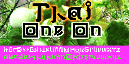
- a picture alphabet - Unknown license

- Talking Picture JNL by Jeff Levine,
$29.00 In a vintage photograph, promotional signage outside an old theater for the 1929 early sound film “The Doctor’s Secret” had lettering in a wide, bold Art Nouveau slab serif design. This was the model for Talking Picture JNL, which is available in both regular and oblique versions.
 - Picture Postcard NF by Nick's Fonts,
$10.00Lettering artist Alf Becker suggested that this typeface was suitable for postcard work, and we agree (although it's suitable for a great many other uses, as well). It packs a lot of information in a limited amount of horizontal space. - Printers Pictures JNL by Jeff Levine,
$29.00 Printers Pictures JNL is another volume of vintage letterpress stock cuts, cartoons, embellishments and what-nots for those who enjoy these charming illustrations.
 - MB Picture House by Ben Burford Fonts,
$30.00 Small caps art deco font inspired by the golden age of Hollywood and childhood trips to the Majestic Cinema. Two styles, each with three weights. Picture House One is sharp and crisp, Picture House Two has a slightly 'Out of Focus' look to it. Both come with extended language support and oldstyle numbers, giving a lot of scope for may uses.
 - Road Picture JNL by Jeff Levine,
$29.00 Road Picture JNL was modeled after the hand lettered title and credits for the 1940 Bob Hope-Bing Crosby semi-musical comedy “Road to Singapore”, and is available in both regular and oblique versions. Although the lettering design doesn’t resemble anything that was probably used in Singapore at the time, its faux “exotic” look still makes for an interesting revival. Bob Hope and Bing Crosby made a total of seven “road” pictures, hence the homage in the name of this type font.
 - Picture Show JNL by Jeff Levine,
$29.00 An ad promoting the 1919 silent film comedy “Back Stage” starring Roscoe “Fatty” Arbuckle was hand lettered in a thick-and-thin sans style with Art Nouveau influences. This lettering is now available digitally as Picture Show JNL, in both regular and oblique versions.
 - BCTUR - Unknown license

- Nine One One BA by BA Graphics,
$45.00A heavy serif grunge font with a western feel, great for that extreme look for today.. - More than Enough - Personal use only

- More than Enough - Personal use only

- Eat More Chocolate - Personal use only

- More than human - Unknown license

- KR More Holidays - Unknown license

- Four More Years - Unknown license

- EF More Kaputt by Elsner+Flake,
$35.00 - ZP Monsterz More by Illustration Ink,
$3.00 This adorable, blocky font features monster elements and fur on each letter. Great for Halloween or just fun projects for kids.
 - San de More by Kereatype,
$12.00 San de More is a Variable family Serif font. A Hype of summer-themed brings us to express a thirst for creating a product that can help you to choose fonts for your creations. Like as we are on the preview above, how the fonts can "stand" within your design. San de More is created on a 5 weight with italics style. You won’t be worried about which one fits your creative design. Also, You can Mix it up all of it without worrying about design collision. No special software is required to type out the standard characters of the Typeface. To access the Opentype Ligatures and Alternates you will need software that supports Opentype features in fonts. San de More Features: Multilanguage Alternates PUA Encoded Ligatures Very easy to use in any software (Instructions included). If you have any questions, please feel free to get in touch. Thank you
 - More Than Life by Ronny Studio,
$19.00 The More Than Life Bubble graffiti tag font is a typography style commonly used in street art and graffiti culture. It features rounded and inflated letters that create a three-dimensional, bubble-like effect. This style is often used for tagging, a form of graffiti in which an artist writes their name or a stylized chosen word to mark their territory or establish their presence. This font is perfect for your design needs with a graffiti theme. Features : - All Caps - numbers and punctuation - multilingual - PUA encoded Please contact us if you have any questions. Enjoy Crafting and thanks for supporting us! :) Thank you
 - More Or Less by Hanoded,
$15.00 More Or Less was made with a permanent marker pen on thin Japanese paper. It is a handwritten note-style font with an uneven baseline and zippy glyphs. Comes with bells & whistles and a whole bunch of diacritics.
 - More Than Enough by Kimberly Geswein,
$5.00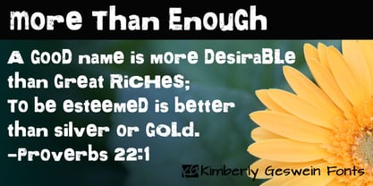
- More Modern Flow by T-26,
$19.00 - Tessie Some More by Ingrimayne Type,
$12.00 A tessellation is a shape that can be used to completely fill the plane without gaps or overlaps—simple examples are isosceles triangles, squares, and hexagons. Tessellation patterns are eye-catching and visually appealing, which is the reason that they have long been popular in a variety of decorative situations. TessieSomeMore has two family members, a solid style that must have different colors to be useful and an outline style. They can be used separately or they can be used in layers with the outline style on top of the solid style. For rows to align properly, leading must be the same as point size. To see how patterns can be constructed, see the “Samples” file here. Shapes that tessellate and also resemble real-world objects are often called Escher-like tessellations. Most of the shapes in TessieSomeMore are Escher-like. Over half are either bug-like and bird-like shapes. There are also a few animal and other object shapes as well as some geometric or abstract shapes that have visual appeal.
 - Le Mores Collection by Great Studio,
$16.00 Hi everyone, I want to introduce Le Mores Collection Font Duo, a classy pair of contemporary serif fonts and scripts. With its unique serif ligature font, it is perfect for combining with signature script fonts. This font is perfect for your various design projects , elegant branding, wedding stationery, romantic book cover designs, classy packaging, album covers, handwritten quotes, greeting cards, unique social media posts, and so much more. Le Mores Collection Script A modern and elegant signature script font containing upper and lowercase characters, and a variety of alternative letters, all punctuation and numbers. Also contains 64 automatic ligatures to help text flow naturally like the original handwriting. Le Mores Collection Serif is all Caps stylish & modern containing uppercase characters, all punctuation and numbers. It is also equipped with 32 automatic ligatures and has several alternative letters to enhance your beautiful design. Cheers, Great Studio
 - Motion Picture Personal Use - Personal use only

- Odisean One - Personal use only

- Flame on! - Personal use only

- Escobeta One - Personal use only

- Caminata One - Personal use only

- One-Eighty - Unknown license

- Zeroes One - Unknown license

- Later On - Unknown license


