3,955 search results
(0.008 seconds)
- Crash Demons by Gian Studio,
$10.00 About Product Crash Demons, Display Typography is an elegant modern variable font. It's basically Sans with a touch of serif to each letter. A Simplicity yet very legible with various widths and weights that you can explore, combine, create and help you design things. Language Support: English, French, German, Indonesian, Irish, Italian, Low German, Norwegian, Portuguese, Swedish, Swiss German. Thank you.
 - Mi Casa by FontMesa,
$25.00 Mi Casa is a new condensed version of our Home Style font which is a revival of an old 1800's classic ornate French font. This new 2021 condensed version takes this old classic to an all new level by adding small caps, italics and a new black version. Mi Casa is perfect for headlines and logos from advertising to product labels, t-shirt lettering and restaurant menus. Fill fonts are also part of this family, new to this font style is the half fill font for creating a two color effect on the letters, you'll need an application that works in layers to use the fill fonts in Mi Casa. The regular fill font for Mi Casa isn't meant to be used as a stand alone font so we've created a solid black version with thicker serifs on top and adjusted outlines throughout for a better appearance as a solo font. We hope you enjoy Mi Casa as much as we did making it. Mi Casa is a trademark of FontMesa LLC
 - Dash Grid by Gleb Guralnyk,
$13.00 Hi there, introducing an abstract font named Dash Grid. At's a geometric display typeface made of square dashed blocks. Dash Grid font supports most of the european latin languages and includes ukrainian cyrillic alphabet (check out all available characters on the last screenshot).
 - Jerky Tash by PizzaDude.dk,
$20.00Jerky Tash is supposed to look somewhat handwritten, that’s why it has got jumpy letters, different sized serifs and a loose kerning. The font is spaced to look okay when used without kerning, but the font definitely deserves to be viewed using the kerning pairs! - Lestatic Lashed by !Exclamachine,
$32.99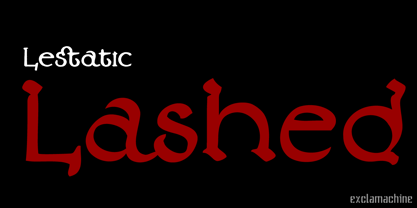
- Mash Octave by Baqoos,
$12.00 Eva Poshy is an inquisitive rhapsodic handwritten typeface apt for headline, editorial, branding, packaging, printed materials and typographic applications. 220+ glyphs including punctuation and numerical.
 - Urban Case by Inumocca,
$15.00 URBAN CASE inspiration from the Urban People, Simple, Elegant, Classy, have a great different Style. great for your Logos, signature, promotion media, etc. unique glyph and deep touch. - Multilingual Characters Support - UPPERCASE - Lowercase - Numeric - Symbol - Punctuation Character inumocca type Studio
 - LDJ Bash by Illustration Ink,
$3.00 - Soyuz Crash by Sensatype Studio,
$15.00 Soyuz Crash is a Modern Sci-fi font that created special for Technology, Sci-fi, modern and more stand out typography needs, with extra alternative styles that make your design more memorable. It's so perfect to add your style and headline overview for future, technology, actions, and technology theme. And specially for this font, we crafted for bold action style and modern feels so enjoy to create any project that will show your main idea out. Soyuz Crash Modern Sci-fi font ready with: Modern Font variation characters prepared to get creative Preview as a inspirations that you can do Ready with All Uppercase characters Wish you enjoy our font. :)
 - Ashes 1 - Unknown license

- Dash Pixel-7 - Personal use only

- stoned wash 6 - Unknown license

- Dash Dot (BRK) - 100% free

- Print Clearly Dashed - Unknown license

- Dash Dot BRK - Unknown license

- VA Fluttered Lashes by V Anderson Designs,
$14.00 Fluttered Lashes is a handwritten monoline font with both discretionary and standard ligatures to give your products that handwritten feel. It's perfect for greeting cards, fun branding, and crafting files.
 - Atlantic Sea Washed by URW Type Foundry,
$39.99 The original plan for Atlantic was to design a typeface in the Venetian syle of the Renaissance, with handwriting character and large ascenders. There is a wave-rolling unevenness in both the x- and cap-height caused by the strong ductus pointing to the upper right, together with heavily curved serifs, resulting in a very lively image of text on a page. Atlantic – its name reflects the ocean, ships, carriers and loads, tourism and so on. These are the themes Atlantic is best suited for. The extended family includes a serif, a sans, and a special variant – a SeaWashed. Atlantic was designed for the URW++ SelecType collection.
 - Detective Case JNL by Jeff Levine,
$29.00 The cover title for “Private Detective” magazine (from October, 1942) was hand lettered in a stylized, extra bold Art Deco type design which is now available as Detective Case JNL in both regular and oblique versions.
 - Federal Case JNL by Jeff Levine,
$29.00Federal Case JNL is a stencil version of Government Issue JNL... adding the feel of industrial, military or high-level government espionage... From the lettering on a shipping crate to the cover of a secret folder of undercover plans, this font fits like a hand in a glove. - Dash Horizon Stripe by Anomali Creative,
$19.99 Dash Horizon is a new sporty, modern and fresh script with a bold, strong style making this font look extreme, strong, and tough for any awesome project that needs a sporty look. Dash Horizon features the distinct impression of speed. It works well in vintage racing posters, automotive t-shirts, motorcycle events, garage signs, kid's cards, esport logos, race numbers, extreme sports and more.
 - Supporting Cast JNL by Jeff Levine,
$29.00 Supporting Cast JNL is a hybrid of similar designs for hand lettering found on title cards from two morality photoplays from 1936 dealing with drug abuse, "Cocaine Fiends" and "Marihuana" respectively. The films were produced with the hope of educating the public against the dangers of illicit drugs, but they have taken on a cult status because of the dated approach to the problem. Despite all this, it is the Deco-influenced hand lettering which is being celebrated in this font release, not the subject matter of the films.
 - Case Closed JNL by Jeff Levine,
$29.00 Case Closed JNL is a bold, slab serif stencil font inspired by a set of brass stencils spotted for sale in an internet auction.
 - Kids Arabic Dashed by Beast Designer,
$47.99 Kids Arabic Dashed Font is an incredibly unique and interesting dashed display font. It was designed especially for letter tracing worksheet for children, but it could be employed to a variety of other designs. Add it to your portfolio of fonts and it will soon become a favorite option, no matter the creation!
 - Cold Case JNL by Jeff Levine,
$29.00The unusual type design that comprises Cold Case JNL was modeled from a 1950s set of letter and number stencils manufactured by the Huntington Oil Cured Stencil Company of Huntington, NY (later relocating to South Florida). - NorB Pen Cased by NorFonts,
$28.00 This is the Cased version of my NorB Pen fonts are being inspired from Arial Round font, I use this font regularly in my jazz lead-sheets. It's a handwritten text font emulating marker permanent pen. You can use this font with any word processing program for text and display use, print and web projects, apps and comic books, graphic identities, branding, editorial, advertising, scrapbooking, cards and invitations and any casual lettering purpose… or even just for fun! Pen cased font8 weights, each with their matching italics and in a Light, Normal, Bold and Heavy version.
 - Dash To School by Comicraft,
$15.00 One of the more popular pupils in the Comicraft Academy of Lettering Arts, Dash Decent, has been working on his penmanship, thanks to a grant from those lovely learning specialists at Brainzy and Education.com. Developing learning games for Pre K, K and 1st grade, Brainzy requested a font that was fun and clean to help children learn to print. Dash to School is an all new revision and expansion of the Dash Decent family and features fun bold/heavy/outline and drop shadow weights for display, guidelines and dashed lines to assist learning and understanding and a healthy dose of decency! Dash Decent has graduated 1st Grade and with Dash to School’s help, so can you! See the families related to Dash To School: Dash Decent Features: Nine fonts (Regular, Bold, Heavy, Outline, Shadow, Guides, GuidesDashed & GuidesSolid) with upper and lowercase alphabets.
 - The Crashed Fonts by Resistenza,
$39.00 We destroyed our fonts and create a new collection with our best-sellers types.
 - Balder Dash NF by Nick's Fonts,
$10.00The distinguishing characteristics of this typeface were suggested by cover artwork for the May 1930 issue of Inland Printer: a combination of caps based on Breda Gotisch, released by H. Berthold AG in 1928, and a lowercase based on Goudy Text. The result is a remarkably elegant and retro-stylish blackletter face. Both versions of the font contain the complete Latin 1252 character set plus support for Central European (Unicode 1250) languages as well. - Just in case by PizzaDude.dk,
$14.00 Just in case you need something crispy for your next project - this could be it! Handmade, multilingual and with contextual alternates - 4 different versions of each letter, and these cycle automatically as you write, for a random look.
 - Cast Shadow JNL by Jeff Levine,
$29.00Cast Shadow JNL uses the same wood type as found in Trade Printer JNL and adds to it a cast shadow in right or left versions for a bold and unique look. Both fonts have limited character sets and should be used in point sizes larger than normally chosen to compensate for the visual discrepancy due to the cast shadow's effects. - C-V Dashes by ARTypes,
$10.00C-V dashes are transcribed from 72-pt ornaments designed by Enric Crous-Vidal and issued by Typefoundry Amsterdam c. 1950. - Casting Call JNL by Jeff Levine,
$29.00 Casting Call JNL is a simple condensed sans modeled from the hand-lettered title of a piece of vintage sheet music entitled "Somebody Else is Taking My Place"; a 1940s song co-authored and made famous by bandleader Russ Morgan.
 - Case Lot JNL by Jeff Levine,
$29.00 A style example found within the pages of a vintage type foundry catalog inspired Case Lot JNL. The design is a classic early 20th Century sans with chamfered corners.
 - Open Case JNL by Jeff Levine,
$29.00 Open Case JNL is the distant cousin to the 2009 release by Jeff Levine Fonts called Cold Case JNL, as both were based on sets of lettering stencils designed and manufactured by the Huntington Oil Cured Stencil Company (originally of Huntington, New York and later of Delray Beach, Florida). While sharing similar design traits, there are enough differences to have both type designs work well together in a complimentary setting. Open Case JNL is available in regular and oblique styles.
 - Hash And Beans JNL by Jeff Levine,
$29.00Sitting in a diner and looking upon a wall full of nostalgia, there hangs a picture of another older diner in some Northern city. The lettering from it's rooftop sign almost screams "Make a font out of this!"... so Jeff Levine did... "Hash and Beans JNL". - Cast And Crew JNL by Jeff Levine,
$29.00 Cast and Crew JNL is a condensed monoline font that lends itself well to any text project where more copy needs to fit into a limited space. A perfect example of this is a movie poster's cast, director, producer and other acknowledgements.
 - Crash Waves Lead To Skinny Font - 100% free

- Faustus - Unknown license

- Blacksmith Delight - Unknown license

- Eckhardt Centerline JNL by Jeff Levine,
$29.00 This typeface is one of a number of sign painter-oriented fonts named in honor of Jeff Levine's good friend Albert Eckhardt, Jr. (who ran Allied Signs in Miami Florida from 1959 until his passing).


