10,000 search results
(0.012 seconds)
- Stencil Work JNL by Jeff Levine,
$29.00 Stencil Work JNL was re-drawn from a vintage paper stencil with one inch high Roman letters and numbers, often found in stationery, drug and variety stores in the 1950s through the 1980s.
 - OTC New York by OTC,
$39.00 OTC New York is a geometric sans serif font family with support for Latin, Cyrillic and Greek. The display font comes in 18 styles, 9 weights (including italics) and as a variable font which supports two axis variability: weight and italic. It’s ideal for branding, logos, headlines, editorial design, packaging, web and television use. The font family is inspired by the Bauhaus school with its simplified geometric form, balanced layout, harmonious geometric shapes that are simple but strong. OpenType features contain stylistic alternates (for A, a, e & g); old style figures; fraction figures; subscript, superscript, numerator and denominator figure position and tabular figures.
 - Boss Jock JNL by Jeff Levine,
$29.00 The title and credits from the 1965 film “Strange Bedfellows” were hand lettered in a style typical of the early-to-mid 1960s – casual and playful. This brought to mind similar type designs used by many radio stations when advertising their disc jockeys as cool, hip and fashionable in the slang term of the day “boss” jocks. Boss Jock JNL is available in both regular and oblique versions.
 - Along Slab Work by Brenners Template,
$19.00 Along Slab WORK is a elegant Slab Serif font family, which designed by Ryuld Davidson of the Brenners Template. It retains the skeleton of the Along Sans S2(https://www.myfonts.com/fonts/brenners-template/along-sans) Especially, all italic styles were rhythmically redesigned for inspiration of glyphs. This font family has a unique personality for each style and will help a designer's choice.
 - Nouveau Yorke JNL by Jeff Levine,
$29.00 Inspired by the hand-lettered address for the publisher of some 1920s sheet music, Nouveau Yorke JNL is a throwback to a simpler period in time when sheet music and piano rolls were the mainstay of parlor entertainment.
 - Work Yard Stencil by Jeff Levine,
$29.00 The image of a set of vintage French tin stencils spotted online was the starting point in designing Freight Yard Stencil JNL. A more traditional ‘B’ and ‘R’ replaces the original characters (which looked kind of awkward due to extra ‘stencil breaks’ within the letters). However, there are a few interesting variants in other characters to set the design apart from similar stencil fonts. Work Yard Stencil JNL is available in both regular and oblique versions.
 - MC Hork Beans by Maulana Creative,
$22.00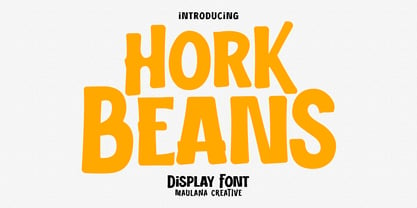 Hork Beans is a simply casual handwritten font. With medium low contrast stroke, fun character with a bit of ligatures and alternates. To give you an extra creative work. Hork Beans font support multilingual more than 100+ language. This font is good for logo design, Social media, Movie Titles, Books Titles, a short text even a long text letter and good for your secondary text font with sans or serif. Make a stunning work with Hork Beans font. Cheers, Maulana Creative
 - Pen Work JNL by Jeff Levine,
$29.00 The 1938 sheet music for "(The Dwarves Marching Song) Heigh-Ho" from Walt Disney's "Snow White" had the part of the title in parenthesis hand lettered with a round nib ink pen. This lettering became the inspiration for Pen Work JNL, and is available in both regular and oblique versions.
 - Public Works JNL by Jeff Levine,
$29.00Public Works JNL emulates the hand-made lettering found on older signs printed by silk screen for local governments. - Work In Progress by StereoType Fonts,
$39.00 Work In Progress is a smooth script font with a very specific style of connected curves. It brings a unique curly style with the possibility to create dynamic dancing words with it's ligatures and alternates.
 - Office Work JNL by Jeff Levine,
$29.00 The 1965 film “Mirage” had its titles and credits hand lettered in a simple, thin sans serif with rounded corners and an overall square design. This is now available digitally as Office Work JNL, in both regular and oblique versions.
 - New York Point by Thomas Käding,
$1.00 - KR Off To Work! - Unknown license

- Sign Work Deco JNL by Jeff Levine,
$29.00 The prolific hand lettering of Samuel Welo is showcased in his “Studio Handbook for Artists and Advertisers” (published in both 1927 and 1960). A thick and thin Art Deco design in the 1960 edition – somewhat reminiscent of Futura Black (but with significant differences) is now available as Sign Work Deco JNL in both regular and oblique versions.
 - Work Crew Stencil JNL by Jeff Levine,
$29.00 In the 1949 Paramount comedy "My Friend Irma" (a film based on the popular radio series that introduced America to Dean Martin and Jerry Lewis), an opening gag set-up involving excavation work utilizes street barricades which inspired Work Crew Stencil JNL. Placed along the site, different advisories are stenciled upon barricades warning of the work in progress. The scatterbrained Irma (Marie Wilson) walks straight through the construction, oblivious as to what's going on around her and steps right into the open hole dug into the sidewalk (a scene she reprises in 1950's "My Friend Irma Goes West").
 - Eat your face with a fork - Unknown license

- ITC Jaft by ITC,
$29.99ITC Jaft is the work of New York designer Frank Marciuliano, an adventurous, energetic display typeface. It began with a series of posters designed by Marciuliano for the New York Times. The lettering was drawn with a bamboo pen and then filled in to create the unusual angles that give ITC Jaft its unique look. - Parks Department JNL by Jeff Levine,
$29.00 A WPA (Works Progress Administration) sponsored Water Carnival taking place in Central Park in the 1930s had "Department of Parks, City of New York" in the thin Art Deco hand lettering which is now available as Parks Department JNL.
 - Summer Program JNL by Jeff Levine,
$29.00 The WPA (Works Progress Administration) posters on file at the Library of Congress have been a treasure trove of classic hand-lettered type designs. Summer Program JNL is based on one such poster offering free arts and crafts classes in New York City sponsored by the Federal Art Project.
 - Quadrus by ITC,
$29.99Quadrus is the work of New York graphic designer Peter Fahrni, a condensed open slab serif typeface. Fahrni was inspired by the lettering styles typical of baseball, basketball and American football sportswear. Quadrus is an all caps alphabet ideal for a variety of applications, particularly for those related to sports. - Ridgewood JNL by Jeff Levine,
$29.00 While watching a movie filmed on location in New York, one scene stood out with a classic neon sign for a neighborhood restaurant. Ridgewood JNL is based on the lettering from that sign, and emulates many of the Art Deco elements that was so unique to sign work of the day.
 - Extravaganza by Solotype,
$19.95Originally, this 1870s wood type font was called Armenian. We came across a showing of alphabet at the South Street Seaport in New York, bought it and immediately drew the additional characters needed to make the font. We used it for some circus program work that was part of our livelihood. - Inlove by Sudtipos,
$29.00 Ideal for magazines, posters or flyers, Inlove is a modern take of Ariel Di Lisio’s passion for geometric and very contrasted typefaces. Because the strong influence over his work, Ariel was invited during 2009 to be part of the Herb Lubalin Exhibition at New York. Designed by Ariel Di Lisio and digitized by Ale Paul.
 - Mo' Funky Fresh by ITC,
$29.99Mo' Funky Fresh is the work of New York designer David Sagorski. It is an all capital typeface which includes a set of alternative capitals, compatible symbols and lively illustrations. Mo' Funky Fresh brings to mind sunny days, tiki bars, surfboards and cool drinks and is a great choice for headlines requiring a vital, energetic look. - ITC Freddo by ITC,
$29.99ITC Freddo is the work of New York designer James Montalbano and was inspired by a sign lettering manual from the 1930s. Montalbano liked the character shapes illustrated in this manual but found many of the proportions odd. So he reinterpreted them to produce capitals and lower case letters which, according to today's standards, better complement one another. - Concert Series JNL by Jeff Levine,
$29.00 The design of Concert Series JNL is based on hand-lettering for a 1930s-era WPA (Works Progress Administration) poster for the Federal Music Project of New York City’s symphony concerts. Held every Sunday at the Theater of Music [located at 254 West 54th Street], the admission in those Depression-era days was 25 cents and 60 cents, with all seats reserved.
 - ITC Peter's Miro by ITC,
$29.99ITC Peter's Miro is the work of New York designer John Peter. It was inspired by the letters used by Joan Miro in his paintings. No one used letterforms more frequently in his work than Joan Miro," says Peter. For his typeface, however, "considerable liberty has been taken with his [Miro's] original letters and missing characters have been added." The letters are a simple script, irregularly and almost crudely written, but bursting with energy. To give designers free rein with their creativity, Peter designed two complete versions of the alphabet in both upper- and lowercase, Peter's Miro and Peter's Miro Too." - Cabarga Cursiva by ITC,
$29.00Cabarga Cursiva is the work of the father and son team of Demetrio E. Cabarga and Leslie Cabarga, both New York designers. The details of the sharp strokes almost give the impression of a knife blade, whether straight or curved like a scimitar. The capitals should be used only as initials and are complemented by a robust lower case alphabet as well as alternate forms and ligatures. - Franklin Gothic Hand Demi Shadow by Wiescher Design,
$39.50 Franklin Gothic Hand Demi Shadow is another one in my series of hand-drawn fonts from way back in time – before computers changed the way we worked in advertising. This one was especially used for what we called "pork-belly-ads": ads for food-stores! I think it is very useful for all kinds of advertising that demands a lot of bang! Your powerful typedesigner Gert Wiescher
 - Strak by Kustomtype,
$25.00 Strak is a font that was born out of admiration for the work of E. Vermeulen, a Belgian artist known for his tight, precise line and an unseen masterpiece that is spread around the world. He has published and exhibited his work in London, Liverpool, Angoulême, New York, Geneva, Amsterdam, Lyon and Turku (in Finland) and he even signed for the New York Times. Based on a few characters, a complete font was composed by Kustomtype. After a few sketches, Strak came to life. The name Strak, in this case, refers to the slender, beautiful woman with the correct waistlines and proportions. The font is designed this way; it is completely hand-drawn, digitized and can be used in all modern and graphic media. Strak is available in 8 different styles, has class and will make many people's mouth water when they see it on your designs. Do you want quality and style? Then Strak is the font-perfect solution!
 - Syracuse by Woodside Graphics,
$19.95Syracuse is a font inspired by the typefaces of the "Arts & Crafts" designers of the early 20th Century. As such, it has a distinct "hand" look. In "Syracuse" you will find hints of Dard Hunter's work at the Roycrofters in East Aurora, New York, a little of the Art Nouveau style of 1900 Vienna, even a touch of Charles Rennie Mackintosh's design ideas in Glasgow, Scotland. The font was named for the city in New York where Gustav Stickley produced his Craftsman furniture. Syracuse owes a debt to all of these sources yet is original and different from any other "Arts & Crafts" font available. - Visigoth by Linotype,
$29.00Visigoth font was created in 1988 by Arthur Baker for AlphaOmega Typography. He designed it specifically for setting the text of A Dante Bestiary published in 1989 for Ombondi Editions in New York. Highly expressive and unusual letter shapes make Visigoth unique among script faces: it has bold, pen written lines, a slight incline, and a distinct variation in stroke weights, making it ideal for advertising and other display work. - P22 Bauhaus by P22 Type Foundry,
$24.95 The P22 Bauhaus Set includes three type faces designed by Herbert Bayer, including the famous Universal font most commonly associated with the Bauhaus school. A collection of 72 graphic elements inspired by various Bauhaus works rounds out this collection. This set is authorized by the Herbert Bayer Estate. For more typefaces from the Bauhaus, see our Josef Albers set. © 2021 Artists Rights Society (ARS), New York / VG Bild-Kunst, Bonn
 - Open Case JNL by Jeff Levine,
$29.00 Open Case JNL is the distant cousin to the 2009 release by Jeff Levine Fonts called Cold Case JNL, as both were based on sets of lettering stencils designed and manufactured by the Huntington Oil Cured Stencil Company (originally of Huntington, New York and later of Delray Beach, Florida). While sharing similar design traits, there are enough differences to have both type designs work well together in a complimentary setting. Open Case JNL is available in regular and oblique styles.
 - Delectables by ITC,
$29.99A former lettering artist at Hallmark Cards, Rob Leuschke now has his own thriving design businesses, Alphabytes and the new TypeSETit. Growing up in St Charles, Missouri, where he still lives, Rob showed great artistic promise at an early age. He earned a BFA in graphic design at the University of Missouri at Columbia. After graduation, his stint at Hallmark Cards gave him the opportunity to learn from and work with some of the best lettering artists in the industry. Rob struck out on his own in 1987 and now boasts a long list of clients from all over the world. Rob has created over 250 custom typefaces, and his work has been exhibited in New York. Ambiance BT is Rob’s first typeface published by Bitstream, with more to follow. - Ginkgo by Linotype,
$29.99 Designed by Alex Rütten, Ginkgo is a stylish text typeface. It works well for setting extended passages of text at small sizes thanks to its open counters, generous character widths, and clear and unique letterforms. On top of that, the handling of details such as in the serifs, cross bars, and terminals are wonderful to appreciate when used at large point sizes as well. Gingko received a Certificate of Excellence in Type Design at the Type Directors Club of New York TDC2 competition in 2009.
 - Sam Suliman by K-Type,
$20.00 Sam Suliman is a condensed display face supplied in three weights – Regular, Medium and Bold – plus a set of handy italics (obliques). All six fonts are included in the value family pack. The fonts are inspired by lowercase lettering on a Sarah Vaughan album cover designed by Sam Suliman in 1962, a style which contrasts sharp tight outer corners with soft rounded counters. The letters were perhaps influenced by a Solotype font called Herald Square, but without that font’s aversion to diagonals, and adding distinctive perky ascenders/descenders on the lowercase r, a, u, g and n. The Sam Suliman fonts also add the nubs to d, m, p, and q. Suliman was born in Manchester, England in 1927. After working for McCann Erikson in London, he moved to New York where he took on freelance work designing album covers, particularly celebrated are his striking minimalist designs for jazz records. He moved back to England in the early 1960s, designing many book jackets, film titles and fabrics, also working in Spain and India before settling in Oxford in the 1980s.
 - On The Town JNL by Jeff Levine,
$29.00 On the Town JNL is a reworking of Parks Department JNL, giving it a classic "solid black Art Deco treatment". The wide monoline font of the original design was inspired by hand lettering on a WPA (Works Progress Administration) poster. Art Deco typography and the streamlined style it embraced often conjures up images of New York City in the 1930s and 1940s, thus On the Town JNL is named for the classic MGM musical starry Gene Kelly, Frank Sinatra and Jules Munchen that was filmed on location in "the city that never sleeps".
 - East Village JNL by Jeff Levine,
$29.00 The Federal Art Project division of the WPA (Works Progress Administration) employed numerous artists, musicians, actors and other creative sorts in a effort to help many survive the Great Depression of the 1930s. One of the posters created by this project was for a "Card Party and Barter Benefit" with proceeds going toward the Nassau Art Teachers Benefit Fund - taking place at the Coca-Cola plant in Rockville Centre, New York. East Village JNL was derived from this poster, and is available in both regular and oblique versions.
 - FF Nort Headline by FontFont,
$50.99 The FF Nort™Headline is the ideal companion to the already released FF Nort typeface family. It is open, inviting, highly legible, strikingly handsome and a comfortable performer on screen and in print. As a powerful display type tool, it is perfect for headlines, navigational links and banners. OpenType® Pro fonts of FF Nort Headline, have extended character sets that support most Central European and several Eastern European languages – including Greek and Cyrillic. Graphic communicators will also benefit from the additional ligatures, and suite of symbols and signs. FF Nort’s designer Jörg Hemker has a background in corporate and governmental design and has received a variety of awards for his work – including the prestigious German Red Dot Design Award. He works as a freelance graphic and branding designer and is a lecturer in type and typography at the University of Applied Science in Hamburg

