10,000 search results
(0.02 seconds)
- Ink Brush Arabic by NamelaType,
$29.00 This is the sibling font of Ink Brush, with the addition of Arabic glyphs; Arabic, Persian, Urdu, Kurdish, and Jawi (Pegon). The Ink Brush Font is a captivating addition to the world of typography. This versatile typeface offers two distinctive versions, adding a dynamic element to your creative projects. The textured version brings a sense of artistic spontaneity with its handmade appearance, while the solid version delivers clarity and precision. Whether you’re aiming for a rustic, handcrafted feel or a sleek, professional look, the Ink Brush Font has you covered. It’s perfect for a wide array of design applications, from branding and packaging to invitations and artistic endeavors, infusing your work with character and style
 - Ink Spots JNL by Jeff Levine,
$29.00 For decades, spot illustrations - whether by hot type, photoengraving, clip art or (in later years) digital means provided decorative and often lighthearted breaks in reading printed copy. This collection of twenty-six cartoon images has been meticulously re-drawn in digital format from 1920s-1930s era source material. By adding a simple caption underneath a design, your ad copy can be enhanced with these wonderful period pieces.
 - Inked God Pro by CheapProFonts,
$10.00 This font has that grungy, gritty look, and combines it with some elegant swirls. Weird and wonderful. I have added swirls and decorations to ALL the uppercase letters that did not have them, so there are now wider possibilities to add interesting decorations to your composition. In addition to the expanded language support, of course. ALL fonts from CheapProFonts have very extensive language support: They contain some unusual diacritic letters (some of which are contained in the Latin Extended-B Unicode block) supporting: Cornish, Filipino (Tagalog), Guarani, Luxembourgian, Malagasy, Romanian, Ulithian and Welsh. They also contain all glyphs in the Latin Extended-A Unicode block (which among others cover the Central European and Baltic areas) supporting: Afrikaans, Belarusian (Lacinka), Bosnian, Catalan, Chichewa, Croatian, Czech, Dutch, Esperanto, Greenlandic, Hungarian, Kashubian, Kurdish (Kurmanji), Latvian, Lithuanian, Maltese, Maori, Polish, Saami (Inari), Saami (North), Serbian (latin), Slovak(ian), Slovene, Sorbian (Lower), Sorbian (Upper), Turkish and Turkmen. And they of course contain all the usual "western" glyphs supporting: Albanian, Basque, Breton, Chamorro, Danish, Estonian, Faroese, Finnish, French, Frisian, Galican, German, Icelandic, Indonesian, Irish (Gaelic), Italian, Northern Sotho, Norwegian, Occitan, Portuguese, Rhaeto-Romance, Sami (Lule), Sami (South), Scots (Gaelic), Spanish, Swedish, Tswana, Walloon and Yapese.
 - Shiny Ink Display by Lloyd David Designs,
$14.99 Hi there, thanks for looking at my first typeface. It began as one of my original sketches back in 2019 as a freelance graphic designer trying to create unique letterforms that I could use for posters or websites with other possible use cases in mind for commercial use. The sketches were then passed on to and worked on with Vladimir Tsagolov who has more experience in creating professional typefaces, the experience for me was invaluable, and I have many more typefaces I'm now working on. Shiny Ink Display is a collection of hand drawn fonts based on the flow of reflective viscous ink with 7 styles, some styles can be interchangeable and used on top of each other. For example, Shiny Ink Display Plain, can be used with Shiny Ink Display Plain Lined to create shadows underneath it, at angles not available with the Shadow styles you'll see in the font collection. Shiny Ink Display has various use cases, maybe even infinite, but more specifically for posters or websites with large text, though it bodes quite well at smaller sizes, and is visually appealing to its viewers as long as it's at a legible font size. When it comes to font pairing, Shiny Ink Display works especially well with Monospace and sans-serif fonts. You can check the poster examples on this page to help you imagine what you could do with the font styles. I also had in mind manufactured products, but I could leave that to you to create your ideas with the available font styles. In regards to languages or typing on a keyboard, most of the English/European latin or cyrillic language keys are supported, so you'll have lots of glyph characters to play with for a number of ideas you may have. All the best with your projects using my fonts, if there are any issues, don't hesitate to contact me for support: lloyddaviddesigns.co.uk - Lloyd David
 - Ink Nouveau JNL by Jeff Levine,
$29.00 Ink Nouveau JNL is loosely based on the hand lettered title from a lobby card for the 1927 film “The Taxi Dancer” and is available in both regular and oblique versions. The design emulates a hastily or sloppily drawn Art Nouveau display font.
 - Pen And Ink by Rachel Kick,
$10.00 Pen & Ink is a quirky hand-drawn font. Inspired by notetaking and classroom doodles, this font has a friendly and approachable feel that perfectly compliments artwork and social media. Mix and match uppercase and lowercase letters throughout each word to get a truly hand-drawn feel. There are also 33 swash and icon extras.
 - Ink by Lio by Ililion,
$12.00 Ink by Lio is a handcrafted font for use in many different projects. It is inspired by Japanese ink calligraphy and has all basic glyphs for various uses.
 - Offshore Banking Business - Unknown license

- F25 Bank Printer - 100% free

- Pillo Talk Soft - Unknown license

- Talking Picture JNL by Jeff Levine,
$29.00 In a vintage photograph, promotional signage outside an old theater for the 1929 early sound film “The Doctor’s Secret” had lettering in a wide, bold Art Nouveau slab serif design. This was the model for Talking Picture JNL, which is available in both regular and oblique versions.
 - Plain Talk JNL by Jeff Levine,
$29.00 Plain Talk JNL is similar to Eckhardt Centerline JNL, but lacks the thin inline lettering and has a different A and G. The hand-lettered look of this font makes it perfect for titling applications.
 - Bank Stencil EF by Elsner+Flake,
$35.00 - Bank Script SB by Scangraphic Digital Type Collection,
$26.00Since the release of these fonts most typefaces in the Scangraphic Type Collection appear in two versions. One is designed specifically for headline typesetting (SH: Scangraphic Headline Types) and one specifically for text typesetting (SB Scangraphic Bodytypes). The most obvious differentiation can be found in the spacing. That of the Bodytypes is adjusted for readability. That of the Headline Types is decidedly more narrow in order to do justice to the requirements of headline typesetting. The kerning tables, as well, have been individualized for each of these type varieties. In addition to the adjustment of spacing, there are also adjustments in the design. For the Bodytypes, fine spaces were created which prevented the smear effect on acute angles in small typesizes. For a number of Bodytypes, hairlines and serifs were thickened or the whole typeface was adjusted to meet the optical requirements for setting type in small sizes. For the German lower-case diacritical marks, all Headline Types complements contain alternative integrated accents which allow the compact setting of lower-case headlines. - Bank Of England by K-Type,
$20.00 Bank of England is loosely based on the blackletter lettering from Series F English twenty pound banknotes introduced in 2007. The font takes inspiration from German Kanzlei (Chancery) typefaces and the English calligraphers John Ayres and George Bickham. For designers using OpenType-aware applications, Bank of England includes Swash versions of all uppercase letters and ampersand, Alternates for nine lowercase letters and capital Z, and sixteen ornamental flourishes. Western European accented characters are included, and also a simplified St. Edward’s Crown (Elizabeth II’s coronation crown) at the Section (§) and PlusMinus (±) keystrokes (Windows Alt-0167 and Alt-0177).
 - Bank Statement AOE by Astigmatic,
$19.95A typeface made from vintage typewriter samples and meticulously compiled into a complete character set. - Talk To Me by PizzaDude.dk,
$20.00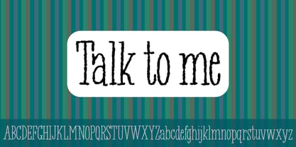
- Bank Sans EF by Elsner+Flake,
$35.00 With its extended complement, this comprehensive redesign of Bank Gothic by Elsner+Flake offers a wide spectrum for usage. After 80 years, the typeface Bank Gothic, designed by Morris Fuller Benton in 1930, is still as desirable for all areas of graphic design as it has ever been. Its usage spans the design of headlines to exterior design. Game manufacturers adopt this spry typeface, so reminiscent of the Bauhaus and its geometric forms, as often as do architects and web designers. The creative path of the Bank Gothic from hot metal type via phototypesetting to digital variations created by desktop designers has by now taken on great breadth. The number of cuts has increased. The original Roman weight has been augmented by Oblique and Italic variants. The original versions came with just a complement of Small Caps. Now, they are, however, enlarged by often quite individualized lower case letters. In order to do justice to the form changes and in order to differentiate between the various versions, the Bank Gothic, since 2007 a US trademark of the Grosse Pointe Group (Trademark FontHaus, USA), is nowadays available under a variety of different names. Some of these variations remain close to the original concept, others strive for greater individualism in their designs. The typeface family which was cut by the American typefoundry ATF (American Type Founders) in the early 1930’s consisted of a normal and a narrow type family, each one in the weights Light, Medium and Bold. In addition to its basic ornamental structure which has its origin in square or rectangular geometric forms, there is another unique feature of the Bank Gothic: the normally round upper case letters such as B, C, G, O, P, Q, R and U are also rectangular. The one exception is the upper case letter D, which remains round, most likely for legibility reasons (there is the danger of mistaking it for the letter O.) Because of the huge success of this type design, which follows the design principles of the more square and the more contemporary adaption of the already existing Copperplate, it was soon adopted by all of the major type and typesetting manufacturers. Thus, the Bank Gothic appeared at Linotype; as Commerce Gothic it was brought out by Ludlow; and as Deluxe Gothic on Intertype typesetters. Among others, it was also available from Monotype and sold under the name Stationer’s Gothic. In 1936, Linotype introduced 6pt and 12pt weights of the condensed version as Card Gothic. Lateron, Linotype came out with Bank Gothic Medium Condensed in larger sizes and a more narrow set width and named it Poster Gothic. With the advent of photoypesetters and CRT technologies, the Bank Gothic experienced an even wider acceptance. The first digital versions, designed according to present computing technologies, was created by Bitstream whose PostScript fonts in Regular and Medium weights have been available through FontShop since 1991. These were followed by digital redesigns by FontHaus, USA, and, in 1996, by Elsner+Flake who were also the first company to add cursive cuts. In 2009, they extended the family to 16 weights in both Roman and Oblique designs. In addition, they created the long-awaited Cyrillic complement. In 2010, Elsner+Flake completed the set with lowercase letters and small caps. Since its redesign the type family has been available from Elsner+Flake under the name Bank Sans®. The character set of the Bank Sans® Caps and the Bank Sans® covers almost all latin-based languages (Europe Plus) as well as the Cyrillic character set MAC OS Cyrillic and MS Windows 1251. Both families are available in Normal, Condensed and Compressed weights in 4 stroke widths each (Light, Regular, Medium and Bold). The basic stroke widths of the different weights have been kept even which allows the mixing of, for instance, normal upper case letters and the more narrow small caps. This gives the family an even wider and more interactive range of use. There are, furthermore, extensive sets of numerals which can be accessed via OpenType-Features. The Bank Sans® type family, as opposed to the Bank Sans® Caps family, contains, instead of the optically reduced upper case letters, newly designed lower case letters and the matching small caps. Bank Sans® fonts are available in the formats OpenType and TrueType.
 - FM Thank You by The Fontmaker,
$20.00 FM Thank You consists of 26 ‘thank you’ hand letterings - all custom made and handwritten. Now you have 26 unique ways to say ‘thank you’, adding a personal touch to your message.
 - ITC Talking Drum by ITC,
$29.99 - Banks and Miles by K-Type,
$20.00 K-Type’s ‘Banks & Miles’ fonts are inspired by the geometric monoline lettering created for the British Post Office in 1970 by London design company Banks & Miles, a project initiated and supervised by partner John Miles, and which included ‘Double Line’ and ‘Single Line’ alphabets. The new digital typeface is a reworking and extension of both alphabets. Banks & Miles Double Line is provided in three weights – Light, Regular and Dark – variations achieved by adjusting the width of the inline. Banks & Miles Single Line develops the less used companion sans into a three weight family – Regular, Medium and Bold – each with an optically corrected oblique. Although the ‘Banks & Miles Double Line’ and ‘Banks & Miles Single Line’ fonts are based on the original Post Office letterforms, glyphs have been drawn from scratch and include numerous adjustments and impertinent alterations, such as narrowing the overly wide Z and shortening the leg of the K. Several disparities exist between the Post Office Double and Single Line styles, and K-Type has attempted to secure greater consistency between the two. For instance, a wide apex on the Double Line’s lowercase w is made pointed to match the uppercase W and the Single Line’s W/w. Also, the gently sloping hook of Single Line’s lowercase j is adopted for both families. The original Single Line’s R and k, which were incongruously simplified, are drawn in their more remarkable Double Line forms, and whilst the new Single Line fonts are modestly condensed where appropriate, rounded letters retain the essentially circular form of the Double Line. Many characters that were not part of the original project, such as @, ß, #, and currency symbols, have been designed afresh, and a full set of Latin Extended-A characters is included. The new fonts are a celebration of distinctive features like the delightful teardrop-shaped bowl of a,b,d,g,p and q, and a general level of elegance not always achieved by inline typefaces. The Post Office Double Line alphabet was used from the early 1970s, in different colours to denote the various parts of the Post Office business which included telecommunications, counter services and the Royal Mail. Even after the Post Office was split into separate businesses in the 1980s, Post Office Counters and Royal Mail continued use of the lettering, and a version can still be seen within the Royal Mail cruciform logo.
 - EF Tante Emma by Elsner+Flake,
$35.00 - People Talk JNL by Jeff Levine,
$29.00 A title card with cast credits for the 1935 movie “The Whole Town’s Talking” (starring Edward G. Robinson and Jean Arthur) formed the basis for People Talk JNL. The hand lettered names were done in a slightly condensed slab serif – mostly rectangular in shape with rounded corners. A few characters take on their own unique appearance. People Talk JNL is available in both regular and oblique versions.
 - Dirty Deo Hand Ink by TypoGraphicDesign,
$19.00 CONCEPT/CHARACTERISTICS Experimental analog handwritten style. Handwritten in ink in a conventional roll-on deodorant. The dirty, grimmy Grunge-Look and the sloppy, rough Handwritten-Look script character, gives the typeface a high recognition value and uniqueness. The motto is handmade, rough & experimental. APPLICATION AREA The rough, ink-like, handwritten look of the handmade font „dirty deo hand ink“ would look good at logos, display size for poster, flyer, comics and graphic novel lettering, headlines in magazines or websites, packaging, music covers or webbanner etc. TECHNICAL SPECIFICATIONS Headline Font | Display Font | Raw Trash Script Font „dirty deo hand ink“ OpenType Font with & 282 glyphs & 1 style (regular). Symbols and ligatures (with accents & €)
 - BN M@TAN - Unknown license

- TAN Waltzing Mathilde by TANTypeCo.,
$19.00 Our fonts are supported by most design software, please make sure it can read the OpenType fonts to be able to access all ligatures. Please be informed that while our font works well in Canva, but Canva itself doesn’t support advance opentype features such as special characters.
 - CANDY INC. - Personal use only

- Detectives Inc - Personal use only

- Pink Shark by Creativemedialab,
$15.00 Introducing Pink Shark, a fun and simple handwriting fonts. Perfect for DIY projects, labels, quotes, greeting cards, posters, wall art, branding, packaging, websites, photos, photography overlays, window art, signs, scrap booking, tags and so more! Pink Shark consists of a Regular and a cute 'Wrap' version and will make your project stand out!
 - Long Wink by Seemly Fonts,
$14.00 Long Wink is a handwritten typeface that is ideal for use on stationery, logos, t-shirts, paper, print designs, website headers, picture frames, flyers, album covers, posters, image sliders, and other things.
 - Rose Pink by Olivetype,
$18.00 Introducing Rose Pink, a fun and exciting font suitable for any creative project. From product packaging to logos, this font is the perfect way to express your creativity with a bold style and playful look. The whimsical and flowing curves of this font also can help create a sense of lightheartedness in your design. project. Thank You and Happy Designing!
 - Pink Gladiolus by madeDeduk,
$15.00 Pink Gladiolus is a modern brush script! It comes with two variations and bonus ornaments. This font perfect for all your designs project, events and more. Feature Uppercase Lowercase Numbers & Symbol International Glyphs Alternative Uppercase Alternative Lowercase Ligatures If you need anything else just shoot me on email at: dedukvic@gmail.com Hope you enjoy it.
 - Inky Fingers by Hanoded,
$20.00 Inky Fingers… Well, the name says it all! This rather obese font was made by hand (literally) using my index finger, some sheets of paper and a lot of Chinese ink. As the eco-paper absorbed quite a lot of ink, I had to do a second ink-run! Inky Fingers is a very legible typeface, ideal for headlines, books and posters. It comes with Babylonian language support - including the Schwa/schwa glyphs for the Azeri speaking crowd. Ain't I nice?
 - Pink Bottom by Supfonts,
$12.00 This modern calligraphy script has been attentively written, with gentle curves to produce a font thats completely distinctive and original. It contains a full set of lower & uppercase letters, a large range of punctuation, numerals, and multilingual support. Perfect for adding a elegant and unique touch to your lettering projects and branding Also with their help, you can create a Wedding lettering or beautiful frame for your home. Or just use for your small business, book covers, stationery, marketing, magazines and more. What's included Loneliness Regular Loneliness Swashes Multilingual support Cricut support Check out my blog: https://www.instagram.com/superdizigner https://pinterest.com/dmitriychirkov7
 - Sage & Pink by Pixel Colours,
$15.00 Sage & Pink is a font lovingly designed to look as close as possible to a natural hand writting. Includes 3 styles of letters to make your designs look uniquely made by hand. A font family that also looks great on logos!
 - Pink Rock by Epiclinez,
$18.00 Get ready to rock your designs with Pink Rock, a bold and edgy display font This bad boy is perfect for grabbing attention and making a statement. Whether you're designing a punk rock-inspired magazine cover, creating a rebellious brand identity, or adding some oomph to your product packaging, Pink Rock will bring your visuals to life. Unleash your inner rebel with the power of typography – choose Pink Rock today and let your designs rule the world! Pink Rock features : Standard Latin Numbers, symbols, and punctuations Multilingual Support. Fully accessible without additional design software Simple Installations Works on PC & Mac Thank You.
 - Meta Link by Logofonts,
$10.00 Meta Link is Sans Serif inspired by future techno and sport great for product logo, poster, headline, card logo, web, magazine, packaging, stationery and much more. Easily creates your own logo types with font. Meta Link have 4 weight fonts with italic style also has an Open Type feature to access a large selection of unique alternative letters and many ligatures to make it easier for you to create. Meta Link can be accessed perfectly on design applications such as Adobe Illustrator, Adobe Photoshop, Corel Draw, Affinity Designer but does not rule out the possibility that it can also be accessed using web-based applications such as kittl, canva, artboard studio and others.
 - Pink Crestelle by Creativemedialab,
$20.00 Been working on a tropical or fancy themed project? You will love this family. Introducing Pink Crestelle a fancy, versatile and playful font family. This family contains 9 weights and has tons of alternates and ligatures. Best for branding, webdesign project, Clothing brand, logo design, valentine's greetings, packaging and much more.
 - Inky Pinky by Designova,
$29.00 InkyPinky - a lovely & playful handwritten font inspired by kids cartoons & sketchbooks, completely handmade and developed with perfection The typeface is actually simple in design but with a touch of uniqueness, it can be perfectly useful for designing posters, flyers, cartoons, comics, graphics, logotype, web, and display usage. Please see the examples shown above to get an idea about the capability of this typeface. InkyPinky comes with a total of 252 glyphs having Extended character sets including Western European, Central European, and South-Eastern European character sets having support for 19 languages: Afrikaans, Albanian, Catalan, Croatian, Danish, Dutch, English, Estonian, Finnish, French, German, Italian, Lithuanian, Norwegian, Portuguese, Slovenian, Spanish, Swedish, Zulu.
 - Linked Now by Jehoo Creative,
$16.00 Linked Now is so named because this Typeface has Multiple Discreationary Ligatures that unite two different letters to make a striking shape. Is a powerful grotesque typeface designed to be versatile in a wide range of contexts. Having more than 50 stylish Dsicreationary Ligatures on Uppercase letters and unique Alternate on certain letters makes it seem like they have various shapes, so they are great to use as display fonts. To complete it, Linked Now typeface is equipped with 8 weights from Extralight to black and each includes italic. More than 485 glyphs on each and support most European languages .


