787 search results
(0.094 seconds)
- Kremlin II Pro by CheapProFonts,
$10.00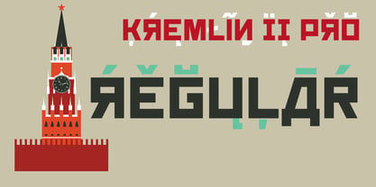 Most uppercase letters of these constructivist fonts are made to look like cyrillic letters, so by carefully interspersing those you can set your text and headlines with it and make it look Russian! To a native Russian this of course looks very silly indeed, so to make amends for toying with their letters I have also included a full proper and genuine cyrillic character set. So these are the first CheapProFonts fonts to support languages using the cyrillic script in addition to the usual 65 latin-based languages. Check out Kremlin Pro for a version with different designs for these glyphs: ¡ ¿ 0 3 6 9 K k M m N n R r V v X x ? ! ALL fonts from CheapProFonts have very extensive language support: They contain some unusual diacritic letters (some of which are contained in the Latin Extended-B Unicode block) supporting: Cornish, Filipino (Tagalog), Guarani, Luxembourgian, Malagasy, Romanian, Ulithian and Welsh. They also contain all glyphs in the Latin Extended-A Unicode block (which among others cover the Central European and Baltic areas) supporting: Afrikaans, Belarusian (Lacinka), Bosnian, Catalan, Chichewa, Croatian, Czech, Dutch, Esperanto, Greenlandic, Hungarian, Kashubian, Kurdish (Kurmanji), Latvian, Lithuanian, Maltese, Maori, Polish, Saami (Inari), Saami (North), Serbian (latin), Slovak(ian), Slovene, Sorbian (Lower), Sorbian (Upper), Turkish and Turkmen. And they of course contain all the usual "western" glyphs supporting: Albanian, Basque, Breton, Chamorro, Danish, Estonian, Faroese, Finnish, French, Frisian, Galican, German, Icelandic, Indonesian, Irish (Gaelic), Italian, Northern Sotho, Norwegian, Occitan, Portuguese, Rhaeto-Romance, Sami (Lule), Sami (South), Scots (Gaelic), Spanish, Swedish, Tswana, Walloon and Yapese.
 - Symply by TripleHely,
$16.00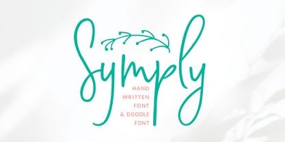 Hi there! Let me introduce Symply – a handwritten signature-style font. Symply is perfect for logos, branding, quotes, blog headlines, magazine and book design, product packaging, web design – or for any text on postcards and your favorite photos. Symply contains: a standard set of characters with wide multilingual support: Western-, Central- and Eastern-European, Baltic, Turkish, Latin-type Africans, and Asian (94 languages in total) 2 additional sets of alternative characters for lowercase letters 8 alternative characters for some initial letters 28 ligatures for double letters and frequent combinations a bonus font with 62 swashes and doodles Symply has two types of embedded auto-replacements: lowercase letters without connecting strokes (for a case of the last character of the word), and ligatures (for a case of two letters that do not pair well together). These features work well in many apps (even simple ones like Notepad/TextEdit), and if you need to customize their application – you could use programs that support OpenType features (for example, Adobe apps or CorelDraw). All these additional glyphs are PUA-encoded, so if your software does not support OpenType — you could access them through Character Map (Windows) or Font Book (Mac) Swashes and doodles come in a bonus font, Symply Swashes. To type them, please press keys with letters A – X, a – x, and numbers 0 – 9 I hope you will like Symply and create great designs with it! And if you have any questions, feel free to contact me via e-mail: triple.hely@gmail.com
 - Kremlin Pro by CheapProFonts,
$10.00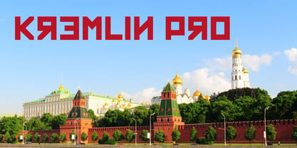 Most uppercase letters of these constructivist fonts are made to look like cyrillic letters, so by carefully interspersing those you can set your text and headlines with it and make it look Russian! To a native Russian this of course looks very silly indeed, so to make amends for toying with their letters I have also included a full proper and genuine cyrillic character set. So these are the first CheapProFonts fonts to support languages using the cyrillic script in addition to the usual 65 latin-based languages. Check out Kremlin II Pro for a version with different designs for these glyphs: ¡ ¿ 0 3 6 9 K k M m N n R r V v X x ? ! ALL fonts from CheapProFonts have very extensive language support: They contain some unusual diacritic letters (some of which are contained in the Latin Extended-B Unicode block) supporting: Cornish, Filipino (Tagalog), Guarani, Luxembourgian, Malagasy, Romanian, Ulithian and Welsh. They also contain all glyphs in the Latin Extended-A Unicode block (which among others cover the Central European and Baltic areas) supporting: Afrikaans, Belarusian (Lacinka), Bosnian, Catalan, Chichewa, Croatian, Czech, Dutch, Esperanto, Greenlandic, Hungarian, Kashubian, Kurdish (Kurmanji), Latvian, Lithuanian, Maltese, Maori, Polish, Saami (Inari), Saami (North), Serbian (latin), Slovak(ian), Slovene, Sorbian (Lower), Sorbian (Upper), Turkish and Turkmen. And they of course contain all the usual "western" glyphs supporting: Albanian, Basque, Breton, Chamorro, Danish, Estonian, Faroese, Finnish, French, Frisian, Galican, German, Icelandic, Indonesian, Irish (Gaelic), Italian, Northern Sotho, Norwegian, Occitan, Portuguese, Rhaeto-Romance, Sami (Lule), Sami (South), Scots (Gaelic), Spanish, Swedish, Tswana, Walloon and Yapese.
 - Arsapia by URW Type Foundry,
$49.99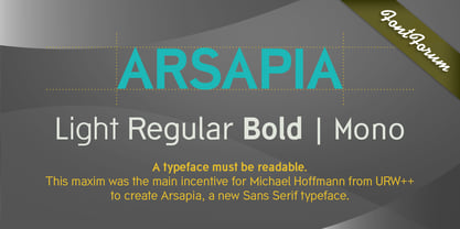 Michael Hoffmann manufactures digital fonts for 30 years. At URW++ he contributed to the technological progress. Over the years, he also specialized in the ideal representation of fonts on screen and the complex assembly of international fonts with scripts of all countries. In his latest project he put the emphasis on developing a highly readable typeface. Less interested in the design as in the functionality of this typeface, he designed Arsapia which he has now installed as a system font on all his computers. Michael Hoffmann studied Japanology at the University of Hamburg and traveled in the early years of his professional activity frequently to Japan, there to train the IKARUS font production tools to Japanese customers. In his spare time he plays guitar or golf depending on the weather. The typeface Arsapia has been designed in such a way that all three font styles Light, Regular and Bold have the same width. When a user therefore opts for the use of Arsapia Light, even though he has already written his text in Regular, nothing changes with respect to the letter tracking. When choosing the Bold for emphasis: Nothing changes except the blackness of the letters. A font change does not engender unwanted line and page breaks of itself. All letters can be clearly distinguished from each other. 1 l I O 0 are all different. For programmers and lovers of monospaced fonts Michael Hoffmann has developed a fourth typeface: Arsapia Mono. This is the perfect terminal font.
 - As of my last update in April 2023, there isn't a widely recognized or standard font specifically known as "79." Fonts typically have names that are either descriptive of their style, such as "Times ...
- As of my last update, Rammstein isn't widely recognized as a standard or commercially available typeface in the traditional sense, such as Helvetica or Times New Roman. Instead, Rammstein's associati...
- Kontext Dot by Elster Fonts,
$20.00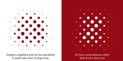 Imagine a font that is easier to read the smaller it is – or the further away the text is. There are already many rasterised fonts, I wanted to take it to the extreme and use as few dots as possible. The result is a typeface that lives up to its name. Each individual circle makes no sense on its own; individual letters are only recognisable in the context of all associated circles, individual letters are most likely to be recognised in the context of whole words. Attached to a building wall, text would be readable from a great distance and become increasingly difficult to decipher the closer you get to the building. Placed on the ground or on a large flat roof, text would only be readable from a higher building, an aeroplane or - depending on the size - in Google Earth. Kontext has old style figures, superscript numerals, case-sensitive questiondown and exclamdown and an alternative ampersand, 390 glyphs at all. Use the same value for font size and line spacing to keep the lines in the grid, or change the line spacing in 10% steps. Change the spacing in 100-unit increments to keep the grid. The numbers in the family- and style-names refer to the (ca.) grey value of the respective background and the font itself. Kontext Dot 00-33 has e.g. a white background (0%) and 33% grey value. Kontext Dot 66-33 has a 66% background and 33% grey value. »Positive« styles (first number smaller than the second number) have kerning, »negative« styles (first number bigger than the second number) can have none.
 - Merrymakers JNL by Jeff Levine,
$29.00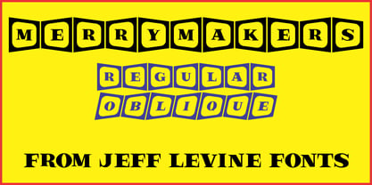 A throwback design reminiscent of 1950s signage and print ads, Merrymakers JNL takes a previous release (Bluesman JNL) and places the letters and numbers inside parallelograms with ‘TV screen’ openings. Merrymakers JNL is available in both regular and oblique versions. The upper case A-Z characters have the taller side of the shape to the left, while the lower case a-z has the taller side to the right. To make a ‘fan fold’ or zig-zag message, simply alternate upper and lower cases as in this example: C-a-R D-e-A-l-E-r-S You can type spaces between words, but if you prefer blank connectors, use the following: Upper case solid black connector – left bracket key Lower case solid black connector – right bracket key Upper case ‘TV screen’ connector – left brace key Lower case ‘TV screen’ connector – right brace key There is a very limited set of punctuation available. The upper case ampersand, question mark, exclamation point, period, comma, single quote and double quote are all on their respective key positions, but to accommodate the lower case [smaller side] versions, those glyphs have been reassigned to other standard keyboard positions: Type @ to get & Type # to get ? Type $ to get ! Type ^ to get . Type * to get , Type - to get ’ Type = to get ” Additionally, to access the lower case [smaller side] versions of the numerals, type the following keys: Type % to get 0 Type ( to get 1 Type ) to get 2 Type + to get 3 Type / to get 4 Type : to get 5 Type ; to get 6 Type < to get 7 Type > to get 8 Type \ to get 9
 - Motorway by K-Type,
$20.00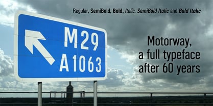 MOTORWAY is the companion typeface to TRANSPORT, the British road sign lettering. The Motorway alphabet was created for the route numbers on motorway signage, and is taller and narrower than the accompanying place names and distances which are printed in Transport. However, for Motorway Jock Kinneir and Margaret Calvert created only the numbers 0 to 9, the capitals A, B, E, M, N, S and W, ampersand, slash, parentheses and a comma. So, although the lettering made its first appearance on the Preston bypass in 1958, K-Type Motorway is the first complete typeface and contains all upper and lower case letters, plus a full complement of punctuation, symbols and Latin Extended-A accented characters. As with the Transport alphabet the starting point was Akzidenz Grotesk, Motorway taking inspiration from condensed versions. Changes were mainly driven by a quest for legibility, resulting in some reduced contrast between horizontal and vertical strokes, and Gill-esque straight diagonal limbs on the 6 and 9, and high vertex for the M. Kinneir and Calvert designed the limited range of characters in two weights; a SemiBold 'Permanent' weight for use as white letters on blue motorway signs, and a Bold 'Temporary' weight for heavier black letters on yellow non-permanent signage. In addition to creating full fonts in both original weights, the K-Type family adds a new Regular weight, plus a set of italics, completing a highly usable condensed typeface which, while rooted in history, is fully functional for both print and web usage. The K-Type fonts are spaced and kerned normally, simply increase the tracking to recapture the generous spacing of motorway signage.
 - Cornhusker by Section Type,
$22.00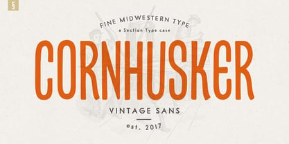 Standing tall as an Illinois cornfield in September, Cornhusker Regular is a strapping condensed sans designed by a champion cornhusker. Inspired by 1940s Midwestern signage, it's warm & charming characters are perfectly at home in logos, beverage bottles and food packaging, restaurant menus, travel advertisements, websites, stationery, handmade product packaging and so much more. If you're looking for a hand-crafted typeface with punch (who can fit into tight spaces!) then Cornhusker Regular is the font for you. This inspired revival excels in both retro & modern designs. Cornhusker Regular includes capital letters, small caps, and alternate cuts (with diacritics) of A, E, F, J, X, Y, ᴀ, ᴇ, ғ, ᴊ, x, ʏ, 0, 1, 2, 3, 4, 5, 7 and a sharp German double s in both cap and smallcap. This font is not affiliated with or endorsed by the University of Nebraska. WHAT'S INCLUDED Cornhusker Regular includes an installable digital Opentype Font file in a single weight. This file contains a basic Latin character set with a full set of uppercase and small caps, multilingual diacritics, numbers, international currency figures, punctuation and pagination symbols. The font also includes alternate cuts for select uppercase and smallcap letters (located in stylistic sets). It is compatible with Adobe CS and CC, Microsoft Word and other type editing apps. SUPPORTED LANGUAGES Afrikaans, Alsatian, Basque, Bislama, Breton, Catalan, Chamorro, Danish, Dutch, English, Faroese, Finnish, Flemish, Franco-Provencal, French, Frisian, Friulian, Galician, German, Greenlandic, Icelandic, Indonesian, Irish, Italian, Ladin, Latin, Luxembourgish, Malay, Manx Gaelic, Northern Sotho, Norwegian (Bokmål), Norwegian (Nynorsk), Occitan, Portuguese, Rhaeto-Romance, Romansh, Sami (Inari), Sami (Lule), Sami (Northern), Sami (Skolt), Sami (Southern), Scottish Gaelic, Spanish, Swahili, Swedish, Tagalog, Walloon and Welsh.
 - Parisine Std by Typofonderie,
$59.00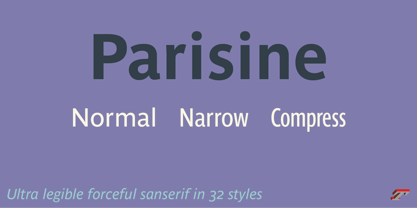 Ultra legible forceful sanserif in 32 fonts Parisine was born as official parisian métro signage typeface. This family of typefaces has become over years one of the symbols of Paris the Johnston for the London Underground or the Helvetica for the New York Subway. The Parisine was created to accompany travelers in their daily use: ultra-readable, friendly, human while the context is a priori hostile. Meanwhile, Parisine is now a workhorse and economical sanserif font family, highly legible, who can be considered as a more human alternative to the industrial-mechanical Din typeface family. More human, but not fancy: No strange “swashy” f, or cursive v, w etc. on the italics, to keep certain expected regularity, important for information design, signages, and any subjects where legibility, sobriety came first. Born as signage typeface family, the various widths and weights permit a wider range of applications. In editorial projects, the Compress version will enhances your headlines, banners, allowing ultra large settings on pages. The Narrow version will be useful as direct compagnon mixed to standard width version when the space is limited. The various Parisine typeface subfamilies Parisine is organised in various widths and subsets, from the original family Parisine, Parisine Gris featuring lighter versions of the usual weights and italics, Parisine Clair featuring extra light styles, to Parisine Sombre with his darker and extremly black weights as we can seen in Frutiger Black or Antique Olive Nord. Many years of adjustments were necessary to refine this complex family. Initially, Parisine was designed by Jean François Porchez in 1996 for Ratp to solely fulfil the unique needs of signage legibility. Parisine remain the official corporate typeface of the public transport in Paris, the worldwide capital for tourism, and now integral part of the French touch. Directly related, Parisine Office was initially created for Ratp’s internal and external communication, Parisine Office is available at Typofonderie too. Not connected with Ratp and public transports, Parisine Plus was created as an informal version of Parisine. Parisine: Introducing narrow and compressed families About Parisine Parisine helps Parisians catch the right bus Observateur du design star of 2007
 - Vinyle by Lián Types,
$37.00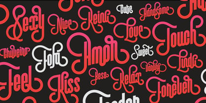 Bold, rounded and super cool. Those are the attributes of my latest font “Vinyle”, french for vinyl. In this epoque where all fields of Design are giving a lot of importance and attention to Typography and Lettering, I felt it was my duty to contribute with something that could really stand alone and ‘say something else’ that just words to be read. I've found that lately in the world, regarding a finished piece of design, the role of Typography (and of letters in general) went from being secondary, (like a minor player or a supporting actor) to the most important one. People are starting to understand the beauty of a well-done letter: they want their storefronts with unique scripts, they want to drink coffee surrounded by lettered blackboards, they want to buy books with astonishing covers with swashes ‘por doquier’. I'm more than happy to be alive in a present where even the most unimaginable friends of mine, (who couldn't spot differences between comic sans and helvetica before) are now conscious of the importance of a letter, or let’s say: Of the ‘voice’ of Typography. With Vinyle I tried to make a font with power. Following the nowadays trend of, let me say, “the vintage sans renaissance”. This time I put my brushes and nibs aside and experimented with something new. It wasn't easy, if you will pardon, for me to see swashes all over the place withouth the classic calligraphic ‘thick and thins’, but with after some weeks of work I started to love them. Like I already showed you in other creations (1) let me finish with the phrase: GEOMETRY IS SEXY! TIPS Vinyle has a lot of attitude, it shouts “here I am!” it really can ‘design an entire piece’ for you with just a word or two: It was designed with a 10 degree slant on purpose so the user may rotate it (like on the posters) that amount of degrees in order to see better results. Use Vinyle with the ‘fi’ standard ligatures activates for better kerning and ligatures! NOTES (1) See my font Selfie , the ‘little sister’ of Vinyle.
 - CP Company by FSD,
$23.37 C.P. Company is a group of types including 4 different forms and it is a complementary sign of communication for the C.P. Company clothes maker. C.P. Company communication makes use of media such as the press and the web and that’s the reason why we have always felt the need for a font that would not show incongruities through the monitor. Therefore we have decided to change the structure of glyphs like a, e, g, s… in the most contrasted versions to prevent the serifs from touching the internal parts of the letters and in this manner we have made a really unusual stylistic choice for a group of types. The difference between the height of caps and smalls is very low (about 20%) so that the smalls are easy to read even when their dimensions are on a very small scale. Moreover this stylistic solution gives the possibility to avoid using the small capitals in case of charts and catalogue codes (i.e. Tricot M5) and provides more vertical compactness between the lines. Even a sentence written in capital letters next to another one written in smalls does not look so much contrasted from a typographical point of view and then it is not unpleasant. The limits due to different constructive principles have been overcome by means of a grid based on the automatic division of EM square of 9-point type and in this manner the letters have a wider face. The font is even more unusual owing to the style chosen that belongs to the classical tradition of hair-lined types for glyphs like e and also thanks to ligatures like ? in the characters set. CP Company is a geometrical font whose alphabet makes use of the style of types that preceded the Helvetica, matched with more experimental and updated solutions. Numbering is monospaced. The bending of number 2, the slight raising of the oblique serif of number 4 and the presence of a hair-line in number 7 are the solutions adopted to make the types match in a more balanced manner.
 - As of my last update in early 2023, the font named "Ptarmigan" is not one of the widely recognized or mainstream fonts, such as Helvetica, Times New Roman, or Arial, which have broad applications and...
- Ah, "Future Earth" by Yautja – a font that's not your everyday Helvetica or Times New Roman. No sir, this font is what happens when typography decides to go on a space odyssey and ends up at a rave p...
- Ah, the Capitular Moldurada font by Ouripedes Gallene, a font so distinctive that it makes Arial look like it's pretending to be Helvetica at a costume party. Imagine if letters decided to go to a ma...
- Ma Braille by Echopraxium,
$5.00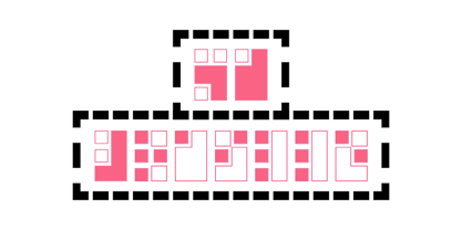 The "Ma" in "Ma Braille" is used as a minimalist way to say "Negative Space". "Ma" in japanese arts is an "esthetical usage of emptiness". Thus this font explicits the negative space around visible braille dots in each glyph. A. Font user guide a.1. Lowercase glyphs { A..Z } In these glyphs, dots are represented as "black squares" while the negative space is displayed as 1 or 2 white filled polygons. a.2. Uppercase glyphs { a..z } In these glyphs, dots are represented as "white squares" while the negative space is displayed as 1 or 2 black filled polygons. a.3. Digits: they are just the same than a..j, but the "North US version" is also provided in ascii codes 0xE0..0xE4 (1..5) and 0xE7..0xEB (6..0). a.5. "Dashed Border": a.5.1. "Black dashed" border glyphs; { £, ¥, µ, Â, Ä, Ê, Ë, Î, Ï, Ô } a.5.2. "White dashed" border glyphs; { Ö, Õ, °, ô, ö, î, ï, û, u, õ } B. Posters Poster 1: "Font Logo" version 1, it displays "Ma Braille" text surrounded by the "black dashed border" glyphs. Poster 2: "Font Logo" version 2, it displays "MA" glyphs in big size and smaller "Braille" glyphs within "M" and within "A" as well. Poster 3: the classical pangram to test a font "The Quick Brown Fox jumps over the Lazy dog". Poster 4: Article 1 of the Human Rights: All human beings are born free and equal in dignity and rights. They are endowed with reason and conscience and should act towards one another in a spirit of brotherhood. Poster 5: the "Glyph set" (Border glyphs not included) with A..Z, a..z, digits and special characters.
 - Text Tile by Tetradtype,
$25.00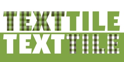 TextTile is a system of heavy sans titling faces which can be utilized to carry a repeating chromatic pattern across words and letters. It stands apart from other chromatic faces, where layered effects typically interact only within each letter and do not carry through from one letter to another. The pattern repetition across letters of varying widths is achieved through OpenType substitution, using conditional alternates for each successive letter to allow for a seamless appearance across words, regardless of letter combinations. Though the pattern exists on a strict grid and the letters' widths and spacing must be highly regular in order to preserve the pattern repeat, the letterforms themselves are not rigid; rather, they appear organic, lively. The initial release includes patterns inspired by a classic buffalo plaid, separated into its horizontal and vertical components to maximize the creative possibilities for layering one-, two-, three-, and even four-color plaid patterns. Kits are available to produce the plaid pattern in detail—with overlapping diagonal hatching fully visible—or as a simplified version in which transparency can be used to simulate plaid or to create a checkered or striped effect. The TextTile family of fonts is a flexible canvas for mixing and matching a broad array of patterns to create a unique look. Check back for more pattern releases and take a look at the online specimen to see what is possible with the current offerings. Usage Notes For best results use an OpenType aware program. Enabling Contextual Alternates will ensure pattern alignment. For patterns that are made up of vertical stripes or columns using the Stylistic Alternate/Stylistic Set 1 will shift the columns. Stylistic Set 2 will change 1-0 into blocks of patterns.
 - Eksja by Protimient,
$29.00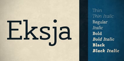 Eksja is a modern slab serif available in four weights, each with a corresponding italic. All the fonts in the family have small caps, the extended latin character set, diacritical f-ligatures, enclosed numerals (numbers in circles) and case-sensitive punctuation. The general design of the typeface has been with a strong human touch in mind. The ends of the serifs have been given a subtle rounding, just enough to take the edge off which, when coupled with the largely humanist structure of the design, creates an open, friendly and approachable design, abandoning the usual geometric severity commonly associated with slab serif typefaces. Eksja contains quite a comprehensive numerals system. Obviously, each font has the standard proportionally and tabularly spaced lining and old-style figures but, crucially, the tabular numerals share the exact same width in each font variant. That means that you can choose to use the thin, regular, bold, black and their italic forms all in the same setting and they will always line up. In addition to the 'normal' numerals there are super-script and sub-script numerals and OpenType fractions that can be automatically composed as you type. There are also the enclosed numerals, numbers inside a circle, that are useful for numerically listing items and, thanks to the wizardry of OpenType, they can contain any number of digits (typically, enclosed numerals are precomposed single digits, only encompassing the 0–9 range, the enclosed numerals in Eksja can go to double digits, triple digits or, in fact, any number of digits*). *The automation of the enclosed numerals is accessed via either "Stylistic Set #1" or "Stylistic Alternates" which requires the use of an application that supports OpenType stylistic sets or stylistic alternates, such as Adobe's InDesign or Photoshop.
 - DNP Shueitai by DNP,
$225.00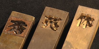 Shueitai is a typeface that has been undergoing development for more than a century, starting from the days when Dai Nippon Printing Co., Ltd. (DNP) was still known as Shueisha. As Japan underwent rapid modernization during the early years of the Meiji era, Shueisha, believing that printing was a business befitting a modern civilized society, began operations with a focus on letterpress. Before long the company expanded into developing its own typefaces. In 1912 it completed a full range of Mincho type, in sizes from Sho-go (#0 size, 42pt) through Hachi-go (#8, 4pt), which it called "Shueitai" a new style that came to form one of the two mainstreams of Japanese typefaces and continues to have a significant influence on font design even today. The Shueitai typeface is distinguished by abundant variations matching the size of type and the changing demands of the times. Whether it is the spirited and powerful Sho-go, the delicate and flowing San-go (#3, 16pt), or the bright and solidly reassuring Shuei-Mincho L, all Shueitai typefaces share a vibrant brushwork that adds an expression of eloquence and a burst of brilliance to every printed word. Currently, Shueitai is composed of 17 kinds of fonts useful for various purposes. The world has witnessed vast changes in the environment surrounding the printed world, with the tran-sition first from letterpress to Desktop Publishing, and most recently to e-books. But no matter how this environment might evolve, the written word remains the basis of communication, and the importance of beautiful and readable typefaces stays unchanged. In preparation for the changes that will inevitably come during the future, DNP will continue to evolve the Shueitai designs from now on. Through its continual reinvention, Shueitai, a typeface consistently adopted at the vanguard of the industry, perhaps represents Japanese innovation at its very best.
 - Supernett cn by FaceType,
$19.90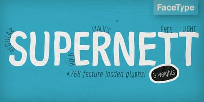 ›Hi! Please note you are visiting Old Supernett. We decided to upgrade it: more styles, more glyphs, more features, more everything! View New Supernett here: Supernett 2019› Georg from FaceType Supernett – a versatile hand drawn/handmade/handwritten font – is tailored for large font sizes but also impresses with an astounding legibility in small typesettings. Supernett is fairly condensed for space-saving headlines. The extensive character set supports Central and Eastern European as well as Western European languages. Each style contains more than 4700 glyphs to let the font look real hand-made. Three OpenType features are specially created to enhance this impression, with a maximum effect when applied to big type: Alternating Letters For a truly hand-drawn look, letters and numerics alternate randomly between three different variants → activate Contextual Alternates Rotating letters All glyphs rotate randomly and slightly around their own axis → activate OpenType Swashes Varying Baseline Shift Each single glyph moves individually up or down → activate OpenType Titling Alternates More OpenType Features: Case Sensitive Forms This feature shifts various punctuation marks to a position that works better with all caps typography → It is deployed when an app’s all-caps styling is applied Slashed Zero The problem with the numeral 0 is that it can look too much like O in some typefaces. This feature replaces every zero with a slashed zero → activate Zero with a Slash Fractions Substitutes figures separated by a slash by proper fraction glyphs. A date however, written like 10/12/2013 will remain unchanged → activate Fractions Stylistic Set 03 Choose between two different styles of bullet (•) → activate Stylistic Set 03 Stylistic Set 04 Choose between two different styles of Y → activate Stylistic Set 04 View other fonts from Georg Herold-Wildfellner: Sofa Serif | Sofa Sans | Mila Script Pro | Pinto | Supernett | Mr Moustache | Aeronaut | Ivory | Weingut
 - Ah, KG Seven Sixteen, a font that confidently saunters into the world of typography, tipping its hat with a cheeky grin. Crafted by the whimsical wand of Kimberly Geswein, it's as if this font was sp...
- **The Enigmatic Elegance of Xiparos Lombard: A Font Review by Yours Truly, the Artistic Oracle** In the grand parade of typographies where fonts like Arial and Helvetica march with their heads held...
- Ggx89 by Typodermic,
$11.95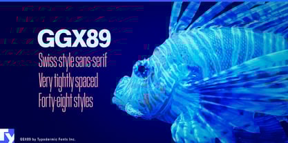 Introducing GGX89, the ultimate display typeface with a minimalist look that exudes Swiss-style sophistication. With its tight spacing and sleek lines, GGX89 is perfect for creating eye-catching headlines, logotypes, and titles that demand attention. Inspired by the iconic mid-20th-century sans-serif typefaces like Helvetica and Univers, GGX89 embodies the essence of Swiss graphic design, a style known for its simplicity, clarity, and precision. Its clean and straightforward design is sure to make any project look polished and professional. But GGX89 isn’t just all looks. It’s also incredibly versatile, making it a top choice for a wide range of design applications. Whether you’re creating marketing materials, advertising campaigns, or editorial designs, GGX89 has got you covered. And if you’re looking for a font that’s equally impressive for body text, look no further than GGX88. Together, these two typefaces offer a complete and cohesive design solution that will elevate your work to the next level. So why settle for anything less than the best? Choose GGX89 and GGX88 for your next design project and experience the timeless elegance of Swiss-style typography at its finest. Most Latin-based European, Vietnamese, Greek, and most Cyrillic-based writing systems are supported, including the following languages. Afaan Oromo, Afar, Afrikaans, Albanian, Alsatian, Aromanian, Aymara, Azerbaijani, Bashkir, Bashkir (Latin), Basque, Belarusian, Belarusian (Latin), Bemba, Bikol, Bosnian, Breton, Bulgarian, Buryat, Cape Verdean, Creole, Catalan, Cebuano, Chamorro, Chavacano, Chichewa, Crimean Tatar (Latin), Croatian, Czech, Danish, Dawan, Dholuo, Dungan, Dutch, English, Estonian, Faroese, Fijian, Filipino, Finnish, French, Frisian, Friulian, Gagauz (Latin), Galician, Ganda, Genoese, German, Gikuyu, Greenlandic, Guadeloupean Creole, Haitian Creole, Hawaiian, Hiligaynon, Hungarian, Icelandic, Igbo, Ilocano, Indonesian, Irish, Italian, Jamaican, Kaingang, Khalkha, Kalmyk, Kanuri, Kaqchikel, Karakalpak (Latin), Kashubian, Kazakh, Kikongo, Kinyarwanda, Kirundi, Komi-Permyak, Kurdish, Kurdish (Latin), Kyrgyz, Latvian, Lithuanian, Lombard, Low Saxon, Luxembourgish, Maasai, Macedonian, Makhuwa, Malay, Maltese, Māori, Moldovan, Montenegrin, Nahuatl, Ndebele, Neapolitan, Norwegian, Novial, Occitan, Ossetian, Ossetian (Latin), Papiamento, Piedmontese, Polish, Portuguese, Quechua, Rarotongan, Romanian, Romansh, Russian, Rusyn, Sami, Sango, Saramaccan, Sardinian, Scottish Gaelic, Serbian, Serbian (Latin), Shona, Sicilian, Silesian, Slovak, Slovenian, Somali, Sorbian, Sotho, Spanish, Swahili, Swazi, Swedish, Tagalog, Tahitian, Tajik, Tatar, Tetum, Tongan, Tshiluba, Tsonga, Tswana, Tumbuka, Turkish, Turkmen (Latin), Tuvaluan, Ukrainian, Uzbek, Uzbek (Latin), Venda, Venetian, Vepsian, Vietnamese, Võro, Walloon, Waray-Waray, Wayuu, Welsh, Wolof, Xavante, Xhosa, Yapese, Zapotec, Zarma, Zazaki, Zulu and Zuni.
 - Gravtrac by Typodermic,
$11.95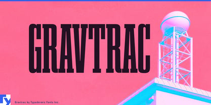 Gravtrac is a slab serif headliner designed to deliver solid punches while taking up as little horizontal space as possible. Inspiration comes from mid twentieth century classics: Univers 59 Ultra-Condensed, Helvetica Inserat and Compacta. It’s all about flat sides, a steady rhythm and tight, precision curves. The widest style of Gravtac is Condensed—compact, yet a comfortable read, available in 7 weights from Ultra-Light to Heavy. Gravtrac Compressed is probably the width where most typefaces would quit. It's narrow enough for most...but not for you. That’s why we have Gravtrac Crammed. It’s audaciously narrow—perfect for times where you want the reader to slow down and truly pay attention to the message. Gravtrac Crushed is devilishly slender. Try it with wide tracking for a stark, opulent look. All styles are also available in obliques varying from 7 to 10 degrees—58 styles in total. Gravtrac includes Opentype fractions, numeric ordinals, a breadth of currency symbols and old-style (lowercase) numerals. Every skilled designer already has slab serif typefaces in their stockpile but some of us have the need to squeeze. Most Latin-based European, Vietnamese, Greek, and most Cyrillic-based writing systems are supported, including the following languages. Afaan Oromo, Afar, Afrikaans, Albanian, Alsatian, Aromanian, Aymara, Azerbaijani, Bashkir, Bashkir (Latin), Basque, Belarusian, Belarusian (Latin), Bemba, Bikol, Bosnian, Breton, Bulgarian, Buryat, Cape Verdean, Creole, Catalan, Cebuano, Chamorro, Chavacano, Chichewa, Crimean Tatar (Latin), Croatian, Czech, Danish, Dawan, Dholuo, Dungan, Dutch, English, Estonian, Faroese, Fijian, Filipino, Finnish, French, Frisian, Friulian, Gagauz (Latin), Galician, Ganda, Genoese, German, Gikuyu, Greenlandic, Guadeloupean Creole, Haitian Creole, Hawaiian, Hiligaynon, Hungarian, Icelandic, Igbo, Ilocano, Indonesian, Irish, Italian, Jamaican, Kaingang, Khalkha, Kalmyk, Kanuri, Kaqchikel, Karakalpak (Latin), Kashubian, Kazakh, Kikongo, Kinyarwanda, Kirundi, Komi-Permyak, Kurdish, Kurdish (Latin), Kyrgyz, Latvian, Lithuanian, Lombard, Low Saxon, Luxembourgish, Maasai, Macedonian, Makhuwa, Malay, Maltese, Māori, Moldovan, Montenegrin, Nahuatl, Ndebele, Neapolitan, Norwegian, Novial, Occitan, Ossetian, Ossetian (Latin), Papiamento, Piedmontese, Polish, Portuguese, Quechua, Rarotongan, Romanian, Romansh, Russian, Rusyn, Sami, Sango, Saramaccan, Sardinian, Scottish Gaelic, Serbian, Serbian (Latin), Shona, Sicilian, Silesian, Slovak, Slovenian, Somali, Sorbian, Sotho, Spanish, Swahili, Swazi, Swedish, Tagalog, Tahitian, Tajik, Tatar, Tetum, Tongan, Tshiluba, Tsonga, Tswana, Tumbuka, Turkish, Turkmen (Latin), Tuvaluan, Ukrainian, Uzbek, Uzbek (Latin), Venda, Venetian, Vepsian, Vietnamese, Võro, Walloon, Waray-Waray, Wayuu, Welsh, Wolof, Xavante, Xhosa, Yapese, Zapotec, Zarma, Zazaki, Zulu and Zuni.
 - Hollgates by Mozatype,
$17.00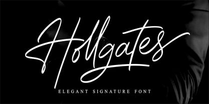 Proudly present our new font. It is named Hollgates - Elegant Signature Font. Hollgates is script handwritten style with a natural charm. This font which is a modern signature and unique style handmade comes with very beautiful character changes. To keep the maximum real hand-lettered effect, there were created 240 ligatures (you can see them among the presentation pictures). When creating the font, we should take into consideration that each letter should be able to be connected with other letters. For example, the letter "a" should be well connected as well as with "l" and "n" and with any other letters. This limits us: we have to start letter from exact one point and finish at exact second point. So here come ligatures. Hollgates font contains following ligatures: ab ad af ah ai ak al am an ao ap as at az az bh bl bk bt bx br cb cl ch ck cc cr cs ct co cx cz dd db dh dl dk dt dr ds dx dz eb ef eh ek el et ett er em en es ex ez ff fh fl fk fi fo fs ft fr fz fx gg gh gr gb gf gl gk gt go gs gz hf ho hs ht hz ib if ih ik il it itt ii in im ip is ir iz ix jo kl kk kh ko ks kr kt kx kz lo li ls lu lr lx ly lz mm mf mi mh ml mk mo mp ms mt mz mx nb ni nf nh nl nk no ns nr np nt nx nz ob of oh oi oj ok ol om on op os ot ott ou ox oz ph ppl pp ps pt pu pi pr po px pz rs rr st sh sl sk sb si sm sn so sp su sx sy sz oll all ell ill ull th tl tk ti ts tr to tu tx tz ty ub ul uh uk ul ut utt un um up us ux uz vh vl wh wl wo zz ee ll ff oo rr ss tt dd ff It’s the perfect fit for all luxury projects, such as wedding invitation, signatures, luxury logos, printed quotes, grettings cards, social media headers, product packaging and many more! It includes a full set of uppercase and lowercase letters, multilingual symbols, numerals, punctuation and ligatures. It is PUA encoded which means you can access all of the glyphs and swashes with ease! Fall in love with its incredibly versatile style and use it to create spectacular designs! Use this font for any crafting project that requires a personalized look! What’s Included : – Works on PC & Mac – Easy to use ( Installations ) – Easy Convert to webfont – Compabilty Windows, Apple, Linux, Cricut, Silhouette and Other cutting machines Thanks for downloading, and I hope you enjoy it!
 - Hand Print Stamp Rough by TypoGraphicDesign,
$29.00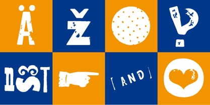 The typeface Hand Print Stamp Rough is designed in 2018 for the font foundry Typo Graphic Design by Manuel Viergutz. The rough hand-printed typeface based on old wood letters, rubber-stamps and plastic stamps. 7 font styles (Reg + Mix, Circle, Diamond, Square Star + Icons) each with 1350+ glyphs incl. 200+ decorative extras like icons, arrows, dingbats, emojis, symbols, geometric shapes, catchwords, decorative ligatures (type the word LOVE for ♥ or SMILE for ☻ as OpenType-Feature dlig) and stylistic alternates (9+ stylistic sets). For use in logos, magazines, posters, advertisement and packaging plus as webfont for decorative headlines. The font works best for display size. Character Set: Latin Extended (Adobe Latin 3). 1350+ glyphs with 200+ extra icons like arrows, dingbats, symbols, geomatric shapes, catchwords and many alternative letters. (9× A–Z, 9× a–z, 9× 0–9) For use in magazines, posters, headlines and advertisement, plus as webfont for decorative headlines. Have fun with this font & try-before-buy the DEMO-FONT (with reduced glyph-set) FOR FREE! ■ Font Name: Hand Print Stamp Rough ■ Font Weights: Regular + Mix, Circle, Diamond, Square, Star + Icons + DEMO (with reduced glyph-set) ■ Font Category: Sans Serif + Slab Serif Display for Headline Size ■ Font-Format: .otf (OpenType Font for Mac + Win) + .ttf (TrueType Font) ■ Glyph Set: 1350 glyphs ■ Language Support: 27+ for Latin Extended (Adobe Latin 3). Afrikaans, Albanian, Catalan, Croatian, Czech, Danish, Dutch, English, Estonian, Finnish, French, German, Hungarian, Icelandic, Italian, Latvian, Lithuanian, Norwegian, Polish, Portugese, Romanian, Slovak, Slovenian, Spanisch, Swedish, Turkish, Zulu ■ Specials: 200+ decorative extras like icons for arrows, dingbats, emojis, symbols, geometric shapes, catchwords + German Capital Eszett. Open Type Features: Kerning (kern), Stylistic Set 1 (ss01) … Stylistic Set 16 (ss16), Localized Forms (locl), Superscript (sups), Ordinals (ordn), Slashed Zero (zero), Fractions (frac), Standard Ligatures (liga), Contextual Alternates (calt) e. g. Stylistic Set-Loop and Decorative Ligatures (dlig) e. g. type the word “LOVE” for ❤ or “SMILE” for ☺ ■ Design Date: 2018 ■ Type Designer: Manuel Viergutz
 - Letta Rillok Cyrillic by Ira Dvilyuk,
$19.00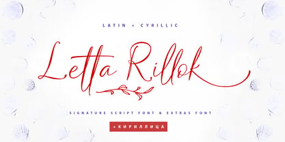 The Letta Rillok Cyrillic font is a handwritten calligraphic signature script font paired with additional symbols font with extras. It is the font pair with will be the best option for branding, logos, wedding invitations, social media, packaging, business cards, DIY projects, social media, and many others. Letta Rillok Symbols is the font with 62 lovely hand-drawn flourishes and illustrations. Letta Rillok script Latin part contains a full set of uppercase letters and 3 full sets of lowercase letters, (standard, initial, and final forms with flourishes or teils. To make a needed form type a letter with a number such as a1, b1, c1...after that select the word and apply the Open Type Features in programs such as Adobe Illustrator, Photoshop, and others) And 53 ligatures can be used to create a handwritten calligraphy look. The Cyrillic part of the font contains uppercase letters and 3 complete sets of lowercase letters, (standard, initial, and final form. To make a needed form type a letter with a number such as a1, б1 в1... After that select the word and apply the Open Type Features in programmes such as Adobe Illustrator, Photoshop, and others) Letta Rillok Symbols is a font with over 36 hand-drawn elements, floral illustrations, and swashes and can help to make your design unique and matchless. Combine and merge swashes and illustrations to create your own designs and make borders, frames, dividers, logos, and more (just use A-Z or a-z and 0-9 keys in the included Letta Rillok Symbols font). A different symbol is assigned to each uppercase or lowercase standard character, so you do not need graphics software, just type the letter you need. Multilingual Support for 33 languages: Latin glyphs for Afrikaans, Albanian, Basque, Bosnian, Catalan, Danish, Dutch, English, Estonian, Faroese, Filipino, Finnish, French, Galician, Indonesian, Irish, Italian, Malay, Norwegian Bokmål, Portuguese, Slovenian, Spanish, Swahili, Swedish, Turkish, Welsh, Zulu. And Cyrillic glyphs support Russian, Belorussian, Bulgarian, Ukrainian, and Kazakh languages.
 - World Pressure by Haksen,
$14.00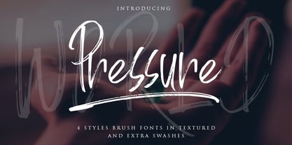 Introducing: World Pressure A rustic, dapper handwritten font with a personal charm. With quick dry strokes and a signature style, World Pressure is perfect for branding projects, homeware designs, product packaging - or simply as a stylish text overlay to any background image. World Pressure includes 4 font styles and additional swashes: World Pressure Regular handwritten script font containing upper & lowercase characters, numerals and a large range of punctuation. World Pressure Alternate This is a second version of World Pressure, with a completely new set of both lower and uppercase characters. If you wanted to avoid letters looking the same each time to recreate a custom-made style, or try a different word shape, simply switch to this font for an additional layout option. World Pressure Slant This is a third version of World Pressure, with a completely new set of both lower and uppercase characters in slant version. If you wanted to avoid letters looking the same each time to recreate a custom-made style, or try a different word shape, simply switch to this font for an additional layout option. World Pressure Alternate This is a forth version of World Pressure, with a completely new set of both lower and uppercase characters in slant version. If you wanted to avoid letters looking the same each time to recreate a custom-made style, or try a different word shape, simply switch to this font for an additional layout option. World Pressure Swashes A set of 26 hand-drawn swashes, the perfect finishing touch to underline your Northwell text. Simply install this as a separate font, select it from your font menu and type any A-Z Uppercase and Lowercase also Number 0-9 character to create a swash. Fonts are provided in OTF formats. Fonts include multilingual support. Ligatures are also available for several lowercase characters (double-letters which flow more naturally). These are only accessible via software with opentype capability or a glyphs panel, e.g. Photoshop/Illustrator.
 - Miss Katherine Cyrillic by Ira Dvilyuk,
$21.00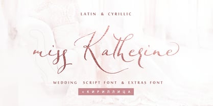 Wedding calligraphic script font Miss Katherine Cyrillic is the best option for your wedding stationery, invitation designs, social media, branding, logo designs, product packaging and other projects. Miss Katherine Cyrillic is an elegant, graceful handwritten script font, as well as a Miss Katherine Symbols font with 36 lovely hand-drawn flourishes and illustrations. Miss Katherine script font contains the Cyrillic glyphs too. Miss Katherine script Latin part contains a full set of uppercase letters and 4 full sets of lowercase letters, (standard, alternative, initial and final forms). To make a needed form just type a letter with a number such as a1, b1, c1...after that selecting the word and apply the Open Type Features in programmes such as Adobe Illustrator, Photoshop, and others) And 36 ligatures - which can be used to create a handwritten look. The Cyrillic part of the font contains the uppercase letters and 3 full sets of lowercase letters, (standard, initial and final form. To make a needed form just type a letter with a number such as a1, б1 в1... After that select the word and apply the Open Type Features in programmes such as Adobe Illustrator, Photoshop, and others) Miss Katherine Symbols is a font with over 36 hand-drawn elements, flourishes catchwords, and swashes and can help to make your design unique and matchless. Combine and merge swashes and illustrations to create your own designs and make borders, frames, dividers, logos, and more (just use A-Z or a-z and 0-9 keys in the included Miss Katherine Symbols font). A different symbol is assigned to each uppercase or lowercase standard character, so you do not need graphics software, just type the letter you need. Language Support for 31 languages: Latin glyphs for Afrikaans, Albanian, Basque, Bosnian, Catalan, Danish, Dutch, English, Estonian, Faroese, Filipino, Finnish, French, Galician, Indonesian, Irish, Italian, Malay, Norwegian Bokmål, Portuguese, Slovenian, Spanish, Swahili, Swedish, Turkish, Welsh, Zulu. And Cyrillic glyphs support for Russian, Belorussian, Bulgarian, Kazakh and Ukrainian languages. Works perfectly on the Canva platform. For Cricut & Silhouette recommended.
 - Buongiorno Rastellino Cyrl by Ira Dvilyuk,
$20.00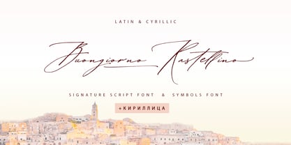 The enchanting sweepy of fast handwriting of script font Buongiorno Rastellino will be the perfect complement for all your projects. The font pair Buongiorno Rastellino Cyrillic is the best option for branding, logos, social media, packaging, business cards, DIY projects, social media, and many others. Buongiorno Rastellino Symbols is the font with 62 lovely hand-drawn flourishes and illustrations. Buongiorno Rastellino Cyrillic script font contains the Cyrillic glyphs too. Buongiorno Rastellino script Latin part contains a full set of uppercase letters and 3 full sets of lowercase letters, (standard, initial and final forms with flourishes or teils. To make a needed form just type a letter with a number such as a1, b1, c1...after that selecting the word and apply the Open Type Features in programs such as Adobe Illustrator, Photoshop, and others) And 43 ligatures - which can be used to create a handwritten calligraphy look. The Cyrillic part of the font contains the uppercase letters and 3 full sets of lowercase letters, (standard, initial and final form. To make a needed form just type a letter with a number such as a1, б1 в1... After that select the word and apply the Open Type Features in programmes such as Adobe Illustrator, Photoshop, and others) Buongiorno Rastellino Symbols is a font with over 36 hand-drawn elements, floral illustrations, and swashes and can help to make your design unique and matchless. Combine and merge swashes and illustrations to create your own designs and make borders, frames, dividers, logos, and more (just use A-Z or a-z and 0-9 keys in the included Buongiorno Rastellino Symbols font). A different symbol is assigned to each uppercase or lowercase standard character, so you do not need graphics software, just type the letter you need. Multilingual Support for 32 languages: Latin glyphs for Afrikaans, Albanian, Basque, Bosnian, Catalan, Danish, Dutch, English, Estonian, Faroese, Filipino, Finnish, French, Galician, Indonesian, Irish, Italian, Malay, Norwegian Bokmål, Portuguese, Slovenian, Spanish, Swahili, Swedish, Turkish, Welsh, Zulu. And Cyrillic glyphs support Russian, Belorussian, Bulgarian, Ukrainian, and Kazakh languages.
 - Cornhusker Rough by Section Type,
$22.00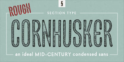 Well lookee here: an authentically distressed "rough" version of our best-selling Cornhusker font! Standing tall as an Illinois cornfield in September, Cornhusker Rough is a faux-printed, condensed sans designed by a champion cornhusker. Inspired by 1940s Midwestern signage, it's warm & inky characters are perfectly at home in logos, beverage bottles and food packaging, restaurant menus, travel advertisements, websites, stationery, handmade product packaging and so much more. If you're looking for a hand-crafted typeface with punch (who can fit into tight spaces!) then Cornhusker Rough is the font for you. This inspired revival excels in both retro & modern designs. Cornhusker Rough includes capital letters, small caps, and alternate cuts (with diacritics) of A, E, F, J, X, Y, ᴀ, ᴇ, ғ, ᴊ, x, ʏ, 0, 1, 2, 3, 4, 5, 7 and a sharp German double s in both cap and smallcap. Please note: Cornhusker Rough features a highly detailed, realistic inkplate texture. This font may render slowly in some applications. This font is not affiliated with or endorsed by the University of Nebraska. WHAT'S INCLUDED Cornhusker Regular includes an installable digital Opentype Font file in a single weight. This file contains a basic Latin character set with a full set of uppercase and small caps, multilingual diacritics, numbers, international currency figures, punctuation and pagination symbols. The font also includes alternate cuts for select uppercase and smallcap letters (located in stylistic sets). It is compatible with Adobe CS and CC, Microsoft Word and other type editing apps. SUPPORTED LANGUAGES Afrikaans, Alsatian, Basque, Bislama, Breton, Catalan, Chamorro, Danish, Dutch, English, Faroese, Finnish, Flemish, Franco-Provencal, French, Frisian, Friulian, Galician, German, Greenlandic, Icelandic, Indonesian, Irish, Italian, Ladin, Latin, Luxembourgish, Malay, Manx Gaelic, Northern Sotho, Norwegian (Bokmål), Norwegian (Nynorsk), Occitan, Portuguese, Rhaeto-Romance, Romansh, Sami (Inari), Sami (Lule), Sami (Northern), Sami (Skolt), Sami (Southern), Scottish Gaelic, Spanish, Swahili, Swedish, Tagalog, Walloon and Welsh.
 - Bright Gabbemy Cyr Gr by Ira Dvilyuk,
$20.00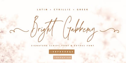 The Bright Gabbemy Cyrillic Greek is handwritten monoline signature script font and additional symbols font with extras. It is the font pair with will be the best option for branding, logos, wedding invitations, social media, packaging, business cards, DIY projects, social media, and many others. Bright Gabbemy Symbols is the font with 36 lovely hand-drawn flourishes and illustrations. Bright Gabbemy Cyrillic script font contains the Cyrillic and Greek glyphs too. Bright Gabbemy script Latin part contains a full set of uppercase letters and 2 full sets of lowercase letters, (standard, and final forms with flourishes or teils. To make a needed form just type a letter with a number such as a1, b1, c1...after that select the word and apply the Open Type Features in programs such as Adobe Illustrator, Photoshop, and others) And 53 ligatures - which can be used to create a handwritten calligraphy look. The Cyrillic part of the font contains uppercase letters and 2 full sets of lowercase letters, (standard, initial and final form. To make a needed form just type a letter with a number such as a1, б1 в1... After that select the word and apply the Open Type Features in programmes such as Adobe Illustrator, Photoshop, and others) Bright Gabbemy Symbols is a font with over 36 hand-drawn elements, floral illustrations, and swashes and can help to make your design unique and matchless. Combine and merge swashes and illustrations to create your own designs and make borders, frames, dividers, logos, and more (just use A-Z or a-z and 0-9 keys in the included Bright Gabbemy Symbols font). A different symbol is assigned to each uppercase or lowercase standard character, so you do not need graphics software, just type the letter you need. Multilingual Support for 33 languages: Latin glyphs for Afrikaans, Albanian, Basque, Bosnian, Catalan, Danish, Dutch, English, Estonian, Faroese, Filipino, Finnish, French, Galician, Greek, Indonesian, Irish, Italian, Malay, Norwegian Bokmål, Portuguese, Slovenian, Spanish, Swahili, Swedish, Turkish, Welsh, Zulu. And Cyrillic glyphs support Russian, Belorussian, Bulgarian, Ukrainian, and Kazakh languages.
 - Oxford Street by K-Type,
$20.00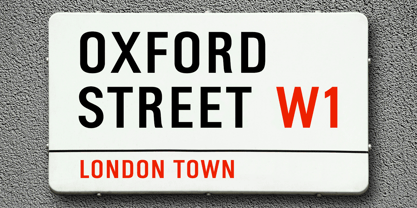 Oxford Street is a signage font that began as a redrawing of the capital letters used for street nameplates in the borough of Westminster in Central London. The nameplates were designed in 1967 by the Design Research Unit using custom lettering based on Adrian Frutiger’s Univers typeface, a curious combination of Univers 69 Bold Ultra Condensed, a weight that doesn’t seem to exist but which would flatten the long curves of glyphs such as O, C and D, and Universe 67 Bold Condensed with its more rounded lobes on glyphs like B, P and R. Letters were then remodelled to improve their use on street signs. Thin strokes like the inner diagonals of M and N were thickened to create a more monolinear alphabet; the high interior apexes were lowered and the wide joins thinned. The crossbar of the A was lowered, the K was made double junction, and the tail of the Q was given a baseline curve. K-Type Oxford Street continues the process of impertinent improvement and includes myriad minor adjustments and several more conspicuous amendments. The stroke junctions of M and N are further narrowed and their interior apexes modified. The middle apex of the W is narrowed and the glyph is a little more condensed. The C and S are drawn more open, terminals slightly shortened. The K-Type font adds a new lowercase which is also made more monolinear so better suited to signage, loosely based on Univers but also taking inspiration from the Transport typeface both in a taller x-height and character formation. The lowercase L has a curled foot, the k is double junctioned to match the uppercase, and terminals of a, c, e, g and s are drawn shorter for openness and clarity. A full repertoire of Latin Extended-A characters features low-rise diacritics that keep congestion to a minimum in multiple lines of text. The font tips the hat to signage history by including stylistic alternates for M, W and w that have the pointed middles of the earlier MOT street sign typeface. Incidentally, Alistair Hall (‘London Street Signs’, Batsford, 2020) notes that when the manufacturer of signs was changed in 2007, Helvetica Bold Condensed was substituted in place of the custom design, “an unfortunate case of an off-the-peg suit replacing a tailored one” and a blunder that has happily since been rectified, though offending nameplates can still be spotted by discerning font fans.
 - Albert Einstein by Harald Geisler,
$29.00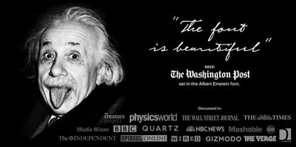 Harald Geisler wants to make you as brilliant as Albert Einstein. Or at least let you write like him. Or at least write in his handwriting. — The Wall Street Journal Imagine you could write like Albert Einstein. The Albert Einstein font enables you to do exactly that. In an joined effort, creators Harald Geisler and Elizabeth Waterhouse, spend over 7 years on finalising the project. It was made possible with the help of the Albert Einstein Archive, the Albert Einstein Estate, and funding by a successful Kickstarter Campaign of 2, 334 backers. The outcome was worth the effort: a font unprecedented in aesthetic technique and a benchmark for handwriting fonts. To create a result that is true to the original, Harald Geisler developed a method to analyse the movement of the famous writer. Letter by letter, every glyph was digitally re-written to create a seamlessly working font. It is the only font that holds 5 variations for each lowercase and uppercase-letter, number, and punctuation sign. Each based on meticulous detail to the original samples of Albert Einstein’s handwriting. The OpenType contextual alternates feature dynamically arranges the letters automatically as you type to ensure that no repeated letter forms are placed next to each other. Stylistic variants can also be accessed through stylistic sets. The font has 10 fine-tuned weights ranging from extra-light to fine and extra bold to heavy. The result is a vivid handwritten text true to the original. A PDF documentation, showing step by step how the font was made and comparing numerous original samples, is included with the font and can be downloaded here. The work has been recognised internationally, by press, Einstein fans, and designers. Some quotes used in images: “The font is beautiful“ — Washington Post “If you could write like Einstein, would it help you to think like Einstein?” — The Times (London) “Finally, if your colleagues aren’t taking you seriously, then perhaps you could start sending e-mails in a new font that mimics the handwriting of Albert Einstein.” — Physics World “Geisler and Waterhouse are really asking deeper questions about the diminishing (or evolving) role of our flawed, variable penmanship as a conduit of thought in today’s pixel-perfect landscape.” — QUARTZ “Your writing will look imaginative — which is exactly what Einstein would've wanted." — Huffington Post Arts & Culture "Forget Myriad Pro, Helvetica or Futura. The only font you’ll ever need" — Gizmodo “Capture a piece of Einstein's genius in your own writing." — Mashable
 - Air Superfamily by Positype,
$29.00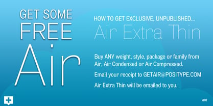 In B-movie awesomeness, Air began as Grotesk vs. Grotesque. I was trying to unify the prevailing traits of German and English Grotes(que/k)s in order to make something different but familiar. I am NOT trying to reinvent Helvetica (snore), so get that out of your system. From the onset, I intended this typeface to be a true workhorse that offers infinite options and flexibility for the user. At its core, it is the maturation of the Aaux Next skeleton I developed years ago. I worked out Aaux Next to settle my issues and love for Akzidenz. With Aaux Next, I strove to be mechanical, cold and unforgiving with it. I was single, young, cocky and it fit. Now I'm married, kids, dog and have found that I've turned into a big softy. When I look at Aaux Next (and have for the past few years) I see another typeface trying to eek out. I wanted it to avoid the trappings of robotic sans, quick tricks and compromises. The typeface’s DNA needed to be drawn and not just generated on a screen — so I set aside a year. I love type. I love working with type. I hate when my options for a slanted complement is only oblique or italic. I set out to produce both to balance usage — there are more than enough reasons to prepare both and I want the user to feel free to consciously choose (and have the option to choose) the appropriate typeface for print, web, etc. That flexibility was central to my decision-making process. The Oblique is immediate and aggressive. The Italic was redrawn at a less severe angle with far more movement and, as a result, is far more congenial when paired with the Uprights. Condensed and Compressed. Yep, why not? I know I would use them. There are nine weights currently available. The logical progression of weights and the intended flexibility demanded I explore a number of light weights and their potential uses — this has produced a number of ‘light without being too light’ options that really work based on the size. The result is a robust 81-font superfamily that is functional, professional, and highly legible without compromising its personality. Pair that with over 900 characters per font that includes ligatures, discretionary ligatures, stylistic alternates, fractions, proportional/tabular lining and proportional/tabular oldstyle figures, numerators, denominators, ordinals, superiors, inferiors, small caps, case-sensitive functionality and extensive language support and you have a versatile superfamily well-suited for any project.
 - Czykago Rough by TypoGraphicDesign,
$19.00 From 2019 back to the 90s … The typeface “Czykago Rough” by Alexander Branczyk and Manuel Viergutz is a re-issue of the font “Czykago” published in 1995 by the font label “Face2Face”. Designed as a re-release for the Font Foundry “Typo Graphic Design” in 2019. The rough sans serif display font is inspired by the 80s and 90s. Glyhph-Set: Latin Extended (Adobe Latin 3). 907 glyphs with 3× A–Z & a–z and 350+ decorative extras like icons, arrows, dingbats, emojis, symbols, sign of the zodiac, geometric shapes, catchwords, decorative ligatures (type the word #LOVE for ❤ or #SMILE for ☺ as OpenType-Feature dlig) and stylistic alternates (4× stylistic sets). For use in logos, magazines, posters, advertisement plus as webfont for decorative headlines. The font works best for display size. Have fun with this font & use the DEMO-FONT (with reduced glyph-set) FOR FREE! ■ Font Name: Czykago Rough ■ Font Weights: Cond + Stretch + Mix + CondBG + Icons + DEMO (with reduced glyph-set) ■ Font Category: Display for headline size ■ Font Format: .otf (OpenType Font for Mac + Win) + .ttf (TrueType Font) ■ Glyph Set: 907 glyphs with 350+ decorative extras like icons ■ Language Support: 80+ for Latin Extended (Adobe Latin 3). Afrikaans, Albanisch, Baskisch, Bemba, Bena, Bosnisch, Dänisch, Deutsch, Englisch, Estnisch, Färöisch, Filipino, Finnisch, Französisch, Friulisch, Galizisch, Gusii, Indonesisch, Irisch, Isländisch, Italienisch, Kabuverdianu, Kalenjin, Katalanisch, Kinyarwanda, Kölsch, Kornisch, Kroatisch, Lettisch, Litauisch, Luhya, Luo-Sprache, Luxemburgisch, Machame, Madagassisch, Makhuwa-Meetto, Makonde, Malaiisch, Manx, Morisyen, Niederländisch, Niedersorbisch, Nord-Ndebele, Norwegisch Bokmål, Norwegisch Nynorsk, Nyankole, Obersorbisch, Oromo, Pare, Polnisch, Portugiesisch, Rätoromanisch, Rombo, Rukiga, Rumänisch, Rundi, Rwa, Samburu, Sango, Sangu, Schottisches Gälisch, Schwedisch, Schweizerdeutsch, Sena, Shambala, Shona, Slowakisch, Slowenisch, Soga, Somali, Spanisch, Suaheli, Taita, Teso, Tschechisch, Türkisch, Turkmenisch, Ungarisch, Vunjo, Zulu ■ Specials: Alternative letters, stylistic sets, automatic contextual alternates via OpenType Feature (3× different versions of A–Z & 0–9 + a–z), Euro, kerning pairs, standard & decorative ligatures, Versal Eszett (German Capital Sharp S), 350+ extras like Dingbats & Symbols, arrows, hearts, emojis/smileys, stars, further numbers, lines & geometric shapes ■ Design Date: 1995–2019 ■ Type Designer: Alexander Branczyk and Manuel Viergutz
 - West Byanetta Cyrillic by Ira Dvilyuk,
$20.00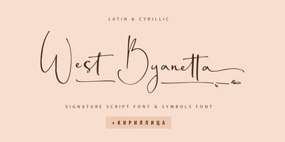 I'm happy to present to you luxurious handwritten script font West Byanetta Cyrillic. It's the best option for your branding, logo designs, invitation designs wedding stationery, social media, product packaging and other projects that require an elegant touch. West Byanetta Cyrillic is an elegant, graceful handwritten script font, as well as a West Byanetta Symbols font with 36 lovely hand-drawn flourishes and illustrations. West Byanetta script font contains the Cyrillic glyphs too. West Byanetta script Latin part contains a full set of uppercase letters and 3 full sets of lowercase letters, (standard, initial and final forms). To make a needed form just type a letter with a number such as a1, b1, c1...after that selecting the word and apply the Open Type Features in programmes such as Adobe Illustrator, Photoshop, and others) And 40 ligatures - which can be used to create a handwritten look. The Cyrillic part of the font contains the uppercase letters and 3 full sets of lowercase letters, (standard, initial and final form. To make a needed form just type a letter with a number such as a1, б1 в1... After that select the word and apply the Open Type Features in programmes such as Adobe Illustrator, Photoshop, and others) Also Cyrillic part of the font contains 31 handwritten Cyrillic ligatures. West Byanetta Symbols is a font with over 36 hand-drawn elements, floral illustrations, and swashes and can help to make your design unique and matchless. Combine and merge swashes and illustrations to create your own designs and make borders, frames, dividers, logos, and more (just use A-Z or a-z and 0-9 keys in the included West Byanetta Symbols font). A different symbol is assigned to each uppercase or lowercase standard character, so you do not need graphics software, just type the letter you need. Language Support for 32 languages: Latin glyphs for Afrikaans, Albanian, Basque, Bosnian, Catalan, Danish, Dutch, English, Estonian, Faroese, Filipino, Finnish, French, Galician, Indonesian, Irish, Italian, Malay, Norwegian Bokmål, Portuguese, Slovenian, Spanish, Swahili, Swedish, Turkish, Welsh, Zulu. And Cyrillic glyphs support for Russian, Belorussian, Bulgarian, Ukrainian and Kazakh languages. Works perfectly on the Canva platform. For Cricut & Silhouette recommended.
 - Shelf Tags JNL by Jeff Levine,
$29.00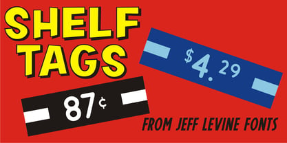 Before the mid-to-late 1970s, when retailers started to embrace UPC (universal price code) technology on a grand scale, pricing merchandise took on many forms. One method especially popular with variety stores (such as Woolworth's, McCrory's, Kress, etc.) were pre-printed price tags that came in small pads and were inserted into metal holders. Shelf Tags JNL recreates a vintage price tag based on examples seen online, and allows the user different ways to create their own vintage-style price tags. You can either utilize the round pen nib style numbers and price marks to place on any size or type tag, or type out prices using the reversed characters (white on black) along with the two end caps provided to form a complete tag unit. For the more adventurous, a complete blank tag is also provided in case the desire is to print a solid color tag background and [using the regular numbers] crate prices in custom colors. Two sets of smaller number (for "floating" cents prices) are also provided in regular numbers and reverse panels. As an extra bonus, there is a set of 1 through zero, dollar sign, cents sign and decimal point individual black-on-white outlined panels for making individual pricing numbers. The keyboard layout for the various characters is as follows: asterisk key - regular cents sign (no panel) dollar sign key - regular dollar sign (no panel) period key - regular decimal point (no panel) left and right parenthesis keys - panel end caps (to form price tags) colon key - reverse decimal point on black panel 1 thru 0 keys - regular numbers (no panels) A through J keys - small regular numbers (no panels) K and L keys - truncated [shorter width] end caps M through Y keys - individual price numbers (black on white with black border a through j keys - reverse numbers on black panels k key - reverse dollar sign on black panel l key - reverse cents sign on black panel m through v keys - reverse small numbers on black panels w through z keys - blank rectangular panels of varying widths equal sign key - full black panel price tag hyphen key - blank rectangular black panel based on the width of most number panels
 - Neuzeit Office Soft Rounded by Linotype,
$29.99 Every year, more and more text is read directly on a computer screen in office applications, or from freshly printed sheets from a copier or laser printer. Clear, legible text faces are more imperative to office communication than ever before. Yet every worker desires a small bit of personality in the corporate world. Most office environments are only equipped with a few basic fonts that are truly optimized for use in text, with laser printers, and on screen. The Linotype Office Alliance fonts guarantee data clarity. All of the font weights within the individual family have the same character measurements; individual letters or words may have their styles changed without line wrap being affected! All numbers, mathematical signs, and currency symbols are tabular; they share the same set character width, ensuring that nothing stands in the way of clear graph, chart, and table design. In addition to being extremely open and legible, the characters in this collection's fonts also share the same capital letter height and the same x-height. The production and reading of financial reports is duly streamlined with the Linotype Office Alliance fonts. The Neuzeit Office family is designed after the model of the original sans serif family Neuzeit S, which was produced by D. Stempel AG and the Linotype Design Studio in 1966. Neuzeit S itself was a redesign of D. Stempel AG's DIN Neuzeit, created by Wilhelm Pischner between 1928 and 1939. Intended to represent its own time, DIN Neuzeit must have struck a harmonious chord. DIN Neuzeit is a constructed, geometric sans serif. It was born during the 1920s, a time of design experimentation and standardization, whose ethos has been made famous by the Bauhaus and De Stijl movements in art, architecture, and design. Upon its redesign as Neuzeit S in the 1960s, other developments in sans serif letter design were taken into account. Neuzeit S looks less geometric, and more gothic, or industrial. Separating it from typefaces like Futura, it has a double-storey a, instead of a less legible, single-storey variant. Unlike more popular grotesque sans serifs like Helvetica, Neuzeit S and especially the redesigned Neuzeit Office contain more open, legible letterforms. Neuzeit Office preserves the characteristic number forms that have been associated with its design for years. After four decades, Neuzeit has been retooled once again, and it is more a child of its age than ever before. Akira Kobayashi, Linotype's Type Director, created the revised and updated Neuzeit Office in 2006. His greatest change was to retool the design to make its performance in text far more optimal. Additionally, he created companion oblique to help emphasize text. The other three families in the Office Alliance system include Metro Office, Times Europa Office and Trump Mediaeval Office.Some weights of the Neuzeit Office are availabla as soft rounded versions. "