10,000 search results
(0.043 seconds)
- Wilberty by Timurtype,
$14.00 Introduced by Timurtype Studio! Wilberty is a Handbrushed Signature Script Font This font embrace the artistry of handwritten elegance with our handbrushed signature script font, where every stroke tells a story of timeless sophistication and personal style. Redefine your brand with a touch of bespoke authenticity Wilberty font is perfect for product packaging, branding project, megazine, social media, wedding, or just used to express words above the background. Wilberty Font also supports multilingualism. Enhance your designs with our original fonts, feel free to comment or provide feedback, Enjoy the fonts 😊 Thank You
 - Mondera by Twinletter,
$17.00 Introducing MONDERA, our newest san serif font. We created this font by paying close attention to the harmony between each letter, resulting in a lovely blend of words when viewed or read. If you use this font for all of your projects, both official and informal, everything will look the same. of course, your various design projects will be perfect and extraordinary if you use this font because this font is equipped with a font family, both for titles and subtitles and sentence text, start using our fonts for your extraordinary projects.
 - Puntodewa by Twinletter,
$12.00 Puntodewa Sans serif font. The font design is influenced by the Serif family-style and geometric shapes, which makes it easy for us to create compositions in designs that are modern and unique. This font is our best effort to make your project nice and special, and hope you enjoy it. of course, your various design projects will be perfect and extraordinary if you use this font because this font is equipped with a font family, both for titles and subtitles and sentence text, start using our fonts for your extraordinary projects.
 - Mirava by Din Studio,
$25.00 Hi, Everyone! Ready to make your branding spark? If you need to create a big, bold logo for your business, work on a poster for an event, or whatever your project may be-then this is the perfect font for you. Mirava Sans-A Sans Serif Font Family If we can give you many options then why not? Mirava San is a package that will delight you. With this family you will get many options to maximize your designs with stylish fonts. This font designed to bring your branding to life and add a touch of modernity, fun and style. Mirava paves the way for you to write the information you need to send out to your audience. Perfect to create amazing headings, logos, menus, social media graphics, and many more. Our font always includes Multilingual Support to make your branding reach a global audience. Features: Multilingual Support PUA Encoded Numerals and Punctuation Thank you for downloading premium fonts from Din Studio
 - OKASA by Twinletter,
$15.00 Okasa, our newest typeface, is now available. We present to you a quirky and contemporary typeface, which you can use to produce an optimal visual display in each of your projects and to impress all of your audience with the unique look of your project. Because everyone does not necessarily understand Japanese letters, we supply fonts with letters that can be utilized for your project. We produced this display font with a Japanese theme or an Asian font, which we designed to fulfill the needs of your Japanese-themed project. Of sure, your initiative will be understood by people all around the world. Logotypes, food banners, branding, brochure, posters, movie titles, book titles, quotes, and more may all benefit from this font. Of course, using this font in your various design projects will make them excellent and outstanding; many viewers are drawn to the striking and unusual graphic display. Start utilizing this typeface in your projects to make them stand out. Caps only fonts
 - Patsy PB by Pink Broccoli,
$14.00 Patsy is a quirky sans-serif font inspired by the titling sequence from the 1964 film, "The Patsy", starring Jerry Lewis. Heavyweight, yet fun and full of personality, it was a lettering styles that was so much fun to flesh out and make into a typeface. I've opened up the letter spacing lightly from the original film poster design for better readability at a range of sizes. With an alternating all-caps character set, and offbeat letter weighting, Patsy is fun to typeset with as the font auto-switches between Capitals and Lowercase (alternate capitals) no matter if you type all caps or all lowercase.
 - Pucky by Just My Type,
$25.00 When teaching font-making at the Art Institute of Tucson, I give my students plenty of lab time to come up with design ideas. I designed Pucky while one class created their fonts. It came about through an idea for a capital A: sort of a triangle with two round sides and a crossbar formed by a circle falling out. (You can see it here.) In drawing that, I hit upon the idea of making the tops of the alphabet sharp and square and the bottoms rounded. (See the whole alphabet here.) Pucky suggests both circus and psychedelia. Hmmmm, does anybody have an “in” at Cirque du Soleil?
 - Fortune Square by Letterhend,
$12.00 Fortune Square is street display font which is made by a natural hand writing. The bold stroke make this font looks stands out, very suitable to be applied especially for logo, title, headline, slogan / tagline and the other various formal forms such as invitations, labels, logos, magazines, books, greeting / wedding cards, packaging, fashion, make up, stationery, novels, labels or any type of advertising purpose. Features : Uppercase & lowercase Numbers and punctuation Alternates & Ligatures Multilingual PUA encoded We highly recommend using a program that supports OpenType features and Glyphs panels like many of Adobe apps and Corel Draw, so you can see and access all Glyph variations.
 - Linkgray by Letterhend,
$19.00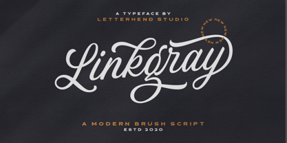 Please welcome our newest script font, Linkgray Script, a beautiful typeface with unique alternates and swashes. This font is perfect to be applied especially in logos and other various formal forms such as invitations, labels, logos, magazines, books, greeting/wedding cards, packaging, fashion, make up, stationery, novels, labels or any type of advertising purpose. Features : uppercase & lowercase numbers and punctuation multilingual ligatures alternates swashes PUA encoded We highly recommend using a program that supports OpenType features and Glyphs panels like many of Adobe apps and Corel Draw, so you can see and access all Glyph variations. Email us to letterhend@gmail.com if you need something! Happy Designing!
 - Samarquand by BluHead Studio,
$29.00 Samarquand is a handwritten script design from Roy Preston. Based on the handwriting of a friend, Roy has expanded this friendly, semi-connecting script to include three weights, Light, Regular and Bold, opening up even more design possibilities. The Samarquand fonts support an extended character set, as well as some ligatures, inferior and superior numbers, and unlimited fractions. There are some really nice letterforms in these fonts, particularly that uppercase W! Peruse the posters to see. I'm kind of partial to the Light weight, which is really quite elegant in use, but that Bold can really make a strong statement! Samarquand. Check it out for yourself.
 - Moonie Eyes by IKIIKOWRK,
$19.00 Proudly present Moonie Eyes - Graffiti Type, created by ikiiko. Moonie Eyes is a handwritten font with spontaneous curves inspired by street art markings. The letters bubble and pile up on each other to become strong characters in this graffiti letters. You can play with separate characters or overlapping each other. This type is very suitable for making a streetwear brand, poster or magazine layout, fashion design, quotes, or simply as a stylish text overlay to any background image. What's Included? Uppercase & Lowercase Numbers & Punctuation Multilingual Support Works on PC & Mac Enjoy our font and if you have any questions, you can contact us by email : ikiikowrk@gmail.com
 - Hyperdrive by Comicraft,
$19.00 If you're about to make the jump into hyperspace, buckle up and engage your R2 unit with our new font release, HYPERDRIVE! Ten years in the making, we've spent almost as much time developing these characters as George Lucas spent developing his! Co-created by Starkings & Roshell (HYPERDRIVE, not George), this font is guaranteed to keep TIE fighters off your tail and will always come in useful if you get menaced by phantoms or attacked by clones. So sit back, relax and enjoy the flight -- but don't forget; let the Wookiee win! Remastered Hyperdrive includes new letter shapes, 200+ connecting letter combos, improved spacing & kerning and support for Western & Central Europe.
 - Kristabelle by Letterara,
$12.00 Kristabelle is a handwritten script with a modern and sensible style. This font is ideal for weddings and other romantic invitations. Kristabelle works both on Mac & PC and is easy to install. It contains ligatures and multi-lingual support (ä ö ü Ä Ö Ü ß ¿ ¡). To access the alternate glyphs, you need a program that supports OpenType features such as Adobe Illustrator CS, Adobe Photoshop CC, Adobe Indesign, and CorelDraw. More information about how to access alternate glyphs, check out this link (http://goo.gl/ZT7PqK) To stay up to date of my latest fonts, follow me and let be friends because there will be many promos.
 - Galix Mono by Eclectotype,
$25.00 This monospaced version of Galix was commissioned in 2037 by the space exploration company Earth2, as part of a major overhaul of their branding, which had used, since 2021, a generic sans serif (much like every other company). Many specialists in both design and space exploration suggested that this very rebrand started a chain of events that concluded with the invention of time travel in 2041. Contrary to the perceived notion put forward in popular Science Fiction, time travel is only (as of now) possible in the digital realm. It was considered fitting that included among the first files sent back in time should be the Galix Mono typeface, which was remade in OTF format to ensure that it would work with the technology available in 2019. Earth2, for all their insight, did not foresee that the release of the typeface in September of 2019, would lessen the impact of their rebrand. What kind idiots would rebrand a forward looking company with a font that was, by then, almost 18 years old? The subsequent lacklustre response to the redesign didn’t inspire the tidal wave of R&D funding Earth2 had anticipated, and the company went into administration in the summer of 2039, having never invented the time travel which made the release of Galix Mono in 2019 possible. Experts believe that the files sent back in time, although their very sending made it impossible for them to be sent, remained as “time relics” of the future that might have been.
 - Postale by Dear Alison,
$24.00 I recently came across an old travel journal I’d misplaced, and in it was a really rough sketch of an Italian post office. The sign lettering caught my eye while flipping through the pages, and while not my forte, I thought I’d take my stab at recreating sans-serif lettering as a font. The Postale family recaptures that old post signage and the vintage flair that appeals to me. A little reminiscing is always a good thing. You’ll find the Stylistic Alternates feature changes up the retro styled letters to a more modern sans serif styling for a handful of letterforms, if the vintage style of certain letters isn’t your cup of tea.
 - Termit by Ditatype,
$29.00 Termit is a striking display font designed with a game theme, featuring large letters with a fairly thick weight and a rectangular shape with sharp corners. This font shows large letters that demand attention and create a bold statement. The rectangular shape with sharp corners in Termit adds a sense of structure and stability to the font. The clean lines and defined angles create a visually bold and impactful appearance. This unique feature evokes a sense of strength and resilience, reflecting the competitive and strategic nature of the gaming world. Each character shares the same height and width, creating a cohesive and pleasing visual experience. With its low-contrast design, it offers a subtle and understated look. The minimal variation in stroke width adds a sense of uniformity and simplicity to the font, allowing the overall design to take center stage. This feature ensures that the focus remains on the content while still maintaining a strong visual impact. Enjoy the available features here. Features: Stylistic Sets Multilingual Supports PUA Encoded Numerals and Punctuations Termit fits in headlines, logos, posters, titles, branding materials, print media, editorial layouts, website headers, and any other game-themed projects. Find out more ways to use this font by taking a look at the font preview. Thanks for purchasing our fonts. Hopefully, you have a great time using our font. Feel free to contact us anytime for further information or when you have trouble with the font. Thanks a lot and happy designing.
 - First March by Nathatype,
$29.00 First March is a captivating display serif font designed with elegance and a touch of modernity. This typeface combines classic serif elements with a contemporary twist, offering a unique and refined look to your creative projects. The elegant letterforms with clean lines and balanced proportions adding a sense of sophistication and grace to your typography. The serif details provide a timeless appeal, while the modern twist brings a fresh and current vibe to the font. This combination creates a harmonious balance between tradition and innovation. What sets First March apart are its swinging endings in select letters. These graceful and subtle flourishes add a touch of dynamism and playfulness to the font, creating an engaging visual experience. The swinging endings bring a sense of movement and fluidity to the letterforms, enhancing the overall elegance of the typeface. Because of its legibility you can use this font in a variation of text sizes. Enjoy the available features here. Features: Ligatures Stylistic Sets Multilingual Supports PUA Encoded Numerals and Punctuations First March fits in headlines, logos, posters, titles, invitations, branding materials, print media, editorial layouts, website headers, and many more. Find out more ways to use this font by taking a look at the font preview. Thanks for purchasing our fonts. Hopefully, you have a great time using our font. Feel free to contact us anytime for further information or when you have trouble with the font. Thanks a lot and happy designing.
 - Spaclar by Ditatype,
$29.00 Spaclar is a captivating display font with a game-themed design, featuring uppercase letters with consistent proportions and rectangular shapes with sharp corners. This font shows uppercase letters with uniform proportions, ensuring a clean and balanced visual experience. Each character maintains the same size and shape, resulting in a cohesive and harmonious composition. This design choice creates a sense of order and precision, reflecting the strategic nature of gaming. The rectangular shapes with sharp corners in Spaclar add a modern and futuristic touch to the font. The clean lines and defined angles exude a sense of sleekness and sophistication, reminiscent of advanced technology and sci-fi aesthetics. This unique feature adds an element of visual intrigue, making this font the perfect choice for game-related designs that embrace a cutting-edge atmosphere. For the best legibility you can use it in the bigger text. Enjoy the available features here. Features: Alternates Ligatures Multilingual Supports PUA Encoded Numerals and Punctuations Spaclar fits in headlines, logos, posters, titles, branding materials, print media, editorial layouts, website headers, and any other game-themed projects. Find out more ways to use this font by taking a look at the font preview. Thanks for purchasing our fonts. Hopefully, you have a great time using our font. Feel free to contact us anytime for further information or when you have trouble with the font. Thanks a lot and happy designing.
 - Arcade King by Ditatype,
$29.00 Arcade King is an exciting display font inspired by classic arcade games. Designed in uppercase, this typeface captures the nostalgic essence of retro gaming with its playful style. With consistent letter proportions and high contrast, this font ensures easy readability while immersing you in a world of gaming fun. The consistent letter proportions of Arcade King create a sense of harmony and balance throughout the font. Each uppercase letter is carefully crafted to maintain visual cohesion, ensuring a smooth and enjoyable reading experience. This design choice guarantees that every character complements the others, resulting in a visually appealing and cohesive typographic composition. The stark difference between thick and thin strokes enhances the visibility of each letter, making them easily distinguishable even at smaller sizes. The high contrast design adds a touch of boldness and excitement to the font, capturing the essence of the arcade gaming experience. Enjoy the available features here. Features: Stylistic Sets Multilingual Supports PUA Encoded Numerals and Punctuations Arcade King fits in headlines, logos, posters, product packaging, branding materials, print media, editorial layouts, website headers, and any projects that aim to evoke a sense of fun and adventure. Find out more ways to use this font by taking a look at the font preview. Thanks for purchasing our fonts. Hopefully, you have a great time using our font. Feel free to contact us anytime for further information or when you have trouble with the font. Thanks a lot and happy designing.
 - 1557 Italique by GLC,
$38.00 Italic type was invented by Aldus Manutius in 1499 or 1501, first, before to be a style name, it was a plain font familly name. This Italique style font was inspired from these who was used by Jean de Tournes in Lyon (France) to print La mÈtamorphose d'Ovide figurÈe, a splendid book with numerous gothic style wood carved pictures. The original font contains almost all modern usual characters except accented ones, no longer in use on that time. They have been added, with some others, with respect for the original design. . A render sheet, enclosed in file, help to identify various others unusual letters on keyboard. It is used as successfuly as web-site titles, posters and fliers design, editing ancien texts or greeting cards, invitations, gastronomic menus... and much more, as a very decorative and elegant font... It supports easily as enlargement as small size, remaining clear and easy to read from 8 or 9 points to 72 and more, particularly on prints.
 - Glaw by Flavortype,
$15.00 Meets Glaw, A new carefully crafted Fonts from Ilham Herry to bring a new heavy look of Psychedelic Theme. The Ideas of this fonts are from 70s, Psychedelic, Funk, Hippie, Party, Music and Etc. Even though it’s a specific theme for this fonts. It doesn’t ruled out the possibility of creating a new style or themes. Glaw Created with a 3 Weight on the traditional OTF, Condensed, Regular and Expanded. Not Just that, If your software are support for Variable Fonts like Adobe Illustrator or Photoshop, The Weight are going to 100 Weight!. Glaw Best used for a Large Text such as Headline, Poster, Branding, Logos, Concert, Branding and Any other use that needs a Heavy looks for the Title. Our creation on the display to give you a reference what it looks like on your project. It shows that how Glaw will look on your design style.
 - Aubgane by Pista Mova,
$15.00 Aubgane is a classy display script inspired by the romantic era. It's unique and pairs perfectly with most of our typography. A sweet compliment to a serif or sans serif, whether bold or more subtle. It also supports multilingual. Multilingual SupportFuture updates for free — Our typography works best in design software. Please note that while our fonts work well in Canva, Canva itself does not support advanced open type features such as special characters. For support please email me at pistamova02@gmail.com.
 - Risolla Calisto by HansCo,
$12.00 Risolla Calisto is an elegant handwritten font with a little bold style also stay look clean and modern. This font carries a slightly masculine feel while still working on a background with a feminine theme. This font come with many ligature style that give you a sleek, elegant look for your logos, business card, wedding invitations, quotes, advertisements, and more. Highly recommended to use it in OpenType capable software - there are plenty out there nowadays as technology catches up with design. The OpenType features can be accessed by using programs such as Adobe Illustrator, Adobe InDesign, Adobe Photoshop Corel Draw X version, Afinity and more. Let's create something beautiful today with Golden Stanbury. Enjoy!
 - Shigat by Grontype,
$14.00 Introducing Shigat, a sophisticated serif font that seamlessly blends unique and modern design elements to elevate your typographic expression. This font stands out with its distinctive serifs, lending a touch of elegance and refinement to any project. What sets Shigat apart are its extensive ligatures and alternates, adding a level of fluidity and cohesiveness to your text. These ligatures enhance the overall visual harmony, creating a smooth and seamless reading experience. Whether you're designing for print or digital platforms, Shigat's ligatures contribute to a polished and professional appearance. Features: Uppercase & Lowercase Basic Latin Glyphs Multilingual Support Numeral and Punctuation currencies and fraction Ligatures & Alternates Thankyou for picking up this font, hope you enjoy it. Regard. Grontype
 - Rashavine by Arterfak Project,
$21.00 Introducing our new brush exploration, Rashavine. A freestyle brush font made with the high attention of the brush details. This font has the feel of energic, which challenges you to create a powerful design and fast! Rashavine complete with alternates characters, ligatures, and swashes which you can apply on T-shirt, label, title, books, hoodie, logos, sticker, website, and many more! Rashavine is an all-caps font that you can mix and match from different letterforms. Accented characters available for many different languages. Also, you can access the swashes with ease, by simply type 'underscore' and 1 to 0' from the middle of your word. That's all, folks! Thank you for watching and keep it up!
 - Naive Sans by S&C Type,
$8.00 Naïve Sans is a sans serif handwritten font designed by Fanny Coulez and Julien Saurin in Paris. Our goal was to draw a font with finely irregular lines that give a human and whimsical feeling. We drew five finely balanced weights to assure a good readability whatever the size, with contrasting upstrokes and downstrokes to add an unusual, fancy touch. We also designed five shaked versions with different lowercases and uppercases, to improve your designs and bring a more organic and playful feeling. Mixed or not, both styles can be used for various purposes, such as headings, logos, posters, wedding invitations... This font is part of our Naïve superfamily that contains lot of variations: Line, Inline, Serif, Sans Serif, and a special Art Deco one. Just click on our foundry name to see them all! We hope you will enjoy our work. Merci beaucoup!
 - Naive Inline Sans by S&C Type,
$8.00 Naïve Inline Sans is a layered sans serif handwritten font designed by Fanny Coulez and Julien Saurin in Paris. Our goal was to draw a font with finely irregular lines that give a human and whimsical feeling. We designed three weights to assure a good readability whatever the size. They can be enhanced with five different interior patterns and three shadows to improve your designs and bring a charming and unusual feeling. To do so, you can simply superimpose the layers with a compatible software like Photoshop, the weight above and the pattern(s) below, then choose a color for each. This font is part of our Naïve superfamily that contains lot of variations: Line, Inline, Serif, Sans Serif, and a special Art Deco one. Just click on our foundry name to see them all! We hope you will enjoy our work. Merci beaucoup!
 - Magneta by Positype,
$25.00 To describe what inspired Magneta would be to add a little Dwiggins, throw in some Benton with a hint of Austin, wrap it up in a crisp, contemporary package and serve. The skeleton of the family is a Garalde (like my earlier Epic) but with a desire to produce something much more transitional and contemporary, I sought to simplify, simplify, simplify. Cap and ascenders share the same height, the x-height is slightly larger than expected which should make a functional typeface for editorial, headlines or where more visually complex systems are needed. The modulation is much more intentional than historical and creates some interesting interactions between the various weights. There are both Normal and Condensed widths available with 6 different weights and matching italics, small caps, oldstyle figures, swashes, stylistic and discretionary ligatures (that includes some fun majuscule ligatures in the roman styles), there is no lack of typographic goodness for the designer. To add some spice, a set of Decorative Ornaments have been created that include geometric, floral, curvilinear patterns and much more.
 - Magneta Condensed by Positype,
$25.00 To describe what inspired Magneta would be to add a little Dwiggins, throw in some Benton with a hint of Austin, wrap it up in a crisp, contemporary package and serve. The skeleton of the family is a Garalde (like my earlier Epic) but with a desire to produce something much more transitional and contemporary, I sought to simplify, simplify, simplify. Cap and ascenders share the same height, the x-height is slightly larger than expected which should make a functional typeface for editorial, headlines or where more visually complex systems are needed. The modulation is much more intentional than historical and creates some interesting interactions between the various weights. There are both Normal and Condensed widths available with 6 different weights and matching italics, small caps, oldstyle figures, swashes, stylistic and discretionary ligatures (that includes some fun majuscule ligatures in the roman styles), there is no lack of typographic goodness for the designer. To add some spice, a set of Decorative Ornaments have been created that include geometric, floral, curvilinear patterns and much more.
 - Glade by Dear Alison,
$24.00 My latest typeface is a formal, copperplate script named Glade. Beginning as a project for a client who wanted several widths of a formal script style, the project never saw fruition. However, it did get me excited about the idea of a width family of steel nib scripts, ranging from extra narrow to extra wide, and the result is the Glade family. To give Glade a minor modern makeover from the original intent, the lowercase has been scaled up, and the Capitals scaled down for a more friendly personality. The character set has been expanded, and OpenType support has been added for unlimited fractions, ordinals, superiors and inferiors. So if you have the need for a formal connecting script, but are short on space, try Glade Narrow or Glade Extra Narrow. If space is not an issue, then the Regular, Wide or the generously gracious Extra Wide should do nicely. And if you get the whole family, well then you are set for anything that comes your way.
 - Elogium Pro by Naghi Naghachian,
$48.00 Elogium Pro is designed by Naghi Naghashian. It is a modern interpretation of classic Roman characters in 3 weight: Light, Regular and Bold. The character set of this Font family supports most western languages including: Afrikaans, Basque, Breton, Catalan, Danish, Dutch, English, Finnish, French, Gaelic, German, Icelandic, Indonesian, Irish, Italian, Norwegian, Portuguese, Sami, Spanish, Swahili and Swedish. There are 17 additional symbol characters: euro, litre, estimated, omega, pi, partialdiff, delta, product, summation, radical, infinity, integral, approxequal, notequal, lessequal, greaterequal, and lozenge. It also includes the characters necessary to support the following central European languages: Croatian, Czech, Estonian, Hungarian, Latvian, Lithuanian, Polish, Romanian, Serbian (Latin), Slovak, Slovenian and Turkish.
 - Serling Galleria by Mans Greback,
$39.00 Serling Galleria is a classy, classic serif font that exudes an air of fine art and high-end creativity. With its clear, legible letterforms and modernist inventiveness, Serling Galleria brings a touch of strict creativity to your designs, making them stand out in sophistication. This versatile font family is perfect for projects that require a refined, elegant aesthetic. With its variable font feature, you have the flexibility to fine-tune the font to your specific needs and create a truly bespoke typographical experience, or use the pre-defined font styles: Thin, Thin Italic, Extra Light, Extra Light Italic, Light, Light Italic, Regular, Regular Italic, Medium, Medium Italic, SemiBold, SemiBold Italic, Bold, Bold Italic, Extra Bold, Extra Bold Italic, Black, Black Italic The diverse styles in the Serling Galleria font family provide unmatched versatility, allowing you to adapt your typography to various design contexts and moods seamlessly. With this array of weights and styles at your fingertips, you can effortlessly create a visual hierarchy, emphasize key elements, and establish a cohesive, engaging design language across your creative projects. Also includes a variable font! Only one font file, but the file contains multiple styles. Use the sliders in Illustrator, Photoshop or InDesign to manually set any weight and width. This gives you not only the predefined styles, but instead more than a thousand ways to customize the type to the exact look your project requires. Built with advanced OpenType functionality, Serling Galleria ensures top-notch quality and provides you with full control and customizability. It includes stylistic and contextual alternates, ligatures, and other features to make your designs truly unique and tailored to your needs. Serling Galleria offers extensive lingual support, covering all Latin-based languages, from Northern Europe to South Africa, from America to South-East Asia. It contains all the characters and symbols you'll ever need, including all punctuation and numbers.
 - Etrusco Now by Italiantype,
$39.00 Etrusco Now is the revival of a lead typeface originally cast in lead by Italian foundry Nebiolo in the early 1920s. Heavily inspired by the design of the Medium weight of Schelter & Giesecke's Grotesk, Etrusco was, like Cairoli, an early precursor of the modernist grotesque superfamilies: a solid, multi-purpose "work-horse" typeface family that could solve a wide range of design problems with its range of widths and weights. When designing the new incarnation of Nebiolo's Etrusco, the Italiantype team directed by Cosimo Lorenzo Pancini and Mario de Libero decided to extend the original weight and width range to keep this "superfamily" approach. Etrusco Now has twenty-one styles widths in three widths of seven weights each, with matching italics; the original weights for the typeface have been collected in the Etrusco Classic subfamily. Etrusco Now new widths allowed the team to include in the design many nods and homages to other vintage classics of Nebiolo. The lighter weights of the normal width have been heavily influenced by the modernist look of Recta, while the heavy condensed and compressed widths refer to the black vertical texture of Aldo Novarese's Metropol. This infuses the typeface with a slightly vintage mood, making Etrusco at the same time warmly familiar and unexpected to eyes accustomed to the formal and cold look of late modernist grotesques like Helvetica. Contemporary but rich in slight historical quirks, Etrusco Now is perfect for any editorial and branding project that aims to be different in a subtle way. Etrusco Now's deviations from the norm are small enough to give it personality without affecting readability, while its wide range of open type features (alternates, stylistic sets, positional numbers) and language coverage make it a problem solver for any situation. Like its cousin Cairoli, Etrusco is born out of love for lost letterforms and stands like its lead ancestor from a century ago, at the crossroads between artsy craftsmanship and industrial needs.
 - Million Smiles by Subectype,
$17.00 Introducing our newest font, "Million Smiles", a casual bold script font with hand-letterred style. Million Smiles is an upgraded version of our previous font, "Billion Dreams". In this new version, we've rounded the edges a bit for a softer look, compared to the sharp edges of the old one. This enchanting font is the perfect choice for design projects that aim for a fun, urban, and classy vibe. It adds a touch of cool to your creativity without losing its elegant charm.
 - Rosvard by Bombastype,
$35.00 Rosvard is our new old fashioned typeface. Inspired by vintage signages and brewery emblems. You could feel the vintage vibe on our preview images. Although you could use it to modern design as well. Since our last font just single font. We decide to make another layered font like we did in the past. This one in particular contains Stripe, Outline, Regular, Extrude and Shadow. You could combined all of them of just use two or three of them as you like. We also give you the separate ornaments we used for the preview image as an icon/dingbat font. You could mix and match each part to make your own badge / emblem. Because we believe you could do it.
 - Eyadish by Eyad Al-Samman,
$7.00 Eyadish is an entertaining, comic, and childish font. The name of this font is originally derived from two main syllables. The first one is "Eyad-" which refers to my first name and the second syllables is "-ish" which means characteristics of or relating to. Hence, "Eyadish" refers to the characteristics that "Eyad", the typographer, himself has and had during his childhood. I do like this font for its childish and comic shapes. I have decided to design this font trying to leave a humble and personal imprint regarding the magic and innocent world of all children. Frankly, it is my most favorable designed font. This font comes in two different weights with facilities for writing and publishing in different alphabets included in various Latin and Cyrillic texts and scripts. "Eyadish" is primarily designed to be fit with all prints of kids, children, and juveniles' products. It is major usage is in advertisements and publications. It is suitable for T-shirts, books' covers of children such as fairy tales and comic stories, advertisement light boards in malls, and titles in parental, childish, comic, and other related magazines. "Eyadish" also can be printed in many children's products such as garments, towels, shoes, socks, toys, pacifiers, diapers, exhibitions, festivals, books titles and contents, medicines' packages, kindergartens' signs, buses, comic and TV series, kids and children organizations and charities names, images, software, foods including milk cans, candies, chocolates, and other related products. The font is extremely and distinguishably attractive when it is used with various, and vivid colorful letters and words in posters, cards, and placards. "Eyadish" is specifically designed for commercial, educational, cultural, and social purposes related to infants, babies, kids, and children. The main characteristic of "Eyadish" Typeface is in its childish look that remains when anyone reads or types or even deals visually with its characters.
 - Cursed Stone by Ditatype,
$29.00 Cursed Stone is a spine-chilling display font that will transport your designs to a realm of dark enchantment. Designed in large letters and with a bold weight, this typeface demands attention and exudes an aura of haunting mystery. Each letter is meticulously crafted with eerie stone texture details, adding an ominous and cursed touch to the font. The large size of the letters enhances the font's imposing presence, making it impossible to ignore. The stone texture details in each letter of this font bring an authentic and sinister feel, as if the font was chiseled from the depths of an ancient cursed monument. These haunting details add an element of mystique and darkness, immersing the viewer into a world of malevolent enchantment. The combination of bold weight and stone texture gives Cursed Stone a rugged and formidable look, evoking images of cursed relics and forbidden ruins. The letters appear to hold secrets from the past, carrying a haunting energy that captures the imagination. For the best legibility you can use this font in the bigger text sizes. Enjoy the available features here. Features: Alternates Multilingual Supports PUA Encoded Numerals and Punctuations Cursed Stone fits in headlines, logos, movie posters, flyers, invitations, branding materials, print media, editorial layouts, headers, and any horror-themed project. Find out more ways to use this font by taking a look at the font preview. Thanks for purchasing our fonts. Hopefully, you have a great time using our font. Feel free to contact us anytime for further information or when you have trouble with the font. Thanks a lot and happy designing.
 - Blok - 100% free

- Fantazia MF by Masterfont,
$59.00 This font is a vivid choice when you want to effortlessly make your designs stand out with a remarkable clearly crafted handwriting.
 - Dganit MF by Masterfont,
$59.00 This font is a vivid choice when you want to effortlessly make your designs stand out with a remarkable clearly crafted handwriting.
