1,897 search results
(0.102 seconds)
- Neona by Wundes,
$18.00Neona is a font in the spirit of the standard 'no frills' sans-serif 4-inch-high neon sign text used in cheap bars, coffee shops, bakeries and tattoo parlors around the world. - Pilgrim by Linotype,
$29.99 Pilgrim is a re-cut of a Linotype face that Eric Gill originally designed for a book published by the Limited Edition Club of New York. Admired for its tranquil dignity, the Pilgrim type is both firm and elegant. Its general appearance resembles that of Gill’s Joanna font family. The contrast of the font is not very strong. The serifs are bracketed. Eric Gill, who designed the type on which Pilgrim is closely based, observed one sort of model for his lettering - the incised monumental letter of Roman origin. This is clearly seen in his capitals, but is also true of his lowercase letters, which have little of the calligraphic or engraved qualities of most other type designs. Gill’s types are Roman in the classic sense, yet also particular to Gill himself.
 - Faber Sans Pro by Ingo,
$42.00 A classic-modern sans serif appearing in two forms — ”standard“ and a ”stylistic alternate“ with uncial script-orientated characters which give the font a completely different ”look.“ Faber Sans is a sans serif in the classic-modern style of type creations of the early 20th century — godfathered by Futura from Paul Renner and Gill Sans from Eric Gill. Unlike classic sans serifs, Faber Sans includes a ”true“ italic. Faber Sans Pro will perfectly pair with the accompnying Roman Faber Serif Pro.
 - DisneyPark - Unknown license

- Mignone - 100% free

- 1470Jenson - Personal use only

- PharmaCare - Unknown license

- 1492_Quadrata_lim - Unknown license

- Feelin Sweet - Unknown license

- Cartoo Nature - Personal use only

- Maison Luxe by FontMesa,
$25.00 Maison Luxe is a revival of a very old font designed in France in or around the year 1820. You may have seen this font in the past under the names of Circus, Roma, Madame and Gillé Classic. As of November 2016 we have changed the name of this font from Gillé Classic to Maison Luxe which means Luxury House in French. For many years Joseph Gillé was credited as the original designer of this font however we've recently been contacted by a type historian in France reporting that he could not find any evidence supporting Joseph Gillé as the designer and to the best of his knowledge an artist by the name of Sylvestre may be the true designer. If you love this classic font then you're sure to enjoy the alternate version also with a matching lowercase available from FontMesa under the name of Home Style. This version of the classic with its squared off shadow is true to the original design where Home Style has diagonal lines creating a cast shadow. New in 2016 for Maison Luxe is a new matching lowercase, an uppercase German Double S (versal eszett), Greek character set, opentype features including case sensitive forms and old style numerals. We know you'll enjoy the new additions to this timeless classic design.
 - Basic Lettering JNL by Jeff Levine,
$29.00 Sometimes lettering without any frills or formality gets a message across better than the use of fancier typefaces. The simple charm of the hand-lettered phrase "Safety Comes First" found on a vintage WPA (Works Progress Administration) poster served as the model for Basic Lettering JNL.
 - Chessnota by AKTF,
$10.00 Chessnota is a font suitable for the design of chess schemes. It includes original graphic images of chess pieces as well as checkers. Smaller pieces are placed at the level of the text string in order to replace letters in chess notation. It can be used for printing of chess magazines, books, in any design of schemes on websites.
 - Red Pen Society - Unknown license

- Asta by LLW Studio,
$16.00 Asta, named after the adorable pup in the “Thin Man” movies from the 1930‘s and early ‘40‘s, is an Art Deco / Streamline Moderne all-caps display font. Inspired by forms from the iconic machinery of the day like trains and autos, Asta has a heavy and masculine proportion, a cut-in “grille” effect and a slight slant which emphasizes its moderne roots. Fantastic for illustration or retro applications like antique product “logos,” signs and vintage packaging, or for a fun & funky ‘70‘s Disco look.
 - Grillmaster by FontMesa,
$25.00 Grillmaster is a nice clean sans serif that you'll find many uses for with eight widths and eight weights in each width set plus italics. It’s always grillin' season with Grillmaster; at 128 font files strong Grillmaster is ready to serve large crowds and dinner parties. So put on some cheap shades and cutoff jeans, then fire up the grill and turn up that perfect song on the radio: the Grillmaster is here to satisfy your appetite; I guarantee you won't go home hungry.
 - Manics - The Holy Bible - Unknown license

- 1543HumaneJenson - Personal use only

- 1742Frenchcivilite - Unknown license

- Gilgamesh by ITC,
$29.99Gilgamesh is the work of British designer Michael Gills, based largely on his calligraphic experiments and named after a poem from Middle Eastern mythology, The Epic of Gilgamesh". Gilgamesh offers functionality with style and will give emphasis to any typographic design." - Cut Block by Adam Ladd,
$20.00 A hand-drawn typeface that depicts the idea of cutting away pieces of wood. It has a rough, yet modern appearance as it is largely based off the popular Gill Sans (with some modifications). Leaving a graphic and textured look.
 - Parisine Office Std by Typofonderie,
$59.00 Humanistic sanserif in 4 fonts The Parisine Office typeface family can be considered as the text version of the Parisine. When Parisine xheight fit Helvetica large xheight, Parisine Office is more close to Gill Sans in term of proportion, as it was developed for Ratp, the public transport in Paris to allow compatibility with documents set in Gill Sans without changing the length of text. Parisine Office by default is a humanistic sanserif available in 4 fonts perfect for text setting. The design of the italic lowercases is more cursive than in Parisine. About Parisine Parisine helps Parisians catch the right bus Observateur du design star of 2007
 - Charbroiled by Typodermic,
$11.95 Picture this: the smell of freshly-grilled shiitake mushroom burgers wafting through the air, the sound of sizzling plant-based steaks on the grill, and a cold drink in your hand. It’s barbecue season, and you want your message to sizzle just as much as your food. Enter Charbroiled, the scorched and antiqued typeface that will take your design to the next level. Inspired by the classic American Italic from 1902, Charbroiled has a rustic and natural design that will add panache to any message. But Charbroiled isn’t just any old font. Custom letter pairings are automatically swapped to achieve a more genuine look, giving your design that extra edge. With its bold and distinctive style, Charbroiled will make your message stand out in any setting. So fire up the grill, crack open a cold one, and let Charbroiled do the talking. Whether it’s for a barbecue invitation, a restaurant menu, or a summer sale flyer, Charbroiled will give your message the perfect touch of authenticity and style. Get your message across with Charbroiled, and make your design sizzle! Most Latin-based European writing systems are supported, including the following languages. Afaan Oromo, Afar, Afrikaans, Albanian, Alsatian, Aromanian, Aymara, Bashkir (Latin), Basque, Belarusian (Latin), Bemba, Bikol, Bosnian, Breton, Cape Verdean, Creole, Catalan, Cebuano, Chamorro, Chavacano, Chichewa, Crimean Tatar (Latin), Croatian, Czech, Danish, Dawan, Dholuo, Dutch, English, Estonian, Faroese, Fijian, Filipino, Finnish, French, Frisian, Friulian, Gagauz (Latin), Galician, Ganda, Genoese, German, Greenlandic, Guadeloupean Creole, Haitian Creole, Hawaiian, Hiligaynon, Hungarian, Icelandic, Ilocano, Indonesian, Irish, Italian, Jamaican, Kaqchikel, Karakalpak (Latin), Kashubian, Kikongo, Kinyarwanda, Kirundi, Kurdish (Latin), Latvian, Lithuanian, Lombard, Low Saxon, Luxembourgish, Maasai, Makhuwa, Malay, Maltese, Māori, Moldovan, Montenegrin, Ndebele, Neapolitan, Norwegian, Novial, Occitan, Ossetian (Latin), Papiamento, Piedmontese, Polish, Portuguese, Quechua, Rarotongan, Romanian, Romansh, Sami, Sango, Saramaccan, Sardinian, Scottish Gaelic, Serbian (Latin), Shona, Sicilian, Silesian, Slovak, Slovenian, Somali, Sorbian, Sotho, Spanish, Swahili, Swazi, Swedish, Tagalog, Tahitian, Tetum, Tongan, Tshiluba, Tsonga, Tswana, Tumbuka, Turkish, Turkmen (Latin), Tuvaluan, Uzbek (Latin), Venetian, Vepsian, Võro, Walloon, Waray-Waray, Wayuu, Welsh, Wolof, Xhosa, Yapese, Zapotec Zulu and Zuni.
 - Parisian Ornamentals by Celebrity Fontz,
$24.99Beautiful, richly ornamented shadowed letters in the Empire fashion, similar to the fonts of the Parisian type founder J. Gille', cut around 1810. Includes one set of A-Z ornamental initials conveniently assigned to both the upper and lower case alphabet characters. - Astoria by Alan Meeks,
$45.00 Based heavily on Gill especially in the mid weights, Astoria has a subtle top left serif which makes it not quite a Roman and not quite a Sans. Designed specifically as a text face it still works very well as a headline font.
 - Janda Happy Day - Personal use only

- Benson Script by Kyle Wayne Benson,
$10.00 Benson Script is a script that is desperately trying to be anything but a script. With 3 contrast levels, and 2 styles, the six styles of Benson Script are an experiment in the diversity of a single stem width. Modernism’s desire to fit all elements within geometric constraints and adhere to strong verticals has spread throughout type design, but has had little to do with the frills and ornaments of script. Cutting a script down to its bare bones is an offensive idea to many—almost seeming insulting to its genre. Benson Script bridges that genre gap between frill and function. As a matter of genre Benson Script errs on the side of modernism, and adds flair as a last resort. Read more about her open type features, and the development process here.
 - Bunyan Pro by Canada Type,
$39.95 Bunyan Pro is the synthesis of Bunyan, the last face Eric Gill designed for hand setting in 1934 and Pilgrim, the machine face based on it, issued by British Linotype in the early 1950s — the most popular Gill text face in Britain from its release until well into the 1980s. Gill’s last face doesn't date itself anywhere near as obviously as Gill’s other serif faces, which were all really products of their time, heavily influenced by the richly ornamental and constantly changing aesthetic trends of the interwar period. When compared to Gill’s previous work, Bunyan seems like a revolution in the way he thought and drew. It’s as if he was shrugging off all heavy burden of what was popular, and going back to the basics of older standards. Bunyan had no bells and whistles, doesn't risk functionality with contrasts that are too high or too low, and didn't venture far outside the comfortable oldstyle rhythm Gill grew up with. By interbellum standards, this was utter austerity, a veritable denial of deco excess. Surprisingly, even without all the cloying trivialities, Bunyan still stood indisputably as an aesthetically pleasing, space saving design that could have been made only by Eric Gill. Bunyan Pro comes in three weights and their italics. The main font is intended for use between 8 and 14 points. The medium and the bold are great for emphasis but also have good merit in larger sizes, so can make effective display types as well. All six fonts include small caps, ligatures, alternates, six sets of figures, and three original Gill manicules. We tried to keep the best features of the handset (Bunyan) and machine (Pilgrim) versions while building a text face that can function in today’s immersive reading media. Deciding on which useful letterpress features to preserve for aesthetic importance was hell on our eyeballs — which lead to complex and painstaking ways of ironing out irregularities and inconsistencies related to metal technologies, in order to provide something with authenticity. The result is a unique typeface based on a Gill design that, to a much greater extent than any of his other faces, works well as a text face that can be used for entire books and magazines. For more information on Bunyan Pro’s character set, features, development process and some print tests, please consult the PDF in the gallery section of this page.
 - MC Dippie by Maulana Creative,
$18.00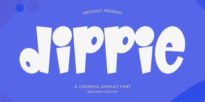 Dippie cheerful display font. Heavy stroke, fun character with a bit of ligatures. To give you an extra creative work. Dippie cheerful display font support multilingual more than 100+ language. This font is good for logo design, Social media, Movie Titles, Books Titles, a short text even a long text letter and good for your secondary text font with script or serif. Make a stunning work with Dippie cheerful display font. Cheers, Maulana Creative
 - MC Coolbass by Maulana Creative,
$22.00 Coolbass cheerful display font. Heavy stroke, fun character with a bit of ligatures. To give you an extra creative work. Coolbass cheerful display font support multilingual more than 100+ language. This font is good for logo design, Social media, Movie Titles, Books Titles, a short text even a long text letter and good for your secondary text font with script or serif. Make a stunning work with Coolbass cheerful display font. Cheers, Maulana Creative
 - Astoria Sans by Alan Meeks,
$45.00 The Sans serif companion to Astoria. Based heavily on Gill especially in the mid weights and with a consistant series of condensed weights. Designed specifically as a text face it still works very well as a headline font. There are 6 weights with accompanying Italics.
 - Kensington by AVP,
$29.00 Kensington started life as a sans serif based loosely on the strokes and weights of Garamond but, inevitably, influences of Gill Sans crept in, creating an interesting mix. The single weight is excellent for titling and works as a body font in reasonably small quantities.
 - Katfish by ITC,
$29.00Katfish is the work of Michael Gills, a unique and inventive script font. Initial capitals are complemented by a lively lowercase and a number of alternative characters, ligatures and swash elements. Katfish has a fun, irregular style and includes charming cat, fish and dolphin illustrations. - Aint Nothing Fancy by Hanoded,
$15.00 A nice, ‘normal’ script font without the frills and thrills of my other work. It’s a handwritten typeface with a schoolboy kind of feel to it. Use it for your websites, your letters and product descriptions! Because of its unobtrusive nature, the font won't attract too much attention, so your work will stand out better.
 - Hand Drawn by ITC,
$29.00Hand Drawn is a faithful adaptation of the original typeface of hte Letraset range by Michael Gills. A set of numerals was added to complete the font. Hand Drawn has all the charisma of the 1950s brush style and should be set closely for the best impact. - Elysium by ITC,
$29.99Elysium is the work of Michael Gills who was in turn influenced by Czechoslovakian designer Oldrich Menhart. The typeface is an old style roman font whose refreshing quality comes from the designer's love of calligraphy. Elysium has a crisp appearance coupled with creative and unique letterforms. - Nd Harquied by Notdef Type,
$25.00 What about some spooky type? Nd Harquied is great for Halloween, Comics, Monsters, or maybe something that you came up with melting cheese! How creative can you be?
 - Shesek by Hanoded,
$15.00 Shesek is an informal, loose, handwritten font without any frills. It is deceivingly plain, but when you use it, you will find out that Shesek has a distinct taste, not unlike its namesake, the Japanese plum, or Loquat. The Loquat is a soft, oval, yellow fruit which is grown mostly in Japan and Israel (where it is called ‘Shesek’).
 - XChessNut by Ingrimayne Type,
$5.00 XChessNut contains two chess fonts that resemble actual chess pieces. The key layout is a bit complicated; see the key guide for detailed information on how to position pieces correctly.
 - Prague by ITC,
$29.00Prague was designed by Michael Gills, who was strongly influenced by the work of Czech designer Oldrich Menhart. It is a strong, angular roman typeface with classical overtones. The exciting vibrancy of Prague is suitable for a wide range of advertising work requiring a traditional or classical approach.


