3,245 search results
(0.015 seconds)
- Girl Mermaid by Ake,
$12.00 Girl is a cool, incredibly detailed and chic duo font (script and dingbats). This font is PUA encoded which means you can access all of the glyphs and swashes with ease! Fall in love with its incredibly versatile style and use it to create spectacular designs!
 - Germs - Unknown license

- Gray by Sensatype Studio,
$15.00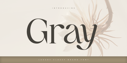 A Modern Classy Luxury Font that we created special for Luxury and Fashion branding needs, with extra characters alternate in unique shape will be ready to add value of your brand. It so nice to leverage designer or product owner that need solutions to make their design look more classy and modern. And specially for this font, We prepared any alternate characters to help you create unlimited variations for your creative needs. Gray Modern Classy Luxury Font ready with: Any options to get creative variations (combination of Any Alternates) Preview as a inspirations that you can do with Gray font Ready with Lowercase and Uppercase characters Wish you enjoy our font. :)
 - Gemas by Allmo Studio,
$22.00 Gemas is a wide typeface that looks incredible and has attractiveness when you see it. Each letter shape has been designed to have a character that is easily recorded in the mind. This font has cute and classy characters, clean lines, and smooth curves giving any project an extra touch of class. A serif modern and wide typeface that his own unique style & modern look. This typeface is perfect for large point size, for example in magazine layouts, packaging, book, title design, fashion brand, clothes, lettering, quotes design, and many other ways to your work. A-Z Character Set a-z Character set Numerals & Punctuations Multilingual Thanks, Alamsa
 - German Blackletters, 15th c. - Unknown license

- Vtg Stencil Germany No1 by astype,
$45.00 The Vtg Stencil series of fonts from astype are based on real world stencils. The Germany No.1 design was derived from authentic antique German stencil-plates. » pdf specimen « Surprisingly these stencil-plates offer a high contrast Didot design very similar to the French stencils produced and sold till today. The production time of these stencils is in the range of the German imperial period (1871‒1918). Of course the usage period was even longer. The font styles PAINT and SKETCH include 4 additional variations of base glyphs and figures. An extensive random function will mix the glyphs as you type - on proper OpenType-savvy apps like Adobe InDesign only. All styles offer an extended Latin character set.
 - Permanent daylight Italic - Unknown license

- Vtg Stencil Germany No.101 by astype,
$31.00 Vtg Stencil Germany No.101 is modeled after historic stencil plates from Bavaria. The design is a blackletter chancery, a romantic reprise of a style that was common in German writing offices from the 14th to the 16th century. The flourishes stylistically quote the Baroque period. A talented mind, perhaps around 1890, has transformed the textura shapes into a modular stencil system. Many elements are repeated throughout the glyph set - see for example the initial swashes on the letters A, B, U etc. Overall, this decorative blackletter doesn’t look like a stencil design. Maybe it was originally used by a sign painter, and all the typical stencil bridges would have been painted over in the final work. If you’re looking for a decorative blackletter font with a unique touch and a romantic feel, you will love Germany No.101.
 - Calm Gray by WR Foundry,
$20.00 The Calm Gray typeface is a book font with good readability. It is relatively bright, has a gentle rhythm and neutral expression. Calm Gray is a lightweight font, and thanks to its small caps and oldstyle figures, it allows to create a pleasant, unaccented text grayness. The Thin and ExtraBold weights are suitable for headlines and highlights in text while maintaining the uniform character of the design.
 - Gray Asphalt by Din Studio,
$29.00 Isn’t it interesting to create a design in a stylish, firm font made of mixture of style and authenticity? This is the Gray Asphalt. Gray Asphalt is a racing-themed script font to give you steady, firm, solid impressions for word or message emphases. Its thick display is suitable to apply on bigger-sized texts. The font features you can enjoy are as follows. Features: Stylistic Sets Ligatures Swashes Multilingual Supports PUA Encoded Numerals and Punctuations Gray Asphalt fits best for various designs, such as posters, banners, logos, book covers, headings, printed products, merchandise, social media, and more. Find out more ways to use this font by taking a look at the font preview. Enjoy your experience with this font and feel free to contact us for further product information or trouble complaints. Thank you and wish you good luck with your designs,
 - White Gray by Sulthan Studio,
$14.00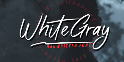 White Gray is a signature script font with natural handwriting, this font is perfect for watermarks, invitations, stationery, wedding designs, social media posts, advertisements, product packaging, product designs, labels, photography, logos, special events and more. . White Gray comes with many additional features which allow you to customize your text. You will get a complete set of separate upper and lowercase, multilingual, punctuation, ligatures, and swashes
 - ITC Gema by ITC,
$29.99ITC Gema is the work of Brazilian graphic designer Claudio Rocha. It was first written in a small size to keep the surface irregularity of a non-coated paper when enlarged for use as a display font," says Rocha. Many strokes do not quite join, giving Gema the visual effect of a stencil typeface, the distinguishing characteristic of the font. "Some characters have my own handwriting gestures," says Rocha, like elongated endings and angular shapes. Gema comes complete with an unusual variety of ligatures and alternate characters." - Ermis Pro by Wannatype,
$62.00 Ermis Pro – handwritten, multilingual, natural Ermis Pro is a cross between a perfectly finished, comprehensive, classically cut old face type and handwriting. It combines the slightly irregular contours you see in very small letter sizes caused by the flow of ink on paper with the elegant look and feel of a serif font. This makes Ermis Pro the perfect choice for stylish printed materials with a personal touch, doubtlessly winning fans in the worlds of fiction and fantasy alike. Ermis Pro is robust and easy to read in both display and body copy. With its comprehensive character set, it is suitable for a wide range of typographical uses. Besides the standard Latin, the character set includes the Greek and Cyrillic alphabets as well as extended Latin with pan-African letters and the complete International Phonetic Alphabet (IPA). Ermis Pro also comes with numerous OpenType features such as discretionary ligatures, small capitals and nine number variants. The typeface features upright and italic fonts in three weights: Light, Regular and Bold.
 - Dear Gray by Redy Studio,
$17.00 Dear Gray – Modern Wedding Fonts Dear Gray is a beautiful, feminine, and modern calligraphy script for your wedding designs. Dear Gray includes a full set of uppercase and lowercase letters, numerals, punctuation, and common ligatures for a more harmonious look. With Opentype features and stylistic alternatives, Dear Gray gives you a lot of possibilities to make your design even more special. Following the trend of modern hand-drawn typography, Dear Gray is a friendly choice to convey your loving words. Dear Gray features: A full set of upper & lowercase characters Numbers & punctuation Ligatures Lowercase beginning swashes Lowercase ending swashes A ton of stylistic alternatives PUA Encoded Characters – Fully accessible without additional design software. Feel free to give me a message if you have a problem or question. Thank you so much for taking the time to look at one of our products.
 - Gray Light by Ali Hamidi,
$10.00 Gray Light is a fun and friendly brushed display font. Whether you’re looking for fonts for Instagram or calligraphy scripts for DIY projects, this font will turn any creative idea into a true piece of art!
 - Plakat-Fraktur - Unknown license

- Fette Trump-Deutsch - Unknown license

- Pilsen Plakat - Unknown license

- Rudelskopf deutsch - 100% free

- VerzierteSchwabacher - 100% free

- Fraktur-Schmuck - Personal use only

- Deutsche Zierschrift - Personal use only

- Schwabacher - Personal use only

- KlausBFraktur - 100% free

- Schmalfette Fraktur - Personal use only

- Kalenderblatt Grotesk - Personal use only

- DIN 1451 fette Breitschrift 1936 - 100% free

- Rammstein - Unknown license

- LudwigHohlwein - 100% free

- Black Metal G - Unknown license

- Berlin Email - 100% free

- 1883 Fraktur by GLC,
$38.00 This family was inspired by the set of fonts used in the end of 1800s by the famous J. H. Geiger, printer in Lahr (Germany), especially these used to print an almanac for the year 1883. It is a Fraktur pattern, with two styles, as a few others incomplete fonts also used for this work were Blackletters from other patterns. Both were used in two size, for titles, subtitles, main text and notes. This font contains standard ligatures and German historical ligatures (German double s, long s, tz, ch, ck...) and diacritics. 1543 German Deluxe Initials may be used in complement this family.
 - Steinwald by Kitchen Table Type Foundry,
$15.00 Steinwald font was named after a mountain range slash nature park in southern Germany. I have to admit that I have never been there, but this font was just screaming for a good German name and I settled on Steinewald (which, in German, means Stone Forest). Steinwald was made by hand and cleaned up by computer. It looks quite neat, but its edges are a bit rough, giving it ‘ye olde handmade look’! Use it for your posters, your product packaging and your supermarket signs. Comes with extensive language support.
 - Rundgotisch by HiH,
$10.00 One of my favorites. Rundgotisch is a easy to read for eyes that are accustomed to roman letterforms, yet keeps in touch with its blackletter roots. It was released around 1900 by Schelter & Giesecke of Leipzig, Germany. Can be used to set short text passages and pairs easily with many different decorative initials of the period. A very useful typeface. Don't leave home without it. According to Bringhurst, Schelter & Giesecke was formed in 1819 by Johann Gottfied Schelter and Christian Friedrich Giesecke. This old German printing house was sucked up by state-owned Typoart in 1946, after Marshall Zhukov and the Red Army had established Soviet dominion over East Germany.
 - Liturgisch - Personal use only

- Goose Creek JNL by Jeff Levine,
$29.00 The hand lettered credits from the 1942 British film comedy “The Goose Steps Out” became the model for Goose Creek JNL, a simple sans serif design available in both regular and oblique versions. According to the Internet Movie Database (imdb), “A bumbling teacher turns out to be the double of a German general. He is flown into Germany to impersonate the general and cause chaos and hilarity in a Hitler Youth college.” The title is a parody of the “goosestep” style of marching by German soldiers during World War II. As a variant on the movie’s title, the font was named for Goose Creek, South Carolina – a charming community just northeast of historic Charleston.
 - 1538 Schwabacher by GLC,
$38.00 This 1538 Schwabacher was based on a font used by Georg Rhau in Wittemberg (Germany) to print Des Babsts Hercules [...], a German pamphlet against roman catholicism written by Johannes Kymeus. The original font has a relatively complete set of characters including “long s”, but also the special german types like k, fl or ‰, ˆ, ¸.... A few omissions were remedied, and accented letters were added. A render sheet, enclosed with font files, help to identify them on keyboard. It can be used as web-site titles, posters and fliers, editing ancient texts, menus or greeting cards as a very decorative font... Although this font remains clear and easy to read from 8 or 9 points on screen, it is clearly designed for print works.
 - Barock 1720 by SoftMaker,
$10.99 Blackletter is the classic “German” printing type. Starting in the 16th century and lasting well into the 20th century, most works in Germany were printed using blackletter types. Today, blackletter fonts are mainly used decoratively. If you want to communicate a feeling of old-world quality or nostalgia, blackletter fonts are the preferred choice – use them on signs, in brochures or on invitation cards. Barock 1720 is a classic blackletter font of its epoch which inspires you to create vintage-looking designs with ease.
 - Albrecht Duerer Fraktur Pro by SoftMaker,
$10.99 Blackletter is the classic “German” printing type. Starting in the 16th century and lasting well into the 20th century, most works in Germany were printed using blackletter types. Today, blackletter fonts are mainly used decoratively. If you want to communicate a feeling of old-world quality or nostalgia, blackletter fonts are the preferred choice – use them on signs, in brochures or on invitation cards. Albrecht Duerer Fraktur Pro is a classic blackletter font of its epoch which inspires you to create vintage-looking designs with ease.
 - Innsbruck Initials by SoftMaker,
$10.99 Blackletter is the classic “German” printing type. Starting in the 16th century and lasting well into the 20th century, most works in Germany were printed using blackletter types. Today, blackletter fonts are mainly used decoratively. If you want to communicate a feeling of old-world quality or nostalgia, blackletter fonts are the preferred choice – use them on signs, in brochures or on invitation cards. “Innsbruck Initials” is a classic blackletter font of its epoch which inspires you to create vintage-looking designs with ease.


