552 search results
(0.014 seconds)
- BillieBob by JOEBOB graphics,
$-
- Herzchen by Font-o-Rama,
$25.00 - Buddy Parts by PizzaDude.dk,
$15.00 - Great Western by FontMesa,
$22.00
- Pandemizing by Morganismi,
$9.00
- Ulissia by Autographis,
$39.50
- Gans Fulgor by Intellecta Design,
$12.00 - Peach Comix_PersonalUseOnly - Personal use only

- Shelter_PersonalUseOnly - Personal use only

- Gans Titania by Intellecta Design,
$19.95 - Gans Titular Adornada by Intellecta Design,
$14.95 - December by OrakArik,
$10.00
- Epos by Serebryakov,
$39.00
- Gans Vessels Fishes by Intellecta Design,
$19.90
- Gans Sport Club by Intellecta Design,
$19.90 - Gans Transportation by Intellecta Design,
$19.90
- Gans Gotico Globo by Intellecta Design,
$9.00 - Gans Royality by Intellecta Design,
$23.90
- Deco Neue Wilde by Open Window,
$-
- Lady Cleo by Solotype,
$19.95 - Bodoni Unique by Monotype,
$29.99 - Sweet Tea PW by Patty Whack Fonts,
$24.00
- Invertida St by Vanarchiv,
$35.00
- Atwin by Cubic Type,
$14.00 - Cash Point Mono by Matthias Luh,
$2.00
- Playdates - Personal use only

- Negro by Storm Type Foundry,
$32.00
- Winterfell by Alan Meeks,
$45.00
- Charade by profonts,
$41.99
- Seasonal Drift by Hanoded,
$15.00
- Vatican by Alan Meeks,
$45.00
- Invertida by Vanarchiv,
$35.00
- Treves Sans by AdultHumanMale,
$15.00
- Bloesbury by Attract Studio,
$14.00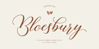
- Gans Antigua Manuscrito by Intellecta Design,
$14.95 - Candy Randy by Lauren Ashpole,
$15.00
- Signorina by Talavera,
$20.00
- Brainstroke by Typotheticals,
$9.00
- KG Love You Through It by Kimberly Geswein,
$5.00
- Blabbermouth by Hanoded,
$15.00


