10,000 search results (0.01 seconds)
  1. Lecture Hall JNL by Jeff Levine, $29.00
    Lecture Hall JNL is a reworking of Dance Hall JNL. By removing the Art Deco flairs and realigning the horizontal strokes in order to create a more traditional design, the font now takes on the look of a classic headline face.
  2. Las Valles Textured by Kaligra.co, $29.00
    Las Valles Textured is a tall, ultra-condensed sans serif font offered in 4 styles. Combining vintage charm with modern appeal, it boasts unique ligatures and versatile choices. The mix of rounded and regular styles adds a fresh touch. Particularly suitable for headlines, quotes, logos, web, and print design, including magazine covers, posters, and signage.
  3. Maria-Ballé-Initials by ARTypes, $35.00
    Maria-Ballé-Initials are derived from the Ballé series I made by the Bauer foundry. When set at 60 pt this font will match the size of the original 48-pt Didot design.
  4. Tall Order JNL by Jeff Levine, $29.00
    The condensed style and square character shapes of a vintage typeface originally known as Raleigh has been re-interpreted by Jeff Levine Fonts as Tall Order JNL. There is an alternate A, K, M, N and S on the respective lower case keys.
  5. Calling Card JNL by Jeff Levine, $29.00
    In today's day and age, the term "calling card" refers to a prepaid means of making long distance phone calls. In a more gentler time, the calling card (similar to a business card) was what a gentleman presented to a housekeeper or butler when visiting (calling) on a friend or business contact.
  6. Just Fall Holidays by Outside the Line, $19.00
    Lots of Fall fun, many Halloween icons... black cat, haunted house, witch hat, ghost, scary masks, pumpkins, bat, BOO! and more. Plus back to school icons... bus, pencil, flashcards, paste, leaves and an apple for the teacher.
  7. Samaritan Tall Lower by Comicraft, $49.00
    Fifteen hundred years from now, a man will be selected to go back in time to prevent a catastrophic event which turned his world into a dystopia. Sent back in time, he was enveloped in empyrean fire, the strands of energy that make up time itself. Crash-landing near Astro City in late 1985, he learned how to master and channel the empyrean forces that had suffused his body -- finally learning to control his powers in time to prevent the destruction of the Space Shuttle Challenger, the event he had been sent to avert. He described himself to journalists as nothing more than "a Good Samaritan", and has continued to help his fellow man in Astro City ever since. John JG Roshell has also been struggling with the empyrean challenge of fitting all of Kurt Busiek's ASTRO CITY dialogue into balloons with the regular Samaritan font, so he created the Samaritan Tall font to help his fellow comic book letterers! It's kinda the same thing, really.
  8. Down The Wall by Hanoded, $15.00
    I have no great love for walls, especially when they are built to keep people out. When I started working on this font, I realized it looked a bit like protest graffiti, found on… yes, walls. Down The Wall is a great little font: it is handwritten, messy and in your face. It has no real baseline and glyphs jump all over the place. Use it for book covers, posters, album covers - anything really. It certainly would look good on a wall too! Comes with a whole bunch of diacritics, so whatever you have to say, the world will understand.
  9. Gill Floriated Capitals by Monotype, $29.99
    Gill Floriated is based on a single character which Eric Gill drew as a decorated initial for use on a specimen setting of his Perpetua type. Although Gill was at first reluctant to produce a full alphabet, Monotype advisor Stanley Morison was able to persuade him to draw a few more characters from which the Type Drawing Office was able to create a full set. Issued in 1937 for display casting, it was revived by Monotype in 1995 for electronic publishing. Best used sparingly as dropped initials.
  10. Tall Skinny Condensed by Outside the Line, $19.00
    This is the tallest, skinniest, most condensed, non serif font I know of. I designed this because I felt a serious need for that one big, thin word to fit in a narrow space. It is great for ‘SALE!’ in a one column ad. Also is a life saver for several long words in a narrow space like Merry Christmas... If you need a full character set take a look at the new Ultra Condensed 3 font family. Ultra Condensed was based on Tall Skinny Condensed with some changes and a full character set. Ultra Condensed Lettered is a hand lettered version and Ultra Condensed Line is a lighter hand drawn version
  11. Tall Scrawl NF by Nick's Fonts, $10.00
    This very free freehand script bounces across the page and enjoys every moment of it. Use it to liven things up! Both versions of the font include 1252 Latin, 1250 CE (with localization for Romanian and Moldovan).
  12. All Over Again - Personal use only
  13. All Star BV - Unknown license
  14. KR All American - Unknown license
  15. all used up - Unknown license
  16. KR All Heart - Unknown license
  17. All Hooked Up - Unknown license
  18. All That Jazz - Unknown license
  19. YOU ALL EVERYBODY - Unknown license
  20. All Round Gothic by Dharma Type, $24.99
    Originally designed in 2012 by Ryoichi Tsunekawa, All Round Gothic is a font family inspired by classic sans serif fonts such as Avant Garde Gothic and Futura. All Round Gothic is a structured geometric sans, but also creates a sweet and cute atmosphere by removing unnecessary stems. With their bowls shaped by not-perfectly-geometric circles, All Round Gothic makes an organic impression in some degree. As a result, All Round Gothic became a new font family that covers between 1920s Bauhaus and contemporary design trends comprehensively and one of the most suitable family for any purpose such as text, headline, logo, poster, and animations thanks to clean and legible but soft and friendly letterforms. All Round Gothic includes 5 weights and obliques corresponding to each weight. Why don't you try this family if you got a little bored with classic sans serifs. This font is used in Minions movie.
  21. Ragtime Gal JNL by Jeff Levine, $29.00
    Amongst a batch of antique sheet musical instruction booklets offered for sale online was a piece with Art Nouveau hand lettering on the cover entitled “Seven Musical Travelogues for Piano”. This design served as the inspiration and model for Ragtime Gal JNL, which is available in both regular and oblique versions. The font’s name comes from the line ‘Hello my baby, hello my honey, hello my ragtime gal…’ from the 1899 song “Hello Ma Baby”; a tune that found a new burst of popularity in an odd way within a 1955 Warner Brother’s cartoon [“One Froggy Evening”].
  22. All Over Again by Hanoded, $20.00
    All Over Again is a messy, scratchy script that looks like someone wrote a lengthy letter, realized he had screwed up and had to start all over again.
  23. Shes All That by Typadelic, $19.00
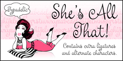
  24. All Pro JNL by Jeff Levine, $29.00
    All Pro JNL is a sports font embellished with stars and stripes and is perfect for team banners, sportswear and sports-oriented ads. The font contains alphabet, numerals and the most basic of punctuation with very little kerning.
  25. All for you by HOHOHtype, $28.00
    ‘Allforyou’ is an elegant serif type family. The family has 3 different weights. It was designed to have the flexibility of italics in the form of serifs. It has a feminine and elegant feeling due to its smooth curves. It was designed with applications such as advertising and packaging, editorial and publishing, logo, branding and creative industries, poster and social media, and marketing in mind.
  26. All Is Quiet by Kitchen Table Type Foundry, $15.00
    The year 2022 went and 2023 came. I can honestly say that last year was a horrible year and I am happy it ended a couple of days ago. The first week after New Year’s Eve always fills my head with the U2 song ‘New Year’s Day’ - so I named this font after a line from the lyrics. I also happened to watch a fantastic movie called ‘Im Westen Nights Neues’, directed by Edward Berger, but based on a book by Erich Maria Remarque, which, in English, was published as ‘All Quiet On The Western Front’. So there you have it: naming a font in 2 easy steps! ;-) All Is Quiet is a lovely brush font, which I created using my father in law’s Chinese pencil and ink. I can suggest some uses here, but I am convinced you can come up with that yourself.
  27. That’s All Folks by Comicraft, $19.00
    Run amuck and head on down to Toon Town with us to enjoy some Madcap Laffs with our latest Frolicking Font, 'THAT'S ALL FOLKS'. It's good, clean family fun for all your favorite comic cuts and looney'toons! What's more, it's (sing along) S-O-E, A-S-Y, T-O-U-S-E! Includes new Inline Regular and Bold weights, Western European accents, and Crossbar I Technology!
  28. KR Ball N Chain - Unknown license
  29. BN Suck My Balls - Unknown license
  30. Hall Fetica Narrow Italic - Unknown license
  31. Hall Fetica Upper Decompose - Unknown license
  32. Hall Fetica Upper Italic - Unknown license
  33. Balls on the rampage - Unknown license
  34. Gable Antique Condensed SG by Spiece Graphics, $39.00
    This Art Nouveau typeface was created around the turn of the 20th century by the Bauer Type Foundry in Germany. A unique foot and head serif treatment is the key design feature in this antique revival. Many vertical stems terminate in what has been called “the swooping, pointy-foot look.” A marvel to look at and a joy to set, Gable Antique Condensed will be a lasting asset to your growing typeface collection. Gable Antique Condensed is also available in the OpenType Std format. Some new characters have been added to this OpenType version. Advanced features currently work in Adobe Creative Suite InDesign, Creative Suite Illustrator, and Quark XPress 7. Check for OpenType advanced feature support in other applications as it gradually becomes available with upgrades.
  35. LD Deck The Halls by Illustration Ink, $3.00
    Deck the halls with boughs of holly..." The fun letters of this font are sure to get you in that holiday spirit! The capital letters each have a hanging ornament.
  36. Tall And Narrow JNL by Jeff Levine, $29.00
    Let Me Call You Sweetheart was one of the most popular songs of the early 20th Century, and a piece of vintage sheet music for this tune had its title hand lettered in a square, narrow block lettering style. With a few adjustments and adaptations, this led to the creation of Tall and Narrow JNL, a digital version of the type design which is a perfect alternate to the more conventional condensed faces.
  37. Gill Sans MT Greek by Monotype, $67.99
    The successful Gill Sans® was designed by the English artist and type designer Eric Gill and issued by Monotype in 1928 to 1930. The roots of Gill Sans can be traced to the typeface that Gill's teacher, Edward Johnston, designed for the signage of the London Underground Railway in 1918. Gill´s alphabet is more classical in proportion and contains what have become known as his signature flared capital R and eyeglass lowercase g. Gill Sans is a humanist sans serif with some geometric touches in its structures. It also has a distinctly British feel. Legible and modern though sometimes cheerfully idiosyncratic, the lighter weights work for text, and the bolder weights make for compelling display typography. Gill Sans is also available as Value Pack for Macintosh, PC or as Hybrid CD with both platforms.
  38. Call Me Ishmael NF by Nick's Fonts, $10.00
    That she blows! Another disco-era delight, this typeface is based on an Affolter and Gschwind release called Moby Dick. Both versions of this font support the Latin 1252, Central European 1250, Turkish 1254 and Baltic 1257 codepages.
  39. Port Of Call JNL by Jeff Levine, $29.00
    The hand lettered titling on a vintage piece of sheet music for the song "Sweet Siamese" is the basis for Port of Call JNL.
Looking for more fonts? Check out our New, Sans, Script, Handwriting fonts or Categories
abstract fontscontact usprivacy policyweb font generator
Processing