10,000 search results
(0.038 seconds)
- Din Condensed by ParaType,
$30.00 Designed at ParaType (ParaGraph) in 1997 by Tagir Safayev. Based on a condensed style of DIN type family (Linotype Staff designers). That is a group of sans serif faces made to conform to the German Industrial Standard. Based on geometric style, they vary in width but not in weight. Light style was added in 2014 by Manvel Schmavonyan. Demi Bold style was added in 2020 by Isabella Chaeva.
 - Quebra Condensed by Vanarchiv,
$55.00 Quebra Cond is an extend display sans-serif font family, available with four widths (Extra Condensed, Condensed, Normal and Expanded) and ten weights, italics versions are available. The main strokes contain small breaks simulating modulated variations on the letterforms, these details are more present on large body sizes. All font versions contain Latin and Cyrillic encoding characters and also ligatures, case-sensitive forms, fractions, oldstyle and finally tabular figures.
 - Obvia Condensed by Typefolio,
$29.00 'Obvia' appeared as a result of direct observation on typefaces classified as geometric and the plan to explore for the first time width axes Expanded, Wide, Normal, Narrow and Condensed The idea behind 'Obvia's design was to create a distancing from geometrically pure shapes, in this case, square shapes. Then some details were added, such as subtle inktraps, concave endings of the stems and carefully drawn alternate characters, giving a 'geohumanist' tone to the font. This first family of 'Obvia' has 9 weights ranging from Thin to Black, delivering a strong typographic identity, from the paper to the pixel.
 - Manchester Condensed by Vástago Studio,
$23.90 Every day we are faced with designing on small screens and new formats; This is where condensed fonts have great potential, as they make the most of tight spaces in big headlines. Manchester Condensed is a typeface family designed by Vástago to be applied in large headlines in different formats, such as web, editorial or packaging. Just to mention a few. Different Manchester weights enhance performance at large type sizes, providing hierarchy and imposing style with its elongated shapes. Its use in capital letters is remarkable and fits perfectly into very precise diagramming spaces.
 - Americane Condensed by HVD Fonts,
$40.00 “It’s all about Soul!” – Strong, decided and edgy. The Americane super family is inspired by the old wood type specimen books. Delivering some glorious vibes of the handcrafted values from the pioneers AND keeping one eye on todays demands and technology, Americane is made for high professional use. Americane Condensed & Americane is a super family of 24 fonts in total – a normal and a condensed width in six weights with matching italics. Made for complex, professional typography, the OpenType fonts feature five variations of numerals, alternate letters, arrows and an extended character set to support Central and Eastern European as well as Western European languages.
 - Moderna Condensed by Los Andes,
$16.00 Moderna Condensed is a modern condensed Sans-serif font, simple and neutral, especially for short texts, headlines, and sub-headlines, logos, posters and branding, includes some alternate characters, arrows and labels.
 - Van Condensed by Vanarchiv,
$30.00
- Keiss Condensed by DSType,
$50.00 The Keiss type family is our interpretation of the popular nineteen century Scotch Roman typefaces. We intended to keep a very classic approach while introducing a couple of new elements that differentiate this type family from it’s ancestors. This design, with short descenders and ascenders, along with three very distinct optical sizes makes this type family well suited for contemporary newspapers. The Title and Big versions range from Thin to Heavy, with matching italics, in order to be used in big sizes and stand out in the design. The Text ranges from Thin to ExtraBold and is a standalone type family for text usage, with narrow proportions and wider and open italics for improved text setting. The Condensed versions, ranging from Thin to Bold, don’t have italics, although they can be matched with the italics of the Title and Big versions, due to the fact they are very condensed.
 - Sanchez Condensed by Latinotype,
$- Sánchez, designed by Daniel Hernández, is a serif typeface belonging to the classification slab serif, or Egyptian, that bears a strong resemblance to the iconic Rockwell, but with rounded edges— offering contrast and balance to the square structure. Sánchez & Sánchez Condensed comprises 12 variants, ranging from extra light to black, each of the same x-height. Regular and Italic variants are available for free.
 - Rehn Condensed by moretype,
$40.00 With all the features of its wider relative, Rehn Condensed has been specifically designed for those situations where space is a premium. Rehn and Rehn Condensed together offer a complete package suitable for a wide range typographic applications.
 - Wasabi Condensed by Positype,
$20.00 Remastered in 2019. Wasabi is the re-imagining of my very first release, Iru. Like Iru, Wasabi was heavily influenced by the monument lettering style, Vermarco. The simple, geometric forms allowed for small lettering sizes to be sandblasted cleanly and has been a monument lettering workhorse for decades… the only issue centered around the lack of a lowercase or any other letters beyond the 26 uppercase glyphs and the numerals. Wasabi solves this with the same simple, efficient line reminiscent of the old Vermarco while bringing it into the 21st century. Visual and optical incongruities of the original uppercase were replaced with new interpretations for the capital letters, a new lowercase and small caps were produced and the original single weight alphabet was replaced with six new weights. Wasabi has several ‘lighter’ weights primarily because the thin lines and simple transitions produce very elegant relationships… and I wanted to make sure those relationships could be explored regardless of the scale of letter. Stylistic Alternates show up through the upper, lowercase and small cap glyphs that attempt to simplify these shapes even more when the opportunity arises. Wasabi is as much a utilitarian typeface as it is a headline face. This realization led to the decision to produce a companion Condensed version shortly after the initial regular weights were developed and tested; so, try them all!
 - Homage Condensed by GarageFonts,
$49.00 Paying homage to the 1960s and 1970s designs of Tom Carnase and Herb Lubalin, Homage Condensed is a digital revival and recutting of LSC Condensed in two weights along with italics and numerous stylistic alternate characters.
 - Magallanes Condensed by Latinotype,
$29.00 Say hello to the new Magallanes Condensed Family, a contemporary neo-humanist sans serif font designed by Daniel Hernández. Its strokes and terminals are related to the calligraphic strokes from humanist typefaces. It comes with 8 styles, from Ultra Light to Black, each with its true italics. Every weight comes with alternative glyphs for a more dynamic use. Magallanes is the perfect titling font to complement text faces in magazines, logotypes, etc. Languages supported include Basic Latin, Western European, Euro, Catalan, Baltic, Turkish, Central European, Romanian, Pan African Latin.
 - Avancar Condensed by Brenners Template,
$19.00 Avancar Condensed Font Family showcases the exquisite pairing of modern grotesque style and soft sans-serif design. These conjunctions provide the effect of owning two subfamily typefaces and are an amazing solution for designers. The main feature of this font family is a semi-condensed design with a slightly higher x-height. And, while having the same skeleton design and stem width, they provide a completely different look and feel.
 - Aragon Condensed by Canada Type,
$24.95The condensed version of Hans van Maanen's Aragon is a headline star. The elements that made Aragon a popular "Dutch Garamond" text repeat here, with the slight stress shifts and tapering stems optimized for headline use. Aragon Condensed also comes in bold and italic variations. All three fonts contain extended language support, superiors and inferiors, and class-based kerning. - Queulat Condensed by Latinotype,
$- This font is the condensed version of Queulat, but keeping the same features as the original typeface. Queulat Cnd is a hybrid typeface that combines different styles, reflecting charm, freshness and, especially, a strong personality.. Since it is a condensed font, it is well-suited for publishing and subheadings. The font is inspired by Modern and Grotesk styles. The former is shown in some characteristic features such as teardrop terminals, which give the typeface an attractive unique look, making it an ideal choice for logotypes and labelling. The latter, with its rationality, makes Queulat Cnd a stable and strong face for headings and subheadings. The combination of styles can be clearly seen by comparing the Regular with the Alt version. The Regular version is more simple than the Alt one. Differently, the alternative version possesses more features of the Modern style, like teardrop terminals in ‘k’ and ‘v’.
 - Prelo Condensed by DSType,
$55.00Prelo was designed to be a neutral, highly readable typeface, for identity, editorial and information design. With nine weights and nine true italics, from Hairline to Black, Prelo is a workhorse typeface, full of OpenType features such as Small Caps, Tabular Figures, Central Europe characters and Historical Figures, among others. Like other DSType fonts, most of the diacritics were designed to fit the gap between the x-height and the caps height, avoiding some common problems with the accented characters. The curves are soft and smooth, providing legibility, even in very poor conditions and the neutrality allows this typeface to be used with any serif companion. - Blitz Condensed by Wiescher Design,
$20.00 A very glitzy Blitz! Blitz-Condensed is an addition to my normal Blitz family. Both are topheavy fonts and are meant to be used together. The font gets a special shine because of this effect. And it stays readable despite its special design. Your designer of surprising typefaces, Gert Wiescher
 - Candide Condensed by Hoftype,
$49.00 Candide Condensed is the complement for Candide and widens greatly the possible applications of the Candide family. Through Its moderately condensed proportions, it also works superbly as a discrete space saving text face. Candide Condensed comes with the same character layout and features as Candide. Candide Condensed consists of 16 styles. It comes in OpenType format and provides an extended language support. All weights contain standard and discretionary ligatures, proportional lining figures, tabular lining figures, proportional old style figures, lining old style figures, matching currency symbols, fraction- and scientific numerals, matching arrows and alternative characters.
 - Breuer Condensed by TypeTrust,
$30.00 Breuer Condensed is a mechanical sans ideal for captions and headline settings, and may also be suitable for moderate lengths of body copy with its comprehensive offering of OpenType features. The italics are optically adjusted obliques with a selection of augmented lowercase glyphs to provide a warmer read. The overall design ensures a distinct aura of technical precision in a personable tone. This family of eight fonts is designed to accompany the Breuer Text and Breuer Headline sets released in 2007. Breuer Condensed offers a 76% narrower footprint compared to Breuer Text and is fine-tuned to render typographic color equivalent to each sibling Text weight.
 - Medio - 100% free

- Medin by Viaction Type.Co,
$25.00 Medin is a serif font with elegant characters. Medin is perfect for your elegant-themed work, suitable also for elegant vintage. This font is available multilingual & alternate characters, making it easy to do work on various design themes. Medin is equipped with multilingual accents. Get it now Medin fonts, to add to your collection and work solutions. Viaction Type Thanks.
 - Modum by The Northern Block,
$- A contemporary serif font family. The design takes influence from traditional serif forms to develop a precise, highly functional text face with a low contrast. Smooth radius details are blended with carefully drawn angles that give a crisp, distinctive aesthetic when used across body copy. Modum is a stylish modern day serif with great charm, harmony and practicality that is best suited for complex hierarchical projects, such as editorials, newspapers and text based books. Details include 8 weights and true italics, over 800 characters with alternative lowercase a, e, g and y. 7 variations of numerals, true small caps with accents, ligatures, manually edited kerning and Opentype features.
 - Meditative by UICreative,
$23.00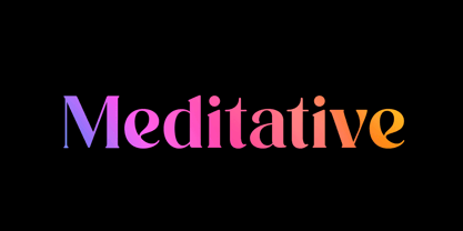 Introducing our new product the name Meditative Elegant Classic Serif Font. Modern Serif font that feels beautiful classy, elegant, and modern. This font is perfectly suited for a wide variety of projects, such as signature, stationery, logo, wedding, typography quotes, magazine or book covers, website headers, clothing, branding, packaging design, and more. Also for fashion-related branding or editorial design and displays both masculine and feminine qualities.
 - De Futura - Unknown license

- Futura ND by Neufville Digital,
$45.25 Futura is one of the best known and most widely used of modern typefaces. Designed by Paul Renner between 1924-1927 for the Bauersche Giesserei, it remains today one of the most successful typefaces due to its simplicity of features, perfect legibility, and meticulous finish of each of its letters. Its great variety of styles and weights makes Futura particularly fit for distinguished user interfaces, information displays, smart watches, e-readers, television apps, technical appliances, and internet-related uses. Futura is a Trademark of BauerTypes SL
 - Futura Black by URW Type Foundry,
$39.99 The Futura Black font, related to the Futura font family is boldly geometric and has detached strokes suggesting stencil lettering.
 - Futura SH by Scangraphic Digital Type Collection,
$26.00Since the release of these fonts most typefaces in the Scangraphic Type Collection appear in two versions. One is designed specifically for headline typesetting (SH: Scangraphic Headline Types) and one specifically for text typesetting (SB Scangraphic Bodytypes). The most obvious differentiation can be found in the spacing. That of the Bodytypes is adjusted for readability. That of the Headline Types is decidedly more narrow in order to do justice to the requirements of headline typesetting. The kerning tables, as well, have been individualized for each of these type varieties. In addition to the adjustment of spacing, there are also adjustments in the design. For the Bodytypes, fine spaces were created which prevented the smear effect on acute angles in small typesizes. For a number of Bodytypes, hairlines and serifs were thickened or the whole typeface was adjusted to meet the optical requirements for setting type in small sizes. For the German lower-case diacritical marks, all Headline Types complements contain alternative integrated accents which allow the compact setting of lower-case headlines. - Futura TS by TypeShop Collection,
$24.80 - Futura Classic by Wiescher Design,
$39.50 FuturaClassic is a recut of Paul Renners original Futura. This version was what Mr. Renner wanted the Futura to look like. He had to change his very stringent design because the market wanted a more pleasing typeface. I think the original design is worth saving because it is much more typical and has a personal and distinguished touch. I have also designed Geometra Rounded with rounded endings that looks more interesting than your usual DIN type Yours trying to save the typographical past Gert Wiescher
 - Futura Maxi by Monotype,
$29.00 First presented by the Bauer Type Foundry in 1928, Futura is commonly considered the major typeface development to come out of the Constructivist orientation of the Bauhaus.movement in Germany. Paul Renner (type designer, painter, author and teacher) sketched the original drawings and based them loosely on the simple forms of circle, triangle and square. The design office at Bauer assisted him in turning these geometric forms into a sturdy, functioning type family, and over time, Renner made changes to make the Futura fonts even more legible. Its long ascenders and descenders benefit from generous line spacing. The range of weights and styles make it a versatile family. Futura is timelessly modern; in 1928 it was striking, tasteful, radical - and today it continues to be a popular typographic choice to express strength, elegance, and conceptual clarity. The PL Futura Maxi font family was created by Victor Caruso in 1960 to add more display weights to Paul Renner's 1927 Futura family. Typefaces in the same style like Futura are: Avenir, Metromedium, Neuzeit Grotesk,
 - Futura BT by Bitstream,
$39.99 Futura is the fully developed prototype of the twentieth century Geometric Sanserif. The form is ancient, Greek capitals being inscribed by the Cretans twenty-five hundred years ago at the time of Pythagoras in the Gortyn Code, by the Imperial Romans, notably in the tomb of the Scipios, by classical revival architects in eighteenth century London, which formed the basis for Caslon’s first sanserif typeface in 1817. Some aspects of the Geometric sanserif survived in the flood of Gothics that followed, particularly in the work of Vincent Figgins. In 1927, stimulated by the Bauhaus experiments in geometric form and the Ludwig & Mayer typeface Erbar, Paul Renner sketched a set of Bauhaus forms; working from these, the professional letter design office at Bauer reinvented the sanserif based on strokes of even weight, perfect circles and isosceles triangles and brought the Universal Alphabet and Erbar to their definitive typographic form. Futura became the most popular sanserif of the middle years of the twentieth century. Ironically, given its generic past, Futura is the only typeface to have been granted registration under copyright as an original work of art, and, further irony, given the key part played by the Bauer letter design office, the full copyright belongs to Renner and his heirs. This decision in a Frankfurt court implies that a further small group of older typefaces may also be covered by copyright in Germany, particularly those designed for Stempel by Hermann Zapf. This situation appears to be limited to this small group of faces in this one country, although protection of designers’ rights in newer typefaces is now possible in France and Germany through legislation deriving from the 1973 Vienna Treaty for the protection of typefaces. Mergenthaler’s Spartan is a close copy of Futura; Ludlow’s Tempo is less close. Functional yet friendly, logical yet not overintellectual, German yet anti-Nazi... with hindsight the choice of Futura as Volkswagen’s ad font since the 1960s looks inevitable.
 - Futura PT by ParaType,
$30.00 Futura is a classic geometric sans serif, one of the crucial typefaces of the 20th century. It remains relevant today and is widely used in logos, headings, web and print. Futura was designed by Paul Renner for Bauersche Gießerei (Bauer) in 1927. The typeface is based on simple geometric forms and is close in the aesthetics to 1920s-30s constructivism and the Bauhaus. Futura PT is the most complete Cyrillic version of Futura. It’s a type system of 25 styles: 16 regular and 9 narrow, from Thin to Extrabold. Futura PT has linear and old style figures, subscripts and fractions. The typeface supports more than 100 languages: Western and Central European Latin and the Cyrillic-extended. The Cyrillic version of Futura was designed by Vladimir Yefimov in 1991–1995. He partially redesigned the typeface in 2007, making it a wholesome consistent system, and Isabella Chaeva added new styles. The typeface was released under the name Futura PT. Isabella Chaeva returned to work on Futura in 2022. The typeface has three new styles, old style figures and extended Cyrillic support.
 - Futura Black by Bitstream,
$39.99Josef Albers drew a stencil sanserif form at the Bauhaus in 1923 (published in 1926); Paul Renner and the Bauer design office made a similar design into a typeface in 1929, and rather confusingly included it in the Futura series. Many websites erroneously attribute the stencil design to Josef Albers, but there is no evidence that the two met or collaborated on Futura Black. In 1929 Josef Albers and Jan Tschichold corresponded on the “Transito” typeface (another very similar stencil typeface, while Paul Renner was working with Jan Tschichold. - Futura EF by Elsner+Flake,
$35.00 - Futura Script by Linotype,
$42.99 - Futura SB by Scangraphic Digital Type Collection,
$26.00Since the release of these fonts most typefaces in the Scangraphic Type Collection appear in two versions. One is designed specifically for headline typesetting (SH: Scangraphic Headline Types) and one specifically for text typesetting (SB Scangraphic Bodytypes). The most obvious differentiation can be found in the spacing. That of the Bodytypes is adjusted for readability. That of the Headline Types is decidedly more narrow in order to do justice to the requirements of headline typesetting. The kerning tables, as well, have been individualized for each of these type varieties. In addition to the adjustment of spacing, there are also adjustments in the design. For the Bodytypes, fine spaces were created which prevented the smear effect on acute angles in small typesizes. For a number of Bodytypes, hairlines and serifs were thickened or the whole typeface was adjusted to meet the optical requirements for setting type in small sizes. For the German lower-case diacritical marks, all Headline Types complements contain alternative integrated accents which allow the compact setting of lower-case headlines. - Futura Next by Neufville Digital,
$45.25 Our most up-to-date Futura adapted to the new times. Its peculiarity lies in the curved endings of three of its letters (“j”, “l” and “t”), which gives the typeface a more dynamic and modern look, making it easier to visualize on small and low-resolution screens. The original designs of these characters are also included. Futura is a Trademark of BauerTypes SL
 - Futura Futuris by ParaType,
$30.00
- Futura Now by Monotype,
$53.99 For nearly 90 years, Paul Renner’s Futura has been as popular as it is versatile—from children’s books to fashion magazines to the plaque on the Moon. Futura is a typographic icon. Futura Now offers designers a chance to see Futura with fresh eyes. It’s more truly Futura-like than any digital version you’ve ever worked with. “It brings some much-needed humanity back to the world of geometric sans serifs,” says Steve Matteson, Monotype’s Creative Type Director who led the design team. “Despite its reputation as the ultimate modern typeface, Futura Now is surprisingly warm,” he explains. “It’s just as at home set next to a leafy tree as it is next to a stainless-steel table, because it skillfully navigates the border between super-clean geometry and humanist warmth.” Futura Now—the definitive Futura—contains 102 styles, including: new Headline and Text weights; new Script and Display weights and styles; and new decorative variants (outlines, inlines, shadows, and fill). Its contemporary alignment of names and weights makes the family easier to understand and use, and its comfortable Text and judicious Headline subfamilies provide instantly refined spacing. With a large Latin, Greek, and Cyrillic character-set, Futura Now serves a wider international creative community. Futura Now is available both as individual OpenType fonts and as a set of Variable fonts, delivering limitless styles in a tidy digital footprint.

