5,915 search results
(0.007 seconds)
- FS Neruda by Fontsmith,
$80.00 A literary font FS Neruda takes its name from Chilean poet Pablo Neruda, described as “the greatest poet of the 20th century in any language”. As such, it’s a font that references the very best literary typeface traditions. Smart, sharp and classical, FS Neruda bridges the gap between the classical and the offbeat. This font started life in the world of newspapers and books and is the perfect storytelling typeface for savvy, inquiring readers whether in printed journals, hard news, short online missives or poetry. Idiosyncratic precision FS Neruda is clear and legible in body text, while also being a space-saver fitting in more characters on each line than the typefaces that inspired it. In larger sizes it becomes a different beast – livelier, quirkier, but no less sharp. This is a truly classic typeface designed with long text setting in mind, thanks to its large x-heights, and short ascenders and descenders. FS Neruda mixes suave, sharp confidence with a sense of fragility and quirkiness. It’s knowledgeable, informative and idiosyncratic; one for readers and enquiring minds. Subtle weight modifications The construction and details of the letterforms differ across each of the five weights, with each cut separately to evoke different flavours: Thin is typewriter-like, Light is classy, Regular is canonical, Bold is robust, Black is magazine-esque. FS Neruda also boasts a radiant italic companion, a wide set of small caps, lower and uppercase ligatures, case punctuation and spacing, four sets of figures, and some ageless typographic symbols such as manicules, fleurons and teardrop crosses. Suggestive simplicity “The key to success in the current type design landscape is to design a typeface which looks conventional at text sizes but has a few small, suggestive touches visible at bigger sizes that make it distinct,” says designer Pedro Arilla. “Another thing we wanted to achieve with this typeface is simplicity.” FS Neruda is available in ten carefully crafted styles: it’s designed to work perfectly at text sizes, but still glows as a display typeface.
 - FS Emeric by Fontsmith,
$60.00 Right now! FS Emeric reconciles a pair of seemingly opposing approaches: the systematic but chilly functionalism of early modernist typography, trapped in time, and a warmer, more emotional, more optimistic spirit. What Fontsmith created was something that marries precision with expression, geometry with movement, functionality with humanity. FS Emeric has a sharp, kinetic edge that cuts across design disciplines – graphic, fashion, product, automotive. It’s about what’s happening right now. Contemporary, optimistic, distinctive – a classic working sans serif. Appetite Discussions with some of Fontsmith’s design studio clients had revealed an appetite for a new kind of typeface that could express mid-century modernist principles in a fresh, contemporary voice. As he crafted the letterforms that would form FS Emeric, Phil Garnham was guided by two central ideas. First, there was Jan Tschichold’s contention that a good letter is “one that expresses itself, speaking with the utmost distinctiveness and clarity”. Second was a belief that a font can be personally expressive without compromising its functionality. These provided the fuel that drove the project to its conclusion. Posters To mark the launch of FS Emeric, Fontsmith asked 11 eminent design studios from around the world – the likes of Pentagram, Studio Dumbar, Bibliotheque, Non-Format and Build – to create a limited edition A1 poster. Each poster celebrated a different weight of FS Emeric, and just 50 of each were screen-printed by Dan Mather onto 175gsm Colorplan stock. “We gave away a randomly selected poster every time two or more weights of the FS Emeric were purchased,” says Phil Garnham. “They’ve now become somewhat of a collector’s item in their own right.” Superfamily In the spirit of Univers, the original font superfamily, FS Emeric now comprises 22 Roman and italic typefaces overall, making it one of the most versatile and functional modern fonts across all kinds of media, as well as one of the most distinctive.
 - Fs Ornaments by Cuda Wianki,
$20.00 Fs ornaments are unique modular sets of ornaments that are based on ancient patterns and medieval woodcuts. They work very well on modern layouts as well. What is more You can use them not only as ornaments but also as borders. This complexity gives you a carefully planned tool with high decorative qualities. All this depends only on your imagination! With it you can add a genuine touch of distinction to every sophisticated layout but use them carefully. The basic set is Fs ornament 1 while Fs ornament 2 is a distorted version of it. Fs ornament 3 is a woodcut underlying that could be applied underneath ornaments or without them. The usage is very simple-You type them as you normally type letters but instead you get those great decoration! Easy isn't it?
 - FS Sophie by Fontsmith,
$50.00 Slinky Chic, svelte and slinky, FS Sophie was inspired by and designed in partnership with ATTIK UK. With clean lines, simple, elegant curves and dynamic forms, it brings a feminine sophistication to text and headlines in publishing and advertising. Kinky FS Sophie’s engaging simplicity arises from its construction, using a modular set of core, rounded shapes and straight strokes, drawn and then repeated to create letterforms. An extra technical detail of occasional, short 45-degree diagonals adds a distinctive little kink to Sophie’s cool exterior. Alchemy By some kind of typographic alchemy, the combination of simple curves and lines with unexpected twists to the shapes of characters creates an unusually spirited and lively design in all three weights and their italic sets. Born for the spotlight, FS Sophie is a natural for big headlines, pull quotes and other high-profile text elements.
 - FS Hackney by Fontsmith,
$80.00 Elliptical The squareness of curves. That was the elliptical – in more than one sense – notion being explored in the making of FS Hackney. The squareness of curves and vertical terminals to create a gentle, soft sans serif, with a little bit of magic. A momentary thought – “It doesn’t have to be like this” – provided the spur to explore the verticals and skeletons of letterforms beyond conventional type design limits. A 12-month gestation period gave rise to a font with a larger-than-usual character set, including non-lining figures, small caps and superior and inferior numbers. It’s a collection that speaks confidently for itself. Assertive It was the Hackney carriage – the black London cab – that gave this font its name, not the north London neighbourhood. Solid, dependable, effective and built to last, FS Hackney was honed to perform in all conditions. Cool, compelling lines and a satisfying overall simplicity lend FS Hackney its assertive air. Assured, versatile and effective; just like a black cab (but without the grumbling). Machined Over a string of meetings, Jason Smith and FS Hackney designer Nick Job worked out how to infuse Nick’s sketched letterforms with Fontsmith’s familiar geniality. “Nick is very meticulous and produces very clean design work,” says Jason. “Hackney is ideal for branding as it’s very clear and its quirks are sensible ones, not odd ones, that don’t distract from the message.”
 - FS Rome by Fontsmith,
$50.00 Trajan The original template for this one-weight, all-caps font was the inscription on Trajan’s Column, carved in AD 113 to celebrate the emperor Trajan’s victory in the Dacian Wars. College student Jason Smith copied the stone lettering from the cast on display in London’s Victoria & Albert Museum. In Roman times, the signmaker would paint letters onto stone with a wide brush for the stone mason to chisel out later. The signwriter would end each stroke with a flick of his brush, which the mason would also carve into the stone. Ecce (as they would have said in Rome): the serif was born. Hand-crafted “I first drew this typeface when I was 17,” says Jason. “I drew it with a very sharp 9H pencil on polydraw film. “Then, using a Rotring pen, I inked the letters in and scraped back the serifs so they were perfectly sharp. These letters were then reduced on a PMT camera. I’d designed my first typeface, although it wasn’t digitised till much later.” Digitised Years after Jason had drawn the original typeface, its transfer into digital form made further refinements necessary. The serifs and weights needed thickening slightly, creating a crisp, new version whose delicate elegance is best appreciated in larger sizes. A classically-inspired font, timeless and perfectly-proportioned, to reflect the refinement of premium brands.
 - Proclamate Heavy - Unknown license

- Heavy Heap - Unknown license

- Heavy Rotation - Unknown license

- Heavy Texture - Unknown license

- Macquarie Heavy by Type Associates,
$24.95 Macquarie Heavy was used for a logo back in the mid nineties and never completed until recently when I decided to revive it. It works very well in all-caps blocky headlines and is surprisingly legible in lowers with plenty of strength.
 - Heavy Black by Panritype Studio,
$17.00 Heavy Black is all capital brush font, made from real brush pen with original texture. it can work with any design project, such as clothing or street wear logos, headlines, social media, quotes, and more. The original texture will give a strong impression on your design.
 - Beiko Heavy by Minor Praxis,
$20.00 A heavy font made by Minor Praxis. Inspired by blocks toy design. Ideal use for headlines, medium and large prints format, displays, and posters. Built by a quite heavy structure and dense kern which can make a hefty and solid impression. It can be matched with basic sans serif fonts as a body copy. Available in 4 styles with multi languages support.
 - Girder Heavy by Wooden Type Fonts,
$15.00Based on a revival of one of the popular wooden type fonts of the 19th century, suitable for display, or text. - Clarendon Heavy by Wooden Type Fonts,
$15.00A revival of one of the popular wooden type fonts of the 19th century, suitable for display. - Heavy Pitch by PizzaDude.dk,
$19.00 Fun packed comic style font. Especially made for commercial products such as all kinds of packaging, cereals, video games, candy, kids toys and alike. I added ligatures for double letters to avoid a repeating look. Enjoy!
 - Heavy Duty by Gerald Gallo,
$20.00 Heavy Duty is a bold condensed sans serif font set. Heavy Duty Solid is crisp and clean while Heavy Duty Sketch suggests characters that could have been sketched with a pen or pencil. Both fonts have the same uppercase and small caps lowercase alphabet, numbers, punctuation, symbols, and miscellaneous characters. The Heavy Duty fonts are ideal for making a bold statement in headlines, titles, or text. Heavy Duty Solid and Heavy Duty Sketch are to be sold only as a set priced at $20.
 - London Heavy by Wooden Type Fonts,
$15.00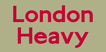 A revival Johnston Underground.
 - Heavy Heap by Typodermic,
$11.95 Get ready to burn rubber with Heavy Heap—the ultimate typeface for fans of hot-rod culture and high-speed thrills! This groovy psychedelic typeface is on fire, with a scorching look that’s sure to turn heads. With three sizzling weights to choose from, you can customize your typography to match your project’s intensity level. And with blistering mathematical symbols, torrid OpenType fractions, and a range of searing hot currency symbols, Heavy Heap is ready to take on any design challenge. But this headliner is more than just a pretty face—it’s a powerhouse of design options. It looks outstanding when used with warp and envelope effects, allowing you to create dynamic, eye-catching layouts that really pop. And with its bold, energetic style, Heavy Heap is perfect for any project that needs a little extra heat. From posters to flyers, from logos to website headers, this font is the ultimate choice for anyone who wants to make a brave statement. So rev up your engines and get ready to hit the road—with Heavy Heap, you’ll be riding in style! Most Latin-based European writing systems are supported, including the following languages. Afaan Oromo, Afar, Afrikaans, Albanian, Alsatian, Aromanian, Aymara, Bashkir (Latin), Basque, Belarusian (Latin), Bemba, Bikol, Bosnian, Breton, Cape Verdean, Creole, Catalan, Cebuano, Chamorro, Chavacano, Chichewa, Crimean Tatar (Latin), Croatian, Czech, Danish, Dawan, Dholuo, Dutch, English, Estonian, Faroese, Fijian, Filipino, Finnish, French, Frisian, Friulian, Gagauz (Latin), Galician, Ganda, Genoese, German, Greenlandic, Guadeloupean Creole, Haitian Creole, Hawaiian, Hiligaynon, Hungarian, Icelandic, Ilocano, Indonesian, Irish, Italian, Jamaican, Kaqchikel, Karakalpak (Latin), Kashubian, Kikongo, Kinyarwanda, Kirundi, Kurdish (Latin), Latvian, Lithuanian, Lombard, Low Saxon, Luxembourgish, Maasai, Makhuwa, Malay, Maltese, Māori, Moldovan, Montenegrin, Ndebele, Neapolitan, Norwegian, Novial, Occitan, Ossetian (Latin), Papiamento, Piedmontese, Polish, Portuguese, Quechua, Rarotongan, Romanian, Romansh, Sami, Sango, Saramaccan, Sardinian, Scottish Gaelic, Serbian (Latin), Shona, Sicilian, Silesian, Slovak, Slovenian, Somali, Sorbian, Sotho, Spanish, Swahili, Swazi, Swedish, Tagalog, Tahitian, Tetum, Tongan, Tshiluba, Tsonga, Tswana, Tumbuka, Turkish, Turkmen (Latin), Tuvaluan, Uzbek (Latin), Venetian, Vepsian, Võro, Walloon, Waray-Waray, Wayuu, Welsh, Wolof, Xhosa, Yapese, Zapotec Zulu and Zuni.
 - Heavy Rain by Mans Greback,
$59.00 Heavy Rain is a decorative roman typeface. Drawn and created by Mans Greback during 2020 and 2021, this medieval serif font has a distinct classic style and a historical character. It gives antiquity to any graphic project, and with its ornamental capitals it accentuates your message. In addition to the decorated uppercase, it is provided in a regular, simplified text style. Heavy Rain is built with guaranteed top-notch quality. It has extensive lingual support, covering all Latin-based languages. It contains all characters and symbols you'll ever need, including all punctuation and numbers.
 - Top Heavy by m u r,
$15.00A font that's a little off balance because of its exaggerated serifs. - Heavy Boxing by Vozzy,
$10.00 Introducing a vintage look label duo font named "Heavy Boxing". This family includes regular bold and strong font and cute handwritten script font. Regular font have different small and capitali letters. This font will good viewed on any retro design like poster, t-shirt, label, logo etc.
 - Heavy Brush by Rochart,
$15.00 Heavy Brush is my hand drawn brush font, and makes with original brush paint, by using high resolution brush stroke images with incredible definition. Its look natural. It will be great for Logotypes, Posters, Digital Lettering Arts, Clean Design, Branding Design, Sign, Merchandise and Social Media Posts. This font contain of Uppercase, Lowercase, Number, Symbol, Punctuation, also support multilingual and already PUA encoded. And swashes.
 - Heavy Force by Blankids,
$20.00 Are you looking for a vintage layering display font? Do you want of creating Something that stand out and inspire creativity, imagination, and endless fun? Wait no more, we will give you the best choice. Heavy Force a Sharp Display Font Heavy Force a Sharp Display Font, Inspiring from old signage typography. This font is perfect for a design that makes it more attractive and playful. made with a very good level of aesthetics making this font suitable for book cover, poster, packging, merchandise, logotype and much more. Heavy Force font includes Multilingual Support, among others : Afrikaans, Albanian, Asu, Basque, Bemba, Bena, Breton, Catalan, Chiga, Cornish, Danish, Dutch, English, Estonian, Faroese, Filipino, Finnish, French, Friulian, Galician, German, Gusii, Indonesian, Irish, Italian, Kabuverdianu, Kalenjin, Kinyarwanda, Luo, Luxembourgish, Luyia, Machame, Makhuwa, Meetto, Makonde, Malagasy, Manx, Morisyen, North Ndebele, Norwegian Bokmål, Norwegian Nynorsk, Nyankole, Oromo, Portuguese, Quechua, Romansh, Rombo, Rundi, Rwa, Samburu, Sango, Sangu, Scottish Gaelic, Sena, Shambala, Shona, Soga, Somali, Spanish, Swahili, Swedish, Swiss German, Taita, Teso, Uzbek (Latin), Volapük, Vunjo, Zulu FEATURES : Uppercase Lowercase Number Punctuation Multilingual PUA Encode Opentype
 - Bite me - Unknown license

- Shelter Me - Personal use only

- Shelter Me - Personal use only

- Wash Me by Fonthead Design,
$9.00 - Look @ Me by Matthias Luh,
$20.00 Look @ Me is a cartoonish, fancy font. Its special features are the different eyes of the capital letters. The letters literally have faces and who knows, probably they may talk to you... ;)
 - Loving me by Letterara,
$12.00 Loving me is a new, fresh, sweet, and quirky handmade font. It’s ideal for branding and decorate your projects. Loving me font has a classy, and modern look that can be used for logos, branding, invitations, poster, advertising, stationery, wedding designs, social media posts, and much more! It is PUA encoded which means you can access all of the glyphs and swashes with ease!
 - Stich Me by Volcano Type,
$19.00 Stich Me was inspired by embroidery patterns
 - Me & You by Green Adventure Studio,
$20.00 Me & You is a fun and playful display font. Masterfully designed to become a true favorite, this font has the potential to bring each of your creative ideas to the highest level!
 - Love Me by Bedoodle,
$9.00Casual, fun, handwriting font. - Be Me by One Line Design,
$15.00 When your handwriting is that good... make a font! Now you can "Be Me." Give your text a little attitude with this fun font! This font is great for beauty, fashion, announcements and so much more! With a variety of swashes and fun symbols to create quirky posters. Regular & Bold fonts include: 1821 Glyphs Including Basic Latin, Latin-1 Supplement, Latin Extended-A, Latin Extended-B, Greek and Coptic, Cyrillic, Thai, Miscellaneous Symbols, Hiragana, Katakana, CJK Unified Ideographs, & More.
 - Hire Me by Celebrity Fontz,
$19.99A professional-looking original typeface that can be used in resumes, curriculum vitae, business communications, and e-mails, this font contains the subliminal message "hire me" embedded into each of its characters. Use it in your resume, cover letter, and written communications with a potential boss, hiring manager, recruiter, Human Resources department, or anyone who may have a say in the decision to employ you. In this tough job market, you can use every advantage you can get. If you would like a high-quality TrueType font with a subliminal message of your own choosing, contact celebrityfontz@yahoo.com for more information. - Touch Me by Latinotype,
$69.00 Touch Me is a Script hand-drawn style typeface—designed by Coto Mendoza—resulting from polyrhythmic exploration, sign deconstruction and altered calligraphic contrast plays with watercolour brush. Coto has been using these experimental calligraphy techniques when creating the catchwords for Macarons, the Boho Family, Bikini Season Script and Matcha Script and so forth. Touch Me was inspired by a character in a story written by Coto while attending a literary workshop with Ina Groovie in Santiago de Chile. The character is a tribal girl who lives on an island in the Caribbean. She is heir of ancestral knowledge and possesses wild beauty, very passionate and sensual: intense, strong and free. These features are reflected in the polyrhythm of the typeface's curves: an irregular baseline, variable x-height, different lengths of initial and terminal strokes (that sometimes expand and sometimes shrink) and amount of brush pressure that generates changes in contrast within the characters. This way, when composing, signs with stroke contrast randomly alternate with monolinear ones and with signs of altered contrast, thanks to the typeface's OpenType programming. The family, with more than 3,000 glyphs, provides a number of alternative characters, swashes, ligatures, initial and terminal forms, in short, a vast ocean of choices! Touch Me is a spontaneous typeface with a fresh and unique personality. It is the perfect choice for short text in both print and digital formats. The family comes with a Script Regular version and a seductive Script Drop that you will enjoy a lot! The Extras set includes some catchwords, dingbats and ornaments that allows for endless composition options. The family also comes with a Caps version —designed by Luciano Vergara—in 2 styles: a funny and big-headed condensed Sans Grotesk display of inverted vertical proportion plus a Grotesk, neutral and slightly expressive Petite. Both versions, available in 6 weights, have been especially designed to create hierarchies when composing. This allows for balance between strokes of different weight when it comes to the Sans and Script fonts. Come and dare yourself! Touch Me! Thanks Alisa for sharing your amazing and beautiful picture with us.
 - Kiss Me by Motokiwo,
$18.00 Kiss Me script font is beautiful, a well designed for pretty girls. It’s handwritten font with a chic ballpoint strokes style that very suitable for romantic and passionate typography projects such as wedding, fashion logo, branding, or a signature text.
 - Kill Me by Octopi,
$13.00 I have terrible and messy handwriting so I thought it would be a good idea to make a twisted version into an horrific font. In that respect I think it is quite successful, plus, Hallowe'en is nigh.
 - Keep Me by Seemly Fonts,
$12.00 Keep Me is a brand new display font. Keep Me is perfectly suited for stationery, t-shirt, paper, print design, website header, photo frame, flyer, music cover, poster, image slider, and much more.
 - FS Silas Sans by Fontsmith,
$80.00 The great enigma There are hidden depths to FS Silas Sans. First impressions are of a functional, multi-purpose typeface with a cool, edgy, angular character. Gaze into its eyes a little longer, though, and you'll detect a more nuanced, colourful personality, with full, open, satisfyingly squarish forms balancing the abruptness of the sharply-angled terminals and ascenders. Authoritative, official and stern on the outside; amiable and welcoming on the inside. You’re so Dane The designers, led by Phil Garnham, were trying to capture something straight-talking, authentic, and a little... Scandinavian. ‘We were thinking about some of the characters in Danish dramas that were on in the early stages of the font’s development, like The Killing and The Bridge,’ says Phil. ‘The police officers, that is, not the psychopathic killers. Smart and a bit cool, but with a warm heart.’ For a good Danish name, we settled on Silas. It was that or Hans-Christian. The finer points Silas Sans rewards close inspection. Study, if you will, its amply squarish forms, the roomy ‘o’ and ‘e’, in particular. Observe the angular ascenders and terminals of, for example, the ‘L’, ‘I’, ‘d’ and ‘i’, inferring the movement and lift of a pen. Consider the cuts to the ‘A’ and ‘v’ that create harmony with adjacent letters. And scrutinise the subtle ink traps set within the ‘A’ and ‘Y’ for reproduction at small sizes. A fine subject, we think you’ll agree, and available in a versatile range of weights to make (with FS Silas Slab) a typographic system with a comprehensive hierarchy.


