6,438 search results
(0.021 seconds)
- Nami by Linotype,
$29.99Nami, the Japanese word for wave," is the latest collaboration between Adrian Frutiger and Linotype's Type Director, Akira Kobayashi. This typeface family is the most humanistic sans serif design ever to come from Adrian Frutiger, and it has an interesting twist: lapidar alternates that may be surfed through with the help of OpenType-savy applications. Adrian Frutiger began the design that would blossom into Nami during the 1980s. Although it would not be produced during the 20th century, it was quite forward thinking. The typeface included several seemingly avant garde alternates; these were "lapidary" versions of common letterforms. Revisiting the project in 2006, Akira Kobayashi reworked the concept into a working family of three typefaces. Each font contains 483 glyphs, including 11 alternates-two extra forms of the lowercase g, as well as new forms for a, e, h, l, m, n, r, t, and u." - Kill your darlings AC - Unknown license

- Bruno Ace Pro Rounded by Stiggy & Sands,
$29.00 Auto-Techno-Motive Stance in a softer package. Bruno Ace Rounded Pro is a fresh derivative of our Bruno Ace Pro typeface. It draws its inspiration from modern automotive logotypes. This geometric sans-serif has a wide stance with a tall x-height for a strong look and appeal, as well as ease of legibility. The SmallCaps and extensive figure sets offer a more extensive range of use as well as a more intense vibe. Bruno Ace Rounded Pro has an obviously softer feel to it compared to the original. See the 5th graphic for a comprehensive character map preview. Opentype features include: - SmallCaps. - Full set of Inferiors and Superiors for limitless fractions. - Tabular, Proportional, and Oldstyle figure sets (along with SmallCaps versions of the figures). - Stylistic Alternates for Caps to SmallCaps conversion.
 - MC Parize Display Font by Maulana Creative,
$15.00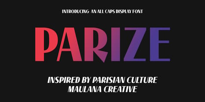 Parize is a decorative display font. Bold stroke, fun character with a bit of ligatures and alternates. To give you an extra creative work. Parize font support multilingual more than 100+ language. This font is good for logo design, Social media, Movie Titles, Books Titles, a short text even a long text letter and good for your secondary text font with script or serif. Make a stunning work with Parize font. Cheers, Maulana Creative
 - MC Blothe Display Font by Maulana Creative,
$13.00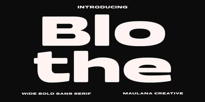 Blothe is a wide sans serif basic font. With bold extended stroke, fun character with a bit of ligatures and alternates. To give you an extra creative work. Blothe font support multilingual more than 100+ language. This font is good for logo design, Social media, Movie Titles, Books Titles, a short text even a long text letter and good for your secondary text font with handwritten or script. Make a stunning work with Blothe font. Cheers, Maulana Creative
 - MC Alvesto Sans Font by Maulana Creative,
$16.00 Alvesto is a minimalist sans serif font. Bold stroke, fun character with a bit of ligatures and alternates. To give you an extra creative work. Alvesto font support multilingual more than 100+ language. This font is good for logo design, Social media, Movie Titles, Books Titles, a short text even a long text letter and good for your secondary text font with script or serif. Make a stunning work with Alvesto font. Cheers, Maulana Creative
 - FreeSet by ParaType,
$30.00 The type family in four basic styles was designed in ParaType (ParaGraph) in 1992 by Tagir Safayev. Based on Frutiger, of Mergenthaler Linotype, 1976 by Adrian Frutiger. Frutiger font was originally designed for use on signs at the new Charles de Gaulle Airport at Roissy. The straightforward sans serif shapes are suited well for both text and display setting. Six additional styles were added in 1998-2000. Multilingual versions of 6 styles (Light, Demi and Extrabold) include Armenian alphabet designed by Manvel Shmavonyan in 1997. Two condensed Cyrillic styles (Demi Condensed and Bold Condensed) designed by Manvel Shmavonyan in 2005.
 - Linotype Didot by Linotype,
$29.00 Linotype Didot™ was drawn by Adrian Frutiger in 1991, and is based on the fonts cut by Firmin Didot between 1799 and 1811. Frutiger also studied the Didot types in a book printed by the Didots in 1818, "La Henriade" by Voltaire. This beautifully drawn family is the right choice for elegant book and magazine designs, as well as advertising with a classic touch.
 - Serifa by Bitstream,
$29.99 Developed by Adrian Frutiger for Bauer in 1966, Serifa is a slabserif based on the principles that led to the success of Frutiger’s 1956 sanserif, Univers. Glypha, designed by Frutiger for Stempel in 1979, is a version of Serifa with a moderately larger x-height; Stempel has paid royalties on Glypha to Neufville since 1984. Serifa® font field guide including best practices, font pairings and alternatives.
 - Benjamin by Wilton Foundry,
$29.00Wilton's "Benjamin-Regular" is a delightful twist on a classic - reminiscent of Franklin Gothic, Helvetica and Frutiger with it's own contemporary twist. - Phoebus by Linotype,
$29.99Phoebus is one of Adrian Frutigers first typefaces which he made for the Deberny & Peignot foundry in Paris. The intention was to create a shadowed type with extra ordinary impression. - Courier New OS by Monotype,
$50.99 Designed as a typewriter face for IBM, Courier New was re drawn by Adrian Frutiger for IBM Selectric series. A typical fixed pitch design, monotone in weight and slab serif in concept.
 - Serifa by Linotype,
$29.99 This slab serif font of Adrian Frutiger is extremely legible and robust, making it suitable for most any use. Based on the forms of Univers, Serifa makes a harmonious and timeless impression.
 - Vectora by Linotype,
$40.99In creating Vectora, Adrian Frutiger was influenced by American Gothic styles, especially those of Morris F. Benton’s Franklin Gothic and News Gothic. Vectora is light and balanced, giving text legibility and a harmonious appearance. - Egyptienne F by Linotype,
$29.99Adrian Frutiger designed Egyptienne F for the Deberny & Peignot Foundry in 1956. This was the first of several Egyptians designed by Frutiger, see also Glypha and Serifa. “Egyptian” or “Egyptienne” is a typographic designation for roman typefaces with slab (or square or rectangular) shaped serifs; and those that have bracketing between main stroke and serifs (like this one) are known as “Clarendon-style Egyptians”. Egyptienne F has a medium x-height and excellent character spacing for setting text in small point sizes. Legible, flexible, and neutral in appearance, Egyptienne F is a good choice for books, magazines, and on-screen presentations. - Fact by ParaType,
$29.00 Fact is a workhorse open sans serif type system. It is inspired by the great Frutiger typeface. While the Regular style is slightly modernized but still quite close to Frutiger, changing the weight or width makes differences of the design more pronounced. The style range of Fact is wider than of any cognate type family, including weights from Thin to Black and widths from Compressed to Expanded. Fact type system contains 48 upright styles and 48 italics with variations in width and weight. The font was designed by Alexandra Korolkova and Manvel Shmavonyan and released by Paratype in 2018-2019.
 - Avenir Next Georgian by Linotype,
$49.00 The original Avenir typeface was designed by Adrian Frutiger in 1988, after years of having an interest in sans serif typefaces. The word Avenir means “future” in French and hints that the typeface owes some of its interpretation to Futura. But unlike Futura , Avenir is not purely geometric; it has vertical strokes that are thicker than the horizontals, an “o” that is not a perfect circle, and shortened ascenders. These nuances aid in legibility and give Avenir a harmonious and sensible appearance for both texts and headlines. In 2012, Akira Kobayashi worked alongside Avenir’s esteemed creator Adrian Frutiger to bring Avenir Next to life, as a new take on the classic Avenir. The goal of the project was to take a beautifully designed sans and update it so that its technical standards surpass the status quo, leaving us with a truly superior sans family. Since then, Monotype expanded the typeface to accommodate more languages. Akira’s deep familiarity with existing iterations of the Frutiger designs, along with his understanding of the design philosophy of the man himself, made him uniquely suited to lead the creation of different language fonts. Avenir Next World family, the most recent release from Monotype, is an expansive family of fonts that offers support for more than 150 languages and scripts that include Latin, Cyrillic, Greek, Hebrew, Arabic, Georgian, Armenian and Thai. Avenir Next World contains 10 weights, from UltraLight to ExtraBlack.
 - Hanah Hebrew by Jonahfonts,
$42.00 Hanah Hebrew without cantillation marks, very much used in everyday modern Hebrew. I have added Alternate Stylistics with just some additional cantillation marks which in some cases may be necessary. Use the Character Map (Windows) or Character Viewer (Mac) to access these characters. Unlimited Fractions can be obtained. You may be interested in these Hebrew fonts as well, NEWMARK HEBREW, HEBRON HEBREW,YOM TOV HEBREW, KOMUNIDAD HEBREW SCRIPT and PAGEANTRY HEBREW. Check them out! These fonts require OpenType-aware software.
 - Rusticana by Linotype,
$29.99Rusticana is a part of the 1990 program Type before Gutenberg, which included the work of twelve contemporary font designers and represented styles from across the ages. Linotype offers a package including all these fonts on its web page, www.fonts.de. Rusticana was designed by Adrian Frutiger and appeared with Linotype in 1993. Its historical roots go back to the Roman Capitalis, the all caps engraved writing of ancient Rome which reached its peak in the first century. From this style evolved other Roman forms, and one, Rustica, proved particularly good for text on bronze, as opposed to in stone. The Rusticana of Frutiger has open, seemingly irregular forms which lend a distinctive rhythm to text. - Monotype Courier 12 by Monotype,
$29.99Designed as a typewriter face for IBM, Courier was redrawn by Adrian Frutiger for the IBM Selectric series. Courier is a typical fixed pitch design, monotone in weight and slab serif in concept. The Courier font is used to emulate typewriter output for reports, tabular work and technical documentation. - Courier Line Draw by Monotype,
$29.99Designed as a typewriter face for IBM, Courier was redrawn by Adrian Frutiger for the IBM Selectric series. Courier is a typical fixed pitch design, monotone in weight and slab serif in concept. The Courier font is used to emulate typewriter output for reports, tabular work and technical documentation. - M XiangHe Hei SC Pro Variable by Monotype,
$1,049.99The M XiangHe Hei Simplified Chinese typeface merges traditional brush strokes with modern letterforms to carefully balance traditional calligraphy with humanist design. Named for the smooth movements of a flying crane, the M XiangHe Hei typeface is designed to glide across the page, and features strokes that are partly derived from the Kaishu calligraphic style – an everyday script which dates back hundreds of years. Seol Sans features Neue Frutiger for its Latin glyphs, and works harmoniously with Neue Frutiger World and Monotype’s CJK typefaces Tazugane Info (Japanese) and Seol Sans (Korean). M XiangHe Hei is a great choice for global brands using sans serif Latin typefaces looking to maintain their visual identity, and communicate with a consistent tone of voice with Simplified Chinese. - President by Linotype,
$29.99In 1952, Charles Peignot made a bold and fortuitous move: he invited a young Swiss designer to Paris to be the art director of the Deberny & Peignot type foundry. This started the professional type design career of Adrian Frutiger; and since then he has designed an astonishing range of masterful typefaces. One of the earliest for Deberny & Peignot was Président, a sharp-seriffed Latin titling face. Latin" is a typographic designation for roman typefaces with wedge or triangular-shaped serifs, a stylistic form that Frutiger would return to later with his beautiful typeface Méridien. Président™ has wide, solid shapes; very little contrast between thick and thin strokes; and an air of assurance. Use this titling font for business cards, announcements, or artistic signage." - M XiangHe Hei SC Std Variable by Monotype,
$1,049.99The M XiangHe Hei Simplified Chinese typeface merges traditional brush strokes with modern letterforms to carefully balance traditional calligraphy with humanist design. Named for the smooth movements of a flying crane, the M XiangHe Hei typeface is designed to glide across the page, and features strokes that are partly derived from the Kaishu calligraphic style – an everyday script which dates back hundreds of years. Seol Sans features Neue Frutiger for its Latin glyphs, and works harmoniously with Neue Frutiger World and Monotype’s CJK typefaces Tazugane Info (Japanese) and Seol Sans (Korean). M XiangHe Hei is a great choice for global brands using sans serif Latin typefaces looking to maintain their visual identity, and communicate with a consistent tone of voice with Simplified Chinese. - M XiangHe Hei TC Variable by Monotype,
$1,049.99The M XiangHe Hei Traditional Chinese typeface merges traditional brush strokes with modern letterforms to carefully balance traditional calligraphy with humanist design. Named for the smooth movements of a flying crane, the M XiangHe Hei typeface is designed to glide across the page, and features strokes that are partly derived from the Kaishu calligraphic style – an everyday script which dates back hundreds of years. Seol Sans features Neue Frutiger for its Latin glyphs, and works harmoniously with Neue Frutiger World and Monotype’s CJK typefaces Tazugane Info (Japanese) and Seol Sans (Korean). M XiangHe Hei is a great choice for global brands using sans serif Latin typefaces looking to maintain their visual identity, and communicate with a consistent tone of voice with Traditional Chinese.¶ - M XiangHe Hei SC Pro by Monotype,
$187.99The M XiangHe Hei Simplified Chinese typeface merges traditional brush strokes with modern letterforms to carefully balance traditional calligraphy with humanist design. Named for the smooth movements of a flying crane, the M XiangHe Hei typeface is designed to glide across the page, and features strokes that are partly derived from the Kaishu calligraphic style – an everyday script which dates back hundreds of years. Seol Sans features Neue Frutiger for its Latin glyphs, and works harmoniously with Neue Frutiger World and Monotype’s CJK typefaces Tazugane Info (Japanese) and Seol Sans (Korean). M XiangHe Hei is a great choice for global brands using sans serif Latin typefaces looking to maintain their visual identity, and communicate with a consistent tone of voice with Simplified Chinese. - Hedge Backwards by Comicraft,
$39.00 You begged with us..! You pleaded with us..! But we decided to release the official Richard Starkings font anyway! Yes, I am Richard Starkings and you may remember my hand lettering from such comic books as THE KILLING JOKE, TRANSFORMERS and, um, THE KILLING JOKE! Yes, finally Comicraft is making available the font that started it all -- from the pages of MARVELS, SUPERBOY, GENERATION X and, um... MARVELS! The font that Kurt Busiek, writer/creator of ASTRO CITY, really, really likes but we've always refused to make available to him. Always leave your friends wanting more, that's my motto.
 - Glypha by Linotype,
$29.99 Glypha was designed by Adrian Frutiger and appeared with D. Stempel AG in 1977. The font consists of ten cuts and is formally based on its predecessor, Serifa, although its lower case letters are a bit larger. Like Serifa, Glypha is also based on the general scheme used to design Univers.
 - Avenir Next Cyrillic by Linotype,
$49.00 The original Avenir typeface was designed by Adrian Frutiger in 1988, after years of having an interest in sans serif typefaces. The word Avenir means “future” in French and hints that the typeface owes some of its interpretation to Futura. But unlike Futura, Avenir is not purely geometric; it has vertical strokes that are thicker than the horizontals, an “o” that is not a perfect circle, and shortened ascenders. These nuances aid in legibility and give Avenir a harmonious and sensible appearance for both texts and headlines. In 2012, Akira Kobayashi worked alongside Avenir’s esteemed creator Adrian Frutiger to bring Avenir Next to life, as a new take on the classic Avenir. The goal of the project was to take a beautifully designed sans and update it so that its technical standards surpass the status quo, leaving us with a truly superior sans family. Since then, Monotype expanded the typeface to accommodate more languages. Akira’s deep familiarity with existing iterations of the Frutiger designs, along with his understanding of the design philosophy of the man himself, made him uniquely suited to lead the creation of different language fonts. Avenir Next World family, the most recent release from Monotype, is an expansive family of fonts that offers support for more than 150 languages and scripts that include Latin, Cyrillic, Greek, Hebrew, Arabic, Georgian, Armenian and Thai. Avenir Next World contains 10 weights, from UltraLight to Heavy. The respective 10 Italic styles do not support Arabic, Georgian and Thai, since Italic styles are unfamiliar in these scripts/languages. Separate Non-Latin products to support just the Arabic, Cyrillic, Georgian, Hebrew and Thai script are also available for those who do not need the full language support.
 - Avenir Next World by Linotype,
$149.00 The original Avenir typeface was designed by Adrian Frutiger in 1988, after years of having an interest in sans serif typefaces. The word Avenir means “future” in French and hints that the typeface owes some of its interpretation to Futura. But unlike Futura, Avenir is not purely geometric; it has vertical strokes that are thicker than the horizontals, an “o” that is not a perfect circle, and shortened ascenders. These nuances aid in legibility and give Avenir a harmonious and sensible appearance for both texts and headlines. In 2012, Akira Kobayashi worked alongside Avenir’s esteemed creator Adrian Frutiger to bring Avenir Next to life, as a new take on the classic Avenir. The goal of the project was to take a beautifully designed sans and update it so that its technical standards surpass the status quo, leaving us with a truly superior sans family. Since then, Monotype expanded the typeface to accommodate more languages. Akira’s deep familiarity with existing iterations of the Frutiger designs, along with his understanding of the design philosophy of the man himself, made him uniquely suited to lead the creation of different language fonts. Avenir Next World family, the most recent release from Monotype, is an expansive family of fonts that offers support for more than 150 languages and scripts that include Latin, Cyrillic, Greek, Hebrew, Arabic, Georgian, Armenian and Thai. Avenir Next World contains 10 weights, from UltraLight to Heavy. The respective 10 Italic styles do not support Arabic, Georgian and Thai, since Italic styles are unfamiliar in these scripts/languages. Separate Non-Latin products to support just the Arabic, Cyrillic, Georgian, Hebrew and Thai script are also available for those who do not need the full language support.
 - Avenir Next Hebrew by Linotype,
$79.00 The original Avenir typeface was designed by Adrian Frutiger in 1988, after years of having an interest in sans serif typefaces. The word Avenir means “future” in French and hints that the typeface owes some of its interpretation to Futura. But unlike Futura, Avenir is not purely geometric; it has vertical strokes that are thicker than the horizontals, an “o” that is not a perfect circle, and shortened ascenders. These nuances aid in legibility and give Avenir a harmonious and sensible appearance for both texts and headlines. In 2012, Akira Kobayashi worked alongside Avenir’s esteemed creator Adrian Frutiger to bring Avenir Next to life, as a new take on the classic Avenir. The goal of the project was to take a beautifully designed sans and update it so that its technical standards surpass the status quo, leaving us with a truly superior sans family. Since then, Monotype expanded the typeface to accommodate more languages. Akira’s deep familiarity with existing iterations of the Frutiger designs, along with his understanding of the design philosophy of the man himself, made him uniquely suited to lead the creation of different language fonts. Avenir Next World family, the most recent release from Monotype, is an expansive family of fonts that offers support for more than 150 languages and scripts that include Latin, Cyrillic, Greek, Hebrew, Arabic, Georgian, Armenian and Thai. Avenir Next World contains 10 weights, from UltraLight to Heavy. The respective 10 Italic styles do not support Arabic, Georgian and Thai, since Italic styles are unfamiliar in these scripts/languages. Separate Non-Latin products to support just the Arabic, Cyrillic, Georgian, Hebrew and Thai script are also available for those who do not need the full language support.
 - ITC Jamille by ITC,
$29.99Mark Jamra based the design for Jamille on the forms of the 18th century Modern Face fonts of Didot and Bodoni, but was also influenced by the work of artists like Adrian Frutiger, who reworked such fonts to adapt to the demands of modern technology. A very legible font, Jamille will give text a classic, elegant feel. - Unisketch by Letters&Numbers,
$22.00 Unisketch is an homage to my favorite font Univers when I was at design college. Univers is a neo grotesk font by famous Swiss typeface designer Adrian Frutiger. Unisketch, with its worn, misaligned and slightly tilted characters, still retains some of the qualities that workhorse body copy requires: It is legible at small sizes and produces a compact ‘Schriftbild’.
 - Shannon by Monotype,
$29.99The Book of Kells is a handwritten Irish text which dates back to the 8th century. Kris Holmes and Janice Prescott digitalized some letters from this book and some from a Grotesk font in the style of Frutiger. A computer filled in the blanks and the designers then gave the font its finishing touches by hand. - Sernes by Graptail,
$15.00 Sernes was inspired by the letterforms in the film series "stranger things" with condensed letters.comes with 18 weights which includes display, alternate and italic. Also supported PUA encoded. Simply copy and paste the alternate characters using the Character Map (Windows), Font Book (Mac) or a software program such as PopChar (for Windows and Mac).
 - Seol Sans Variable by Monotype,
$1,049.99The Seol Sans design offers a fresh palette for designers working with the Korean alphabet, particularly those looking to pair Latin and Korean alphabet (or Hangul) forms without creating typographic friction. The choices for Hangul fonts that work well with humanist Latin typefaces are limited. As Monotype’s first original Korean design, the Seol Sans typeface is a humanist take on the traditional rigid and hard designs of Hangul characters. The Seol Sans design more closely resembles the natural curve of hand-written characters. Seol Sans features Neue Frutiger for its Latin glyphs, and works harmoniously with Neue Frutiger World and Monotype’s CJK typefaces Tazugane Info (Japanese) and M XiangHe Hei (Chinese). Seol Sans is a great choice for global brands using a Sans Serif design looking to maintain their visual identity, and communicate with a consistent tone of voice in the Korean market.¶ - LHF Chicago Script by Letterhead Fonts,
$46.00 This Charles Borges' script takes full advantage of the Open Type format with several automatic ligatures that occur as you type for a nicer fit. Plus, the manual stylistic alternates allow you to choose the letters you prefer. Alternates occur automatically as you type in supported programs when you have "Ligatures" or "Stylistic Alternates" turned on. If your program does not support automatic ligatures and substitutions, you may still access the alternates manually using the printable keyguide or using Character Map (Windows) or Font Book (Mac).
 - Meridien by Linotype,
$29.99 Frutiger based the design for his Meridien on the 16th century characters of Jenson, saying: As I designed Meridien, I wanted to avoid stiffness in the forms - I thought they should have a more natural line and flow. My main consideration was in creating a font which was both extremely legible and aesthetically pleasing. Meridien is proof of Frutiger’s success in his endeavor.
 - Oceanwide Pro by California Type Foundry,
$47.00 A font perfect for not just one, but many projects! Introducing Oceanwide Pro, a sans that loves to be used in just about any situation! Designed with ultra clean lines and versatility in mind, Oceanwide wants to be your new favorite sans! Oceanwide’s ultra clean letters work anywhere you want to communicate orderliness and competence, and designed to build trust and rapport with your audience. Its wide proportions make it ideal for display and logo use. Oceanwide especially shines for white/bright letters on black/dark backgrounds! That’s because the inside shapes are nearly perfect circles in many weights. Here's a quick video tour of Oceanwide Pro by Dave Lawrence, including all the great things Oceanwide can be used for! We've tested Oceanwide for these industries, with stunning results!: Tech Arts Fashion & Style Business & Branding Corporations Logistics Architecture Food and many more... Oceanwide can be used for: Headers Subheadlines Logos Even body text, if tracked. Print & Screen The styles it can take are also many. It's great for: Modern/minimalist design Flat design Cut out design User Interface (UI) Technical designs In combination with text effects, even for grunge and other situations. And many others... DESIGN FEATURES Simplicity Tall x-height Hand-sloped obliques (italics) Narrow spacing Semi-wide proportions Expert kerning Well proportioned, usable lights & extra lights Large caps Great ALL CAPS MODE Uppercase punctuation Uppercase spacing with California Type Foundry’s Smart Tracking™ Advanced fraction support Proportional lining figures Thick joins Smooth curves Sturdy—great for textures and effects Variable font available Latin Pro character set for Central European languages. That's the writing for over 782 languages and transliterations worldwide! DESIGN STORY—THE FORGOTTEN SANS by Dave Lawrence, Lead Designer, California Type Foundry Adrian Frutiger was the 20th century master of sans, but I didn't realize he had made—not one—but TWO geometric sans! It wasn't until I had purchased the book “Adrian Frutiger: Typefaces”. I had hoped to someday meet Adrian Frutiger, but he passed away that very same year. Here is the story of Frutiger's forgotten sans. Back in 1968, Frutiger was approached by Pentagram to make a design for British Petroleum. They wanted a "new version of Futura". However, they wanted him to make a couple adjustments. First, they felt that Futura was "too fiddly." By this, they meant that it narrowed too much at the joins. (Joins are for example where the round and straight parts of the 'd' meet.) This is something that is necessary for small print text (to prevent ink clogging), but is not necessary at large sizes. Second, they wanted it to be entirely geometric, using the circular shape with minimal optical corrections. Unfortunately this font was not even used very consistently in the BP brand. A haphazard mix of Futura and Frutiger's BP font ensued. It was then replaced by another font design very soon after. My design is different in several ways. First, the commas and quotes are a more modern style. I tried his original commas, but these just didn’t work to 21st century eyes. Second, in his drawings, Frutiger went for a more standard u with a downstroke on the right. However, Oceanwide has a simpler u. Third, I made more optical adjustments. At the direction of his employer, Frutiger reluctantly put no font optical corrections into the letters. So I think my optical adjustments are similar to what Frutiger would have wanted. Fourth, I extended the weight into the light and extra light ranges. Fifth, the rest of the font I created according to the principles of Adrian Frutiger, but with no sources for inspiration. Here is Frutiger’s design philosophy, in his own words: “If you remember the shape of your spoon at lunch, it has to be the wrong shape. The spoon and the letter are tools; one to take food from the bowl, the other to take information off the page... When it is a good design, the reader has to feel comfortable because the letter is both banal and beautiful.” The words about the spoon were the ones I kept in my mind as I tried to make the curves ultra smooth, and the shapes ultra simple. Hopefully this font is a worthy successor to the font that inspired it. Released on the 93rd birthday of Adrian Frutiger, to celebrate the life and achievements of this amazing designer. ——————— Simplicity. Versatility. Oceanwide.
 - M XiangHe Hei TC by Monotype,
$187.99 The M XiangHe Hei Traditional Chinese typeface merges traditional brush strokes with modern letterforms to carefully balance traditional calligraphy with humanist design. Named for the smooth movements of a flying crane, the M XiangHe Hei typeface is designed to glide across the page, and features strokes that are partly derived from the Kaishu calligraphic style – an everyday script which dates back hundreds of years. M XiangHe Hei TC features Neue Frutiger for its Latin glyphs, and works harmoniously Neue Frutiger World and Monotype’s CJK typefaces: Tazugane Gothic (Japanese) and Seol Sans (Korean). M XiangHe Hei TC is a great choice for global brands using sans serif Latin typefaces looking to maintain their visual identity, and communicate with a consistent tone of voice with Traditional Chinese. The M XiangHe Hei TC fonts have over 19,000 glyphs, and support the BIG5/HKHCS and CP950 character sets for Traditional Chinese.
