145 search results
(0.016 seconds)
- Freeland by Trial by Cupcakes,
$29.00
- Deco Freehand - Unknown license

- Ulse Freehand - Unknown license

- Freehand 575 by Bitstream,
$29.99 - Freehand Brush by Zetafonts,
$39.00
- Quickly Freehand by Cititype,
$12.00
- Freehand 591 by Tilde,
$39.75 - Ruzicka Freehand by Linotype,
$29.99 - Freehand 471 by ParaType,
$30.00
- Freehand 471 by Bitstream,
$29.99 - Freehand 521 by Tilde,
$39.75 - Freehand 591 by Bitstream,
$29.99 - Freehand 471 by Tilde,
$39.75 - Freehand 575 by Tilde,
$39.75 - Freehand 521 by Bitstream,
$29.99 - Freeman by Device,
$29.00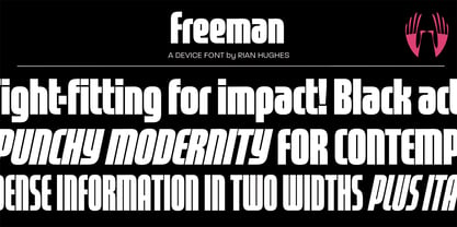
- Kelt Caps Freehand - Personal use only

- Eckhardt Freehand JNL by Jeff Levine,
$29.00 - Freelance Kamchatka - Unknown license

- Show Card Freehand JNL by Jeff Levine,
$29.00
- Westrider2057:FreehandProfit - 100% free

- Cascade Script by Linotype,
$29.99
- Average Handwriting by Inclusive Fonts,
$9.99
- Hacienda by Jonahfonts,
$18.00
- Flowy by Typesketchbook,
$49.00
- Gratinoli by Seventh Imperium,
$20.00
- Rhapsodie by Type Associates,
$24.95
- Scriptonite by Jonahfonts,
$30.00
- Tall Scrawl NF by Nick's Fonts,
$10.00 - Artlessness by sugargliderz,
$18.00
- Brush Swipe by Jonahfonts,
$35.00
- Suboel by Subtitude,
$-
- Swipe Write by Something and Nothing,
$10.00
- Evadare by Scriptorium,
$18.00 - Shirah 25 by LightHouse,
$49.00 - Karty Solid by Eurotypo,
$22.00
- Karty by Eurotypo,
$22.00
- Pigeon Street - Unknown license

- DG Zanardini by DubbioGusto,
$35.00
- Ready Kid by Flying Fuzzball,
$22.00


Page 1 of 4Next page