6,699 search results
(0.02 seconds)
- Informational Sign JNL by Jeff Levine,
$29.00
- Sign Crafters JNL by Jeff Levine,
$29.00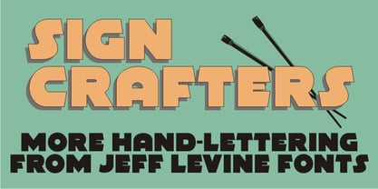
- Sign Kit JNL by Jeff Levine,
$29.00 - Sign Painter JNL by Jeff Levine,
$29.00 - Sign Lettering JNL by Jeff Levine,
$29.00
- PIXymbols Highway Signs by Page Studio Graphics,
$139.00 - PIXymbols ADA Signs by Page Studio Graphics,
$40.00 - Sign Merchant JNL by Jeff Levine,
$29.00
- Sign Maker JNL by Jeff Levine,
$29.00 - Sign Stencil JNL by Jeff Levine,
$29.00
- Window Sign JNL by Jeff Levine,
$29.00
- Stock Signs JNL by Jeff Levine,
$29.00
- Sign Writer JNL by Jeff Levine,
$29.00
- Sign Production JNL by Jeff Levine,
$29.00 - Sign Decal JNL by Jeff Levine,
$29.00 - Sign Template JNL by Jeff Levine,
$29.00
- Donkey Sign Graffiti by Sipanji21,
$18.00
- Sign Card JNL by Jeff Levine,
$29.00
- Aztec Day Signs by Deniart Systems,
$15.00
- Big New Sign by Thaddeus Typographic Center,
$49.00 - Sign Expert JNL by Jeff Levine,
$29.00
- Sign Shop JNL by Jeff Levine,
$29.00 - Growing Script free - Personal use only

- SKETCHUP FREE TRIAL - Personal use only

- Octin Sports Free - 100% free

- Octin Prison Free - 100% free

- walker free style - Unknown license

- Octin College Free - 100% free

- Octin Vintage Free - 100% free

- Scooter Boy Free - Unknown license

- Sui Generis Free - Unknown license

- Neuropol X Free - Unknown license

- Octin Spraypaint Free - 100% free

- Chinese Rocks Free - Unknown license

- Fenwick Outline Free - Unknown license

- Fat Free Solid - Unknown license

- BoumBoum (Free version) - Unknown license

- Fancy Free JNL by Jeff Levine,
$29.00
- Free Form Deco by Jeff Levine,
$29.00
- Sultan Free Bold by Sultan Fonts,
$19.99


